COLOR GUIDE
SPRING 2023
How to Create the PERFECT Spring Palette
TIPS & TRICKS from one of our Creators! MIX IT UP!
WITH OUR SPRING COLOR RECIPES
Welcome to Country Chic Paint 2023 Spring Color Guide, the ultimate source of inspiration for bringing the fresh, colorful energy of spring into your home!
We’ve curated a collection of articles that cover a range of topics, from color theory and how to create a spring palette for your home, to a step-by-step tutorial on how to create paint glazes for furniture. So sit back, relax, and let Country Chic Paint Spring Color Guide inspire you to infuse your home with the vibrant energy of the season.
#thecolorsofspringtime
WANT A CHANCE TO WIN A $150 GIFT CERTIFICATE?
Have you used one of the featured colors in the Spring Edition of Country Chic Paint Magazine to update the furniture or decor in your home? We’d love to see what you’ve created!
Just post your spring makeover on Facebook or Instagram (or both!) using any one of our 12 top spring colors and use the hashtag #springflingwithcountrychic
Post as many projects as you’d like between April 1 to May 31st, 2023 and you’ll be entered to win a $150 gift card from Country Chic Paint. One lucky winner will be chosen from a random drawing and will be announced on June 1st, 2023.
COUNTRY CHIC PAINT WWW.COUNTRYCHICPAINT.COM 2
SPRING COLOR GUIDE WWW.COUNTRYCHICPAINT.COM 3 #COUNTRYCHICPAINTMAGAZINE Create the Perfect Spring Palette Get inspired by Kate’s Reclaimed Helpful Question & Answers Step by Step Tutorial on Glazing Premium Products, Premium Retailers Mix it Up! Spring Color Recipes Motivating Spring Photography 6 7 12 16 30 26 34 TABLE
CONTENTS
of
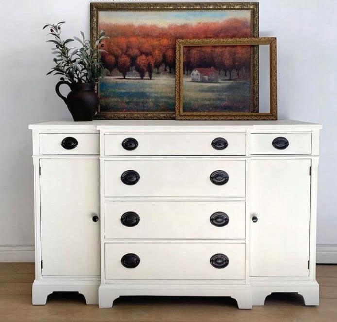
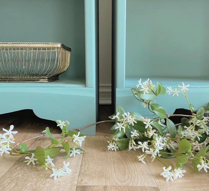
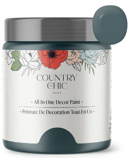
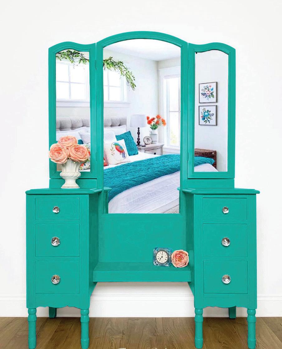
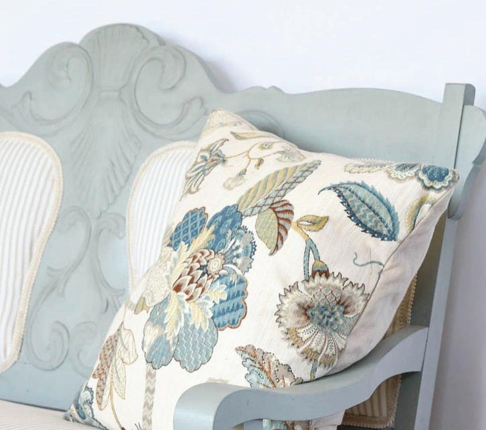
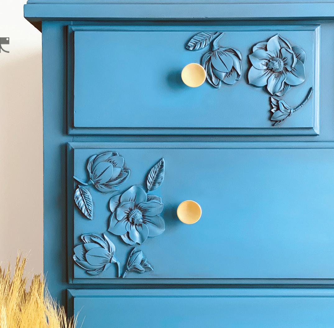
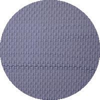
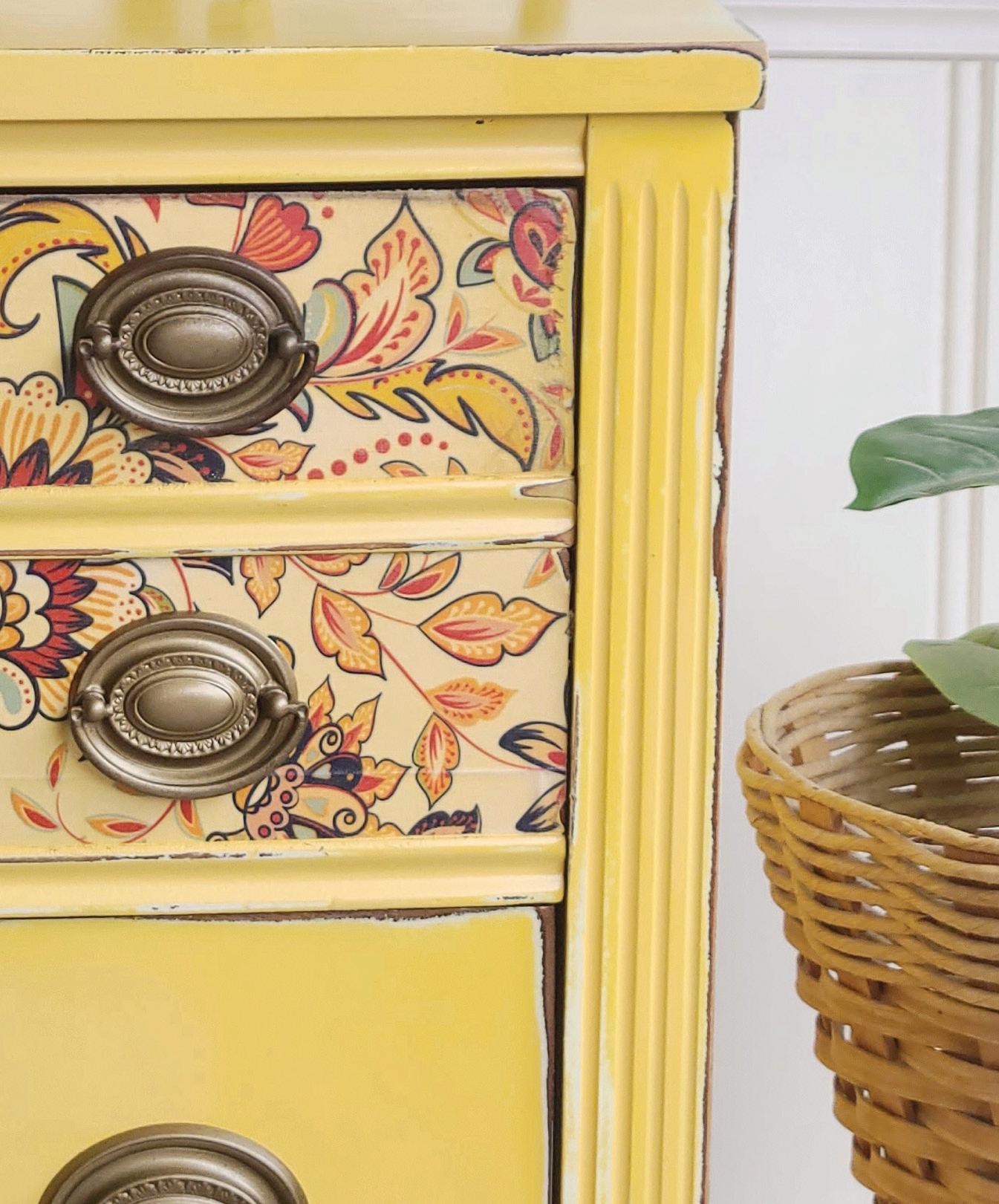
Starstruck
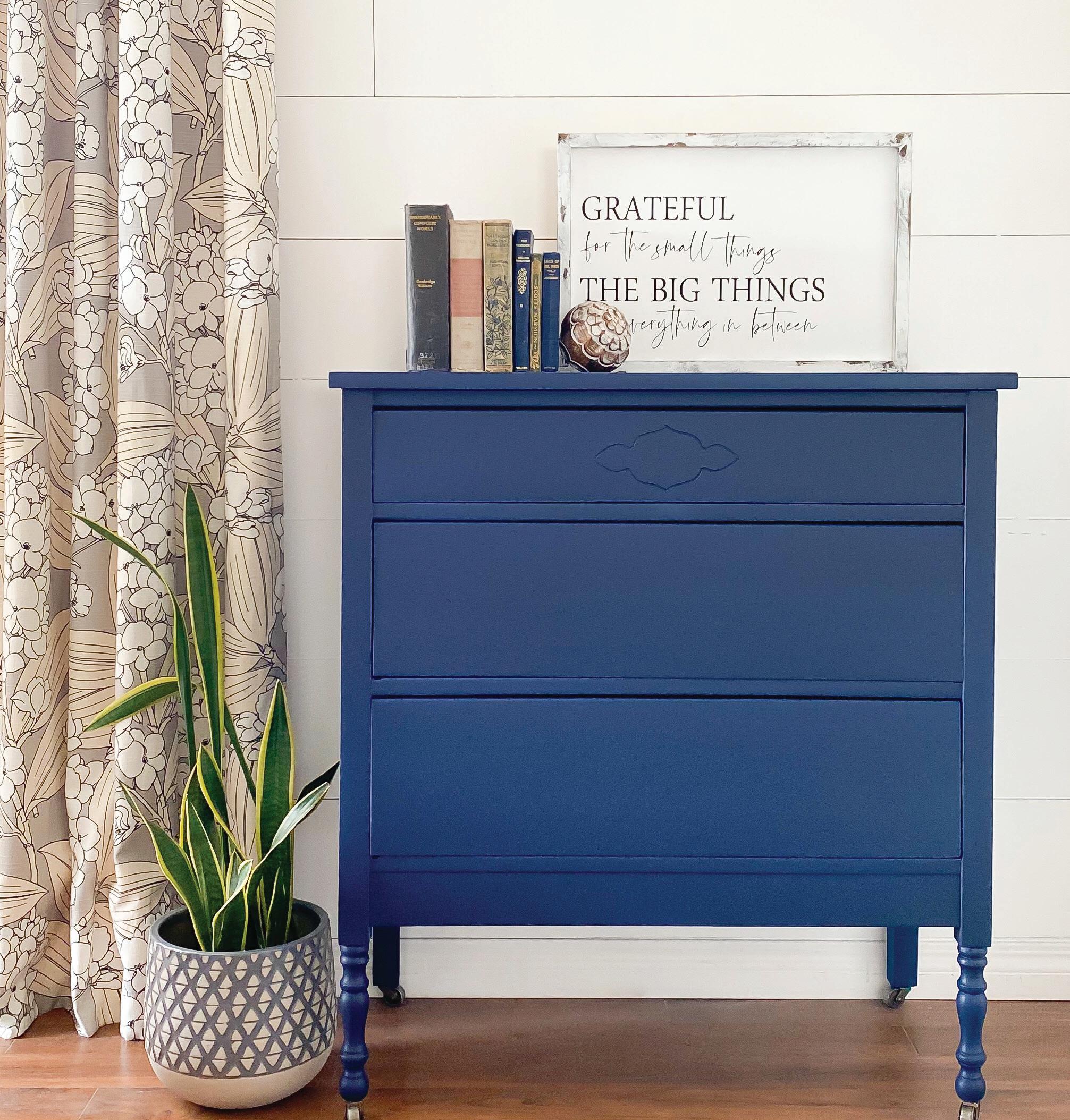
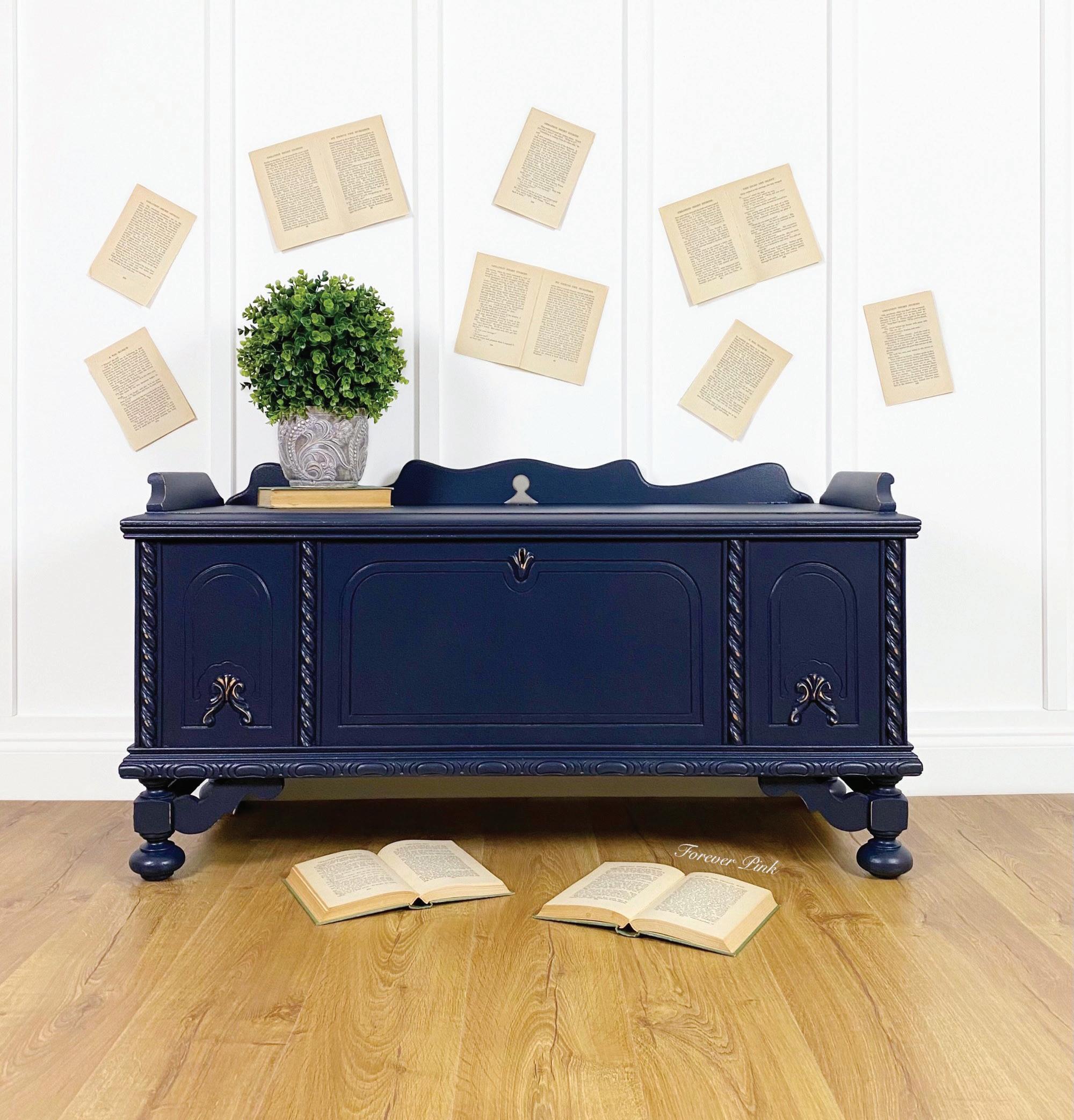
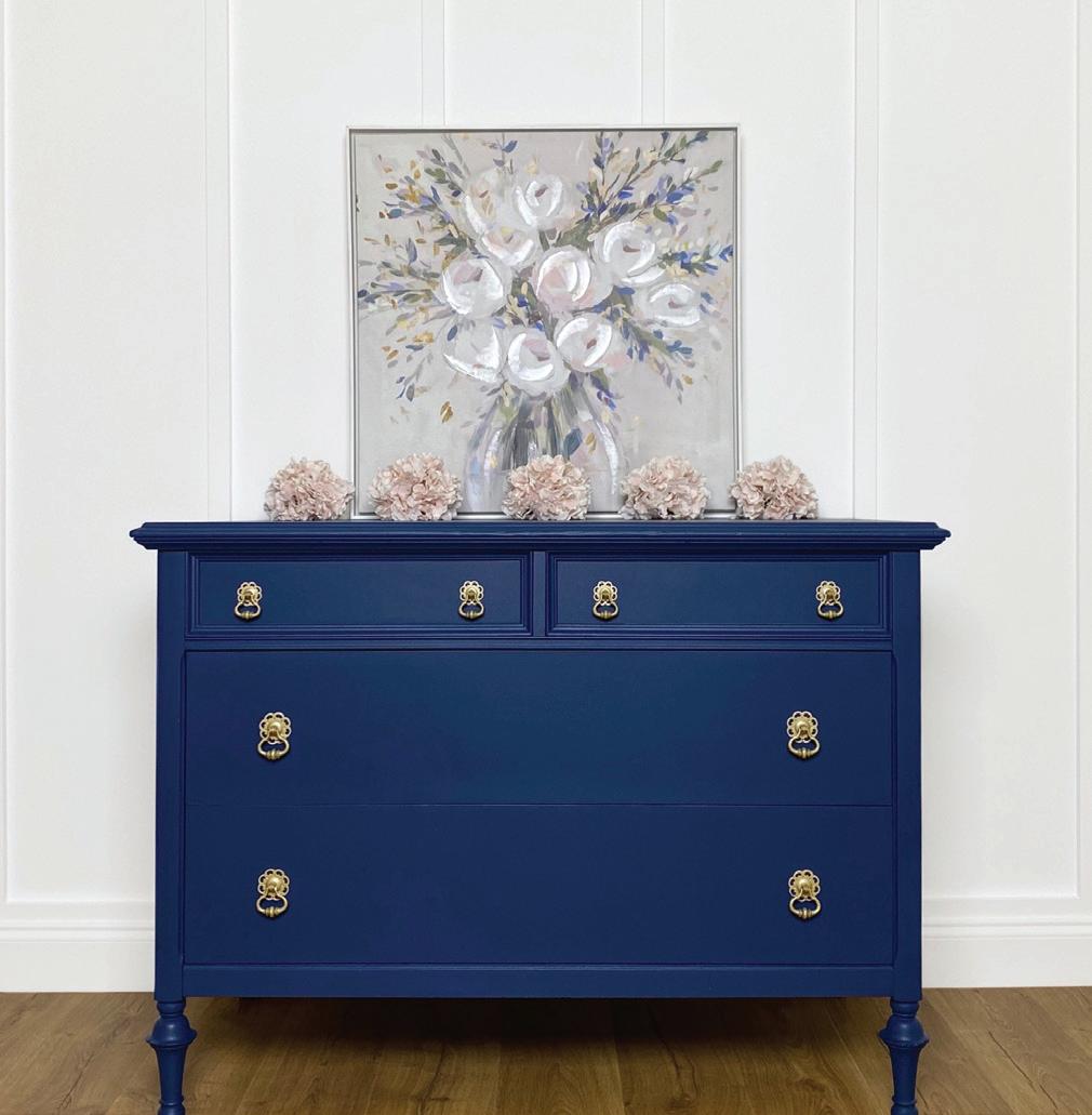
Starstruck is a dark, saturated blue like lapis lazuli gemstones. It’s closest to a true navy. This rich, dark hue makes it a great choice for adding drama and depth to any space. This versatile color pairs well with a range of other colors, including Belle of the Ball and Fresh Mustard, or any of our more neutral colors. It also looks stunning when paired with metallic accents, such as gold or copper, for a touch of glamor.
COUNTRY CHIC PAINT WWW.COUNTRYCHICPAINT.COM 4
© Little City Farmhouse
©
© Forever Pink
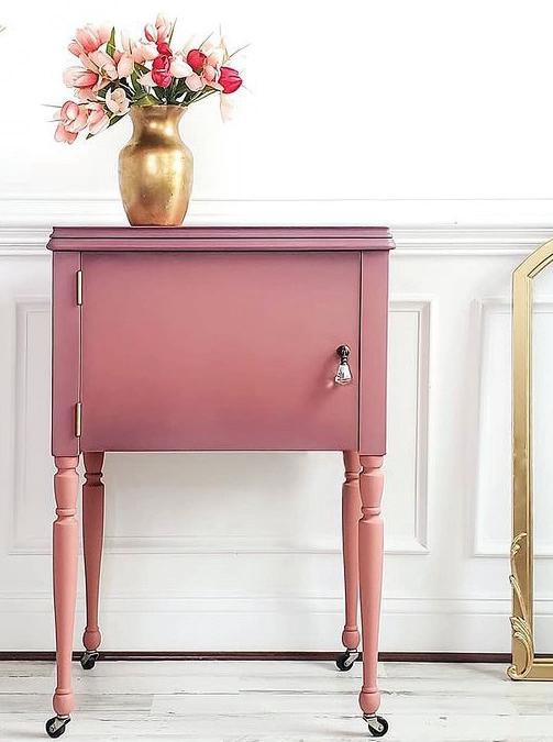
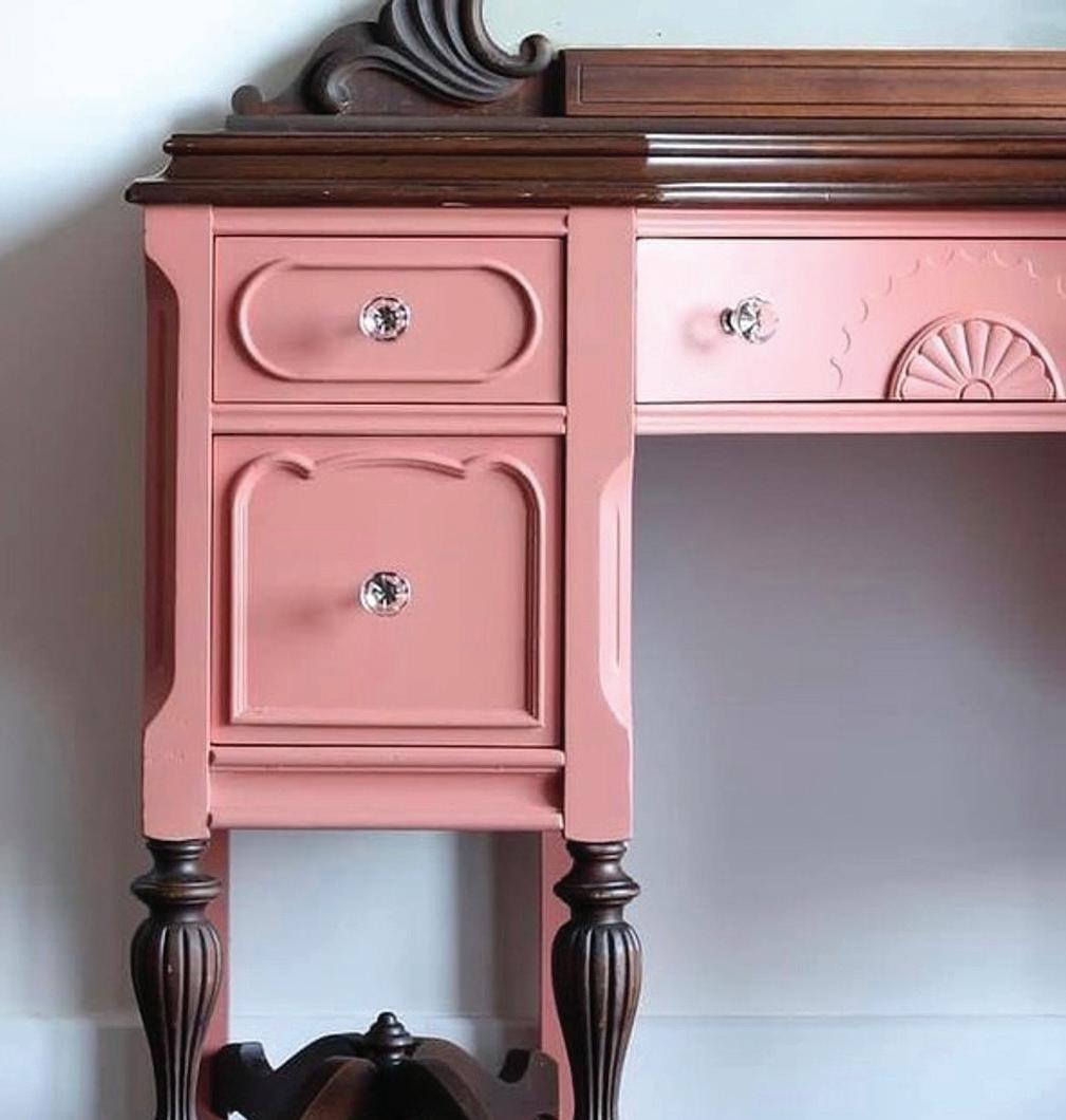
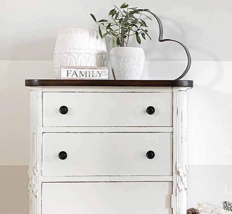
Forever Pink
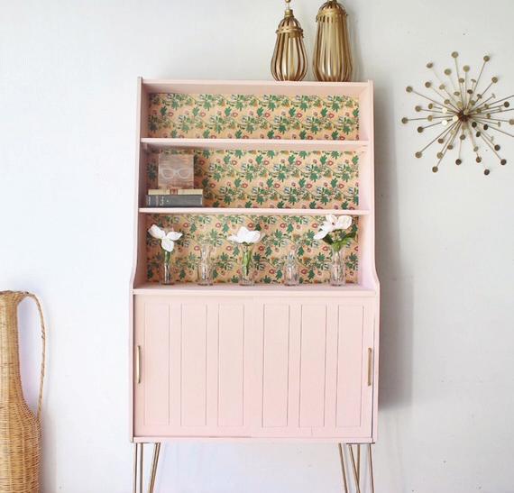
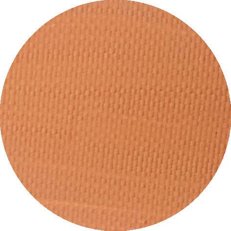
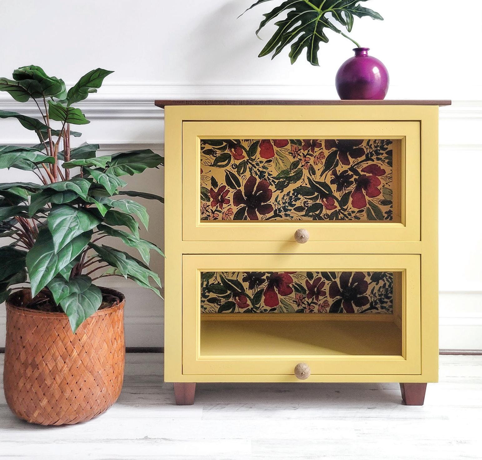
Peachy Keen
Peachy Keen is a retro, peachy clay color that looks amazing with warm browns like Leather Bound and Driftwood. We like to think of it as a “grown up” coral pink. For interior design pieces, consider using natural materials like wood, jute, or rattan and adding metallic accents like brass or gold for a touch of elegance.
SPRING COLOR GUIDE WWW.COUNTRYCHICPAINT.COM 5 #COUNTRYCHICPAINTMAGAZINE
© Salvaged by K Scott
© BT Treasures
© Amini Designs
How-to Create the Perfect Spring Palette for your Home
Interior color choices are highly subjective, which means there’s no right or wrong way to select a color scheme for your space. A carefully curated color scheme can set the tone for your entire space, bringing together furniture, decor, and architectural details. Here are a few things to consider whe creating a color palette for your interior design:
1. Consider the room’s function: The color palette you choose for a particular room should reflect its function. For example, calming and soothing colors such as blues and greens are great for bedrooms, while warm and welcoming tones like yellows and oranges work well in living spaces.
2. Think about the mood you want to create: The colors you choose can affect the mood of the room. Bright and bold colors create a lively and energetic atmosphere, while muted and neutral tones create a more relaxing ambiance.
3. Consider the lighting: The lighting in a room can affect how colors appear. Before finalizing your color palette, consider the amount and type of lighting in the room, including natural light, artificial light, and the direction of the windows.
4. Choose a dominant color: Select one dominant color that will serve as the anchor for your color palette. This color should be used in larger amounts throughout the room, such as larger furniture pieces.
5. Use complementary colors: Complementary colors, or colors that are opposite each other on the color wheel, can create a dynamic and visually appealing color scheme. However, it’s important to use complementary colors sparingly to avoid overwhelming the space.
6. Test out samples: Before committing to a color palette, test out samples in the room to see how they look in different lighting conditions and with other elements in the space.
Creating a color palette for your interior design can be a fun and rewarding process. By considering these factors, you can create a cohesive and visually stunning space that reflects your personal style and enhances your home’s overall aesthetic.
If you want help choosing colors for your space, take our Color Quiz!
#springtimewithcountrychic
COUNTRY CHIC PAINT WWW.COUNTRYCHICPAINT.COM 6
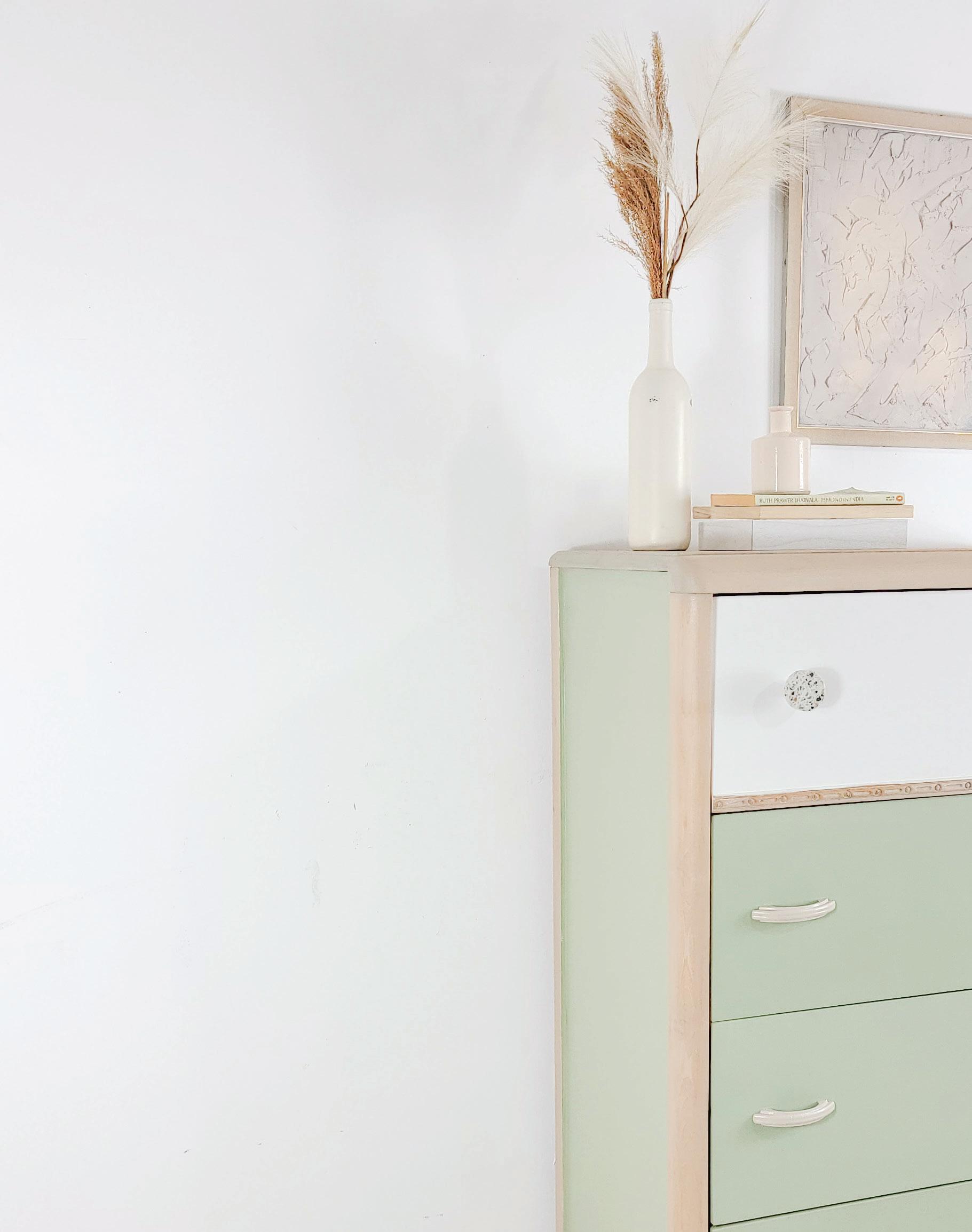
LIGHT NEUTRAL COLOR
This color wil be used for background and supporting elements such as walls or within wallpaper or other wall decor.
DARK NEUTRAL COLOR
Pick a dark neutral color that aligns with the rest of your color scheme. Textiles and fabric are great ways to bring Dark Neutrals in without making your space too dark.
DID YOU KNOW?
Despite the many differences of cultures and people around the world, there is at least one thing a lot of us have in common: the color blue! Studies reveal that a whopping 40% of people consider blue to be their favorite color.
ACCENT COLOR
BOLD DOMINANT COLOR
This color will be used for grabbing attention & highlighting small accents in your space such a small furniture pieces or decor.
COMPLEMENTARY COLOR
This color contrasts and compliments the bold color. It can be useful to use the color wheel for picking a complimentary color. This color should also be used sparingly through Wall Art or Decor pieces.
Accent colors are supplementary colors that typically contrast the complementary color used in a room. Accent colors are used for emphasis & to enhance a color scheme. Great for accent walls or on larger furniture pieces
SPRING COLOR GUIDE WWW.COUNTRYCHICPAINT.COM 7 #COUNTRYCHICPAINTMAGAZINE
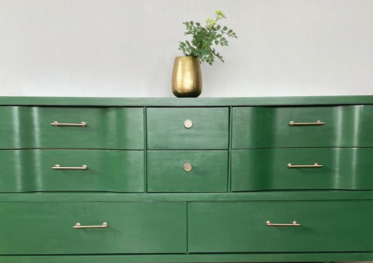
STARSTRUCK
PEACHY KEEN
VANILLA FROSTING JITTERBUG
OOH LA LA
COUNTRY CHIC PAINT WWW.COUNTRYCHICPAINT.COM 8
“Don’t be afraid to do some research, ask questions & make mistakes. ”
Creator Highlight: Meet Kate!
Meet Kate, the founder of Kate’s Reclaimed , a furniture restoration and painting business that creates stunning pieces for homes. In this interview, Kate shares her inspiration, must-have tools, favorite projects, and tips for someone starting their own business in furniture restoration. Be sure to check out her work for non-stop inspiration.
Q: What inspired you to reinvent furniture?
A: My interest in furniture restoration was sparked by my father & grandfather, who were both handy with household projects. I wanted to find a way to add beautiful furniture to my home without the big-box store cost and in an environmentally friendly way. I began restoring and painting furniture for myself in 2008 and officially started my furniture business in 2021.
Q: What is your favorite part about this job?
A: I love the furniture community and connections I’ve made through social media. I enjoy being creative and making something that will be a conversation piece in someone’s home. I also love the entire process of restoring and painting furniture, from getting the piece to staging it and seeing the transformation.
Q: What are some of your must-have tools?
A: The importance of prep work before painting a piece and investing in quality tools to ensure the best results are a must! My must-have tools include a Surf Prep sander for efficient sanding and a Country Chic Painting Sponge and 1.5”& 2” Oval brushes for applying paint evenly.
Q: What is your favorite project of all time?
A: I have done many projects that I love, but my all-time favorites are taking a vanity and turning it into nightstands and restoring an antique secretary hutch that was given to me by a friend. The hutch turned out beautifully, and a couple drove over six hours to pick it up.
Q: Where do you find inspiration?
A: I find inspiration from other restorers on Instagram; my main source of connection and inspiration over the years. Usually when I pick up a new to me piece of furniture, I have a vision right away. I think since I’ve been doing this for awhile now I know my style, and I paint or restore furniture like I would if we were keeping the piece for our home.
Q: What are your favorite colors to work with?
A: I love all of the Country Chic Paint colors and furniture glazes, but my favorite colors are neutrals, including Liquorice, Hurricane, Hollow Hill, Sage Advice, Dark Roast, Rocky Mountain, Driftwood, Sunday Tea, and Peacoat. I tend to paint colors that would go well in my own home; mostly black, blues, greens, and grays.
Q: What’s the best piece of advice you have for someone just starting out in their own business?
A: Trust yourself! Practice on a small piece! Learn from others but also find what works for you! Don’t be afraid to do some research, ask questions and make mistakes. There is so much that goes into a piece of furniture-literally time, love, blood, sweat and tears. Find what inspires you and have fun.
SPRING COLOR GUIDE WWW.COUNTRYCHICPAINT.COM 9 #COUNTRYCHICPAINTMAGAZINE
Vanilla Frosting
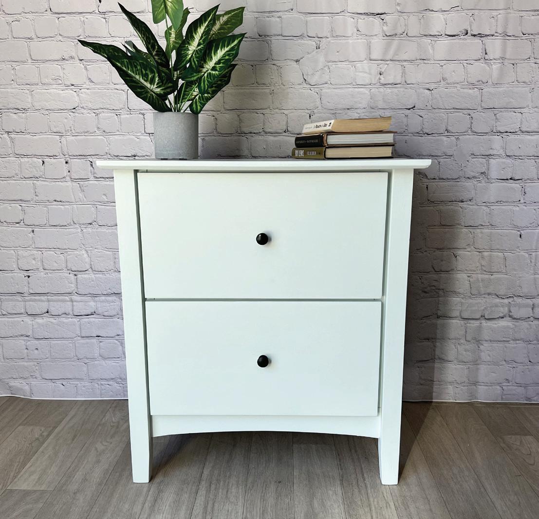
Vanilla Frosting is a light, creamy off-white, and arguably our most popular neutral. It’s warmer than Simplicity or Crinoline, but less yellow than Cheesecake This soft color pairs well with Elegance, Dune Grass and Ooh La La. It creates a cozy atmosphere and complements natural materials like wood and woven textures, as well as metallic accents like copper or bronze. Vanilla Frosting is a timeless color choice for creating a welcoming space.
COUNTRY CHIC PAINT WWW.COUNTRYCHICPAINT.COM 10
© Farm Life Best Life © Little City Farmhouse
© Restore Reimagined
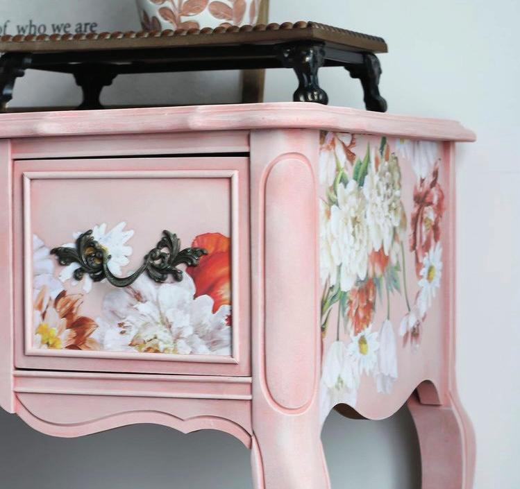
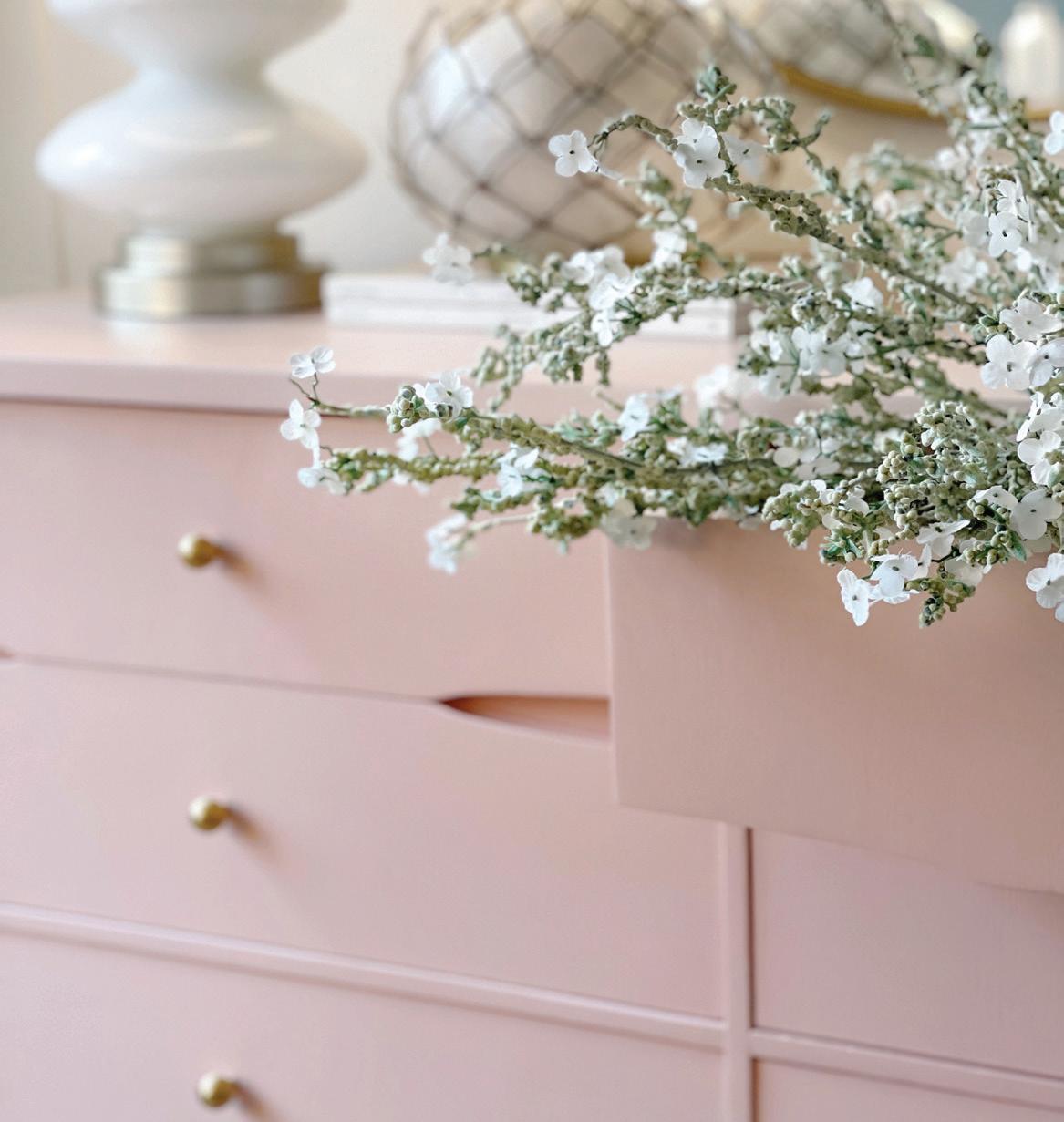
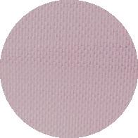
Ooh La La
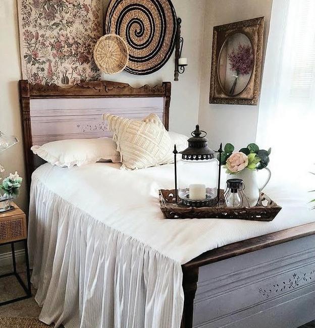
Ooh La La is a dainty blush pink color - It’s perfect for adding a subtle, feminine touch to your decor. It also complements jewel tones like Jitterbug and Starstruck for depth. It’s a perfect choice for springtime renovations and looks at home on French Provincial style furniture. This color can work well in various interior design styles, such as shabby chic, coastal, and modern farmhouse.
SPRING COLOR GUIDE WWW.COUNTRYCHICPAINT.COM 11 #COUNTRYCHICPAINTMAGAZINE
© Sitting Pretty
© BT Treasures
© Danielle Bradley
Q&A
Q: I am so overwhelmed! How do I get started?
A: We completely understand that starting your first project can be a little intimidating! Fear not! We have a lot of great resources to get you feeling less overwhelmed and more inspired to start your project. You can get inspired by visiting our Color Page and checking out the colors that interest you. Each individual color has more about it’s origin, what it pairs well with and photos of furniture makeovers using the color. If seeing beautiful furniture calms you down, we suggest in checking out our Inspiration Page. Not sure what color to choose? Take our Color Quiz for personalized suggestions based on your likes and dislikes. If you have the color in mind but want to know what it will look like on certain furniture, our Paint Visualizer will surely be helpful.
Once you are feeling more inspired and ready to go, check out our Tutorials page for tips, tricks and great techniques to get you feeling confident! Still need help? No problem! Contact us anytime through our Live Chat option or email or call us! Our email address is hello@countrychicpaint.com and our phone number is 1-888-523-2360 (Mon-Thurs 8:00 am – 4:30 pm PST, Fri 8:00 am – 2:30 pm PST)
Q: What kind of brushes should I use on my DIY Project?
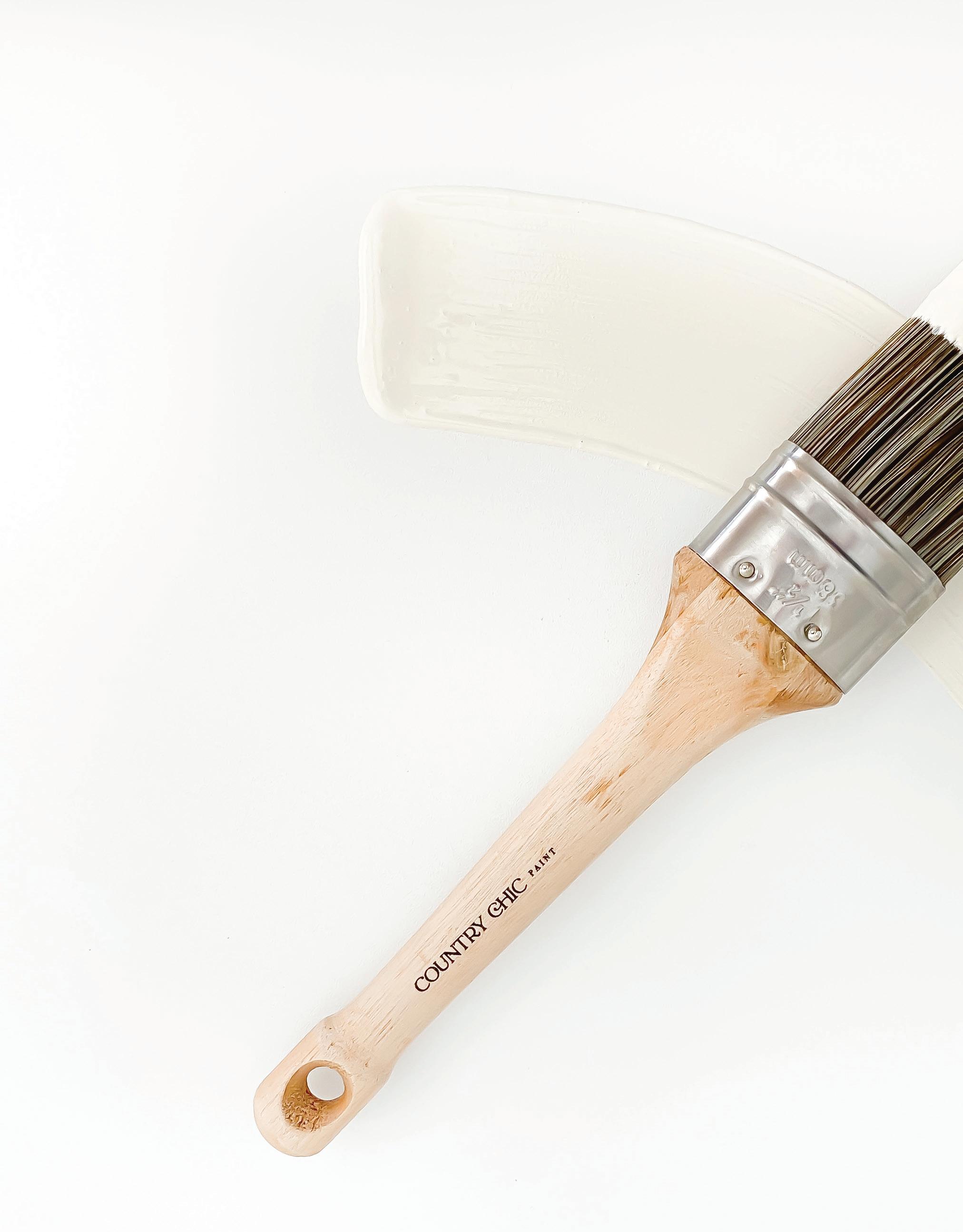
A: Country Chic Paint doesn’t contain solvents; it is water-based. Therefore, natural bristle brushes are not recommended to use because they absorb water, which causes the bristles to flare or become too soft to paint effectively.
Our line of brushes was selected specifically for use with our paint and wax - they are made from a special blend of synthetic bristles which will allow you to easily apply the paint to your piece without noticeable brush strokes. These brushes are high-quality and will last you a very long time.
Q: Do I need to wax my piece?
A: The best results are achieved when you wax your piece after you’ve painted it. It works as a protective coating so you will be able to enjoy your piece for years to come. Please don’t forget that the wax will need to be reapplied every 6-12 months. Just a little note: when you use a tinted wax on a sitting surface, make sure it is completely cured before you use it. Allow about 4 weeks before you sit on a dark waxed surface, otherwise you might end up with stained clothing. Take a look at our waxes and other top coat options.
COUNTRY CHIC PAINT WWW.COUNTRYCHICPAINT.COM 12
Want to see more of our most frequently asked questions? Visit our website!
Q: I need help picking a color!
A: We would love to help! We offer color cards to help you see what the actual paint colors look like. You just pay a small shipping & handling fee and then you can see all our colors in your own space. Every room has different lighting and tones so the charts can be a real help when it comes to choosing that perfect color or color combination.
You can also take our Color Quiz! You will end up with personalized suggestions that you’re guaranteed to love!
Q: How do I care for my painted furniture?
A: We recommend cleaning your painted furniture and home decor with a slightly dampened cloth. It is also recommended that you re-apply the wax finish every 6-12 months.
Q: How long should I wait between coats of paint on my furniture?
A: The drying time between coats of paint can vary depending on the type of paint and the temperature and humidity of your workspace. In general, it’s a good idea to wait at least 2-4 hours between coats of paint to ensure that each layer has dried completely. When you’re using a water-based paint, you may need to wait longer between coats to avoid lifting or smudging the previous layer.
Q:
I’m thinking of using a glaze on my painted furniture for a more ` aged look. How do I apply it?
A: Start by applying a base coat of paint to the furniture, and allow it to dry completely. Then, using a brush or paint sponge, apply the glaze in a thin, even layer. Work in small sections and use a dry brush or cloth to remove any excess glaze as you go. Finally, allow the glaze to dry completely before applying a topcoat of clear sealer. Follow along with our step by step Tutorial for more in-depth instructions.
Q: Can I paint kitchen cabinets with Country Chic Paint?
A: Yes, our All-In-One Decor Paint is wonderful for painting kitchen cabinets! We have a tutorial available that shows you how to paint cabinets, so make sure to read and watch this tutorial before you start.
SPRING COLOR GUIDE WWW.COUNTRYCHICPAINT.COM 13 #COUNTRYCHICPAINTMAGAZINE
Wanderess
Wanderess is a captivating, deep sea green color. It’s in a similar color family as Jitterbug, but lighter. It pairs well with complementary shades of beige like Vanilla Frosting & Ooh La La, pink. A great way to create a serene atmosphere in any room. Natural materials like wood, as well as metallic accents like brushed nickel or brass, complement Wanderess beautifully. It makes us feel like taking off our shoes and wandering through an enchanted forest.
COUNTRY CHIC PAINT WWW.COUNTRYCHICPAINT.COM 14
© Painted Home Goods
Life Best Life
© Farm Life Best Life
© Farm
© Yellow Barn Creations
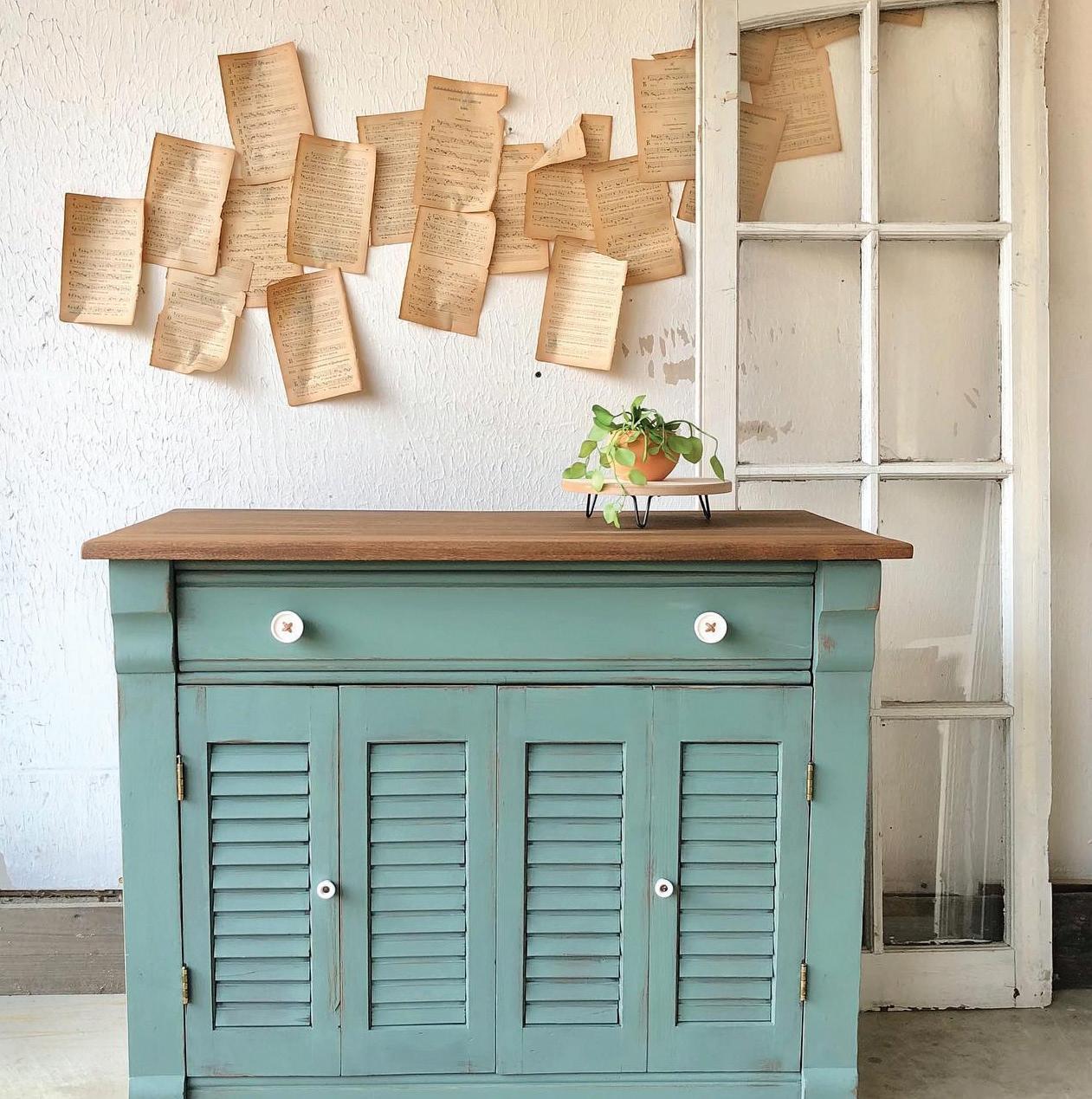
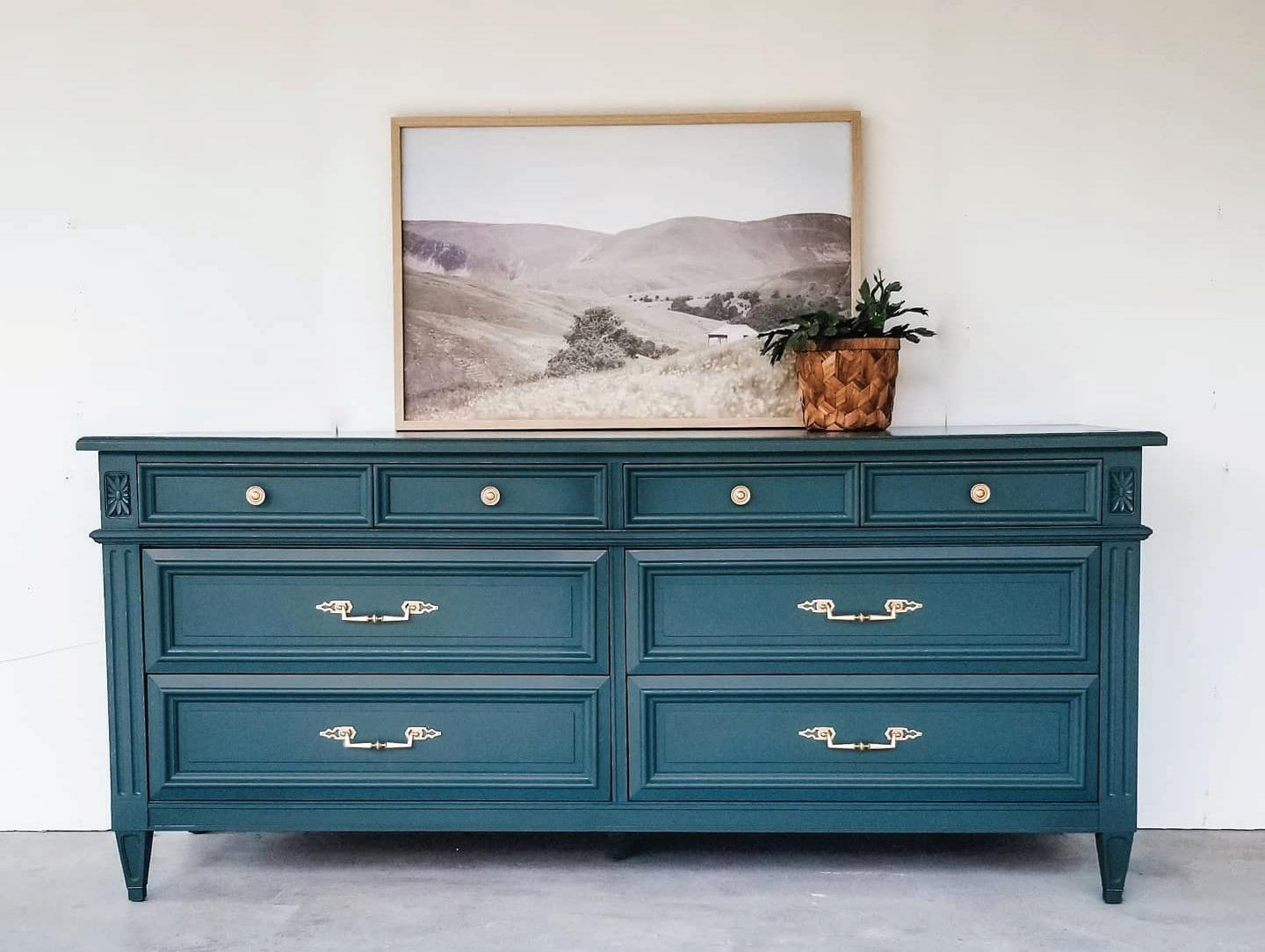
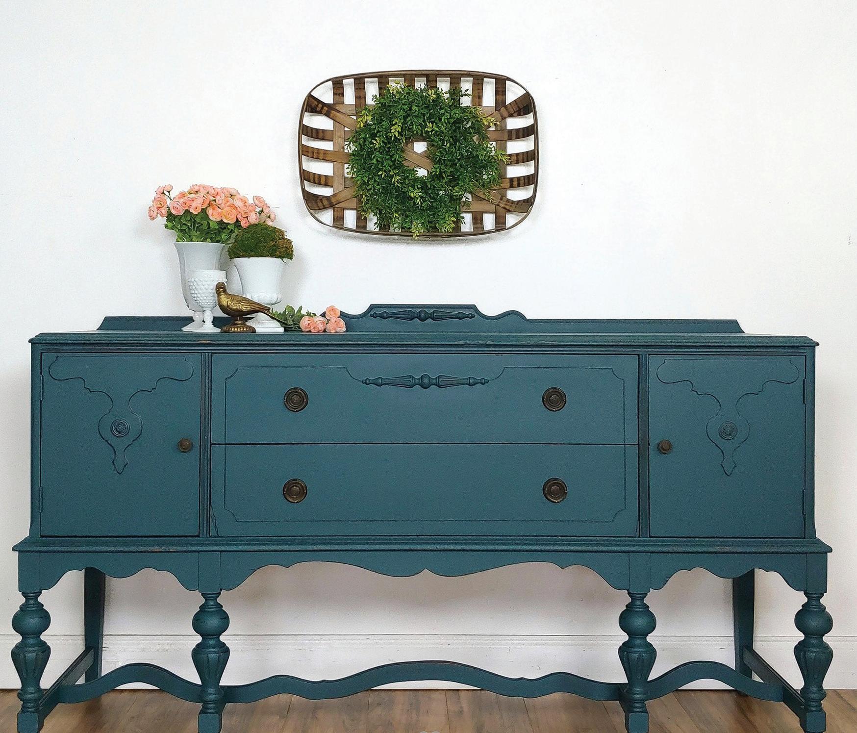
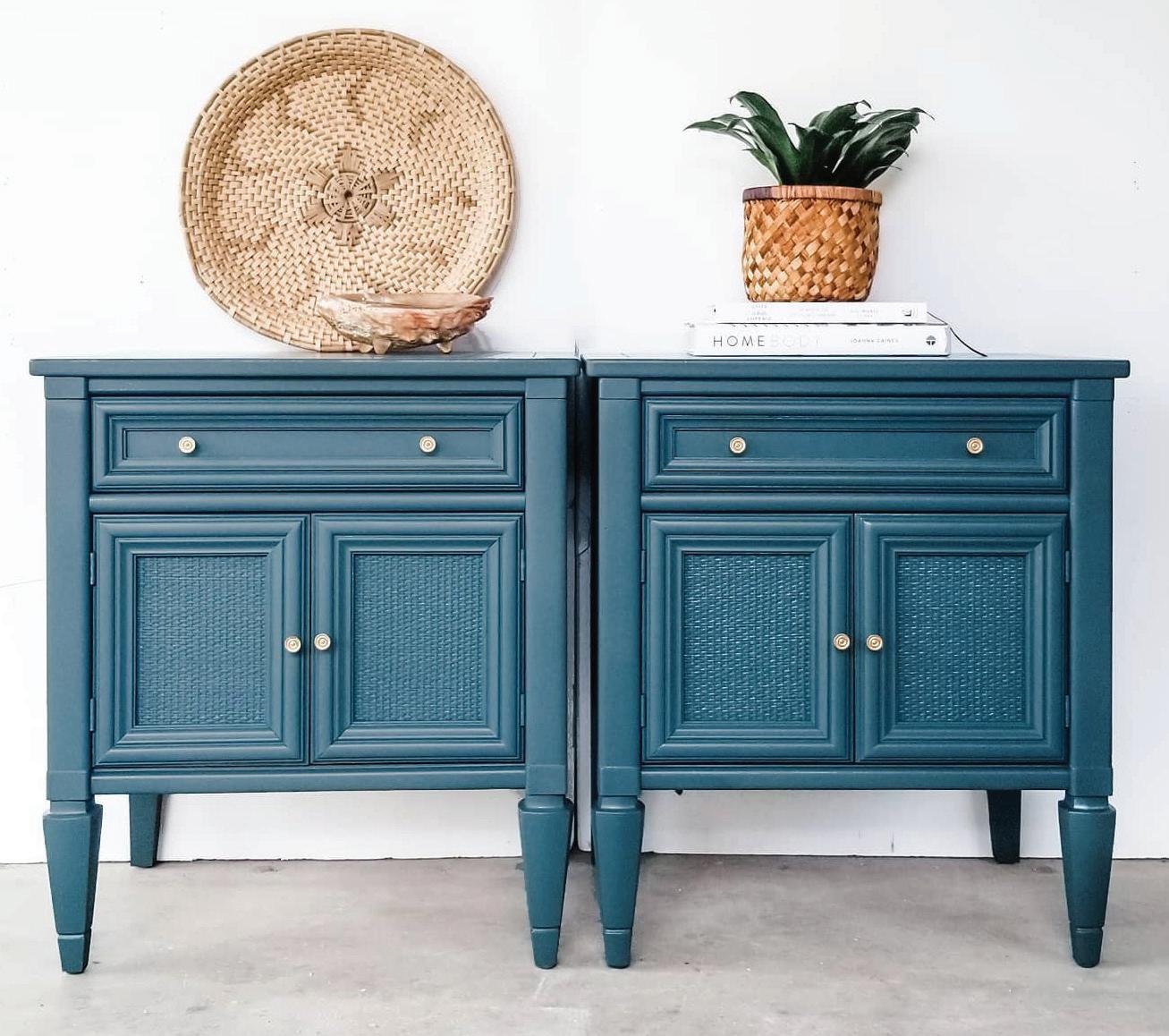
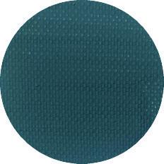
Jitterbug
Jitterbug is a widely beloved, deep muted teal color. Its unique blend of green and blue tones makes it pair well with neutral shades, such as crisp whites and warm beiges, as well as with earthy tones like Leather Bound or Dark Roast. This color also looks amazing when paired with natural wood accents, such as exposed wooden beams or rustic furniture pieces. Jitterbug adds a touch of sophistication and serenity to any space.
SPRING COLOR GUIDE WWW.COUNTRYCHICPAINT.COM 15 #COUNTRYCHICPAINTMAGAZINE
© Sage and Hearth Homes
© Happily Restored © New Beginnings Decor
© Sage and Hearth Homes
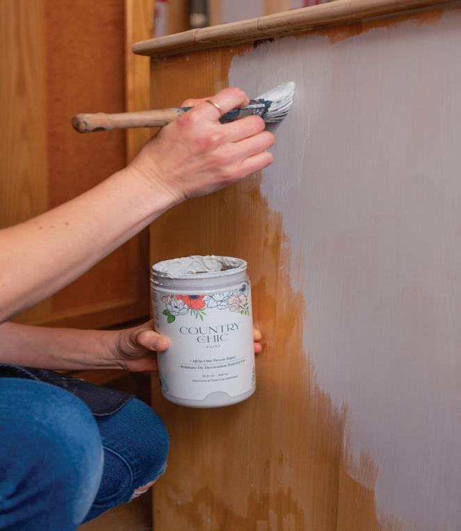
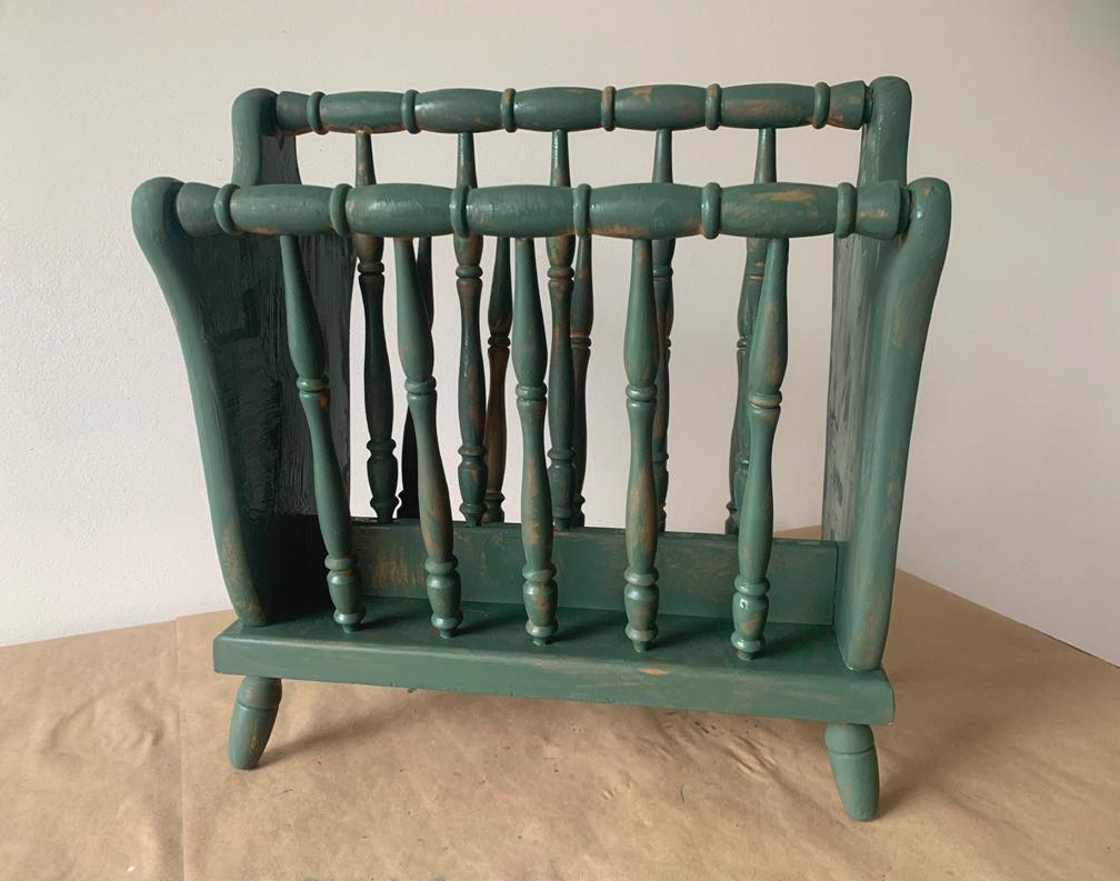
STOP! It’s Tutorial Time!
Do you want to give a piece of furniture a new lease on life? Painting furniture is an affordable and easy way to transform your home decor. With a little bit of effort and the right tools, you can turn your drab furniture into something beautiful and unique.
In this tutorial, we will show you how to paint your furniture with a paint glaze to achieve a beautiful antiqued look. Our Furniture Glaze is a translucent medium that can be mixed with paint that is applied over a base coat of paint to create depth and texture. It is an easy and effective way to add dimension and character to your furniture.
Tips for success:
•Experiment glaze colors to achieve different effects
•Use a lint-free cloth to remove excess glaze
•Apply the glaze in thin layers for a more subtle effect
•Let the glaze dry before applying Clear Coat
Below is a list of supplies we used for this Tutorial:
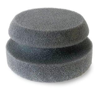
PAINTING SPONGE
A Painting Sponge can be the best for a light layer but you can use any synthetic brush.
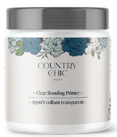
BONDING PRIMER
Very easy to apply! This Clear Bonding Primer allows the paint to adhere to any smooth surface.
COUNTRY CHIC PAINT WWW.COUNTRYCHICPAINT.COM 16
Painting furniture with glaze is an easy and affordable way to transform your home decor. With a little bit of patience and some creativity, you can create a beautiful and unique piece of furniture that will stand out in any room. So why not give it a try? Prefer a video tutorial? Click here to follow along!
The first step is to clean the surface thoroughly with soap and water, and then allow it to dry completely. Next, you may want to sand the surface lightly with fine-grit sandpaper to create a rough texture that will help the paint adhere better. Finally, wipe the surface down with a cloth to remove any dust or debris.
LINT-FREE CLOTH SOAPY WATER
Before you start use a mixture of lukewarm water and mild soap, gently rub your DIY project in a circular motion.
HOT TIP: When painting with our paint, it’s important to keep in mind that less is more. Instead of loading up your brush with a lot of paint, use a light hand and apply thin coats.
SPRING COLOR GUIDE WWW.COUNTRYCHICPAINT.COM 17 #COUNTRYCHICPAINTMAGAZINE
BEFORE
1
A lint free cloth that does not leave fine and short fibres on a surface after wiping.
Step 2: After your piece has been cleaned, apply your first layer of your chosen base coat color. This should be thin and even, using a brush or painting sponge. It is applied to give the surface an initial layer of color and texture, allowing subsequent layers to adhere more easily.
Step 2 continued: It may appear streaky or uneven at first, but don’t worry – subsequent layers will smooth out any imperfections. Once dry, you can move on to adding additional layers or begin the glazing process to achieve your desired look.
Step 3: The second layer of paint is when the furniture starts to come alive! This is where you will start to see the true color of your paint come through. The second layer helps to even out any areas that may have been missed on the first layer, and it also adds depth and richness to the overall finish.
Step 3 continued: You’ll want to apply the second coat of paint in the same way as the first, using smooth and even strokes. Apply as many coats until you are happy with the opacity. Once you’re finished, let the second layer dry completely before moving on to the next step.


COUNTRY CHIC PAINT WWW.COUNTRYCHICPAINT.COM 18
2 3
FIRST PAINT LAYER
SECOND PAINT LAYER
FIRST GLAZE LAYER
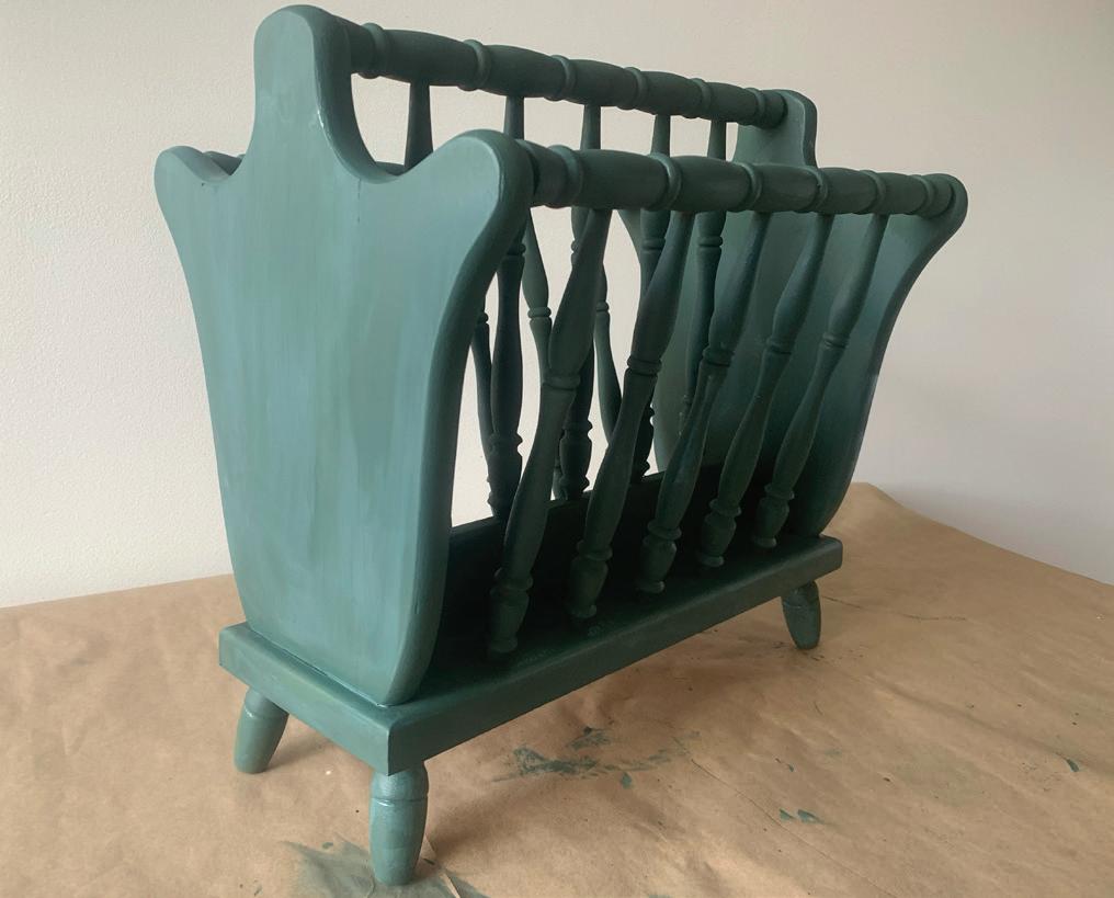
Step 4: Once your base coat is completeley dry, it’s time for your first layer of glaze! We suggest 4 parts Glaze to 1 part Paint. This layer is a thin and transparent coat that adds depth and dimension to the piece.
Step 4 continued: It allows the underlying paint color to show through while adding a subtle tint to the overall finish. This layer of glaze helps create the base for the final glaze layer, which will provide more depth and contrast. Applying the glaze in one direction in a thin and even layer is important to ensure a consistent looking finish.
SECOND GLAZE LAYER
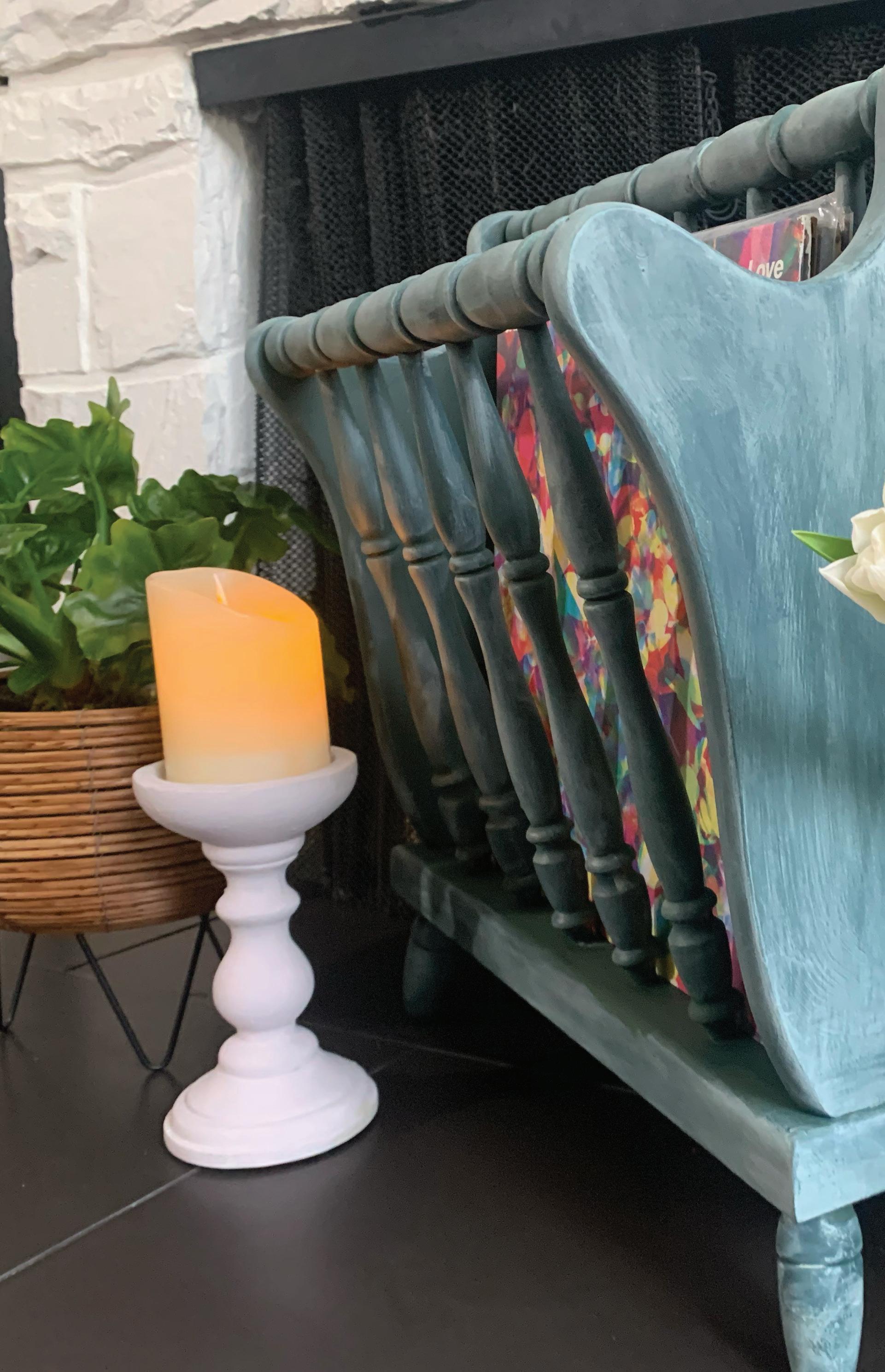
Step 5: Sometimes one layer of glaze is all you need to add depth, in this case we created a second glaze to really add dimension to the furniture piece. The glaze will settle into the grooves and details of the furniture, creating a beautiful antiqued effect.
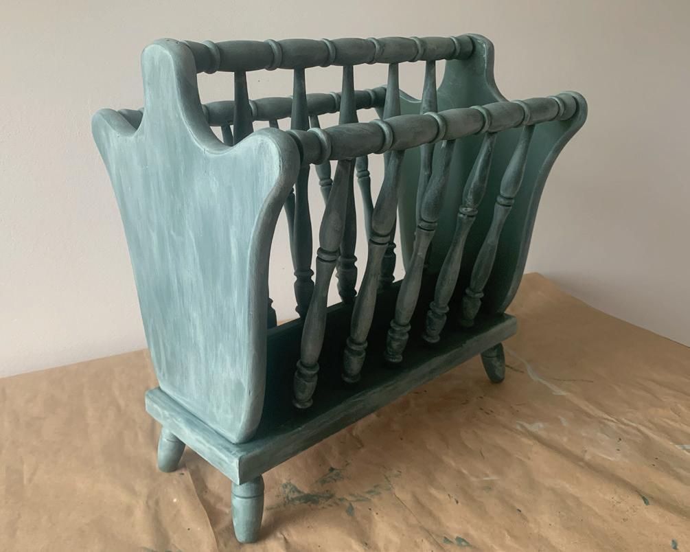
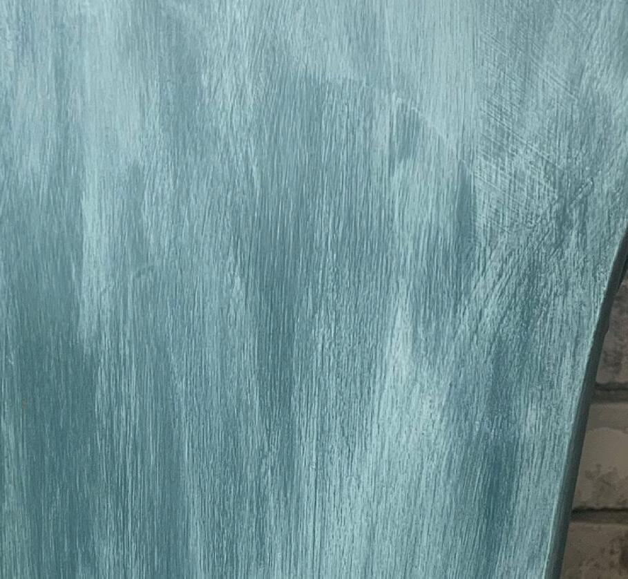

Step 5 continued: You can apply the glaze in a variety of ways, including using a brush or rag. Just make sure to work in small sections and blend the glaze evenly to achieve the desired look. Don’t worry if it looks a bit messy at first, as the glaze will dry into a beautiful finish that will make your furniture piece stand out.
SPRING COLOR GUIDE WWW.COUNTRYCHICPAINT.COM 19 #COUNTRYCHICPAINTMAGAZINE
4
5
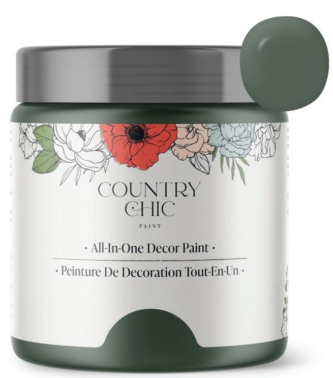
FIRST COAT, HOLLOW HILL
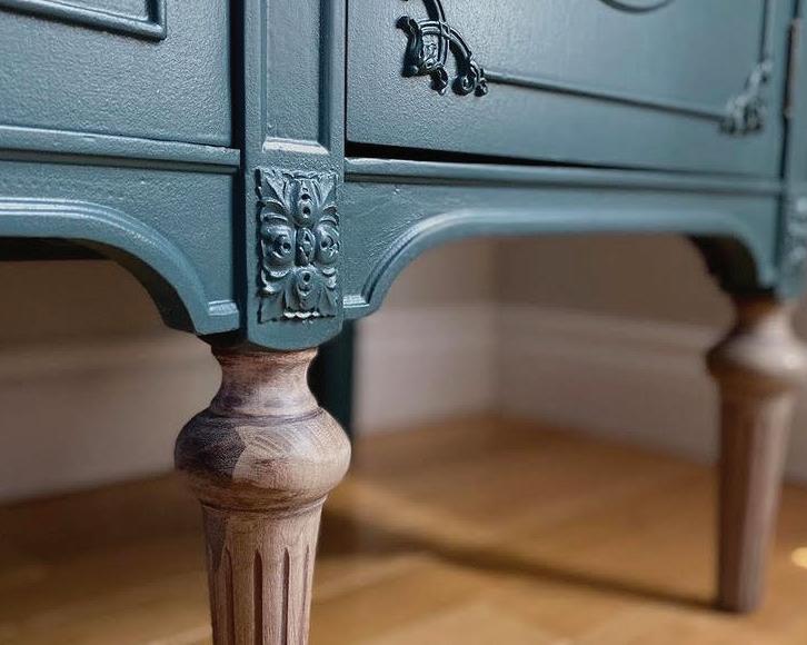
Hollow Hill is our darkest green with a slightly cool undertone, much like the leaves of a forest floor.
FURNITURE GLAZE
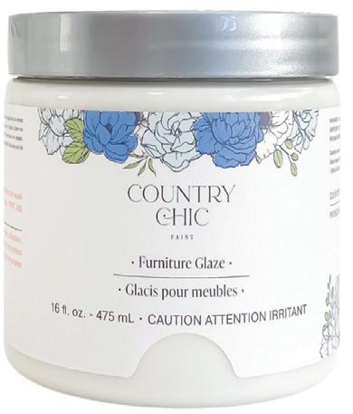
Adds beautiful depth and aging to your furniture
Five pre-tinted glazes: Graphite, Limestone, Slate, Smoky Quartz and Tiger’s Eye. Or tint your own with Clear Glaze!
COUNTRY CHIC PAINT WWW.COUNTRYCHICPAINT.COM 20
AFTER
FIRST GLAZE, JITTERBUG
Jitterbug is a widely beloved, deep muted teal color. It adds sophistication and serenity to any space.
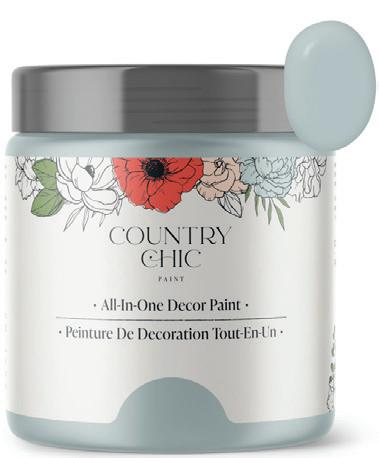
SECOND GLAZE, DUNE GRASS
Dune Grass pairs well with other soft, muted colors such as pale pinks, sandy beiges, and warm whites, creating a soothing and inviting atmosphere.
SPRING COLOR GUIDE WWW.COUNTRYCHICPAINT.COM 21 #COUNTRYCHICPAINTMAGAZINE
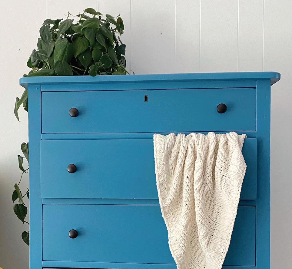
Whoop-De-Do
Whoop-De-Do is a vibrant peacock teal color. It’s similar to Tropical Cocktail, but much deeper. With its bold and playful personality, it can add a touch of whimsy and fun to any interior design style. This color is perfect for adding a pop of color to a neutral color scheme or for pairing with other bright, bold hues such as Poppy or Raspberry Sorbet. Whether used as an accent or as the main color, Whoop-De-Do is a great choice for those looking to add a bit of excitement and personality to their space.
COUNTRY CHIC PAINT WWW.COUNTRYCHICPAINT.COM 22
© Fig & Poppy Co.
© Forever Pink
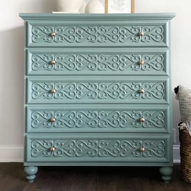
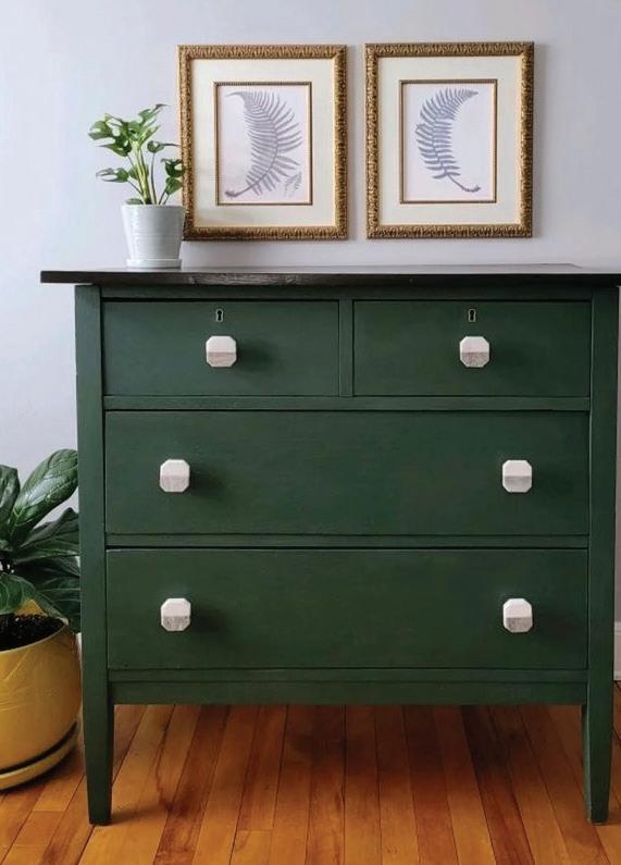
Hollow Hill
Hollow Hill is our darkest green with a slightly cool undertone, much like the leaves of a forest floor. It pairs well with natural materials like wood, rattan, and jute, making it an excellent choice for rustic and bohemian interior design styles. Complement it with accents of warm earthy tones, such as Fresh Mustard, Sunday Tea or Sage Advice, for a cozy and inviting atmosphere.
SPRING COLOR GUIDE WWW.COUNTRYCHICPAINT.COM 23 #COUNTRYCHICPAINTMAGAZINE
© Demilune Home
© Pumpkin Seed Designs
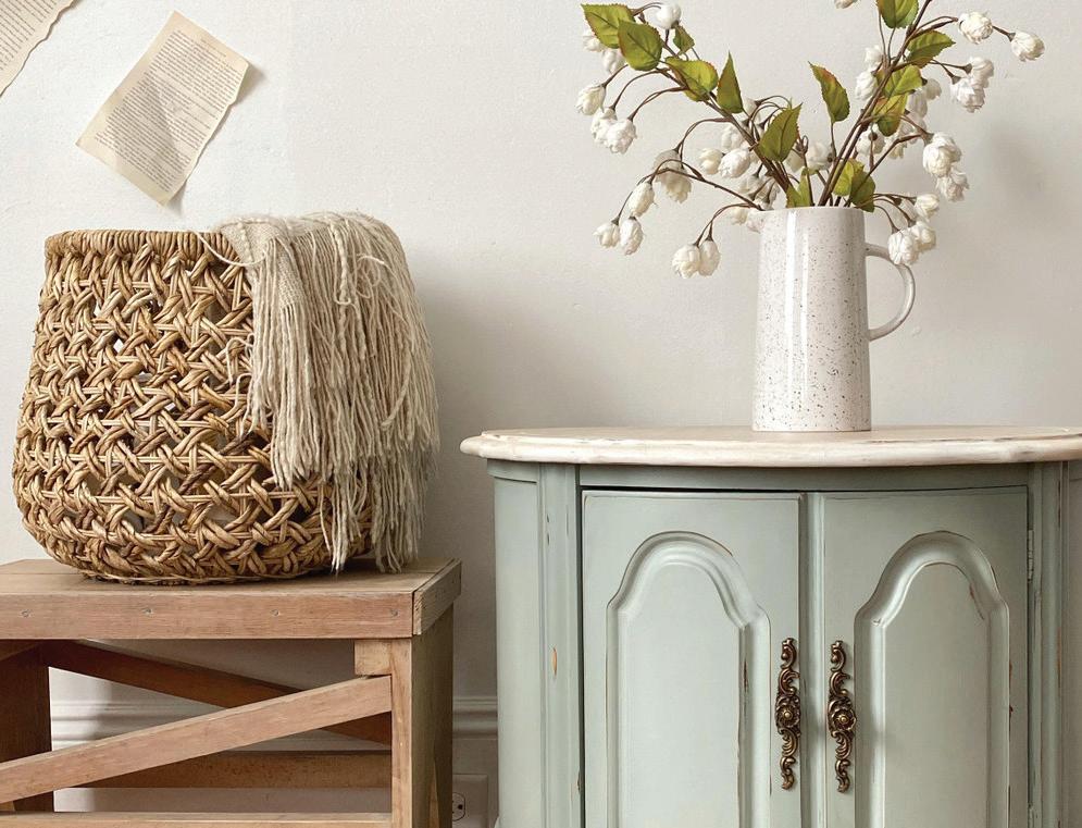
Dune Grass
Like a gentle breeze blowing through the dunes, this soft muted green will transport you to a state of relaxation. Whether you’re surrounded by sand or not, Dune Grass will give you all the coastal vibes you need. It’s the perfect complement to a beachy decor or to bring a touch of nature into your space. Pairs well with Fireworks, Peacoat and Cobblestone. So sit back, relax, and let Dune Grass take you on a soothing journey.
COUNTRY CHIC PAINT WWW.COUNTRYCHICPAINT.COM 24
© New
© Timeless Creations
Beginnings
© Amini Design Ashburn
Tide Pool
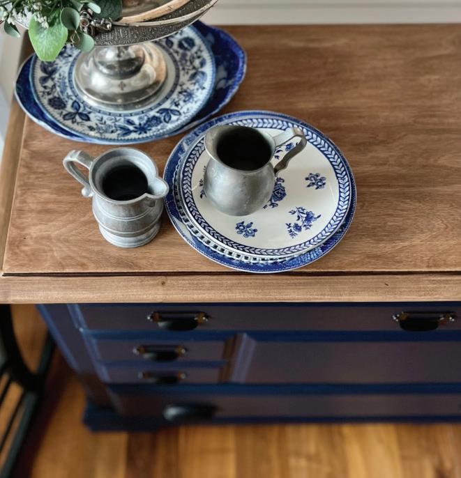
Tide Pool is a mesmerizing, tealish, ocean blue. Its characteristics include a refreshing and invigorating energy, making it perfect for adding a pop of color to any space. It pairs well with Simplicity, Road Trip and Fancy Frock. Whether used as an accent or as the main color in a room, Tide Pool is a versatile and dynamic color that is sure to bring a fresh and lively feel to your interior design.
SPRING COLOR GUIDE WWW.COUNTRYCHICPAINT.COM 25 #COUNTRYCHICPAINTMAGAZINE
© Fig and Poppy
Vintage
© Happily Restored
©
Lilly Moon
Mix-it-Up with NEW Color Recipes!
Looking for a way to add a unique touch to your space this spring? Why not experiment with mixing and matching some of our Country Chic Paint colors? Don’t be afraid to get creative and try out new color combinations – the possibilities are endless! And if you’re looking for more inspiration, be sure to check out our website where we have a page dedicated to mixing our paint colors to create new shades!
COUNTRY CHIC PAINT
ENCHANTED FOREST
Looking for a paint color that will bring whimsy into your home? Look no further than Enchanted Forest! This rich, deep green color created with Tide Pool, Hollow Hill and Starstruck will transport you to a world of wonder. So go ahead, embrace your inner fairy tale character and add a touch of magic to your home with Enchanted Forest paint! It pairs well with Happy Hour and Darling.


SPRING COLOR GUIDE #COUNTRYCHICPAINTMAGAZINE
1 PART TIDE POOL
2 PARTS HOLLOW HILL
= + +
1 PART STARSTRUCK
2 PARTS 1 PART YELLOW WELLIES TIDE POOL
+
1 PART 2 PARTS
Take your decor to the depths of the ocean with our new mixed paint color Deep Ocean, a stunning blend of Starstruck and Tide Pool. The result is a rich, dark blue that captures the mystery and beauty of the deep sea. Add this color to any room for a touch of sophistication and tranquility. Pair it with a complemtary color like Fresh Mustard and Nightfall
Keen for a paint color that’s as sweet as it sounds? Look no further than Sweet Potato! This vibrant hue is the perfect blend of Peachy Keen and Yellow Wellies, creating a bold and sunny shade that’s sure to brighten up any room. With its warm, orange undertones and playful vibe, Sweet Potato pairs perfectly with Jitterbug, Leather Bound and Opulence.
COUNTRY CHIC PAINT WWW.COUNTRYCHICPAINT.COM 28
+
PEACHY KEEN STARSTRUCK
DEEP OCEAN SWEET POTATO = =
1 PART
1 PART 1 PART PEACHY KEEN WISTERIA PEACHY KEEN
2 PARTS 2 PARTS STARSTRUCK WISTERIA
DAYDREAM LAVENDER FIELDS
Daydream; a mix of Wisteria and Peachy Keen, the color that will transport you to a world of endless possibilities! With its soft, dreamy hue, Daydream will transform any room into a calming oasis where you can unwind and let your imagination run wild. Daydream pairs beautifully with Simplicity, Fancy Frock and Soiree
Lavender Fields, a soft and dreamy shade, created from a blend of Starstruck, Peachy Keen and Wisteria, offering a relaxing and calming vibe to any space. Its delicate and elegant hue pairs well with neutral tones such as Crinoline, Cheesecake, and can also be complemented by deeper shades of grey like Rocky Mountain.

SPRING COLOR GUIDE WWW.COUNTRYCHICPAINT.COM 29 #COUNTRYCHICPAINTMAGAZINE
+
=
=
+
Our Partners, Our Premium Retailers
Here at Country Chic Paint, we are passionate about supplying our customers and retailers with the highest quality products for their creative endeavors. Quality is not the only thing that matters though; the whole experience - from giving the customer advice and training to making sure that they were happy with the end result - these are things very close to our
heart. The relationship with our retailers is of the utmost importance to us. We strive to make sure that every retailer we partner with becomes as successful as they can be. We want to work with business owners who are passionate about making their business a success by offering an exceptional customer experience. Here’s a highlight of some of our Premium Retailers & their beautiful locations.
WANT TO SEE IF THERE IS A STORE NEAR YOU? FIND OUT!
The Little Blue House
Miss Tracy is a creative enthusiast and owner of Miss Tracy Creates and the Little Blue House A thriving business that offers unique online workshops, kits, and subscription groups. She believes that creativity is the ultimate therapy for the mind, body, and soul and is passionate about teaching others to embrace their inner maker. Her goal is to inspire and motivate others to create and have fun while doing it.
3932 Sandshell Dr, Fort Worth, TX
COUNTRY CHIC PAINT WWW.COUNTRYCHICPAINT.COM 30
The Variety Shop
The Variety Shop is an absolute delight for anyone who loves to indulge in shopping for unique & high-quality items. The shop specializes in custom-made furniture from reclaimed wood, which not only looks amazing but is also an environmentally responsible choice. From chic and contemporary to vintage and rustic, the furniture collection at The Variety Shop is diverse enough to cater to all tastes and preferences.
35129 Atlantic Avenue, Millville, DE
Beyond the Sandbox
Beyond the Sandbox is a very small family owned and operated business. The store sells paint , supplies and offers custom paint jobs! They have been a Premium Retailer of Country Chic Paint since 2014. The effort at Beyond the Sandbox is to try to help their customers achieve their dream designs by expert advice on color choice, style and general DIY tips.
50 W Mohler Church Rd, Ephrata, PA
INTERESTED IN BEING A RETAILER?
By partnering with Country Chic Paint, you’re in business for yourself, not by yourself. We look forward to chatting and building a great relationship with you! Click to visit our website for more information!
SPRING COLOR GUIDE WWW.COUNTRYCHICPAINT.COM 31 #COUNTRYCHICPAINTMAGAZINE
Wisteria
Wisteria is a delicate and airy pale purple color, reminiscent of the beautiful blooming vine it is named after. This soft shade of purple is perfect for creating a soothing and serene atmosphere in any room. It can be used as a subtle accent color or as the main color in a space, pairing well with Simplicity, Vanilla Frosting and Pebble Beach. The calm and serene nature of Wisteria makes it a great choice for bedrooms or bathrooms, adding a touch of tranquility to any interior design style.
COUNTRY CHIC PAINT WWW.COUNTRYCHICPAINT.COM 32
© Driftwood Home Furniture
© LRenzy Land
© Ugly Ducking Upcycle
String of Pearls
String of Pearls is a tranquil pale green paint color with subtle gray undertones that works well with natural colors like Crinoline and Soiree. It also pairs nicely with jewel tones like Opulence and Starstruck. This versatile hue complements a variety of interior design styles, from traditional to modern, and creates a serene and refreshing atmosphere in any room.
SPRING COLOR GUIDE WWW.COUNTRYCHICPAINT.COM 33 #COUNTRYCHICPAINTMAGAZINE
© Samantha Butler
© Deza Rose Designs
© Deza Rose Designs
Spring Palette Inspiration
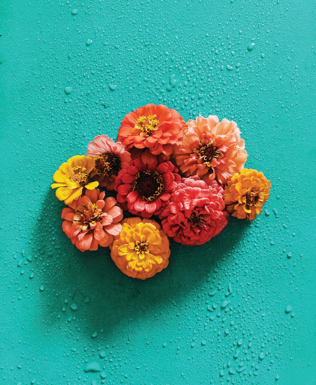
Spring is a time of new beginnings, growth, and renewal. It’s a season that brings color, life, and vibrancy back into the world after the long, cold winter. To capture the essence of spring, we’ve put together a three-page spread of stunning spring photography that showcases the season’s beauty and wonder.
Whether you’re looking to add a touch of spring to your home decor, planning your next outdoor adventure, or simply seeking inspiration for your next creative project, these images are sure to ignite your imagination and fill you with a sense of joy and renewal.
Need more visual motivation? Visit our Inspiration Page for more ideas!

DUNE GRASS
VANILLA FROSTING
STRING OF PEARLS

PEACHY KEEN

YELLOW WELLIES

SPRING COLOR GUIDE WWW.COUNTRYCHICPAINT.COM 35 #COUNTRYCHICPAINTMAGAZINE


COUNTRY CHIC PAINT WWW.COUNTRYCHICPAINT.COM 36
WHOOP-DE-DO
HOLLOW HILL
JITTERBUG
WISTERIA


SPRING COLOR GUIDE WWW.COUNTRYCHICPAINT.COM 37 #COUNTRYCHICPAINTMAGAZINE
OOH LA LA STARSTRUCK WANDERESS TIDE POOL
COUNTRY CHIC PAINT WWW.COUNTRYCHICPAINT.COM 38
© Lubbly Jubbly
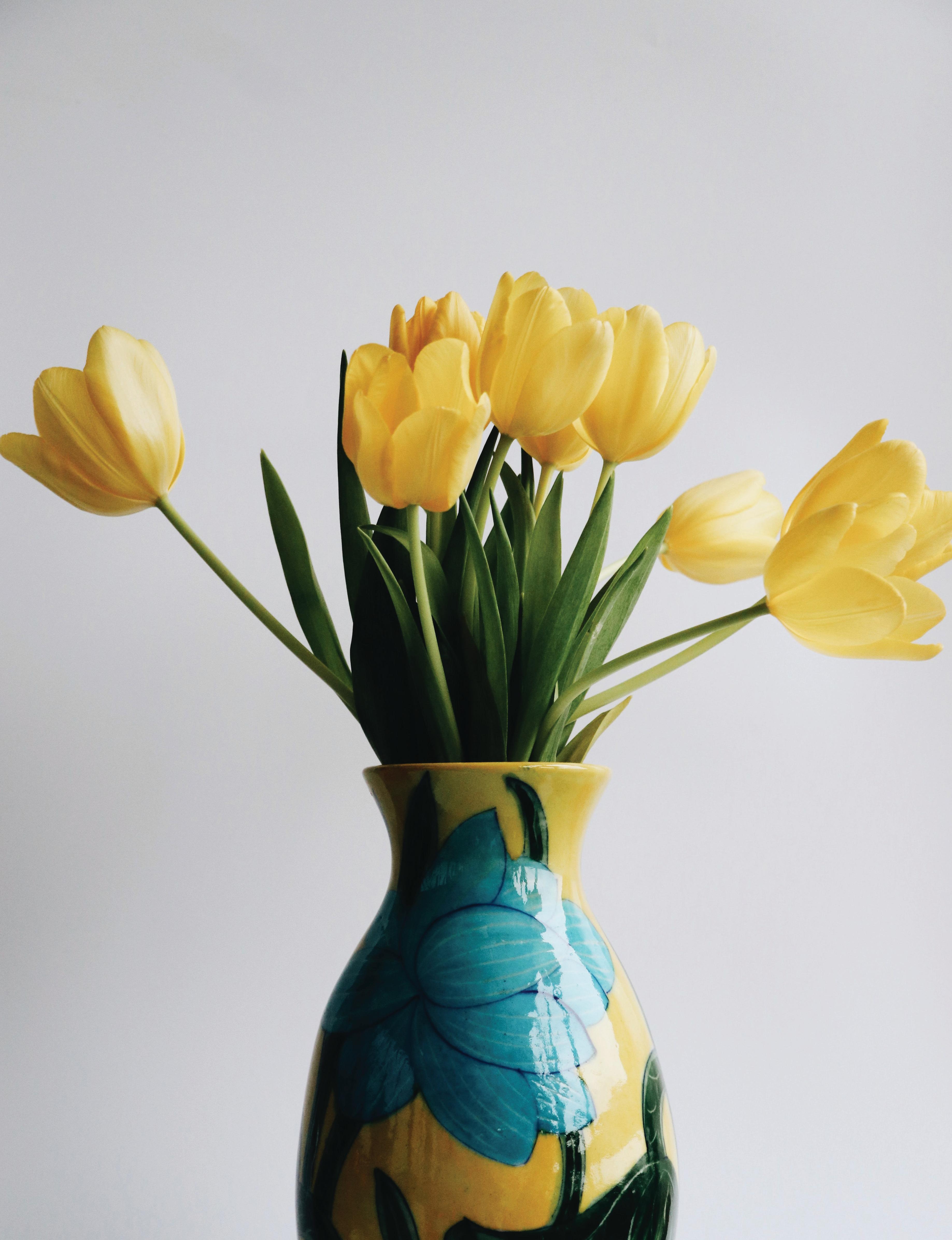
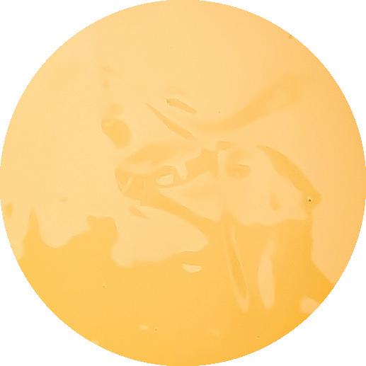
Yellow Wellies
Yellow Wellies paint color captures the vibrant, cheerful energy of springtime. It pairs well with Crinoline, Persimmon & Bling Bling
It’s warm, inviting tone complements natural materials, such as wood and rattan, for a rustic or farmhouse look, while its boldness can also make a statement in a contemporary or modern interior.
SPRING COLOR GUIDE WWW.COUNTRYCHICPAINT.COM 39 #COUNTRYCHICPAINTMAGAZINE
© Pocket Full of Posies
© Kate’s Reclaimed
© Amini Design Ashburn
Thank You!
Ready to add some color into your space? That’s a wrap on our spring color guide. We hope you found some inspiration for your next project. Before you go, don’t forget to check out our website for even more paint colors, tutorials, and inspiration. And if you create something amazing with our paint, share it with us on social media using
#CountryChicPaintMagazine
Contact us anytime through Live Chat, Email or by giving us a call! Our email address is hello@countrychicpaint.com and our phone number is 1-888-523-2360


Happy DIYing!
Want to be the first to receive our Summer 2023 Color Guide? Sign up to receive our newsletters so you don’t miss a thing!

FOLLOW US ON SOCIAL MEDIA: © Rebecca Willis


