Installed 30 feet above 42nd Street, 43rd Street, and Sixth Avenue between 12:00 am and 4:00 am.
“Install it with the precision needed for a future New York City landmark and make sure you have it up in five hours max.”
I_]di :[YWb d[m -%Seamlessly welded, hand-ground, and polished to a museum-quality finish.
“Make it visible from two blocks away and flawless from two inches away.”
You imagine. We build.
i[]Z:;I?=D
I_]di ;dl_hedc[dji =hWf^_Yi :[i_]di
(&'& I;=: :[i_]d 7mWhZi ! (&'& I;=: <[bbemi L_h]_d_W =[^i^Wd WdZ @[hec[ 9bekZ ! <Wh[m[bb je B[ib_[ =Wbb[ho :_bmehj^
(/ (&'& de$
“Make three sets of 36" high by 12" deep fabricated stainless steel letters with a 2¼" stroke.” Waterjet-cut Alloy 316 stainless steel letters, with continuously welded seams, built on precision-rolled 3/8" stainless framing.
Bank of America Tower, New York City Designer: C&G Partners Architects: Cook + Fox, Adamson Associates Owner: Durst Organization Contractor: Tishman Construction Corporation Project Scope: Marquee letters, building entrances, lobby and elevator signage, and 52 floors of interior signage.
DKC8;H (/" (&'& mmm$i[]Z$eh]
“Make it strong enough to withstand a hurricane but make it float over the canopy.” Average letter weight approximately 300 lbs., 6,000 lbs. total, floated on minimal 2¼" support pins.
Signs+Decal TM
Building what visionaries see. For two generations. Please contact me personally: Mohamed Khalfan,Vice President 718-486-6400 mk@signsanddecal.com signsanddecal.com/segd You imagine. We build. is a registered trademark of Signs + Decal Corporation.
Color freedom. It looks like this
Custom Signs and Architectural Graphics for Every Environment Now celebrating our 30th year in the custom sign and architectural graphics industry, GableSigns has a unique combination of experience, capabilities and services to work with you during any phase of your next project. From design, budgeting, and engineering assistance to custom fabrication and installation of any size or type of sign project imaginable, you can count on the GableSigns team every step of the way to make you and your project shine!
Tailor-made in any shade worldwide, AkzoNobel paints and coatings offer total color freedom. Our unrivalled signage services protect and add value. And our products are not only guaranteed consistent, they’re kinder to the environment too. For the full picture visit signfinishes.com or call 1-800-618-1010.
AkzoNobel Sign Finishes
AWA R D
ED
New” ProductExpo
“Best
GD
010 SE
at the 2
om n-Guru.c www.Sig out! Check
it
design, engineering & prototype assistance | cost/budget analysis | permits total project management | advanced manufacturing | installation ser vices anywhere
www.GableSigns.com
JLI PC>C H A M IF ONC IH M @ I L N B? < O C FN ? HP C L I HG ? HN
N> A ;L >? H N> A[l^_h& fi][n_^ ch <imnih G[mm[]bom_nnm cm nb_ big_ i` HBFÎm <imnih <lochm [h^ H<;Îm <imnih =_fnc]m( Nb_ [l_h[ _hnl[h]_ jf[t[ c^_hnc`c][ncih& qbc]b cm ]igjlcm_^ i` [ m_lc_m i` p_lnc][f af[mm ]b[hh_fm mn[aa_l_^ ch `lihn i` [ 1** f\( jf[n_ af[mm j[h_f nb[n cm chn_lh[ffs'cffogch[n_^ qcnb F?>m& cm nb_ `i][f jichn `il nbcm 1//&*** mk( `n( ]igjf_r( Nbcm jlid_]n [fmi ch]fo^_m _rn_lcil \ocf^cha c^_hnc`c][ncih [h^ ;>; ]igjfc[hn mcahm( >_mcah_^ \s ?hnli =iggohc][ncihm( ,/ >ls^i]e ;p_ho_ <imnih& G[mm[]bom_nnm *,,+*
jbih_ 0+1(/.,(30,* `[r 0+1(3/+(*111
+*0++ M[n_ffcn_ <iof_p[l^ Ilf[h^i& @filc^[ -,2-1
jbih_ .*1(2/0(300+ `[r .*1(2/0(30+1
,1 Q_mn ,.nb Mnl__n& Mocn_ 2*. H_q Sile& H_q Sile +**+*
jbih_ ,+,(,//(-,,0 `[r ,+,(,//(-,//
qqq(^]f\imnih(]ig
showing the world whatâ&#x20AC;&#x2122;s possible... Schomburg Center for Research in Black Culture
Schomburg Center for Research in Black Culture
Henry Millerâ&#x20AC;&#x2122;s Theater
Hotel New Yorker
Scenic Hudson
Big Apple Visual Group is committed to providing the best architectural signage, project implementation and management in the industry. Our value engineering methodology can bridge the gap between design intent and successful project implementation. This results in endless graphic possibilities while ensuring consistency and the highest level of quality. Call Big Apple Visual Group today to learn what we can do for you, 877.244.2775, or visit bigapplegroup.com.
247 West 35th Street, New York, NY 1000
212.629.3650
bigapplegroup.com
New York
Dubai
no. 29
Contents
30
40
36
48
46
52
56
Features 11
Leading the Way Leslie Gallery Dilworth helped broaden the scope and influence of environmental graphic design. 16 Firm Foundation The work of 2010 SEGD Fellows Virginia Gehshan and Jerome Cloud is based on human factors research and a rigorous design process. 25 Public Engagement It’s a read/write world: The 2010 SEGD Design Awards were dominated by projects that invite interaction. 26 Honor Award: Badge of Honor Gensler creates a dramatic memorial to LAPD’s fallen officers. 30 Honor Award: Finding the Future Environmental graphics promote collaboration in a massive Boeing aircraft factory. 36 Honor Award: Green Community Sustainable approaches and materials tell the stories of pioneering cities. 40 Honor Award: Legible London A new wayfinding system strives to make London a walkable city. 42 Honor Award: The Color of Hope Art and design projects nurture hope and healing in a Rwandan village.
46
Honor Award: Word Play Bright color and playful text enliven a performing arts center. 48 Honor Award: NYC, Virtually The Official NYC Information Center is a digital-era waystation. 50 Honor Award: Green Cabinet of Curiosities The scientific specimen box gets a modern-day, sustainable reinterpretation. 52 Honor Award: The Wayfinding Handbook David Gibson writes a seminal guide to urban wayfinding. 56 Merit Awards 80 Lot with a Little Awards 84 Jury Awards
Columns 8 11 87 87 88
From the Editor by Leslie Gallery Dilworth Up Close: Leslie Gallery Dilworth Design Marketplace Ad Index Get Lost
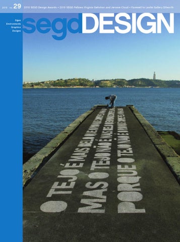
On the cover: Bikeway Belém is a 7,362-meter bike route along the Tagus River in Lisbon. P-06 Atelier’s wayfinding and graphics help energize the diverse urban spaces along the way—including a pier that bears the words of Portuguese poet Alberto Caeiro’s verse celebrating the river. Photo: João Silveira Ramos. Story, page 58
segdDESIGN 3
News Conference Publisher
About Us
SEGD Services Corp.
Editor in Chief Leslie Gallery Dilworth, FAIA leslie@segd.org
Society for Environmental Graphic Design The global community of people working at the intersection of communication design and the built environment
Executive Editor Ann Makowski ann@segd.org
Editor Pat Matson Knapp pat@segd.org
Design James Pittman, Design Director LuAnn Arena, Andy Brown, Design Associates
Executive and Editorial Offices 1000 Vermont Ave., NW Suite 400 Washington, DC 20005 Phone: 202.638.5555 Fax: 202.478.2286 www.segd.org segd@segd.org
Advertising Sales Sara Naegelin 202.489.8977 sara@segd.org
SEGD Blog Green Resource Guide About Us Conferences News Publications Member Directory
Editorial, Subscriptions, Reprints, Back Issues 202.638.5555 segd@segd.org
segdDESIGN is the international journal of environmental graphic design and the Society for Environmental Graphic Design. Opinions expressed editorially and by contributors are not necessarily those of SEGD. Advertisements appearing in segdDESIGN do not constitute or imply endorsement by SEGD or segdDESIGN. Material in this magazine is copyrighted. Photocopying for academic purposes is permissible, with appropriate credit. segdDESIGN is published four times a year by the Society for Environmental Graphic Design. Periodical postage paid at York, PA, and additional mailing offices. Subscriptions: US $200/year, Canada and Intâ&#x20AC;&#x2122;l $275/year. Send US funds to segdDESIGN, 1000 Vermont Ave., NW, Suite 400, Washington, DC 20005. To charge your order, call 202.638.5555.
www.segd.org 4 segdDESIGN
Postmaster: Send address changes to segdDESIGN, 1000 Vermont Ave., NW, Suite 400, Washington, DC 20005. Š segdDESIGN 2010 SSN: 1551-4595
Inspiring your
Creative
Options
3M Congratulates SEGD 2010 Design Award Winners We value our long-standing relationship with SEGD and look forward to continuing to provide you with innovative and inspiring solutions.
The latest innovations from 3M Decorate walls, ceilings, doors, columns and more with an easy to use and inexpensive adhesive-backed finish. Available in hundreds of patterns – 3M™ DI-NOC™ Architectural Finishes Create a beautiful etched-glass appearance on interior glass partitions or the inside surface of curtain wall glass without the associated high cost. A polyester film available in over 40 patterns – 3M™ Fasara™ Glass Finishes Use science-based visual modeling to help increase the likelihood people will notice key design elements during the first 3–5 seconds of exposure – 3M™ Visual Attention Service Try it Free – 3M.com/vas Optimized print ad
To learn more about how you can expand your creative options with 3M solutions, please call 1-800-374-6772 or visit 3MBrandSolutions.com.
©2010 3M. All rights reserved.
2010 segdDESIGN Sponsors and Patrons Our sincere thanks to segdDESIGN’s 2010 Sponsors and Patrons!
H $2,500+ Sponsors
H $500 Patrons • FMG Design • Jonathan Alger, • Pentagram C&G Partners • Ralph Appelbaum Associates • Calori & Vanden Eynden H $1,000 Sponsors • The Douglas | Group • APCO • Alan Jacobson, ex;it • Cloud Gehshan • Infinite Scale Design • CommArts Group • Gallagher & Associates • Kelly Kolar • Graham Hanson Design • Robert Goes • Hunt Design • Kate Keating Associates • Nordquist Would you like to be a • Shikatani Lacroix Brandesign Sponsor or Patron? • Two Twelve Email sara@segd.org
SEGD BOARD OF DIRECTORS Officers President: Wayne McCutcheon, Entro Communications, Toronto Vice President: Amy Lukas, Infinite Scale Design Group, Salt Lake City Treasurer: Gary Stemler, Nordquist, Minneapolis Jill Ayers, Design360, New York Jennifer Bressler, Hunt Design, Pasadena Teresa Cox, APCO Graphics, Atlanta Peter Dixon, Prophet, New York Paul Gable, Gable Signs, Baltimore Michael Gericke, Pentagram, New York Sue Gould, Lebowitz | Gould | Design, New York Mary Grems, FMG Design, Houston Edwin L. Hofmann, Limited Brands, New York Lonny Israel, Skidmore, Owings & Merrill, San Francisco Cybelle Jones, Gallagher & Associates, Bethesda James Keppel, thirty three thousand feet, Boulder Kelly Kolar, Kolar Design, Cincinnati Tali Krakowsky, Apologue, Los Angeles Phil Lenger, Show+Tell, New York John Lutz, Selbert Perkins Design, Chicago Daniel Montaño, Little, Charlotte Tucker Trotter, Dimensional Innovations, Overland Park, KS Mark VanderKlipp, Corbin Design, Traverse City, Mich. Alexandra Wood, The Holmes Wood Consultancy, London Ex Officio Steven Stamper, fd2s, Austin (Past President) David Middleton, Kent State University, Kent, OH
Society for Environmental Graphic Design The global community of people working at the intersection of communication design and the built environment.
6 segdDESIGN
D U W O 8 3 $ 0 & 2 9 Z R /
,QWURGXFLQJ 2XU 1HZ %UHDNWKURXJK
/HVV WKDQ J / RU OEV JDO 92& SULRU WR PL[LQJ $OO H[LVWLQJ FRORU IRUPXODV DUH DYDLODEOH +LJK VROLGV IRUPXOD DQG PD[LPXP SLJPHQW FRQWHQW SURYLGH EHWWHU KLGLQJ DQG D IDVWHU ÀOP EXLOG PRUH LPSDFW UHVLVWDQFH LQ GLUHFW DQG UHYHUVH LPSDFW WHVWLQJ EHWWHU JORVV UHWHQWLRQ +ROGV XS EHWWHU WR H[WUHPH FKDQJHV LQ WHPSHUDWXUH (QKDQFHG SURWHFWLRQ LQ FRUURVLYH HQYLURQPHQWV
7KH %HVW RI %RWK :RUOGV 7DNH D VWHS WRZDUG FUHDWLQJ SRVLWLYH FKDQJH 7KLV QHZ HQYLURQPHQWDOO\ IULHQGO\ SRO\XUHWKDQH SDLQW OLPLWV 92& WR OHVV WKDQ J / ZKLOH GHOLYHULQJ LPSDFWIXO GHVLJQ ZLWK VXSHULRU FRORU DQG GXUDELOLW\ 0$3 /9 LV D QHZ EUHDNWKURXJK SDLQW WKDW SURYLGHV JUHDWHU GXUDELOLW\ JORVV UHWHQWLRQ DQG KLGLQJ WKDQ VWDQGDUG DFU\OLF SRO\XUHWKDQH SDLQWV 0DNLQJ WKH VZLWFK LV HDV\ ZLWK DOO RI 0DWWKHZV H[LVWLQJ FRORUV DYDLODEOH DQG WKH VDPH JUHDW FXVWRPHU VHUYLFH \RX KDYH FRPH WR NQRZ IURP 0DWWKHZV 3DLQW ,W UHDOO\ LV WKH EHVW RI ERWK ZRUOGV
&DOO XV RU YLVLW RXU ZHEVLWH IRU PRUH LQIRUPDWLRQ
ZZZ PDWWKHZVSDLQW FRP
no. 29
From the Editor
Keep Up the Good Work
As
most of you know, after almost 13 years, I have stepped down as the executive director of SEGD, and am retiring to Galisteo, New Mexico, a little village of 260 near Santa Fe, where I have lived for seven years. Before I disappear from an active role in SEGD, I want to say thank you to each of you who together are the members and staff of this terrific organization. Thank you for the opportunity to enrich SEGD, and to learn from so many creative and imaginative people. How fortunate I have been!  The field that has come to be known as environmental graphic design is healthy, vital, and exuberant. I believe this vibrancy is a result of you, the creatives who are working at the intersection of graphics, architecture, communication, city planning, branding, narrative and interpretive design, landscape architecture, interior design, and industrial design. This diversity has always been the strength of EGD, and will continue to be. To build on this, I have established a restricted fund within the SEGD Education Foundation to encourage interdisciplinary design studios and research at the academic level. It is our intent that a grant will be awarded annually to a school or faculty member to initiate an interdisciplinary design project or studio. I have made an initial contribution of $5,500 to establish this grant, which the SEGD Board has agreed to match, and to which individual board members and staff have already contributed funds. We believe it is important to the future of this field to encourage these interdisciplinary projects in our academic institutions. I invite you to join in supporting this initiative. Tax-deductible contributions can be made to this fund, the Leslie Gallery Dilworth Fund for Interdisciplinary Studies, through SEGD. Smart, creative, imaginative, original, careful, thorough, serious, clever, conscientious, concerned, fun, and dedicated are just some of the adjectives I would use to describe the members of SEGD. I will miss you. Please continue your good work!
Leslie Gallery Dilworth, FAIA
8 segdDESIGN
Contributions to the Leslie Gallery Dilworth Fund for Interdisciplinary Studies can be sent to: SEGD 1000 Vermont Ave. NW Suite. 400 Washington, DC 20005. For information, call 202.638.5555.
In Japan, Fugu is a prized delicacy yet one taste can lead to instant death. Slicing must be exact. Cooks must be licensed to prepare it. I raised my chopsticks in a toast as I put my fate in the hands of the chef.
PRECISION ENGINEERING.
Š 2010 Nordquist Sign Company, Inc.
no. 29
Up Close
Leading the Way Retiring CEO Leslie Gallery Dilworth has always seen a clear path for SEGD and environmental graphic design.
Leslie Gallery Dilworth loves to tell the story about her introduction to environmental graphic design. It was 1986, and she and her husband Dick had just arrived at the Philadelphia International Airport, back home from a vacation in Spain, where—despite not speaking the language—they had been easily able to navigate the country’s roads and cities. But on the way home from the airport, they got lost. “Of course I’d been to the airport countless times and certainly knew my way home,” recalls Dilworth. “ But in following the signs, we wound up at a dead end in front of a city dump.” The experience led Dilworth, at the time the executive director of Philadelphia’s Foundation for Architecture, to spearhead a groundbreaking urban wayfinding program called Direction Philadelphia. The program, which included financing, legislation, “Leslie has helped management, and maintenance of a comprehensive sign system, open all our eyes to still exists today. It also helped the scope and cement Dilworth’s belief that potential influence wayfinding, urban placemaking, storytelling, and other aspects of of environmental environmental graphic design are graphic design.” crucial components in dynamic cities, not just ornamentation. Eleven years after her airport adventure, Dilworth—then working as a consultant—was asked to evaluate SEGD and develop a strategic plan for its future. In 1998 she became SEGD’s executive director and, working closely with the Board of Directors, worked to return the organization to sound financial footing and develop a plan for its growth. The direction was clear: reshape SEGD by widening the scope of its membership to include not only the creatives who design and fabricate signage, but those in allied fields who work at the intersection of communication design and the built environment. “I realized that there were many people who influenced this field but who did not consider themselves to be ‘environmental graphic designers’ in the narrow sense,” notes Dilworth. SEGD’s real strength, she told the Board of Directors, was its position at the confluence of a wide range of design disciplines affecting the built environment. “When Leslie came on as executive director, we were an organization—and a field—in its adolescence. Leslie had a grownup vision for us,” says Wayne Hunt, FSEGD, past president of the SEGD Board of Directors and principal of Hunt Design (Pasadena).
Dilworth became SEGD’s executive director in 1998. One of her first duties was organizing the SEGD annual conference, held that year in Washington, D.C.
Dilworth (right) worked with Deborah Sussman of Sussman/Prejza on the Direction Philadelphia program, which helped spawn a new generation of urban wayfinding systems.
segdDESIGN 11
DEAR LESLIE,
It has been such a pleasure and a wonderful experience to be a colleague and Fifth Avenue Digital friend for so many years. You have been the driving force in making SEGD what it is today. I especially enjoyed the interviews that you conducted with the incredibly talented people that make up our organization. You have always been available when we needed your advice or a corporate connection and your tough critique of our advertising was appreciated but not without cursing. We will miss you a lot and wish you the very best in life for whatever the future At the TKTS boothmay in Times Square hundreds of eager show owe goers you wait in line hoping to snatch bring. I know that we still that bus ride, somewhere down the up discounted tickets variety Broadway andon Off-Broadway events. TDF contracted roadto awe willofmake good that. Until then.
Dynamic LED Solutions for Evolving Ideas Sunrise Systems to upgrade the LED panels that live inside the landmark TKTS pylons.
Your friends,
Updated daily, these displays are critical in informing the waiting crowds of show times and
HENRY APPLETON AND THE SUNRISE TEAM
discounts. The super bright LEDs were just the ticket to give an old space a new punch.
Clear. Creative. Custom.
www.sunrisesystems.com
phone: 781.826.9706
sales
fax: 781.826.0061
sunrisesystems.com
no. 29
Up Close
During Dilworth’s final conference with SEGD—also held in Washington, D.C.—she received SEGD’s Gold Arrow Award for her contributions to the organization.
Q
“Leslie has helped open all our eyes to the scope and potential influence of environmental graphic design,” says current SEGD President Wayne McCutcheon, principal of Entro Communications (Toronto). He credits Dilworth for helping SEGD regain solid financial footing and for developing strong educational programs in both professional development and academic education. And he attributes SEGD’s strong role in areas such as ADA compliance, sustainability, and dynamic environments to Dilworth’s leadership. One of Dilworth’s other important legacies to the SEGD community is segdDESIGN magazine. Starting a publication devoted to EGD was on the top of her to-do list when she became involved with SEGD in 1997. In 1998, she produced a book, You Are Here, which showcased five years of award-winning EGD projects. Four years later, the SEGD Board of Directors began discussing the possibility of magazine publication and, in 2003, Dilworth persuaded them to take a huge risk by allocating the seed money for this venture. “I knew that EGD needed to define, showcase, and celebrate itself, and a magazine was the best way to do that,” Dilworth explains. “It was quite a gamble for a small nonprofit with precious few financial and staff resources—but it paid off.” Before retiring from her CEO post effective July 1, Dilworth took some time to look back over her tenure at SEGD over the past 12 years and to comment on the future.
What were your primary goals for SEGD during your leadership? First, to keep it on a sound financial footing so that it could provide resources for those who could benefit from information and education. And then, of course, to provide quality educational resources to this community. And to develop and produce an outstanding, financially self-sufficient magazine, to develop interdisciplinary programs in higher education, and to recognize that SEGD must provide a balance between responding to the members’ needs and preparing them for the future. What accomplishments during your SEGD tenure are you most proud of? The finances, the board, the programs, and the staff. And the friendships I have made here. I’m very proud of the fact that this organization operates as a responsible and vibrant nonprofit, with fine programs and publications, a balanced budget with a reserve fund, a dedicated board that represents leadership from this field, and a committed and outstanding staff of extraordinarily talented and smart people.
Q You’re an architect, a fellow of the AIA, and a trained
I like each of those words separately, but I still do not like the sound of them together. I think the term chases people away: When I say SEGD, then explain what it stands for, people get a puzzled look on their face and then ask me about “brownfields.” And society sounds so exclusionary. I guess I like the word resource, or center. What are your hopes for SEGD in the future?
landscape architect, and yet you’ve always been a tireless advocate for EGD. Why do you think EGD is so important to architects and architecture?
The range of environmental graphic design has enormous impact on our lives. Those who work in the field of EGD have considerable influence, which gives them great strength. If they recognize this, then others with whom they work will treat them with the respect they deserve. EGD is important to the public. I hate the fact that most architects think their buildings are too precious for signs and navigational clues that help the users. On the other hand, it always annoys me that some graphic designers think that because they can work in print, they can easily work successfully in three dimensions. An outstanding wayfinding program does not call attention to itself, but rather, calls attention to the information.
Q
Q
You’ve never liked the term “environmental graphic design.” What would you rename EGD (or SEGD) if you had your way?
Q
I hope it continues to thrive and be dynamic. I hope it becomes truly international in order to respond to all those who can benefit from our resources, and in turn, becomes more diverse by having such broad representation and input. I hope that SEGD’s academic and research programs continue to expand, that the organization begins to publish books, and that SEGD becomes more of a resource to the agencies and regulatory bodies that influence signage, graphics, and communication in the built environment. segdDESIGN 13
Save the date!
June 1 through 4 2011 SEGD annual conference + EXPO Hyatt Regency Montréal Montréal, CANADA
Montréal Montréal Inscrivez-le à votre agenda
1 au 4 Juin 2011 SEGD conférence annuelle + EXPO Hyatt Regency Montréal Montréal, CANADA
1000 Vermont Ave., NW Suite 400 Washington, DC 20005 www.segd.org
U.S. Citizens! Passports are required for entry to Canada. If you don’t already have one it’s a good time to start the process.
Firm Foundation 2010 SEGD Fellows Virginia Gehshan and Jerome Cloud have built their practice on intellectual rigor, systemic thinking, and a user-centered approach to information architecture.
When Virginia Gehshan and Jerome Cloud forged their design partnership in 1986, they intended to build an idea firm—one that leaned toward innovation and away from quick turnaround, fastmoney projects. Two-and-a-half decades later, clients seek them out for their thorough research and analysis, methodical design process, and perspective that recognizes signs are just one of many physical expressions of a brand or place. Cloud Gehshan Associates may be best known for its groundbreaking work on large, multi-component projects such as university campuses, medical centers, and park systems. Their work integrates identity, storytelling, signage, and information systems in a process they call placebranding.
They are also innovators. The firm was the first to incorporate sculptural elements into directional signage (University Center, Baltimore), created the first exterior interactive wayfinding kiosks (Johns Hopkins University), and created one of the first prototypes for branding, interpretation, and signage for the U.S. National Heritage Corridor system. Both are teachers and lecturers on design issues, and Gehshan—a past SEGD board member and president—authored many of SEGD’s foundation documents, including its Standard Form of Agreement, Process Guide, Fee Guidelines, and model RPF. The partners talked with segdDESIGN recently about the role of process, passion, and social consciousness in their work.
Q
When you entered Cornell (Virginia), you had never heard of design. And starting at the Philadelphia College of Art (Jerome), you thought you wanted to be an illustrator. How did you find your way to design careers? Virginia: I was interested in psychology. I enrolled in the standard freshman courses, but needed an elective and discovered the design curriculum while paging through a course catalog. I took an introductory design class and loved it. I switched to product design (Design & Environmental Analysis) the next year and never looked back. It opened my eyes to a whole different world. Jerome: I thought I wanted to become an illustrator, but found my 2-D and 3-D classes much more engaging. I went to a presentation of student work by a young Swiss named Hans Allemann, an instructor in the graphic design department. I remember him describing the student exercises as a “visual language.” I was captivated by the typography studies and posters the students were working on. It seemed a bit arcane and mysterious, but it appealed to me. My subsequent study of drawing, color, typography, form, and image taught me to approach a problem in a systematic way without preconceptions. The process instilled in me the belief that I would find an acceptable solution and if I really applied myself, I might even find something unique. 16 segdDESIGN
“Theirs is a humanistic approach to design. Cloud Gehshan have for over two decades provided beautiful solutions that engage the mind and elevate the spirit.” —David Gibson, Two Twelve
Q
What were your first design jobs, and how did you become involved with EGD? Virginia: I did some retail signing and exhibit design for Noel Mayo, an industrial designer who was my first employer. Then I worked for Daroff Design, an interior design firm. Most of my work was EGD for high-end corporate office buildings. I learned a lot, working side by side with the interior designers and architects. When I started my own firm, my first project was for Garden State Park racetrack. It was a very complex project with 49 buildings and a large site. I had to learn a lot very quickly. I developed a kit of parts (colors, fonts, racing silk patterns) from which to design the hundreds of individual
signs. I wanted each area to be unique while still contributing to a cohesive identity overall. Jerome: I first worked for John Andrew Gallery, director of the Office of Housing and Community Development in Philadelphia. He had pulled together a group of young people just out of architecture and planning school, a kind of think tank dedicated to addressing the urban decay in Philadelphia’s neighborhoods. I designed and produced a bilingual newspaper that chronicled the office’s policies, achievements, and programs. Next I worked for Alina Wheeler and Joel Katz, who had just formed Katz Wheeler Design. I was their first hire. We did identity, print, maps, diagrams, and some signage. Joel gave me a set of publications called “Choice or Chance,” created to introduce inner-city grade school kids
to architecture, urban planning, and design. The series was created by the Group for Environmental Education, which included John Gallery, Richard Saul Wurman, and Stefan Geissbuhler. Here were an urban planner, an architect, and a graphic designer working in close collaboration to bring these conversations into the classroom. This series gave me the sense that working as a traditional graphic designer wasn’t going to connect me with the communities and ideas I cared about.
1
3
4
2
1. Historic Addiriyah (2009-present) We are bringing a world heritage site to life by creating a brand palette for Addiriyah and its eight precincts, then designing comprehensive wayfinding and interpretive signage. All graphic elements will be in both Arabic and English. Materials, including Cor-ten steel and limestone, are designed to complement the mudbrick architecture and the region’s current push for modernity and technology. 2. New York-Presbyterian Hospital/ Columbia University Medical Center (2003-06) For this comprehensive sign system, we began with a branding study that examined how to present the hospital and university both separately and together. This included diagramming the institutional relationships, building ownership, and sign sequence to clearly understand what the public should see when navigating the 27-building campus. Consistency, clarity, and use of the logotypes as “overbrands” or “underbrands” were all important in prioritizing wayfinding information, and extensive visitor testing was essential. 3. American Veterans Disabled for Life Memorial (2006-present) Dedicated to the more than 3 million American veterans living with permanent disabilities, the Washington, D.C., memorial will capture the voices of those who served and sacrificed for their country. Quotations aimed at conveying emotion and dignity will be inscribed in 50 freestanding glass panels, integrated with a series of large-scale images and bronze figures by artist Larry Kirkland. 4. Forbidden Drive (2000-07) This comprehensive sign system informs and educates park users. It includes park maps and rules, vehicular and pedestrian directional signs, and interpretive signs that cover subjects ranging from animals and plants to historic buildings and dams. Through this wealth of information, citizens become more aware of their public spaces, leading to a sense of pride and increased stewardship.
5
5. Hamad Medical City (2007-09) Authenticity is a crucial ingredient in effective placemaking; the more genuine, the more long-lasting it will be. The abundant cultural resources of Qatar—architecture, textiles, art, and native flora and fauna—provided inspiration for our graphic wayfinding program for Hamad Medical City in Doha. Images of familiar animals such as the Arabian horse and the camel will provide amusement for young patients in the pediatric facility. In the three adult facilities, we pay homage to traditional calligraphy and geometric patterns.
segdDESIGN 17
“Cloud Gehshan are leaders in both the practice and building of the profession of EGD. The firm leads by example with exemplary design and innovative practice, and Virginia has made enormous contributions to SEGD over her many years of involvement.” —Sarah Speare, colleague and former SEGD executive director
Q
Your work is often founded on human factors and environmental analysis research. Why is that important? Jerome: One of the unique aspects of our process is the involvement of an environmental psychologist at the front end. Peter Hecht’s knowledge provides us grounding in human cognition and the factors important to helping people navigate space.
Virginia: Most designers think of wayfinding as a trail of breadcrumbs, getting people from Point A to Point B by signing all the decision points. That’s one way to approach it. We look at the bigger picture. Rather than responding to what’s there, we can rethink the system and manage the arrival and navigation sequence from the front end.
Q
Q How did Cloud Gehshan get started? Jerome: We met at a local AIGA meeting in 1985. We had both admired each other’s work. Initially we decided to share space, and I moved into Virginia’s office, which was on the first floor of her home. We ran our separate practices side-by-side and slowly began pursuing projects
together as Cloud Gehshan Associates. Eventually, we phased out our original companies and merged. It was also an amazing time because our children were around the same age, and were all enrolled in the nursery school next door to Virginia and her husband Gary’s house. The yards were connected so we got to interact with our children every day. I would roll in with my son in the morning and head back home with him each evening. The whole thing just felt so perfectly tied together. I didn’t feel the stress that so many parents experience of working long days and not seeing their children as much as they’d like.
Q What is your partnership like? Virginia: We often disagree. Although it can bewilder the staff, we think it’s a good thing—we have to talk through issues to reach a conclusion. But overall we have the same core values and fundamental philosophies. Jerome: It’s really been the most extraordinary gift of my career to have someone with whom I truly connect, whose values and judgments I feel in sync with. I’m not saying we agree on everything. We’re both very competitive. But we’re interested in ideas, not styles, and we can always rely on each other’s integrity and commitment. We believe in the power of design to impact people’s lives in positive and memorable ways.
Q
What are the core philosophies that guide your design practice? Virginia: A love of cities, towns, and Main Street. The desire to make a positive and lasting social contribution. And having a “sense of other,” both for the client and for the client’s audience. Only by putting yourself in their shoes can you design effectively.
Jerome: We believe clients seek us out because of our thoughtful process in analyzing problems, our ability to develop innovative, strategy-based solutions, and our drive to deliver results that exceed expectations. At the same time, we’ve supported family-centered values, and have tried to inspire the best in people. This means we measure success by what we embrace, what we create, as well as who we include and how we manage our projects. 18 segdDESIGN
You’ve also refined your process for capturing your clients’ perspective and defining the unique problems associated with each project. How does that work? Jerome: One of the tools we’ve developed over the years is message mapping. We spend a lot of time with our clients trying to coax out what they’re trying to achieve, what they think about themselves, and where they think they should be headed. Our visual mapping/audit is a system architecture that allows us to move away from subjective factors and identify objective ones, which helps the group come to consensus. Virginia: As a designer, you never want to have a great answer to the wrong question! This is an amazing tool that helps us define or redefine the problem. It’s a valuable point of reference that our clients use to write letters, raise funds, or describe project goals internally. And it’s a touchstone for our design team.
Q
In an ever-more-complex built environment, how do you think the role of signage and graphic communications is changing? Virginia: Once exotic, EGD is now commonplace; it is a given on many project types. More clients are aware of it. And as environments grow increasingly complicated, the need for EGD is more clear. There is no question that EGD will become more and more integral to projects, both because of greater awareness and increasing complexity. Electronically-based wayfinding and interpretation elements will be incorporated into more and more design solutions. But the social space will change, and not necessarily for the better. I recently went to a design exhibit where everyone was plugged into iPods. They got lots more information but the exhibition space was eerily silent. No one was discussing or debating the content, and people were not sharing thoughts or laughter. The space was dead. Jerome: In the past 20 years, we’ve seen rapid growth in our field as new technological infrastructure has been put in place. The last decade feels like prologue to the next phase of even more rapid innovation. I’m certain the range of tools and services we can provide and deploy in the service of our clients and their communities has already expanded beyond our ability to keep pace.
As a result, environmental design will increasingly become a profession of allied disciplines. These alliances are the only way we will achieve the kind of cross-platform integration of information that our clients and their communities need to function and be effective. Everything we know will continue to be important and useful, and everyone we know with special knowledge and skills will be potential members of an extended team...a fine-tuned network of specialists with each link improving the next.
6. The University of Texas at San Antonio (2009-10) As part of the campus master plan, we assessed best practices for visitor maps, both digital and printed, including databases, content, human factors, design, and evolving technologies. We then designed a comprehensive vehicular and pedestrian sign system including gateways, directionals, orientation stations, sheltered kiosks, parking ID, maps, banners, and building identification.
6
7
7. Johns Hopkins University Homewood Campus “i-Site” kiosk (2003) A network of 12 computerized kiosks created one-stop wayfinding centers for visitors. Recognizing that different people would access the information in different ways, we provided three access points: touch the map, the LCD screen itself, or push one of the buttons. The anodized-aluminum map works like a conventional static map, but is also interactive. 8. Midland, Michigan (2004-07) Home to Dow Chemical Company and Dow Corning, Midland, Michigan, boasts an unusual collection of early modern architecture designed by Alden Dow, a disciple of Frank Lloyd Wright. The wayfinding system identifies the city’s five major districts and helps visitors find cultural, shopping, and recreational destinations.
8
9
9. The University of Texas at Austin (2005) UT Austin has thousands of first-time visitors, a densely packed central campus, ongoing construction projects, and multiple visitor garages. We developed a comprehensive pedestrian and vehicular sign system that provides immediate help by better defining campus edges, providing highway trailblazers, creating standards for banners, and improving pedestrian wayfinding. 10. University Center (1994) Finding ways to express our clients’ visions of themselves in physical ways has been a big part of our practice. The sign vocabulary for this huge complex is based on the double helix—the building block of life—reflecting the university’s focus on biotechnology and the life sciences. This was the first time metallic sculptural elements were added to directional signage.
10
11
11. PECO (2009-present) A beloved Philadelphia landmark for over 30 years, the digital messages atop Philadelphia Electric Company’s building have announced countless events important to the city. But the display was a dinosaur, with inefficient bulbs, primitive software, and aging components. We studied options for changing over to LED lights, researching the latest display technologies and operating systems. The resulting LCD display has a wealth of capabilities for both video and static images.
segdDESIGN 19
2011 SEGD Design Awards Program Deadline January 31
www.segd.org
BUILDING VISIONS WITH LED TECHNOLOGY Block 37, Chicago’s newly-remodeled shopping destination, needed an innovative medium to advertise its unique collection of shopping, dining and entertainment, and position itself as the elite gathering spot in the city. A visit to Daktronics’ headquarters convinced Block 37’s decision team to select Daktronics’ full color video technology—with 6 mm pixel pitch—because of its ability to produce crisp, vibrant colors and defined images. Daktronics worked closely with JPRA Architects to design displays with custom curvatures to match the interior structure of Block 37’s Center Court, five story atrium façade. To create a truly unforgettable ambiance, a Daktronics sound system streams background sounds and music in conjunction with the display content. Learn more about the exciting potential of LED video products and discover how we can bring your unique vision to reality. Contact Daktronics today! www.daktronics.com/spectaculars
888-325-7446
commercial@daktronics.com
% A 4% ER 2!. EGIST 5! OM R LS #+ 'TIES C DETAI ! I " CIL ETE %9 REFA MPL /. CA CO - W H FOR
E 3E
W
3%'$ -EMBERS 3AVE ON A #ONFERENCE 0ASS OR GET A &2%% %XPO 0ASS 2EGISTER AT WWW HCAREFACILITIES COM AND USE 3OURCE #ODE (#%' 7
W
SP
4HE $E½NING %VENT FOR THE $ESIGN
3EPTEMBER ¯ .AVY 0IER Â&#x201E; #HICAGO ), 4HE (EALTHCARE &ACILITIES 3YMPOSIUM %XPO NOW IN ITS RD YEAR
#ONSTRUCTION AND
IS THE ORIGINAL EVENT THAT BRINGS TOGETHER THE ENTIRE TEAM WHO
/PERATIONS 4EAM
FOCUSES ON HOW THE PHYSICAL SPACE DIRECTLY IMPACTS THE STAFF
DESIGNS PLANS CONSTRUCTS AND MANAGES HEALTHCARE FACILITIES (&3% PATIENTS AND THEIR FAMILIES AND THE DELIVERY OF HEALTHCARE )DEAS PRACTICES PRODUCTS AND SOLUTIONS WILL BE EXCHANGED EXPLORED AND DISCOVERED AT (&3% THAT IMPROVE CURRENT HEALTHCARE FACILITIES AND HELP PLAN THE FACILITIES OF TOMORROW $ON´T MISS THE ONE EVENT THAT TRULY BRINGS TOGETHER TODAY´S EVOLVING MARKETPLACE
WWW HCAREFACILITIES COM
SPONSORS:
GOLD MEDIA SPONSORS:
EARN MORE THAN 17.5 CEU HOURS FROM:
MEDIA / ASSOCIATION SPONSORS:
TEXAS SOCIETY OF ARCHITECTS
&OR COMPLETE EVENT INFORMATION PLEASE VISIT WWW HCAREFACILITIES COM &OR INFORMATION ON EXHIBITS AND SPONSORSHIPS PLEASE CONTACT .ANCY *O (AUCK AT OR NJ JDEVENTS COM 22 segdDESIGN
!"#$%&$'()'*"+',"(+'-"&%-'.,)$/&0'1/%-/+ 23%4-'4#*"5),)$/&06)47#%7/8&"3'!%--'9::'9:;'<=>< !!!"#$#%&'()#*+,-+&"'./
0.123-455 *,%&4'(-,+&-63&5 -32/*,2/5#*+,55 -,151*#73-$55 #$#%&/#
!!!"#$#%&'()#*+,-+&"'./
to the needs of others
to our creativity to the world around us
design is being connected planning texture
process
research
language
sustainability
The UC Davis Design Program offers a two-year interdisciplinary Master of Fine Arts degree with four areas: exhibition design, visual communication, interior architecture, and fashion and textile design. Collaborations with other departments are highly encouraged. Graduate studies in design will blend focused research and creative practice with an understanding of key design issues in history, theory, research methodology and sustainable design practices.
mfa-design.ucdavis.edu history pattern
please include 1pt. border
Elements 2 with FullView by APCO
$ 1HZ 6LJQ 0DWHULDO IRU $ 1HZ .LQG RI 'HVLJQ Introducing NovAcrylÂŽ â&#x20AC;&#x201C; GRâ&#x201E;˘ Photopolymer 5V](JY`S Â&#x17D; Âś .9Â? PZ THU\MHJ[\YLK \ZPUN WVZ[ PUK\Z[YPHS JVU[LU[ JVU[YPI\[LZ [V 3,,+ JYLKP[Z HUK PUJVYWVYH[LZ .YLLU.\HYK JLY[PMPLK TH[LYPHSZ 5V](JY`S Â&#x17D; Âś .9Â? [OL UL^ Z\IZ[YH[L MVY HSS `V\Y (+( 9VVT 0KLU[PĂ&#x201E;JH[PVU ULLKZ
w w w. N o v a P o l y m e r s . c o m
Honor Award
Los Angeles Police Department Memorial Boeing Future Factory Green Community Legible London Rugerero Sunflower Cooperative Theatre and Auditorium of Poitiers Official NYC Information Center California Academy of Sciences Exhibits The Wayfinding Handbook
Merit Award
Aleph American Eagle Outfitters Flagship Spectacular Bikeway Belém Christian Dior Temporary Store Docks en Seine Grey Group Hand to Hand Indemann Observation Tower Mad Mex Fresh Mexican Grill Metro Opposites Campaign Museu Fundação Oriente Obsessions Make My Life Worse Risking Reality RTKL Associates SAP America Soho China Teknion IIDEX Exhibit 2009 WNYC Broadcast Studio Wild: Amazing Animals Exhibit World Square Car Park Zero Waste 15 Seconds of Fame
Lot with a Little
2009 AIGA BoNE Show The Context of Consumption Klaus Moje: Paintings in Glass Sculpture by the Sea Totem Park
Jury Award
The Dead Sea Scrolls Monastery Street Park Object Factory: The Art of Industrial Ceramics Two Times Venturi, Scott Brown and Associates’ Window Displays Walmart Retail Environment
2010 SEGD Design Awards
Public Engagement
P
rojects that invite users to broadcast their faces on Times Square, steal coins from a mural, or sit on museum exhibits prove that the most successful environmental graphics are those that inspire people to actively engage with them. n Many of the winning projects in the 2010 SEGD Design Awards Program were designed to spur interaction, says Henry Beer, principal of CommArts (Boulder, Colo.) and chair of the Design Awards jury. n “The more people feel engaged, the more emotionally connected they are with a place,” says Beer. “Environmental graphics can be an incredibly effective way to promote that connection.” n And as digital natives overtake digital immigrants in the world’s population, he predicts, interaction will increasingly be delivered via technology. “We are no longer a read-only culture,” he adds. “Environmental graphics is migrating closer and closer to interaction design in its need to engage users and solicit their responses. There’s no question the two are heading for convergence as technology allows it and the demographics of designers and users change.” n But while the Design Awards Program continues to receive many technology-based submissions, jurors cautioned that technology is no substitute for a good concept. n “We saw several entries that were competently using the latest technology,” notes juror Graham Hanson, principal of Graham Hanson Design (New York), “but in many cases there was a paucity of good concepts to base that technology use on.” n This year’s 43 winners were chosen from a field of 430 entries, including a record number, and winners, from outside North America. Winners represent 20 countries. Three winning projects were by students or teams of students. n The 2010 jury noted that the bar for EGD projects is ever higher as EGD enters the mainstream of design. “We’ve become somewhat jaded because the quality of design is generally high,” says Beer. “When everything is well designed, what stands out? It takes a lot more horsepower to propel something to the front of the pack today because the whole pack is fast.” For more on the 2010 SEGD Design Awards, as well as an archive of past years’ winners, visit www.segd.org/design-awards/index.html.
The 2010 SEGD Design Awards Program was sponsored by ADCON. The 2010 SEGD Design Awards Jury included (from top, l-r): Vaughn Davies, EDAW/AECOM; Michael McBride, Washington Metropolitan Area Transit Authority; Robin Perkins, Selbert Perkins Design Collaborative; Henry Beer (chair), CommArts; and Graham Hanson, Graham Hanson Design. Bottom l-r: Mitchell Mauk, Mauk Design; Leslie Smolan, Carbone Smolan Agency; Caroline Oh, Potion; and Min Wang, China Central Academy of Fine Arts.
segdDESIGN 25
Badge of Honor
Honor Award
An officer’s badge inspires a shimmering tribute to the LAPD’s fallen officers.
By Leslie Wolke
Los Angeles Police Department Memorial Location Los Angeles Client Los Angeles Police Foundation Design Gensler Los Angeles Design Team Rob Jernigan (principal in charge); Li Wen, David Herjeczki, Philippe Pare, Richard Hammond (designers); Dominick Ricci (graphic designer); Gary Downer (project architect); Hae Sun Kim (supporting designer) Fabricators A. Zahner Co. (brass wall fabrication), Italian Marble & Tile Co. (granite paving) Consultants Light Group Industries (fixtures), Steve Miggas (letterform artist) Photos Ryan Gorbuty/Gensler
Jury comments “Powerful and well thought out use of materials and design that creates an emotional response in viewers.” “A beautifully executed living monument to our community’s heroes.”
E
nvironmental graphic designers are most often called upon to convey concrete information in a visual language of form and material. It is a rare assignment that asks them to articulate abstract expressions such as reverence, solemnity, and commemoration. Our desire to consecrate places that memorialize individuals and events must be innate, since memorials pre-date written history. And with countless examples to draw upon, it’s difficult to sidestep clichés that have lost their emotive power from overuse. The most compelling contemporary memorials merge a sense of place with an implicit invitation to visitors to interact within the space. Maya Lin’s Vietnam Veterans Memorial on the Mall in Washington, D.C., may be the most notable example of transforming a passive site of formal remembrance into a stirring and intimate experience, one that moves visitors to touch the stone and make pencil rubbings of their loved ones’ names. Seeking the same kind of connection with visitors, the Los Angeles Police Department’s new Memorial to Fallen Officers salutes those who have died in the line of duty. The memorial was commissioned by the Los Angeles Police Foundation to be located outside the new police headquarters in the heart of the civic center. Foundation Chair Jim
Wyatt called on friend and colleague Rob Jernigan, managing director of Gensler Los Angeles, to see whether his studio would design the memorial on a pro bono basis. The answer was a resounding yes. Kick-starting the concept
From the beginning, Jernigan and Gensler Design Director David Herjeczki realized the LAPD memorial presented unique opportunities for their firm. First, a pro bono project provided the team with some autonomy in defining the design process. Second, the memorial represented a project type uncommon in Gensler’s portfolio. It was the ideal opportunity to pilot test a new cross-studio collaborative approach to kick-starting the concept stage. “The methodology was fresh in that we opened up the early stage of the process to anyone who wanted to participate,” remembers Herjeczki. “An open call for design concepts generated 30 unique ideas for the memorial and broad participation from the office during a studio-wide presentation and critique.” Those designs were distilled into categories and presented to the stakeholders. A tough crowd
Meetings with the client group included leaders of the Los Angeles Police Foundation, the chief of police, and selected officers, what Foundation President Karen Wagoner described as “a tough crowd.” Through the process, she recalls, the Gensler team “learned about police culture and what is meaningful to us.” Through this inclusive and collaborative process, the Gensler team determined that the goal of the memorial was twofold: honor the sacrifice of individual officers within the context of the unity of the police force as a whole. After a sequence of design exercises and critiques, the idea of an articulated wall composed of individual plaques became the leading concept. From afar, the wall would appear to be solid and substantial, echoing the solidarity and brotherhood of the force. As visitors approached, the true nature of the installation, and of the police force itself, would emerge: a tight-knit constellation of individuals who embody the mission “to serve and protect.” segdDESIGN 26
Opposite top and below: Over 12 ft. high by 32 ft. long, the porous brass wall scatters the Los Angeles light against its many metal surfaces. Genslerâ&#x20AC;&#x2122;s original design called for it to be 14 ft. high, but
when fabricator Zahner planned its shipping route from the shop floor in Kansas City to Los Angeles, they discovered it was too tall to pass through a tunnel in the Rockies.
Opposite bottom: The Gensler design team hoped the new memorial would invite visitors to make both a physical and emotional connection with the police force and its fallen heroes.
segdDESIGN 27
Below: At night, integrated uplighting makes the 11,000-pound structure appear to hover above its stone base.
Right: Each 15-in.-by-2.5-in. plaque, precision-cut from 1/10-in. brass plate, carries the name and badge number of an officer killed in the line of duty. Stud-welded to a pair of structural support bars, the plaques can be removed, etched, and replaced on the memorial as needed.
From inspiration to reality
Inspired by that most iconic symbol of a police officer—the brass badge—the team selected brass as the material for the wall and component plaques. “There is nothing more sacred to cops than the badge,” affirms Wagoner. At 32 ft. long and more than 12 ft. high, the memorial consists of a painted-aluminum structure perforated to ricochet light against its many metal surfaces. Gensler created a shimmering, seemingly organic composition by layering more than 2,000 15-in.-by 2.5-in. brass plaques that jut out from both sides of the wall at various projections. Some 202 of the 1/10-in.-thick brass plates carry the name and badge number of an officer killed in the line of duty. The result manages to recognize the slain officers in a way that is both formal and intimate. Indeed, the Gensler team hoped to create an experience that would inspire visitors to react and touch the individual plaques to commemorate the officers’ sacrifice.
To recall the unadorned nature of the officer’s badge, the Gensler team chose the font Expedition Stencil for the plaques and commissioned its designer, Steve Miggas, to customize the typeface for legibility and fabrication. Miggas maximized the positive space in the stencil letterforms and further articulated the negative space to suit engraving limitations. “The final drawing of the face was exactly what we had envisioned, strong and powerful while honorable and approachable in its details,” notes Herjeczki. To fabricate the complex configuration of brass, Gensler partnered with Zahner, an engineering and fabrication company known for its metal and glass work for architecture and art installations. Making segdDESIGN 28
the most of Zahner’s expertise early in the project, the Gensler and Zahner teams collaborated through a series of videoconferences. They experimented with digital file-to-fabrication and the team was more than satisfied with the results. “Because we were involved so early with the design team, there was no push and pull—the design improved through the partnership,” notes Gary Davis, Zahner’s marketing director. A memorable journey
Before the memorial even arrived for installation in Los Angeles, it had already become an expressive symbol of police dedication. The truck transporting the wall began its journey from Zahner’s headquarters in Kansas City to its destination in downtown Los Angeles accompanied by a Kansas City Police escort. When the truck reached Los Angeles, passing firefighters pulled over and turned on their lights out of respect. The LAPD Motor Officers accompanied the truck on its final leg.
At its dedication in October 2009, it was evident the Gensler/Zahner team had succeeded in creating the moving tribute they’d envisioned. As bagpipes played, family members of the fallen officers tucked white roses in the ledges of plaques and ran their fingers over the engraved names of their loved ones. Leslie Wolke (leslie.wolke@gmail.com) is a consultant who specializes in interactive wayfinding and donor recognition systems. Based in Austin, Wolke writes about design and architecture. (Editor’s note: This project was also featured in “Design for Good,” segdDESIGN No. 28/2010.)
Honor Award
Finding the Future In a factory the size of a small city, environmental graphics help boost productivity by connecting the people who build aircraft with those who design them. By Deborah K. Dietsch
BOEING FUTURE FACTORY Location Everett, Wash. Client The Boeing Company Design NBBJ Design Team Eric LeVine (principal in charge); Stephen Kellogg (lead designer); Robert Murray, Yusuke Ito, Samuel Stubblefield (designers) Fabrication Trade-Marx Sign and Display Corp. Consultants NBBJ Architecture/ Interiors Studios, NBBJ Lighting Studio Photos ©Sean Airhart/NBBJ
Jury comments “Brilliant implementation of clarity in a place of overwhelming visual anarchy.” “A simple and bold use of color makes these oversized ‘banners’ a striking addition to the space.”
segdDESIGN 30
Opposite top: Visible from across the vast factory floor, 65-ft.-tall, perforated-aluminum panels with colored-coded graphics are affixed to five-story steel towers flanking aircraft assembly bays.
Opposite bottom: NBBJ assigned a different color to each factory bay. The hue is applied to the tower “whitewalls” as a gradated stripe rising to an alphanumeric marker.
Bottom: The perforated-metal panels allow views into the steelframed offices and meeting spaces within the towers. The colored stripe at the edge gradually becomes lighter to set off the 7-ft.diameter bay marker at the top.
Below: Maps at about 60 locations throughout the factory help employees and visitors pinpoint destinations through a matrix of numbered and lettered bays.
F
or Seattle-based NBBJ, the task of developing environmental graphics for the Boeing aircraft factory in Everett, Washington, was daunting to say the least. The jet aircraft assembly plant is the world’s largest building by volume: about 472 million cubic feet, with a roof area of 12 acres. Within its walls, about 20,000 employees do the work required to build Boeing’s 747, 767, and 777 airliners as well as its new 787 Dreamliner, constructed primarily of composite materials. The factory’s gargantuan proportions and visual chaos demanded a wayfinding system that could provide instant clarity on a large scale and detailed information on a small scale, says NBBJ Principal Eric LeVine, who leads the architecture firm’s branding and design studio. “We had to understand that our work would be viewed from hundreds of feet away as well as up close. And everything had to be installed while the airplanes were being built.” Boeing undertook the renovation of the 1968 plant as one of several initiatives to increase workflow and productivity among employees at the Everett facility. The intention was to create a “Future Factory” where office workers could better communicate with their colleagues on the shop floor through visual connections and “collaboration zones” of meeting rooms. “Our objective was to bring white collar and blue collar together so there is quicker problem-solving and shorter production times,” explains LeVine.
Natural order
The project started in 2005 with planning workshops aimed at developing agreed-upon design principles. One expressed theme was connection to nature: employees wanted to sense the outdoors while they worked. That request led NBBJ to use daylight and color, rather than directional signage, as organizing devices within the chaotic space. LeVine’s epiphany was to consider the bays or “canyons” where the planes are assembled as identifiable units for ordering the wayfinding system. He assigned a full spectrum of colors—blue, green, yellow, orange, red, and violet—to each bay. The colors are applied to the steel columns within the bays as well as to signage mounted on the overhead supports. To supplement the color-coding, NBBJ assigned alphanumeric designations to the factory’s 238 support columns. In much the same way as a location is pinpointed on a gridded map, the wayfinding system combines numbers for the bays (running in a north-south direction) with letters A through R (east-west). Round markers emblazoned with the number/letter pairs project from the columns like street signs in a city. The result is a comprehensive grid system that provides orientation at any location within the factory. NBBJ’s system builds on the factory’s original column identifications that were already in place, but had only been stenciled onto the columns in black and were barely noticeable. “There was an order in place, but it wasn’t being used to its full advantage,” says LeVine. The team chose Helvetica Neue type to be consistent with Boeing’s design standards, using both bold and condensed versions depending on viewing distances. Factory maps at about 60 locations help workers and visitors find specific destinations within the color-coded “neighborhoods.” Towering graphics
The color-coding extends to the five-story, steel-framed towers flanking the 350-ft.-wide aircraft assembly areas. These vertical structures segdDESIGN 31
Below: Like street signs, markers bearing alphanumeric locations within the factory grid project from the steel columns supporting the building. Each production bay is designated a different color for ease of navigation.
Bottom: In the tunnels beneath the factory floor, the grid system continues with graphics stenciled on the concrete floors.
house offices, meeting areas, and staff amenities while allowing views of the factory floor through glass partitions and balconies. “Our task was to make these existing structures more habitable and comfortable while clearly identifying the conference rooms and other collaborative zones within them,” explains LeVine. The design team originally envisioned a more sculptural expression for the towers, including staircases, balconies, and kiosks projecting from their enclosures. “Then we discovered the realities of the space and refined our ideas,” LeVine explains. Tower facades were simplified so they wouldn’t interfere with the cranes and gantries transporting airplane parts within the plant. Those restrictions led the NBBJ team to a more graphic approach: superscaled “whitewalls” comprised of 65-ft.-tall, perforatedaluminum panels applied to the tower faces. “They dampen the sound, while acting as screens and identifiers,” says Bart Haynes, sales manager with Trade-Marx Sign and Display (Seattle), the project fabricator. Powdercoated in white, the billboardlike constructions provide visual relief within the busy environment of machinery, equipment, and people. Daylight filtering through from new skylights accentuates their presence and helps employees feel closer to nature. Broken into 3.5 ft.-by-6-ft. sections, the screens are perforated to create three degrees of transparency. In some places, they allow for direct views into conference rooms, offices, and the factory floor. Elsewhere, they’re almost opaque to conceal the steel structure of the towers behind them. Along the edges of the screens, digitally printed, colored stripes and alphanumeric markers correspond to the column grid on the factory floor. Colors gradually lighten as they rise to the tops of the screens, allowing the letters and numbers at the top to stand out. “Now, an engineer on the third level of the tower can call a mechanic on the production floor and invite him to a meeting in a clearly identified location, and they can solve the problem together,” says LeVine. “The needed changes then can happen more quickly.” segdDESIGN 32
Below and bottom: The bright color scheme and grid-based signage extends to office spaces. Vinyl wall graphics connect Boeing’s sophisticated aircraft engineering with aerial views to represent the emotional and physical effects it has on travelers.
Graphic punches
The same color-coding and signage applied to the bays and tower screens are repeated in the office spaces. Wall colors, carpet patterns, upholstery, and artwork in bright hues add graphic punch to the mostly neutral interiors. Entrances are marked with letters and numbers corresponding to the grid, applied to wall-mounted aluminum disks. Punctuating the offices are photo murals of nature seen from the air, including red rocks and orchards. The aerial images were digitally printed onto 3M wallpaper material and labeled with the location’s altitude, latitude, and longitude. They are paired with shots of the airplane parts assembled at the Boeing plant. “The juxtaposition of photographs connects the product to the physical and emotional effects of the aircraft on the traveler,” explains LeVine. Going under
NBBJ extended its colorful alphanumeric wayfinding system to the tunnels below the production bays. These underground spaces are used by employees as both circulation routes and recreational areas for jogging and biking. To ease navigation, letters and numbers stenciled on the concrete floors correspond to the column bays on the upper level. A substantial portion of NBBJ’s rainbow-colored vision has been completed, along with upgrades to company cafeterias and other amenities. NBBJ’s informal survey of employees showed they’re pleased with the improvements to their work environment, especially the addition of bold color and natural light, as well as the eased navigation (especially for those who only occasionally work in the plant). And by using environmental graphics to help connect company employees with one another, says LeVine, “Hands-on problem-solving has dramatically increased at the factory.” Deborah K. Dietsch is a freelance writer based in Washington, D.C. segdDESIGN 33
Green Community
Honor Award
Architectural vision, engaging graphics, and the elegant use of green materials tell the stories behind sustainable cities.
GREEN COMMUNITY
Exhibition Graphics MGMT. design
Location Washington, D.C.
Design Team Sarah Gephart (partner); Asad Pervaiz, Eleanor Kung (designers)
Client The National Building Museum Client Team Cathy Crane Frankel (vice president for exhibitions and collections), Susan PiedmontPalladino (curator), Reed Haslach (assistant curator), Hank Griffith (head exhibition coordinator), Christopher Maclay (master carpenter)
Fabrication Matter Architecture Practice (display cases, furnishings), National Building Museum (gallery buildout, installation)
Exhibition Design Matter Architecture Practice
Photos Harry Zernike
Consultants Potion (digital interactive design), Lisa Grossman (film editor)
Design Team Sandra Wheeler, Alfred Zollinger (partners in charge); Ken Kinoshita, Parker B Lee, Christopher Malloy, Elizabeth Beecherl, Christine Chang (designers)
Jury comments “The subject matter and the scale and character of the exhibit materials were in perfect alignment. The shapes, color palettes, and materiality respond perfectly to the context. They combine to create a serene and open feeling that allows visitors to establish a self-paced discourse easily.”
segdDESIGN 36
Opposite top: The exhibit’s brand identity, by MGMT. design, uses color-coded circles to represent exhibit categories. The circles are repeated in display tables and floor graphics.
Opposite bottom: For the first time ever, south-facing windows at the museum were left uncovered to allow natural light in. This allowed the design team to avoid using incandescent sources; displays were lit with electroluminescent film and LEDs.
Below: A horizontal timeline inspired by ice-core drillings was made of glass with ecoresin insets. Small artifacts illustrated major benchmarks in community sustainability.
Bottom: Clusters of display tables sat atop circular patches of recycled carpet tile. The tables were set up so visitors would see each other, not the walls.
T
he National Building Museum’s 2003 Big & Green exhibit, focused on sustainable skyscrapers, was its coming-out party for green advocacy. The museum followed it with the equally successful The Green House in 2006. And when it decided to continue the trajectory with Green Community in 2008, the museum’s curatorial staff had a strong concept, piles of research, and excellent examples of cities and towns pioneering sustainable strategies for resource and energy use, transit planning, and land conservation. What they didn’t have were the dramatic physical artifacts that helped make the first two exhibits so successful. Big & Green featured huge models of skyscrapers, and The Green House included, among other objects, a piece of Michelle Kaufmann’s beautiful prefab Glidehouse. But how do you visually represent what amounts to sustainable policies? “There are only so many site plans and bar charts we can ask visitors to look at,” laughs Curator Susan Piedmont-Palladino. “We knew the physicality of this exhibit would be a challenge.” So when the museum issued an RFP and interviewed design teams for the project, it was looking for full “creative and intellectual partners” who would help shape the exhibit content using design. It found those partners in the New York-based team of Matter Architecture Practice and MGMT. design. Shaping content with space
Through the RFP, Matter Architecture Practice partners Sandra Wheeler and Alfred Zollinger knew the exhibit would be set on a
segdDESIGN 37
Right: Tabletop lightboxes featured multilayered information about communities that have adopted innovative sustainable strategies. To create depth, images and text were printed directly on both sides of the plexiglass.
4,000-sq.-ft. “site” that encompassed four of the museum’s signature shallow-domed bays. “As architects, our instinct is to respond to the space,” says Wheeler. And in the absence of artifacts, the notion of “spatial gesture” became even more important in shaping the exhibit content. The museum’s initial concept was to use the four elemental categories of earth, wind, fire, and water as a means to organize content in the four rooms. Realizing that a strong graphic identity would be needed to unify the space and content, they called on the expertise of frequent collaborators MGMT. design to help develop the exhibit’s graphic tone. The Matter/MGMT. team had also worked on the museum’s 2003 Picture This: Windows on the American Home exhibit. A series of meetings with the design team and museum staff focused on giving shape to the massive collection of research material. Inspired by the notion of “community,” Matter decided to situate display elements in clusters so that visitors were looking at each other instead of walls. MGMT. developed a graphic identity that uses overlapping colored circles to represent the four elements and their corresponding content categories. And Piedmont-Palladino and Assistant Curator Reed Haslach responded by refining content to fit the spatial and graphic solutions. “At the beginning, we didn’t really know how it would look,” admits Piedmont-Palladino. “But we shared the sense that the process had to have integrity—that we had to adhere to the principles we were trying to represent. And we all shared the feeling that this was a great cause, not just another project.” Elegance and ethics
But Piedmont-Palladino and her design team did have some unbreakable ground rules. Rule number one: no excess materials. The exhibit used a spare and green palette including Ecoglass for display elements, untreated steel for display supports, cork and recycled carpet tiles for flooring, reclaimed wood for benches, and electroluminescent film and LEDs for display lighting. Graphics were printed direct to substrates, and intense research went into every material and process used in the exhibit. “For example, we looked at materials that could be used in their natural state with no additional finishing, and we did a lot of research into whether we should use aluminum or steel for display supports,” notes Wheeler. “Steel, which initially seems dirty, is 100 percent recycled content. In the end, the embedded energy in aluminum was higher than in steel and there was less waste associated with fabricating the steel.” Rule number two, according to Piedmont-Palladino, was “don’t fight the building.” Rather than masking it with drywall and treating it as a neutral stage set, the team used it to help connect visitors with the natural environment. The space’s south-facing windows were left uncovered for the first time ever to allow natural light in. “A subtle part of that equation was that by allowing visitors to glimpse the outside, we communicated the idea that this exhibit is in the world, and the world is in this exhibit. That became our mantra.” The design team also wanted the exhibit experience to be airy and luminous, even elegant, says Sarah Gephart, partner with MGMT. design. “We wanted to avoid the ‘crunchy’ visual stereotypes of some green exhibits.” The team also prohibited negative environmental images (no drowning polar bears or smokestacks). And they wanted the exhibit path to be non-linear so that visitors—ranging from schoolchildren to special-interest groups who often booked group tours—could move through the rich content in any order and access it from a variety of perspectives. segdDESIGN 38
Giving form to the abstract
Exploring ways to give physical shape to the abstract concepts of sustainable strategies, the design team was inspired by larger definitions of community, from the macro scale of digital communication networks to the near-atomic community of cells that make up who we are. They employed circles as both metaphor and physical convention, using them not only for the exhibit identity, but as the shape for tabletop displays, floor graphics, and interpretive elements. To enliven potentially dry statistical content, they reinterpreted time-honored scientific tropes such as the magnifying glass, bar graphs, and ice-core drillings (which help scientists gauge humans’ impact on the planet). Tabletop lightbox displays used magnified Google Map images as the background for layered information on sustainable community planning. Nine- to 12-ft.-high, hollow Pyrex columns (which also recall trees) were employed as three-dimensional bar graphs and filled with materials such as bits of recycled tires, cork, or shredded plastic bottles. A 45-ft.-long Time Core timeline that spans the length of the exhibit is fashioned after an ice-core drilling. Pyrex tubes with Ecoglass panels are filled with small artifacts that illustrate benchmarks in sustainable community planning. At each end, mirrored surfaces extend the timeline indefinitely in both directions. “It was a witty and unrelenting way for us to make an important point,” says Piedmont-Palladino. “We are not the first to deal with this. And we won’t be the last.” Content/design/build
The project was a case study in how the processes of content planning, design, and fabrication can be intertwined with great result. While helping their client shape content using space and graphics, Matter was also the project fabricator. “It’s how we work best,” says Wheeler, “with sketching, drawing, and physical models instead of working digitally and having someone else build it.” For example, to ensure that the exhibit treaded lightly, the team wanted the display supports to be as thin as possible. “That took several iterations to achieve,” explains Wheeler. “So we focused on prototyping instead of making digital drawings, sending them out, pricing them, and having them built several times by someone else. By doing our own fabrication, we essentially extended our design time.” The team’s clear architectural vision and elegant, unexpected use of green materials and graphics was transparent to most visitors. But Green Community made an important topic approachable, inviting, and engaging. Piedmont-Palladino says the museum achieved its primary goal for the exhibit. “For all of our visitors, we wanted the takeaway to be ‘Who knew’? And that’s what we got.”
ENABLE ENGAGING HUMAN EXPERIENCES INTRODUCING THE GROUNDBREAKING LASER PHOSPHOR DISPLAY (LPD)— AN ECOVATIVE, LONG LASTING, FREEFORM, AND BRILLIANT LARGE FORMAT DISPLAY FOR DESIGNERS AND ARCHITECTS. Learn more at prysm.com
BRING LIGHT TO LIFE
Prysm is committed to ecovation—a design and development mission to exceed industry standards for energy use and environmental impact while delivering a brilliant display. This viewpoint contributes to efficient products that outperform and outlast the conventional alternatives, enables a clean environmental lifecycle and offers a low cost of ownership. Using Prysm LPD technology, you can finally bring light to life. For more information, email sales@prysm.com or call 877.99.PRYSM.
Legible London
Honor Award
AIG’s wayfinding system deconstructs a complex city and encourages walking. LEGIBLE LONDON Location London Clients Westminster City Council, New West End Company, Transport for London, Crown Estate, Greater London Authority Planning and Design Applied Information Group, Lacock Gullam Design Applied Information Group Design Team Tim Fendley (creative director); Kasper de Graaf (executive producer); Richard Simon (planning director); Ben Acornley (design director); Manuela Zwingmann (project director); Collete Jeffrey (inclusivity director); James Lefrere, Ben Gibbs, Matt Cooper (information designers); Simon Hillier (researcher and planner) Lacock Gullam Sam Gullam (product director); Paddy Long, Paul Garratt (product designers) Fabrication Woodhouse (fabrication), Westone (installation) Photos ©Philip Vile/AIG
L
Jury comments “A state-of-the-art wayfinding strategy, rigorous research, and robust hardware incorporates both traditional and digital methods for encouraging fine-grain explorations of a very complex city. Useful and intelligible information delivered selectively through a multitude of channels won the jury’s favor.”
ondon is a sprawling city of 32 boroughs, countless neighborhoods, and structures dating back to medieval times. An unplanned maze of streets and vestiges of out-of-date sign systems only add to the confusion. A 2001 survey showed many Londoners are not confident navigating their city on foot. And for the city’s 27 million visitors a year, the situation could only be described as daunting. It’s well known that London’s Tube (subway) map is one of the best wayfinding diagrams in the world and in fact, surveys conducted in conjunction with the Legible London program showed that more than 40% of people have been using the Tube map for walking, too. Legible London was created to provide better support for the millions who walk every day—that’s more than half of all journeys in the capital city. A wayfinding study identified no fewer than 32 separate pedestrian sign systems in the central area, resulting in visual noise rather than reliable, coordinated information. Legible London aims to provide that coordination: across neighborhoods and borough boundaries, connecting up with the other transport modes, and delivering information not just in the street, but in all the ways people find their way around. In 2005, the Central London Boroughs commissioned Applied Information Group (London) to conduct audits, interviews, and street surveys to determine how people get around London and how their journeys could be improved. AIG’s research uncovered three basic needs: information at transport systems, information on the street, and strategies for traveling by foot. London’s mayor committed a large budget to designing, building, and installing wayfinding signage. AIG took the design lead, working with TfL and a host of stakeholders to create a fast-track prototype signage system. The first phase was installed in November 2007 in the Bond Street area. One of the goals of the new signage system was to help pedestrians create mental maps of their routes so they could calculate distances and determine if they’re walkable, says Fendley. The team also measured the time it took to take the Tube—including the walk to the platform, wait time, and travel time—and found that 55% of journeys under a mile are actually quicker by foot than by Tube.
segdDESIGN 40
Opposite top: Side panels give cell phone users additional information about the area. The signs are equipped with space for Wi-fi technology to be installed in the future.
Below: Although the signs are designed with heads-up orientation—showing the road map in front of the viewer—a small “north” marker at the base of the sign provides additional orientation.
Below: A map gives an overview of nearby neighborhoods and sites that are walkable in 15 minutes. Attractions are highlighted in yellow, and a “You are here” bar clearly shows how the viewer is oriented in relation to what’s on the map.
Opposite bottom: On monolith signs, information is organized hierarchically. The iconic walker appears at top in a bright yellow bar to indicate this is a walking map. Next comes the name of the neighborhood, directional information to adjacent villages and neighborhoods, an eye-level planner map (or “15-minute map”) and a five-minute map, and an alphabetical index of streets showing nearby destinations.
The signs were designed to answer four basic questions: Where am I? Where is it? What else can I find here? Can I walk there? The design process built on principles of universal access and cognitive science, and resulted in an array of heads-up mapping available at key junctions in the street, at transport arrival points (Tube stations and bus shelters), and in people’s pockets on printed maps. An agreed set of landmarks and area names peppered the system. The prototype was independently evaluated and surveys suggested journey time-savings of 16% and universal improvements to people’s confidence to navigate on foot. (Editor’s note: Legible London was originally featured in segdDESIGN No. 26/2009.)
segdDESIGN 41
The Color of Hope
Honor Award
Art and design projects nurture hope and healing in Rwandan genocide survivors. By Pat Matson Knapp RUGERERO SUNFLOWER OIL COOPERATIVE MURAL Location Gisenyi, Rwanda Client Rugerero Sunflower Oil Cooperative Design ex;it Foundation/Alan Jacobson Mural Painting Rugerero Womens Support Group, Meghan Morris (mural painting facilitation), Rukundo Ephrem (translator) Photos Eric Reynolds
Jury comments “This entry had the most profound emotional response for me. The simple act of painting the building façade with the sunflower pattern instantly identified the building in a nonverbal way, enhancing and beautifying its surroundings and supporting the brand— everything a successful environmental graphics program should do!”
A
little color can be a very powerful thing.
Alan Jacobson has seen its magic in a tiny village in western Rwanda, where since 2005 he has been working with survivors of the country’s 1994 genocide. When he first arrived in the village near Gisenyi, Rwanda, Jacobson was part of a team creating a genocide memorial. In the years since, he’s led a series of projects that have helped transform the village from a place of despair to one of hope and healing. One of Jacobson’s first initiatives was to help the villagers paint their mud-brick homes in bold colors and simple, textile-inspired
segdDESIGN 42
patterns—a kind of collective identity project that cultivated civic pride and community building. He has also led art classes for village children and adults, while helping to improve living conditions and promote the importance of education. Lack of income is a major barrier for the villagers, so Jacobson has helped them explore ways to create jobs in the community. In 2008, the Rugerero Sunflower Oil Cooperative was established to produce and sell cooking oil made from sunflowers grown locally. “It’s a rare income-producing activity, but more than that, it has helped build the community and provides villagers with a purpose and a place to gather,” says Jacobson.
Opposite top: Alan Jacobson drew this rough sketch that became the basis for the sunflower mural.
Opposite bottom: A local young women’s group painted the mural, with the help of supportive bystanders.
Below: The Rugerero Sunflower Oil Cooperative opened up shop in a neglected village building. The finished mural broadcasts the cooperative’s purpose and adds color and vibrancy to the village.
Bottom: Sunflowers are a plentiful local resource near the Rugerero Survivors Village in western Rwanda.
Most cooking oil products in Rwanda are imported from Uganda and Republic of the Congo, but Rwandans would prefer to support local products if they are available, he explains. To help promote the cooperative’s purpose and products, Jacobson’s nonprofit ex;it Foundation helped organize two projects that bring even more color, light, and hope to the village. Building as billboard
To communicate the energy inside the cooperative building and visually broadcast its purpose, the group envisioned painting a colorful sunflower mural on its nondescript façade. Jacobson sketched a rough concept and the cooperative enlisted help from a local young women’s group to paint the mural. The 10 women in this group, victims of violence during the genocide, gather weekly to learn new skills and work toward healing and creating a new future. Although they had never done this kind of work before, they agreed to partner with the cooperative and, with some help charting the mural on the building, completed the painting in two weeks. The total cost of the project was one paper napkin (free), $200 for paint and brushes (supplied by the ex;it Foundation), and a donation to the women’s group for sewing supplies (made by an anonymous donor). segdDESIGN 43
Below left: Posters based on the logo design were given to everyone in the village, as well as to first-time oil buyers. They became treasured home décor in a place where artwork is rare.
Bottom: Before starting their design work, graphic design students from Drexel University immersed themselves in research about Rwanda, the 1994 genocide, and the conditions in which villagers are trying to rebuild their lives.
Below: The students’ designs were applied to bottle tags, business cards, signage, and tablecloths used at the market stands where the sunflower oil is sold.
RUGERERO SUNFLOWER OIL COOPERATIVE BRANDING Location Gisenyi, Rwanda Client Rugerero Sunflower Oil Cooperative Design Graphic Design students from Drexel University’s Antoinette Westphal College of Media Arts and Design, ex;it Foundation Instructor Jody Graff Design Team Alan Jacobson, Jody Graff, Kevin Dietrich, Nicole Doenges, Tristine Harding, Kathleen Madamba, Yesenia Perez-Cruz, Maggie Ruder, Anne Trencher Fabrication Garrison Printing Company (bottle tags, business cards, posters), Color Reflections (ground covers, table covers, signage) Photos Alan Jacobson
Jury comments “The brand identity/logo is beautiful, joyous, and well executed. This program was Best of Show for me.”
Branding the future
In the second project, graphic design students from Drexel University’s Antoinette Westphal College of Media Arts and Design developed brand identity and marketing materials for the cooperative. The project was made possible by a grant from Sappi Fine Paper North America’s Ideas that Matter program. “An equally important objective was to allow the students to fully engage in a philanthropic endeavor and use their design skills for a humanitarian effort,” says Jody Graff, the school’s program director for graphic design. A group of seven Drexel students worked on the project for nine months. The initial stages of the project focused on immersing students in the Rwandan culture and the context of the village, says Graff. Jacobson provided an overview of the village, its experiences with the mass killings of Rwandans in 1994, and his connection with the community. The students also researched the region and culture and spent time discussing the delicate nature of the project and the context in which their work was to be done. After their design concepts were developed, the students’ work was presented to the villagers, who chose from three options. The chosen concept was built around a logo consisting of concentric circles that represent the unity and solidarity of the village community. The shape segdDESIGN 44
references sunflowers, the sun, and optimism for the future. The color palette reflects the Rwandan flag, sunflowers, earth, sun, and sky. Used in repetition, the mark is evocative of the textile patterns seen in Rwanda, and also signifies the growth of the collective. The logo was applied to bottle tags, business cards, banners, signage, and tablecloths for the market tables and roadside stands that are the cooperative’s retail outlets. Students also produced colorful posters that were distributed to everyone in the village and given to first-time oil buyers. “The villagers really treasure these posters, because art and graphics are rare to nonexistent in their homes,” notes Jacobson. The reverse side of the posters left the Cooperative Sunflower Oil brand in outline form for children to color. The villagers’ pride in their cooperative has risen considerably thanks to the professional quality and vibrancy of the materials, says Jacobson. And the students learned a valuable lesson about how their design lives and functions in real-world situations, adds Graf. On both sides of the globe, a little color nurtured a lot of hope, and the pride that comes from creating something together. (For more information, see “Finding Your Rwanda,” segdDESIGN No. 15/2007.)
Solomon Victory Theater - New Orleans, LA
Dynamic LED Solutions for Evolving Ideas Newly designed with full color LEDs and a thin cabinet, the ARX series rivals other LED signs on the market as a sleeker yet still totally customizable LED display. ARX LED signs can be built with rigid or flexible chassis allowing them to adapt to a variety of surfaces, whether straight or curved without length limitations. Appropriate in any setting, use a Sunrise Systems LED sign to add a pop of visual appeal to any space.
Clear. Creative. Custom.
www.sunrisesystems.com
phone: 781.826.9706
sales # sunrisesystems.com
fax: 781.826.0061
Honor Award
Word Play
Vibrant color and Dada-inspired graphics enliven a French performing arts center. By Pat Matson Knapp THEATRE AND AUDITORIUM OF POITIERS Location Poitiers, France Client JLCG Architects Design P-06 Atelier Design Team Nuno Gusmão (creative director); Estela Pinto Pedro Anjos (project managers); Vera Sachetti, Giuseppe Greco, Miguel Cochofel, Miguel Matos (designers) Fabrication Demetro a Metro (signage and graphics) Consultants João Luis Carrilho da Graça (architect) Photos SG+FG Architectural Photography
Jury comments “A bold and humorous use of type and color, well integrated with the formal structure of the building, both inside and out.”
I
n the ancient French city of Poitiers—known for its medieval architecture and one of the oldest universities in Europe—the new Theatre and Auditorium of Poitiers provides a contemporary contrast. The 345,000-sq.-ft. cube, with its glowing glass façade, enfolds two box-like containers for theater and musical performances. Initially partnered with JLCG Architects (Lisbon) to design a wayfinding system for the center, Portuguese firm P-06 Atelier was also asked to complete a chromatic study and, later, to extend the wayfinding graphics to branding and identity. The P-06 team was immediately inspired by the sounds that would be created there. TAP, tap, tap
Fascinated by the “sound poetry” of the Dada movement, the P-06 team had first begun to play with the center’s name, realizing that TAP was not only its acronym, but the sound made at the beginning of theater performances to focus the audience’s attention. On exterior wayfinding totems, consisting of 8-ft.-tall, painted metal structures with vinyl graphics, the team contrasted white and yellow text and symbols playfully against black backgrounds. The result is lively but legible for visitors entering and exiting the site. segdDESIGN 46
Interior spaces gave the P-06 team more room to play. Large wall expanses provided an ample canvas for vibrant color and bold graphics. And because the floors in public circulation areas would be crowded on performance nights, the design team needed to keep the floors clear of unnecessary objects. So P-06 co-opted the walls and ceilings for dramatic swathes of yellow and a series of playful text treatments that provide wayfinding information as well as a sense of fun. Yellow helps clarify the space, offsetting the presence of wayfinding information and providing a “warm vibration” in a relatively gray and cloudy city, explains Nuno Gusmão, creative director for P-06. (The city embraced the choice of yellow enthusiastically: on the center’s opening day, storefronts were decorated with yellow, the mayor wore a yellow tie, and a special yellow, cube-shaped cake, “le TAP,” was born.) The superscaled graphics are poetry in motion. Painted directly on walls or rendered in vinyl, they invade the space as they move across walls and around corners. The meanings of some words are transformed when letters are separated. “Our plan was to literally make the building a container for freeflowing words and sounds,” says Gusmão. “The building is really two huge sound boxes, so the concept of having printed onomatopoeics
Opposite top: In the public parking garage, huge-scaled graphics point the way to the auditorium. P-06 chose BS Monofaked type, created by Portuguese designer Mário Feliciano, for its simple lines and scalability.
Below: Public spaces became canvases for “sound poetry,” including onomatopoeic expressions that mimic the sounds created inside the performance center.
Opposite bottom left and right: P-06 Atelier (Lisbon) was originally commissioned to create the center’s wayfinding system. Eightft.-tall painted totems feature playful but legible text and custom symbols in vinyl.
Bottom: The contemporary Theatre and Auditorium of Poitiers (TAP) contrasts sharply with its surroundings in an ancient city known for its medieval architecture.
Right: Inside the center, vast expanses of wall cried out for color and bold graphics. Yellow adds a “warm vibration” and offsets superscaled graphics.
expressing sounds—like CLAP, CLAP, BADABOUM, ZINNNNNNNN—seemed a natural way to express the activity in the space. And like in the Dada movement, they also have the freedom to travel as they want.” P-06 chose the font BS Monofaked, by Portuguese designer Mário Feliciano, for its simple lines and scalability for oversized graphics. Playful custom symbols add to the expressiveness of the system. A global identity
Initially commissioned only to create a wayfinding system for the center, P-06 credits the City Hall of Poitiers with recognizing that a well integrated graphic identity would serve the center, and the city, best. So at the city’s behest, P-06 created TAP’s corporate identity, including brochures and collateral, using the same bold font, colors, and playful graphic logic as the wayfinding system. “It was a very wise attitude from our client, because the result has really been effective in terms of recognition for Poitiers,” notes Gusmão. In the center of the ancient city, TAP glows like the elusive sun, both outside and in. segdDESIGN 47
NYC, Virtually
Honor Award
The Official NYC Information Center is a digital launching pad for New York tourists. The Official NYC Information Center Location New York Client NYC & Company Design Local Projects (media design), WXY Architecture (architecture) Design Team Jake Barton, Claire Weisz (principals in charge); Katie Lee (art director); Mark Yoes, Layng Pew (architects); Ian Curry (interaction designer); David Lu, Brian House, Jack Kalish, Veronique Brossier (developers); Tiya Gordon (interactive producer); Claire Lin, Benjamin Bours (graphic designers); Ariel Efron (videographer); Jim Aveni (sound designer) Fabrication 3-D Laboratory (shopfitting), Barisol (tensile structures), GestureTek (touchscreens), Salitek (videowall) Photos As noted
Jury comments “The perfect integration of technology, information, and architecture. The clean white lines of the space provide a modern, serene backdrop to the well-designed, clear information graphics tables. The space is inviting, fun, and interactive for adults and children alike.”
L
ocated just north of Times Square, The Official NYC Information Center integrates architecture and media in a seamless experience that invites visitors to plan their New York adventures using digital technology. New York-based designers Local Projects and WXY Architecture transformed the storefront space from a stereotypical visitor-service center into a new model that swaps printed maps and brochures for digital interfaces. The centerpiece of the experience is a bank of three large interactive map tables. By placing a “You are here” disc on the table, visitors can explore the city and create custom guidebooks that can be emailed, sent via SMS, or printed. Visitors can also see their saved places on a large-scale, Google Earth fly-through via a videowall in the back of the store. The purpose of the project is both to help guide New York City visitors to places they know about, and to help them discover new parts of the city they may not have known existed. Although the center is advanced in terms of its use of technology, the interfaces strive toward intuitive simplicity and accessibility for people who may have limited English skills, or who are not technologically oriented. The center seeks to give people flexible access to information, and to make that information as portable as possible. The project applies a retail approach to an information space, allowing visitors to self-select their level of interest, with the staff helping to facilitate their experience. It emphasizes user-curated information, and porting out of the center, whether through a customprinted guide, an email, or a multi-media SMS.
segdDESIGN 48
Opposite top: The dramatically renovated Official NYC Information Center is a high-tech launching pad for many of the city’s 47 million annual visitors. (Photo: Paul Warchol)
Opposite bottom: Inside, the printed maps and brochures found in traditional visitor centers have been replaced by touchscreens and interactive map tables that help visitors create personalized tours that can be delivered to their phones or PDAs. (Photo: Albert Vecerka/Esto)
Below: Rather than tacking technology onto the architectural surface, Local Projects and WXY Architecture seamlessly melded the two. User interfaces are embedded in walls and in the sculptural table elements that punctuate the open floor plan. (Photo: Paul Warchol)
The design team found that using a web architecture model was surprisingly apt for this kind of project. All the exhibits are networked, share common databases, and many are served from a central server. This allows them to maintain the Information Center as if it was website, because all the code is relatively centralized. Local Projects’ Principal Jake Barton notes: “I think a lot of ‘smart spaces’ will probably end up architected similarly, if only because they require that a user’s information must be portable between interactives. If a user does something on the table, we have to remember who that person is when they get to the media wall or the printing station. In the center, you don’t need to keep entering your information and what you want to see because it is saved to your physical ‘you are here’ disc. Knowing what a user has done already and using that to make subsequent interactions more relevant is something I think we’ll see a lot more of in public space interactivity.” (Editor’s note: The Official NYC Information Center was originally featured in segdDESIGN No. 26/2009.) segdDESIGN 49
Honor Award
Green Cabinet of Curiosities
Exhibits at the new California Academy of Sciences give the time-honored specimen box a contemporary—and sustainable—spin.
CALIFORNIA ACADEMY OF SCIENCES EXHIBITS Location San Francisco Client California Academy of Sciences Design Volume Inc., Cinnabar Inc. Design Team Volume Inc. Adam Brodsley, Eric Heiman (creative directors); Amber Reed (senior designer); Margot Piper, Iran Narges, Talin Wadsworth (designers) Cinnabar Inc. Jonathan Katz (executive producer), Jeannie Lomma (project manager), Juan Corral (production manager), Pixie Hearn (specimen and content integration), Dante Thomas (interactive developer), Mindi Lipschultz (media director) Consultants Hodgetts & Fung (modular exhibit system development); Darcie Fohrman, Natasha Fraley, Emily Routman (exhibit development); Carolyn Collins Petersen, Jeremy Bloom, Sophie Katz, Aaron Pope, Michael Rigsby (writers) Fabrication Cinnabar Inc. Photos Joe Fletcher
Jury comments “The design’s juxtaposition of the organic with structural geometric forms is beautifully executed, and the integration of digital media is seamless. It’s the perfect expression of science and nature.”
A
t the new Renzo Piano-designed home of the California Academy of Sciences in San Francisco, the Islands of Evolution exhibit examines the academy’s expeditions and research in the Galápagos and Madagascar with a focus on evolution. In line with the building’s LEED Platinum rating, the exhibition design team was challenged to create a new generation of sustainable exhibits for a space bathed in natural light and without walls, in the middle of Golden Gate Park. Inspired by the specimen boxes of early scientific collection, Volume Inc. (San Francisco) developed a modular, tiered system of organization in which to display a wide variety of media, from photographs and video to specimens and illustrations. Working with exhibition producer Cinnabar, Volume Inc. gave the specimen box a contemporary spin, allowing for varied and compelling arrangements of different kinds of information. The result is a contemporary “cabinet of curiosities.” The freestanding exhibit modules were developed from a flexible, modular kit of parts using environmentally preferable materials and processes—including direct-to-substrate printing on FSC-certified plywood, low-VOC toner, minimal use of adhesives and solvents, and low-energy LED lightboxes. Visitors benefit from the displays’ 360-degree views (rather than being constrained by the “black box” model typical in natural history museums) through transparent materials and openings in the exhibits that encourage human interaction. With a nod to how we parse content in the modern age, the Volume team developed the visual framework for the exhibits in a way that allows visitors to digest the information based on their individual interest levels—whether that’s two seconds, two minutes, or two hours. (Editor’s note: This project was originally featured in “Green Cabinet of Curiosities,” segdDESIGN No. 24/2009.) segdDESIGN 50
Opposite top: Volume Inc. devised a modular, tiered graphic hierarchy that contemporizes the classic specimen box and accommodates a wide range of media, from photos and video to specimens and illustrations.
Opposite bottom: Natural history exhibits live inside Renzo Pianoâ&#x20AC;&#x2122;s open, light-filled volumes, with Golden Gate Park visible outside the glass curtain wall.
Below: The exhibits were designed with sustainability in mind. A spare materials palette consists mostly of FSC-certified plywood and steel. Exhibit graphics were printed directly on the plywood with no additional substrates required.
segdDESIGN 51
Honor Award
The Wayfinding Handbook
David Gibson’s user-centered approach shines through in a seminal guide to urban wayfinding.
The Wayfinding Handbook: Information Design for Public Places Author David Gibson Publisher Princeton Architectural Press Design Two Twelve Design Team Laura Varacchi (creative director); Vijay Mathews, Julie Park (designers) Editors Ellen Lupton (series editor), Linda Lee (project editor), Clare Jacobsen (acquisitions editor), Juanita Dugdale (consulting editor) Photos Jonathan H. Posnett
Jury comments “Insightful. Informative. Incredibly useful.” “Makes me wish every profession was able to capture as succinctly what they do and how they do it. Thank you David, for an indispensable resource!”
W
here am I? What can I do here? Where can I go from here? Consciously or not, we ask such questions every day as we navigate the places and spaces of our lives. Whether we find ourselves in a museum, hospital, train station, park, or street in an unfamiliar city, we depend on systems of visual, audible, and tactile cues not only to lead the way, but also to keep us safe. They are the fundamental questions of wayfinding—a process that encompasses both the experience of choosing a path within a built environment and the set of design elements that aid in such a decision. In February 2009, Princeton Architectural Press published David Gibson’s guide to the environmental graphic design process. The Wayfinding Handbook: Information Design for Public Places has rapidly become a seminal work representing the field.
A decade ago, the professional practice of wayfinding design simply involved devising sign systems. Today, the field is much broader and continues expanding, addressing new technological developments— kinetic media, GPS systems, web connectivity, and smart materials—as well as cultural changes in areas such as branding and environmental awareness. A cross-disciplinary familiarity with graphic, architectural, landscape, interior, industrial, and information design has become an essential requirement of 21st century wayfinding design. The Wayfinding Handbook: Information Design for Public Places is the newest volume in Princeton Architectural Press’s acclaimed Design Brief series. Gibson, founding partner of Two Twelve (New York) draws on nearly 30 years of experience collaborating with architects, planners, developers, facilities managers, and civic leaders to offer an insider’s view of this rapidly evolving discipline. Using real-life examples, Gibson illustrates the way type, color, mapmaking, dimensional forms, material selection, and new media are used to create effective wayfinding systems. The Wayfinding Handbook is a complete guide to the discipline, from planning and design to practical considerations, such as setting up teams and managing projects. “Other Voices” sidebars, presented throughout the book, reveal the opinions of experts who plan, manage, and shape wayfinding projects. A comprehensive bibliography and gallery of resources round out what is becoming the go-to source for students, professionals, or anyone charged with designing peoplefriendly, universally accessible environments. (Editor’s note: The Wayfinding Handbook was originally featured in segdDESIGN No. 25/2009.)
segdDESIGN 52
Opposite top and bottom: The Wayfinding Handbook was designed for students, architects, and designers and reveals Gibson’s process for finding the “hidden logic” in urban spaces.
Below: Author David Gibson is a founding partner of Two Twelve, New York.
segdDESIGN 53
Project: â&#x20AC;&#x153;Transpacâ&#x20AC;? Long Beach, CA Eleven curved photographic porcelain enamel exhibits commemorating the Transpacific Yacht Race
segdDESIGN 54
^em m_bb oek WZlWdY[ j^[ ijWj[ e\ j^[ Whj5 \ehmWhZ$ fki^ j^[ [dl[bef[ Wj Xk_bZ Xeijed$
Xk_bZ Xeijed (e'e DEL;C8;H '-Å'/ I;7FEHJ MEHB: JH7:; 9;DJ;H J^[ Dehj^[WijÊi fh[c_[h WhY^_j[Yjkh[ WdZ Xk_bZ_d] [l[dj$
Fh[i[dj[Z Xo j^[ 8eijed IeY_[jo e\ 7hY^_j[Yji
\h[[ WZc_ii_ed je j^[ [n^_X_j ^Wbb WdZ mehai^ef Z_iYekdji _\ oek h[]_ij[h Xo eYjeX[h (/
El[h '+& mehai^efi" ceh[ j^Wd (+& l[dZehi _d j^[ [n^_X_j ^Wbb" Wbkcd_ h[Y[fj_edi" WiieY_Wj_ed [l[dji WdZ ej^[h d[jmeha_d] effehjkd_j_[i$ For exhibit space and sponsorship information, call 800-996-3863. To register or for more details go to www.buildboston.com.
segdDESIGN 55
Merit Award
Aleph
Aleph
was a typographic installation by students in Leonardo Sonnoli’s Type Design course at the University of Venice, Graduate Visual and Multimedia Design Program. The team’s objective was to convey the mood of a piece of literature, in this case The Aleph by Argentine writer/poet Jorge Luis Borges. In Borges’ story, the Aleph is a point in space that contains all other points. Anyone who gazes into it can see everything in the universe from every angle simultaneously, without distortion, overlapping, or confusion. The team created a typographic “Aleph situation” using a sentence at the end of the story: “Vi a un tiempo cada letra de cada pàgina.” (“All at the same time I saw each letter on each page.”) Based on cone-of-vision studies of their site, an inner courtyard in Venice’s Museo Fortuny, the designers determined the exact point at which their typographic statement would be visible—and legible— to visitors. Playing with the laws of perspective, they arranged cutcardboard letters (in Centaur, chosen for its readability and calligraphic qualities) at various heights and depths in the space. As visitors entered the courtyard, they saw an apparently random display of white letters against a dark background. When they arrived at the predetermined point in the space, the sentence could be read correctly. Using humble materials and a budget of just 50 euros, the team succeeded in creating an engaging experience blending time, space, and meaning. 56 segdDESIGN
Location Venice Client IUAV University of Venice Design, Fabrication, Photos, and Video Sara Poli, Silvia Cervellin, Matteo Ferraro, Margherita Rubini Instructor Leonardo Sonnoli
Jury comments “Remarkably simple in construction, but a remarkably rich result.” “Inventive and simple. Oldfashioned ‘interaction’ where perception changes reality.”
American Eagle Outfitters Flagship Spectacular
Considered one of the most dynamic urban spaces in the
world, Times Square is fundamentally a collection of individual buildings with sign “spectaculars” applied to their surfaces. In contrast to the flat, rectangular LED screens that proliferate on the square, American Eagle Outfitters’ new spectacular, designed by The Barnycz Group, is a sculptural, 12-faceted display system that serves as a dynamic canvas for the retailer. By delivering content to the uniquely shaped, dimensional display elements in infinite combinations, the system creates the illusion of morphing building shapes, varied scales, and changing elevations. Content can be manipulated to unify the structure into a singular expression or segment it to celebrate specific facets of the architecture and viewing corridors. Designed to run off an iPhone, the system choreographs content 18 hours a day. The multiple display facets make content viewable from the many viewing corridors afforded by the Times Square location. The 12-faceted assemblage of Barco LED panels (more than 15,000 sq. ft. in total, including 1,441 TF-20 LED panels) delivers a total pixel count nearing 3.3 million. The LED panels can deliver 281 trillion colors. In contrast to the high-tech LED displays, a 125-ft.-tall tower structure holds 6-ft. aluminum channel letters identifying American Eagle in two-stroke neon—a nod to Times Square’s heritage of retro sign structures.
Location New York Client American Eagle Outfitters Multimedia Design The Barnycz Group Design Team Daniel Barnycz Fabrication Barco (LEDs), North Shore Neon Sign (LED and signage installation, channel letter fabrication), Hanover Signs (canopy and under-canopy signage) Consultants American Eagle Outfitters (content), Bar
Architecture (store architecture), Tom Rectenwald Construction (general contractors), Scott Lewis (structural engineers), Lilker Associates (electrical engineers), JK Design Group (exterior thematic lighting) Photos Kevin Weber
Jury comments “A truly engaging customer experience that has tangible consumer merits. The wellproportioned, super-scaled screens are a welcome addition to Times Square.” segdDESIGN 57
Merit Award
Bikeway Belém
Bikeway Belém was designed to not only provide way-
finding for the new 7,362-meter bike route along the Tagus River in the center of Lisbon, Portugal, but to energize the diverse urban spaces it traverses. P-06 Atelier and Global Landscape Architecture collaborated on a system that goes beyond wayfinding. First, bold white wayfinding words and symbols were painted directly onto new pavement to articulate bike lanes, measure distances, and provide direction. Graphic “incisions” consisting of metal circles and polygons were made in existing pavements, then filled with asphalt to preserve the surface and provide an everlasting system of signs. The team also created a series of graphic and narrative interventions that help draw cyclists farther and farther along the stretch. Under a bridge support, onomatopoeic text imitates the sounds of the bridge. Along a pier, the words of Portuguese poet Alberto Caeiro’s verse about the river Tagus are writ large in bold white letters. The total effect is of a story unfolding along the bikeway. 58 segdDESIGN
Location Lisbon Client Lisbon Seaport (APL), EDP, Lisbon City Hall Design P-06 Atelier, Global Landscape Architecture Design Team Nuno Gusmão, João Gomes da Silva (creative directors); Estela Pinto, Pedro Anjos (project managers); Giuseppe Greco, Miguel Matos (designers) Fabrication CME (master contractor), Electroestúdio (graphics) Photos João Silveira Ramos
Jury comments “Every community that has a bike/walking/running path needs a system like this. Bold, clear, fun, and engaging.” “The bold graphics and expressive typographic textures give this bikeway a fantastic personality that’s fun, functional, and engaging.”
Christian Dior Temporary Store
While
Christian Dior readied its 57th Street, Manhattan, store for renovation, it opened a temporary store in the Madison Avenue Historic District a little further uptown. Gensler was given two months to create a unique space that celebrated the Dior fashion heritage with a modern twist. The team created an envelope with minimal intervention on the existing historic architecture. Instead of built hard lines, wall-applied illustrations were used to create the feeling of custom interiors and architectural statements. Gensler simulated 9-ft.-high panels of sleek metallic gray using printed vinyl applied to level 5-finish drywall, creating individualized merchandise areas within the enfilade of rooms. Brand assets from the Dior Salons and ateliers of the past—including houndstooth, cross hatch, lily of the valley, roses, oval frames, bows, and French wall paneling—were integrated with inspiration from Dior’s first collection on Avenue Montaigne in Paris. Artist Ann Field’s reinterpretations of these elements were composited and printed on digital film used on walls, dressing rooms, mirrors, windows, elevators, and stairwell railings. Location New York Client Christian Dior Couture Retail and Brand Design Gensler Design Team Kathleen Jordan (project manager), Lance Boge (design director), John Bricker (creative director), Leah Ho (designer) Fabrication Applied Image (environmental graphics), Shawmut (contractor), Dazian Fabrics (awnings and drapes)
Jury comments “Effectively utilizes historical images in a contemporary context.” “An overall sense of restraint is complemented with simple, whimsical illustrations. A successful articulation of the Dior brand.”
Consultants Ann Field (illustrator) Photos Andrew Bordwin Studio
segdDESIGN 59
Merit Award
Docks en Seine
Docks en Seine is a new fashion and design-focused development
on the Left Bank, part of ongoing urban renewal efforts in Paris’ 13th arrondissement. Architects Jakob + MacFarlane (Paris) designed an arresting green metal pipe structure that envelops an existing 1907 concrete warehouse. The warehouse serves as the project’s circulation, linking various spaces such as a fashion school, cafes, restaurants, and a bookstore. The signage program was developed by Nicolas Vrignaud (Paris). Vrignaud perceived the building itself as a sign and as a sequence of “moments along the Seine.” His concept for the signage was based on the idea of sequence and of a promenade. He punctuated the horizontal flow of the promenade with a system of “beacons” in the form of aluminum panels wrapped around the warehouse’s existing concrete supports, providing continuity on four levels. 60 segdDESIGN
Location Paris Client Icade Design Nicolas Vrignaud Design Team Nicolas Vrignaud (signage design), Lorenzo Ascani (architect), Fanny Naranjo (graphic design) Fabrication JML Communication Visuelle Photos © Nicolas Vrignaud
Jury comments “Signs take a coarse space and contrast it with architecturally polished elements.” “Integration of the modern structural signage elements in the historical context is superb.”
Grey Group
A creative
company needs an innovative workspace. For Grey Group, one of the world’s largest marketing communications firms, a move to new headquarters in New York symbolized a renewed commitment to creativity. A Pentagram-designed environmental graphics program promotes that creativity and unifies the loft-like floors of the new space. The interiors were designed using different materials for each division or department on each floor. The graphics program mixes these materials—wood, glass, metal, and polymer—with elements of reflection, transparency, and pattern to create a series of playful optical illusions. In the first-floor lobby, a dramatic entry wall features company logos rendered in backlit metal mesh. On the second floor, Pentagram created a typographic sculpture with the Grey logo rendered in neon inside a 35-in. cube. The sculpture sits on the floor like a piece of art, surrounded by reflective glass that multiplies its graphic effect and activates the space. The playful graphics continue in restroom signs featuring anamorphic, superscaled male and female icons that appear “correct” at their respective entrances but then graphically stretch down the halls.
Client Grey Group Location New York Design Pentagram Design Team Paula Scher, Andrew Freeman Fabrication Design Communications Ltd. Photos Peter Mauss/Esto
Jury comments “An intriguing and powerful example of simple typography. The interesting thing for me is the range of disparate materials, held together by the idea.” “The play with bold graphics, scale, and textures conveys a sense of delight within an otherwise ordinary workspace.”
segdDESIGN 61
Merit Award
Hand to Hand
What could be more universal than the language of pointing
hands? That was the premise of two separate “Hand to Hand” wayfinding/art installations, one staged in an old building in Madrid’s city center and the other held as part of Barcelona’s ExpoHogar, a biannual fair of interior design and decoration. The client wanted to guide visitors through the two spaces in an engaging, unexpected fashion. The team of architect María de Ros and photographer Daniel Loewe created an international language with superscaled photo images of hands showing visitors the way. In Madrid, the placement of aluminum-framed panels set at an angle provided two surfaces for messaging. The images were printed on firesafe polyester. Inside a much larger exposition space in Barcelona, the hand imagery was rendered in black and white, and the panels were configured in different ways to suit the space. In both instances, images of a flat hand signaled visitors to stop and read the information. 62 segdDESIGN
Location Madrid and Barcelona Client PRINT IT! Design María de Ros, Daniel Loewe Design Team María de Ros (architect), Daniel Loewe (photographer) Fabrication PRINT IT! Photos AZAphoto (Madrid); Hassel&Gretel, Xavier Pascual (Barcelona)
Jury comments “Simple, powerful, functional, and with emotional quality.” “Excellent use of materials and ingenuity to create a strong and powerful message.”
Indemann Observation Tower
Located next to the busy A4 motorway through Inden, Germany,
the 118-ft.-tall, 270-ton Indemann Observation Tower is a popular tourist attraction featuring three observation decks that provide visitors with breathtaking views of the region. Maurer United Architects designed it to resemble a primitive robot extending its arm to point out the area’s evolving landscape. Their goal was to create a symbol of the structural-political evolution of the former mining district as well as progressive planning for the future. The tower is skinned in 15,822 sq. ft. of semitransparent stainless steel mesh studded with LED profiles. By day, the metallic surface shimmers and softens the Indemann’s geometric silhouette. At night, it is the canvas for a computer-controlled light show that delivers colors and effects via the 256 LED heads positioned in front of the mesh. The intensive colors reflecting off the mesh create the impression of a three-dimensional hologram. Each of the more than 40,000 individual LEDS can be separately controlled, providing infinite effects. The weather-resistant mesh serves as sun protection and climate membrane for the tower. The embedded LED pixels consume far less power than a traditional LED board, conserving energy and making the tower an environmentally friendly work of art.
Location Inden, Germany Client GWS Design Maurer United Architects Fabrication GKD – Gebr. Kufferath Düren AG, ag4 Media Façade GmbH Photos ©GKD/ag4, ©Maurer United Architects
Jury comments “A hauntingly powerful celebration of industrial scale and materials. I wished at once that it could move.” “See and be seen. Whimsy on a gigantic scale. Fabulous use of technology to create both an iconic welcome and viewing platform for visitors.”
segdDESIGN 63
Merit Award
Mad Mex Fresh Mexican Grill
Operating in five locations in Sydney, Mad Mex Fresh
Mexican Grill offers the flavors of Mexico and Southern California to a far-off continent. The restaurant’s brand, visual identity, and environmental graphics (by Holy Cow! Design & Advertising) emphasize fresh ingredients and create a fun, visual experience based on a lucha libre wrestler character whose mission is to fight for flavor and defend freshness, vanquishing all lesser foods. The signature Mad Mex Mask environmental graphic is the focal point of each restaurant. Holy Cow! created the look of a traditional Mexican wrestling mask by combining areas of shaped Spanish text that communicate the restaurant’s brand values and colors (green for fresh, red for flavor, and white for pure). To complement the Mad Mex Mask, a type-based wall graphic represents the fresh foods and flavors synonymous with the brand. The team also created a series of faux advertising posters for Mexican wrestling events, using the original style of posters of this genre and featuring the Mad Mex character. Menus and signage also support the brand, along with Mad Mex’s award-winning website and online promotions.
64 segdDESIGN
Location Sydney Client Mad Mex Fresh Mexican Grill Design Holy Cow! Design & Advertising Design Team Lee Nicol, Lachlan Bruce, Alex Mustakov (concept, design, and artwork); Emma Gray (concept, design, artwork, client liaison); Melissa Webber (creative direction, client liaison) Fabrication Signaction (graphics printing and installation, lightbox fabrication), Cuneen Signs (lightbox fabrication), Online Building Services (builder), Giant Design (interior architecture) Photos Lee Nichol, Lachlan Bruce
Jury comments “Wonderful use of illustrative and expressive typography. The result is both powerfully energetic and intelligent.” “’Super’ graphics! Fun, bold, and wacky.”
Metro Opposites Campaign
Metro’s 2008 Opposites campaign was designed to increase
ridership and raise awareness of Metro services. With a possible sales tax ballot measure pending at the time, it also allowed Metro to position itself as the solution to traffic congestion in Los Angeles County. Early creative discussions focused on just two words: problem and solution. From this simple word pairing, the Opposites program took shape. The premise: congestion, high gas prices, and pollution are all major problems in LA, and Metro is the solution. Opposites was designed to be the ultimate quick read. The Metro team created simple icons and text in white on black backgrounds, helping the icon-and-word pairs pop to maximum effect, regardless of media. The campaign was applied to outdoor and print advertising, supergraphic banners, and posters on Metro buses and trains. Wearables and specialty items were distributed to Metro Pass customers and Metro’s rideshare business clients, and the Metro design team also sent the items to influential designers, writers, thought leaders, and even LA baristas. With a budget of $250,000, the project produced very positive results, achieving a recognition level well beyond previous efforts.
Location Los Angeles County Metropolitan Transportation Authority Client Los Angeles County Metropolitan Transportation Authority Design Metro Creative Services Fabrication International Color Posters (bus and bus shelter ads), Clear Channel Outdoor (billboards), Beyond Zebra (t-shirts), Promotional Dreams (lollipops and balloons), GMPC (tote bags)
Jury comments “This was a very visible and effective environmental communications program. Simple, clean, bold graphics and messages got the point across. Well done.”
Photos Metro Creative Services
segdDESIGN 65
Merit Award
Museu Fundação Oriente
Lisbon’s
new Orient Museum opened in 2008 in a former warehouse. P-06 Atelier developed the museum’s corporate identity, communication display system, and wayfinding system and supports, in addition to a chromatic study, the media campaign for its opening, and collateral such as books, tickets, and merchandising. Color is an important part of the museum identity as well as an organizing tool for the exhibition spaces. On the rooftop, a huge gold ingot announces the museum and its collection of Asian art and references the gods in Eastern culture. In the museum entrance, bold red (a color symbolizing the people) saturates the ceiling and guides visitors toward the collections. In the spaces where permanent exhibitions are housed, P-06 masked huge pillars and low ceilings with black, achieving a theatrical look that offsets the art and casts the objects as actors on a stage. A color-coding system organizes exhibition spaces by country (gold for China, red for Macau, silver for Japan, etc.). Exhibit graphics are rendered on glass. The wayfinding system uses oversized graphics due to the building’s corridor configuration.
Location Lisbon Client JLCG Arquitecto Design P-06 Atelier Design Team Nuno Gusmão (creative director); Estela Pinto, Pedro Anjos (project managers); Joana Proserpio, Vera Sachetti, Giuseppe Greco, Miguel Cochofel, Miguel Matos, Clara Jana, Pedro Schreck (designers) Fabrication Construções Sampaio (master contractor), Demetro a Metro (vinyl applications), Outros Mercadus (signage) Architect João Luis Carrilho da Graça Photos SG+FG Architectural Photography, Francisco Feio
66 segdDESIGN
Jury comments “Bold use of color in surprising locations both complements the exhibits and invites the viewer into the blackness of the exhibition rooms.” “Elegant use of color, design, and application resulted in an impactful exhibition. It’s engaging and visually compelling.”
Obsessions Make My Life Worse and My Work Better
On September 13, 2008, Sagmeister Inc. began the
installation of a mural on Waagdragerhof Square in Amsterdam. Over the course of eight days and with the help of more than 100 volunteers, 250,000 Eurocent coins were sorted into four different shades and carefully placed over this 300-sq.-meter area to spell out the sentence: “Obsessions make my life worse and my work better.” After completion, the coins were left free and unguarded for the public to interact with. Less than 20 hours after the grand opening, a local resident noticed a person bagging the coins and taking them away. Protective of the design piece they had watched being created, they called the police. After stopping the “criminal,” the police—in an effort to “preserve the artwork”—swept up every remaining cent and carted them away.
Location Amsterdam Client Experimenta/Urban Play Design Sagmeister Inc. Design Team Stefan Sagmeister (art director); Richard The, Joe Shouldice (designers) Photos Jens Rehr
Jury comments “An elegant mural. Beauty from money, and in the end, destruction by authority.” “An inspiring example of self-initiated environmental graphic design, with incredible precision and attention to detail.”
segdDESIGN 67
Merit Award
Risking Reality
Arriscar o Real (Risking Reality), an exhibition at the Berardo
Collection Museum in Lisbon, focuses on art that explores the imitation of reality. R2 used its exhibition design as an opportunity to explore the meaning of the real and figurative in space. Rather than relying solely on an interpretive approach, R2 Design used three-dimensional typography to intervene directly in the 3,000sq.-meter space. Three-dimensional letters made of Intasa MDF sheets were placed on the entrance hall floor, forming the words “Arriscar o Real.” However, the manner in which these letters could be read differed depending on the observer’s viewpoint. The exhibition was held on the ground floor of the museum, with access via a ramp or stairs. The words “Arriscar o Real” could be read more clearly from the upper floor and at the top of the stairs or ramp. As visitors drew nearer to the letters, their ability to read the sentence decreased. The 1,275-mm-high by 700-mm-wide letterforms were also used as seating. R2 used color to guide visitors’ movement through the exhibition, progressing from bold red in the entrance hall to shades of gray as the exhibit progressed through the museum. Location Lisbon Client Berardo Collection Museum Design R2 Design Design Team Lizá Ramalho, Artur Rebelo (art directors/designers) Fabrication Construcções Sampaio (3D letters, wall text) Photos Fernando Guerra
68 segdDESIGN
Jury comments “Excellent use of color and form to create an engaging and informative exhibit.” “I love how the typography became furniture and sculpture.”
RTKL Office
With its new 60,000-sq.-ft. Washington, D.C., office, RTKL’s goal
was to create a workplace that reflects its collaborative culture and commitment to environmental stewardship. Graphics were inspired by the concept of “done by hand.” The team wanted to create a look and feel that showed personality and process—a personal touch that one would expect to find in a creative environment prior to the advent of computers. Almost sketch-like, the graphic content is light-hearted and playful, including illustrative wayfinding and back-of-house signs and fun bathroom mirror graphics that illustrate proper hand-washing techniques. A major challenge was researching and specifying materials that are sustainable, durable, and fit within the project budget. The team saw this as a unique opportunity to discover new materials, application techniques, and technologies. Technology is integrated via the use of projection animations, monitors with rotating images that perpetuate the firm’s core services and values. Large-scale graphics applied to conference room glass walls promote privacy and visibility. In the entrance foyer, a superscaled version of the stenciled RTKL wordmark is rendered via a translucent resin wall backlit by color-changing LEDs.
Location Washington Client RTKL Associates Design RTKL Design Team Environmental Graphic Design Thom McKay (vice president in charge); Frank Christian (design manager); Greg Riestenberg, Steven Norris, John Newton (designers); Anne Chan (photographer) Interior Architecture and Design Kim Heartwell (vice president in charge); Neal Hudson (senior designer); Irwin Gueco (project architect); Kate Tichauer, Corcoran Canfield (designers) Special Systems Design Group Darren Vican (vice president in charge); Michael Colburn (construction manager); Brian Brustad (senior designer); Clinton Khoury, Daniel Zimnoch, Paxson Laird (designers); Melvin Saunders, Jason Litt (consultants)
Jury comments “In a moment when digital media has come to replace the hand drawing that typified architecture in the past, these designers found a way to combine a very contemporary color and visual sensibility with the judicious use of witty, hand-drawn iconography, with great success. A balanced blend of left brain and right brain—evident in all good design—is here and available to all visitors, clients, and the employees themselves.”
Fabrication Gable Signs (environmental graphics), Hitt Contracting Inc. (general contractor) Photos David Whitcomb, Paul Warchol, Anne Chan
segdDESIGN 69
Merit Award
SAP America Headquarters
Business
software company SAP America’s new U.S. headquarters in Newtown Square, Pa., is also its first “green” building. ex;it was commissioned to create a wayfinding system designed to complement the open and minimal nature of the interior architecture. ex;it created bold, solid wall-mounted dimensional letters A through D to denote the building’s four main sectors, while using contrasting outlined numbers to reflect the floor. A bright color-coding system offsets the building’s neutral color palette and makes the system visible across the building’s open plan. Elevator banks are landmarks and information hubs for the four building zones. Orientation blades communicate the services contained within the zones and elevator blades provide upper-level information along with building orientation maps. Glass corner features behind the directories at elevator bank entrances highlight information centers. ex;it worked closely with the SAP brand team to ensure the program reflected brand guidelines for color, tone, voice, and typography. A unique family of symbols was designed to identify public destinations such as vending, restrooms, break-out areas, mail rooms, and supply centers. In sync with SAP’s efforts to minimize the building’s impact on the environment, ex;it minimized material usage, designed interchangeable sign elements, and specified low-VOC paints. 70 segdDESIGN
Location Newtown Square, Pa. Client SAP America Design ex;it Design Team Alan Jacobson (principal in charge, design direction), Mark Jenkinson (lead designer, project management, creative direction), Dave Schpok (planner, project management), Elizabeth Trost (programming), Keith Davis (construction detailing) Architect FXFOWLE Architects Fabrication AGS Photos Alan Jacobson, Mark Jenkinson
Jury comments “A rich, elegant system that is probably quite economical. Multiple contrasts, textures, and shadows.” “In a sea of renegade and vagabond typographic expression, this program is refreshingly simple and sophisticated.”
Soho China
Soho
China, a developer of high-profile branded commercial properties in central Beijing and Shanghai, collaborates with internationally recognized architects to create iconic real estate. Several of Soho China’s developments have become landmark structures in Beijing’s emerging skyline. Soho Shang Du is a mixed-use development in the central business district on a 2.2-hectare site, a block away from the Rem Koolhaasdesigned CCTV Tower. Designed by Lab Architecture Studio Australia, Soho Shang Du has 450 shops and 270 offices, and includes two 30story buildings and a five-story vertical shopping street. emerystudio was tasked with the wayfinding, public information and signage, brand identity, and retail image overlays for the development. The brand identity for the complex was derived from the architectural design expression, specifically the diagonal intersections of the volumes. The letterform characters are square shaped, enabling either horizontal or vertical configurations of the wordmark and horizontal or totemic expressions of signs featuring the brand.
Location Beijing Client Soho China Design emerystudio Photos Tim Griffith
Jury comments “Arresting typography. Bright and friendly. Memorable, which is all you can ask of a monument sign.” “As beautiful an example of dimensional letterforms as we’d seen in this year’s submissions. Walking by, I’d definitely take a picture.”
segdDESIGN 71
Merit Award
Teknion IIDEX Exhibit 2009
Teknion’s
commitment to sustainable business practices encompasses the design, development, and manufacture of all its products. These same principles informed design choices for the 2009 IIDEX exhibit. To maximize the exhibit’s modest size (1,200 sq. ft.), the Vanderbyl Design team conceived a 16-ft.-high surround that is suspended 1.5 ft. off the floor. This “floating” wall creates an appropriate enclosure that directs the visitor’s attention to the product, while also creating an illusion of spaciousness. Keeping responsible use of materials in mind, the exhibit walls were fabricated of fully recyclable aluminum and spandex. Carpeting was re-used from the 2008 IIDEX booth. Nature-inspired graphics printed on the spandex interior offer vivid symbols of Teknion’s commitment to the natural environment. Like Teknion’s products, the 2009 IIDEX exhibit stressed the intelligent use of resources—space, light, and materials—to sustain a healthy, productive workplace. Location Toronto Client Teknion Design Vanderbyl Design Design Team Michael Vanderbyl (principal-in-charge/designer); Peter Fishel, Dave Hard (designers) Fabrication The Taylor Group Photos Interior Images
72 segdDESIGN
Jury comments “Simple design solution to create a dynamic space. Engaging.” “The most minimal statement of all the entries. Creates a closed environment that is still easy to access. Subtle identification outside and a strong environmental message inside. Really takes you out of the trade show reality.”
WNYC Broadcast Studios
WNYC New York Public Radio is America’s most listened-
to public radio station, reaching more than a million listeners each week. WNYC’s new 72,000-sq.-ft. broadcast studios in Lower Manhattan take up 2.5 floors of a 12-story building in the former hub of the city’s printing industry. Its number of recording studios has been doubled, and a 2,300-sq.-ft., glass-enclosed auditorium allows New Yorkers to experience live radio broadcasts, hear great musicians, engage in civic conversations, attend author and artist talks, and meet the faces behind the microphones. Poulin + Morris developed a comprehensive environmental graphics, wayfinding, and donor recognition program, designing visual elements around metaphors representing sound. Sound waves, graphic equalizers, voice patterns, and related visual technology all play a major role in the program. The ground-floor performance space is identified with immense, bright-red letters spelling WNYC in painted-aluminum square bar stock. A curved, 100-ft.-long LED ticker undulates through the display windows, making news available to passersby. A 6-ft.-high by 10-ft.long donor recognition element—comprised of colored lightblock panels with white goldleaf lettering—recalls a graphic equalizer. An entrance canopy and stainless steel tenant information signage feature cut-out versions of the WNYC logotype.
Location New York Client WNYC Design Poulin + Morris Inc. Design Team Douglas Morris (design director), Erik Herter (designer) Fabrication Mark IV (LED elements), Graphika (window graphics, canopy)
Jury comments “The cut-out logo and its quiet nod to radio/sound technology are both humorous and slick.” “I love the donor wall that emulates a graphic sound equalizer, as well as the logo.”
Photos Deborah Kushma, Matthew Arnold (exterior storefront)
segdDESIGN 73
Merit Award
Wild: Amazing Animals in a Changing World
Wild: Amazing Animals in a Changing World, a permanent exhibit
at the Melbourne Museum, presents the fragile state of Australian biodiversity, environment, and climate through the display of more than 700 animals from a natural history collection. Critical to the exhibition’s message of vulnerability, the MV Studios design team created a visual information system based on three levels of object labeling: each animal’s common name, its scientific name, and its conservation status. Colors, lines, and brackets highlight the status of each specimen, with the movement of lines and brackets accentuating the fact that an animal’s status can shift from secure to endangered or extinct. Folding elements, inspired by paper origami and geometrical forms, communicate content via printed panels, multimedia touch screens, and a large-scale projection design. Three interactive touchscreen “navigators” mimic a live camera feed, allowing visitors to explore the exhibition and access multiple layers of information. The folding design form is used to reveal the interactive interface, allowing visitors to move among layers of information. With sustainability in mind, the design team used recycled and reused exhibit components. Low-impact materials, such as LED light boards, e0 MDF, and reclaimed timber were also employed. 74 segdDESIGN
Location Melbourne Client Melbourne Museum Design MV Studios, Museum Victoria Design Team Kathy Fox (producer); Kate Phillips (senior curator); Dot Georgoulas (graphic designer); Richard Glover, Ingrid Rhule, Peter Wilson (exhibition designers) Fabrication Jenni Meaney, Stephen Dixon (multimedia); MV Studio, Synthesis (fabrication); ARUP (structural engineers); Whittelsea Glass (glassier); Lumen (interactive touch-table design); Consolidated Graphics (screenprinting); Megafun (interactive touchscreens and navigators) Photos Benjamin Healley/Museum Victoria, Dianna Snape (exhibition entrance)
Jury comments “Often displayed in inaccessible or overly complex settings, zoological exhibitions rarely connect with the visitor. This exhibit was distinguished by the clarity and visual accessibility of the specimens, supplemented by well-placed typography and a well-ordered system of cases.”
World Square Car Park
Location Sydney Clients Brookfield Multiplex
Located
in the heart of Sydney’s central business district and covering an entire city block, World Square Car Park is an amalgamation of several car parks situated under the new developments that make up the largest multi-use complex in Australia. BrandCulture Communications used cognitive mapping and circulatory navigation approaches, combined with integrated and intuitive design, to develop an effective wayfinding program for the massive garage. The system established two lines of sight: the first visible from cars, using full-height icons, type, and colors; and the second from the elevated position of a pedestrian. The system combines playful, super-scaled level numbers and icons with blocks of punchy, memorable colors to help orient drivers and pedestrians from the moment they arrive. Stencil-inspired graphics contrast with the concrete and add an element of fun to the otherwise drab environment. Primary wayfinding signage was painted directly onto concrete walls and floors. Lightboxes were installed in the ceiling at key visual points. Elevator lobby and retail entry signs were made from routed aluminum-composite panels with vinyl lettering.
Design BrandCulture Communications Design Team Stephen Minning (client liaison, creative and design director, project coordination), Bobby Rakich (design and artwork), Matthew Hayes (prototyping, production, and installation project management) Fabrication Wizardry Signs (signage fabrication, painting)
Jury comments “Elegantly bold and dramatically effective combination of color and graphics. An unusually bright and welcoming environment for a traditionally dark context.” “Eye-catching and well detailed. A memorable use of a simple medium (paint).”
Photos Kris Baum
segdDESIGN 75
Merit Award
Zero Waste
Zero Waste was RTKL Associates’ exhibit at an AIA Dallas event aimed at introducing architecture firms to the public. Rather than showcasing specific project work, RTKL wanted to show how creative thinking and collaboration can change the way we view our environment. The team also wanted to show that quality design can be achieved without spending a lot of money. The budget for the entire project was less than $100. The idea was to reinterpret commonplace, normally discarded objects that could be found around RTKL’s office. As its primary material, the team used 300 of the ubiquitous cardboard tubes left over when a roll of plotter paper has been depleted. The tubes were cut into four different lengths and assembled into square layers, each rotated approximately seven degrees to create a dynamic, twisting form that surrounded a core of constantly changing LED lights. The base was made from particleboard salvaged from discarded shelving, and the LEDs were borrowed from a consultant and later returned. With its focus on new solutions, creative thinking, and collaboration, the installation reflected RTKL’s core values and also made a broader statement about unnecessary waste and how it can be minimized.
76 segdDESIGN
Location Dallas Clients RTKL, AIA Dallas Design RTKL Associates (Dallas office) Design and Fabrication Team Jenny Huang, Jason Litt, Sarmistha Mandal, Hernan Molina, Brendan O’Grady, Hector Perez, Jason Phillips, Aarohi Pilankar, Daryl Quick, Melvin Saunders, Rick Smith, Pheba Thomas, Dustin Wekesser Consultants Gemini Stage Lighting and Sound Photos RTKL Associates
15 Seconds of Fame
Location New York
Jury comments
Client American Eagle Outfitters
“This piece makes Times Square personal and intimate while still being monumental and dynamic. Wonderful!”
Design R/GA
Hundreds of thousands of people visit Times Square every
day, taking photos of themselves in one of the greatest landmarks in the world. And countless numbers come to New York to become famous and leave their mark. Recognizing their customers’ hunger for fame, American Eagle Outfitters commissioned R/GA to create a unique digital experience that would leverage the visibility afforded by the retailers’ presence on Times Square. After a purchase, guests are invited to have their picture taken and write a personal message. Moments later, the photo and message are displayed on the store’s 25-story-high, 15,000-sq.-ft. “spectacular” for all of Times Square to see. R/GA’s system allows the AE sales associate to take a photo of the customer, view it on a computer screen, then scale and post it to the sign. The system required extensive 3D modeling and rendering to test how images would work together on the facets of the spectacular. In one of the busiest and most competitive shopping areas in the world, the experience has been successful in attracting people to enter the store and shop. On the first day, a gentleman used the experience to propose to his girlfriend (and she said yes!).
Design Team John Jones, Roman Kalantari (creative directors); Ted Warner (senior developer); Steven Kalifowitz (executive producer); Mary Church, Andrew Hsu, Andrew Chee (associate creative directors); Matt Lawrence (art director, 3D); Michael Shagalov (quality assurance director); Jeffrey Dzwonkowski (senior technology project leader); Marc Shillum (director of brand development); Shannan Coghill, Tyler Forster (senior visual designers); David Yates (senior interaction engineer); Christopher Raleigh (motion graphics designer); Stephen Barnwell (digital studio manager); Jamie Reeder (visual designer); Mark Voelpel (CG supervisor); Bharat Vohra (junior video editor); Jesse Beller (workflow and delivery manager) Fabrication R/GA (software) Consultants The Barnycz Group (multimedia/”spectacular” design), Barco (LEDs) Photos Stephen Barnwell
segdDESIGN 77
®
Design Big. Dream Big. And take a step through the looking glass with Alice® direct-to-glass printing, brought to you by GGI. Using Alice’s high-resolution printing technology, any image, design, or text you imagine can be printed permanently, accurately and cost-effectively on glass. So, whether you’re designing a large scale mural, wayfinding signage, or an exhibit display, work with GGI and Alice to Tell Your Story With Glass!
©2009 Matthews International Corporation
SEGD Jan2010 Ad Dutton&Matw.indd1 1 78 segdDESIGN
12/21/09 9:54:50 AM
designed to inspire 2/90 Modular is designed to help you realize your vision. Uniquely flexible and exceptionally crafted from highquality materials, 2/90 Modular is the lasting solution for an ever-changing work environment. For more information, please contact us at 800.777.4310 www.290signs.com Interior/Exterior Signs â&#x20AC;˘ Installation
segdDESIGN 79
Lot with a Little
2009 AIGA BoNE Show The BoNE (Best of New
England) Show is a biennial design competition, exhibition, and fundraiser benefiting AIGA Boston. Inspired by the theme of “Community,” the design team celebrated the 49 winners as well as the entire New England design community. Thirteen local designers, design firms, and artists built large letter sculptures that together spelled out AIGA B(oNE) Show. This became a centerpiece of the exhibition. Two infographic walls presented data about the AIGA in New England, including chapter sizes, locations, and designer statistics. The team used locally sourced, environmentally preferable materials, creating graphics by hand or printing them on a digital press with UV-curing inks on recycled chlorine-free kraft paper, at a printer just five miles away. Salvaged materials (furniture, twine, and discarded cardboard) were incorporated, and designs used mechanical fasteners and nontoxic glues. Display fixtures were made from 50 repurposed wooden shipping pallets deconstructed and reconfigured into shelves, platforms, and frames—providing the exhibit’s signature look.
80 segdDESIGN
Location Boston Client AIGA Boston chapter Design Brandon Bird, Jeff Stammen (directors); Christine Lefebvre (exhibit designer) Photos Christian Phillips For more information and a complete credits list, visit http://www.segd.org/#/designawards/5200.html.
Jury comments “A perfect idiosyncratic expression of this region’s take on graphic design. A high impact impression at the show’s entry results from an inspired use of everyday and found objects for the main graphic.”
The Context of Consumption Garbage cans are often
the center of pollution on an individual level. By creating unexpected display approaches in three public contexts, Sarah Kirchoff sought to heighten awareness of this often-overlooked functional object and draw attention to individual and societywide consumption and pollution. The three installations on Earth Day 2008 were created in conjunction with Kirchoff’s 2008 MFA thesis, “The Influence of Context on Message-Making and Audience Reception in Graphic Design.” Kirchoff’s premise is that the reception of a graphic design solution is greatly affected by its viewing environment (the space around it) and how it is approached and accessed. By using display methods that rebel against the chosen context, she contends, designers can bring more attention to solutions and strengthen viewer response.
Kirchoff chose three existing garbage cans at the Rochester Institute of Technology’s Student Alumni Union, creating displays that focused on environmental statistics from the U.S. Environmental Protection Agency. All three sites shared the common, linked feature of the trash can, but maintained individual site-specific components. Location Rochester, N.Y. Client Rochester Institute of Technology Graphic Design MFA Program Design Team Sarah M. Kirchoff (MFA candidate, project manager) Instructor Deborah Beardslee (associate professor/School of Design, thesis advisor) Photos Sarah M. Kirchoff For more information and a complete credits list, visit http://www.segd.org/#/designawards/5200.html.
Jury comments “The designer used visual metaphor, wit, and a high degree of resourcefulness to communicate the consequences of runaway waste and consumption.”
Klaus Moje: Paintings in Glass An
exhibition at the Museum of Arts and Design featured the work of modern glass artist Klaus Moje in a strict chronological sequence of 64 pieces ranging from small vases to large-scale wall-mounted works. An extremely limited exhibition budget ($22,000, or $10/sq. ft.) and short (five-day) installation period demanded that the exhibit be fabricated off site and brought to the museum in pieces sized to fit the elevators. To create a dynamic and exciting graphic form for the exhibition, Wendy Joseph Evans Architecture mirrored the glass “zipper” feature on the MAD façade in a 100-ft.-long, 42-in.-wide ribbon of cabinets that displays the pieces either horizontally on tables and floor cases or vertically on the wall.
To achieve the effect of the vessels reading as flat “paintings in glass,” templates the exact size of each bowl were used to cut holes into the top layer of the plywood cabinetry. The inside of the ribbon was painted white to reflect light back through the pieces, creating a feeling of illumination although the budget did not allow for actual lighting.
Location New York Client Museum of Arts and Design Design Wendy Evans Joseph Architecture Photos Ed Watkins For more information and a complete credits list, visit http://www.segd.org/#/designawards/5200.html.
Jury comments “Simple and clever, both presentation format and wayfinding. The black ribbon that folds and twists through the exhibit space provides a simple and bold navigation system, a strong backdrop for the highly colored artifacts.”
Sculpture by the Sea
Location Sydney
Frost* Design created the
For more information and a complete credits list, visit http://www.segd.org/#/designawards/5200.html.
whimsical Wonderland as a sitespecific typographical artwork for the 2009 Sculpture by the Sea exhibition, which annually attracts more than 500,000 visitors to Sydney’s Bondi Beach. The installation featured 138 letters in fluorescent orange synthetic fabric that spelled out a verse from the introductory poem All in the Golden Afternoon in Lewis Carroll’s Alice in Wonderland. Deciphering the verse became a journey, as it stretched more than 600 meters along the Tamarama Beach. It referenced the little-known but controversial Wonderland City theme park, which stretched across the beach more than 100 years ago, fencing it off from the public unless they paid to enter the park.
Client Sculpture by the Sea Design Frost* Design Photos Eugene Tan/Aquabumps (aerial panorama), Frost* Design
Jury comments “Perfect alignment of time, cost, and materials. Transforms an existing fence into a format for a fun message that engages and entertains. For the community, by the community. Fun for all!” “Refreshingly straightforward.”
segdDESIGN 81
Lot with a Little
Totem Park Totem Park was an
exhibition at the Energy 21 Conference, an annual energy industry event that addresses issues such as climate change, networks, and energy supplier competencies. The Projects of Imagination design team was commissioned by Citipower and Powercor, two of Australia’s primary electricity distributors (and major conference sponsors), to design an exhibit presenting three core business sectors (smart meters, customer service, and network services) within a 6m-by-6m display area. The team developed a concept they called Totem Park, a series of 250mm-diameter hydraulic poles at varying heights that were used to present key exhibit information. A short timeline (six weeks from briefing) and budget restraints required costeffective materials and malleable
82 segdDESIGN
construction methods. Using only the color palette of the existing corporate identities, the design team created a journey that encouraged visitors to interact with key static and moving messages, headphone poles, 360-degree LED displays, and live smart-meter demonstrations.
Location Melbourne
Jury comments
Client Citipower, Powercor
“A modern constructivist expression of typography provides a dramatic and engaging experience. The contextually-appropriate totems are visually compelling.”
Design Team Projects of Imagination Photos Andrew Craig For more information and a complete credits list, visit http://www.segd.org/#/designawards/5200.html.
“Wonderfully animated and attractive design concept.”
segdDESIGN 83
Jury Award
Dead Sea Scrolls The
Dead Sea Scrolls are immeasurable in their cultural and philosophical significance. For a six-month exhibition dedicated to the scrolls, the Royal Ontario Museum’s Exhibits & Design Department focused on communicating their context, content, and spiritual resonance. Repurposed casework and millwork comprised 75% of the exhibition. Extensive use of fabric walls eliminated the energy and waste typically generated with solid materials. The design team represented the fragmentary nature of the scrolls metaphorically using the motif of the arc, a fragment of a circle standing for a greater
whole. This form shaped the space, articulating key areas within the hall. The many types of texts— section demarcations, section introductions, case overviews, and case labels—were given distinctive treatments to structure and pace the exhibition. Location Toronto
Photos Robert Burley, Brian Boyle For more information and a complete credits list, visit http://www.segd.org/#/designawards/5200.html.
Jury comments “Beautiful use of materials, proportions, and color to convey a message.”
Client Royal Ontario Museum Design Exhibits & Design Department, Royal Ontario Museum
Monastery Street Park Once perched above steel mills and heavy industry, Pittsburgh’s South Side Slopes were the bedroom community for workers in the South Side Flats. In defiance of the challenging topography, buildings and parks were dotted about the wooded hillside. Connecting them, if gradients were too steep for streets, were stairs by the hundreds that served as public rights-of-way. Today the mills are gone, but the stairs remain as primary pedestrian routes. Loysen + Kreuthmeier was chosen to design a neighborhood gateway on a vacant lot between the Slopes and the Flats. Their solution celebrates the unique topography on a waterjet-cut, Cor-ten steel scrim layered over an existing concrete retaining wall. The 48-ft.-long Cor-ten steel plate was waterjet-cut with L+K’s design depicting the neighborhood’s natural and manmade elements, then roll-formed and field-welded to the concrete wall behind it.
84 segdDESIGN
Location Pittsburgh Client South Side Local Development Company, South Side Slopes Neighborhood Association Design Loysen + Kreuthmeier Architects Photos Ed Massery, Peter Kreuthmeier For more information and a complete credits list, visit http://www.segd.org/#/designawards/5200.html.
Jury comments “This solution to a simple retaining wall creates a striking first impression. The elegant use of a single material conveys a bold statement about the community it celebrates, and the abstract rendition of the neighborhood plan in relief beckons the viewer to enquire more about the place.”
Object Factory Object Factory: The Art
of Industrial Ceramics is a group show of modern porcelain design and artwork. The 200 pieces of inventive, highly varied objects are items of everyday use that have been artistically re-thought and manipulated. Wendy Joseph Architecture’s challenge was to show each of the pieces distinctively and without hierarchy. The visual identity for the show is shaped by use of a dense Delft Blue color and by the idea of silhouette. The team designed three display systems that could be re-used for future exhibitions. Linear, 36-in.high platforms and shelves give the gallery an expansive feeling while unifying the multitude of diverse pieces. To conserve resources, the casework’s flexibility and adaptability were critical. The table supports are designed as symmetrical fins that make an
Two Times Dois
Tempos (Two Times) is the second in a series of typographical installations R2 Design has produced on the façade of an 18th century chapel now housing an art gallery. R2 developed a project that could also be integrated in ExperimentaDesign Lisboa 2009, an international design biennial themed “It’s About Time.” Using headlines plucked from the pages of international
equidistant reading in either direction for re-arrangement. All surfaces are painted plywood, and can be easily assembled and secured. Location New York Client Museum of Arts and Design Client Team Marek Cecula (curator) Design Wendy Evans Joseph Architecture Photos Ed Watkins For more information and a complete credits list, visit http://www.segd.org/#/designawards/5200.html.
Jury comments “A fresh air of elegant simplicity in a sea of otherwise technology-driven and visually overwhelming projects. The simple blue, white, and yellow color palette intelligently identifies the exhibition and effectively showcases the objects. The light-handed architectural detailing is exquisite.”
newspapers, the installation humorously relates the social, religious, political, economic, and technological themes of our times. The text includes nonsensical headlines such as “Suspicious paper bag closes Metro for two hours,” “World’s oldest woman dies happy,” and “Church recommends seven days of sex.” Countering the ephemeral and two-dimensional nature of the original means of communication (newspaper), the content is represented three-dimensionally with letters formed from Intasa
hydrofuge sheet, with variable depth and luminosity. At night, the facade is transformed into a huge light-box, with the text progressively separated from the background by increasing contrast. Location Lisbon, Portugal Client Ermida Nossa Senhora da Conceição Design R2 Design Design Team Lizá Ramalho, Artur Rebelo (art directors/designers) Photos Fernando Guerra, Tiago Pinto
For more information and a complete credits list, visit http://www.segd.org/#/designawards/5200.html.
Jury comments “Big impact in a small, narrow space. This exhibit draws visitors in to discover more, and is a perfect blend of old and new. The ‘glow-inthe-dark’ feature invites the child in all of us to interact by contributing our thoughts (if only temporarily) with a flashlight. Picasso, watch out!”
segdDESIGN 85
Jury Award
VSBA Window Displays Venturi, Scott Brown
and Associates’ architectural office is located in Philadelphia’s Manayunk neighborhood, an industrial mill town reborn in the late 20th century as a vibrant strip of restaurants, bars, condos, and nightlife. One of VSBA’s contributions to the life and excitement of Main Street is displays in its office’s two huge storefront windows. The displays showcase VSBA’s building projects, drawings, decorative arts, plans, and other
Walmart Retail Environment The
new Walmart retail environment—designed by Lippincott and debuted at a new store in Jacksonville, Fla.— leverages signage, graphics, colors, and fixturing to improve customers’ in-store experience through a more consistent and less cluttered brand expression. Two major objectives were to clearly delineate grocery from general merchandise and to establish strong sightlines into key departments. The store interior was transformed through the addition of color to the walls, which reinforces the brand while being friendlier and more approachable. Lippincott’s signage and graphics system aids in wayfinding through all points on the shopping journey. Departments are identified by large signage components and lifestyle imagery. Graphics, information, and price identification signage are used at the fixture level to merchandise products and communicate with 86 segdDESIGN
interesting exhibits. Using modest materials such as paper, foam core, and vinyl lettering, the VSBA design team creates bold impact by playing with scale, pattern, and rich colors. The windows are meant to be viewed from multiple perspectives: from across the street and close up, from passing cars, by the young and the old, and by harried shoppers and lazy strollers. With the recession, Manayunk has become pocked with empty storefronts, making VSBA’s contribution to the life of the street even more important.
Location Philadelphia Client Venturi, Scott Brown and Associates Design Venturi, Scott Brown and Associates Photos Matt Wargo/VSBA For more information and a complete credits list, visit http://www.segd.org/#/designawards/5200.html.
Jury comments “I applaud this firm’s effort to engage with their community and respond to the current
the customer. A cornice element in key departments can be tailored to merchandise, promotional displays, and seasonal campaigns. This flexible kit-of-parts changes out quickly and easily to make communications relevant and up-to-date. Location Jacksonville, Fla. Client Walmart Design Lippincott Photos ©Albert Vecerka/Esto For more information and a complete credits list, visit http://www.segd.org/#/designawards/5200.html.
Jury comments “A graphic program that probably touches more lives than all of the other entries combined. Clean, organized, and appropriate. Not overdesigned. That a project
of this scale survived intact the gauntlet of meetings, tests, and prototypes is a great testament to the designers.”
issue of the economy, which has resulted in empty storefronts in most American cities. I congratulate this firm for their desire to bring imagery-positive messages to what would otherwise be urban blight. I would like to see a program like this adopted by city councils around the country to address these conditions that are occurring in almost all of our cities.”
Building Visions with LED Technology Contact Daktronics Today www.daktronics.com 888.325.7446 commercial@daktronics.com
Nord_SEGDdesign_Marketplace_Ad.indd 1
Ad Index
General Glass International….78 www.generalglass.com
For active links to advertisers,
GraphTec….29 www.graphtecinc.com
visit www.segd.org and click on segdDESIGN Magazine!
Healthcare Facilities Symposium....22 www.hcarefacilities.com
2/90 Sign Systems….78 www.290signs.com
iZone….79 www.izoneimaging.com
3M Commercial Graphics…5 www.3m.com
L+H Companies….82 www.lhsigns.com
Accent Signage….55 www.accentsignage.com
Matthews Bronze….79 www.matthewsbronze.net
Advance Corp….6 www.BrailleTacSigns.com
Matthews Paint….7 www.matthewspaint.com
Akzo Nobel….Inside Front Cover www.signfinishes.com
Nordquist….9 www.nordquistsign.com
Alpolic….10 www.graphic-al.com
Nova Polymers….24 www.novapolymers.com
Big Apple Visual Group….2 www.bigapplegroup.com
Prysm, Inc….39 www.prysm.com
Britten, Inc….83 www.britteninc.com
Sign Industries….34 www.signindustries.tv
Build Boston…55 www.buildboston.com
Signs & Decal…Back Cover www.signsanddecal.com
Daktronics….21 www.daktronics.com
Spectralite….54 www.spectralite.ca
Design Communications….1 www.dclboston.com
Sunrise Systems….12 & 45 www.sunrisesystems.com
ensignia….54 www.ensigniasigns.com
Systech Signage Technology….23 www.systech-signage.com
Fabric Images….35 www.fabricimages.com
TFN Architectural Signs….15 www.thirdfloornorth.com
Gable Signs….Inside Back Cover www.gablesigns.com
UC Davis Design Program….23 design.ucdavis.edu
Gemini, Inc….54 www.signletters.com
Winsor Fireform….54 www.winsorfireform.com
12/13/07 11:11:22 AM
“SEGD Design” Marketplace Ad Nordquist Sign Company JLIPC>CHA MIFONCIHM @IL NB? <OCFN ?HPCLIHG?HN @il ]ihn[]n ch`ilg[ncih m__ iol [^ ih j[a_ + i` nbcm cmmo_(
>?MCAH =IGGOHC=;NCIHM FN>(
www.nordquistsign.com
no. 29
Get Lost
J^[ FWj^ e\ j^[ Hkdd_d] CWd K_\ L%J% _Xj Y\\e lj`e^ Yfc[ i\[ <O@K j`^ej ]fi \d\i^\eZp jX]\kp j`eZ\ k_\ (0*'j% 9lk ]fi k_\ i\jk f] k_\ nfic[# k_\ Ilee`e^ DXe `j k_\ le`m\ijXc jpdYfc ]fi k_\ nXp flk# \o`k# fi iflk\ kf jX]\kp% K_\ k\ok mj% jpdYfc YXkkc\ Zfek`el\j kf iX^\# Ylk `e kf[XpËj dlck`$ZlckliXc# dlck`$cXe^lX^\ \em`ifed\ekj# Ilee`e^ DXe dXp Y\ dXb`e^ jfd\ `eifX[j%
Graphics: Justin Molloy, signitecture
88 segdDESIGN
Color freedom. It looks like this
Custom Signs and Architectural Graphics for Every Environment Now celebrating our 30th year in the custom sign and architectural graphics industry, GableSigns has a unique combination of experience, capabilities and services to work with you during any phase of your next project. From design, budgeting, and engineering assistance to custom fabrication and installation of any size or type of sign project imaginable, you can count on the GableSigns team every step of the way to make you and your project shine!
Tailor-made in any shade worldwide, AkzoNobel paints and coatings offer total color freedom. Our unrivalled signage services protect and add value. And our products are not only guaranteed consistent, they’re kinder to the environment too. For the full picture visit signfinishes.com or call 1-800-618-1010.
AkzoNobel Sign Finishes
AWA R D
ED
New” ProductExpo
“Best
GD
010 SE
at the 2
om n-Guru.c www.Sig out! Check
it
design, engineering & prototype assistance | cost/budget analysis | permits total project management | advanced manufacturing | installation ser vices anywhere
www.GableSigns.com
Installed 30 feet above 42nd Street, 43rd Street, and Sixth Avenue between 12:00 am and 4:00 am.
“Install it with the precision needed for a future New York City landmark and make sure you have it up in five hours max.”
I_]di :[YWb d[m -%Seamlessly welded, hand-ground, and polished to a museum-quality finish.
“Make it visible from two blocks away and flawless from two inches away.”
You imagine. We build.
i[]Z:;I?=D
I_]di ;dl_hedc[dji =hWf^_Yi :[i_]di
(&'& I;=: :[i_]d 7mWhZi ! (&'& I;=: <[bbemi L_h]_d_W =[^i^Wd WdZ @[hec[ 9bekZ ! <Wh[m[bb je B[ib_[ =Wbb[ho :_bmehj^
(/ (&'& de$
“Make three sets of 36" high by 12" deep fabricated stainless steel letters with a 2¼" stroke.” Waterjet-cut Alloy 316 stainless steel letters, with continuously welded seams, built on precision-rolled 3/8" stainless framing.
Bank of America Tower, New York City Designer: C&G Partners Architects: Cook + Fox, Adamson Associates Owner: Durst Organization Contractor: Tishman Construction Corporation Project Scope: Marquee letters, building entrances, lobby and elevator signage, and 52 floors of interior signage.
DKC8;H (/" (&'& mmm$i[]Z$eh]
“Make it strong enough to withstand a hurricane but make it float over the canopy.” Average letter weight approximately 300 lbs., 6,000 lbs. total, floated on minimal 2¼" support pins.
Signs+Decal TM
Building what visionaries see. For two generations. Please contact me personally: Mohamed Khalfan,Vice President 718-486-6400 mk@signsanddecal.com signsanddecal.com/segd You imagine. We build. is a registered trademark of Signs + Decal Corporation.