
SUSAN SHEEHAN


FAIR DATES:
OCTOBER 12TH (BY INVITATION)
OCTOBER 13TH-16TH (PUBLIC DAYS)
LOCATION:
GREEN, AT THE NORTHEAST CORNER THE REGENT’S PARK LONDON
4HA
FOR ADDITIONAL FAIR INFORMATION:
SUSAN SHEEHAN GALLERY
136 East 16th Street New York, NY 10003
Sheet

Printer
Catalogue
Signed,
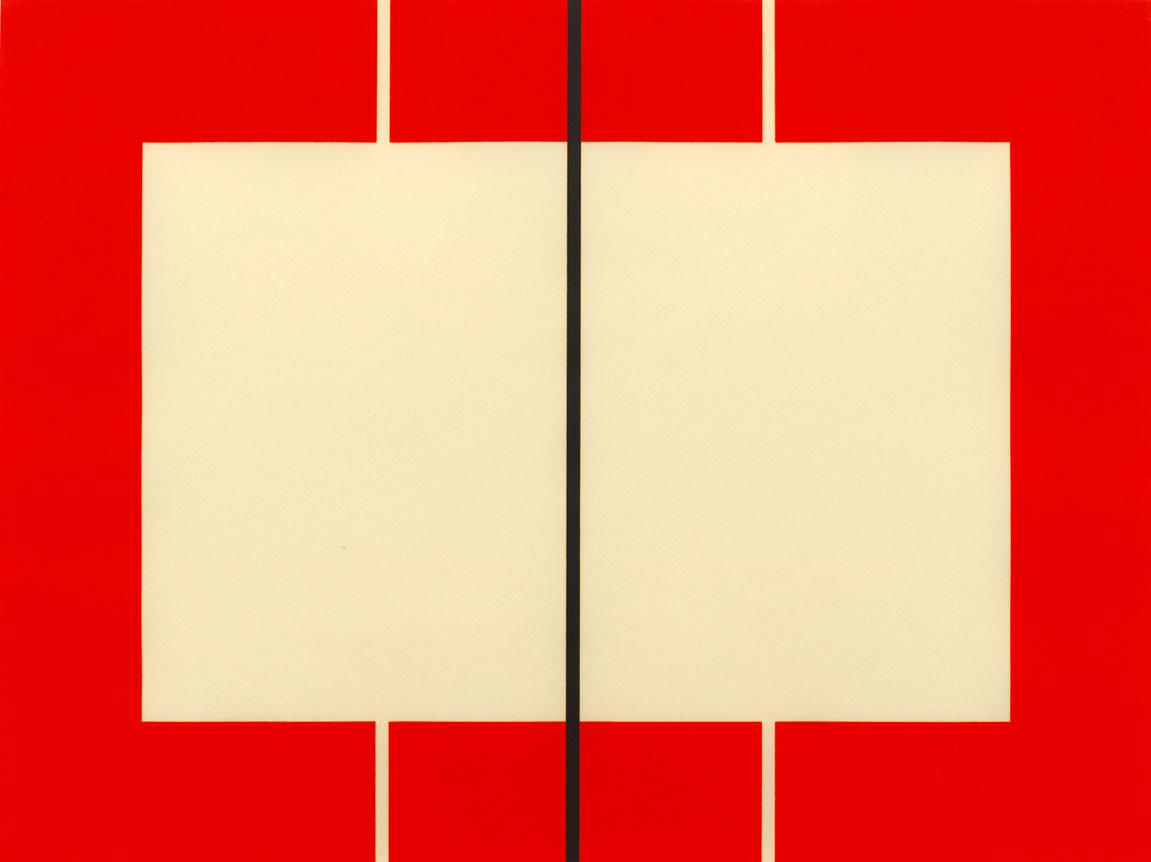
Frank Stella (b. 1936) is perhaps best known for his shaped canvases that blur the line between sculpture and painting. However, he first made a name for himself by creating minimal and highly geometric paintings and prints at a time when gestural Abstract Expressionism dominated these mediums. Double Gray Scramble represents the apex of his formal exploration of concentric squares, which he began in 1962 and returned to in the 1970s. To create these optically dizzying works, Stella would first draw the pre cise compositions on graph paper and meticulously translate the lines to the canvas or paper. While many of the works in Stella’s Concentric Square series are rendered in pal ettes of gray, Double Gray Scramble blends gray tones and vivid colors, with the spec trum of the left-hand square inverted, or scrambled, in the right-hand square. The print also mirrors a large-scale painting by the same name from 1968, produced right before Stella’s first major retrospective at The Museum of Modern Art. By placing the squares side-by-side, Stella enhances the images’ illusionistic qualities, yet the screenprint medi um reinforces their pristine flatness.
By the 1970s Stella had begun his exploration of three-dimensional works, but colorful prints like Double Gray Scramble surely acted as important stepping stones to Stella’s vibrant, shaped canvases of the 1980s. Looking back in 1987, Stella remarked, “The Concentric Squares created a pretty high, pretty tough pictorial standard. Their simple, rather humbling effect—almost a numbing power—became a sort of ‘control’ against which my increasing tendency in the seventies to be extravagant could be measured.”

Lithograph
Sheet

Printer
Catalogue
Signed,
Jasper Johns (b. 1930) created his first artwork containing letters of the alphabet in 1956. The painting, Gray Alphabets, was also his first in gray. Through his use of commercial stencils and an orderly grid-like composi tion, the painting transforms the recognizable symbols into aesthetic ob jects or painterly gestures, drawing attention to the ways in which written language is an ostensibly arbitrary creation of humankind. Twelve years later, Johns returned to the same symbols and color scheme to create this lithograph of the same title. However, using a complex technical litho graphic process, the print renders the letters slightly less legible.

Working with master printers at Gemini G.E.L. in Los Angeles, Johns cre ated Gray Alphabets using four different shades of gray and four different matrices, in addition to stamps and stencils of the letters. Johns also used water-tusche to affect a graphite wash. The resulting print is at once chaotic yet orderly, featuring perfectly scaled letters lined up in rows, each symbol following its own individual yet uniform gridlines. On top of its technical complexity, Gray Alphabets is remarkably large—one of the largest prints Johns has ever produced. An exceptional feat of the medium, the work is also a unique example of Johns’s experimentation with one of his signature motifs.
Many of Johns’s artworks featuring the alphabet were inspired by child hood toys painted with letters. By evoking graphite through his use of gray, Johns conjures images of a school worksheet or chalkboard, inviting view ers to imagine that darker gray shades are not absent from certain areas of the print, but rather that they were erased. As a result, Gray Alphabets builds upon his 1956 painting, further scrutinizing the function and reso luteness of language.
This impressioned was was deaccessioned from the Pasedena Art Museum in 1980. It was previously exhibited at the San Francisco Museum of Art, 1968; McNay Art Institute, San Antonio, Texas, 1969; Pasadena Art Mu seum, California, 1969-1970; Vancouver Art Gallery, 1970; Pasedena Art Museum Circulating Exhibition in Williamsport, Pennslyvania, 1972; and Pasedena Art Museum, 1972.
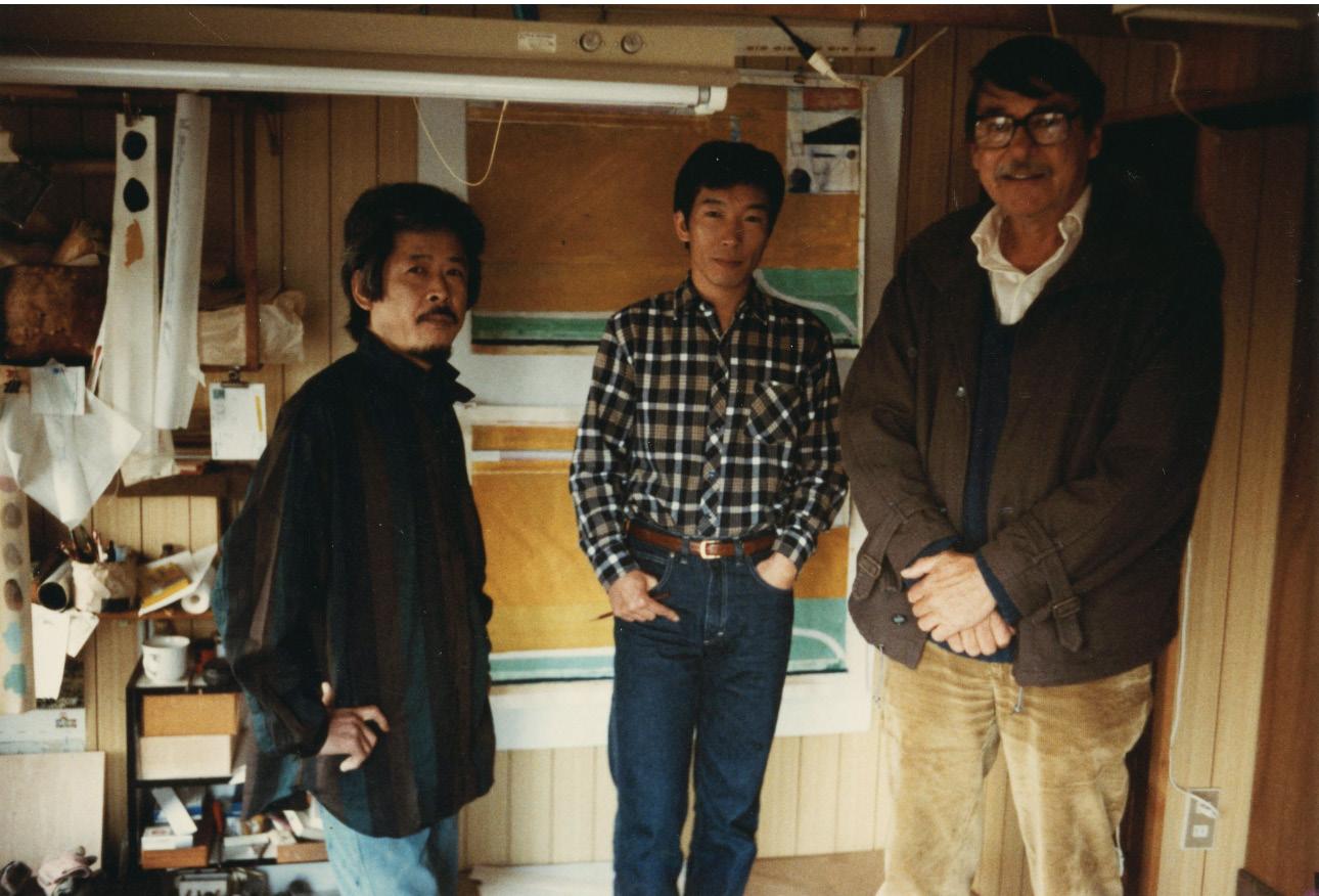
Jasper Johns working at Universal Limited Art Editions, West Islip, New York, 1966 Photo: Ugo Mulas, courtesy Universal Limited Art EditionsEllsworth Kelly
Iris, 1989
Sheet

Josef Albers

Hommage au Carré, 1965
Screenprints
Sheet size: 19 x 30 inches, each
Printer: Atelier Arcay, Paris
Publisher: Editions Denise René, Paris
Edition: 125, plus proofs
Catalogue Raisonné: Danilowitz 160.1-12
Each sheet is signed, dated, and numbered
The

Josef Albers (1888–1976) first began making prints in 1923 at the Bau haus in Weimar, Germany before moving to the United States in 1933. While teaching at Black Mountain College, he created a course to teach an “experimental way of studying color and teaching color,” which includ ed exercises to encourage students to see colors in specific contexts to better understand their functions and potentials. He continued to develop the course when he took up the position of Head of the Department of Design at Yale in 1950, publishing a book on the theory in 1963 entitled Interaction of Color. Albers applied this theory to create his own work as well. In the same year that he moved to New Haven, he began his famous series of oil paintings, Homage to the Square, which he would continue until his death in 1976. Albers simultaneously explored his interest in color theory and the square form through vibrant screenprints made through out the 1960s and 1970s, such as this series of ten works by the same name. In each print, Albers presents squares of different sizes and colors arranged in a precise manner, aiming to invite the viewer to question their perception of the deceptively simple image and its depth.

Works such as Hommage au Carré were conceived as complete portfolios to enable the viewer to consider the relationships between the various colors, much like his class exercises did. This portfolio Hommage au Carré features 12 prints in different color combinations.
The very rare complete portfolio of 12 screenprints and title pages with the original linen covered portfolio box.
Josef Albers in his studio, New Haven, Connecticut 1967Ellsworth
Green

Lithograph
Sheet
Printer
Edition:
Catalogue
Signed
David Hockney
Printer

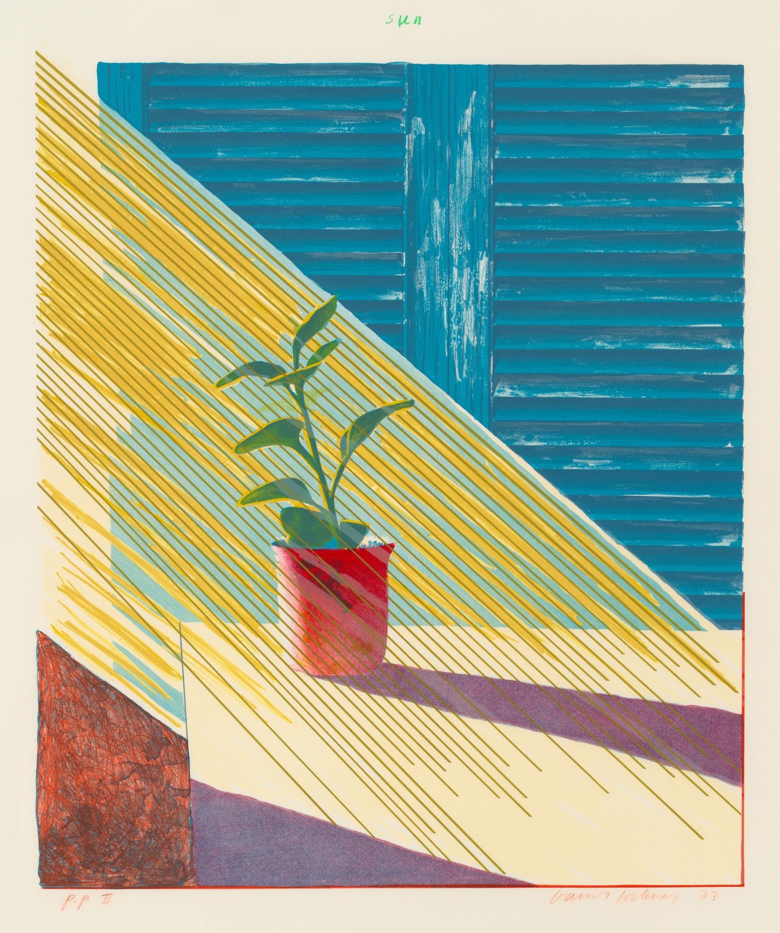
Although born and educated in England, artist David Hockney (b. 1937) is best known for his depictions of outdoor subjects in sunny southern California, where he has lived on and off since 1964. He painted his first image of a pool that same year, rendering the water with undulating lines in various shades of blue on white. The year 1964 also marked Hockney’s return to printmaking, a medium he had not worked in since his time at Bradford College of Art in the early 1950s.
Afternoon Swimming is a key example of Hockney’s exploration of new mediums, including printmaking and photography, in order to find ways to capture challenging subjects throughout the 1970s. In the late 1970s, he produced numerous significant pool prints at Kenneth Tyler’s printmaking studio which was located north of New York City, including his innovative Paper Pools series in 1978. Hockney’s experience creating this body of work undoubtedly informed the composition of Afternoon Swimming. As in Paper Pools, the bold, energetic lines of this print reveal the in fluence of Japanese ukioy-e woodblock prints as well as Henri Matisse’s cutouts on Hockney’s depictions of water and pools in particular. However, in addition to splash es and waves, Afternoon Swimming uniquely features abstracted figures, which rare ly appear in Hockney’s prints despite the prevalence of figures in his earlier paintings of pools. This lithograph thus speaks to Hockney’s continued interest in depicting pools and swimmers across media and his oscillation between expressionism and realism throughout his career.
 David Hockney, Los Angeles
Photo: Paul Joyce
David Hockney, Los Angeles
Photo: Paul Joyce
 David Hockney painting Kenneth Tyler’s swimming pool, Bedford Village, New York, 1987 Photo: Kenneth Tyler
Brice Marden


Cold Mountain Series, Zen Studies 1-6, 1991
Medium: Etchings with aquatint
Sheet size: 27 1/4 x 35 1/4 inches, each
Printer: Jennifer Melby
Publisher: Brice Marden
Edition: 35, plus proofs
Catalogue Raisonné: Lewison 43/1-6
Each sheet is signed, dated, and numbered
The complete set of six etchings with aquatint


Richard Diebenkorn
Blue with Red, 1987

Woodcut
Sheet size:
Printer: Tadashi Toda
Print Shop,
Publisher: Crown Point Press, San Francisco, California
Edition: 200, plus
Initialed, dated, and
Richard Diebenkorn (1922–1993) created some 200 prints over the course of his career, be ginning in the 1940s. Despite establishing his reputation as a painter through his use of color, it was not until 1980 that Diebenkorn began consistently incorporating color into his prints, when Kathan Brown of San Francisco’s Crown Point Press taught him the technique of aqua tint. A few years later, in 1987, Brown once again played a critical role in the development of Diebenkorn’s printmaking practice when she invited him to Crown Point’s studio in Kyoto, Japan to create a series of woodblock prints. There, Diebenkorn worked directly with master printmaker Tadashi Toda to create two prints, including Blue with Red. Working closely to gether, Toda was able to maintain the gestural energy of Diebenkorn’s preparatory sketch in the final print, resulting in a layered series of shapes and strokes that resemble his works on canvas.
While the composition of the print bears similarities to other Diebenkorn prints made with a variety of techniques, Blue with Red is distinctly painterly, a testament to the virtues of wood block printing. Diebenkorn was not the only painter to gravitate to the woodblock for this reason, as artists including Helen Frankenthaler and Jasper Johns had come to similar conclu sions. Of his eye-opening experience in Kyoto, Diebenkorn remarked that the process “was not simply to reproduce or copy but to ‘go’ with the inevitable variances which occur be tween the ‘original’ and the developing print.” Diebenkorn often returned to the woodblock technique after this formative experience, making Blue with Red an exceptionally important touchstone of Diebenkorn’s long engagement with the print medium.
 Diebenkorn with wood-block printer Tadashi Toda and printmaker Hidekatsu Takada, Kyoto, Japan, 1983 Richard Diebenkorn Foundation
Richard Diebenkorn
Large Bright Blue, 1980

Spitbite aquatint and softground etching
Sheet size: 39 5/8 x 26 1/8 inches
Printer and Publisher: Crown Point Press, San Francisco
Edition: 35, plus proofs
Catalogue Raisonné: HFA 32
Signed, dated, and numbered
 Richard Diebenkorn and Kathan Brown in the Crown Point Press studio, Oakland, Califronia,
Donald Judd


Untitled, 1990

Woodcuts
Sheet size: 23 1/2 x 31 1/2 inches
Printer: Derrière l”Etoile Studios, New York
Publisher: Brooke Alexander Editions, New York
Edition: 25, plus proofs each
Catalogue Raisonné: Schellmann 193-199
Each sheet is signed and numbered, verso
The complete set of seven woodcuts


Jasper Johns

Corpse
Screenprint
Sheet
Printer
Edition:
Catalogue
Signed,
John Baldessari

I Will Not Make Any More Boring Art, 1971 Lithograph
Sheet size: 22 1/2 x 30 inches
Printer: Nova Scotia College of Art and Design Lithography Workshop, Halifax
Publisher: Nova Scotia College of Art and Design, Halifax
Edition: 50, plus proofs
Catalogue Raisonné: Coplan Hurowitz 1
Signed, dated, and numbered

In the foreword for his catalogue raisonné of prints and multiples, John Baldessari (1931–2020) wrote, “Every artist should have a cheap line.” For this giant of conceptual art, that line is arguably, “I will not make any more boring art,” a sentence repeated more than ten times in his print of the same name. The print is one of several relics of a 1971 exhibition at the Nova Scotia College of Art and Design. That year, the college invited Baldessari, who was teaching at the new California Institute of the Arts at the time, to exhibit but could not afford to fly the artist to Halifax. Rather than reject the invitation, Baldessari created a set of instructions for an artwork that the students could enact on his behalf. The instruc tions drew on an earlier work by the artist, List of Art Ideas, wherein one of the eponymous ideas was “Write ‘I will not make any more boring art’ 1000 times on wall.” At NSCAD, the students wrote the phrase on the walls of the exhibition space over and over for the duration of the ten day exhibition. Baldessari gave the students little guidance on what the final product should look like; the power of the work laid in the act of creating it. After the exhibition, the students also produced this print based on a page on which Baldessari himself had written the phrase several times, which he had mailed to them.

Reminiscent of the antiquated schoolroom punishment of writing lines on a chalkboard, the work speaks both to Baldessari’s interest in the removal of the artist’s hand and his critical perspectives on art education. When he started working at CalArts in 1968, he fo cused on creating “a situation where art might happen,” focusing not on teaching specific skills but rather encouraging experimentation. In the artist’s words, “while I didn’t think you could teach art, you could supply information.” Jack Goldstein, an artist of the “Pictures Generation,” said of Baldessari’s class: “students didn’t get very much hands-on educa tion, but learned a whole new attitude about what art could be – not expression but inves tigation.” With this in mind, I Will Not Make Any More Boring Art is both a literal mantra and a representation of Baldessari’s teaching ethos.
This work is the first print in Baldessari’s vast oeuvre, even though he was not technically involved in the design nor production of the print itself. In this way, the work embodies Baldessari’s explorations of what an artwork could be at a pivotal moment in his storied artistic career.
John Baldessari (second from the left) working with Jean Milant and other artists at Cirrus Editions Ltd, Los Angeles, 1971Jasper Johns
Skin with O’Hara Poem, 1965

Lithograph
Sheet size: 22 x 34 inches
Printer and Publisher: ULAE, West Islip, New York
Edition: 30, plus proofs
Catalogue Raisonné: ULAE 21
Signed, dated, titled, and inscribed
Jasper Johns

Decoy
Lithograph
Sheet size:
Printer
Edition:
Catalogue
Signed,
Andy
Screenprint

Sheet
Printer:
Publisher:
Catalogue
Signed
David Hockney
Sun,
Lithograph
Sheet
Printer
Edition:
Catalogue
Signed,
David Hockney

Wind,
Lithograph
Sheet
Printer
Catalogue
Signed,
Donald Judd
Untitled, 1961-63/1969


Woodcuts
Sheet size: 30 1/4 x 21 3/4 inches
Printer: Roy C. Judd
Publisher: Edition der Galerie Heiner Friedrich, Munich
Edition: 12
Catalogue Raisonné: Schellman 64, 64, 66-74,37, and 39
Each sheet is signed by the artist, recto
Each sheet is titled twice, numbered, dated, and initialed by Roy C. Judd, verso
The
rare complete set
woodcuts


 Donald Judd at La Mansana de Chinati/ The Block, Marfa, Texas, 1982
Photo: Jamie Dearing
Donald Judd at La Mansana de Chinati/ The Block, Marfa, Texas, 1982
Photo: Jamie Dearing
This set of thirteen color woodcuts descended in the family of the distinguished English collector E.J. (“Ted”) Power. Power bought the set at Judd’s very first London gallery exhibition at Lisson Gallery in 1970. We believe that this extraordinary set is unique.
By 1970, Donald Judd had a successful career as an artist in New York, with solo shows at the Green Gallery, Leo Castelli Gallery and a survey at the Whitney Museum of American Art. He had also exhibited abroad at Galerie Ileana Sonnabend, Paris and Galerie Rudolf Zwirner, Cologne. But it wasn’t until he met Nicolas Logsdail of Lisson Gallery that Judd would debut his works in Lon don.

In 1967, Logsdail converted his studio space in Lisson Grove, London, into a gallery that would become a hub for international minimal and conceptual artists. “When we opened,” Logsdail ex plains, “we were one of only about three contemporary galleries that actually existed in London of any significance.” The dealer made his first trip to New York in search of new talent. He met Don ald Judd and Sol LeWitt and, in 1970, staged a joint show of the two artists. Lisson Gallery contin ued to exhibit Judd’s work with four solo exhibitions and five group exhibitions between 1974 and 1993.
The poster that advertised the 1970 exhibition simply stated “DON JUDD, SOL LE WITT, FIRST LONDON SHOW OF MINIMAL GRAPHICS AND DRAWINGS.” The Judd Foundation retains a letter from Logsdail to Judd written after the show’s opening in which Logsdail reported, “We sold a complete set of parallelogram prints to the English collector E.J. Power, which I thought you should know.” Power, a trustee of the Tate Gallery (the predecessor to Tate Britain, Tate Modern, Tate Liverpool, and Tate St Ives), was a pioneering British collector of contemporary art. His en gagement with leading young and mid-career American artists enabled him to assemble a legend ary collection.
The parallelogram woodcuts were first printed by Judd and his father Roy C. Judd between 1961 and 1963. The early impressions are printed on both etching and fibrous Japanese paper. The artist then printed a small number of impressions on smooth cartridge paper that were published by Edition der Galerie Heiner Friedrich, Munich, in 1969. Friedrich and his wife Phillipa de Menil, daughter of Texas collectors and patrons Dominique and John de Menil, were early financial sup porters of Judd’s endeavors in Marfa, Texas. They also co-founded the Dia Art Foundation.
The catalogue raisonné of Judd’s prints states that Friedrich assembled these particular parallelogram images into a set, perhaps with the intention of selling them at the Lisson show that specifically included “graphics.”
Each print in this set is signed on the verso with matching edition numbers.
Donald Judd, Rainer Judd, and Flavin Judd, Marfa, Texas, 1972 Judd FoundationPrinter:
Catalogue

Andy
Screenprint

Sheet
Printer:
Publisher:
Catalogue
Signed
Robert Rauschenberg

Breakthrough
Lithograph
Sheet
Printer
Catalogue
Signed,
Robert Rauschenberg

Breakthrough
Lithograph
Sheet size:
Printer and Publisher:
Edition:
Catalogue Raisonné:
Signed,
Willem de Kooning

Untitled (Quatre Lithographies), 1986
Lithographs
Sheet size: 28 x 24 inches, each
Printer: Art Estampe, Paris
Publisher: Éditions de la Différence, Paris
Edition: 100, plus proofs
Each sheet is signed, dated, and numbered
The
set
four lithographs
Jackson
Untitled,
Screenprint
Sheet
Printed
Catalogue
Signed,
David Hockney
Black Tulips, 1980

Lithograph
Sheet size: 44 1/8 x 30 inches
Printer and Publisher: Tyler Graphics Ltd., Bedford, New York
Edition: 100, plus proofs
Catalogue Raisonné: MCAT 236
Signed, dated, and numbered
Jasper Johns

0 (from 0-9), 1963
Lithograph
Sheet size: 20 1/2 x 15 3/4 inches
Printer and Publisher: ULAE, West Islip, New York
Edition: 10, plus proofs
Catalogue Raisonné: Proof impression, with an overlay of red/orange ink, of ULAE 19
Signed, dated, initialed, and inscribed

Jasper Johns

Coat Hanger
Lithograph
Sheet size:
Printer and Publisher:
Edition:
Catalogue Raisonné:
Signed,
Jasper Johns Watchman, 1967

Lithograph
Sheet size: 36 x 24 inches
Publisher and Publisher: ULAE, West Islip, New York
Edition: 40, plus proofs
Catalogue Raisonné: ULAE 32
Signed, dated, and numbered
SUSAN SHEEHAN GALLERY
136 East 16th Street
New York, NY 10003 Tel: +1-212 489-3331 info@susansheehangallery.com www.susansheehangallery.com