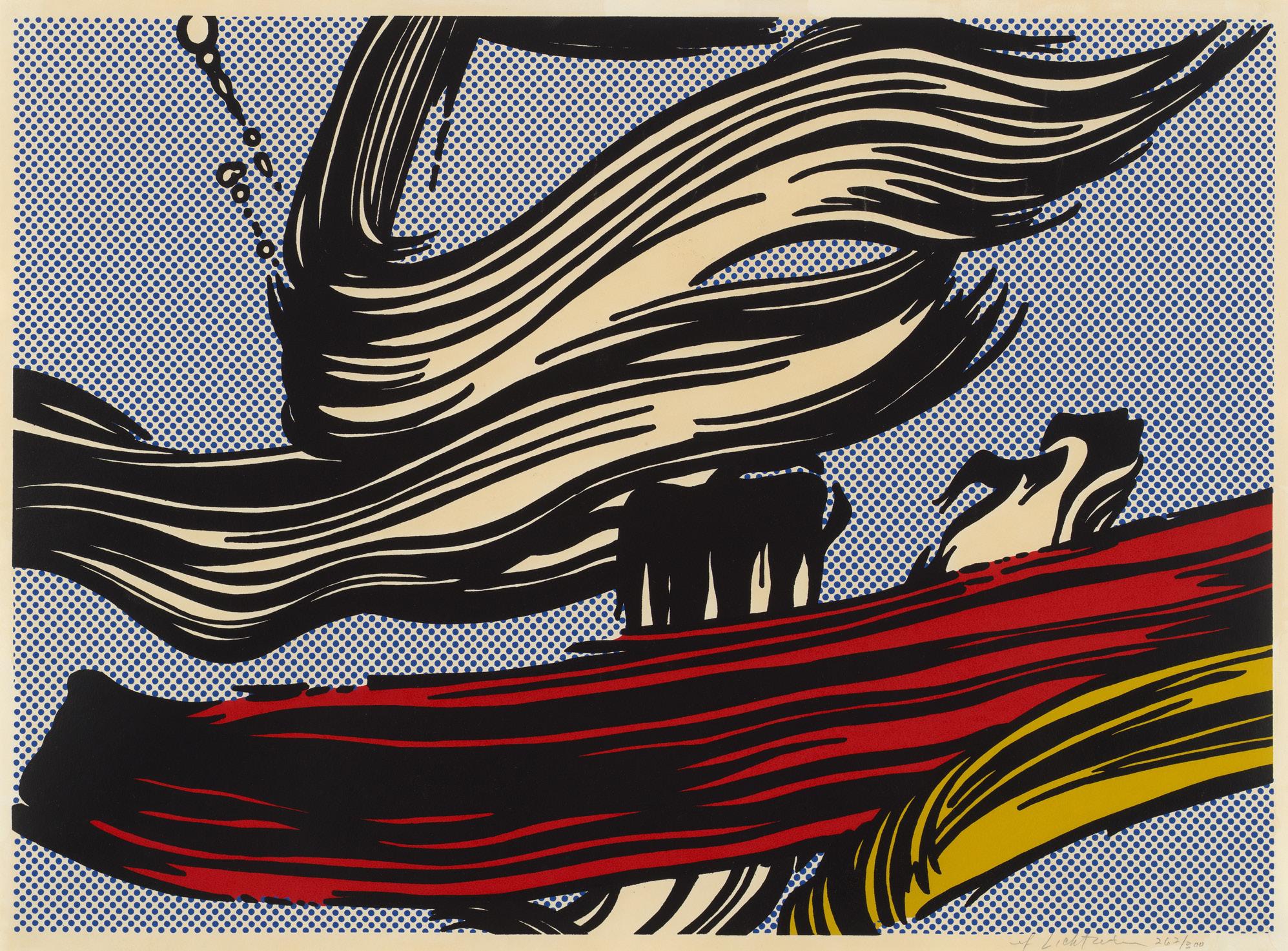
SUSAN SHEEHAN GALLERY 2022


On the cover: Roy Lichtenstein Bull III, from the complete set of six mixed media prints, 1973

On the cover: Roy Lichtenstein Bull III, from the complete set of six mixed media prints, 1973
PRIVATE DAYS: NOVEMBER 29TH - NOVEMBER 30TH PUBLIC DAYS: DECEMBER 1ST - 3RD
LOCATION: MIAMI BEACH CONVENTION CENTER FOR SHOW INFORMATION: https://www.artbasel.com/miami-beach/at-the-show

136 East 16th Street New York, NY 10003 212-489-3331 info@susansheehangallery.com www.susansheehangallery.com
Ed Ruscha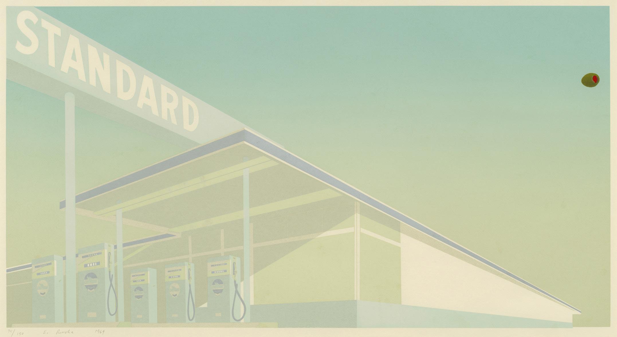
Cheese Mold Standard with Olive, 1969
Screenprint
Sheet size: 25 5/8 x 39 7/8 inches
Printer: Jean Milant and Daniel Socha at the artist’s studio, Hollywood, California
Publisher: The Artist
Edition: 150, plus proofs
Catalogue Raisonné: Enberg 31
Signed, numbered, and dated
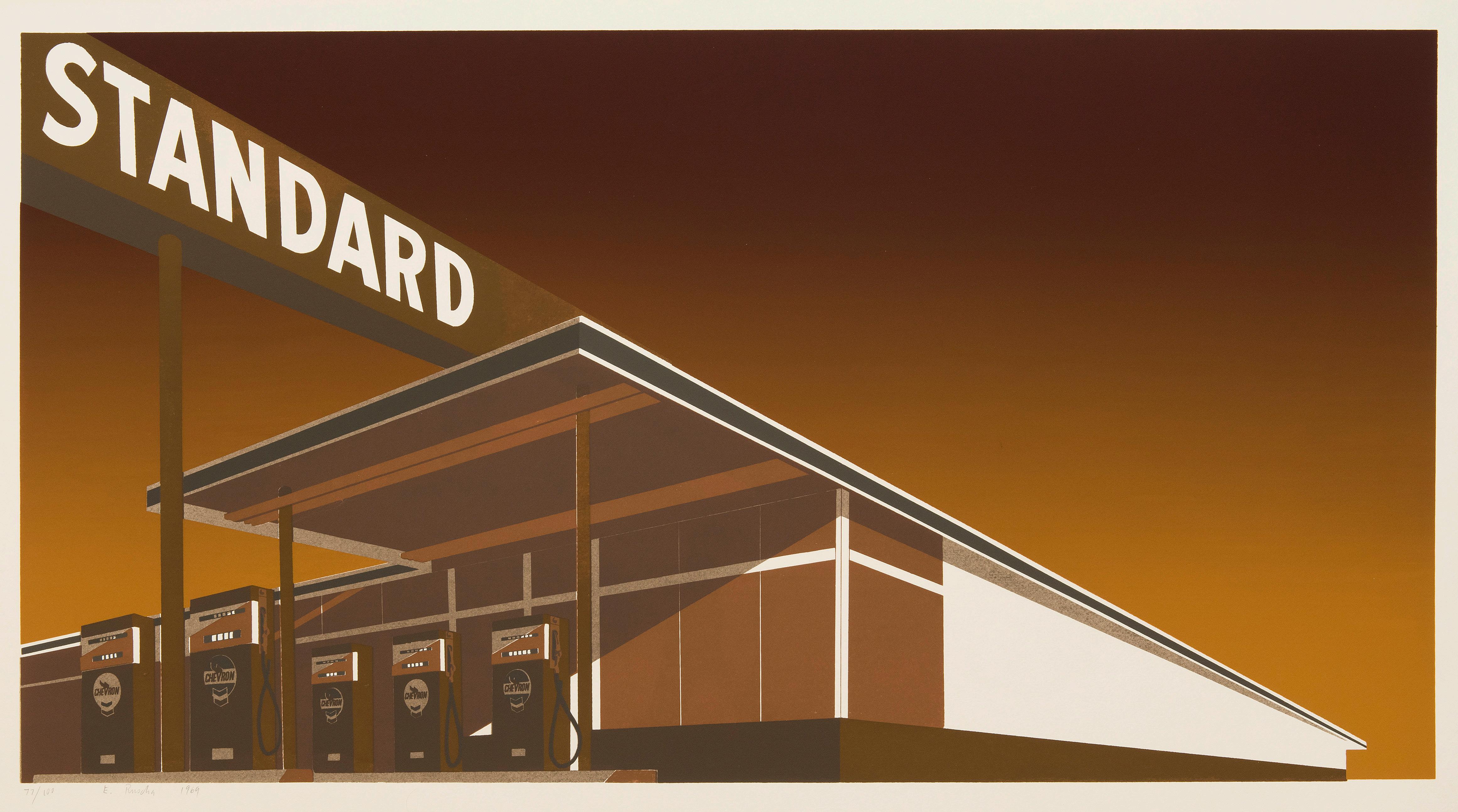
Screenprint
Sheet size: 25 3/4 x 40 1/16 inches
Printer: Jean Milant and Daniel Socha at the artist’s studio, Hollywood, California
Publisher: The Artist
Edition: 100, plus proofs
Catalogue Raisonné: Enberg 30
Signed, numbered, and dated
 Ed Ruscha in his studio, Venice, California
Ed Ruscha
Ed Ruscha in his studio, Venice, California
Ed Ruscha
Made in California, 1971
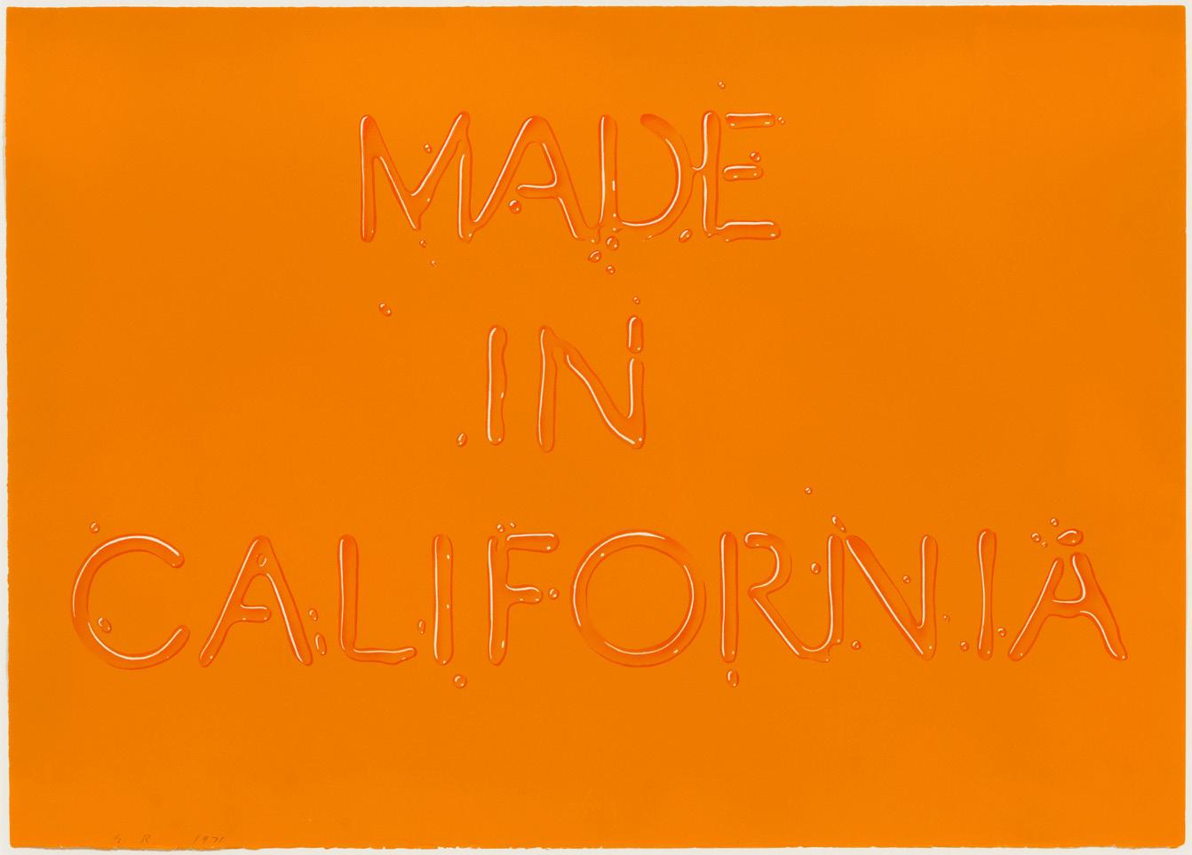
Lithograph
Sheet size: 20 x 27 7/8 inches
Printer: Cirrus Editions, Los Angeles
Publisher: Grunewald Graphic Arts Foundation, University of California, Los Angeles
Edition: 100, plus proofs
Catalogue Raisonné: Enberg 52
Initialed, numbered, and dated
Few artists of the 20th century are as synonymous with California as Ed Ruscha (b. 1937). He arrived in Los Angeles from Omaha, Nebraska in 1956 to attend the Chouinard Art Institute (now CalArts) and immediately began an artistic love affair with the natural and built environments of California. Two years later he completed a printing apprenticeship, quickly embracing the ease of reproducibility and collaborative nature of the process. Printmaking thus lies at the heart of Ruscha’s artistic practice, enabling him to return to certain approaches over time. For example, his work commonly explores how typeface and text color impact the legibility of a phrase, and Made in California is a key example of this line of inquiry. The print features one of Ruscha’s most iconic lithographic techniques: letters so expertly printed that they appear to be made of water droplets. However, in other prints of this kind from 1971, Ruscha uses light-blue paper, a seem ingly fitting choice for the liquid font, but Made in California was printed on a vibrant shade of orange-yellow.
The print’s titular phrase, “Made in California,” is characteristically enigmatic and can be read in a variety of ways. Perhaps it speaks generally to Los Angeles’s then-emerging position as a cultural hub in the United States. Perhaps it is personal, describing how Ruscha found and osten sibly “made” himself in Los Angeles. Or perhaps it is political, alluding to the decline of Califor nia’s previously booming auto manufacturing industry in the early 1970s, and the rise of imports in this and many other industries at the same time. Regardless of its meaning, through his use of the trompe l’oeil water typography, Ruscha seems to suggest that the phrase is unstable or tran sient, at risk of evaporating or being wiped away. Clear yet illegible, permanent yet ephemeral, declarative yet inscrutable, Made in California bears all the hallmarks of the Pop inflections and tongue-in-cheek witticism for which Ruscha is best known.
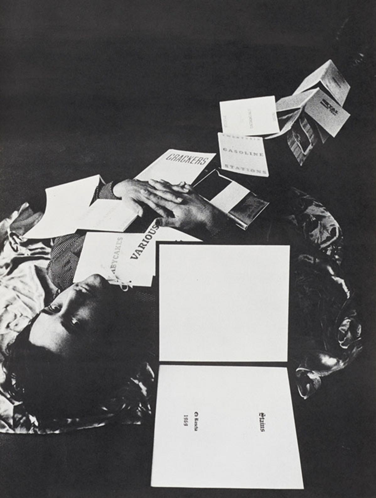 Ed Ruscha with his books, 1970
Roy Lichtenstein
Ed Ruscha with his books, 1970
Roy Lichtenstein
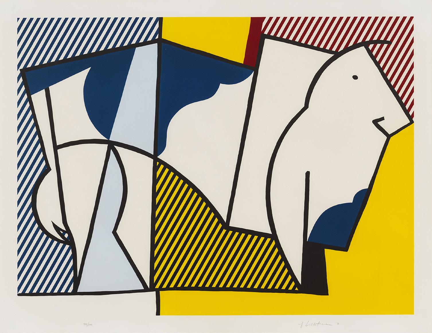
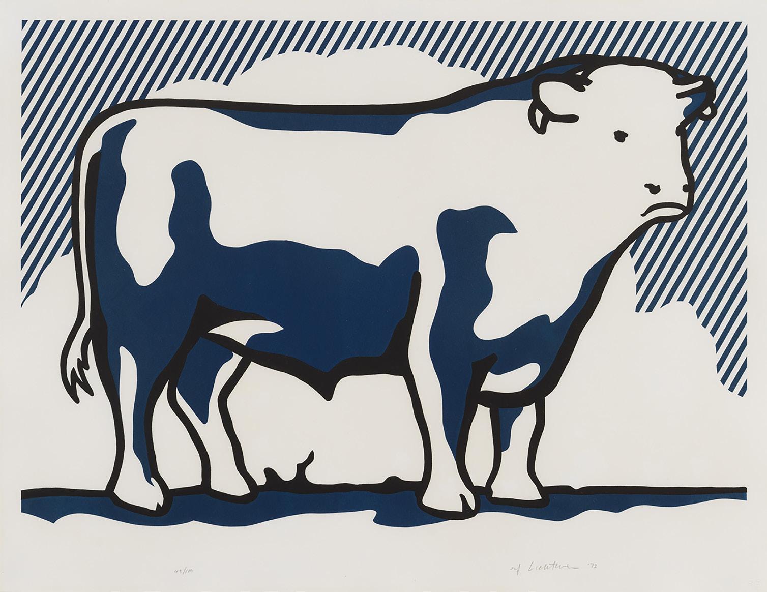
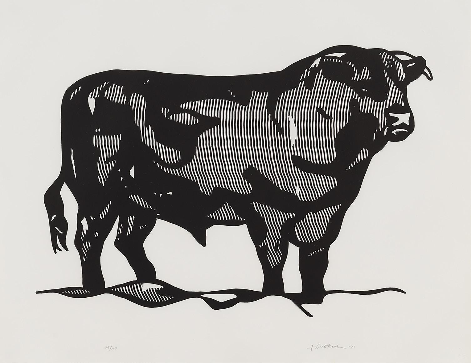
Screenprint, lithograph, and linocut
Sheet size: 27 x 35 inches, each
Printer and Publisher: Gemini G.E.L., Los Angeles
Edition: 100, plus proofs
Catalogue Raisonné: Corlett 116-121
Each sheet is signed, dated, and numbered in pencil, lower margin
The complete set of six mixed media prints
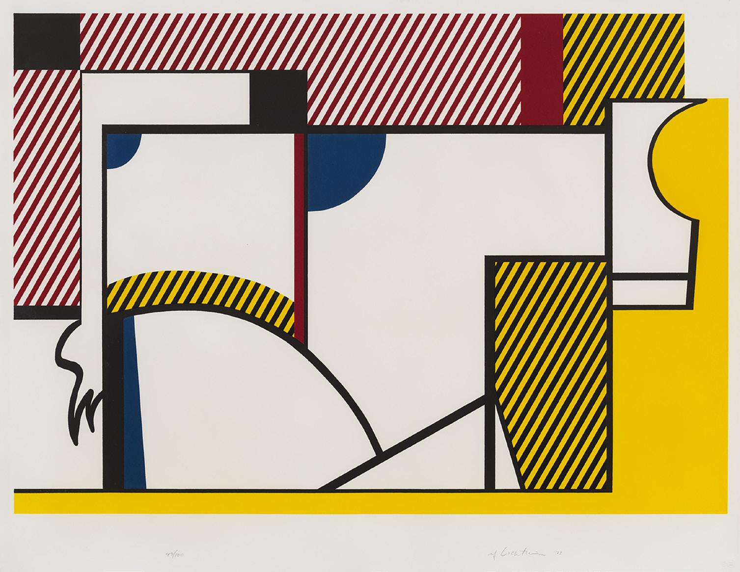
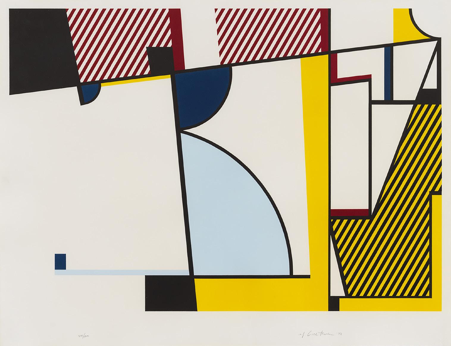
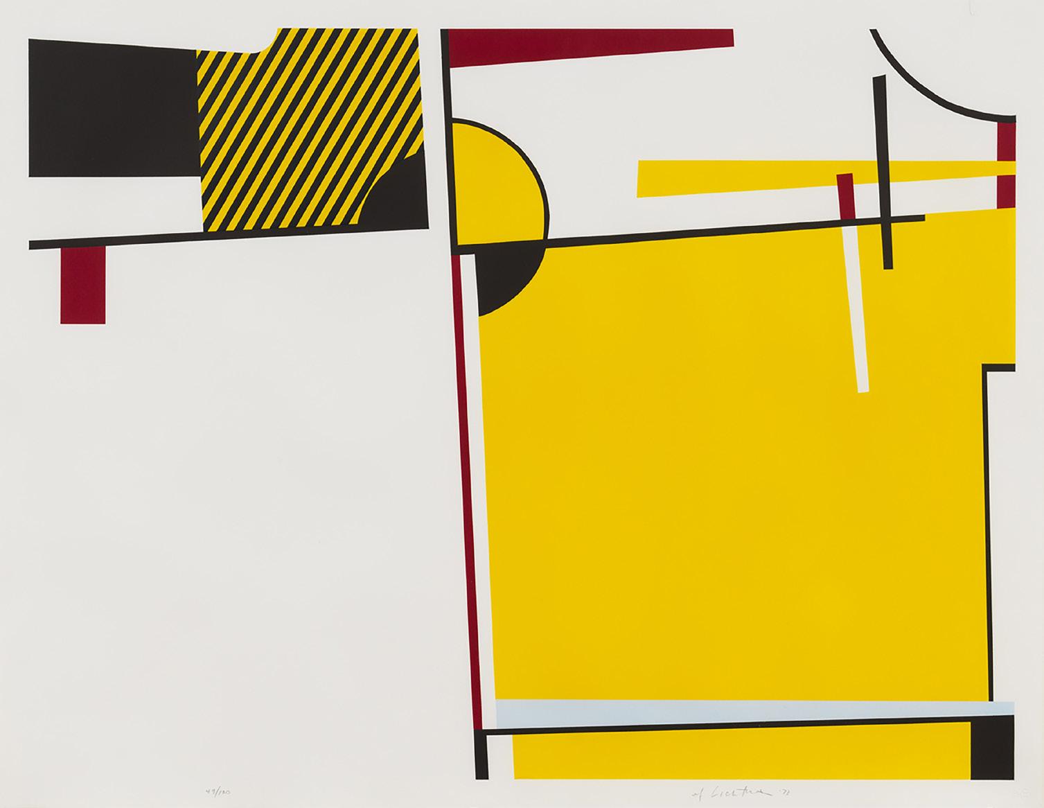
Over the course of six prints, Roy Lichtenstein (1923–1997) progressively simplifies and abstracts a Hol stein cow, a sequence only comprehensible when the series is seen in its entirety. Lichtenstein directly quotes Picasso’s lithographic series The Bull (Le taureau), 1946, and Theo van Doesburg’s pencil stud ies for The Cow, 1916–1917, in which bovines are incrementally rendered abstract. These precedents testify to the modernist belief that universal truth could be revealed through distillation and abstrac tion. Lichtenstein, though, parodies this faith by calling into question the presumed distinction between “realistic” and “abstract” depictions. The stylized, wavy, black patterning in Bull I that calls to mind Old Master woodcuts or line engravings reverberates with the crisp, diagonal cross-hatching in the subsequent prints. This visual rhyme calls attention to the fact that, as Lichtenstein put it, “The series pretends to be didactic; I’m giving you abstraction lessons. But nothing is more abstract than anything else to me. The first one is abstract; they’re all abstract.”
Taking guidance from a photograph in a 1970 cattle sales catalog, Lichtenstein based the prints in the Bull Profile series on drawings he made in New York and subsequently reworked at Gemini as prepa ratory collages. “I didn’t want to destroy the bull in doing it, you know, because whatever else I was doing, it had to look like a bull. I mean, all of the marks . . . are made for other reasons, but it can’t look unlike a bull, it would be inconsistent with the idea.” Lichtenstein’s interest in progressively abstract ing a bovine is further manifested in Bull Head Series, a three-lithograph series also made at Gemini in 1973. He revisited the subject again the following year in the three preparatory studies for the Cow Triptych (Cow Going Abstract) painting, which was produced as a tri-part poster in 1982.
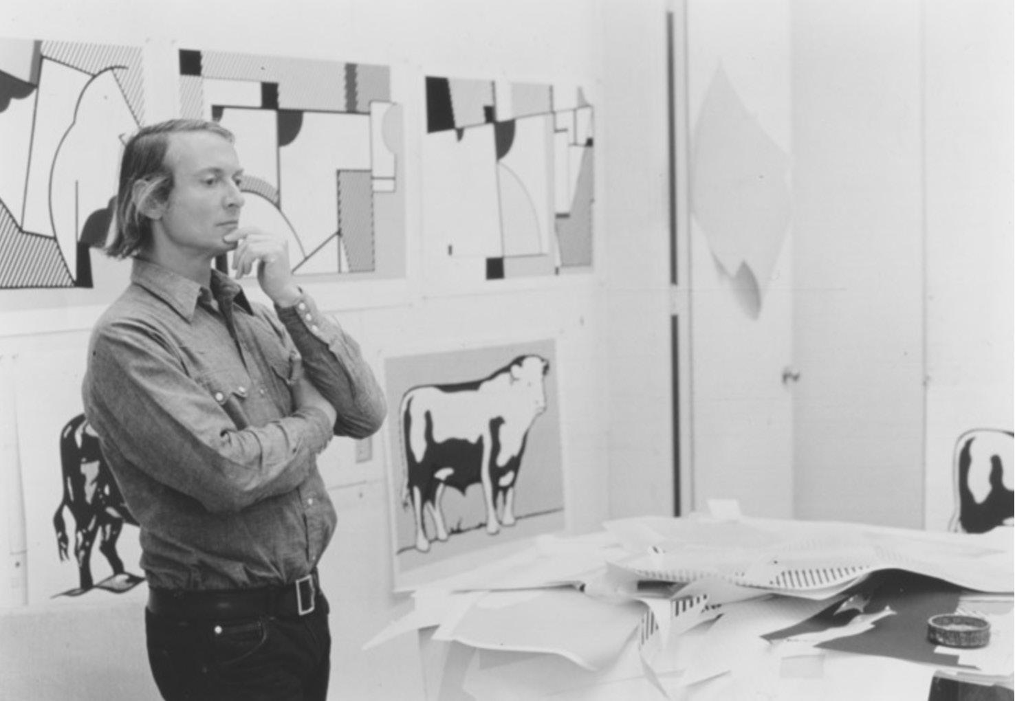 Roy Lichtenstein working on Bull Profile Series, 1973
David Hockney
Roy Lichtenstein working on Bull Profile Series, 1973
David Hockney
Lithograph
Sheet size: 31 3/4 x 39 1/2 inches
Printer and Publisher: Tyler Graphics Ltd., Bedford, New York
Edition: 55 plus proofs
Catalogue Raisonné: MCAT 233
Signed, dated, and numbered
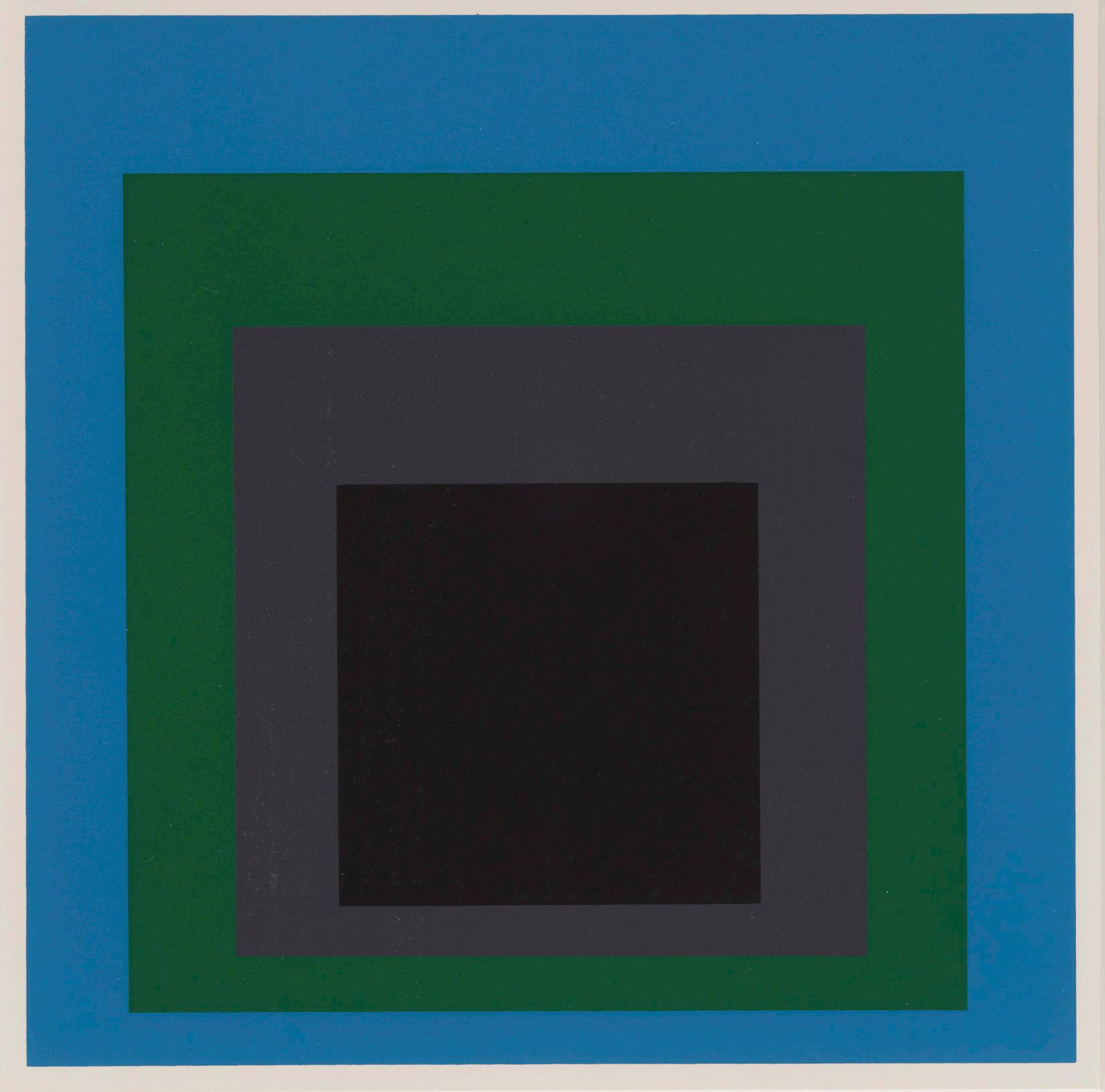
Soft Edge - Hard Edge, 1965
Screenprints
Sheet size: 17 x 17 inches, each
Printer: Sirocco Screenprints, New Haven, Connecticut
Publisher: Ives-Sillman, New Haven, Connecticut
Edition: 250, plus proofs
Catalogue Raisonné: Danilowitz 165
The complete portfolio of 10 screenprints and title pages with the original portfolio box and slipcase
Sheet size: 33 1/4 x 29 7/8 inches
Printer and Publisher: Gemini G.E.L., Los Angeles Edition: 50, plus proofs
Catalogue Raisonné: Axsom 327
Signed and numbered
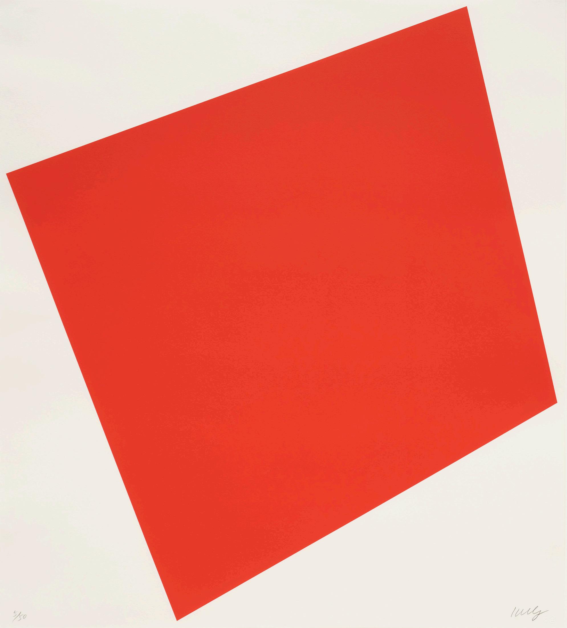
Ellsworth Kelly (1923-2015) was a pioneer in the Color Field and Hard-edge movements whose minimalist paintings, sculptures, and prints explore the power of pure color and form over gesture. This large-scale lithograph, Red, from 2005, is among his most striking late prints and depicts a large-scale trapezium, a four-sided shape with no parallel sides. The bright red form appears tautly suspended on the white page, as if it might burst from its confining edges at any moment.
The remarkable energy of Red stems largely from Kelly’s masterful balance of negative and printed space, which renders the unprinted area just as vital as the red shape. Negative space plays an important role in all of Kelly’s prints and paintings. In fact, he once remarked that the margins surrounding the forms in his paintings and prints were “thought out as much as color and shape” and that “negative space is just as powerful as the space of the object.”
Red’s mesmerizing energy also derives from the punchy shade of the eponymous color Kelly chose for the lithograph. Kelly experimented with three other shades of red in trial proofs before landing on the bright vermilion shade seen in the final print. This characteristically careful approach to color alludes to why Kelly chose lithography for this print: he felt litho graphic inks, dense and greasy, could achieve richer planes of color than the inks used in screenprinting, a preference echoed in his choice of oil paint over acrylic when working on canvas. Red thus exemplifies the close connections between his printmaking and painting practices both in technique and composition.
Ellsworth Kelly at Peter Carlson Enterprises, Sun Valley, Idaho, 1996Yellow, 1973-75
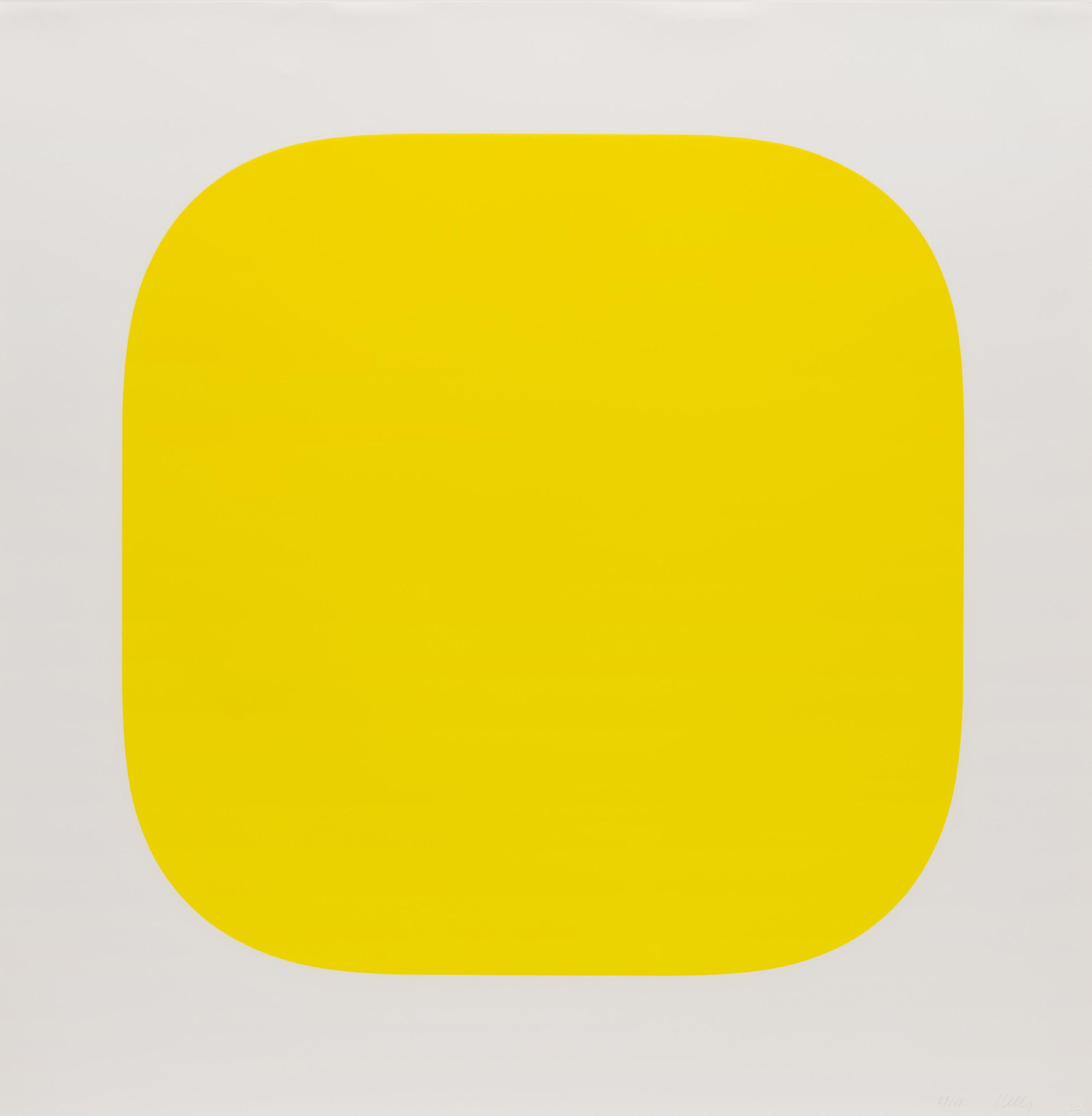
Lithograph
Printer and Publisher: Gemini G.E.L., Los Angeles
Edition: 48, plus proofs
Catalogue Raisonné: Axsom 107
Signed and numbered
Blue Red-Orange Green, 1970-71
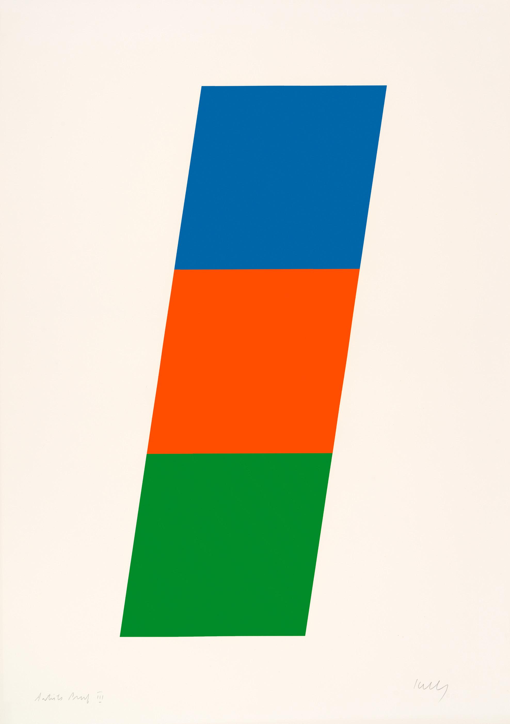
Lithograph
Sheet size: 42 1/2 x 30 inches
Printer and Publisher: Gemini G.E.L., Los Angeles Edition: 64, plus proofs
Catalogue Raisonné: Axsom 75
Signed and inscribed
Portfolio: Marginalia Hommage to Shimizu
Sheet size: 22 x 18 1/8 inches
Printer: Simca Print Artists Inc., New York
Publisher: Jasper Johns and Simca Print Artist, Inc., New York
Edition: 100, plus proofs
Catalogue Raisonné: ULAE 204
Signed, numbered, and dated
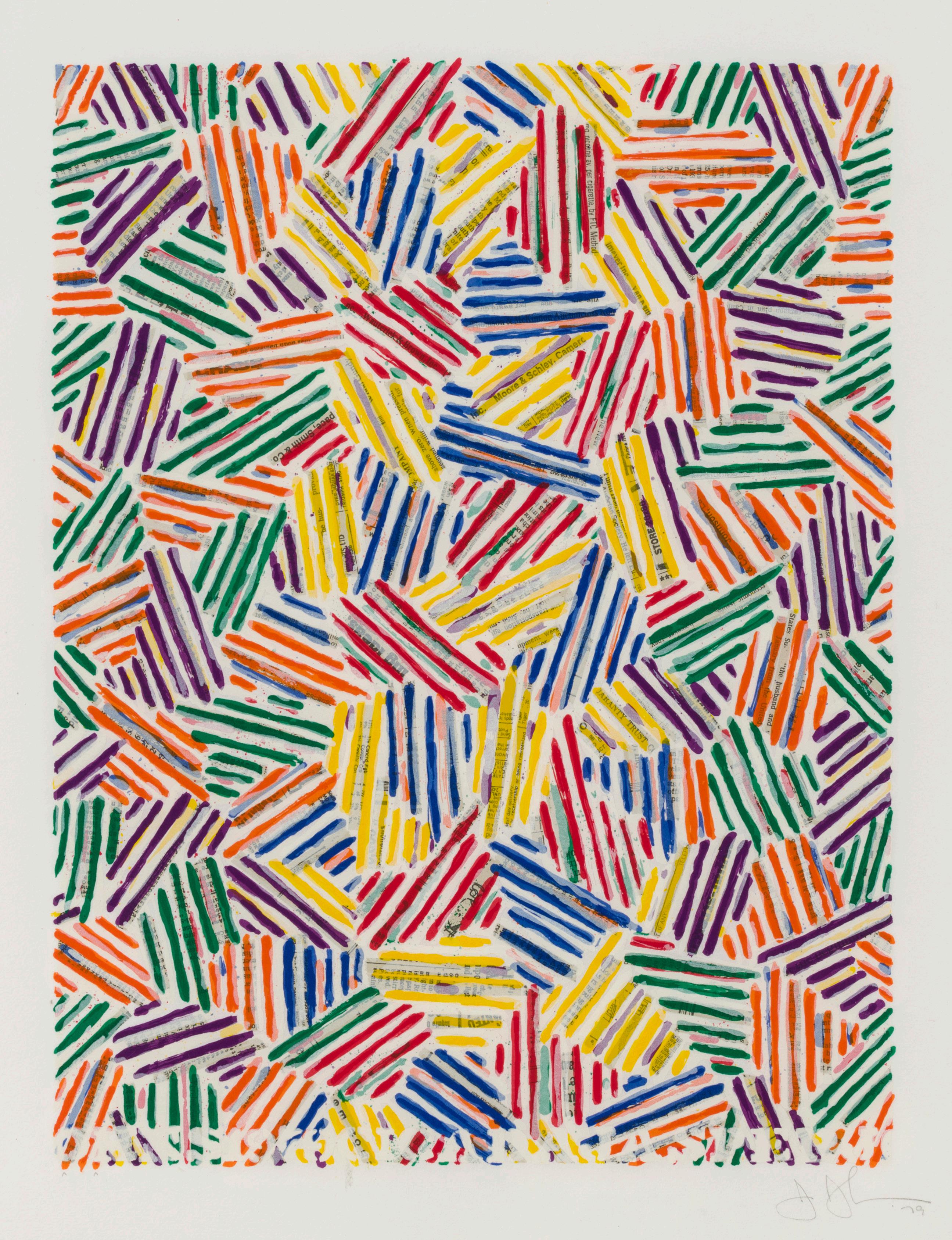
Beginning in the 1970s, Jasper Johns (b. 1937) began experimenting with the crosshatching motif. The original pattern was based mostly upon a deconstruction of an Edvard Munch self-portrait, Between the Clock and the Bed. The bedspread in Munch’s 1943 painting contained a crosshatch ing pattern Johns would reference throughout the 1970s and early 1980s in his paintings, drawings, and prints. Seemingly chaotic and created at random, Johns’ crosshatchings are in fact governed by print-based pat terns of reversal, repetition, and rotation arranged according to complex systems.
Upon close inspection of the crosshatching in the prints entitled, Cicada, a cylindrical pattern emerges. The crosshatching on the right edge matches that on the left, so one can imagine them overlapping and being a contin uation on both sides. This play on space becomes particularly apparent in this Cicada with its lettering. Conceivably this is an homage to the cylin drical press used with newspaper printing thereby echoing the reproduc tive process as well as its perspectival representation.
Cicada has a painterly quality achieved by layering additional screens over the same areas to reinforce the shapes and create the illusion of depth instead of the flat, sharp quality typical of screenprinting. Johns joked that trying to achieve depth of tone in a screenprint could be considered an abuse of the medium.
Cicada prints are included in the collections of the National Gallery of Art, Washington DC, the Museum of Modern Art, New York, and the Harvard Art Museums, Cambridge, Massachusetts, among many others.
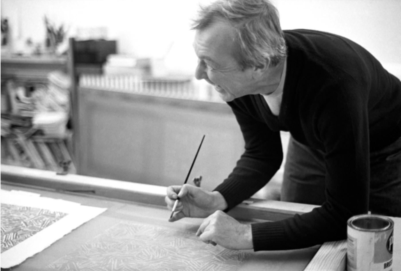
Jasper Johns at Simca Print Artists, New York, 1980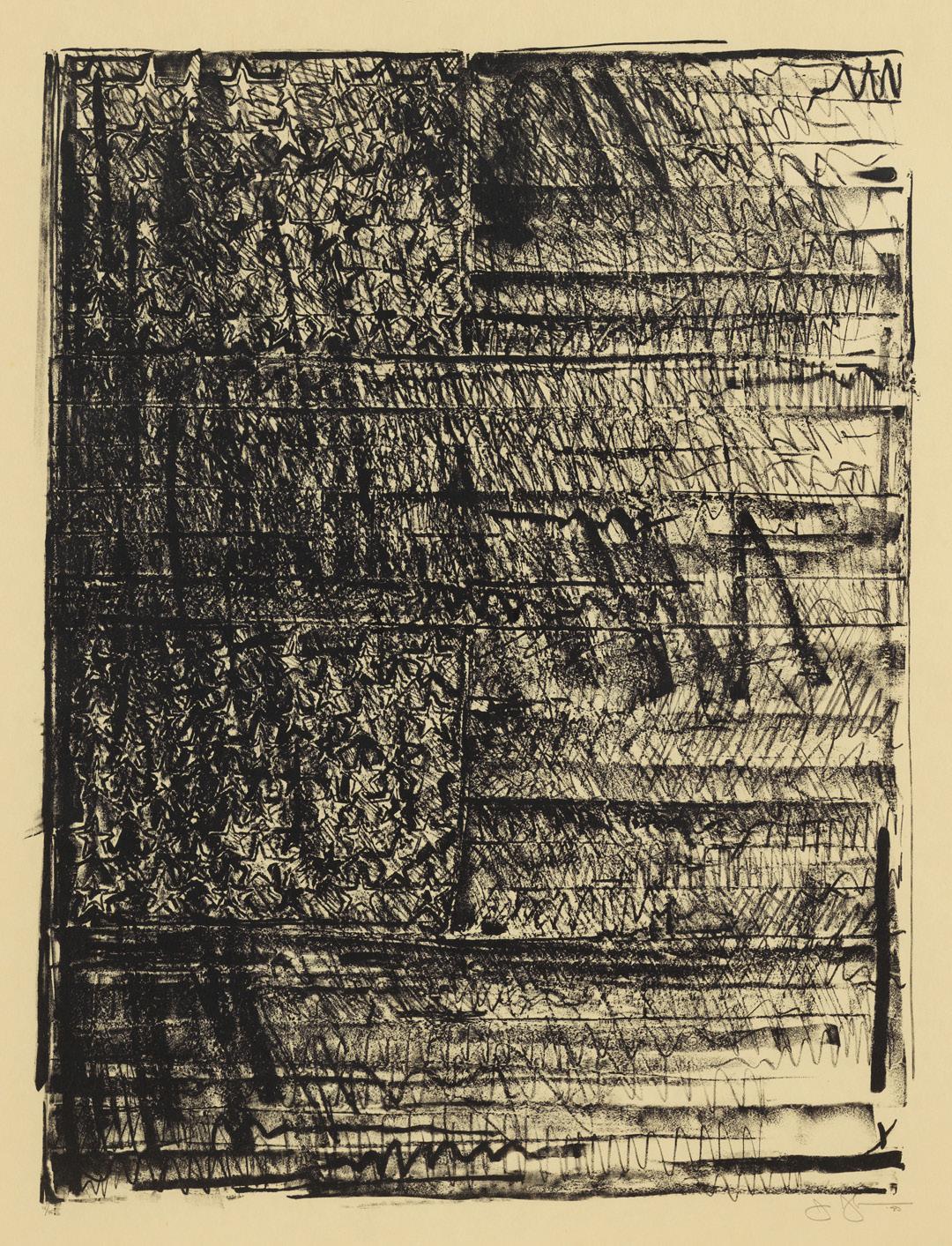
Lithograph
Sheet size: 41 x 29 inches
Printer and Publisher: Gemini G.E.L., Los Angeles Edition: 45, plus proofs
Catalogue Raisonné: ULAE 212 Signed, dated, and numbered
Joan Mitchell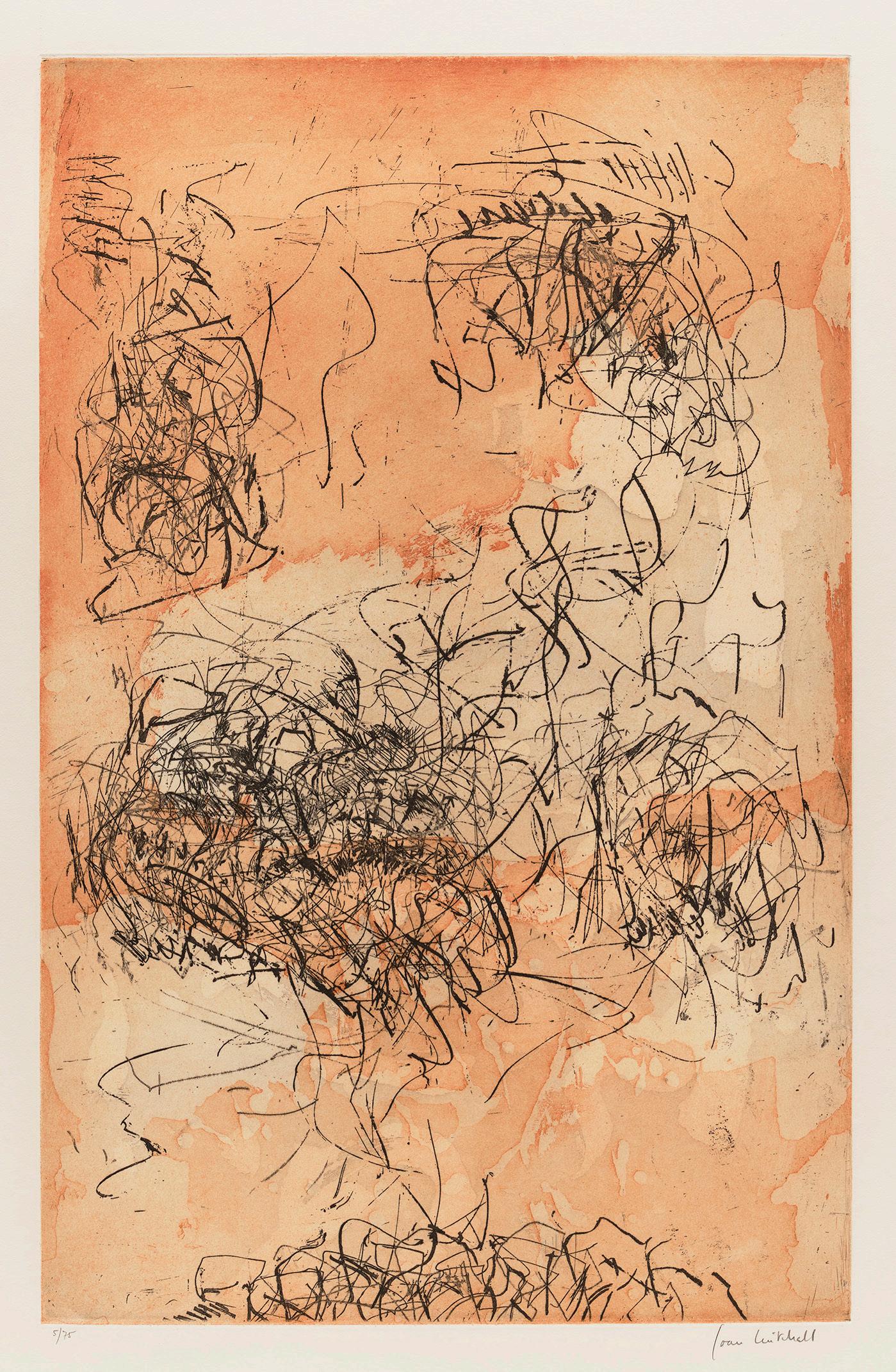
Sunflower V, 1972
Etching with aquatint
Sheet size: 35 7/8 x 24 7/8 inches
Printer: Arte Adrien Maeght, Paris
Publisher: Maeght Editeur, Paris
Edition: 75, plus proofs
Signed and numbered
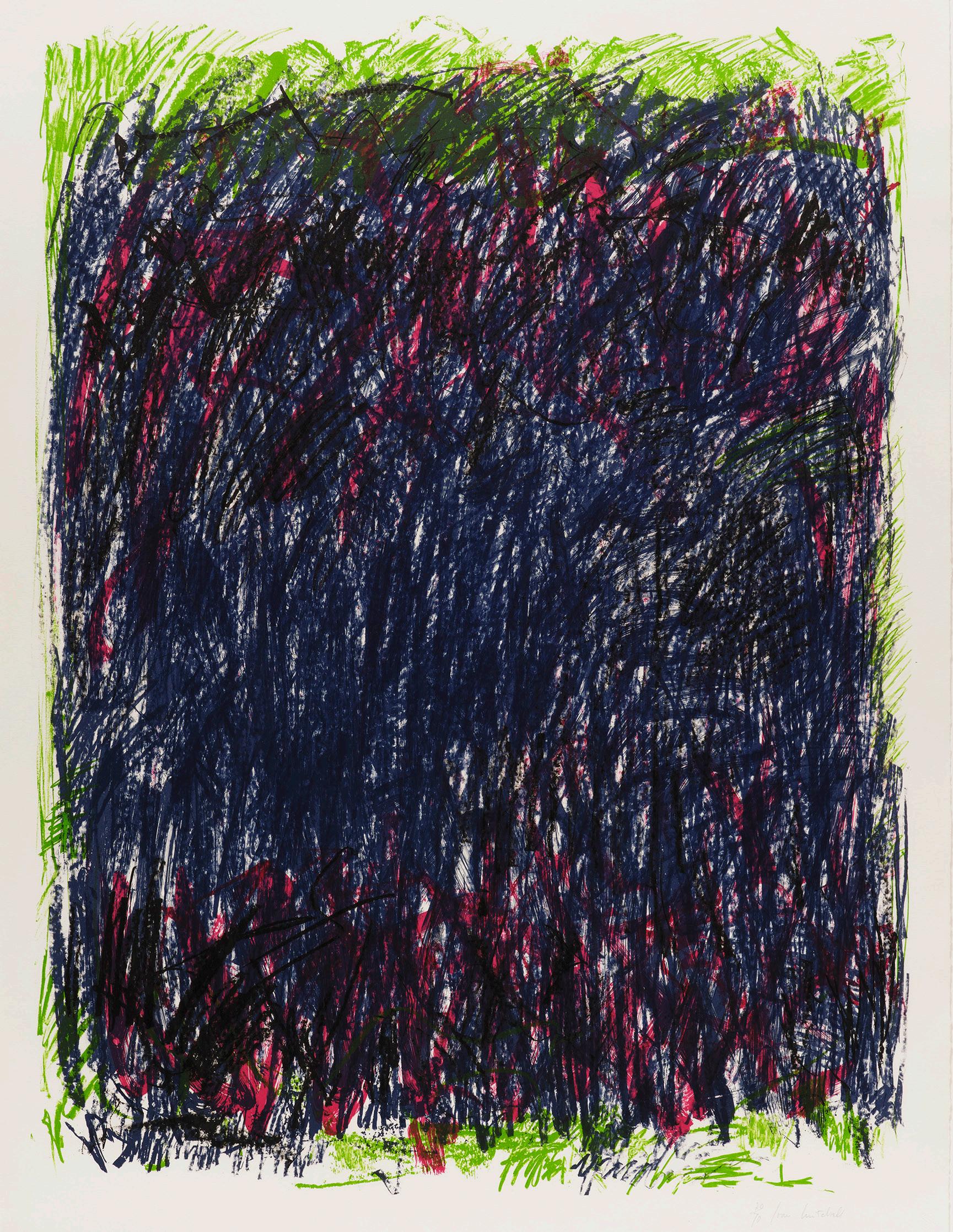
Lithograph
Sheet size: 42 1/2 x 32 1/2 inches
Printer and Publisher: Tyler Graphics Ltd., Bedford, New York
Edition: 70, plus proofs
Signed and numbered
In 1981, Joan Mitchell (1925–1992) produced a series of prints at Kenneth Tyler’s workshop in Bedford, New York aptly titled the Bedford Series. The series includes several sub-groups, including Bedford, Sides of a River, Brush, and Flower. Bed ford II is among the most richly dense and painterly prints from the series, featur ing eight layers of colored ink, most of them aquamarine.
Endlessly seeking to translate her feelings into her art, Mitchell approached print making with the same openness to improvisation and revision with which she applied to painting. Aiming to facilitate Mitchell’s process of experimenting with color and composition, Tyler gave her sheets of Mylar on which to draw her im ages for the Bedford Series prints. The sheets could be layered easily to view an entire image or selections from it, and inspired Mitchell to incorporate more colors into these prints than she had used in any previous printed works. To execute the multifaceted prints, the printmakers transferred Mitchell’s drawings directly from the Mylar to lithographic plates.
Recalling the experience of working with Mitchell, Tyler once remarked, “I [had] never worked with anyone since [Josef] Albers that had such a keen knowledge of color and how colors interacted with each other.” In fact, Mitchell experienced synesthesia, wherein she associated certain people, sounds, and even words and letters with specific colors. This heightened sensitivity to color illuminates why Mitchell described her artworks as being “about a feeling that comes to me from the outside, from landscape.”
Although Mitchell had made many prints prior to 1981, Tyler Graphics was the first workshop she encountered where a full range of printmaking techniques were available to her. Tyler referred to the workshop as his “candy store,” and Mitchell embraced the broad expertise of the workshop whole-heartedly. Rather than learn the printing processes herself, she put her ideas in the hands of the printers, often asking Tyler, “which piece of candy do I get today?”
The success of Bedford II comes not only from its range of hues but also the rich density of the ink, which renders the print deceptively painterly. A true collabora tion between Mitchell and Tyler, the print is clearly the product of a master painter and master printer working together to marry aesthetic vision with technical skill.
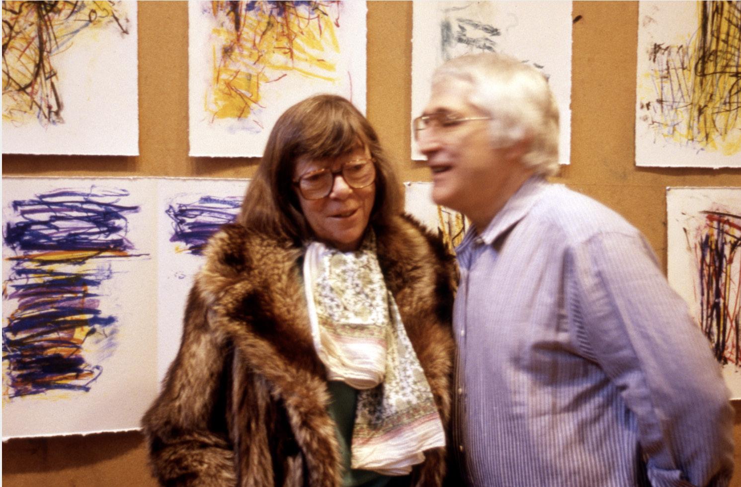 Joan Mitchell and Ken Tyler at Tyler Graphics, 1992

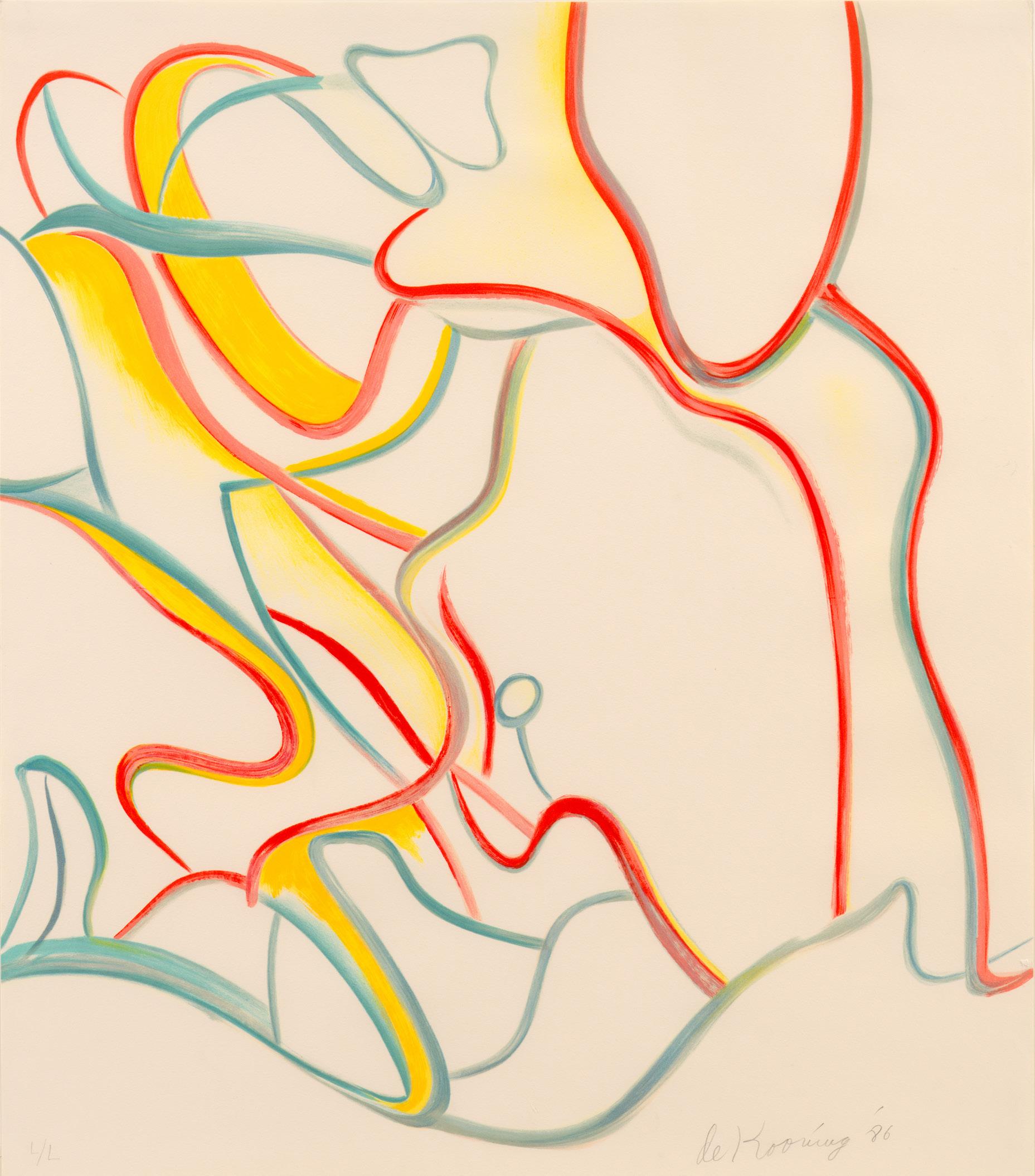
Untitled (Quatre Lithographies), 1986
Lithographs
Sheet size: 28 x 24 inches, each
Printer: Art Estampe, Paris
Publisher: Éditions de la Différence, Paris
Edition: 100, plus proofs
Each sheet is signed, dated, and numbered
The complete set of four lithographs
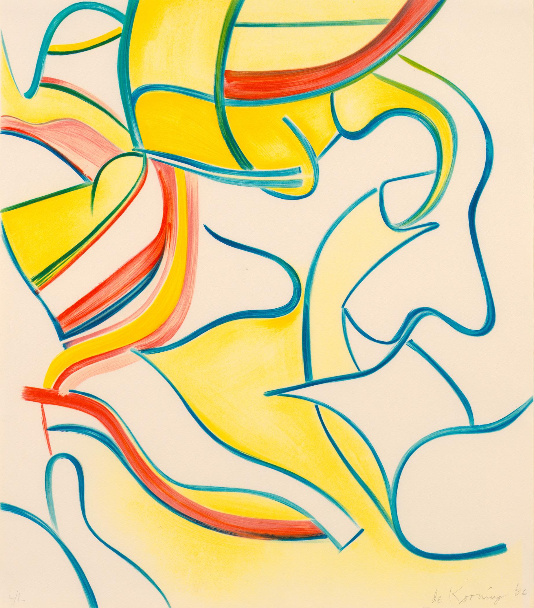
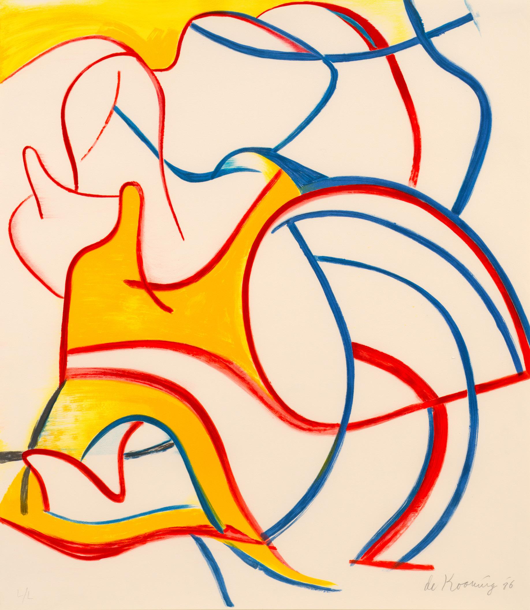
“Later, as I get older, it is such a nice thing to see a nice Matisse... When people say my later paintings are like Matisse, I say ‘You don’t say,’ and I’m very flattered.”
 -Willem de Kooning
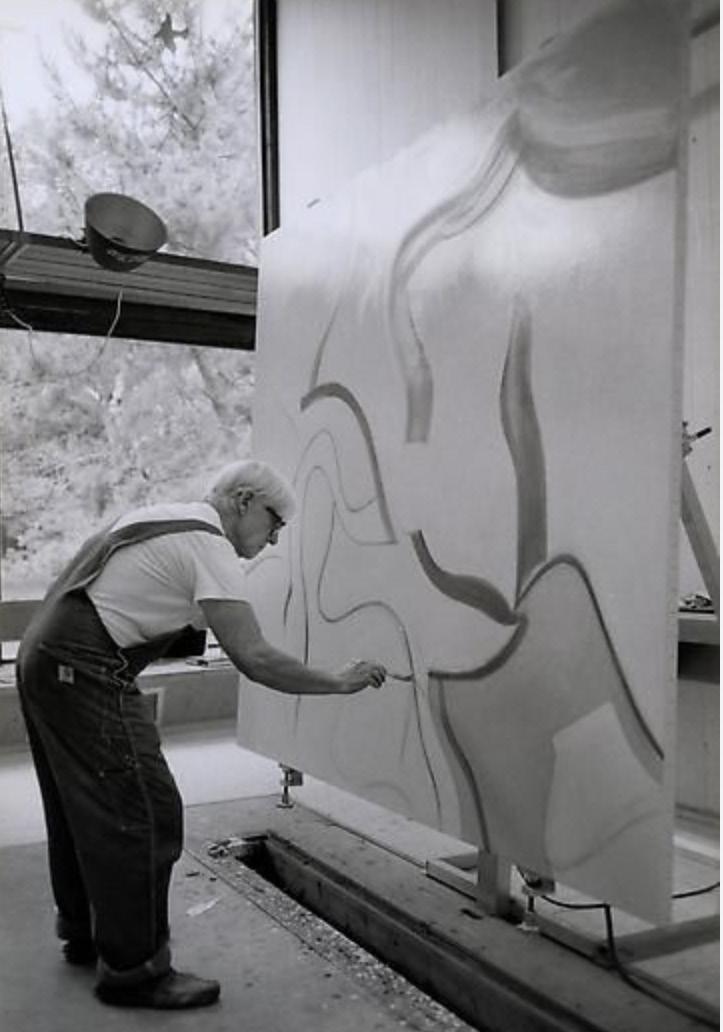
Willem de Kooning, c.1980, East Hampton
-Willem de Kooning
Willem de Kooning, c.1980, East Hampton
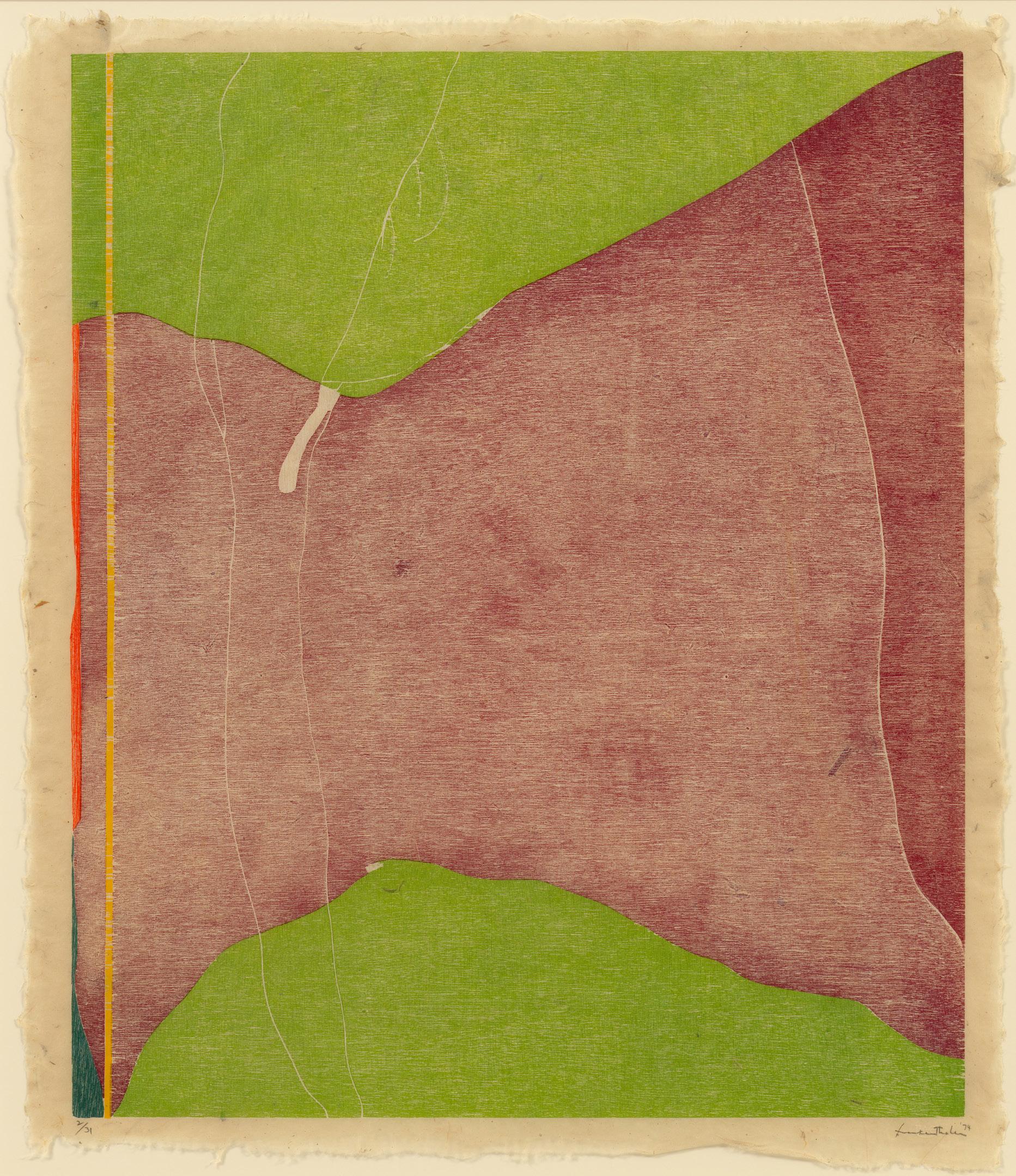
Woodcut
Sheet size: 31 1/2 x 27 inches
Printer and Publisher: ULAE, West Islip, New York
Edition: 31, plus proofs
Catalogue Raisonné: Abrams 47
Signed, dated, and numbered
“There are no rules. That is how art is born.”
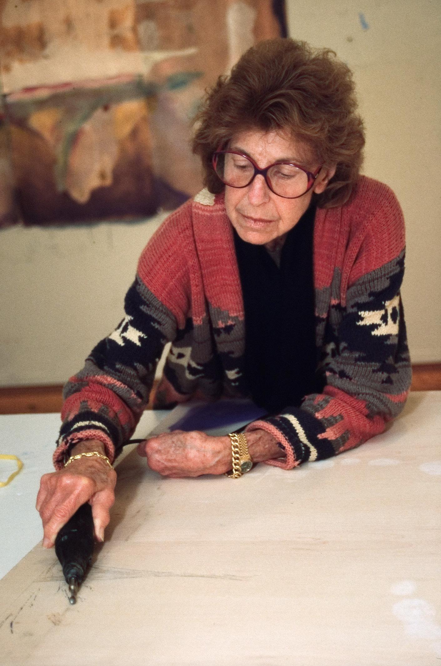
-Helen FrankenthalerWayne Thiebaud
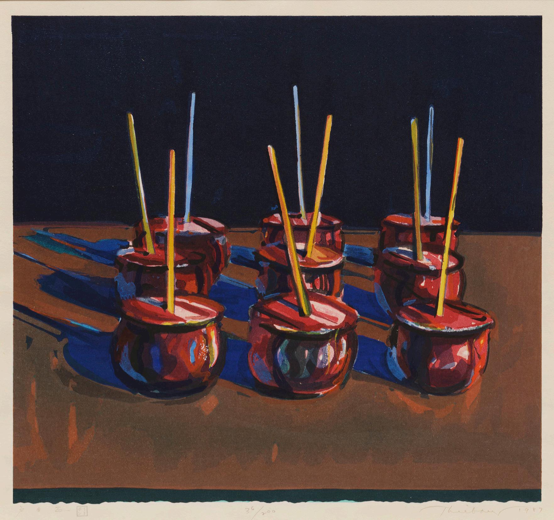
Woodcut
Sheet size: 23 3/8 x 24 1/4 inches
Printer: Tadashi Toda at Shi-un-do Print Shop, Kyoto, Japan
Publisher: Crown Point Press, San Francisco
Edition: 200, plus proofs
Signed, dated, and numbered
Screenprint
Sheet size: 23 x 31 inches
Printer: Aetna Silkscreen Products, New York
Publisher: Leo Castelli Gallery, for the Pasadena Art Museum, California
Edition: 300, plus proofs
Catalogue Raisonné: Abrams 47
Signed and numbered
Landscape with Poet, 1996
Lithograph with screenprint
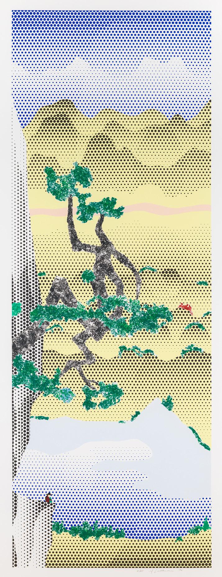
Sheet size: 90 1/4 x 36 inches
Printer and Publisher: Gemini G.E.L., Los Angeles
Edition size: 60, plus proofs
Catalogue Raisonné: Corlett 238
Signed, dated, and numbered
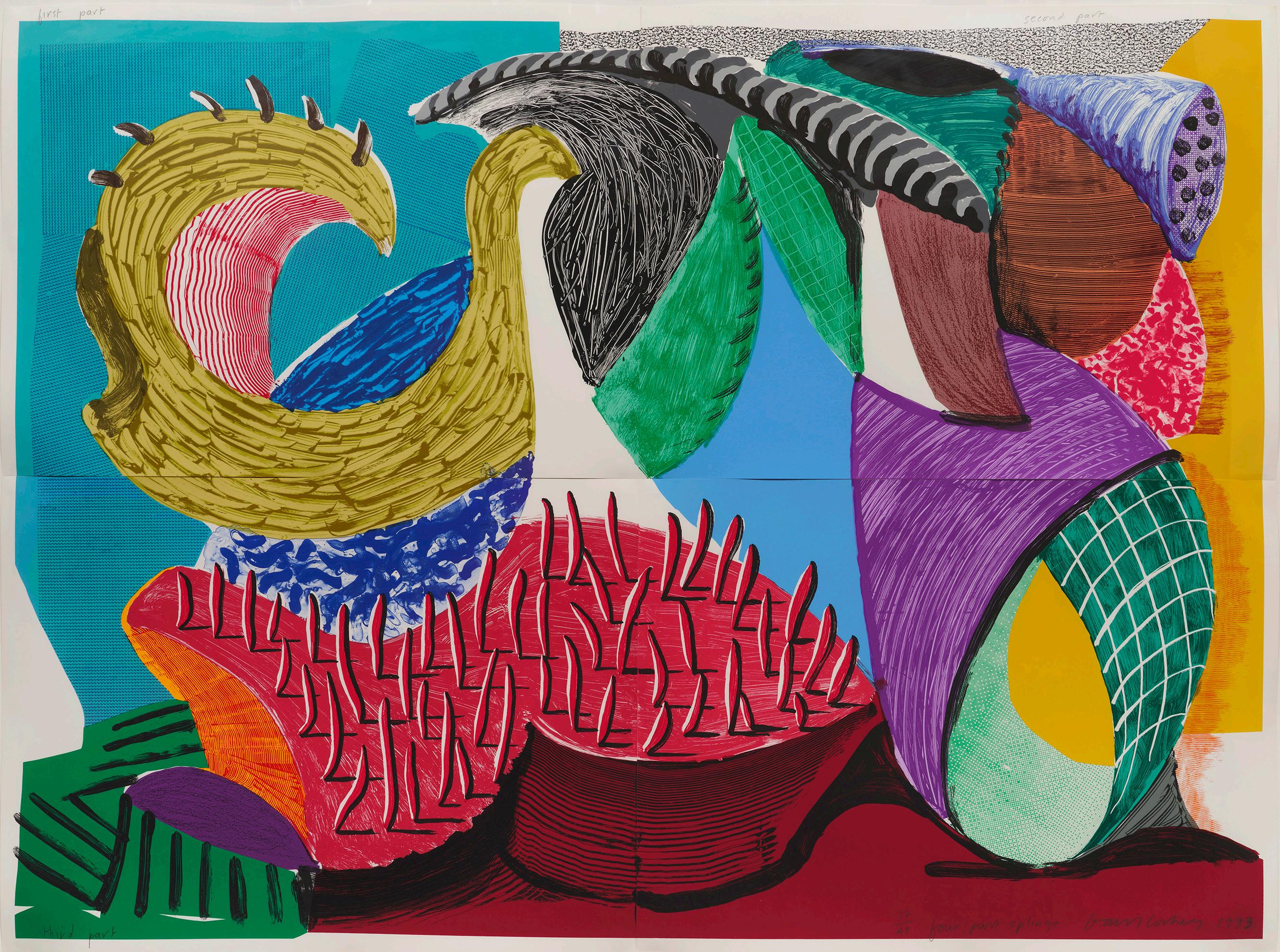
Sheet size: 49 x 66 inches, on 4 sheets
Printer and Publisher: Gemini G.E.L., Los Angeles
Edition: 48, plus proofs
Catalogue Raisonné: MCAT 334
Signed, dated, numbered, and titled
SUSAN SHEEHAN GALLERY 136 East 16th Street New York, NY 10003 Tel: +1-212 489-3331
info@susansheehangallery.com www.susansheehangallery.com
