23
B L AC K T I E O R D E E P B LU E
The Seamaster Diver 300M will take you from the bottom of the sea, to the centre of attention and to the top of the world.
SEAMASTER DIVER 300M MASTER CHRONOMETER
Exclusively at OMEGA Flagship Boutiques and selected retailers worldwide
w w w. s a c a i . j p
44125 COTTON VELVET DOWN-TC WITH REVERSE LAMY FLOCK GIACCONE, CON CAPPUCCIO, REALIZZATO IN VELLUTO DI COTONE STRETCH CON COMPONENTI IN NYLON LAMY, FLOCCATO INTERNAMENTE. IL CAPO FINITO È IMBOTTITO CON LE MIGLIORI PIUME SPECIFICAMENTE TRATTATE PER RESISTERE ALLA TINTURA IN CAPO. UN ELABORATO PROCESSO DI DOPPIA TINTURA DONA DIVERSE TONALITÀ ED INTENSITÀ DI COLORE AL CAPO FINITO. L’AGGIUNTA DI UNO SPECIALE AGENTE ALLA RICETTA DI TINTURA RENDE IL CAPO ANTI GOCCIA. DUE TASCHE A SOFFIETTO CON PATELLA CHIUSA DA BOTTONE, AI LATI, SECONDA TASCA CON ENTRATA CHIUSA DA ZIP. GUANTO MANOPOLA IMBOTTITO IN PIUMA, TRATTENUTO ALLA MANICA DA AUTOMATICO. CHIUSO DA ZIP A DOPPIO CURSORE.
WWW.STONEISLAND.COM
41323 GARMENT DYED CRINKLE REPS NY DOWN ANORAK, CON CAPPUCCIO, IN LEGGERO REPS DI NYLON ULTRA BATTUTO, RESINATO ALL’INTERNO PER UN’AZIONE ANTIVENTO E MODERATAMENTE ANTIPIOGGIA. IL BAGNO DI TINTURA, GRAZIE ALLA PENETRAZIONE DISOMOGENEA NEL TESSUTO RESINATO, DONA ALLA SUPERFICIE UN ASPETTO MOSSO E MAREZZATO. L’AGGIUNTA DI UNO SPECIALE AGENTE ALLA RICETTA DI TINTURA CONFERISCE AL CAPO CARATTERISTICHE ANTI GOCCIA. IL CAPO È IMBOTTITO CON LE MIGLIORI PIUME, OTTIMIZZATE PER LA TINTURA IN CAPO. TASCHE DIAGONALI CHIUSE DA ZIP SU FETTUCCIA DI NYLON. POLSI ELASTICIZZATI. APERTURA DIETRO CON ZIP INVISIBILE. CHIUSO DA MEZZA ZIP NASCOSTA.
WWW.STONEISLAND.COM
A SERIES OF SUSTAINABLE PIECES DESIGNED BY JADEN SMITH, DEDICATED TO THE BEAUTY AND POWER OF NATURE. ALL PIECES IN THE FORCES OF NATURE COLLECTION HAVE BEEN ENGINEERED WITH SUSTAINABLE MATERIALS AND DESIGN INNOVATIONS DEVELOPED BY G-STAR RAW.
G-STAR.COM/FORCESOFNATURE
35 YEARS of TOUGHNESS An interview with Chief Designer Ryusuke Moriai
It’s nearly impossible to not recognize a G-SHOCK watch when you see one. Yet G-SHOCK takes the adage “there’s a watch for every occasion” very seriously – from the requisite diver’s watches for the French Navy and zero-gravity pieces for NASA, to the ones that can graph moon phases and tides for sailors and surfers, to watches with a built-in metronome for aspiring musicians. There are even sleek stainless-steel options for executives that will do just fine whether they’re dropped on the floor of a conference room or hurled out the window, as the father of G-SHOCK Kikuo Ibe did 35 years ago, mercilessly tossing 200+ prototypes out the third-floor men’s washroom of CASIO’s Research and Development Center in his journey to develop the world’s first shockproof watch. To celebrate 35 years of watches that aim to accompany every form of employment and hobby imaginable, G-SHOCK has lined up a slew of special releases and collaborations with the likes of Kolor, Asics, Porter and artist Yu Nagaba, to be released throughout 2018. Chief designer Ryusuke Moriai speaks to us about G-SHOCK’s past and future as the iconic watch turns 35 years old.
On form and function “The first G-SHOCK was launched in 1983, but up to 1995 it was strictly a working watch, for people who needed a very durable watch. Small watches were fashionable in the early 1990s, so most people didn’t like G-SHOCK because they were too big. But when the boom in skateboarding started in ’95, young people started wearing baggy clothes and they liked G-SHOCK because it matched that whole style – plus the watch is accident-proof, so that worked well for them, too. Young people started wearing them in Japan and it spread to other parts of the world.”
On sentimental value “When we first designed G-SHOCK, it was just supposed to be shock-resistant. It was very functional. Now it’s become a culture, through our work with other artists and labels, through being worn by so many young people now, and young people who grew up with the watches who are now adults – it’s become a part of their memories and lives. I’m very happy that G-SHOCK has become more like a ‘happening’ than just an object.”
On innovating “Of course, there are a lot of different ideas, but from our point of view, it’s a watch. It has to stay a watch when you wear it. Smartwatches, they’re popular now, but to me, it’s just changing the outside, the packaging. Nothing changes on the inside, so they’re boring. I don’t want G-SHOCK to be like that. I want to surprise people by introducing new elements.”
On unlikely inspirations “In 2008, we wanted to design something really different. We wanted this new design to come from some element of Japanese subculture that also resonates with countries around the world. We chose [popular robot anime series] Gundam and [sci-fi subgenre] steampunk and conducted a study in Japan. It turned out that more people liked steampunk, so we worked elements of steampunk into GA-110’s design – you can see influences in the casing shapes, metal accents and watch hands – and this model is super popular, not just in Japan but all over the world. Not many people actually know it comes from steampunk.“
On the future “It’s a secret. I’ll surprise you one day.”
120
FEATURE
017
SEQUENCE
PUBLISHER Kevin Ma EDITOR IN CHIEF Kevin Wong EDITOR Vanessa Lee DESIGN Ed O’Brien Design CONTRIBUTING EDITORS Mallory Chin Eddie Eng Keith Estiler Petar Kujundzic Arby Li Emmanuel Maduakolam Andrew Pulig Jake Silbert GUEST EDITORS Josh Davis Gavin Yeung ADVERTISING Jamie Chan Crystal Choi Anthony Esponda Zoe Gauntlett Kendall Hall Paul Le Fevre Fay Kwong Victoria Morris Huan Nguyen Josh Parker Ryan Pun Lily Richardson Jacqueline Ruggiero Alysia Sargent Tiff Shum Chad Steiner Matthew Talomie Jenny Tong SPECIAL THANKS Jen Appel Stephanie Au Paulo Calle Matteo Carcelli Kevin Chao Falcon Chen Bennet Chow Elite Models Yudai Goto Jordan Hall Heison Ho Akiharu Ichikawa Orion Johnson Koto Kurasawa Eddie Lee
ISSUE 23
Jinichi Leung Anny Li Sasha Mademuaselle Kyle Ng MAC Cosmetics Kyle Reyes Ian Salgado Kelly Tigera Tolia Titaev Together Associates Wardartists Wilhelmina James Whitner CONTACT magazine@hypebeast.com 12th Floor 10-16 Kwai Ting Road Kwai Chung Hong Kong +852 3563 9035 PRINTING Asia One Printing Limited In Hong Kong All Rights Reserved ISSN 977-230412500-0 13th Floor, Asia One Tower 8 Fung Yip Street Chai Wan, Hong Kong +852 2889 2320 enquiry@asiaone.com.hk HYPEBEAST.COM PUBLISHER 101 Media Lab Limited 2018 September © 2018 Hypebeast HYPEBEAST® is a registered trademark of 101 Media Lab, Ltd.
018
HTTPS://WWW.HBX.COM
SEQUENCE
ISSUE 23
HIGHLIGHTS
024
KIM JONES
028
STUDIO HAGEL
042
VERDY
056
SIGNS BY THE ROADSIDE
072
ANDREW RICHARDSON
086
DEV HYNES
098
ISSUE 23
020
TABLE OF CONTENTS
SHIN MURAYAMA
110
NO ROSE WITHOUT A THORN
120
MIDNIGHT STUDIOS
134
SNØHETTA
150
YOSHIROTTEN
162
PONY BOYS
172
GUIDE
186
Sequence
021
SEQUENCE
ISSUE 23
We thrash and flounder without 10-step programs or clear-cut directions. Yet most degrees are laughably out of sync with the world of gainful employment, and our careers don’t go exactly as we naively imagined they would when we were younger. We seek fulfillment—some of us find it in one year or twenty, but more of us never do. Does being part of the system mean we know what we’re doing? That it’s herding us in the direction we want to go via a reliable flow chart of black-and-white decisions?
HYPEBEAST 23
Our lives are set to follow a certain structure. We’re taught to seek internships, apprenticeships and accreditations before shooting for the real deal. We’re told our fates hang upon test scores, college majors and whether or not we pay taxes. Our time is ordered into perfect units so we can dedicate days, block off hours and count backwards to occasions that deserve the precision. If the day comes that we finally find ourselves freed from the system, we consider ourselves not free, but rather, lost.
The stories within this issue give us a resounding no. The following pages fail to document a single rise to success. What we assume to be a linear trajectory looks more like someone starting his own design studio when nobody would work with him,
022
EDITOR'S LET TER
like Mathieu Hagelaars of Studio Hagel. It looks like Andrew Richardson expending blood and sweat, braving judgment to produce a magazine that many even today are shy to open, and then doing it again with shirts and accessories. It’s Shin Murayama, who works fastidiously out of his home, not knowing or caring how his work is perceived, to have his pieces end up as marquee accessories on runways halfway around the world and on A$AP Rocky’s album cover. Our cover story traces the path of graphic designer Verdy, who in trying to find personal meaning in his work ended up as the head of a quickly exploding label. Like us, our idols often don’t know what they’re doing. To go forward, they experiment with detours
and dead-ends in the hopes that enough people are willing to take a chance on their journey. They are breaking the mold both ways. Sequences bring to mind parameters, rules and steps, only to show how important it is to disregard all of the above. As we increasingly witness the stories of successful creatives in our culture, the “order of things” seems to love chaos more than any real rhyme or rhythm— meaning that, while each story has a beginning and an end, the path we take to get there is wide open.
KEVIN WONG EDITOR-IN-CHIEF
BRAIN DEAD X BEAMS X REEBOK CLASSIC
SEQUENCE
ISSUE 23
Los Angeles-based Brain Dead has once again teamed up with Beams for an exclusive collaboration alongside Reebok. The pair of Classic Leather running shoes, blends together tonal blues and a pop of pink with a fusion of hairy suede and smooth grain leather. The collaboration also includes a remastered track suit with an ode to traditional Japanese garments. The suit’s trousers are cropped and tapered while the track jacket exhibits a collarless noragi-style finish. All navy-hued items sport a graphic that combines the Brain Dead silhouette logo with Reebok’s wheel branding. The Brain Dead & Beams Reebok Classic Sneaker retails for approximately $116 USD.
C
M
Y
CM
MY
CY
CMY
K
024
THUNDERBOLT PROJECT BY FRGMT X POKÉMON
SEQUENCE
ISSUE 23
No stranger to collaboration, Hiroshi Fujiwara presents his latest cross-branded product alongside storied media franchise Pokémon. Aptly named the THUNDERBOLT PROJECT after Pikachu, a key character in the ongoing series, the collaboration consists of a flurry of T-shirts, outerwear and accessories, marked by collaborative graphics. Alongside Pikachu itself, the collection references other symbols including Poké balls, lightning bolts as well as other Pokémon characters. The Fragment Design and Pokémon collaborative pieces coming in black and white with yellow accents could be found in select retailers in Tokyo starting November. © 2018 Pokémon
026
SEQUENCE
ISSUE 23
Kim Jones
028
FEATURE
WORDS
VA N E S S A L E E PHOTOGRAPHY
M O R G A N O 'D O N O VA N SOPHIE CARRE BRETT LLOYD
Evolutionary
029
SEQUENCE
ISSUE 23
What do we really know about Kim Jones? The current generation knows only to credit the London-born designer with making labels like Supreme and Fragment Design regular parts of the luxury fashion lexicon, when the mere idea would have been laughable just five years ago. It’s easy to envision a pivotal figure such as Jones, magicking these zeitgeist-defining moments into being with the kind of panache usually reserved for the most hysterical of fashion caricatures. Yet the shy, mild-mannered designer—affectionately described as “one of the nicest people in fashion”—is anything but flashy. While well-spoken, you get the feeling he’s a little uncomfortable when locked in place for too long. His body seems to gravitate elsewhere as he speaks, perhaps to fiddle with a jacket or journey to a country most people have never heard of. A childhood spent travelling around Africa and South America with his family has imbued the designer with a lifelong habit of chasing far-flung destinations, along with an intimate love for the natural world and its cultural richness. It’s unsurprising that growing up on the road would result in an eternally-hungry mind that takes in new sights with uncritical enthusiasm. The designer’s passion for collecting—he admittedly has 600-700 pairs of Jordans crammed into the cupboards of his Paris apartment—is
simply the physical manifestation of an encyclopedic brain, full to bursting with myriad objects and ideas. With so much information stored away, it’s not hard to see why he has an unmatched eye for coupling the most unlikely elements, creating what then goes on to become the most obvious unions we can’t imagine ourselves without. Along with such ingrained bazaar-trawling instincts and passion for artifacts comes his preference to shine the spotlight on things he loves, rather than himself—even if it’s during his own debut as Dior’s new menswear director. Case in point: thousands of pink-and-white blooms, comprising a gargantuan KAWS BFF sculpture, taking center stage at Jones’ first show for Dior. The decision to work with KAWS could not have been a more Jonesesque move—Brian Donnelly’s cultural cache within both fine art and streetwear circuits reflects Kim’s own position of having a sneakered foot perfectly placed on both ends of the spectrum. “I think KAWS is the most influential artist for millennials apart from Takashi Murakami. I think he’s super chic and his work speaks universally to everyone; it’s an instant reaction and this is something amazing, when you think about the reach of influence these days,” Jones says. He then cheerfully mentions the iconic bee logo, which he had
030
FEATURE
031
SEQUENCE
ISSUE 23
032
FEATURE
033
SEQUENCE
ISSUE 23
also entrusted KAWS with re-designing for the season. “The result is a very cute bee!” Dior has historically employed a roster of star designers who have indulged both its women’s and menswear divisions in every flamboyant creed, from the sensual drama at the hands of a 21-year-old Yves Saint Laurent, to baroque Amazons who ripped through the runways under John Galliano, to the adroit pallor, skinny suits and cigarette smoke during Hedi Slimane’s tenure at Dior Homme. The maison itself has been so effusively piloted by the checkered genius of its previous directors that many have forgotten that the label’s founder originally rose to fame with the simple elegance and luxurious construction of his designs. “It’s all Dior, pre-Dior really,” said Jones, in an apt summary of his vision for the label.
034
His debut collection indeed rushes headlong into the hallowed halls of old-school Dior: there’s the saddlebag, taken from the It-bag status of the early 00s and updated for menswear in 2019, monogrammed outfits and accessories, floral patterns inspired by Monsieur Dior’s dinnerware—all rendered in a delicate-as-eggshells palette of Dior Grey and Dior Pink. “I was really curious—because I always think of the archive as being predominantly a feminine archive. I was inspired by them, and especially by Mr. Dior’s personal interests: gardening, his dogs, his houses and his love for arts,” Jones explains. He creates a mood that harkens back to the maison’s history rather than the brooding looks of his predecessors at Dior Homme. This decision seems a bit strange for menswear until you realize that Jones is just not that interested in the Diorgoing-dark days of recent years. “The collection is very
FEATURE
chic and very elegant. Because that’s what this house is like,” Kim says simply. As evidenced by his time at Louis Vuitton, Jones has a knack for evolving a label to entirely new heights while also remaining stubbornly loyal to its DNA. “Every time I work for a maison, I always play with its codes and the result is always different. So [with Dior] it was taking what the house has done, which is couture and tailoring, and using that into making the new stuff.” Despite his well-deserved status as one of the industry’s most valuable talents, Kim Jones is not another one of Dior’s star designers. His personal code just doesn’t seem to have enough ego for it. His choice of putting a giant KAWS head in the middle of his debut show, ringed by celebrities and VIPs, creates an exciting centerpiece for the surrounding audience, yet also illustrates exactly
how little the designer cares for the limelight. Some may presume that the individuals in the middle circle might have preferred to enjoy the show in peace, but they are wrong. The small group beamed with pride as their friend’s creations began to encircle them on the runway. This is the enigma of Kim Jones: a soft-spoken man who hates being on camera and with whom it’s almost impossible to gain an interview, yet who is also one of the only designers who can pull off closing his last-ever show at Louis Vuitton with a bright-eyed Kate Moss and Naomi Campbell on each arm, and open his first-ever at Dior with Kate, Naomi and many other household-name friends cheering him on in earnest. It plays out on paper like an ostentatious show of celebrity, yet feels natural in reality because of their close relationships with Jones. He expertly manages to both conduct a grand spectacle
SEQUENCE
ISSUE 23
036
FEATURE
037
SEQUENCE
ISSUE 23
“ EVERY TIME I WORK FOR A MAISON I ALWAYS PL AY WITH ITS CODES AND THE RESULT IS ALWAYS DIFFERENT.”
038
FEATURE
and fastidiously shun the spotlight for himself—hell-bent instead on showing things that he deems more worthy— while effectively stamping Dior onto our consciousness in a dozen gentle ways. The designer is nonchalant when we ask about streetwear influences on his work, saying, “It’s my impression of what the house is. I don’t even like the word ‘street.’ I don’t believe in it, because everyone wears clothes on the street. So how can you say ‘that’s street’ and ‘that’s not street’, when it’s worn on the same street?” His collection still exhibits luxury sportswear touches, such as buckle hardware dreamed up by Matthew Williams of ALYX and double-brimmed caps that echo the saddlebag’s silhouette, yet Jones’ main focus for 2019 remained on Dior’s roots in tailoring and couture. The end product was, Jones says with satisfaction, “sportswear with a couture finish.” The phrase seems easy enough to digest until a Google search for “couture sportswear” rewards inquisitive minds with a mere two entries on athleisure and many more others which bear Juicy Couture in all its velour glory. The knife-edged, techy fabrics of the former and the hot-pink tracksuits of the latter are nothing like what Kim Jones has done at Dior so far—a seamless assemblage made from generations of expert tailoring and couturier techniques, set to the cadence of American sportswear: a cloud-like feathered blouse, each feather meticulously trimmed to fronds of various sizes and organized by length just so; leather bags and trench coats, laser-cut in the cannage, or rattan, woven patterns that adorned Monsieur Dior’s furniture; generously-cut suits reminiscent of 1950s-era Dior. Though Jones himself may be reluctant to call his work revolutionary, his time at Louis Vuitton has heralded the label—and subsequently the fashion industry as a whole—into a new era of luxury that segues effortlessly into streetwear without seeming feigned or forced. The way he
chooses to build upon the natural grain of a fashion house makes his work take on a meaning that reaches beyond his own reputation and designs—leaving the maison to continue on after his departure, just a little bit different than it was before he arrived. Just as fashion is evolving more quickly than ever with the usual luxury-streetwear offerings, Jones is evolving it still further at Dior with a possible reprise of gentleman dressing. Pulling on Jones’ latest creations feels languid, thoughtful, somehow less gregarious than the current standard of a “killer fit.” Much as how Christian Dior himself was credited with creating “The New Look,” a silhouette that returned a sense of elegance, luxury and joie de vivre to fashion for women in the post-WWII climate, Jones may have rekindled an interest in looking more sophisticated for 2019. Perhaps we’re ready to put the ugly-chic phase behind us once and for all. Just as how Kim Jones quietly made luxury streetwear a reality we now take for granted, he’s once again this industry’s unassuming shepherd as it begins to mature into something more.
039
SEQUENCE
ISSUE 23
040
FEATURE
041
SEQUENCE
ISSUE 23
S T U D I O WORDS
MALLORY CHIN
H A G PHOTOGRAPHY
TOMEK DERSU AARON
E L 042
A NEW MARK
INTERVIEW
SEQUENCE
ISSUE 23
throughout, calling out to him as future inspiration— should he need it. But how exactly did the designer go from interning at a footwear brand to selling sneakers, then finally to designing for the industry’s elite?
“I’m not a customizer. I’m a designer,” Mathieu Hagelaars says adamantly. Dressed down in a white Champion tee and skinny jeans, shoulder-length hair carelessly shoved behind both ears, Mathieu welcomes us into his studio with a toothy grin. Although the footwear designer does not consider himself a sneakerhead, his studio is filled with odd sneaker parts, sketches for new shoes emblazoned on whiteboards stationed around the space, and various fabrics from big sheets of it to the tiniest scraps strewn about: an organized mess that shows visitors the exact processes that go into making his one-of-a-kind footwear. As we continue through the studio space, sneaker concepts such as the Nike Zoom Air Mariah Flyknit silhouette with its sole replaced by foam pellets, and a Nike Cortez assembled by vibrantly-colored utility straps, are displayed
Starting as a passion project on Instagram, Hagelaars’ sketches-turned-concept #makersmonday series quickly catapulted him onto the radars of Virgil Abloh, Daniel Arsham and Takashi Murakami. The results were numerous collaborations with Off-White™, creating a one-off pair for Murakami, and finally an exciting experiment with the adidas Futurecraft 4D. Relying heavily on trial-and-error, Hagelaars generally starts his work without a plan in mind. “During this process I keep all options open and I fail a lot. Even while deconstructing a sneaker, you’ll find interesting details that you don’t see at first,” he explains. “These surprises can influence the idea I had in the beginning, but mostly they end up as the best results.” As he meticulously works away at his latest prototype, with us on standby, he ensures each of his intricate designs are infused with Studio Hagel’s DNA, all while keeping each brand’s identity intact. “In my opinion, that’s the way to create new things.”
044
INTERVIEW
045
SEQUENCE
ISSUE 23
046
FEATURE
047
SEQUENCE
ISSUE 23
048
INTERVIEW
Q&A
How did Studio Hagel begin?
I was already active in the footwear industry but not in design. During my career I found out that the product and creation are the things that interested me the most, so I focused on getting closer to the product. I’ve grown up in fashion as both of my parents were creatives in the fashion industry, but I didn’t go to design school. Not having experience in footwear design and not having a design degree were the main reasons why, in the beginning, nobody wanted to hire me as a designer. That didn’t hold me back from starting my own design studio. I believed I could be an addition to the fashion world. Why do you think people are drawn to your work?
My main focus is to bring new things. I experiment a lot
and I’m not afraid to show designs that can be seen as “ugly.” As long as I see potential in it, then it matters to me. All the creations you see on Instagram are the results of me playing around in the studio, having fun and focusing on innovation. What you see is truthful and sincere.
049
SEQUENCE
ISSUE 23
in that white/pink combination. Yes, pink! I loved those
“ EVEN WHILE DECONSTRUCTING A SNEAKER, YOU’LL FIND INTERESTING DETAILS THAT YOU DON’T SEE AT FIRST."
shoes. When they got a re-release, I bought them immediately. After the Pegasus I had a pair of Nike Uptempo, black with gold windows. Sometimes I miss the pre-Internet days, where you literally had to go to the store or look at people’s feet to see new drops. Do you think customized sneakers are as impactful
as they used to be?
It’s a positive thing that there are more customizers out
there. They bring out ideas on sneakers in their own way. Of course, there's a big difference in the quality of how well the products are made, but the “competition” encourages every customizer to be creative and to bring out better and more original ideas. Customizers have the ability to release products way faster than the big sport brands. This way, they can react to a trend instantly. Big brands like Nike, Adidas and Puma are way more ahead when it comes to groundbreaking
Describe how you go from sketches to physical
designs and innovations. This “race” keeps also the
Most of the time, I just start. It’s a very hands-on
effort into a product.
big brands sharp and encourages them to put more
representations and your inspirations behind them.
approach. I look at sneakers that I have and what material I have in my studio. Sometimes I get inspired
What do you find appealing about customization?
by the material and sometimes I get an idea when looking at an existing design or even just one detail.
And why work with sneakers in particular?
I’m not a customizer, I’m a designer. I get a lot of
During this process I keep all options open, and I fail
requests from people if I can make them a pair, but that’s
a lot. Even while deconstructing a sneaker, you'll find
not what I do. I design collections for brands, give a
interesting details that you don’t see at first. These
creative impulse on their collections or another direction.
surprises can influence the idea I had in the beginning
The experiments you see on Instagram are a part of my
but mostly end up as the best ones. All these creations
sketches. It's a different way of sketching compared to
aren’t an end result; they’re a base for the next steps.
drawing. I find that I come up with totally different ideas
Did you always collect sneakers? What was the
and the other way around. The prototypes are a base
I always wore sneakers but wasn’t really a collector.
on them or go straight to a prototype that embodies
I remember that Foot Locker opened a new store in
my idea. So, in a way, you can say that I make my own
while making a prototype instead of drawing a concept, for future designs; I start drawing my designs based
first sneaker you remember owning?
the city nearby where I grew up. We went there every
inspiration. The variety of sneakers is huge and there
time to check out the new Air Maxes and Jordans. Air
are endless possibilities. There’s so much going on in
Maxes were huge in the Netherlands when I was in
one sneaker and that gives me a lot of possibilities.
high school because of the gabber scene. But the first
Next to that, I like wearing sneakers so I can come up
sneaker I owned was a pair of Nike Air Pegasus ’89s
with things that I would like to wear myself.
050
INTERVIEW
051
SEQUENCE
ISSUE 23
052
INTERVIEW
053
SEQUENCE
ISSUE 23
054
INTERVIEW
"ALL THESE CREATIONS AREN’T AN END RESULT, THEY’RE A BASE FOR THE NEXT STEPS.” Who were your favorite people or brands to work
with?
I liked working with Virgil and admire his way of working. He doesn’t settle down and strives for perfection. I’ve learned a lot from that. Takashi was especially interested in my creativity, so I could do everything I wanted. Imagine what it does to you when a living legend like
Takashi says he appreciates your creativity! Puma, on the other hand, was a completely different project and company to work with. It was my first experience with a sports brand on a bigger scale. Working with
swoosh, for example, is perfect for holding two different
the abilities that they have made me challenge myself
patterns as a part of a fastening system or integrated
even more.
more in a silhouette. I try to push the boundaries by experimenting and see how far you can push a design but still maintain the brand's identity. In my opinion,
What do you think is behind the public obsession
that’s the way to bring new things.
towards sneakers?
The endless variety and possibilities. There’s so much out there and there’s so much to come. For the past
Where do you see Studio Hagel in the future?
generations all the breakthrough footwear-innovations
The next step for Studio Hagel is to take experimenting
were in sneakers. And I mean in every sense: comfort,
with shoes to a next level. Now I’m working with the
material, silhouette, aesthetics, etc. So I can imagine
tools and machinery I have in my studio, but what if I
that’s the main reason why sneakers are picked up by
could use my approach with more advanced techniques
all sorts of subcultures, athletes, fashion addicts ,and
and other ways of producing shoes? The big sport
the music industry throughout the past generation.
brands have access to more innovative techniques, so I can’t wait to get my hands dirty with that. Next
You explore branding and brand identities in your
to that, I’m working to bring an actual product to the
In a lot of sneaker designs, branding is done afterwards
to release a physical product that embodies the same
market. I get so many requests on Instagram, so I want
projects, why?
(or it feels very unintegrated). Branding is seen as a
DNA as my creations on Instagram. I’m also about
final touch of the design. I like the idea of branding
to start some interesting projects, but I can’t share
being functional next to identifying a sneaker. Nike’s
anything for now. Stay tuned. More to come.
055
ISSUE 23
056
FEATURE
WORDS
KEVIN WONG PHOTOGRAPHY
YOSUKE DEMUKAI
057
SEQUENCE
ISSUE 23
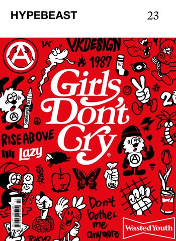
his hometown of Tokyo and throughout Los Angeles. Granted, the first thing GDC brings to mind is a Frank Ocean spin-off, but this simple graphic has proved to be potent, amassing a fanbase with all the hallmarks of a cult following. The work of the Japanese graphic designer has caught fire and spread from the Far East to the West Coast, to adorn musicians ranging from Lil Uzi Vert to A-Trak and Kehlani.
As public image becomes the essential weapon for self-preservation in the fashion and entertainment industries, designers construct personas out of necessity. The stage presence of the man or woman behind the brand almost eclipses the brand itself. Think what the ever-present Jerry Lorenzo is to Fear of God, or the multi-faceted Virgil Abloh is to Off-White. However, that’s not always the case, as seen with Tokyo-based designer Verdy and his freshly formed label, Girls Don’t Cry. Verdy looks almost nondescript compared to the aggressively groomed Lorenzo and the more affable, yet still impeccable, Virgil Abloh. Though Verdy isn’t flashy, he does have a signature aside from the black-rimmed glasses and baseball cap he wears almost every day: a smile stretching from ear to ear accompanied by two fingers, propped artlessly in a jovial peace sign. Verdy’s graphics speak loud enough. The unmistakable lettering of his latest, Girls Don’t Cry, can be seen splayed across the backs of hoodies and tote bags in
Girls Don’t Cry began on the backs of a diverse range of individuals, a trio of words creating the only common element among an otherwise unlinked cast of characters. But, as Verdy explains, his brand has been built on relationships alone. He spends a lot of time talking about individuals who have helped launch his career, Hikaru from Bounty Hunter being first on the list for showing interest in his graphic artwork. Then, Paulo and Reggie of Rare Panther, who introduced him to the streetwear community in LA. GDC grew from the mutual curiosity that results from the meeting of cultures. If it were not for meeting lots of new people and making friends first, Verdy maintains, there would be no Girls Don’t Cry. The label also owes its birth to his wife. The designer initially designed a single GDC T-shirt to give to his wife as a present, one that would function as a mobile business card while she wore it. “They might even ask, ‘What brand is that?’” he jokes, mirth lighting up his features. According to Verdy, he’s made it this far only because of other people: friends, mentors and one very patient woman. At 31 years old, Verdy looks like he will head down a path similar to that of Nigo and Jun Takahashi, as both designers single him out for collaborations and exclusive pieces. Having the support of this tight-knit, pivotal group whose opinion means the world—both to Verdy and to the world itself—has the happy-go-lucky designer poised to pick up a very large and very heavy baton in his homeland Japan, while his name continues to effortlessly spread in the US with Girls Don’t Cry.
058
INTERVIEW
059
SEQUENCE
ISSUE 23
060
INTERVIEW
061
SEQUENCE
ISSUE 23
062
INTERVIEW
something I thought was good. Wasted Youth’s concept is that there’s nothing in life that is a waste even though there are good and bad times, and that in the end everything you’ve come through has been necessary for you. This is the reason why youth culture, skate, punk and hard core—all of which I’ve been influenced by—are all mixed in the graphics. I chose the name Wasted Youth because I wanted people to think that those times they may have felt that their youth has been wasted, the struggles that they’re going through like I have, are what took them—thankfully—to where they are today. The latest brand of them all is Girls Don’t Cry. I wanted to create a project featuring my wife who would always be a great pillar for me. That’s how Girls Don’t cry made
Q&A
its debut; it wasn’t something that was supposed to be sold. One or two years ago in LA, there was a
You’ve gained global attention most recently with
pop-up collaboration with Carrots, and I wanted to
Girls Don’t Cry, but before that you had Wasted
give my wife a T-shirt as a present. Well, there are
Youth and Anarchy & Peace. Tell us about those two projects.
many reasons for why it’s a T-shirt—like, when you
The very first project was Anarchy & Peace. I first wanted
meet someone for the first time and introduce yourself
to make a logo that expressed me the best; I mixed
saying that “I’m in graphic design,” the conversation
up the Anarchy logo, which relates to punk and is part
would end: “Oh, are you?” But if you have a wife next
of my roots, and the smiley face because I smile a lot.
to you wearing the T-shirt you designed, it would be
I was wondering how the two could work together. I
easier to follow up by saying “I’m designing things like
tried putting them side by side, putting one on top of
this.” Or the person may even ask you, “What brand
the other, and finally decided to change the yellow
is that T-shirt?” So that’s the reason I thought a T-shirt
smiley face into white and draw an A. Not only was it
would be a good choice.
expressing Anarchy & Peace well, it also represented me very well. I thought that logo was me in a nutshell.
What are the background concepts behind the
actual logo designs? Like the Wasted Youth logo,
After two or three years, I would go to LA and become
for example.
good friends with Reggie, who designed the front cover
The reason it was a can of liquor is because you think a
of HYPEBEAST Magazine Issue 21. From him, I would
lot when you drink. Like, there would be times when you
learn how to create a brand and the discipline to work
make mistakes because you drank too much or maybe
in art. I was always creating graphics for punk bands
think that the result of something might’ve changed
and there were times when I was apprehensive about
had you had more liquor when you were young. So
making them. Wasted Youth was created at this time,
I thought liquor and drugs were a good reflection of
when I wanted to express my feelings 100% and create
what seems to be a waste but is actually not.
063
SEQUENCE
ISSUE 23
064
INTERVIEW
065
SEQUENCE
ISSUE 23
066
INTERVIEW
Fragment Design. Have you ever gotten inspired by Japanese street fashion brands?
I’ve always been influenced by him. Even now, I’d read all the articles in which my senpais [teachers] I look up to are featured. Ever since I came to LA three years ago and became good friends with many people, I always thought that youngsters in LA are constantly keeping an eye on key people such as Hiroshi [Fujiwara], Nigo, Jonio [Jun Takahashi], Hikaru, Takizawa [Shinsuke], Sk8thng. This is only my personal view; Tyler [the Creator]’s generation was the one that witnessed Nigo and Pharrell collaborate and do something. That’s why I started going over to LA and felt the longings the world gave to them. As I experience and grow more, my respect towards my senpais is growing as well. You had many collaborations with popular names such as Union, Undercover, Undefeated and
Emotionally Unavailable. How did you get to
collaborate with them and what were the reasons behind the decision to work with them?
To tell you the truth, for Undercover, I heard rumors that “Mad Store” was going to hook up young artists; I thought “I’d have to go! I wanna do it!” So I approached them. I really thought about it every day for a long time. Even my wife, who had to listen to me go on and on about it, can explain everything [laughs].
What is the background that forms you? How do you think that leverages your style of working in
So, there are times when people approach me and vice
the fashion industry?
I wanted to become a graphic designer when I was in
versa. However, even when I can feel there’s potential,
junior high school. I didn’t really have enough money to
if I have even the slightest anxiety imagining myself
buy clothes, but I saw through magazines when Ura-hara
doing the collaboration, I would try to stay away from
was at its peak, Hiroshi Fujiwara, Nigo, Jun Takahashi,
it as much as I can, because I feel that you can tell,
Hikaru from Bounty Hunter… and I thought they were
when you’re at the point of deciding whether or not
so cool. So that’s how I started to get interested in
to do it, if it’s something that both parties would feel
graphic design, and at first, I copied punk bands’ logos
was worth doing.
and jackets. I was also in a band. I had someone I knew from the studio that I used to practice at, who
How did you introduce your projects to the American
was really knowledgeable about ʼ80s hard core. He
market? Did you have anyone to help you out?
was the guy that introduced me to some of my favorite
Of course, timing was one. Whenever I went to LA
bands: Bad Brains, Black Flag and Circle Jerks, whose
to start something three years ago, I would stay at
music and artworks are also nice.
Paulo [Calle]’s. I went to so many parties and he would
Your style is in some way somewhat similar and
Verdy, a Japanese designer.” After many conversations,
introduce me to lots of people. He would be like, “He’s I would tell them that I was throwing a pop-up; I had
has something that reflects Hiroshi Fujiwara’s
067
SEQUENCE
ISSUE 23
I think that it’s easy for the younger generation in Japan to just go overseas and communicate with the people there. For my generation, I feel like people were more hesitant to go. Things such as values, the way of printing graphics, how to find your way of expression—things that I could not move forward with in Japan—would dramatically change in America. I can’t promise a change to everyone who’s reading this, but since I changed, there may be a chance for it. Do bear in mind that, in the end, cool brands and people are cool regardless of whether they’re in Japan or America, and things that are not cool are just not cool. People who actively share opinions and people who do interesting things will inevitably connect; I believed in this all the more when I went abroad. Who or what drives your desire to create?
To begin, I believe, more than anything, in not forcing it. I would jot down things that I felt and try to reflect it on my next graphic work. It’s difficult to calm yourself down when you’re angry, or try to be angry when you’re not angry; it’s not easy to control your emotions. That’s why I write things down, like my feelings and things that a lot of people come to the venue. I think my brand
I notice during a certain event in my life. Then I would
was well received because I went to LA where the
discuss with my colleagues and friends how I want to
culture is open and I talked to people first, instead of
express those feelings in a particular set of graphics.
introducing my brand right off the bat.
It’s good if the message is easy to understand, but it’s
Not to mention it’s very important to have friends that
adjusting [until I feel it’s right].
not good if it’s too easy. So I would subtly continue support you. You only succeed when you receive many supports, and in my case, I was lucky to have so many
I always have feelings to create every day, but I would
friends in LA, including Paulo, who would upload my
not force myself to do it. It has to happen naturally.
stuff on Instagram and introduce HYPEBEAST to me. What are your prospects for Girls Don’t Cry? What
Do you think the ties between America and Japan
kind of future do you see in it?
are strong in terms of street fashion and culture?
The pace has been really fast, and there is an increase
Every young American is interested in Japanese culture,
in collaborations, but if Girls Don’t Cry gets too busy, I’ll
but they seem to have a store in mind already, such
have less time with my wife, and the original idea was
as Dover Street Market, F.I.L from Visvim, Undercover,
that it’s a gift to my wife so it’s defeating its purpose. So
Bape, Neighborhood—oh, and don’t count out Kuumba
I’d wish to continue at a pace where my wife wouldn’t
and Gr8. Kapital is also popular.
feel lonely [laughs].
068
INTERVIEW
069
SEQUENCE
ISSUE 23
070
INTERVIEW
071
SEQUENCE
ISSUE 23
SIGNS
BY THE ROADSIDE
072
075
077
079
080
081
083
084
LO OKS
I don’t think there are many
brands now that propose real, long-lasting things instead of just luxury, because “luxury” does not mean anything. They don’t really value things. So I want to propose clothes in a very qualitative way. When we make clothes, when I create exclusive fabrics, I want these fabrics to be from now, but also to stand the test of time so it’s in two different times: the time of having the things from now, but also years from now. I experimented with many fabrics and many things for a long time. From paper to neoprene, all these fabrics I used twenty years ago. For me, what I’m interested in is producing new fabrics and mixing things together like a découpage—with streetwear, with the classic, beautiful, traditional fabrics—for me this is modernity. Masculinity depends on the man, so I love the feminine part of some men. I love the masculine as well. It’s not a question of masculinity, maybe the proportion or the fabrics, but there aren’t so many barriers between masculine and feminine. I don’t think they exist any more. Mixing the streetwear fabrics with our beautiful leather and the very precise work we do in our atelier, mixing craftsmanship with streetwear is the basis of the Hermès men’s collection. Also, a sense of humor is important. Having time to do things is a luxury now. You know, everything is going so fast and I love when things go fast. But to do things beautifully, you need time. It’s become the new luxury. VÉRONIQUE NICHANIAN ARTISTIC DIRECTOR, HERMÈS
HERMÈS ALL LOOKS ALEXANDER BORTZ PHOTOGRAPHY MICHAEL MARTIN DEL CAMPO ST YLING JAKE LUKE MODEL
085
SEQUENCE
ISSUE 23
086
087
LIAM MACRAE
PHOTOGRAPHY
J O S H D AV I S
WORDS
ANDREW RICHARDSON FRIENDS WITH BENEFITS
FEATURE
088
But Marlow is not the kind of place to tie down such restless energy. By 13, Richardson was getting friends to
Andrew Richardson spent his childhood in Marlow, England, about 30 miles west of London. Marlow sounds like the stuff of pastoral fantasy: a quaint town of about 14,000 conveniently nestled on the River Thames. Richardson grew up sailing, canoeing and rowing. By his own account, it’s a great place to float through adolescence.
The characters in Richardson’s story, from 20 years ago to today, recur in various forms like an ensemble cast in a skit show. Really, the enduring narrative with Richardson—as New York City’s legendary downtown scene continues to self-reinvent—is one of collaboration. “It’s about a community of people putting each other on,” Richardson says. “Let the market tell you what works and slowly grow from there.”
For someone who has both a magazine and clothing line named after himself, Andrew Richardson uses the word “we” a lot. He doesn’t say “I,” then quickly correct himself, like people do when they mean to take full credit for an idea. He is quick to acknowledge—in an English accent softened by living abroad—anyone who has had an impact on his career. There’s Steven Meisel, the legendary photographer under whom Richardson honed his craft. There was the late Fumihiro Hayashi, who printed the first runs of Richardson Magazine—everyone called him “Charlie Brown.” There’s his ongoing friendship with Supreme founder James Jebbia.
ISSUE 23
089
That’s a pretty liberal use of the word “provocative.” The first issue, published in December 1998, featured Jenna
At 22, Richardson moved to New York City and never quite looked back. Only, in the coolest sort of irony, England wasn’t done with him. By 1998, in the process of working on Madonna’s Sex book with Steven Meisel, Richardson had compiled scrapbooks of analog sex ads. He also had work from his contemporaries: the likes of Glen Luchford, Richard Prince, Harmony Korine. It was Fumihiro Hayashi who first convinced Richardson to compile them into a magazine. Thus, Richardson, the magazine, was born. Soon after, the art director Lee Swillingham covered the magazine in his own publication. It was—what else?—The Face. A publishing company called Little More printed 10,000 copies of the magazine, 500 of which went to Richardson. The rest were distributed throughout Japan and to various parts of Europe, and sold out. “People responded to the magazine. It had very little advertising, very little commercial ambition,” he says, emphasizing “very” on both mentions. “The real ambition was to show interesting stuff, be provocative, and have a clever dialogue.”
drive him to the Great Gear Market in Chelsea, London— then a haven for punks and bohemians—and picking up pieces like he saw in The Face, the iconic English pop culture magazine. Before social media, print magazines were the gatekeepers of cool, dictating the direction of culture page by page. “Having a small one-page article in The Face,” Richardson recalls, “was like Kim Kardashian wearing your clothing on Instagram today.”
“ ORIGINALLY, THE CLOTHING LINE WAS SUPPOSED TO BE A UNIFORM FOR THE SORT OF PERSON THAT WAS INTERESTED IN THE MAGAZINE.”
FEATURE
SEQUENCE
ISSUE 23
090
FEATURE
091
092
Case in point: the newest issue, which marks the magazine’s 20th anniversary. For one piece, Richardson
For Richardson, sexuality is more like a lens by which to filter the content of his magazine. As such, it defies its own perception. Thanks to the industry’s unflagging commitment to certain binaries, porn usually offers an unrealistic portrayal of the sexual experience. But by using sex instead as a lens for its content, Richardson is free to navigate the spaces surrounding a more realistic sexuality. Which is, more or less, the editorial style that has prevailed for the past two decades.
Deeply immersed in post-KIDS downtown New York City, Richardson played in the shadows of the Twin Towers, running past Keith Haring’s Pop Shop on Lafayette Street and over to Save the Robots in Alphabet City—where you might find Grace Jones at an afterparty at 5am. And in that world, sexuality could very well be a dinner topic. When describing the scene, Richardson recalls: “It was super diverse. All these people that had run away from home to New York didn’t give a fuck. Nothing felt weird. The magazine seemed like the most obvious thing to do.”
Jameson—then the world’s biggest porn star—shot by Glen Luchford, as well as Richard Prince’s “Spiritual America,” which featured an 11-year-old Brooke Shields. Richardson has been referred to as everything from an “erotic publication” to an “art porn magazine.” But the founder thinks of the magazine as “a weird environmental reflection”—which, considering his unique context, offers a less superficial perspective.
SEQUENCE ISSUE 23
093
If the magazine is the manifestation of Richardson’s interests, then the clothing line takes that idea a step further. In 2003, around the time of the third issue,
And so, the result of this relatively unplanned, definitely unpermitted excursion ended up being the lynchpin of the 20th-anniversary issue. You may even have thought that Richardson’s Jamaican adventure would make the perfect Instagram story (or highlight). But that particular story is meant to live far beyond 24 hours. “This issue is about acknowledging Instagram,” Richardson explains, “but that you can take from it, rather than always give to it. You can take a technique from Instagram to a magazine, and show something different about what you’re interested in.”
The second was Shades, a strip club that could make you swear off strip clubs or instigate a sexual awakening— depending on which night you went. Richardson mentioned a scenario involving a smaller man, live intercourse on stage, and inventive ways of ingesting alcohol. “I’ve never seen anything like it,” he says—and he’s been to his share of strip clubs.
found Lauren Avery—a burgeoning photographer he noticed on Instagram—decided he liked her aesthetic and flew with her to Jamaica. Working with what he described as a “shoestring” budget, Richardson admits that there was no plan, only two points of interest. The first was the estate of Lee “Scratch” Perry, his favorite reggae artist, who famously declared that he gifted Bob Marley reggae and who also set fire to Black Ark, his legendary home recording studio, in 1979.
But in 2012, Richardson found a new focus. While launching the sixth issue at Tokyo’s Bonjour Records, he whimsically accompanied the release with a run of commemorative T-shirts, as well as a coach’s jacket. The jacket, crafted by repurposing a vintage rain coat from the 1920s, became the brand’s first real endeavor into cut-and-sew. “There were kids lined around the block, buying our pieces by the armful,” says Richardson, still with an air of disbelief. “Then we said, oh, okay, we should probably keep doing this.” Two years later, after slowly building releases—a club jacket here, rugby shirt there—Richardson officially opened its store.
Supreme founder James Jebbia asked Richardson to develop four shirts for an upcoming collection, featuring some prints from the magazine. “We probably never would’ve done any clothing if it weren’t for that collaboration,” Richardson admits. After that, Richardson took a seven-year hiatus, with the founder focusing on creative direction and styling at various fashion brands.
FOR RICHARDSON, SEXUALIT Y IS MORE LIKE A LENS BY WHICH TO FILTER THE CONTENT OF HIS MAGAZINE. AS SUCH, IT DEFIES ITS OWN PERCEPTION.
FEATURE
SEQUENCE
ISSUE 23
094
FEATURE
095
096
So aside from a letterman jacket—which, I’m told, has been painstakingly tailored with a shoulder that drops “just so”—Richardson will collaborate with Fritz the Cat this season, which he describes wryly as the “spirit animal of the brand.” Originally created by spectacularly subversive American illustrator Robert Crumb, Fritz the Cat has a penchant for “smoking joints, trying to get laid, and being totally inappropriate.”
But in terms of Richardson’s brand ideology, Richardson nods to his friend of 25 years: James Jebbia. “James is a very cultured man,” he says, nodding to the breadth of Supreme’s interests—The Memphis Group, Bad Brains, Louis Vuitton and the myriad other partnerships the brand has fostered. “Supreme is like James’ art project. There was no precedent for an affordable brand to educate on those subjects.” Richardson strives to achieve the same effect with his brand—kind of like a wearable cultural almanac.
While a relatively young brand, Richardson’s clothing arm has already developed a distinct design language. Silhouettes like the “Richardson Hardware” shirt or the bomber jacket are ubiquitous among trendsetting downtown circles in New York and L.A.—where the brand opened its second flagship in 2016. Honest to his character, Richardson attributes his design style to some relatively niche influences. The first is Tetsu Nishiyama, the designer behind the Japanese label WTAPS: “He was refining the shape of military pieces, using better fabrics. I’d never seen anything like it.” Richardson has occasionally collaborated with Nishiyama’s other label, FPAR (Forty Percent Against Rights) with his own brand. Perusing Richardson’s web store, the offerings—from pants to shirts—have a certain harmony, as if they can be worn simultaneously yet seamlessly. And that’s on purpose. “Originally, the clothing line was supposed to be a uniform for the sort of person that was interested in the magazine,” Richardson notes. That sort of person, as it turns out, can be anyone from moody art students to Rihanna. But Richardson surrounds himself with that youth—from store employees to copy-editors—insisting that the next generation is the key to sustained success. “It’s important to have youth—not just listen or watch youth—but to actually have youth inside what you’re doing,” he says. “It’s not ‘me.’ It’s ‘we.’” Yeah, sure, that’s very true. But c’mon man, it’s 2018. Who knew Fritz the Cat was so cool?
The Fall/Winter collection marks another milestone for the clothing line: footwear. Richardson partnered with Vans this season on a range of six styles, adorned with a range of patterns that speak to the brand’s diverse interests. Sure, there’s the standard glyph print, but there’s also “Dazzle Camo,” a somewhat obscure disruptive line graphic originally designed for World War II battleships. The military nods continue with a plimsoll-inspired silhouette, offered in sand and army green—”it’s a bit of a bluer-green,” Richardson meticulously notes.
SEQUENCE ISSUE 23
FEATURE
097
SEQUENCE
ISSUE 23
098
INTERVIEW
WORDS
PHOTOGRAPHY
E M M A N U E L M A D U A KO L A M
CIAN MOORE
DEV HYNES
OPEN BOOK 099
SEQUENCE
ISSUE 23
member of the dance-punk and hardcore London trio, Test Icicles, but they split after one album. In 2007, he re-emerged with the folk-inspired early solo project Lightspeed Champion, dropping two albums but retiring the venture in 2010 to focus on developing his Blood Orange alias. Over the next seven years, Hynes as Blood Orange would grow from inconspicuous musical savant to critically-acclaimed artist. His previous albums—Coastal Grooves (2011), Cupid Deluxe (2013), and Freetown Sound (2016)—have gradually increased his visibility, while his work with other artists has given him the reputation of an artist whisperer. Hynes has worked with the likes of Solange Knowles, Kylie Minogue, Mariah Carey, and A$AP Rocky as producer, songwriter, and/or collaborator. Negro Swan, however, feels like the album that will make Dev himself a household name.
Blood Orange is a national treasure. Born Devonté Hynes, the 32-year-old East Londoner’s music holds a powerful resonance that goes beyond mere singing talent—it’s raw. It hits your core like a sledgehammer and stirs up more feelings than you feel comfortable admitting to. His art amplifies the purity of his music. The video for “Jewelry,” the single off his newest album Negro Swan, is a perfect example of what makes Hynes unique. In fact, it stops you in your tracks. Beginning with a powerful monologue from activist Janet Mock as she walks down a street in New York, transitioning to Hynes and a crew of shirtless bodies jumping and celebrating in slow motion, and ending with 19-year-old model Kai the Black Angel majestically hanging out of a car window as it drives around the city, it’s a mesmerizing collage of blackness and black joy. Hynes’ versatility is as rare as his vision: he wrote the record, produced the song, directed the video, and conceptualized the idea behind the artwork.
If his acclaimed 2016 album Freetown Sound was a story of survival, Negro Swan identifies the atrocities of the battleground and triumphantly moves past them. The 16-song LP isn’t just a body of music but a diary of Hynes’ life over the past two years—filled with random, mundane experiences, a methodic reckoning of his daily life and emotions. Negro Swan touches on subjects like childhood bullying (“Orlando”), skateboarding (“Dagenham Dream”), breaking up (“Hope”), and artists who use hip-hop as a temporary means to make themselves cool, later distancing themselves from the genre (“Vulture Baby”). How long he’ll continue his Blood Orange project is unknown. However, with Negro Swan he has captured the attention of music lovers everywhere.
Over almost 15 years, the self-contained multi-instrumentalist has evolved multiple times. He began as a
100
INTERVIEW
101
SEQUENCE
ISSUE 23
102
INTERVIEW
103
SEQUENCE
ISSUE 23
Q&A
Nothing in particular—it's hard to explain. They're really
It's been two years since your last project, Freetown
that when you're writing your diary entry, you're not
I guess just—love. I was traveling around a bunch. I
competing: you're just documenting what is going on.
just diary entries. It's how I always view it. In the way thinking about the one before, and you're not even
Sound. What have these two years been like for you? guess my records are like diaries. I never go in and
I'm always tweaking and working on music and doing
make a record: it's always like the remnants of moving
things, and then it gets to the point where I think, "OK,
around a lot.
this makes sense."
Was there a song that was particularly hard to write?
What did you experience over the past few years?
Maybe “Jewelry” was, trying to get it right. That took a
or real instruments, recording them, and—it's hard to
second, trying to get that mood. And “Take Your Time”
explain—it's almost like music is so number one that
took a while to get, because I have these feelings that
it's almost not number one. Like, you need water to live,
I know I want to get from my music, so I'm trying to
but I'm not spending every day thinking about water.
Hard as in, tough to actually put on paper?
I was traveling a lot just for fun, just bringing a setup
have it give me that emotion. It's a weird thing—it's like I have the emotion already inside me, and I'm trying to
So it's what’s always happening. If you saw me five
put it down, trying to get it back somehow.
months ago and asked me if I was making an album, I wouldn't know how to answer, because I didn't know if I was making an album. It just developed into one. It's
You said your records are more like diaries. What
just a couple years of my life, which is probably why
were you documenting for this album?
104
“AND THE TRIUMPHANT PART IS COOL, BECAUSE A HUGE THEME OF THE RECORD IS LIKE, FLOSSING AND GLOWING, JEWELRY AND THINGS LIKE THAT. SO IF THERE IS AN UNDERLYING THEME, THAT IS ONE OF THEM.”
I've been able to put albums out every couple of years
I never like to dwell in negativity.
because nothing's competing. It's just documentation. Personally, what has it been like to be in America
Was that what you were trying to do for this album?
the past few years?
I don't know, because I've become a lot more jaded
Because the album feels triumphant.
With this record, more than other records, I wanted
about life in general, and in that sense I've become
whatever people felt from it to be correct and real to
very shut off. I also actively was not in America a lot:
them. I didn't want it to be a case of everyone having
I was in Florence, Copenhagen, and Japan. I'm so
a misunderstanding. I wanted it to be, if you'd taken
tired, so I don't even—maybe that's a little sad—but
this from what I've put out, then it's accurate. It's right.
I don't even let things get to me. It's try and live the
And the triumphant part is cool, because a huge theme
all the time.
best, because it's tiring to always be on the back foot of the record is like, flossing and glowing, jewelry and things like that. So if there is an underlying theme, that
“Actively not staying in America”—why is that?
is one of them.
Because I was in a position where I was lucky enough
that I didn't have to be, so I took it. That's really it. You previously said the underlying thread of Negro Swan is hope.
What do you think of being black in America right
just talking through these things and emotions and
I think it's just as fucked up as always.
I can’t speak of it as a whole. I know for me, I was
now?
situations. But I was definitely trying to make it hopeful.
105
SEQUENCE
ISSUE 23
INTERVIEW
107
SEQUENCE
ISSUE 23
108
INTERVIEW
“ IN THE WAY THAT WHEN YOU'RE WRITING YOUR DIARY ENTRY, YOU'RE NOT THINKING 'BOUT THE ONE BEFORE, AND YOU'RE NOT EVEN COMPETING. YOU'RE JUST DOCUMENTING WHAT'S GOING ON.”
Do you think it's getting better or worse?
I don't know. I only know what I live in, and even then I think it’s limited because it's an 11-year period. I’m somewhat of an outsider because I'm from England, and then it's even more niche because I live in New York, so I only know my own experience. I can look at other people’s [experiences] and see that shit is fucked. I think shit is always fucked, and I think everyone's time is always fucked, so it's just a case of doing what you can do to make your life good and the people you love, their lives good. How are black people perceived outside of America?
I don't feel comfortable speaking for all black people. I can speak for myself. I just ignore people. I'm at a
How did Janet Mock get involved?
point where I don't even pay attention to people. I just
I met her at the Hollywood Bowl last year, and I wanted
live my life these days. Florence is one of my favorite
her involved somehow, I didn't know how. Similar thing
places. I recorded a lot of the album there, and I'm sure
happened with the last record with Deana Lawson,
there are people there that got confused seeing me
who ended up doing the artwork. Initially I thought
walk around, but I'm like, "Fuck it, the coffee's good."
Deana was just gonna be video. But it was a similar thing with Janet, where I knew I wanted something. She came to my studio, we hung out and started to
Actively seeking happiness.
speak about the record, and I just recorded us talking.
Yeah.
Did that come from being tired of shit, or just
Was there a favorite memory from making this
maturity, or something else entirely?
album?
Probably just age and being tired of shit. Honestly, it’s
There was a moment in Tokyo where I was doing the
probably just that.
vocals to “Jewelry.” I had friends hanging out, doing
And it looks like you're happy.
cool, just kicking it. Running around with different
I'm chill! I’m more zen than anything. I think when you
people who are also working on their own shit, and
realize that literally nothing matters, then there’s less
everyone's just freely playing things and pulling ideas
to worry about.
in. That's my idea of life.
their vocals too, like Ian and Eva Tolkin. And that felt
109
SEQUENCE
ISSUE 23
Shin
WORDS
JAKE SILBERT PHOTOGRAPHY
Murayama
EDDIE LEE
Faces of the Maker 110
FEATURE
111
SEQUENCE
While Shin Murayama’s masks are bold and attention-grabbing, the Brooklyn-based creative prefers to keep to himself, to remain focused on his craft. “I just feel comfortable being left alone,” says Murayama. “I don't like to appear in public and try not to place myself in a situation where I have to be the focus of attention.” After graduating from Tokyo’s Bunka Fashion College, he quietly collaborated with the likes of Nepenthes and Takahiro Miyashita The Soloist. Eventually, Murayama’s creations shot into the limelight by appearing in Alyx’s Fall/Winter 2016 video lookbook, which then went viral in fashion-conscious circles. What followed was a gradual growth in popularity to a level that, in 2018, is now higher than ever, with A$AP Rocky and Alyx tapping Murayama to create custom pieces, bringing more attention to his name than perhaps he’s comfortable with. “The current situation surrounding mask-making in general is different from 10 years ago,” Murayama notes. “Masks commonly appear in runway shows and music videos today, and the number of creators who make masks from existing materials such as sneakers has increased.” Indeed, artists like Zhijun Wang and Gary Lockwood have both enjoyed recognition for their sneaker-sourced headgear; both Wang and Lockwood have tantalized social media with dramatic photographs of their gas masks and headwear crafted from sneakers du jour, and even IKEA bags.
ISSUE 23
Lockwood began crafting masks in 2010, blending a love for sneakers with his background in hip-hop and art, yielding dramatic shapes that are part costume, part art piece. However, nothing can quite compare to the personality of Murayama’s ingenious masks, which center around reliably recognizable silhouettes crafted from discarded sportswear, baseball caps, shoes and scraps of fabric. While Wang’s and Lockwood ’s creations are undeniably impressive, Murayama’s designs rarely showcase the textiles used in their creation; instead, the focus is an inimitable fusion of fabric as the finished product. Since he started creating headgear about a decade ago, Murayama’s creative process has remained remarkably consistent. “I don't think my own style of making masks has changed that much, except the improvement of my sewing skills,” he says modestly. They still look like a blend of hockey masks and monkey faces, though Murayama insists that the primate inspirations aren’t indicative of anything in particular, only his fascination with the oblong shape and the red-and-ultramarine ridges of the mandrill’s nose. Murayama’s favorite design is the mask he concocted for A$AP Rocky to coincide with the release of the rapper’s third studio album, Testing. Boasting black-and-yellow hazard symbols, rivets and intricate stitching reminiscent of denim arcs, the mask exemplifies Murayama’s expertise. “I feel like the techniques and ideas were taken to the next level while making it,” he affirms. “I also like the wig made of Nike socks [made for ALYX SS19], although it’s not a mask ... Everything about the piece was done in my very own way.” The quiet mask-maker prefers relationships that begin organically—introductions to brands and musicians made through friends. “Some designers contact me via Instagram,” Murayama admits. “But even in those cases, we found out that there were some mutual friends later on.”
Inspiration came to Beijing-based Zhijun Wang from China’s often-toxic air, and he now blends his love for streetwear with a desire to raise public health awareness.
After getting to know Murayama’s work through his masks, it may come as a surprise that he’s been creating clothing under the Twoness name since 2014, though
112
FEATURE
SEQUENCE
ISSUE 23
114
FEATURE
115
SEQUENCE
116
INTERVIEW
117
SEQUENCE
ISSUE 23
he’s adamant that “Twoness is not a fashion brand … I have no intention of operating a normal fashion label.” Twoness rejects seasonal collections, instead delivering goods when Murayama feels compelled to create. “I don’t think I’m cut out for the business that requires producing a serious number of new pieces every six months.” As such, infrequent creations from Twoness have emerged in specialized boutiques like Nepenthes and Dover Street Market Ginza. Like Murayama’s masks, Twoness centers around up-cycled clothing, vintage sweaters, shirts and jackets repurposed into mashed-up layering pieces and bisected pants. “The interest in utilizing the potential of existing products and turning them into an entirely new piece of clothing is the only thing that motivates me to continue Twoness,” says Murayama unequivocally. Recent collaborations with his second cousin, the designer of emerging Japanese brand Midorikawa, have initiated “a big change” in his design ethos, one that hints at an indirect response to “other labels releasing items reworked with vintage materials.”
clothing were “never really chosen” by Murayama, as the relationship “started through introductions from my friends and trusted people.” Though Nepenthes’ New York and Japanese outposts have worked with the creative in the past, currently Twoness’ primary retail outlet is Dover Street Market’s Ginza location. Murayama refuses to bend to the whims of fashion’s social-media-dominated desires, regardless of his swelling popularity. Rather than documenting his every waking moment, Murayama only occasionally updates his Instagram pages with photographs of his work. Inspiration comes from everyday life, utilitarian lifestyles and strong-willed individuals in his current home of New York City. When pressed about his ever-growing infamy among today’s plugged-in streetwear fanatics, Murayama isn’t too preoccupied with his current status. Flying in the face of his growing follower count, Murayama is content to simply update his feed with occasional projects, rarely—if ever— responding to comments and requests for custom work.
Half-and-half tees surfaced as a recent trend but are indicative of up-cycled clothing’s long-term presence in fashion. Raw-hemmed patchwork has remained a cornerstone element of upcycled fashion for years, but few put in an effort comparable to Murayama’s. When it makes sense from a profit standpoint to cut corners, or seek ways to save time and money, Murayama meticulously crafts his garments instead, applying each stitch, patch, bottle cap and layer by hand. He devises his own patterns for his masks and garments, infusing a striking level of detail into each item. Though Murayama may be too reticent to call out other labels for laziness, his work speaks for itself.
Despite Twoness’ burgeoning success, Murayama rejects the mantle of “designer”: “I think ‘mask-maker’ is an appropriate title for now,” he quietly declares. There could hardly be any title more fitting for Murayama, with demand for his handcrafted masks remaining at an all-time high. Still, he has aspirations beyond merely repurposing footwear into headgear, conceptualizing a future in which he crafts sculptures from cushy materials like worn-in leather and fabrics. Clothing is merely one of many outlets that Murayama manipulates to attain the next stage in his creative journey. “As the range of my art pieces expands, I will consider myself an artist. I am at least not a fashion designer.” Murayama’s mask output is his life’s work, but to him it’s hardly anything out of the ordinary: “Every culture in the world has had masks since time immemorial,” he reminds us. “There have always been mask-makers in societies. I’m just one of them.”
“I have no intention of operating a normal fashion label,” Murayama reiterates. Intricate detail informs each Twoness creation. Delicately embellished flight jackets and patchwork light-wash denim inform the full-fledged deliveries, which are completed at Murayama’s occasional behest. Like his collaborators, the few stores that carry Twoness
118
INTERVIEW
“MASK-MAKING IS A LIFETIME’S WORK FOR ME, BUT MY PIECES WILL POSSIBLY BE SEPARATE FROM BODIES AND NO LONGER IN NEED OF THE FUNCTION OF BEING WORN.”
SEQUENCE
ISSUE 23
120
JACKET: JIL SANDER TURTLENECK: BERLUTI TROUSERS: DIOR HOMME BOOTS: BERLUTI
SWEATER: CALVIN KLEIN 205W39NYC TROUSERS: DIOR HOMME BOOTS: PIERRE HARDY
122
FULL LOOK: PRADA
123
124
JACKET: JIL SANDER TURTLENECK: BERLUTI TROUSERS: DIOR HOMME BOOTS: BERLUTI
FULL LOOK: PRADA
126
JACKET: HELMUT LANG TURTLENECK: JIL SANDER TROUSERS: BERLUTI BOOTS: CALVIN KLEIN JEANS EST. 1978
127
128
JACKET: HELMUT LANG TURTLENECK: JIL SANDER TROUSERS: BERLUTI BOOTS: CALVIN KLEIN JEANS EST. 1978
129
130
JACKET & TROUSERS: DEVEAUX SWEATER: SACAI SHOES: JOHN LOBB SOCKS: SUNSPELÂ
131
JACKET: HELMUT LANG TURTLENECK: JIL SANDER TROUSERS: BERLUTI BOOTS: CALVIN KLEIN JEANS EST. 1978
132
LO OKS
YG MODEL R YA N P L E T T PHOTOGRAPHY TAY L O R O K ATA ST YLING EDDIE LEE PHOTOGRAPHY ASSISTANT A G G I E TA N G ST YLING ASSISTANT
133
ISSUE 23
Neo Punk Movement
WORDS
ANDREW PULIG PHOTOGRAPHY
J O E Y VA L D E Z 134
FEATURE
135
SEQUENCE
ISSUE 23
136
INTERVIEW
for the culture was a mere hobby. But in only five years, Midnight Studios matured from a visual identity to a full-fledged fashion label. Although the high price points may “seem ‘un-punk’” to young consumers, Gonzales is very transparent with his rationale that “to stay in business, we do what we have to do.” And that is what makes the punk attitude special. While he continues to operate in a way that doesn’t compromise the integrity of his beliefs or his brand, he has realized that “at the end of the day, you are your own person and can only think for yourself.” Trusting that gut feeling is a must, but eventually you need to let go and trust the opinions of others. In such a short time, Midnight Studios has accumulated an impressive list of collaborators. He has worked alongside the likes of A$AP Rocky, Virgil Abloh, Sex Pistols and even Converse—impressive indeed, considering that these individuals and entities were once muses for his creations.
Punk is dead: a sentiment which has followed the subculture since its very beginnings. Despite what the purists claim, the philosophy of punk has thrived, progressing far beyond the safety pins and DIY garb associated with it. The anti-everything attitude has seeped into all crevices of modern society, constantly adapting to rehash new perversions of whatever is regarded as pop culture. Punk is widely admired by outsiders for its core sensibilities and the way it stands for a sense of individuality.
Within the current age of the Internet, punk culture must continue to adapt. While its forebears stood against consumerism and establishment, the new generation of punks must carry the counter-culture ethos through the latest cultural revolution. We live in a time when anything can be propelled into popular culture, and that is why the punk philosophy will continue to flourish. Individuals have more room now, more than ever, to choose where they want to fit in. They have the freedom to develop their own identities. This is why free-thinkers like Shane Gonzales are essential to cultural progress. This is why punk can never truly die. Punk is constant.
For Shane Gonzales, punk culture is and always will be “for the youth, by the youth.” And he is currently bearing the torch. If leather jackets and tartan plaid served as the foundations of punk fashion, Gonzales is working to modernize the genre, delivering contemporary garments that speak to the current youth. He aims to earn the trust of would-be consumers, to prove that, even at his age, his garments can sit next to other labels operated by “adults.” For Gonzales, it all began with punk rock. His admiration
137
SEQUENCE
ISSUE 23
138
INTERVIEW
139
SEQUENCE
ISSUE 23
140
INTERVIEW
With longevity in mind for the label, how do you
make sure you aren’t moving too fast in the current speed of media?
Lately, I’ve just been focused on taking my time and making sure I don’t get ahead of myself. I think it’s important as a small, upcoming brand to worry more so about getting everything right and organized than trying to become some huge fashion house overnight. It doesn’t work like that for everyone, despite what the Internet may lead you to believe. I have been working on Midnight Studios for three to four years now and I am very comfortable with the growth we’ve had and the speed we are traveling at as a brand. Ideally, I’d like to see Midnight Studios in twice as many stores, and doing twice as many sales, with twice as much Q&A
press, but that will all come with time. Patience is key.
Working closely with Virgil, AWGE and other
Has it been important operating on the fashion
have made an impact on you?
industry?
creatives, have you picked up any habits that
schedule to be taken seriously in the fashion
If there’s one thing I’ve learned from anyone I’ve
The fashion schedule is slowly, day by day, becoming
worked with, it’s to let go sometimes and trust other
more and more irrelevant. Of course, there is still a
opinions. When I first started my brand, I didn’t
set time and place where buyers from all over the
really want help or input from anyone. I was very to
world will come and see your collection, and it may or
myself about my work and didn’t care or ask what
may not be important to try and be there for that, but
anyone else had to say. Seeing how my peers work
it’s not necessary. I personally feel like the attention
and surround themselves with people they trust and
span of consumers nowadays doesn’t allow much
believe in allowed me to bring in a team of my own
of a window to show a collection six months prior
and bounce ideas off each other day to day. At the
to its release. A hundred percent of the time I see
end of the day, you are your own person and can only
something from another designer that I want, I think to
think for yourself. Having creative people around me
myself, well, if I could buy this right now I would. But
lets me see how the other end of the stick reacts.
six months go by and I see it on the shelves and end
141
SEQUENCE
ISSUE 23
142
INTERVIEW
143
SEQUENCE
ISSUE 23
“IT WAS THE ENERGY AND ATTITUDE THAT CAME ALONG WITH THE WHOLE PUNK MOVEMENT OF THE L ATE 70’S AND EARLY 80’S. THE DIY, THE CREATIVIT Y, THE ANTIEVERY THING, THE ‘I DON’T CARE IF YOU LIKE IT, BECAUSE I DO, SO PISS OFF.’ ”
trust this brand because it’s been around longer and is run by an adult.” I’d like to be considered equal to these companies because I really do focus on design and longevity and a product for everyone. But that could only exist in a perfect world, and hopefully one day that will happen while I’m still young. There would be no Midnight Studios without
punk music, but what parts of punk culture are important to the ethos of the label and which parts can be left behind?
Punk music is, of course, the majority of my inspiration for Midnight Studios. But that inspiration to someone like me who is a designer, and not a musician, is simply all expression of oneself. While I do love listening to these bands which I’ve been listening to for over a decade, it wasn’t the music that made me want to pursue fashion. It was the energy and attitude that came along with the whole punk movement of the late ʼ70s and early ʼ80s: the DIY, the creativity, the
up passing on it because I’m no longer interested, or
anti-everything, the “I don’t care if you like it, because
I’ve found something better. I would like to see a shift
I do, so piss off.” It could be very easy in this industry
in the industry where designers focus more on “see now, buy now.”
to give in and follow trends and make money quick
You’ve spoken about being trapped in a “youth”
I want to do things my way, and if anyone else likes
regarded if you could control its perception?
the high price range, which I sincerely apologize for
history of this industry, it is unorthodox to have an
don’t understand that the cost of production is high,
and rise to the top, but that’s not what I am about.
category. How would you want the label to be
it, then great. As far as what could be left behind, it’s
I think due to my age of 24 and due to the natural
to young consumers of the brand, but most people and in order to stay in business we do what we have
“all-ages luxury label.” It puts me in a place where I
to do. It may seem “un-punk” of us, but that’s the
haven’t earned the respect of the elderly community,
reality. Xoxo.
or the big-time press, or the big-time labels, because to them, I’m just a kid. I think when certain people see
The Sex Pistols project was huge for you. Are
Midnight Studios on the shelves next to a brand with
there any other collaborations that could match
a similar price range that is designed by a 40+ year
your level of excitement?
old, they think to themselves, “Well, maybe I should
144
INTERVIEW
145
SEQUENCE
ISSUE 23
146
FEATURE
147
SEQUENCE
ISSUE 23
148
INTERVIEW
When I first started Midnight Studios, my goal for
I’ve also realized that I have a bit more power now
this brand was to collaborate with the Sex Pistols
to do what I want, so I set my sights high, and don’t
and Converse. Never did I think both of these
stop until I’ve reached it.
would happen in the first five years, but it did. And now I sit back and realize there are so many other
Do you think counter-culture can still exist in
collaborations I can do if I really focus on them. I
today’s digital age?
always go back to my childhood and think, “Okay,
Yes, and no. I think it’s still possible, of course, to be
who would I cry to work with as a 13-year-old kid?”
your own person and kind of go against everything
The list goes on of people who I dream to work with
else, but at the end of the day everyone wants to fit
one day: Daft Punk, Three 6 Mafia, Jun Takahashi
in and be accepted. With the Internet as impactful
from Undercover, Takahiro Miyashita The Soloist,
as it is, you can fit in wherever you want to. You can
Baker Skateboards, etc.
literally decide who you want to be and completely start your whole life over just by deleting your pictures online, changing your look, and going for it.
As a young designer with a quickly growing
reputation, what do you feel are your biggest obstacles?
Right now, I’d say my biggest obstacles are all internal. It isn’t easy doing production with such a small team, and delivering on time, and consistently having product available to keep the consumers’ interest. Most people think, “Oh, I forgot about Midnight, because they haven’t dropped anything in
“WHEN I FIRST STARTED MIDNIGHT STUDIOS, MY GOAL FOR THIS BRAND WAS TO COLL ABORATE WITH THE SEX PISTOLS & CONVERSE . NEVER DID I THINK BOTH OF THESE WOULD HAPPEN IN THE FIRST 5 YEARS. ”
like a month,” but they don’t understand that isn’t easy. Things take time, and while these new outof-nowhere brands are selling thousands of units overnight, there is nothing tangible behind them. I’m focused on becoming something bigger than that. Something that is around forever. Not some T-shirt, hoodie or tracksuit brand cosigned by a supermodel or hip-hop artist that’s cool and profitable for one or two years, then disappears because there is nothing else for them to build on. Have your inspirations changed from the early days of Midnight Studios?
Not really. I still get inspired by the same things for the most part. Music, movies, Japanese fashion and design, skateboarding and everyday life here in Los Angeles. I’ve discovered so much more about all of these things since I’ve started the brand, so the range of what inspires me is now much broader and clearer. I am constantly finding new music, movies, people, etc., all of which give me ideas for the next collection.
149
SEQUENCE
ISSUE 23
S N
At Its Height
Ø H
FEATURE
T E
T
A
WORDS
G AV I N Y E U N G IMAGES
S N Ø H E T TA
151
SEQUENCE
ISSUE 23
152
FEATURE
Indeed, the modern Library of Alexandria, with its emphasis on free speech and cultural exchange, could be blamed at least partly for fostering the political awakening that had taken hold of Egypt during those few months leading up to the overthrow of its despot, Hosni Mubarak. These values underpinned not only the library’s design from the very beginning, but also those of the architecture firm formed in 1989 precisely to bring the library into existence. Snøhetta, named after one of Norway’s tallest mountains, is today a formidable force in architecture, having renegotiated the urban fabric of cities the world over through landmark buildings, yet their first project continues to influence their unflinchingly democratic body of work to this day. On a clear January day in 2011 in Alexandria, Egypt, at the height of the tumult of the Arab Spring, a motley collection of youths—pre-teens and young men sporting wisps of facial hair and numbering into the dozens—sidled up to one another and began to link arms, forming a human perimeter in an act of collective defense against the looters who had emerged from the political chaos. The object they were safeguarding was a curious building: spanning an area of 80,000 square meters, it resembled a giant, stocky disc that had been flipped askew, with one edge sinking toward the coastline, the other slanting upward in an eternal reach. The futuristic structure certainly resembles nothing else in the region—or the world—yet as the hand-engraved hieroglyphics on the building’s walls show, it traces its symbolic lineage back to its namesake, built in the third century BC.
“In Norway there is an ancient customary right, today protected by law, known as allesmannsretten, or ‘the right to roam,’” explains founding partner Craig Edward Dykers. “This law says that any person has the right to move freely nearly anywhere on unfenced land. This idea influenced our thinking about what we call ‘keyless structures’ —radically open spaces that not only allow but encourage access to anyone at any time.” Indeed, Snøhetta’s designs have radically blurred the division between building and street, as well as public and private spaces. Sloped structures that create a seamless transition between ground and roof are a common motif within its portfolio. The most famous of these is the Oslo Opera House, an iceberg-like, marble-clad building that not only connects the street level to a rooftop viewing pavilion, but dips into the waters of the Oslofjord with nary a safety rail to be seen.
153
SEQUENCE
ISSUE 23
open to the public for walks and to use as a meeting place, for scenic viewing and for picnicking—it matters less what the public uses it for than that it is open to whoever visits, year-round, 24 hours a day. “We’re not just listeners, reformatting a predetermined idea. Our role is to evaluate, create dialogue and introduce our own ideas. Sometimes, we say it’s better to like what you get, than to get what you like.”
In addition to meeting the normal client demands and designing with the landscape is Snøhetta’s insistence that there has to be more to it all. Imposing a public plaza atop a space that previously would have catered only to the entertainment of the city’s elite, Dykers says, made the structure representative of an “idea of generosity,” meaning a space that inhabitants and passersby can make into whatever they need it to be. The opera house is
154
Just as it does in the bustling heart of cities, Snøhetta’s ethos of connection applies in the context of Norway’s majestic wilderness. Two upcoming projects, Under and Svart, promise to create new ways for individuals to interact with the rugged northern landscape. The former, a hollow, monolithic concrete column seemingly cast at an angle into the Norwegian shoreline, will become Europe’s first underwater restaurant while also serving as a center for marine life research. The latter is a sustainable hotel at the foot of the Svartisen glacier,
FEATURE
projects, from interior design and branding to product and graphic design, under an approach that has since become known as “transpositioning.” As Dykers puts it: “When freed of disciplinary constraints, it allows each of us to let go of our preconceptions and contribute to the dialogue and the design process in new ways. We work in so many milieus, and transpositioning allows us to draw on sociology, biology, music, engineering, dance, psychology and more—bringing them directly into our design.”
poetic in its circular form and perched, crablike, upon weather-resistant wooden poles that ensure minimal disturbance of the surrounding landscape. “The coast of Norway is generally more exotic and free of common contextual references, [which] will inevitably create an exotic design in our way of working,” Dykers says of these decidedly more radical structures. Perhaps a large part of Snøhetta’s success can be attributed to its ability to draw on myriad schools of thought to inform its transcendent designs. From the outset, the company’s seven founding partners had decided to integrate the traditionally disparate disciplines of architecture and landscape architecture, gradually subsuming an ever-expanding number of fields into its
Against an economic backdrop of ultraspecialization and a political trend toward insularity and protectionism across the West, Snøhetta’s pluralist approach defiantly encourages the mingling of a city’s various social strata. There is no project more indicative of this mindset than the firm’s revitalization of one of the world’s most iconic public spaces—Times Square. Tasked with making the “Crossroads of the World” more suitable for pedestrians, the revamp took place over the course of six years to the tune of $55 million USD, drawing on resources from sunlight studies to livestock behavioral science to create a plaza that was safer for the 330,000 people who pass through on a daily basis. Subsequently, a section of Broadway was closed down, sculpted granite benches were added, and curbs were eliminated to effectively double the amount of pedestrian space available.
155
SEQUENCE
ISSUE 23
156
FEATURE
Yet, for all the countless hours the Snøhetta team spent minutely recording the thousands of ways in which New Yorkers used Times Square, it was important, says Dykers, to preserve an element of serendipity. “Spaces that are more unprescribed in nature allow people to feel ownership over their environment, which in turn cultivates a sense of care for the longevity of the place. The spaces we design serve diverse publics; as such, they rely on the self-discovery of their inhabitants.” The result is, for all intents and purposes, the revival of Times Square as a grand stage upon which all aspects of life in New York, the beautiful and the unruly moments alike, are allowed to play out for the world to witness.
keyless structure serves as a suitable starting point for the annual staff exercise in allesmannsretten, hiking to the company’s namesake mountain that rises 2,286 meters above sea level. Out there in the wind-worn landscape, standing in stark relief to the surrounding black rocky plain, the four peaks of Snøhetta hunch inward toward each other as if in an act of eternal mutual support. There is no truer monument to the architecture firm’s highminded ideals of connection, collaboration and kinship with the boundless Norwegian landscape.
Every year, the company’s 230-odd employees fly from offices in Oslo, New York, San Francisco, Hong Kong, Adelaide, Paris, Stockholm and Innsbruck to gather at Tverrfjellhytta, a viewing pavilion that overlooks the Dovrefjell mountain range in central Norway. With a simple, boxlike exterior of glass and rusted raw steel, and an interior of sculpted wooden logs that ebbs and oozes in a womblike embrace of its users, the Snøhetta-designed
157
SEQUENCE
ISSUE 23
S VA RT S VA RT I S E N, N O RWAY I N S P I R E D BY T H E WAY A C R A B T R E A DS O N T H E L A N DS C A P E — L I G H T LY, L E AV I N G M I N I M A L M A R KS O N T H E SU R RO U N D I N G E N V I RO N M E N T. T H E C I RC U L A R S H A P E O F T H E H OT E L O P T I M I Z E S T H E A M O U N T O F S O L A R E N E RGY CO L L EC T E D T H RO U G H O U T T H E DAYS A N D C H A N G I N G S E A S O N S.
158
© SNØHETTA / PLOMPMOZES
FEATURE
159
SEQUENCE
ISSUE 23
UNDER BÅ LY, N O RWAY T H E BU I L D I N G’ S CO N C R E T E S H E L L E N CO U R AG E S M USS E L S TO S E T T L E O N I TS SU R FAC E , C R E AT I N G A N A RT I F I C I A L R E E F FO R NEW MARINE LIFE. 1 1 X 4 M E T E R PA N O R A M I C W I N D OW M A D E O F T H I C K AC RY L I C S H OWS D I N E RS T H E S E A B E D I N I TS N AT U R A L STAT E .
160
© MIR & SNØHETTA
FEATURE
161
SEQUENCE
ISSUE 23
162
FEATURE
Digital is Natural
WORDS
KEITH ESTILER
PHOTOGRAPHY
T E T S U YA YA M A K AWA 163
SEQUENCE
ISSUE 23
observed across the artist’s extensive body of work, which encompasses graphics, animations, 3D works, installations and album covers. He is a seasoned photo-manipulator, subverting photographs with a wide array of high-tech transformation tools. Lately, he’s been tinkering with materials he’s never used before, “like paper, acrylic, aluminum honeycomb and stones,” he said. “It changes depending on the content.” All things considered, turning the digital into natural-looking visuals may be just the beginning. Yoshirotten’s studio is a curious mix of digital and analog, filled with full-scale artworks, computers and TV screens of varying ages and sizes. Littered throughout are random objects, such as old LPs, toys, a giant disco ball on the floor, neon lights and miniature planet models. The space holds the turbulent, nest-like feel of an artist’s enclave, yet not a drop of paint mars the immaculately white walls and pale-gold pinewood floors.
Oftentimes, we find ourselves in the clutches of technology, seeming to become one with the digital world. Digital images today inform our communication systems, social structure and commerce, alongside our day-to-day narratives. The interplay of natural and digital largely informs the work of Tokyo-based graphic designer and art director Yoshirotten. However, one would be remiss to call him a purely digital artist. “I mostly create my works using computer graphics, but it doesn’t mean that I’m a digital artist,” he said. “My style is to execute my works in various forms. It’s natural and futuristic.”
His interest in graphic design was first spurred by being surrounded by skateboarding and fashion, but especially music. Once part of a DJ team called YATT, he also used to produce original tracks and host underground events in hard-to-find tumbledown spaces in Tokyo, such as old ruins. Music is not only creative therapy for Yoshirotten, it is also a means of collaborating with other artists who spark new influences and styles in his work—not to mention that dabbling in music was how he got his unique artist name in the first place. “When I was doing music, my partner called himself Takakahn and I called myself Yoshirotten. We wanted to create music that mixed Chaka Khan and Johnny Rotten. It was almost a joke to name ourselves after them, but it became a nickname that’s lasted until now.” One of his biggest influences is the iconic Japanese surrealist artist Toshiko Okanoue. Her photo collages were praised for being a contemporary iteration of Alice in Wonderland. Uncanny in appearance, they are more outstanding for what they epitomize: Western civilization’s vicissitudes filtered through the eyes of a Japanese woman. Okanoue’s effortless rearrangement of images pruned from the pages of magazines such as Life and Vogue are similar to Yoshirotten’s modus operandi of pairing opposing subjects, such as snowy mountaintops with goo-like waves, to offer new dialogue in digital forms. While Okanoue’s work became a sort of commentary on her times due to their nature—the comparatively dreamlike excess of America’s
On the surface, the composition of his works might come across as “pop” or “abstract” in style, but careful observation yields boundless layers of influences deeply embedded. The pieces are phantasmagoric, inviting viewers into illusory landscapes and playful atmospheres that overwhelm the senses. We can never quite be certain what we’re looking at. “Many times over, I’ll think of the environment, medium and audience of my work first. I then begin producing the work toward the final outcome I have pictured,” he says. A distorted menagerie of digital graphics portraying natural wonders such as mountain ranges and ocean waves are
164
FEATURE
165
SEQUENCE
ISSUE 23
166
FEATURE
167
SEQUENCE
ISSUE 23
“ THE IDEA OF UNSEEN FUTURE AND FOREVER EXISTING NATURE EXISTING TOGETHER. VISUALIZATION OF WHAT'S UNSEEN.” 168
FEATURE
economic boom following WWII, through the lens of a woman living in ravaged postwar Japan—Yoshirotten’s work similarly offers a contemporary narrative, but geared toward a dichotomy that plagues our generation: the everblurring boundaries between digital and analog forms. His work lets us turn a fresh eye towards the dilemma of our generation where a constantly plugged-in environment begins to distort our realities: think about concert fans with their phones held high to record the performance, watching the whole thing through inches of screen, or our eyes drinking in photo after photo of digitally-enhanced faces and bodies on a daily basis. Our perception of reality has become a melting pot of the digital and the natural, and – unlike Yoshirotten’s works – sometimes we have trouble telling the difference.
“genre doesn’t really matter for me. If I can picture what I could do, then I cast it into shape.” His involvement ranges from creating bespoke imagery and wall art to creative direction for campaign images and interior design, all of them an intricate balancing act between pushing the limits of digital art and good old-fashioned surrealism.
In the past few years, his gleaming artistic abilities have attracted a diverse clientele. In the music sphere, he’s created graphics for Boys Boize, DJ Hell and Tiga. His work ranges from artwork for the Ace Hotel New York, Mercedes-Benz Fashion Week Tokyo and Uniqlo to creative direction and work for the likes of Ambush and Onitsuka Tiger. Elevating his oeuvre are personal projects, exhibitions and installations in major cities such as Berlin and London. He continues to travel from his Nakameguro studio to places around the globe, working with unlikely partners and new artistic mediums. In regards to the companies he decides to collaborate with, the artist maintains that
Yoshirotten has launched solo shows in London and Berlin, and in 2018 he opened a monumental exhibition of his works—his largest to date—called Future Nature. Located at the Tolot/heuristic Shinonome in Tokyo, the show included a massive installation taking up a whopping 1,300 square meters of space that was filled with eyecatching 3D works, moving images and graphic artworks. Over 5,000 people attended the exhibit that also featured a new monograph of his most iconic creations, entitled Gasbook 33 Yoshirotten. Altogether, when rummaging through the seasoned 35-year-old’s vast online portfolio, it’s hard to pinpoint the common themes, if any, behind his works. However, the ever-experimental artist has honed a shrewd ability to merge futuristic and natural elements that are as bizarre as they are visually arresting. Perhaps equally as arresting are the numerous avenues by which he creates them: visual artist, art director, musician—constantly stepping around the line between commercialism and fine art, the digital world and nature, as he shifts from one to the other.
169
SEQUENCE
ISSUE 23
170
FEATURE
171
SEQUENCE
ISSUE 23
172
COAT: LANVIN SHIRT: TOPMAN TSHIRT: CALVIN KLEIN TROUSERS: LEMAIRE COAT: J.S.LEE JUMPER: QASIMI
173
SHIRT: CALVIN KLEIN VEST: TOPMAN TROUSERS: E. TAUTZ SHOES: LOUBOUTIN
174
KODAK
KODAK
400tx
400tx
14A
12
14 A
12
KODAK
KODAK
400tx
400tx
KODAK
KODAK
400tx
400tx
15
13
15
13
KODAK
KODAK
400tx
400tx
175
SHIRT: LANVIN TROUSERS: BAND OF OUTSIDERS SHOES: ACNE STUDIOS
176
KODAK
KODAK
400tx
400tx
24
22
24
22
KODAK
KODAK
400tx
400tx
KODAK
KODAK
400tx
400tx
25
23
25
23
KODAK
KODAK
400tx
400tx
177
SHIRT: J.S.LEE CAP: TOPMAN TROUSERS: MSGM SHOES: CHRISTIAN LOUBOUTIN
178
KODAK
KODAK
400tx
400tx
39
37
39
37
KODAK
KODAK
400tx
400tx
KODAK
KODAK
400tx
400tx
40
38
38
40
KODAK
KODAK
400tx
400tx
JUMPER, TROUSERS, SHOES: ACNE STUDIOS BELT: ETUDES
180
181
BLAZER: E. TAUTZ BLAZER: CASELY HAYFORD TSHIRT: TOPMAN JUMPER: BAND OF OUTSIDERS SHIRT: CALVIN KLEIN BELT: PAUL SMITH TROUSERS: TOPMAN TRAINERS: LANVIN
182
COAT & TROUSERS: J.S.LEE JUMPER: QASIMI SHOES: ACNE STUDIOS
184
LO OKS
CHAD PICKARD PHOTOGRAPHY L U C I A S I LVA ST YLING GLORIA PENARAND MAKE UP SABRINA LEFEBVRE HAIR JAKE LUKE
EUGENE HERBERT MODELS
185
GUIDE
SEQUENCE
ISSUE 23
F E AT U R E D :
A MA MANIERE LIVING BETTER GIFT SHOP D I G I TA L A R T M U S E U M ETHØS MORPHEUS HOTEL O K T YA B R S T O R E T O R O N T O, C A N A D A WA S H I N G T O N D C , U S A
Traveling is a tender balance between scrupulous planning and dealing with the unexpected—the good, dirty and ugly. Only the superlatives of each destination would be searched prior visiting: the biggest, tallest, most-famous, most-visited, not-found-anywhere-else things that need to be checked off the list. Each of these options are then vetted in turn—is it really worth an hour of limited time? We often ignore the space 186
GUIDE
M O S C O W, R U S S I A
SHANGHAI, CHINA
T O K Y O, J A PA N
M A C A U, C H I N A
between points A and B in missioning from one to the other; this holds true whether we’re in somebody else’s hometown or our own. The bane and beauty of new places is that inevitably, even accomplished navigators will get a little lost. Within this issue’s travel guide, we offer a few list-worthy spots around the world, alongside some others that are more likely to show up uninvited. 187
558 D U N D A S S T R E E T W T O R O N T O, O N CANADA
Better Gift Shop
SEQUENCE
Better Gift Shop is a nondescript storefront situated in Toronto’s Chinatown, nearly invisible among the rows and rows of laundromats, restaurants, and little knickknack shops, all decorated in the same vein. “The last very real part of Toronto,” Avi Gold calls it. The sign, rendered in bright primary colors, seems faded by the sun and long-rusted scissor gates spread themselves haphazardly apart to welcome meandering visitors. Inside, it’s a cross between a thrift store and clothing store – with vintage books, records, and random objects of unknown origins filling its shelves, and the latest gear from owner Avi Gold’s much-lauded label, Better. Walking through the store is a nostalgic, visceral experience, just as Avi intended – every item is worth picking up and turning around in the hand, every tee worth a tug off the rack. Trawling through the shop as one does while rummaging through a vintage store – or any store back when smartphones and e-commerce didn’t exist—is encouraged, while behavior such as taking photos of the space is strictly banned. “It’s all about containing the shop experience and making something memorable for people, so then it also becomes a word-of-mouth thing—sort of like how good shops used to be back in the day.”
188
GUIDE
189
SEQUENCE
ISSUE 23
Q&A AVI GOLD, FOUNDER
What's the story behind the gift shop concept?
The concept of the Gift Shop came to life after being underwhelmed by both physical and online retail experiences. It was so important for us to make it exciting for people to spend money again, so I thought long and hard about where I like to buy things. Ultimately it was a mix between gallery gift shops, weird vintage shops in Japan, and eBay [laughs]. The idea aligned well with us from a branding standpoint. We were capable of creating a conceptual platform that lets us sell not only our own product, but the original reference items, sideby-side. We wanted to use these references and unique items to help accelerate people’s interest in our own products; the online gift shop was our first creation and that led us toward opening a physical space that helped people identify the brand and concept in a clear way. Any reason why you chose to open in Chinatown? I mean, I couldn't have pictured the shop anywhere else and that’s especially because Chinatown is the last very real part of Toronto. It still isn't completely gentrified yet. It fits the aesthetic of our shop branding and we're in the heart of the city, so it was more or less a match made in heaven. We never really want to impose ourselves as something we're not, so it helps to still be at the cusp of something so street-level. It’s funny, since moving here we've caught wind of tons of other businesses trying to make their way to this block. How do you want people to feel when they come in?
I want people to really be blown away by all the unique and different items in the shop; I want them to discover something out of the ordinary that makes them say to themselves, "Wow, I didn't know this existed,” or, “Whoa, this is so strange and weird, but I like the way it functions." That’s really the aim in terms of customer experiences: it's important to us to trigger nostalgia, but in a very modern way! We don't allow photos in-store, so it’s all about containing the
190
GUIDE
shop experience and making something memorable
them. In today’s day and age, because of how
for people, so then it also becomes a word-of-mouth
watered down things are, it's really all about raising
thing—sort of like how good shops used to be back
the bar for us and keeping our standards extremely
in the day.
high, not buying into something because it’s a cash grab or because of the hype around it. Quality over
What was important for you while translating your
quantity: that’s always what it’s been about for us!
The most important thing for us was to not lose the
What would be the store's elevator pitch?
brand into its own brick-and-mortar presence?
identity of the brand and for the integrity of the brand
"If we don't sell it you won't need it!" as well as "It
to translate into the store. We want to carry the same
doesn't get any Better than this!"
moral and brand identity when you're shopping in our store, so when we're selling our friends’ products
Favorite items in-store right now?
they're really the best products that our friends have
There's a bunch, but really digging all our artist series
to offer. If it’s our shop tees, they need to literally
shop tees, the new Sneeze Rammellzee issue, Nick
be the best and most timeless shop tees we have
Sethi Khichdi book, and our Better Kuumba Tokyo
to offer—otherwise there is no point in even selling
collaborative incense burner.
191
ISSUE 23
E S T R A D A D O I S T M O, C O TA I MACAU CHINA
Morpheus Hotel
SEQUENCE
In Macau, colonial shophouses with peeling pastel paint sit one crosswalk away from the second most cash-rich place in the world. In fact, the former Portuguese colony ranks second only to Qatar in wealth. In triumphant testament to the city’s financial stature stands Morpheus Hotel, a 1.1-billion-dollar building whose chief aim seems to be putting everything that came before it to shame.
is as absymally grand on the outside as it is on the inside. A free-form web of steel supports the building externally, making the Morpheus Hotel the first exoskeleton high-rise building in the world. Inside, art installations by the likes of KAWS, Jean-Michel Othoniel, and Thilo Heinzmann punctuate the spaces; the hotel also houses retail spaces occupied by coveted luxury brands. Morpheus taps into the modern-day luxury market with its design-savvy features, but only for those who can truly afford it—rooms start at
The structure, concocted by Zaha Hadid Architects,
192
GUIDE
$1,300 per night, and staying at one of their luxury villas—6 out of the 770 guest rooms and suites—is by invitation only. Hermès toiletries, two restaurants and a bar dedicated to one of the world’s most decorated Michelin star chefs, Alain Ducasse, are only some of the facilities, complemented by a host of other elements laser-focused on providing the utmost luxury. With novel service concepts such as the world’s first Chinese-style omakase restaurant and spa butlers— along with real, man-made snow installations within
193
the spa itself—this is an establishment of transcendent standards, for the enjoyment of those who possess pockets of equally superlative proportions. It’s little wonder Morpheus Hotel took its name from the Greek god of dreams—the stuff of dreams, indeed.
SEQUENCE
ISSUE 23
194
GUIDE
195
ISSUE 23
OKTYABR Store
SEQUENCE
B O L S H AYA M O L C H A N O V K A S T R E E T 30/ 7 BUILDING 1 M O S C O W, R U S S I A
Although newly opened in Moscow, skate shop OKTYABR is heavily steeped in skate history. Located across the street from an old favorite skatepark for Tolia Titaev, Gosha Rubchinskiy, and company, the skate shop welcomes the resurgence of the Moscow skate scene at one of the oldest, most familiar places for both veteran and new skaters alike. “A place of power!” co-founder and pro-skateboarder Tolia Titaev exclaims enthusiastically. “A place not only for skaters, but for everyone, like a meeting point.” OKTYABR—meaning “October”—is named for the Oktyaborskay subway station in Moscow, which served as a meeting place for Moscow’s skate community, and is where Titaev skated in his early teens. The formerly-plentiful skate shops that sprang up around Moscow in the late 90s and early 00s may enjoy a revival as OKTYABR opens to support the reviving skate community. OKTYABR is ambitious about upholding the Moscow and Russian skate scene: “We want to support the scene as much as we can! To invite various teams from around the world, show them Moscow and Russia. Make some art, a photo exhibition, magazine premieres, and of course, a competition.” Like the youth culture they work to support, OKTYABR knows no bounds. “Do it all at the same time, everywhere,” Tolia beams. With the skate scene booming again with fresh and veteran faces, the shelves of OKTYABR are brimming with the latest skate goods from all over the world, enough to soothe even the most restless souls wherever they call home.
196
GUIDE
197
SEQUENCE
ISSUE 23
years ago. Second, the location is a bit away from the
Q&A TOLIA TITAEV, CO-OWNER
usual, well-known center of parties and boutiques. And the third and final one is of course the place itself, with two floors and beautiful show-windows.
Can you tell us a little about what the skate scene
What's the story behind the name OKTYABR?
The skate scene in Moscow is huge now. I would say
monument of Lenin at Oktyaborskay metro station in
it’s fresh now: a lot of new kids, new faces, and also
Moscow. “OKTYABR” is a skaters’ slang word for the
many people who haven’t skated for a long time have
place. Like, “Hey man, let’s go to OKTYABR.” That's
returned.
how the name came up. And we used granite details in
OKTYABR—this is one of the oldest skate spots, a
in Moscow is like?
our design, the same ones as on the monument. What spurred the group to open OKTYABR?
Our main idea was to build a place of power! A place
What's your favorite thing in the store so far?
not only for skaters, but for everyone, like a meeting
The whole store is a definite favorite! [laughs] I'm proud
point. OKTYABR. Also we wanted to place our own pin
of what we’ve accomplished and I’m enjoying it every
on the global map. And for the brands we are repre-
day!
senting in the store and for skaters (friends, artists, photographers) from all around the world to know that they
What kind of experience do you hope to give with
have the right, good people here in Moscow.
this store?
We want to support the Russian skate scene as much as we can! To invite various teams from around the world, Why did you choose this neighborhood?
show them Moscow and Russia. During the launch we
There were several points. The first one: directly across
show the new video, make some art, a photo exhibition,
the road was the historic skate spot on New Arbat. We
magazine premieres, and of course the competition. Do
were skating there back in the day, as kids, about 10
it all at the same time, everywhere.
198
GUIDE
199
ISSUE 23
1214 H S T R E E T N E WA S H I N G T O N , D C USA
A Ma Maniere Living
SEQUENCE
What new frontiers need to be conquered these days in order for retail to remain relevant? A Ma Maniere Living has taken the “lifestyle” concept and converted it, in literal terms, for real-life consumption. The company merges hospitality, living, retail and personal shopping in a couple of suites above their retail location in Washington, DC to create a hotel that’s like an extremely livable fitting room. The décor and furniture are for sale, as are the outfits in the closet and the home goods, both of which are curated for each individual
guest to wear and use—and to purchase, if they like. “It’s tough for luxury hotels to create an experience that is personally curated for each guest. The biggest difference is the perspective we bring as retailers,” says James Whitner, owner and mastermind behind the concept model. The hollowed-out basketballs used as hanging planters and coffee table by Snarkitecture are just small examples of what many a hypebeast’s dream apartment would look like. Throw in a personal shopper
200
GUIDE
who readies the closet with potential new favorites prior to the guest’s arrival, and said hypebeasts may never make it outside to explore the neighbourhood around the H Street corridor, a cultural hub in Washington, DC filled with culinary delights, art, and nightlife. “We know our client and we’ve aligned the suites with things that get people excited from our clients’ favorite brands. The goal is to create an experience that allows the guest to not have to show up to A Ma Maniere Living with a bag.”
201
So now these spaces, where we imagine our most often-hounded Insta-famous influencers reside within their perfectly-curated lives, are commodities. A Ma Maniere Living has figured out how to sell the ultimate pipe dream in much the same way that Instagram sells the fantasy houses, bodies, vacations and outfits that our fickle hearts desire. Here’s an enviable, expertlycurated existence that seems achievable, if only with a little more money—or followers—now officially for sale, one glorious day at a time.
SEQUENCE
ISSUE 23
202
INTERVIEW
Q&A JAMES WHITNER, OWNER
How did you first come up with this idea?
Any reason for your choice of this neighbourhood
my sanity. Also, as I’ve matured I’ve begun to obsess
We chose the H street corridor because of the diversity
We are always traveling, so space is very important to
in particular, over other AMA locations?
about my home, architecture and every item that goes
the neighborhood offers and the mix of restaurants
into each room. A Ma Maniere “Living” was ideated on
and other organic things that are happening there. We
that. It’s just a space I’ve been in for the last few years,
thought it fit us to be close to food, street culture, art,
so we thought it would be dope to share our perspective
and nightlife.
on living with the world. We would love for the guest to feel relaxed and inspired.
What's the difference between a stay at AMA Living and a regular hotel?
The biggest difference between “Living” and a luxury
Describe the experience you hope to offer your guests.
hotel is the edge and perspective that we bring as
The goal is to create an experience that allows the guest
retailers. Luxury hotels offer a full living experience,
to show up at A Ma Maniere Living without a bag. We
but it’s tough for them to create an experience that
want to curate a closet for each of our guests and offer
is personally curated for each guest, especially in the
items created for A Ma Maniere Living by our guests’
closet and with home goods items. We know our target
favorite brands.
and we have aligned the suites with things that get those people excited. We also have the ability to curate each
What do you see as the advantage of combining
guest closet and offer them items from their favorite
hospitality and retail?
brands that were only curated for “Living.” I think those
This is one of the advantages of merging hospitality and
things, along with all of the amenities we offer, separate
living. You create retail experiences and moments in a
us and put us in our own lane.
suite for the guest and engage with them very differently than we could if they were just a normal retail client.
203
ISSUE 23
25 3 J I A S H A N L U SHANGHAI CHINA
Ethøs
SEQUENCE
One could spend the better half of a decade peeling back each layer of the stone-faced goliath that is Shanghai: boisterous, in-your-face establishments with every neon sign and brick designed to garishly impress, alongside the monied airs of Old World buildings; murky dive bars blasting cheap-thrill tunes and flickering speakeasies lightly crooning jazz; hardy women tossing street noodles in fire-blackened woks, alternately staving off the cold and suntan in layers of colorful clothing. The thick air seems to be pulled every which way by the endless hustle of people who proudly carve their living from this place of extremes. Ethøs is one example, housed in a disused air-raid shelter in a quiet corner of what was formerly the French Concession, shaded
204
GUIDE
from Shanghai’s blaring lights by the generous reach of Spanish plane trees. For those who tire of the insatiable consumer culture of Shanghai, filled to its borders with shop windows so flawlessly dressed they endanger shoppers’ foreheads along with their wallets, there is Ethøs, a boutique that offers old favorites such as Visvim and Alyx as well as local designers, along with a glass of wine. Visitors can “get a little drunk to enjoy the atmosphere and their time shopping,” the owner says, of how he puts his in-store wine collection to work. Serendipitously, the 1,000 sq ft bunker used to be a wine cellar before it was reclaimed for retail four years ago.
Slowing down in one of the world’s most notoriously fast-growing retail markets is a choice that turns retail more intellectual, fostering conversation between the clients, staff and sometimes designers. The space is designed with movable sections to make room for events that bring together designers, products, and clients. “It’s about human connection. It’s not like, ‘Come in, this is what you should buy.’ Our concept is to have conversations with people, to follow up with you. We want a space that tells you how the clothes have been made, about the quality, why we picked what we did. We want to show the truth and the connections behind the clothes.”
205
SEQUENCE
ISSUE 23
Ethøs was actually named by the shop designer, whose
Q&A FALCON CHEN, OWNER
name is Alexander Moore. He’s an architect and he has a dream of building up an “Ethos,” “Pathos,” and “Logos,”
How did Ethøs get started?
so Ethøs is kind of like the first step of our project.
don’t have many opportunities for good boutiques
Can you tell us how you came to set up shop in
Right after I graduated from my university. Today we in Shanghai: there is only Joyce and I.T. Right after I
this bunker?
We don’t want to face the public, cause we don’t have
graduated from my university I met some designers and we became friends. I thought I could start a web-shop
any kind of publicity. So we want to hide a bit, because
first, but they insisted that I should open a store, and
I think right now at the moment, the more you hide from
then they all supported me a lot to get a shop started.
the people, the more people want to get into the shop.
Then we moved here after three years, so we’ve been here already for four years. It’s kind of like having a shop
Can you tell us about the store’s unique design
for myself and then we can consume a lot, because we
aspects, like the moving display spaces?
It’s unique when you can link designer and product
didn’t have these kinds of products in Shanghai before.
and client altogether, so we always ask and invite our designers to come to Shanghai and meet with the
Any meaning behind choosing to pair a store name
clients and they can do couture. We also had an event
that denotes ethics/ideology with a wartime relic?
206
GUIDE
with a designer called Jeffrey Beezmore—he came here
I’ll introduce you to some fashionable things,’ so it’s a
for a lecture and we had 300 people come here. So
concept to persuade people, and to follow up with you.
we needed a big space that could be flexible enough
Our goal is real life, organic life. Because right now life
to do events.
is not easy, so we want to have a space at least telling them the truth, the quality, how the clothes have been
Can you tell us about the store’s wine collection?
made, how we made the clothes, how they made the
Sometimes it’s a mistake and sometimes we bought
clothes, and why we select them for you guys. It’s all
some good wine from Burgundy, and some of it is
behind the clothes and we want to tell them the truth,
charity wine so it’s good enough to share with the
the connections.
clients. Normally when they are shopping here, I offer them some wine to get a little bit drunk to enjoy the atmosphere and to help them enjoy their time shopping. It’s kind of also part of our service. Can you explain in more detail the kind of experi-
ence you want to give visitors and your customers?
It’s all about human connection. It’s different from the stores that I’ve been to before, like ‘come on inside,
207
ISSUE 22
1-3-8 AOMI, KOTO-KU ODAIBA, TOK YO J APAN
Mori Building Digital Art Museum
SEQUENCE
The Digital Art Museum, recently opened by art group TeamLab in the Odaiba district of Tokyo, is an art gallery on acid. It features interactive, living, breathing installations that invite visitors into an experience that is as unlike the usual gallery visitor’s experience as they come. The installations depend on visitor interaction—the installations use smart learning technology to transform based on user interactions. This means 10,000 square meters of smart art flowing throughout the gallery, making the visitors as much as a part of the exhibits as the art itself.
The space is divided into different sections that offer various experiences, ranging from En Tea House, where flowers bloom inside plates and cups of tea with the aid of AR technology, to more abstract installations, such as Black Waves and Light Vortex—both utilizing light and contrast to pique the senses. One display features a net suspended in mid-air, offering a hammock-like experience where it is possible to view the displays from 360 degrees. There are yet other, more interactive displays include one where new planets are created by jumping on a trampoline, rock-climbing through a ‘light forest,’
GUIDE
and a cotton-candy installation of balloons that light up to the touch while padding softly through a foampadded floor. Although teamLab has hosted numerous art installations in the past, the Digital Museum outshines them all by offering art that is not just something to be seen, but something to be touched, drunk, climbed on, and played with.
209
SEQUENCE
ISSUE 23
210
FEATURE
211
Directory A MA MANIERE A-MA-MANIERE.COM
E. TAUTZ ETAUTZ.COM
PIERRE HARDY PIERREHARDY.COM
ACNE STUDIOS ACNESTUDIOS.COM
ÉTUDES ETUDES-STUDIO.COM
PRADA PRADA.COM
BAND OF OUTSIDERS BANDOFOUTSIDERS.COM
HELMUT LANG HELMUTLANG.COM
QASIMI QASIMI.COM
BEAMS BEAMS.CO.JP
HERMÈS HERMES.COM
READYMADE READYMADE-OFFICIAL.COM
BERLUTI BERLUTI.COM
J. S. LEE JSLEELONDON.COM
REEBOK REEBOK.COM
BETTER GIFT SHOP BETTERGIFTSHOP.COM
JIL SANDER JILSANDER.COM
RICHARDSON RICHARDSONSHOP.COM
BRAIN DEAD WEAREBRAINDEAD.COM
JOHN LOBB JOHNLOBB.COM
SACAI SACAI.JP
CALVIN KLEIN CALVINKLEIN.COM
LANVIN LANVIN.COM
STUDIO HAGEL STUDIOHAGEL.COM
CASELY HAYFORD CASELY-HAYFORD.COM
LEMAIRE LEMAIRE.FR
SUNSPEL SUNSPEL.COM
CHRISTIAN LOUBOUTIN CHRISTIANLOUBOUTIN.COM
MIDNIGHT STUDIOS MIDNIGHTSTUDIOS.LIVE
TIMBERLAND TIMBERLAND.COM
DEVEAUX DEVEAUXNEWYORK.COM
MSGM MSGM.IT
TOPMAN TOPMAN.COM
DIOR HOMME DIOR.COM
PAUL SMITH PAULSMITH.COM
TWONESS TWONESSNY.COM


