Marion Abraham
Glenn Barkley
Seth Birchall
Ry David Bradley
Maria Fernanda Cardoso
Kirsten Coelho
eX de Medici
Lynda Draper
Joanna Lamb
Lindy Lee
James Lemon

Michael Lindeman
Lara Merrett
Tim Silver
Grant Stevens
Jemima Wyman
Michael Zavros
APR/MAY/JUN 2023
Editorial Directors
Ursula Sullivan and Joanna Strumpf
Managing Editor
Claire Summers
Senior Designer & Studio Manager

Matthew De Moiser
Designer Ben Simkiss
Proofreaders
Claire Summers
Millie McArthur
Chloe Borich
Production polleninteractive.com.au
SULLIVAN+STRUMPF
Ursula Sullivan | Director
Joanna Strumpf | Director
EORA / SYDNEY
799 Elizabeth St Zetland, Sydney NSW 2017
Australia
P +61 2 9698 4696
E art@sullivanstrumpf.com
NAARM / MELBOURNE
107-109 Rupert St Collingwood, Melbourne VIC 3066
Australia
P: +61 3 7046 6489
E: art@sullivanstrumpf.com
SINGAPORE
P +65 83107529
Advertising enquiries
art@sullivanstrumpf.com or +61 2 9698 4696
Subscriptions
6 print issues per year AUD$120
Australia/NZ $160 Overseas
Megan Arlin | Director, Singapore
E megan@sullivanstrumpf.com
sullivanstrumpf.com
@sullivanstrumpf
@sullivanstrumpf @sullivanstrumpf sullivan+strumpf
Sullivan+Strumpf acknowledge the traditional owners and custodians of country throughout Australia and recognise their continuing connection to land, waters and community. We pay our respects to the people, cultures and elders past, present and emerging.
APR/MAY/JUN 2023
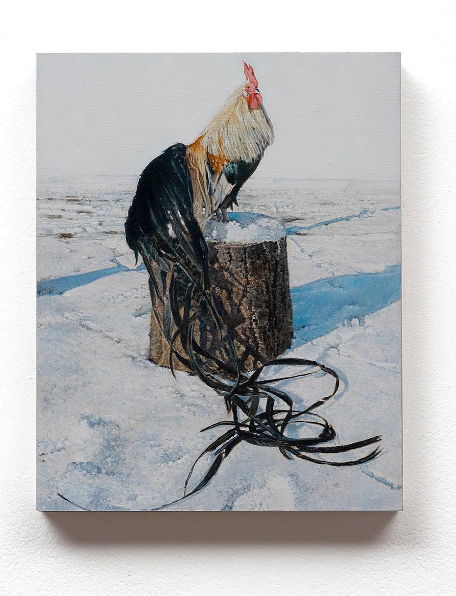
FRONT COVER: Lindy Lee, The Birth of Fire, 2022 Red Gum, fire, 40 x 80 cm
Photo: Aaron Anderson

Jemima
Plume 20, 2022 (detail) Handcut digital photos 450 x 530cm
Wyman

Materiality in Motion
Ursula Sullivan+Joanna Strumpf
The mediums that make up the fabric of contemporary art are becoming increasingly diverse at a pace set by our rapidly changing world. From boundary defying approaches to ceramics and sculpture, to unexpected natural and embodied materials, to experimental enquiries into virtual realms, artists are continuing to expand and challenge our perceptions of materiality.
This sentiment is reflected throughout the pages of this issue, where the unique and ambitious explorations of our artists never fail to impress. Our cover star, Lindy Lee, introduces a new series of profound elemental works that shift between paper, wood and steel in the same breath; Ry David Bradley shares his new venture into painting on pre-printed canvas, without leaving technology behind; James Lemon brings us a shimmering body of work coated in sumptuous glazes; Maria Fernanda Cardoso honours the Australian landscape through her tactile gumnut patterns; and Grant Stevens observes our current zeitgeist through his meditation algorithm—just to name a few.
As you read on, we hope that you’ll enjoy this eclectic offering of insights into the practices and everyday lives of artists; and all the varying textures and details, light and shade, that comes with their individual evolutions. There’s nothing that delights us more than to share them with you.
Happy reading,
Jo+Urs
5
APR/MAY/JUN 2023
James Lemon im fucking pissed, 2023 kiln brick, glaze and ceramic 72 x 22 x 17 cm
Photo: Annika Kafcaloudis

APR/MAY/JUN 2023 GOMA, BRISBANE 24 JUN – 2 OCT 2023 SUPPORTING PARTNER TOURISM & MEDIA PARTNERS MAJOR PARTNERS Michael Zavros / The Phoenix (detail) 2016 / James and Diana Ramsay Fund supported by Philip Bacon AM through the Art Gallery of South Australia Foundation 2016 / Collection: Art Gallery of South Australia
Contents
Quick Curate: Unity
Introducing: Marion Abraham
Lara Merrett: Top 5
James Lemon: Resurrection
Tim Silver: can I, just wait here with you
Joanna Lamb: First Impressions
Ry David Bradley: The Gen Turn
Lynda Draper: Roadside Monuments
Maria Fernanda Cardoso: Fierce Maternity
Lindy Lee: A tree more ancient than the forest it stands in
Carla Zampatti x Lindy Lee
Glenn Barkley: Earthly Delights

Michael Zavros: The Favourite
Verboten: Tom Marioni’s House Rules
Grant Stevens: Agitated presence – Horizon of Happiness
Seth Birchall: The Moon Under Water
Jemima Wyman: Plume 20
Kirsten Coelho: Grounded by Uncertainty
Last Word: Samantha Littley – Curator, Australian Art QAGOMA Up Next

7
8. 12. 14. 16. 24. 28. 30. 36. 38. 46. 56. 62. 70. 76. 78. 88. 96. 98. 100. 106.
67.
46.
Quick Curate: Unity
For this edition of Quick Curate, Founder and Principal of Flack Studio, David Flack responds to a feeling of moving into a new chapter in both his personal and professional life.
“I am forever thinking about how incredible my friends, family and extended communities are and the ways in which they have helped me throughout the last three months. Each of these pieces reflects this passage. They speak to a sense of being held, laughter, new beginnings, spirit, identity, place, love, friendships and memories.”
– David Flack, Founder & Principal, Flack Studio
APR/MAY/JUN 2023


9
Ramesh Mario Nithiyendran Self Portrait with Durian, 2022 painted bronze 91.5 x 25 x 9.5 cm
Photo: Mark Pokorny


 Michael Lindeman Regression Painting (Fashionable...), 2022 finger painted acrylic on mirror 107 x 168 cm
Karen Black Feelings-3 , 2023 oil on board 25 x 20 cm (panel) 4.5 x 24 x 3 cm (shelf)
Sydney Ball Amasis, 1973
Acrylic on cotton duck (unstretched) 218 x 381 cm
Michael Lindeman Regression Painting (Fashionable...), 2022 finger painted acrylic on mirror 107 x 168 cm
Karen Black Feelings-3 , 2023 oil on board 25 x 20 cm (panel) 4.5 x 24 x 3 cm (shelf)
Sydney Ball Amasis, 1973
Acrylic on cotton duck (unstretched) 218 x 381 cm


11
Tim Silver Untitled (heartbeats MN), 2022 copper infused Forton MG
Darren Sylvester Star Machine, 2023 two lightjet prints 240 x 160 cm (unframed)
Naminapu Maymuru-White Mil ŋ iyawuy River of Stars 8 , 2022 Bark Painting 129 x 63 cm
Introducing: Marion Abraham
Sullivan+Strumpf is delighted to introduce Marion Abraham to the gallery stable. Hailing from lutriwita (Tasmania), Abraham paints sweeping figurative compositions that reflect a distinct perspective of her rural surrounds in the green pastures of Molesworth. We look forward to presenting her debut solo exhibition at our Sydney space in October 2023.
By Chloe Borich
Marion Abraham is a painter who investigates inner workings of the self. Embracing a fiercely tangible approach to the medium, Abraham infuses subversive qualities with traditional painting techniques to execute dynamic compositions, focussing on romantic renderings of the body and the landscape. Guided by feminist instinct and a dark sense of humour, she melds quixotic and escapist notions, familiar clichés and suggestive language with the muddiness of the natural world. Through these thematic touchstones, she navigates ideas of the soul, reimagines power structures and centres the valorising of care.
The contents of Abraham’s works feel confidently unbridled. Driven by an uninhibited romanticism, she is “…attracted to violent and bombastic moments, riddled with wild rantings, covered in superficial beauty.” In her paintings, ideas are given permission to roam and become what time intends them to be, ultimately shaping energetic and compelling narratives that meld personal experiences with renowned historical art references.
There is a deliberate urgency to Abraham’s brushwork that wavers between brutality and tenderness; tension and softness; chaos and control. Drawing from years of experience working with ceramics, she realises her subjects on wooden board and canvas as if building them by hand. Gestural strokes of oil paint create bold forms that are at once strong and yielding.
Scenes are evocative of half-formed memories that have been conjured into existence. Blurred features and negative space gives way to strange and stirring moments that shape our personal and collective experiences. Bucolic landscapes are home to unlikely figures who appear unexpectedly throughout verdant fields. Clad in t-shirts and Adidas tracksuits, bodies are depicted in traditional compositions: tangled in passionate embrace, caressing small animals or poised on horseback as if about to charge. They are empowered by their fury and comfortable with their individuality.
Blistering and brooding, Abraham presents a refreshing contemporary take on the pastoral portrait. She relishes in the grimy nuances of a life lived honestly and effusively with an energy that transcends the edges of her paintings, unwittingly imprinting on the memory of the viewer.
APR/MAY/JUN 2023

13 MARION ABRAHAM, 26 OCT – 11 NOV 2023, S+S EORA/SYDNEY + EMAIL ART@SULLIVANSTRUMPF.COM TO REQUEST A PREVIEW
Marion Abraham in her studio, 2023
 Lara Merrett in her studio, 2023
Photo: Hugh Stuart
Lara Merrett in her studio, 2023
Photo: Hugh Stuart
Lara Merrett: Top 5
Lara Merrett shares her favourite studio playlist for creative inspiration, energy, affirmation, joy and reflection.
 By Lara Merrett
Max Richter Dream 1 (before the world blows it all away)
The song I play the most in my studio has to be this one by Max Richter. His music creates an overwhelming desire to connect and create. It's repetitive, which I like, as it seems endless. That’s how I like to feel when I’m making work–like I could just keep going.
M.I.A. Paper Planes
This is the song I listen to when I feel exhausted. Making work gives me energy, but sometimes I’m not in the zone, especially after a hectic morning getting out of the house with three kids and only thinking about everyone else. By the afternoon, I’m ready to collapse but need to give the work one more push. M.I.A. is my favourite artists for that, and Paper Planes is intoxicating with its rhythm and raw energy. I love that M.I.A. was a visual artist before she went into the music industry.
Zbigniew Preisner
1. 4. 2. 5. 3.
The Double Life of Veronique
In 1991, when I was 19, I moved to Spain for a couple of years. I had just seen a French-Polish film, The Double Life of Veronique, and it had a profound impact on me. The powerful, dramatic soundtrack still makes me nostalgic for that time when I was figuring out who I was, and how I was going to live my life as an artist. The film is about a young woman who questions every decision she makes as it takes her down different paths of life. I felt the weight of those same decisions when I moved to Madrid, not knowing who I’d meet or who I’d become. I’m a true romantic and indulged in all that freedom.
John Lennon Oh Yoko!
It’s hard to pick a song by a favourite musical artist, but it’s not so hard to think of one of my favourite visual artists – Yoko Ono. I loved this song before I knew anything about Yoko Ono’s work, prior to becoming obsessed with her and her practice. Hearing John Lennon sing this love ballad always makes me so happy.
Cocteau Twins
Cherry-Coloured Funk
I recently came across this dream-pop hit and love it. I appreciate the way that this song from the 80s still holds its place in the present. It makes me reflect on how so much art made in the past also holds such relevance, even though our present reality is so different. I immediately think of Swedish artist, Hilma Af Klint, who transcends time, and still stops viewers in their tracks.

LARA MERRETT, 20 JUL – 12 AUG 2023, S+S NAARM/MELBOURNE + EMAIL ART@SULLIVANSTRUMPF.COM TO REQUEST A PREVIEW
LARA MERRETTʼS STUDIO MIX + LISTEN NOW bit.ly/LaraMtop5
James Lemon: Resurrection
Stephen Todd takes a deep dive below the gloopy, viscous surface to unearth the origins of James Lemon's bold, brash, ‘metamagical’ totems.
By Stephen Todd
APR/MAY/JUN 2023
James Lemon in his studio, 2023
JAMES LEMON, SPHEXISHNESS, 11 MAY – 3 JUN 2023, S+S EORA/SYDNEY + EMAIL ART@SULLIVANSTRUMPF.COM TO REQUEST A PREVIEW
Photo: Annika Kafcaloudis


APR/MAY/JUN 2023
James Lemon you are a winner , 2023 kiln brick, glaze and ceramic 46 x 23 x 12 cm
Photo: Annika Kafcaloudis
A gaggle of garrulous totems are arranged haphazardly across the gallery floor, their gloopy, tumescent surfaces at once inviting and repelling, the very viscous glamour of them beguiling. Artist James Lemon admits he wants the viewer “to be a bit confused” by his “functionalish” sculptures and I’ll admit he’s got me there. Mostly they’re composed of refired bricks poised upright to form elemental pedestals atop which perch bulbous vessels that appear simultaneously proud and imperilled. Lemon refers to the formation as ‘a forest’ and, if so, it’s one of those dark ones in which strange beasties abound and into which children have a habit of disappearing. Looked at it in this forest light, these functionalish (for now it’s a word) sculptures seem to allude to tombstones and funerary urns, those cupped vessels that fit so snugly in the hand and would amply accommodate the ashes of one or two small beings.
The pieces are, in fact, ‘dancing around death,’ says the artist. “Symbolically, in their formal references, but also materially, in the process of making them. I’m fascinated by what’s known as ‘dunting’, the cracking that occurs as an error in the firing process that leads to the piece collapsing.” So fascinated is Lemon that he provokes the erroneous effect in order to celebrate and elevate imperfection. His is a delirious kind of wabi-sabi. “I fire each piece several times, opening the kiln door sooner than I should which causes the vessels to collapse. It basically fractures the piece. And then I capture that fracture by refiring it.” At the same time, he believes “…there’s a certain amount of sacredness about them, stemming from this idea of birth, death and resurrection.”
If Lemon’s language references the religious that’s likely due to a Pentecostal upbringing in his native New Zealand. As a young boy he was drawn to performance, to theatre and to music, but found his outlets stymied by the conservatism of the church. “I left as soon as I could, fleeing to Australia age 18 with basically no money, no skills, barely any education. I was liberated, at least geographically, and determined to make something happen.” He got jobs in hospitality, made friends, “began dating a guy who was a potter.” Waitering at night, he spent his days experimenting in the tiny home studio: throwing, hand-building, wheel-turning. “I’m not good at boredom. I was attracted to ceramics because it drew my attention to so many locations around the studio where lots of different processes were involved.” Ultimately, the pleasure of working with clay “…is that it’s one of the most fundamental materials around,” he says. “For me, it was initially a really physical response. It was the tactility. As my curiosity deepened, I became intrigued by the lineage of objects, this kind of constant brewing and bubbling.”
19
“there’s a certain amount of sacredness about them, stemming from this idea of birth, death and resurrection.”

 James Lemon
Selected works from Sphexishness, 2023
Photo: Annika Kafcaloudis
James Lemon
Selected works from Sphexishness, 2023
Photo: Annika Kafcaloudis
He uses the term ‘sphexishness’ to refer to his process, defining it as ‘mindless, routine behaviour.’ But it’s behaviour that, in the case of sphex (great golden digger) wasps, results in exquisitely complex, sturdy nests in which the bodies of paralysed victim insects are stockpiled to feed their larvae. The term was coined by the American scientist and scholar of comparative literature Douglas Hofstadter in a September 1982 Metamagical Themas column in the Scientific American journal. Metamagical–‘questing for the essence of mind and pattern’–seems an apt term to apply to Lemon’s work: pregnant with meaning that’s more imputed than imparted; allusively gorgeous; fascinated with the glamour of decadence. “My focus on these objects is intense but kind of blurred,” he says. “I like them to incarnate a sense of mystery and intrigue.”
While Lemon may conceive the series as a forest, you can still see the individual trees. At their most basic, you could say ‘this one’ is a vase, ‘that one’ is a side table. “While I’m comfortable with suggesting function, I don’t think the objects live or die by what they’re able to do or not do,” he insists. “That said, there is definitely power in the purely decorative aspect to them. It brings me back to a reflection on the Rococo where it's like just the most lavish, ridiculous objects.”
He makes a quip about ‘awful art for awful people’ and I happily lean into that, since I am the proud owner of a Lemon piece from 2022 titled Time To Die 2. Composed as a kind of triumphal arch–one horizontal, triple-fired brick laid across two crazy-glazed vertical ones–topped by a vessel shaped like an inverted hive (très sphexish!) – it is furiously self-possessed, an indomitable presence in my living room. Sometimes, for a giggle, I pop a flower–a peony, say, or a gladioli–in its bowl.

23
James Lemon classic objects, 2023 kiln brick, glaze and ceramic
x 30 x 34 cm
Photo: Annika Kafcaloudis
“The frisson of impossible fabulosity is sublime.”

23
James Lemon ashez 2 ashez, duzt 2 duzt, detail, 2023 kiln brick, glaze and ceramic 46 x 23 x 23 cm
Photo: Annika Kafcaloudis
JAMES LEMON, SPHEXISHNESS, 11 MAY – 3 JUN 2023, S+S EORA/SYDNEY + EMAIL ART@SULLIVANSTRUMPF.COM TO REQUEST A PREVIEW
Tim Silver: can I, just wait here with you
Ahead of his upcoming solo exhibition, Tim Silver spoke with Artist Liaison Chloe Borich about the creative process behind one of the central artworks in the show, can I, just wait here with you (2022).
By Chloe Borich
For Tim Silver, harmony is found within transient moments of disorder. He makes work by engaging in intuitive play with temperamental materials that challenge and contradict the human form, usually leading to unexpected yet imaginative outcomes. For can I, just wait here with you (2022), it was an instance of chaos that prompted a return to control. What began as an assortment of individually cast body parts was patiently translated into a sculpture representing the human form. A body obliterated was to become a body resolved.
The late Phyllida Barlow once said that “…the role of the artist is to be able to present their own interpretation and their own personal response to the world around, which might be, as it is in my case, a very small world… it’s a small experience in comparison to so much else.” The minutiae of the everyday similarly intrigue Silver, who through his corporeal sculptures makes seemingly ordinary moments feel expansive and meaningful, even everlasting.
It was a friend’s photo posted on Instagram in August 2020—hands caressing against crumpled white bed sheets, drenched in morning light—that would be the catalyst for the artist to explore the nuances of human connection. Three years on, this symbol of tenderness remains compelling and relevant to Silver’s work. can I, just wait here with you depicts two men embracing: their naked forms are clasped together, arms are wrapped around each other, chins nestled into respective shoulders, eyes are closed. Cast from human bodies, the figures represent vulnerability suspended in time. Their gentleness creates a conduit for empathy, transmitted through lingering touch.
This palpable sense of calm embodied by the final work conceals an active state of production reliant on laborious processes and attention to detail. Faint seams of a cast that once existed leave a trace of the hours Silver spent moulding the forms of two people, who were first covered in vibrant layers of blue and green Body Double, then plaster coated bandages. Another series of casts followed, outer shells materialised, copper infused Forton MG was poured and set. Once the bodies emerged, a patina was drawn out across the work’s milky skin by enveloping the entire sculpture in pieces of fabric soaked in salty water, embalming their limbs, torsos and heads to activate the waiting copper particles infused within the Forton MG. Almost turquoise at first, once dried, the work’s blue hue developed and softened, textural creases and crevasses more discernible than before.
The power of can I, just wait here with you rests in Silver’s ability to immortalise the raw and vital emotion of a fleeting encounter. These bodies will never part one another: heads touching, arms looped, chests pressed firm, legs grazing; the boundaries of their forms blurring together as one. Through seeking out connectivity, the work illuminates the potent moments of intimacy that take place in the quiet of our everyday. Perhaps we don’t realise how intrinsic they truly are until they stand before us, in eternal embrace.
APR/MAY/JUN 2023
Tim Silver can I, just wait here with you, 2022 copper infused Forton MG 160 x 60 x 60 cm
TIM SILVER, 13 JUL – 12 AUG 2023, S+S EORA/SYDNEY + EMAIL ART@SULLIVANSTRUMPF.COM TO REQUEST A PREVIEW

APR/MAY/JUN 2023 MEL BOURNE DESIGN FAIR See and buy collectible design from Australia and around the world Melbourne Convention and Exhibition Centre 18-21 May 2023 MELBOURNE DESIGN WEEK AND THE VICTORIAN DESIGN PROGRAM ARE INITIATIVES OF THE VICTORIAN GOVERNMENT. MELBOURNE DESIGN FAIR IS SUPPORTED THROUGH THE MELBOURNE CITY REVITALISATION FUND – A $200 MILLION PARTNERSHIP OF THE VICTORIAN GOVERNMENT AND THE CITY OF MELBOURNE. THE NGV DEPARTMENT OF CONTEMPORARY DESIGN AND ARCHITECTURE IS GENEROUSLY SUPPORTED BY THE HUGH D. T. WILLIAMSON FOUNDATION. AN INITIATIVE OF THE NATIONAL GALLERY OF VICTORIA DELIVERED IN COLLABORATION WITH THE MELBOURNE ART FOUNDATION. PRESENTED BY MAJOR PARTNER designfair.melbourne Buy tickets

27 MEL
Joanna Lamb: First impressions
From an early age, Joanna Lamb was exposed to the principles and techniques of printmaking through her dad’s off-set printing business. Here, she reflects upon skills she acquired on the workshop floor and how this experience helped shape her aesthetic sensibility.
Interview with Tiffeny Fayne
Tiffeny Fayne / I imagine that as an artistic child experiencing the industrial processes of off-set lithography would have been fascinating. I can visualise masses of flat pantone colour, the repeated transference of images accompanied by the constant whir of machinery. Can you talk about impressions or sensory memories that have stuck with you?
Joanna Lamb / The smells associated with the factory have left the most lasting and evocative associations, especially those of the oil-based inks and freshly printed paper. I was fascinated by the layering and registering of different colours and the gradual revelation of the final printed page. The multiple steps and processes that needed to occur to transform an idea into a poster, a book or a magazine was especially interesting because of its complexity.
TF / A sophisticated understanding of design is pronounced in your cohesive and harmonious work. Were these principles imparted early on or was it a gradual or unconscious assimilation of ideas and knowledge?
JL / I studied graphic design after completing a visual arts degree. That’s when I was really taught the principles of design. These principles apply equally to the visual arts. I’m talking about things like balance, contrast, emphasis, proportion, repetition, movement, hierarchy and unity. Learning how to manipulate these elements to achieve the outcome you intend takes practise over time with a lot of failure along the way.
TF / You’ve previously said that the print room setting played a part in determining your visual language. Can you expand on your pictorial techniques? How do you go about reducing the detail of a scene to achieve such delicate, stylised forms?
JL / My works are hand-manufactured rather than painted in the traditional sense. I want to use current tools and materials in my work to reflect the world we live in. I use a computer rather than a pencil to design the image. The paintings are based on photographic images taken mostly by me of everyday environments. I redraw every element and add my own colour palette. I layer the work using hand cut stencils and use a roller rather than a paint brush to apply the colour, painting on a superfine polyester for a smoother finish.
I’m creating work that reflects the way a lot of people view the world. It’s intentionally flat and superficial. The paintings take a long time to make, but their appearance masks a complex production process. I like the labour intensiveness of my process. I like the act of work.
TF / A stillness emanates from your work that gives rise to quiet contemplation. Do you think this is because the images already confer an aura of the illusory, supported by the absence of human presence or as a result of your methods of refinement?
JL / I think the lack of the human figure creates space for the viewer to project their own experience onto the work. A lot of the stillness is created by the colour palette, the composition and lack of specific detail.
APR/MAY/JUN 2023
Joanna Lamb
Front Yard with Rose Garden, 2022 Acrylic on superfine polyester 91 x 122cm
TF / Were you encouraged to pursue design or visual art as a child? How was this nurtured? Could you share a little about the creative bond you shared with your dad?
JL / I always wanted to be an artist and my dad and I shared a mutual love of art, though not necessarily a love for the same art. His early pastel drawings and watercolours partly inspired my ambition of one day becoming an artist. He believed in me more often than I believed in myself. He rarely missed one of my exhibition openings, especially if it meant an opportunity to get on a plane and go somewhere. Naturally, he didn’t always like everything I painted. I found it difficult to accept his criticism early on but I am grateful for that criticism now. He taught me to be resilient and to persevere, both qualities essential to any artist.
TF / What can we look forward to seeing in your upcoming exhibition at S+S in September?
JL / I’m working on a large-scale still life Laminex work for September, the biggest I’ve made. I’m very excited about it. There will also be painted elements on the wall. It is an extension of smaller still life works I exhibited in Singapore in 2016.
I’m also working on a series of paintings of local gardens and street scenes, most of which are situated very close to my house.

29
JOANNA LAMB, ONE DAY LIKE THIS, 21 SEP – 14 OCT 2023, S+S EORA/SYDNEY + EMAIL ART@SULLIVANSTRUMPF.COM TO REQUEST A PREVIEW

Ry David Bradley: The Gen Turn
At a moment when new technologies are becoming more advanced and more readily available than ever, Ry David Bradley has returned to painting. But he hasn't turned away from technology—the possibilities are too exciting to leave entirely to non-artists.
By Cameron Hurst
31
RY DAVID BRADLEY, GEN, 20 APR – 13 MAY 2023, S+S NAARM/MELBOURNE + TO SEE AVAILABLE WORKS BY RY DAVID BRADLEY ACCESS THE VIEWING ROOM BY ENTERING YOUR EMAIL ADDRESS bit.ly/rdbradley
Ry David Bradley in his studio, 2023
Few artists can claim such sustained engagement with the entwined possibilities of painting and new technology as Ry David Bradley. In GEN, Bradley’s 2023 solo show with Sullivan+Strumpf, the artist returns to his home country of Australia (after completing an MFA at the Victorian College of the Arts, he spent time in New York and London, and now lives in Paris). He also returns to painting. This exhibition is the first time Bradley has worked directly with paint in seven years.
GEN occurs at a radical juncture in terms of the possibilities of AI technologies. Bradley emerged alongside an international generation of ‘post-internet’ artists. Jon Rafman, Amalia Ulman, Simon Denny, Emma Stern, Sun Woo and Olli Epp are among a web of relevant contemporaries—all are, speaking broadly, interested in the social, political and aesthetic relationships between digital and physical image production. They warp, distort and iterate found images, memes and Photoshopped assemblages to explore the nature of networked life. All reveal the impossibility of drawing a sharp line between online and real experience. For these artists, using the internet is like mixing paints.
Now, we are well and truly post-internet. The networked connections that made the internet so ground-breaking have become prosaic. Who could get excited about the possibilities suggested by, for example, video-calling someone on the other side of the world? It is worth noting that throughout the first two decades of the 21st century, conservative art institutions were sceptical of the legitimacy of artists making work about the internet using digital tools. This is no longer true. The digital is central to today’s art world vernacular. Now, when we talk about the post-internet, we sort of know what to expect.
AI, on the other hand, is a different story—one that is terrifying or exciting (or some combination of both), depending on who you ask. Whatever you think, AI is here to stay. In a 2023 interview with the Museum of Modern Art, New York, the AI researcher Kate Crawford theorised that we are at the ‘generative turn.’ This generative turn
is a pivot point: “a moment where what we previously understood about everything—from illustration to film directing to publishing—is all about to change very rapidly.” Artists are in a period of new, intense experimentation. Deep learning models such as Open AI’s DALL-E and ChatGPT can generate image or text outputs within seconds based on prompts, drawing on hundreds of thousands of data points. Input “woman with crimson hair looking at gold-glazed contemporary ceramic artwork in a spacious, white-walled gallery” into DALL-E, the AI will spit out uncanny iterations on the theme. These programs became widely available in 2022. They will only increase in speed and sophistication.
Perhaps now is the point that we will look back to as the start of ‘post-AI’ art. GEN is a crucial moment of artistic investigation.
“AI has this kind of weird understanding for a beauty that feels slightly unnerving, and hence potent. Just a few years ago, it was terrible,” Bradley says. “But then we crossed a threshold. What lies on the other side?”
APR/MAY/JUN 2023

33
Ry David Bradley
Sample Ready, 2023 inkjet and Flashe paint on linen 150 x 160 cm

APR/MAY/JUN 2023
Ry David Bradley Aspect Codex, (render) 2023
This is still a new set of tools. People are responding to the possibilities of generated material differently. But any serious artist working with AI today will tell you that the initial prompts are just one small part of the creative process. First, a kind of textual massaging is required to produce a desired output. For GEN, Bradley began by creating a set of eerie scenes set in otherworldly, liminal places. While AI and new technology might often be considered in the realm of rationality and science, there is an unknowability at the heart of the machinations of the neural networks. It is not incidental that DALL-E, OpenAI’s image generator, is named partly after Salvador Dali. Dali, a leader of the dream-obsessed Surrealist movement, used to stir paint in a bowl for hours in order to lull himself into a trance-like, associative state that he believed created (or generated) his best ideas. Fittingly, AI images often have a dream-like unreality.
Once Bradley generates his ethereal scenes, he manipulates the images using digital processes—diffusing light, altering textures, refining compositions. He then works with a specialist printer to transfer the images onto Parisian linen using a wide-format machine. The result is a matte surface with a flat, paint-like quality. Then, Bradley starts painting by hand. To add another metatechnological reference, Bradley’s acrylic strokes are attempts to replicate the pattern stamp textures of his software brushes (which themselves attempt to replicate the blurred effects of real paint on canvas.)
The presence of grey in Bradley’s work rewards attention. There is a twenty-first century technological sensibility to it. Neutral grey is the default colour of a Photoshop background. It is also the colour of sleekly minimal Apple products, some of the most desirable and influential objects of our epoch. A metallic coolness is discernible in the works in GEN. Bradley says that one reason he chooses to work in grayscale is because of the optical illusion created by layering the same tones in different materials. And it’s true—viewing the work, there is a moment of misrecognition. What is paint and what is print? What is real and what is a glowing, AI-generated mirage?
At a moment when new technologies become more advanced and more readily available than ever, Bradley returns to painting. But he doesn’t turn away from technology. The possibilities are too exciting to leave entirely to non-artists. So, he moves between worlds. Between neural networks and the human hand. Software and wet paint. Ry David Bradley is generating. This is what painting of the future looks like.
35
Acrylic Flashe and Inkjet on Linen 150 x 160 cm
“And it’s true—viewing the work, there is a moment of misrecognition. What is paint and what is print?
What is real and what is a glowing, AI-generated mirage?”
RY DAVID BRADLEY, GEN, 20 APR – 13 MAY 2023, S+S NAARM/MELBOURNE + TO SEE AVAILABLE WORKS BY RY DAVID BRADLEY ACCESS THE VIEWING ROOM BY ENTERING YOUR EMAIL ADDRESS bit.ly/rdbradley


APR/MAY/JUN 2023 LYNDA DRAPER, 24 AUG – 16 SEP 2023, S+S EORA/SYDNEY + EMAIL ART@SULLIVANSTRUMPF.COM TO REQUEST A PREVIEW Postcards from the artist’s collection
Lynda Draper: Roadside Monuments
On the eve of her father’s ninetieth birthday, Lynda Draper reflects on her memories of being on the road in the 1960s and 70s. Ahead of her forthcoming solo exhibition, Draper looks at how these early childhood experiences, snapshots of memory and dreamlike images have influenced her art practice over the years.
By Chloe Borich
Night driving evokes a surreal kind of magic when you’re little. Bundled into the back seat, you become an actively observant passenger on an otherwise passive journey, traversing highways and petrol station pit stops at the desired pace of your parents. Sometimes fast, sometimes slow. Sometimes as if time has ceased to continue at all. Everything outside your window is cloaked in almost darkness, save for the flickering of headlights and moonlight embracing the silhouette of roadside bushland. Constellations of stars come into view the further you move away from the city, embossed into the sky. Tricks are played on your eyes in the shadows, swarms of houses rise in and out of view, eye spy with my little eye the horizon— beckoning your destination.
Some of Lynda Draper’s fondest childhood memories are of road tripping across Australia with her father, “My father was a schoolteacher, every school holiday he planned a road trip. Dad, Mum, my two sisters and I would load up the Holden station wagon and attached trailer, then Dad would drive all night to a chosen spot.” They would visit all kinds of places, from hidden coastal beaches to the Snowy Mountains, and vast deserts to tropical rainforests. It was only upon waking that would reveal where they were and the activities that were to consume their days.
During their travels, Draper searched for Thunder Eggs in riverbeds with crystal lined insides; found above ground ant mounds; discovered mysterious caves and waxy stalactites. By the sea, she explored coral reefs; spotted crocodiles up North; and ventured to tropical mountaintops. When they were on country, they visited Indigenous communities. When they passed through
small towns, they would seek out homebuilt abodes and outsider architectural feats, as well as offbeat themes parks like the Big Pineapple and private museums, including the house of bottles in Broken Hill, Paronella Park in Northern Queensland. The more obscure, the more interesting Draper found them to be.
“One of my earliest memories is visiting Santa Land in Currumbin, Queensland. It was magical,” says Draper, “As an adult looking back, it was a crazy homemade outsider fantasy children’s theme park, consisting of grungy miniature monuments and constructions influenced by scenes from nursery rhymes and Disney films like the Wizard of Oz and Snow White and the Seven Dwarfs.” The features of these fragmented characters and unexpected instances of pareidolia—a face appearing in the front of a building or the pattern of a pavement—have found their way into her ceramic sculptural works over the years, evoking realms that blur the lines between the real and imagined.
“As my father comes to the end of his life it’s easy to fall into a nostalgia for what seemed a less complicated past,” reflects Draper, “Australia has changed, I acknowledge sometimes for the better.” Never to be forgotten though are these formative memories of hers, stamped with the postcodes of peculiar places in foundational moments in time. Forever rendered in the clay of Draper’s works they will remain, towering into the air and branching languidly across walls, like a map of her own making.
37
Maria Fernanda Cardoso: Fierce Maternity
Kelly Gellatly examines the celebrated artist’s childlike sense of curiosity and wonder that Maria Fernanda Cardoso somehow manages to ground in an exhaustive research process encompassing the disciplines of science, history, literature and philosophy.
By Kelly Gellatly
APR/MAY/JUN 2023
Maria Fernanda Cardoso in her studio, 2023
MARIA FERNANDA CARDOSO, FIERCE MATERNITY, 1 JUN – 1 JUL 2023, S+S EORA/SYDNEY + EMAIL ART@SULLIVANSTRUMPF.COM TO REQUEST A PREVIEW
Photo: Jillian Nalty


APR/MAY/JUN 2023
Materials in Maria Fernanda Cardoso’s studio, 2023
Photo: Jillian Nalty
“I like tough nature. I like tough plants. So I appreciate these lifeforms that have adapted to floods, to fires, to drought. I find that curiosity, it’s very humbling, because you assume you don’t know. It’s not imposing but asking.”1
Despite the almost childlike sense of curiosity and wonder that Maria Fernanda Cardoso has brought to her work across her decades’ long career, her practice is grounded in an exhaustive research process this encompasses the disciplines of science, history, literature and philosophy, and the close, often microscopic observation of her chosen source material. Along the way, what started as a spark transforms from interest into overwhelming obsession, with the artist feeling she needs to know absolutely everything about her subject before she can, through her art, make of it something new. In the case of The Museum of Copulatory Organs (2008-2012) for example, Cardoso undertook a PhD at the University of Sydney so that her interest in the reproductive organs of microscopic creatures would be taken seriously by the scientists who later became her collaborators. This expansive project, which was exhibited in the 2012 Biennale of Sydney, saw the creation of a collection of scientific models of the penises of tiny animals (primarily insects) for a hypothetical museum. In creating objects of fascination and beauty from a reality invisible to the naked eye, Cardoso employed techniques ranging from glass blowing to 3D computer modelling and electronic microscopic scanning. Her desire, in this and other works, is to encourage her audience to focus, so that we can learn from and connect to the natural world. The need to create an emotional reaction is deeply embedded in her practice. Cardoso said,
“I want to show how beautiful, fascinating, complex and rich our world is. And hopefully that bond gets communicated. Rather than complain about how we’re damaging, depleting, I want to say, ‘Just stop, look, admire, connect and value.’2”
41
1 Maria Fernanda Cardoso in “Ripples and Droplets: A Public Artwork by Maria Fernanda Cardoso”, Sullivan+Strumpf, https://www.sullivanstrumpf.com/artists/mariafernanda-cardoso/videos_view/189, accessed 4 April 2023.
2 Neha Kale, “Natural Born Artist”, The Saturday Paper, 22-28 May 2021, p. 19.
“I want to show how beautiful, fascinating, complex and rich our world is. And hopefully that bond gets communicated. Rather than complain about how we’re damaging, depleting, I want to say, ‘Just stop, look, admire, connect and value.’”
 Materials in Maria Fernanda Cardoso’s studio, 2023
Photo: Jillian Nalty
Materials in Maria Fernanda Cardoso’s studio, 2023
Photo: Jillian Nalty

Regardless of subject matter, Cardoso’s practice is grounded in making, with the shape, feel and manipulation of the materials in her hands ultimately determining what is done with them. Whether working with sheep’s wool (Sheep [2002]), dead animals (frogs, starfish, seahorses, butterfly wings) or as she is currently with gumnuts, pattern making remains a driving force, with the artist’s strong sense of geometry both referencing and replicating this phenomenon in the natural world. Cardoso’s work with animals and natural materials also makes it impossible for her audience to ignore the natural cycle of life and death. As she observed of her early work:
“We tend not to talk about things that are difficult or uncomfortable, like death, or sex. I lived through one of the most violent and dangerous eras in Columbian history. We were confronted with death, with terrorism, on a daily basis. So I think it was a process of grieving, and representing death, and being able to look at it, face it, and talk about it.”3
While similarly connected to life cycles in the natural world, Cardoso’s work in Fierce Maternity references the more nurturing space of the maternal, where the gumnut is both the source, keeper and protector of the eucalyptus’s seeds, and effectively serves as the storehouse for its future life. Now having spent extended periods of time with this woody, tough, mesmerising material, Cardoso also feels, as a woman just turned 60 that the physical structure and reproductive role of the gumnut also powerfully relates to ageing.4 Cardoso’s fascination and love of the diverse forms and beauty of the gumnut began during an artist camp and workshop project in Central Australia in 2008-09 that she undertook with Indigenous women artists from the Tjampi Desert Weavers. It was here that she first gathered a collection of gumnuts with the women’s permission. Since the time of her pinned gumnut work in the resulting exhibition, KURU ALALA Eyes Open: Tjampi Desert Weavers, Maria Fernanda Cardoso, Alison Clouson (2009), Cardoso has been ‘addicted’ to working in this material, and now collects gumnuts en masse, as well as sourcing them from licenced seed suppliers.5
For Cardoso, the gumnut is an ideal natural form through which to demonstrate her interest in reproductive morphologies, taxonomy, bio-geometry and pattern making, but with more than 700 different species of eucalyptus in Australia–each with its own fruit–the extraordinary variations of scale, shape and design across this resilient species also serve as an elegant visualisation of biodiversity. Paying homage to the artistry of nature, Cardoso describes the gumnut as a “ready-made” – an exquisite wooden form that would take enormous time, effort and skill to carve, yet it is made from within, with nature itself as the creator.6
“To me, the eucalyptus is an artist, and gumnuts are its artworks. … As a trained sculptor, I can only dream of carving with such skill, to produce these perfectly shaped wooden sculptures. The eucalyptus tree does it naturally, after practising for over 100 million years to get these shapes right.”7
In Cardoso’s hands the meditative yet labour-intensive act of aggregating the gumnuts transforms them into “the perfect shape” of a sphere that is at once self-supporting and incredibly strong. “I find that metaphor really powerful for anything we do in life as a collective effort” she says. “I find that really magical.”8
4 Zoom interview with the author, 8 April 2023.
5 Zoom interview with the author.
6 Zoom interview with the author.
7
Hynes,
accessed 4 April 2023.
8 April 2023.
https://www.art-almanac.com.au/maria-fernanda-cardoso-gumnuts-
APR/MAY/JUN 2023
3 Maria Fernanda Cardoso in “Maria Fernanda Cardoso. ‘I’m in awe with the small’: Artist Interview”, Tate Modern, Sullivan+Strumpf, https://www.sullivanstrumpf. com/artists/maria-fernanda-cardoso/videos_view/117, accessed 4 April 2023.
Victoria
“Maria Fernanda Cardoso: Gumnuts and Sandstone”, Art Almanac, 4 May 2021,
and-sandstone/,
8 Maria Fernanda Cardoso in “Gumnut Spheres by Maria Fernanda Cardoso”, Strategic Virtuous Circle Award 2022 Nestlé Zone Latin America, Curated by Sigismond de Vajay, https://vimeo.com/805398030/da4ddc2316, accessed
Materials in Maria Fernanda Cardoso’s studio, 2023
Photo: Jillian Nalty
MARIA
1 JUN – 1 JUL 2023,
+
ART@SULLIVANSTRUMPF.COM TO REQUEST A PREVIEW
FERNANDA CARDOSO, FIERCE MATERNITY,
S+S EORA/SYDNEY
EMAIL

 Lindy Lee with One Bright Pearl, 2021, Blackburn Gardens, Woollahra
Photo: Steven Siewert
Lindy Lee with One Bright Pearl, 2021, Blackburn Gardens, Woollahra
Photo: Steven Siewert
Lindy Lee: A tree more ancient than the forest it stands in
Lindy Lee and Ellen Ferrier in conversation about Lindy’s upcoming exhibition, our kinship with the cosmos and the fragility of life.
A conversation between Lindy Lee and Ellen Ferrier

LINDY LEE, A TREE MORE ANCIENT THAN THE FOREST IT STANDS IN, 4 MAY – 27 MAY 2023, S+S EORA/SYDNEY + EMAIL ART@SULLIVANSTRUMPF.COM TO REQUEST A PREVIEW
Ellen Ferrier / The title of your show is A tree more ancient than the forest it stands in. This is a beautifully evocative title, and a rather perplexing one also.
Lindy Lee / Yes, at first it seems to be a contradiction, because how could it be so? This is typical of zen koans – they often appear paradoxical, encouraging pause and contemplation until a deeper meaning presents itself. In this case, the tree represents a ‘self’ more ancient than the ground on which we stand. Through virtue of an infinite expanse of interconnections we have come to be here at this point in time. It actually goes back to the very beginnings of the cosmos – to the notion that everything that exists, that has existed and that will exist, is inextricably connected. Matter is not created nor destroyed, but rather, transformed. Each being that comes into this world is innately connected to that primordial spark of creation.
EF / It is a reminder of our kinship with the cosmos.
LL / Yes, a necessary reminder. For in the process of becoming ‘civilised’ we have lost our intimate connection to the earth, to that which sustains and nourishes us, often in ways far deeper than we can ever comprehend.
EF / The significance of the ovoid as a form seems to parallel these notions of continuity and oneness. The shape itself has no real beginning and no end; energy flows into and out of itself. Eggs themselves hold further associations still; of birth and beginnings, gestation, nurture, as well as fragility and potentiality.
LL / Yes, the rich potentiality of life, that’s what these egg forms are about. The fragility of all that. They are seeds of life that call into question how we go about nurturing self and other. Or not. The forms that I use are fairly universally understood, and although they arise out of a deeply personal experience, this particularity is in fact, universal. The role of an artist is to form a connection with your innermost self; to explore all that is going on with you, which you can then process and transmute and translate in your work for other people to connect with. The personal becomes the universal.
EF / Is that why you are drawn to working with such elemental materials like fire, water, metal and wood?
LL / Elements are the fundamental building blocks of nature. They demonstrate how we exist in the world. I believe there is the world of spirit, and the world of matter
 Lindy Lee Releasing the 4 elements, 2023 65 x 35 cm
and form. Spirit is like the the drive for life, that invisible thing that inspires and is concretised through our minds, bodies and actions. When I work with elemental materials, I’m trying to bring, experientially, a sense of wonder and intimate connection with all existence.

EF / There are deeper, more primordial energetics at play here.
LL / My process is to try and show up with a clear mind, without any preconceptions or ideas. Rather, I try engage with what is happening with that material. So it’s not me doing anything as such, but rather a process of listening and responding. There’s a Taoist saying, ‘Before you speak, listen deeply’. The wood suggests something to me. The steel suggests something to me. I respond to the essence of that materiality and the particularity of the piece in front of me.
EF / This ability to respond to an object or material, then comes from a practice of deep listening – something you have been cultivating for more than four decades through your studies in Taoism and Zen Buddhism.
“Matter is not created nor destroyed, but rather, transformed. Each being that comes into this world is innately connected to that primordial spark of creation.”

APR/MAY/JUN 2023
Lindy Lee elixir, 2020-21 Chinese ink, fire and rain on paper 200 x 140 cm
LL / The crux of my practice is about me having intimate contact with that which is real; with the actuality of experience as opposed to the thought-worlds and projections we have about that experience. This is what is meant by the ancient tree. The tree is older than the forest in which it stands because it is born of deep cosmic time. Time that is beyond mere chronology, but rather, evocative of the unfolding of the eternal present, which contains no beginning, and no end, and therefore is timeless.
EF / So the shapes that you use and also the marks that you apply to their surface, come from a place of deep listening that fosters an intimacy and responsivity to the material, the elemental.
LL / The mark is a record of a moment. That moment arises from the confluence of all conditions that exist at that point in time. But the marks also have a consistency with the nature of the material itself.
EF / Several of your wooden eggs feature charred fractals on their surface.
LL / Yes, that is the element of fire conversing with the element of wood.
EF / But it’s also electricity, energy. It’s interesting observing the process of fractal burning, for it is like watching neural pathways light up in search for one another.
LL / It is an incredible process that again, requires intimate collaboration with these elements. In deciding to work cooperatively in this way, I must relinquish control to forces beyond my knowing or my reach. The fractal lines are there because they are there. I can’t direct them beyond the initial placement of the metallic probes. And that is not just part of the process but integral to my practice as a whole. Similarly when I throw bronze, I have the principle, the initial action, but I cannot determine the exact shape at all. For me, art is about co-creating with the universe. Not only the material and immaterial, but the people and organisations that I am fortunate enough to collaborate with as well. It is never about a singular genius, but rather a mutual mingling in this activity called life.
EF / Throughout this whole conversation we have been traversing between notions of the elemental and the spiritual. They seem to have this beautiful permeability and reciprocity, their relationship ephemeral and yet deeply embedded within one another.
51
Lindy Lee Basilisk Egg, 2023 Red Gum, acrylic paint 150 x 40 cm
LL / When I speak of the spiritual, I am referring to the multitude of experiences contained within that self. Ten thousand million experiences have brought you to this place in time. Spirit is the stuff we cannot pin down, that is so evanescent, that is tangible and then intangible because it is in a state of constant flux in its becoming. The way it happens with me, with everything from the colours I use in my paintings to the materials I am drawn to working with over any particular period of time, is that each of these materials beckon me in some way. They open up a huge pathway of exploration and discovery of my place in the world. The choice is never arbitrary. Ever. It comes from a desire to understand the meaning and connection of my life to the natural, the experiential, the phenomenal. So when I use materials, they enlarge and they confirm my connection with existence.
EF / Circling back to your earlier statement about the personal becoming the universal, it strikes me to reflect on why your work resonates so deeply at this moment in time. The Westernised world that so many of us exist within really does try to assert this sense of isolation, separation and hierarchy. The art that you create comes from a place of quiet listening, responding to inherent qualities of elemental materials, reminding us of interconnection, of oneness and of transience. It seems to me that this is the perfect medicine for such trying times. A reminder of the true nature of existence.
LL / If art can do anything, it can help us connect back with one another and with the world in which we all live. Great works of art penetrate the invisible realms within us. And once there, we begin to question, to be with, to listen.
APR/MAY/JUN 2023
LINDY LEE, A TREE MORE ANCIENT THAN THE FOREST IT STANDS IN, 4 MAY – 27 MAY 2023, S+S EORA/SYDNEY + EMAIL ART@SULLIVANSTRUMPF.COM TO REQUEST A PREVIEW
Lindy Lee Like Dew and Lightning, 2023 stainless steel
150 cm diameter

CARLA ZAMPATTI X LINDY LEE
For The Art Of Women collaboration between Lindy Lee and Carla Zampatti, Lee's 'Rain and Fire' drawings on paper were photographed and converted into prints for Carla Zampatti's creative director, Karlie Ungar, to design from.

“Fashion is no longer an industry just making clothes, it’s part of a broader design community, it’s multidisciplinary and multicategory, it transcends age, lifestyle and culture, is aspirational and emotional, it’s value based and far reaching. The more collaborative we all are the more intelligent, therefore relevant brands become.”
 —Karlie Ungar
“Without a doubt the reflective surface of her sculptural work is beautiful and immediate. You see yourself. The interconnectedness is overwhelming. That is Lindy’s work. There is always an incredible and powerful story.”
—Karlie Ungar

“Although my work is static, the experience of the work is a dance between solidity and dematerialisation. To see it printed on silk made the pattern even more ephemeral.”
—Lindy Lee
“It was marvellous and a little unreal to see how my work was transformed into these beautiful ethereal pieces. It was quite a moment for me to realise just how important Carla Zampatti was to Australian Culture.”

—Lindy Lee

LEE X
LINDY

61
Glenn Barkley: Earthly Delights
Off the back of his exhibition at Shoalhaven Regional Gallery, Plant Your Feet, Glenn Barkley and Elsiena ten Kate sit down to discuss the year ahead.
A conversation between Glenn Barkley and Elsiena ten Kate
APR/MAY/JUN 2023
Glenn Barkley in his studio, 2023
GLENN BARKLEY, THE ELECTRICAL EXPERIENCE, 15 JUN – 15 JUL 2023, S+S NAARM/MELBOURNE + EMAIL ART@SULLIVANSTRUMPF.COM TO REQUEST A PREVIEW
Photo: Ainslie.Co Photography


21 x 12
9.5
Glenn Barkley wheniwasinmynativeplace vase, 2022 earthernware
x
cm
Photo: Aaron Anderson
Elsiena ten Kate / How are you Glenn? How's your week been?
Glenn Barkley / It’s good. I seem to be eating too much and sleeping a lot. I’ve been watching the whole of The Godfather series, which has been amazing. They're the best films ever made. One and two are amazing. Three is pretty bad.
EtK / You’ve just moved into a new studio. Can you tell me a bit more about it?
GB / Yes, in Annandale. Is this part of the interview? Are you interviewing me now?
EtK / [laughs] Yes, I'm interviewing you now.
GB / It's this funny thing… I feel like I manifested the studio. I had an idea. I had a vision of what the studio would be. I dreamt there'd be a place on Parramatta Road near my house that I could walk to. And then that place just turned up. It's just perfect.
EtK / How do you see the new space shaping and changing your work?
GB / I haven't had a studio in Sydney for a year, and it's just such a beautiful, big space. It's going to have a much bigger kiln, which just means you've got more control over what you make. It's the most empowering thing you can do–to have such proximity to the kiln means that you can work with bigger objects. I can see my work increasing in scale. And Toni Warburton, who's a great ceramicist, once said to me, "Always control the means of production." It's really liberating.
EtK / It’s a busy year for you. Can you give a rundown of some of your forthcoming projects?
GB / I’m curating a big show at the Art Gallery of New South Wales, which is going to include a large piece called The Wonder Room, which was part of an exhibition I did in Shoalhaven. It’s a big terracotta house made up of hundreds of ceramic tiles made by a diverse group of people from the area. The tiles are people's responses to what reminds them of home or what they love about Shoalhaven. They're quite heartfelt. It's been a great project to be involved with.
I’m also involved in the Berry Courthouse project for OpenField. This work involves installing about a 1000 or so small trees, like a formal garden. I'm working with local artists to make trees as well, so it's not just my work. It's a big collaborative piece.
“It's this funny thing… I feel like I manifested the studio. I had an idea. I had a vision of what the studio would be.”
65
 Glenn Barkley flouro double gourd pot, 2022 earthernware
18.5 x 10 x 7 cm
Photo: Aaron Anderson
Glenn Barkley flouro double gourd pot, 2022 earthernware
18.5 x 10 x 7 cm
Photo: Aaron Anderson

EtK / What draws you to working collaboratively?
GB / I like working with people, and I like working with people who exist outside the capital C, capital A Contemporary Art world. I find them interesting. I like talking to people. It's good to simply have a chat and a laugh. Ceramics is an interesting art form that really grounds people. It's meditative. It feels nice. You can do things almost instantly. It's not like photography or computer-generated art or even painting where you have to go through all these hoops. You get clay and start making stuff.
EtK / Can you tell me more about the AGNSW show?
GB / It’s an exhibition called brick vase clay cup jug It looks at the ceramics in their collection, as well as paintings, prints, photography and other objects. I used those words–brick, vase, clay, cug, jug–as basic search terms in their database, because it picked up a lot of different items, not just ceramics. I've been lucky to have a career as a curator and a valuer where I've managed to spend time in art gallery storerooms. I love the logic of the storeroom–it’s an illogical way of putting things together. It's quite often based on the practicalities of storage, but results in these weird juxtapositions where you think, "Oh, that's amazing. Those two things would never go together. A curator would never be game enough to do that, but someone's done it here just because they need to fit things." And I want the show to have an element of that. It's a bit jarring: operating in a space between the gallery and storage.
EtK / You have a new book coming out: Ceramics and Atlas of Forms. Can you tell us about this project?
GB / It tells a global history of ceramics using about 110 objects from Australian and New Zealand collections. It begins with the first pots, an ancient pre-dynastic Egyptian pot, and winds its way through history, finishing with a work that is actually unfinished by Dean Cross. It starts with something fixed and ends with something that’s expansive.
EtK / You’ve also got your exhibition with Sullivan+Strumpf Naarm/Melbourne in June. What are you most looking forward to regarding the show?
GB / I'm really looking forward to getting in the studio and making the work. I’m thinking about the space [in Melbourne], about what it is to present, because you need to start to put things together conceptually. I'm looking forward to experimenting with new things and to show those new pieces in a new space. It means that you can take a bit of risk with new work and put forward new ideas. I think that's important. The new gallery in Melbourne is such a beautiful space too – it’s nice to have that formal space to bounce around in but be informal with the work itself.
EtK / Can you give a little snippet of what people can expect in Melbourne?
GB / The best ceramics you’ve ever seen.
EtK / [laughs] That can be the tagline! You’ve got a massive year ahead. You’ll need to take yourself off to Tahiti or something after this.
GB / It's going to be so good. Actually, I might go somewhere.
EtK / Where would you go?
GB / I'd probably go somewhere just to look at old pots. That's the funny thing.
APR/MAY/JUN 2023
, 15 JUN – 15 JUL 2023,
+ EMAIL ART@SULLIVANSTRUMPF.COM TO REQUEST A PREVIEW
GLENN BARKLEY, THE ELECTRICAL EXPERIENCE
S+S NAARM/MELBOURNE
 Glenn Barkley wokewowsers bottle, 2022 earthernware 20 x 7.5 x 6 cm
Michael Zavros: The Favourite
Australian artist Michael Zavros has made a significant impact on the Australian art world. This winter, GOMA presents a major solo exhibition exploring the artist’s multi-decade practice, throughout which he has created photo-realistic depictions of luxury and beauty, works inflected with humour and ambiguity, that challenge the mind and please the eye, prompting the viewer to consider their own values.
By Peter McKay
Over 25 years of a rigorous practice, multidisciplinary artist Michael Zavros’s singular view of contemporary culture has attracted international recognition. His sought-after works explore worlds of luxury, even decadence, and are often filled with beauty. They convey a sense of desire and, more subtly, the artist’s reflections on identity. Glamorous depictions of idealised figures, stylish fashion, spectacular interiors, whimsical landscapes, purebred animals and playful still lifes are rendered with a painstaking precision and entrancing attention to detail that evokes the richness of his subjects. Raised in the Gold Coast hinterland and now residing in Brisbane, Zavros’s work is not without a challenging streak; many of the artist’s most successful gestures use humour and ambiguity to entertain a deeper meaning and prompt audiences to consider their own values and the broader patterns of society and the individual.
The forthcoming GOMA survey exhibition, ‘Michael Zavros: The Favourite’, begins with a selection of insightful yet divergent explorations of contemporary masculinity, starting with his early ‘suit’ miniatures. Painted when Zavros was in his mid-twenties and still dreaming of the success that he would soon manifest, these contrasty,
APR/MAY/JUN 2023
oil on board 16.1 x 12.8
Michael Zavros Onagadori in the snow, 2023
cm
+
ART@SULLIVANSTRUMPF.COM TO
OUT
MICHAEL ZAVROS, THE FAVOURITE, 24 JUN – 2 OCT 2023, GOMA, BRISBANE
EMAIL
FIND
MORE

71

Michael Zavros Flora, 2016 Oil on aluminium 40 x 30 cm
luminous panels take reproductions of fine tailoring and handcrafted footwear from fashion magazines and imbue them with the aura of a religious icon. Driven by devotion to lofty ideals, these works remain slightly impersonal — as if expressing a desire to be stylish, even beautiful, but also insulated from any pointed questions of self-hood by this veil of appearance. Nearby, the large sleek charcoal ‘Debaser’ drawings iterate this sentiment by depicting headshots of male models wearing the collars of high fashion houses, but with their faces significantly erased. This desire to construct a glamorous self that is free from any individual feature that could be descended on as a fault or failure quietly plays a heart-rending aspect of being judged for appearances — or even singled out and victimised for any intrinsic characteristic.
Despite their rugged, outdoorsy content, the ‘Prince/ Zavros’ series is in some respects a more cerebral exercise. Inspired by the North American conceptual artist Richard Prince’s ‘Cowboy’ works of the late 1980s, or at least, the record-breaking prices they have commanded at auction, Zavros reproduced by hand Prince’s own photographic appropriations of Marlboro advertisements. While Prince played with the potent symbolism, mythology and ubiquity of the iconic Marlboro Man within a mediasaturated landscape, in appropriating Prince, Zavros ponders the life of the image, placing additional emphasis on its transition from studio to art market. Yet it is equally possible that Zavros is more sincere than Prince himself in his affection for the rugged cowboy mythology, demonstrating the tendency for North American culture to supplant the Australian experience.
The ‘Dad’ mannequin photographs present a series of unguarded moments made uncanny to explore a sense of alienation and even depersonalisation. Zavros printed a three-dimensional likeness to stand in for him doing his favourite things, like spending time with his family at the beach, or driving his prized English Red Mercedes. Inspired by a complex range of sentiments, these images address a desire to embody the taller, broader, smoother body spawned by social media expectations, and a more sinking preoccupation with the feeling that one’s interests, and even one’s very presence, might be broadly interchangeable within a certain demographic or cultural group. It seems a sad irony that these caricature elements seem to yield more nuance and dimension in the appreciation of masculinity than more dominant narratives. However, the ‘Dad’ figure is also about the constructions of self that happen beyond our reach — as Zavros
experienced when he started gaining media attention for his success. Unlike many artists, Zavros often appears as frequently within the gossipy social pages as he does the arts media, which has given his second self an oddly unrecognisable alien character.
In one gallery space, the works consider ownership and the trophy phenomenon in fine grain; the way in which special classes of capital also act as social currency. On the walls at the centre of three large and lavish monochrome interiors, Zavros has painted artworks by the very recognisable and coveted Australian artists Emily Kame Kngwarreye, Dale Frank and Bill Henson. In this context, the artworks take on a ‘designer’ aspect, their intended meaning slightly subsumed by the luxury of their surroundings, operating instead as emblems of the absent owner. A more nuanced reading might recognise that these works could also play backdrop to various domestic scenes: time spent resting or recuperating, sharing meals, studying, or any number of life’s joys and pains. While it might seem obvious that evocative artworks can enrich a collector’s private life, these interiors challenge the artworld presumption that the ideal experience of a work of art is in a neutral public space: accessible, but distinctly isolated from everyday existence.
Alongside these works appears a selection of Zavros’s dramatic equestrian paintings, drawings and sculptures, which show the power (and vulnerability) of thoroughbreds; quixotic images of the rare Japanese Onagadori chicken with its stunning but impractically long tail; and small paintings of European palaces such as Hanover’s Gartensaal and Sanssouci in Potsdam, which the artist has infused with sense of outdated opulence (many of these having been painted, literally, from the faded pages of old books). These works can be read in terms of possession and ambition, but also devotion and fragility. This facet of Zavros’s practice culminates in a spectacular trio of paintings in which gleaming bodybuilding equipment appears within the pinnacles of Western magnificence: the Palace (in Echo 2009) and Trianon (in The new Round Room 2010–12 and The new Garden Drawing Room 2019) at Versailles. The scenario conjures a mischievous absurdity that points to a darker undercurrent of extraordinary power in extreme isolation, perceiving something of our increasingly stratified class structure and its recurrence throughout history. As Zavros explains,
73
I wanted to create something that had a postapocalyptic feel. Something that was joyous and celebratory and glittery, but also at the same time ominous, with an air of foreboding . . . For The new Round Room I cast myself as the new Sun King occupying and decorating the strange theme park that is Versailles . . . a folly within a folly.1
Zavros’s Narcissus-themed self-portraits are arguably his most iconic gestures, V12/Narcissus 2009 and Bad dad 2013, especially. Their impeccable, seductive surfaces reward our close attention, while intelligently updating the terms of reference for the ancient Greek myth about the relationship between the love of self and love of others. Zavros, however, is largely ambivalent about moral interpretations of his work; from that perspective, the images are more about recognising the aspirational yet insulating character of our contemporary culture — meditations on consumer meditations — than intended to stoke a fervent critique of consumerism and excess.
Reflections of the artist also appear in his depictions of his children — Phoebe, Olympia and Leo. Phoebe is a natural performer, interested in fashion, make-up and role play. Many works featuring Phoebe explore ideas of identity construction and coming of age. Olympia also appears, though less frequently; she’s more interested in being behind the easel or camera, or a drum kit. Leo distinguishes himself with a surprisingly versatile air of ‘rebel without a cause’. These paintings (and occasional photographs) are complex. They can be read as revealing intimate aspects of family life, yet in many respects, are intended more lightly: observational, but playful. Phoebe, Olympia and Leo aren’t necessarily playing ‘themselves’; instead, they play characters invented in collaboration with Zavros. The temptation to ponder questions about responsible parenting or, again, the moral climate in which children are raised today, should play relatively faintly.
In recent years, still life has been a pillar of Zavros’s practice. We see opulent arrangements of fruits and flowers, seashells and vases on pristine white canvases conjure all kinds of animals from poodles to peacocks, and from giant pandas to the mythological Phoenix. These works recall the fantastical proto-surrealist portraits of sixteenth-century Italian painter Giuseppe Arcimboldo, who often fashioned his subjects from clever compositions of vegetables. Whereas Arcimboldo’s approach was dark and grotesque, Zavros’s is light-filled and light-hearted, overtly operating at surface level. In this way, his still lifes are less about trickery or illusion and more a pure game
or joke, consciously walking the limits of artifice, painterly skill, and the construction of meaning. Despite a fixation on outward appearances and investment in the surface level, Michael Zavros plumbs a multitude of emotional and psychological depths. In that regard, it is not so surprising that Zavros prefers to say little about his work, other than to encourage an open-ended interpretation and to temper the desire to quickly ascribe a critical view. While our relationship to his subjects can be complicated, perhaps our appreciation for his themes of beauty and family, and his penchant for self-reflection, need not be.
Michael Zavros: The Favourite opens from 24 June – 2 October 2023 at GOMA.
For one admission price audiences can see Michael Zavros: The Favourite and ‘eX de Medici: Beautiful Wickedness’.
APR/MAY/JUN 2023
1 Michael Zavros, quoted in Mariam Arcilla, ‘Michael Zavros: Capturing the Prince’, Vault, no.3, April 2013, p.77.

75
OUT MORE
MICHAEL ZAVROS, THE FAVOURITE, 24 JUN – 2 OCT 2023, GOMA, BRISBANE + EMAIL ART@SULLIVANSTRUMPF.COM
TO FIND
Michael Zavros Prince/Zavros 5 , 2012 oil on board 23 x 12.9 cm
Verboten: Tom Marioni’s House Rules
By Michael Lindeman

On a recent research trip to California, I found myself skirting around the Tenderloin neighbourhood in San Francisco en route to the conceptual artist Tom Marioni’s studio.1 Due to an unruly youth, it seems the hippocampus region of my brain (the map reader) has unfortunately been vaporised – I made some wrong turns and needed to angle away pronto.
Across the road from SFMOMA, I arrived at the historic building which also houses the renowned Crown Point Press.2 I anxiously knocked on the open studio door. Who was I to meet? The welcoming artist I had shared economical email exchanges with over previous months? Or the potentially prickly character I had been reading about at the Steven Leiber Conceptual Art Study Center the day before, while trawling through the archives?3 With his Einstein-like hair and suave moustache, Marioni (b.1937) zipped towards the door and invited me in.
The studio is a concise set up, sophisticated – no macho painting to be seen. After surveying some of the works and ephemera, we sat down to talk, except, it was lunch time and Tom was raring to drop into Henry’s Huan Restaurant around the corner. We were the early birds, but this place looked promising. Tom is a regular, so it was logical he should steer us around the menu. Along with dumplings he selected his go-to dishes: Chicken with String Beans and Chicken with Broccoli, both, he stressed, with medium spice. You might think there wasn’t enough variation between these two dishes as I did, however, I was mistaken. It was a masterstroke.
Back at the studio we discussed my position as bartender for Marioni’s Society of Independent Artists (SIA) taking place the following afternoon. A weekly “action”, the SIA is an extension of one of his most seminal ongoing works, The Act of Drinking Beer with Friends is the Highest Form of Art, 1970, in which he uses the museum space for a gathering of artists. We also talked about his exhibition My First Car, 1972, closed by the Director of the De Saisset Museum following the opening as Marioni had used the materials budget to purchase a used 750 Italian Fiat. Marioni drank champagne in the car, talked with the audience through the window, and listened to Mariachi music on the radio at the opening. A certain precursor to French critic and curator Nicolas Bourriaud’s ‘Relational Aesthetics’.4
The next day I was greeted by Marioni and friend Dan Max smoking cigars on the sidewalk. As artists, writers and sound designers arrived I realised I was out of my depth in the role of bartender ensuring everyone signed the guest book, keeping snacks topped up, remembering names, explaining my research and art practise, and recounting who was drinking what. All I could do was share in the drinking (a requirement of the bartender) and hope nobody got upset with me. I knew Marioni was drinking Old Bardstown Whiskey as he had given me instructions earlier including his limit of two drinks, which he then changed to four as the gathering continued. I may have breached my responsible service of alcohol obligation when I let the eighty-five-year-old ride his bike home, but who am I to argue with Marioni?
APR/MAY/JUN 2023
Tom Marioni and Michael Lindeman (bartender), 2022 Photographer: Captain Lindeman
Nonetheless, it was a rousing experience that reminded me of what art can aspire to, to bring people together through shared experiences. In contrast to elbowing each other aside with a feigned smile to gain exposure, preaching to the converted, and gathering the “right friends”, Marioni illustrates that we can have it all if we want. It’s possible to participate with generosity, an affable spirit, and undermine conventional demarcations between the artist and the viewer.
As it turns out, Marioni is not a prickly character, although, he is sincerely operating on another register, playing by his own rules. His practise is a loose type of institutional critique, not a hard-hitting Hans Haacke approach, or calling attention to the unsettling politics of the art world like Andrea Fraser. Marioni chooses a conceptual art with humour, sometimes featuring “bizarre moments that push the limits of credibility.”5
1 The Tenderloin is a neighbourhood between Union Square and the Civic Center district - fifty square blocks of crime, homelessness, drug addiction and dealing.
2 Founded in 1962 by Kathan Brown (Tom Marion’s wife), Crown Point Press is a print workshop and publisher which has worked with artists such as Wayne Thiebaud, Kiki Smith, Ed Ruscha, Helen Frankenthaler, John Baldessari, Tom Marioni, and many others.

3 The Study Center is part of the UC Berkeley Art Museum and Pacific Film Archive (BAMPFA).
4 In his 1998 book Bourriaud used the term relational aesthetics to describe artistic practises which merge spectators with the work of art.
5 Nicholas Holm, “Humour Without Reason: The Nonsense of Absurd Humour,” in Humour as Politics: The Political Aesthetics of Contemporary Comedy, ed. Nicholas Holm. (Cham: Springer International Publishing, 2017), 153.
77
+ EMAIL ART@SULLIVANSTRUMPF.COM TO REQUEST A PREVIEW
MICHAEL LINDEMAN, REGRESSION PAINTINGS, 21 SEP – 14 OCT 2023, S+S EORA/SYDNEY

Grant Stevens: Agitated presence –Horizon of Happiness
How has the Digital Revolution affected our psyche, and what are the consequences of the attention economy? Grant Stevens’ new screenbased work, Horizon of Happiness (2023), employs a spreadsheet database of phrases from positive psychology exercises, mindfulness meditations and affirmations to reflect on the impact of immaterial labor and aesthetic conditioning on our consciousness.
By Stephanie Berlangieri
79
Grant Stevens in his studio, 2023
GRANT STEVENS, HORIZON OF HAPPINESS, 1 JUN – 1 JUL 2023, S+S EORA/SYDNEY + EMAIL ART@SULLIVANSTRUMPF.COM TO REQUEST A PREVIEW
Photo: Anna Hay
The psyche has always been affected and reconfigured by its encounters with technology. The modernists registered the effects of mass industrialisation in the Second Industrial Revolution as catastrophically disturbing the wholeness of subjectivity, using fragmentation as a formal device to articulate a new experience of selfhood (think Georges Braque, TS Eliot, James Joyce, Gino Severini, Virginia Woolf). So, too, did cultural theorists and philosophers of the time observe a shift. German sociologist Georg Simmel examined the influence of the modern metropolis on mental life, noting that the concentration of rapidly changing sense impressions generated by the urban environment ‘use[d] up’ more consciousness compared with the lasting impressions of rural life that flowed ‘more slowly, more habitually, and more evenly’.1 In response, he claimed the ‘metropolitan man’ developed defence mechanisms to cope with overwhelming nervous stimulation, shoring up his intellect to become hard and unfeeling. Simmel’s urban dweller suffered inner reactions to external stimuli: the rush of the hordes, the stench of smog, the clang of heavy industry.
While the Digital Revolution has conjured analogous descriptions of psychic disintegration and dispersal, these are no longer the result of industrialisation. In today’s knowledge-based economy serviced by what has been termed ‘immaterial labour 2’,our cognitive faculties and affective investments are treated as limited resources. Capitalism’s adaptability has meant our psychic functions have themselves been industrialised, becoming the focus of value extraction by governments and corporations alike. Traders in the attention economy use interface design strategies to encourage and extend user engagement through clickbait headlines, content personalisation and recommendation algorithms. Our perceptual experience is trained accordingly: it flits between tasks, seeking out ever more stimulus, attending only momentarily to the most glaring demand on consciousness. This is what literary critic N. Katherine Hayles calls a state of ‘hyper attention’, the cognitive mode she contends is defining a generational divide.3
APR/MAY/JUN 2023
Grant Stevens Horizon of Happiness, 2023
“Our perceptual experience is trained accordingly: it flits between tasks, seeking out ever more stimulus, attending only momentarily to the most glaring demand on consciousness.”

1 Simmel, Georg, ‘The Metropolis and Mental Life’, Simmel on Culture: Selected Writings, p 174.
2 Lazzarato, Maurizio, ‘Immaterial Labour’, Radical Thought in Italy: A Potential Politics, 1996, pp 133–47.
3 Hayles, N Katherine, ‘Hyper and Deep Attention: The Generational Divide in Cognitive Modes’, Profession, vol 1, 2007, pp 187–199.
81
The late philosopher Bernard Stiegler would classify the attention economy as an instance of ‘aesthetic conditioning’, a modulation of consciousness according to the temporality of marketing consumption.4 He saw the realm of the aesthetic, understood broadly in terms of sensory perception and feeling, as the principal domain of social control in this hyperindustrial epoch. ‘Temporal objects’–cinema, television, music–in Sitegler’s view, do the work of regulating consciousness particularly well, given their capacity to seize and carry its flow, and, with it, consumer desire. This manipulation of time eliminates the possibility for individuals to develop meaningful attachments to objects and ‘singularities’, which he regarded as the prerequisite to political community. What results is a generalised state of ‘symbolic misery’, a widespread disengagement from the construction of collective social meaning. The remedy Stiegler called for is the mobilisation of aesthetic production that reclaims the temporal object ‘to fight aesthetic conditioning on its own terrain’.5
Of course, a market opportunity arises from this misery. The wellness industry is one of late capitalism’s antidotes to the forfeiture of political community, offering meaning in the form of positive affirmations and 7-day juice cleanses. It serves corporate profit-making interests and government penny-pinching through a rhetoric often based on an elusive concept of ‘happiness’, that places responsibility for personal wellbeing on the individual, perpetuating social atomisation, and thus capacity for control.6 The rise in mindfulness and meditation practices, divorced from their origins in ancient Eastern spiritual practices, are reappropriated as quick fixes that can be implemented by spiritually starved knowledge workers. Silicon Valley technology professionals on both the political left and right are some of their biggest proponents, reinterpreting Buddhist principles in the
name of self-optimisation.7 The concept of impermanence, for instance, has been reinterpreted by transhumanists (namely, James Hughes, former Buddhist monk and founder of the Cyborg Buddha Project of the US-based Institute for Ethics and Emerging Technologies) to justify self-enhancement through technological means, when, in fact, the dharma teaches the doctrine of anattā (non-self or substancelessness) to relieve suffering.8 Stiegler’s call for unified participation in symbolic activity is sidestepped yet again.
It is from within the actuality of cognitive capitalism, and the wellness industry’s efforts to provide a market solution to its depleting impacts on the psyche, that Grant Stevens attempts to respond to Stiegler’s rallying cry. In Horizon of Happiness (2023), the artist has gathered the linguistic detritus of corporatised wellbeing, compiling a spreadsheet database of phrases from positive psychology exercises, mindfulness meditations and affirmations. These are presented in a randomised sequence rendered on screen in real time using Unreal Engine, a video-game development tool. A CGI sky serves as the backdrop to the text, its changing weather patterns and day-to-night cycle also generated live in response to predetermined settings. The sky is a common trope in wellness graphics–the hugely popular Calm meditation app is branded with an azure gradient, for example – and is a recurrent metaphor in guided visualisations. In my own dabblings in meditation over the years, I can’t count the number of times a palliative voice has invited me to picture my thoughts ‘as passing clouds in the sky’.
4 Stiegler, Bernard, Symbolic Misery, Volume 1: The Hyperindustrial Epoch, 2014.
5 ibid., p 83.
6 While living in the UK, I sought out medical help from the National Health Service (NHS) during a period of depression and anxiety. I was referred to a guided selfhelp course managed through a third-party app called SilverCloud. It offered techniques from cognitive behavioural therapy (CBT) to help manage my symptoms. Every couple of weeks I was supposed to report to a ‘Psychological Wellbeing Practitioner’ in a scheduled phone call. Suffice to say, such an impersonal experience only heightened my feelings of loneliness and despair.
7 See, for example, the proliferation of ectroencephalogram (EEG) headsets (Brainlink, Emotiv, Flowtime and Muse are some options currently on the market) that are being used to track biometric data to achieve deeper meditative states.
8 Ross, Benjamin D, Transhumanism: An Ontology of the World’s Most Dangerous Idea, 2019.
 Grant Stevens Horizon of Happiness, 2023

The accompanying ambient soundscape amplifies a sense of drawn out, infinite time. The absence of a voice ushering you through the meditation avoids the potential for the text to be read as the instructions of a sentient AI agency. As a result, the phrases are further interiorised, grasped in the way they might be if they were encountered during a routine doomscroll session.
The work is therefore cinematic in Stiegler’s radical sense, exploiting the psychic hold of the temporal object. It synchronises with the current of consciousness and lulls you into a state that is, paradoxically, both soothing and disconcerting.9 Horizon of Happiness is a work that, to use Hayles’ words, ‘instantiates the cognitive shift [to hyper attention] in [its] aesthetic strategies.’10 While quieting, it still reproduces the agitated presentness of networked online experience. The work doesn’t insist on a romanticised Luddite escape from technology, nor does it strive to envision some techno-utopia. Stevens acknowledges the destabilising effects of online attention grabs, but he goes beyond presenting a sneering critique of Big Data. He is cynical of the corporatisation of wellness yet also recognises the benefits of meditation apps and other self-care strategies for some individuals, including himself. Stevens works from his position as a hyperindustrial subject, striving to make sense of its affective characteristics, and to recover some agency in the collective production of aesthetic experience.
10 Hayles, p 197.
APR/MAY/JUN 2023
9 I am reminded of a less successful attempt by NSW Health that took place during my first Covid vaccination in June 2021. Seated in a busy waiting area at Sydney Olympic Park, screens displaying highly saturated natural imagery were suspended before row upon row of dutiful citizens. The scene felt comic, albeit mildly disturbing, given how ineffective the experiment was at subduing the highly tense atmosphere.
GRANT
, 1 JUN – 1 JUL 2023, S+S EORA/SYDNEY + EMAIL ART@SULLIVANSTRUMPF.COM TO REQUEST A PREVIEW
“Other than the subtle circadian shift from light to dark, there is no narrative arc to the work. It operates in a kind of hyper-presence mimicking the attentional mode of being online.”
STEVENS, HORIZON OF HAPPINESS
Grant Stevens Horizon of Happiness, 2023


85
NEW EXUBERANCE: CONTEMPORARY AUSTRALIAN TEXTILE DESIGN

Presented by JamFactory, New Exuberance brings together contemporary design, art and fashion through textiles. Celebrating the work of more than 30 creatives the exhibition highlights the rich diversity of current textile-based practices in Australia.
TOURING NATIONALLY UNTIL 2026
jamfactory.com.au/on-tour
APR/MAY/JUN 2023
Jemima Wyman, Haze 7… (detail), 2022. Courtesy of the artist, Sullivan+Strumpf, Sydney and Milani Gallery, Brisbane.
Photo Evan Walsh.
New Exuberance and its national tour is supported by the Visions of Australia touring program, an Australian Government program aiming to improve access to cultural material for all Australians.

87

Seth Birchall: The Moon Under Water
After a recent visit to Seth Birchall’s studio, Emma Finneran reframes his beguiling paintings not as landscapes, but as windows to the soul. Illuminated rectangles latent with impressions of life, they present a new way of seeing, and in turn, being.
By Emma Finneran
89
Seth Birchall in his studio, 2023
SETH BIRCHALL, A MOON UNDER WATER, 18 MAY – 10 JUN 2023, S+S NAARM/MELBOURNE + EMAIL ART@SULLIVANSTRUMPF.COM TO REQUEST A PREVIEW
Photo: Jessica Maurer
One time when a friend was using my phone to ‘look something up’ she asked why I had so many windows open. “Because,” I said, “I'm trying to get an impression of something”. We laughed about how locking the phone was equivalent to closing a door and that being busy people, we are constantly closing doors on rooms with multiple windows open. It made me think about how the act of closing the door on opened windows is such a succulent allegory of how we all pretend to be sealed off from the world. Even though there are ways to see in, you can't enter.
Maybe because looking out a window feels more wistful than longing out of a door. Windows seem to assuage curiosity and boredom, while doors are servile to escaping the physical, personal realm altogether.
Because of that, the door feels like the past to me, while the window feels like the future. It is hopeful, something I am in the process of becoming. Looking out of my window, I’m reminded that some paintings act as windows: illuminated rectangles latent with impressions of life. Monet painted a foggy image of the Le Havre harbour at dawn by looking out of a window. The hurried, loose brushstrokes of the misty atmosphere are all he caught and because of the lack of detail, he referred to the painting as an ‘impression’. Impressions of life are all we really have, aren't they? When I look into a Seth Birchall painting, it feels like I'm looking out of it too. His impressions become mine and mine, his. It is like he is painting windows just for me to open.
APR/MAY/JUN 2023
“Maybe because looking out a window feels more wistful than longing out of a door; windows seem to assuage curiosity and boredom, while doors are servile to escaping the physical, personal realm altogether.”
 Seth Birchall
The Beautiful South, 2023 oil on canvas
46 x 41 cm
Photo: Jessica Maurer
Seth Birchall
The Beautiful South, 2023 oil on canvas
46 x 41 cm
Photo: Jessica Maurer

APR/MAY/JUN 2023 Seth Birchall Concerns About Liquidity (My) , detail, 2023 oil on canvas 153 x 122 cm
Photo: Jessica Maurer
“If we opened people up, we’d find landscapes,” Agnes Varda once said. She saw herself through the sharpest lens. If we are to accept this, we are accepting that we are what we see: what is outside of us is also inside of us. That tree is me, I have roots. That person looks giddy, I am giddy too. When talking to Seth about what it is that he paints, he circled around beginnings and endings, and the journey in between, in cyclic fashion. Not once did he reference the physical: trees, grass and nature or using paint, canvas and brushes. Words like ‘here’, ‘there’ and ‘now’ and musings on fear, longing, and ecstasy leapt at me from him, making it apparent that Seth doesn’t put all of his knowledge and history behind the flat formalities of the literal in life. He lives in finer and more layered detail, examining things in life that are hard to look at: himself, the world, time. That's why his paintings look at us without poise. Armourless and unmoored, they are precarious yet bold refusals of absolutes, reborn with every new meeting. Does it matter if we’ve been to this painted place before? Not really. Like a moon under water, it's somewhere in us regardless.
The atmosphere of life's cycles feels robust in Seth’s paintings, like opening a window only to close a door. A turnstile of pinks licking blues or feelings of dusk by the sea, the layers of colour make me homesick for another world, one that is on its way in tomorrow. Ambient in temperature yet achingly candid, Seth’s yellows and greens feel like questions he’d like to ask the future, whatever that may be. “Is anything ever finished?” he quipped after a terrific silence. It reminded me of that feeling you get when someone, an observer, is taking a picture of you and the gulf that forms between the two experiences. SMILE! All of a sudden, you’re violently supplanted in someone else’s expressionless impression of you, simpering and vacant. Seth's paintings are expressions of his impressions that don't yell at you. Softly
spoken and lilac scented, they speak of beginnings and endings as one. They’re not drunk on capturing moments that have been. Instead they turn our attention to moments that could have been, and furthermore, will be. Because of this, the atmosphere of nothing ever finishing in Seth’s paintings fills white-walled spaces with a new hopefulness. Today will be tomorrow soon enough.
In the 15th-century, Italian Renaissance artist Leon Battista Alberti compared the rectangular frame of painting to an open window. He observed that paintings act as a passageway between the artist and the artist's world. The windows Seth paints are in the moments where, through the trees, lit by a stoned moon-sun, the sky meets the sea. That is the portal. The journey down his paths feels like walking on land after too many days at sea. It speaks to a space and profiles a man who isn't afraid of meditating on life's wobbly bits. Bodies of water are bodies as water. When I asked about the relevance of this, Seth answered “Water is erasable!” Drinking it up, washing things off, flooding land or falling off the horizon, the water Seth paints is simpatico with the impressions his life has made on him. Water offers no explanation for us to determine whether it's good or bad. Like life, it's tidal, and at times, makes no sense. Seth paints windows to places that bloom with earthly considerations where our psychic injuries can heal. They are heroless, hospitable and home for the time you’re with them. His colours make you casually crosseyed, yearning for more and undeniably care about you. Like a window is a place for reflection, Seth’s paintings remind me (in that Proust way) that my destination is no longer the place. Rather, it’s just a new way of seeing, and in turn, being.
93


95
Seth Birchall
The Setting Sun Talks, 2023 oil on canvas 183 x 153 cm
SETH BIRCHALL, A MOON UNDER WATER, 18 MAY – 10 JUN 2023, S+S NAARM/MELBOURNE + EMAIL ART@SULLIVANSTRUMPF.COM TO REQUEST A PREVIEW
Photo: Jessica Maurer
Jemima Wyman: Plume 20

From a distance, Plume 20 2022 appears as a single billowing cloud rising from a raging fire. On closer inspection, we realise Jemima Wyman’s work is a collage made of hundreds of separate clouds of smoke.
Wyman explores air as a site of contest. While usually invisible and intangible, here air appears congested and often toxic. Red flares, white smoke bombs and the yellow smog of tear gas come together in this towering collage. Wyman gleans haze-filled scenes of protest from online sources, printing and cutting each image from its original context. Organised gatherings and spontaneous uprisings, actions of both the political left and right pool together as scenes from Kyiv, New Delhi, Minneapolis, Hong Kong and elsewhere become one dense cloud. Occasionally, we can just make out a human figure.
The Plume series emerged from Wyman’s ongoing interest in street activism and the methods protestors use to disguise themselves. This series examines the ‘mask’ created by smoke and haze which can envelop a crowd, creating a shared identity or countering recognition of individuals. Tear gas, stun grenades and ‘flashbangs’ deployed by law enforcement demonstrate an even more menacing impact.
The artist dedicates this work to the memory of late Queensland artist and teacher Mark Webb (1957–2022).
APR/MAY/JUN 2023
JEMIMA WYMAN, 17 AUG – 9 SEP 2023, S+S NAARM/MELBOURNE + EMAIL ART@SULLIVANSTRUMPF.COM TO REQUEST A PREVIEW
This text appears courtesy of QAGOMA. Plume 20 was made for Air which ran at QAGOMA, Brisbane from 26 November 2022 until 23 April 2023.

97
Jemima Wyman with Plume 20, installation view at QAGOMA, Brisbane.
Photo: Chloë Callistemon
Kirsten Coelho: Grounded by Uncertainty
When Kirsten Coelho first encountered ceramics as an anxious teen, she was immediately drawn to the irresistible pull of its unpredictability. Working with ceramics has given her an important lesson on relinquishing control – a journey filled with dread, fear, but also liberation and excitement.
By Yvonne Wang
Precision and uncertainty are both sides of the same coin in ceramics-making. Clay and glaze chemistry requires the greatest mathematical exactitude, yet once the vessel is placed in the kiln’s raging inferno, all bets are off. No matter how experienced a potter is, one must surrender to the volatile nature of the medium and hope for the best.
Fraught with peril and mysterious wonder, the firing process tends to both betray and delight–a double-edged sword. When Adelaide-based artist-ceramicist Kirsten Coelho first encountered the medium as an anxious teen, she was immediately drawn to the irresistible pull of its unpredictability.
Working with ceramics imparted Coelho an important lesson on relinquishing control – a journey filled with dread, fear, but also liberation and excitement. “The whole process teaches you something new because it’s unexpected until the very moment you open the kiln door,” says Coelho. The spaciousness of uncertainty had a surprisingly grounding effect on her ceramics practice. It allowed her to immerse herself in process rather than outcome, driven by a deep, cellular impulse to make things with her hands.
Coelho’s porcelain vessels are unadorned, modest and deceptively simple, conveying the clarity and disciplined restraint of an experienced potter. Her vessels are reinterpretations of domestic objects made from diverse

APR/MAY/JUN 2023
Kirsten Coelho in her studio, 2023
Photos: Daniel Noone
materials (ceramics, glass and metal wares) across cultural timelines. A reflection of her deep interest in material culture and history, Coelho’s vessels are imbued with multiple references to the waxing and waning of clay and humanity’s fortune. The bleeding band of iron oxide on the rim of her predominately matte white vessels simultaneously evokes Northern Song dynasty Ding ware (white stoneware with copper-bound rim) and industrially manufactured enamelware of the late 19th and early 20thcentury, fusing the past and the present, the rarefied and the mundane.

Coelho’s works draw on, but are not constrained by, the legacy of studio pottery. Rather, she pushes its boundaries into new conceptual terrain. All her vessels – bottles, beakers, bowls, funnels, lidded jars, dishes and cups – are functional objects. But they are conceived as mnemonic devices that create, store and trigger associations and memories. Installations like Ithaca (2020) and Divided Worlds (2018) show how she meticulously juxtaposes her disparate vessels in large, dense clusters, engaging them in dialogue whilst challenging museological conventions of history, connoisseurship, classification and display.

Through these multi-vessel installations, she exploits the expressive potential of the horizontal surface to create visually compelling explorations of form and color, light and space, whilst probing at the evocative power
of objects and their situatedness in the contemporary culture. With their allusive titles and rhizomatic web of associations, Coelho’s work generously invites viewers to reflect on their meanings, inflect on them their personal experiences, and draw their own conclusions.
In her solo exhibition, There on the Other Shore (2021), at Sullivan + Strumpf in Sydney, she deployed her vessels in varied constellations across floating plinths, illuminated by the warm glow of overhead lights. Spellbound by an aura of otherworldliness tinged with melancholy and lyricism, her pristine vessels appeared from afar as if they were conjured out of thin air.
Nothing could be further from the truth. Ceramicsmaking entails dirty and hard physical labour that is often concealed from public view. Despite intent and effort, the result of action is always at the mercy of Fortuna. Step closer and the vessels are jolted back to earth, grounded by their tangible materiality in which the artist’s toil is embodied. The weight of each piece, the asymmetry of form, the gravity of the glaze and the abstraction on the surface are all evidence of the interplay between hard work and uncertainty that defines the ceramics practice as much as it does the human condition.
99 KIRSTEN COELHO, HAUSLIEDER, 27 JUL – 19 AUG 2023, S+S EORA/SYDNEY + EMAIL ART@SULLIVANSTRUMPF.COM TO REQUEST A PREVIEW
Samantha Littley: Curator, Australian Art QAGOMA

APR/MAY/JUN 2023
Last Word:
Samantha Littley takes a walk-through eX de Medici’s upcoming retrospective, Beautiful Wickedness at The Queensland Art Gallery and Gallery of Modern Art.
Samantha Littley and eX de Medici in conversation at the artist’s studio, Canberra, February 2023.
Photographer: Josh Thies.
Image courtesy: QAGOMA
EX DE MEDICI, BEAUTIFUL WICKDNESS, 24 JUN – 2 OCT 2023, GOMA, BRISBANE + EMAIL ART@SULLIVANSTRUMPF.COM TO FIND OUT MORE
Interview with Claire Summers
Claire Summers / We rely on art to ask, rather than answer, the pertinent questions of our time. What individual questions prompted the curation of eX de Medici’s Beautiful Wickedness?
Samantha Littley / It has been an incredible privilege to reflect on eX’s 40-year career and to make sense of what have, at times, seemed to be unexpected shifts in direction. I wanted to establish whether there was a throughline from her early ephemeral practice, which encompassed photocopy, posters, performance and other transitory materials, to the sumptuous and richly decorated watercolours for which she is now known.
The answer lies in the collectivist ideology she has lived and worked by, a philosophy informed by Punk that was fundamental to her formative years and continues to guide her. While the idea is often mentioned in passing, it is more important than that. ‘Punk’s suspicion of authority, [the movement’s] ethos of political activism and its disrespect for capitalism, consumerism and mass culture runs like a lightning rod through [eX’s] practice, which is as consistent as it is confounding.’1
CS / QAGOMA has established itself as one of the most significant institutions presenting contemporary art in Australia today, with your role as a curator of Australian art being essential in shaping the story told by in the exhibitions you present to the public. What story do you hope to tell in the curation of this exhibition?
SL / The word ‘curate’ means to care for, and I take that responsibility seriously. It requires a huge leap of faith to make a career from your creativity, and then to allow someone else to present that career to the public. In this case, I’ve been fortunate to have the chance to steward eX through this process. Together, we have metaphorically rummaged through her back room (the ‘Room of Dorian Gray’, as she calls it). It has been a major undertaking for an artist who has never looked back, always seeking to push her practice further and uncover new truths, no matter how unpalatable. I tell her ‘that’s why it’s called art “history”’, and we have a laugh. At the same time, it’s a profound and rewarding experience to look across an artist’s oeuvre, pick out the threads and present them in ways that audiences can appreciate. I have loved every minute of it.

101
eX de Medici Ecocide (Omicron) , 2021 watercolour on paper 114 x 124 cm
1 Samantha Littley, ‘Something Wicked this Way Comes’, in ‘eX de Medici: Beautiful Wickedness [exhibition catalogue], Queensland Art Gallery | Gallery of Modern Art, Brisbane, 2023, p.19.
 Samantha Littley and eX de Medici speaking about Cure for Pain 2010
(Collection: Australian War Memorial) at the Memorial’s Treloar Technology Centre, Canberra, February 2023.
Photographer: Josh Thies. Image courtesy: QAGOMA
Samantha Littley and eX de Medici speaking about Cure for Pain 2010
(Collection: Australian War Memorial) at the Memorial’s Treloar Technology Centre, Canberra, February 2023.
Photographer: Josh Thies. Image courtesy: QAGOMA

In a way, eX’s practice sits outside contemporary art, a place she is happy to occupy. She chooses to work in watercolour – a medium often regarded as anachronistic –as part of a strategy to entice the conservative viewers she wishes to provoke and rebuke, and because her anti-elitist impulse is to make art that is broadly accessible.
The exhibition will establish that the issues we are increasingly concerned by – environmental protection, the scourge of domestic violence, misuses of power by governments and corporations – are problems that eX has been turning her mind to for four decades. She was ahead of her time and has remained true to her principles.
CS / Beautiful Wickedness represents the most significant exhibition of work from eX de Medici. In what ways has the curation of this exhibition sought to expand upon the themes in her work?
SL / The exhibition will bring eX’s early work and her tattoo practice into conversation with the watercolours she has been making since the late 1990s. The show will begin with a sequence of these large-scale, visually seductive works, then introduce viewers to the artworks that started it all.
Significant among them are two pioneering works that she made in the mid-1980s using Canon prototype gridding photocopiers, Scene from an Ivory Tower (Pistol) and Scene from an Ivory Tower (Wedding Cake); a collection of posters that have miraculously survived from an era in which she was pasting them up on street hoardings to create exhibition opportunities for herself; and six Ilfochrome photographs included in the 1996 Adelaide Biennial of Australian Art that document her tattoo practice, alongside a selection of ‘blood swabs’ she has collected from clients post-tattoo, dating back as far as 1991. From there, the exhibition will return to the
watercolours and the works of decorative art that have been informed by them, including Shotgun Wedding Dress/Cleave 2015, inspired by Julie Andrews’s wedding gown from The Sound of Music, and The Seat of Love and Hate 2017–18, which belong to a series that foregrounds the corrosive effects of coercive control.
The final room is devoted to the moth/weapons from her two most recent series, shown at Beaver Galleries, Canberra, and Sullivan+Strumpf, Sydney, respectively. This spectacular, light-filled room will be somewhat of a reprieve from the dark heart of the exhibition and promises to leave viewers thinking about the complex socio-political narratives in the works.
CS / We often revere artists for their contribution to culture or their influence on the zeitgeist. What sense of culture or modernity is being cultivated by the works in this exhibition?
SL / eX’s practice is a critique of the capitalist system that is trampling on, and triumphing over, nature. She calls it ‘belling the cat’, by which she means drawing a circle around the inequities and hypocrisies that define our world. Her work is both timeless, and of her time. There is a groundswell of people who are echoing her plea that humanity and, specifically, our political leaders, comprehend the consequences of environmental degradation and climate change and take steps to arrest and repair the damage.
CS / What new awareness do you hope viewers will take away from their experience of this exhibition?
I think people will appreciate the messages eX meticulously embeds in her work, the dedicated way in which she has pursued uncomfortable truths, and her commitment to taking paths less followed.
APR/MAY/JUN 2023
EX DE MEDICI, BEAUTIFUL WICKDNESS, 24 JUN – 2 OCT 2023, GOMA, BRISBANE + EMAIL ART@SULLIVANSTRUMPF.COM TO FIND OUT MORE

105 GOMA, BRISBANE 24 JUN – 2 OCT 2023 eX de Medici / The Seat of Love and Hate (detail) 2017–18 / Commissioned by MAAS with support from the MAAS Foundation, 2018 / Collection: MAAS, Sydney / Photograph: Michael Myers SUPPORTING PARTNER TOURISM & MEDIA PARTNERS MAJOR PARTNERS PUBLICATION SPONSOR
Up Next
RY DAVID BRADLEY GEN
20 Apr – 13 May
Sullivan+Strumpf Naarm/Melbourne
LINDY LEE
A tree more ancient than the forest it stands in
4 May – 27 May
Sullivan+Strumpf Eora/Sydney
JAMES LEMON

Sphexishness
11 May – 3 Jun
Sullivan+Strumpf Eora/Sydney
SETH BIRCHALL

A Moon Under Water
18 May – 10 Jun
Sullivan+Strumpf Naarm/Melbourne
MELBOURNE DESIGN FAIR


18 May – 21 May
Melbourne Convention and Exhibition Centre

APR/MAY/JUN 2023
Soft Power

Khadim Ali
Karla Dickens
Julia Gutman
Nadia Hernández
Mehwish Iqbal
Kate Just
Raquel Ormella
mar. – 10 jun. 2023
31
Installation view ‘Soft Power’ at Goulburn Regional Art Gallery 2023 featuring Kate Just, ‘Anonymous was a woman’, 2019 –2021, Courtesy the artist and Hugo Michell Gallery; and Julia Gutman, ‘Once more with feeling’, 2022, Courtesy of the artist and Sullivan + Strumpf. Photograph: Silversalt Photography Goulburn Regional Art Gallery is supported by the NSW Government though Create NSW Goulburn Regional Art Gallery presents

APR/MAY/JUN 2023 @crookedtunedistillery www.crookedtunedistillery.com Enjoy Crooked Tune Responsibly. Mashed, Double Distilled and Bottled in St Peters NSW


dressing starts with a good pair of trousers
modern collection available now pantalonstore.com | @pantalonstore

SULLIVAN+STRUMPF
Ursula Sullivan | Director
Joanna Strumpf | Director
EORA / SYDNEY
799 Elizabeth St
Zetland, Sydney NSW 2017
Australia
P +61 2 9698 4696
E art@sullivanstrumpf.com
NAARM / MELBOURNE
107-109 Rupert St
Collingwood, Melbourne VIC 3066
Australia
P: +61 3 7046 6489
E: art@sullivanstrumpf.com
SINGAPORE
P +65 83107529
Megan Arlin | Director, Singapore
E megan@sullivanstrumpf.com
111