SPRING 2024
A PUBLICATION OF THE OKLAHOMA VISUAL ARTS COALITION
2 PREVIEW
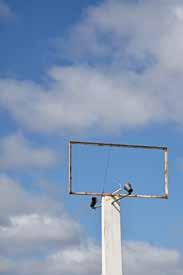
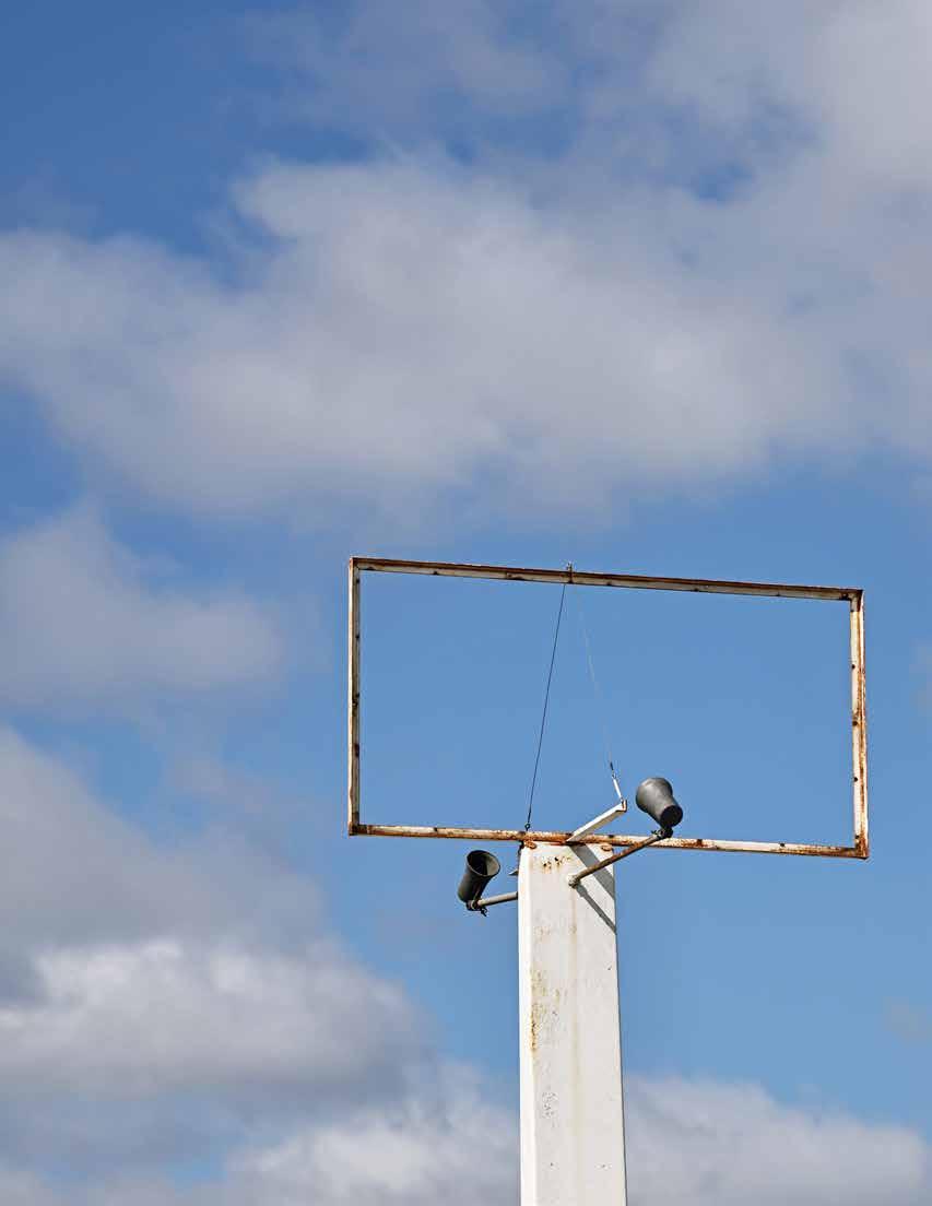
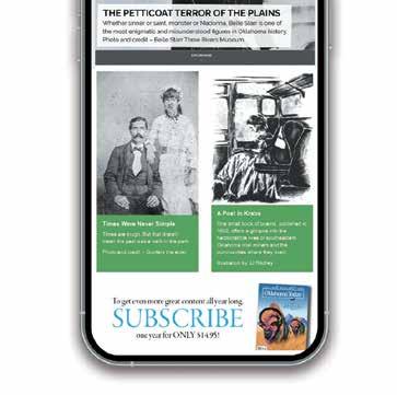
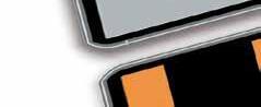
ON THE COVER // VC Torneden, The Other Side No. 049 (Stafford, MO) , 2023, photographic print, page 20; MIDDLE // Einar de la Torre and Jamex de la Torre, ¡2020! , 2020, mixed-media and blownglass sculpture with resin casting, 33 x 22 x 14” | Courtesy of the Koplin Del Rio Gallery. Photo provided by the Philbrook. ©DeLaTorreBrothers, page 10; BOTTOM // Jennifer Larsen, Roadrunner , 2023, micron pen, 9” x 12”, page 22
Support from:


CONTENTS // Volume 39 No. 2 // Spring 2024
4 6 18 10 14
LETTER FROM THE EDITOR JOHN SELVIDGE
IN THE STUDIO // Denae Smith Makes Her Mark KRISTEN GRACE
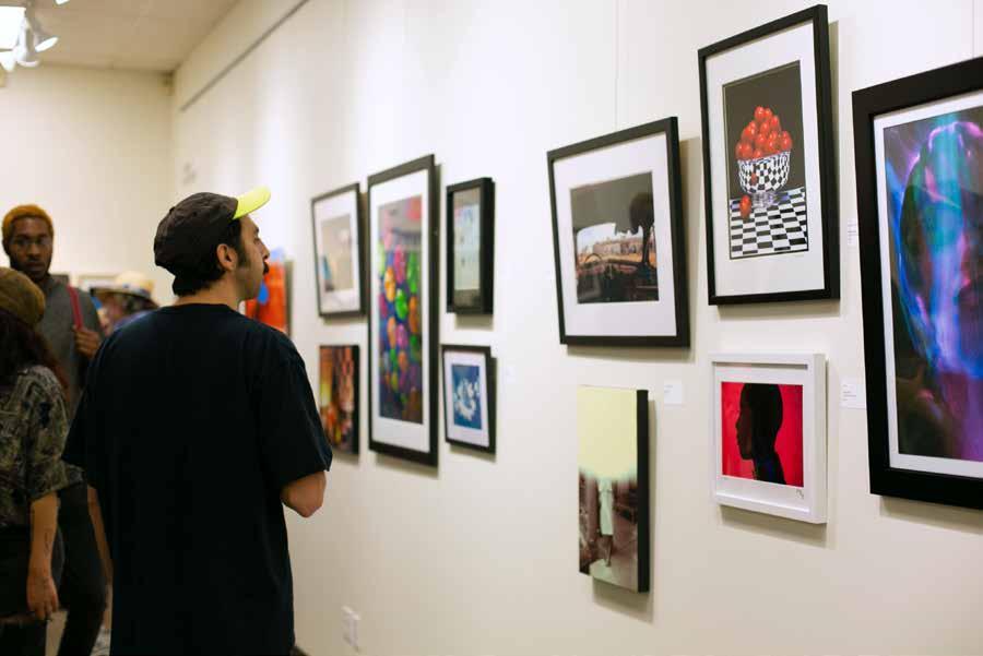
REVIEW Retro-Perspective with the de la Torre Brothers // Collidoscope at the Philbrook ARIANA JAKUB BRANDES
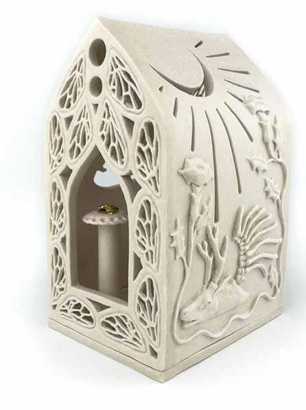
PROFILE Gathering Ourselves // Refurbishing Mark Dion’s Cabinet of Wonder SALLIE CARY GARDNER
PREVIEW Travel My Way, Take the Highway // The Other Side at Living Arts RYANN BEE GORDON
PREVIEW Lust for Life // Biophilia at MAINSITE Contemporary Art OLIVIA DAILEY
INTERMEDIA Exploring Visual Poetry // An Interview with Crag Hill
Oklahoma
to artists and art in Oklahoma. Call or email the editor for guidelines. OVAC welcomes comments. Letters addressed to Art Focus are considered for publication unless otherwise specified. Mail or email comments to the editor at the address above. Letters may be edited for clarity or space reasons. Anonymous letters won’t be published. Please include a phone number.
2023-2024 BOARD OF DIRECTORS // Douglas Sorocco, President, OKC; Jon Fisher, Vice President OKC; Diane Salamon, Treasurer, Tulsa; Matthew Anderson, Secretary, Tahlequah; Jacquelyn Knapp, Parliamentarian, Chickasha; Marjorie Atwood, Tulsa; Barbara Gabel, OKC; Farooq Karim, OKC; Kathryn Kenney, Tulsa; John Marshall, OKC; Kirsten Olds, Tulsa; Russ Teubner, Stillwater; Chris Winland, OKC
The Oklahoma Visual Arts Coalition is solely responsible for the contents of Art Focus . However, the views expressed in articles do not necessarily reflect the opinions of the Board or OVAC staff. Member Agency of Allied Arts and member of the Americans for the Arts. © 2024, Oklahoma Visual Arts Coalition. All rights reserved. View the online archive at ArtFocusOklahoma.org.
3
26
Visual Arts Coalition PHONE: 405.879.2400
N Shartel Ave, Ste B, Oklahoma
OK 73103. Web
ovac-ok.org
1720
City,
//
Editor
John
Anne
Focus is a quarterly publication of the Oklahoma Visual Arts Coalition dedicated to stimulating insight into and providing current information about the visual arts in Oklahoma. Mission: Growing and developing Oklahoma’s visual arts through education, promotion, connection, and funding. OVAC welcomes article submissions related
Executive Director // Rebecca Kinslow, rebecca@ovac-ok.org
//
Selvidge, johnmselvidge@outlook.com Art Director //
Richardson, speccreative@gmail.com Art
22
LETTER FROM THE EDITOR
Most of the time, “content” simply means subject matter, what something is “about.” When discussing art in more academic terms, content can refer more specifically to “the intellectual, psychological, spiritual, narrative, or aesthetic aspect of the work” (this from a handy glossary of art vocabulary from the University of Arizona Museum of Art—the topmost result of my Google search).
Since the internet is rarely far away (apparently) when we’re defining our terms, it’s worth noting the pervasive reach of “content marketing” as well—basically, online content that’s designed to drive audience engagement and/or sales. From a humanist perspective, the marketing dictum “everything is content” (aka, food for the algorithm) has always seemed hollow, even cynical to me in the way it flattens real value in a kind of commercial numbing of experience— especially of the five aspects listed by the U. of A. art museum above.
With the quality of content so often devalued today, I’ve become more and more convinced that the frame’s the thing. To me, how we’re encouraged to observe, contextualize, process, engage with, or frame our experience—of art or anything—seems more like the main event than any given message. On the cover of this issue of Art Focus, VC Torneden’s photograph of a defunct and content-less billboard speaks compellingly to this mindset. Does the literal absence of a sign allow the sky-ness of the sky to become more visible when framed this way? Simply drawing a line or border around something can let us see it differently; just like calling it “art” can imbue it with a quality we didn’t know was there.
Torneden and Harvey’s spectral photographs of Route 66 accomplish this (p. 18), as does Mark Dion’s collection of found objects at Tulsa’s Gathering Place (p. 14). Similarly, the Biophilia group show in Norman reframes scientific engagement with the natural world in artistic terms (p. 22), Denae Smith’s painterly treatments of complex psychologies can be read to renegotiate lines drawn by history (p. 6), and the ecstatic nihilism of the de la Torre brothers elevates a hybrid, kitschy trash-aesthetic to visionary levels (p. 10).
When we reframe, we change the content—and potentially our ways of seeing.
—John Selvidge
JOHN SELVIDGE is an award-winning screenwriter who works for a humanitarian nonprofit organization in Oklahoma City while maintaining freelance and creative projects on the side. He was selected for OVAC’s Oklahoma Art Writing and Curatorial Fellowship in 2018.
4
LETTER FROM THE EDITOR
ROBIN CHASE
PAINTING CERAMICS FIBER ARTS PRINTMAKING AND MORE okcontemp.org | 11 NW 11th St., Oklahoma City REGISTER NOW FOR STUDIO SCHOOL
IN THE STUDIO // DENAE SMITH MAKES HER MARK
by Kristen Grace
Danae Smith became an artist as a young child, as most children do, but she never let go of art. Upon viewing her work closely, one can see concerns with care of and cruelty to the body, as well as both amplification and suffocation of the voice. As an artist, Smith moves through the world, letting her art lead her to what she should learn and create next. She creates her art in the sunroom of her home and as a guest at Paseo One Gallery. A nursing student and sharp observer of history and the present, she applies her scientific studies to inform her work in art.
What inspires you to create?
I’m inspired by many different things. I’m most inspired by the human body, with its versatility and strength. I love choosing the perspective of what I will paint, and whether to try to show the viewer the mind, body or soul of my subject. Because I am a nursing student, I view the human body as art. My acrylic and mixed media works include realistic and abstract elements. I draw from culture and from elements that influence my life. I use textural elements to show the dynamic flow from two dimensions to three dimensions and to demonstrate cohesiveness between the two realms. Creating works that are either for sale or exhibition helps me expand and strengthen my project-design techniques. Art is a continuous movement that pushes creative boundaries through collaborating with other artistic influences.
What media do you use? What is your favorite medium for your art?
I use mixed media most. I combine acrylic paint, plaster, silicone, wood, resin, and other natural elements within my work to create 3D effects to speak to viewers. My
favorite medium is paint, but I have also used woodwork. I plan to grow in that medium as well.
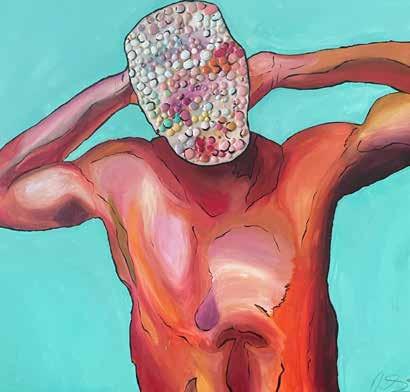
I want to know more about your creative process with the painting Vibe$. I loved that the subject’s face was covered in colorful circles. Can you tell me more about your process and inspiration?
The painting Vibe$ was inspired by an album cover of Jimmy October, who is a national award-winning singer/songwriter from Trinidad and Tobago. He is an influential artist and creative spirit who has helped me while painting different pieces, and this is a tribute to him. The multicolored circles on his face are made of plaster and covered with resin to create a glass-like effect.
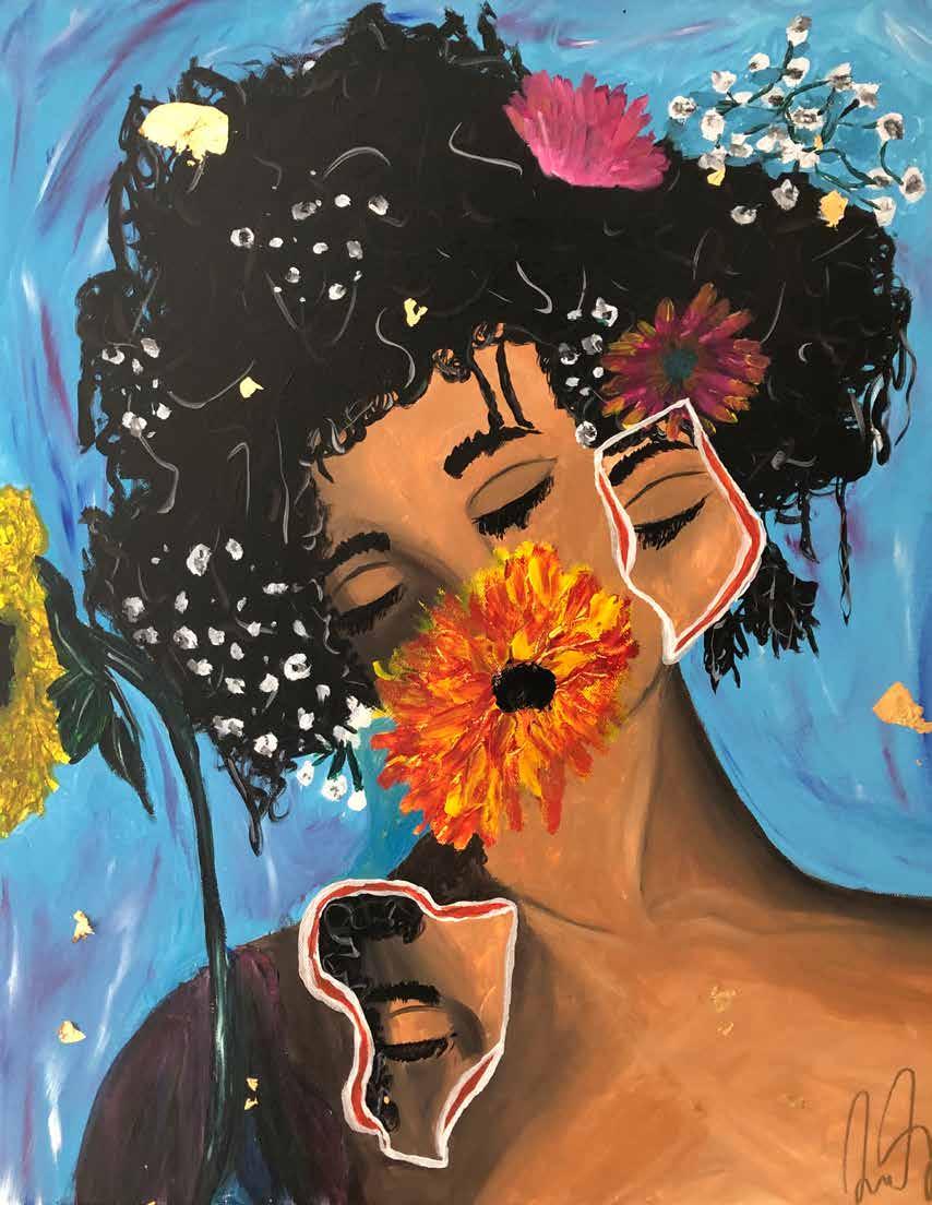
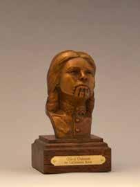
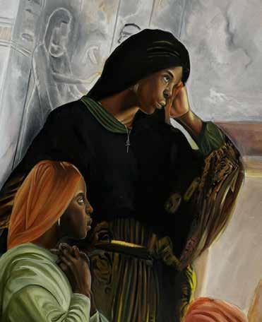
Speak to me about your painting Shattered Beauty. I see a woman with a flower covering her mouth, leaving her throat exposed.
I painted this at a time in my life when I was struggling with the beauty norms in society as an African American woman. I felt there were shattered pieces of myself. I was trying to find myself at a pivotal point in my life. The flowers show the growth within myself as I overcame inner and outer obstacles and began to finally speak. Art is the sharing of thoughts and feelings that words cannot express, but visual expression can display them.
I loved that in Hear My Past (in honor of the Tulsa Race Massacre’s 100th Anniversary) you used both black and white and color in the same piece.
The mouth represents the cry for justice and for the story of what happened to the people involved (and the ones who
7
CONTINUED
IN THE STUDIO
OPPOSITE // Denae Smith, Shattered Beauty, 2020, acrylic on canvas, 18’’ x 24” | All images provided by the artist
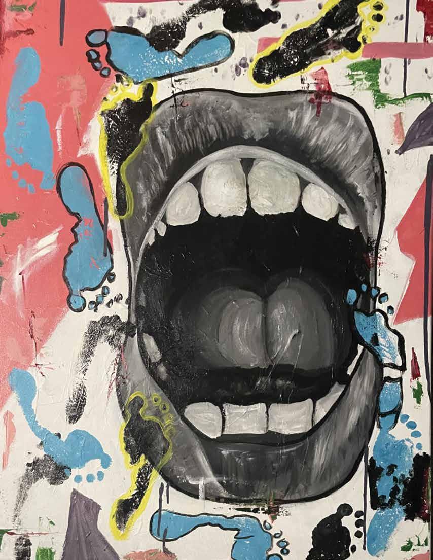
are still alive). It is black and white because people have been silenced for so long. The footsteps go backward and forward, conveying that the past affects the present. The color is to show the active results of the present.
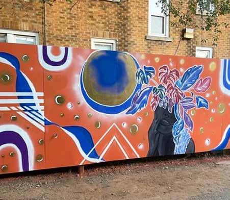
Did you enjoy creating your mural Cosmic Growth in the Plaza District, in concert with the other murals in the Plaza Walls Project?
Yes! I believe murals are a place for the community to come together and share creative thoughts and ideals. Although there were many artists working on separate murals, it felt like we were working together and sharing each other’s creativity.
I asked for the opinions of artists around me while I was painting so I could entertain their perspectives. During the Plaza Walls Project, they had an artist dinner for us the day before the mural festival. There were speakers and meet-andgreets for the artists. It truly felt like a community making an impact on Oklahoma’s creative journey.
I am currently working on a mural with students at Bridge Impact Center. I digitally design my murals before I paint them to either show the client what the mural will look like or to create the image in my mind before I paint it on a larger scale.
Although I can’t find the author, I love the quote “art is simply a manifestation of thoughts the mind cannot speak that shows the complexities of self”. In Cosmic Growth, you can see the theme of evolution of self-identity and growth. I’m excited to share these themes and skills with my students.
Denae Smith is a General Survey Artist for OVAC’s Momentum exhibition this year, showing April 5-6 at the Yale Theater in Oklahoma City.
KRISTEN GRACE is a journalist for 405 Magazine and 405 Business Magazine, a freelance copyeditor for Callisto Media, and a graduate of Oklahoma City University’s Red Earth MFA program. She has authored a picture book for children, The Stepmother Who Believed in Feathers, as well as Wings, a collection of feminist fairy tales, both available from Literati Press. She has recently published poems in Focus Magazine, Mid/South, Freezeray, Behind the Rain Anthology and other literary journals.
9 IN THE STUDIO
OPPOSITE // Denae Smith, Hear My Past, 2021, acrylic on canvas, 30” x 40”; ABOVE // Denae Smith, Vibe$ , 2021, acrylic on canvas, 36’’ x 36”; ABOVE RIGHT // Denae Smith, Cosmic Growth, 2023, mural in Oklahoma City’s Plaza District, ~1700 NW 16th Street
RETRO-PERSPECTIVE WITH THE DE LA TORRE BROTHERS
COLLIDOSCOPE AT THE PHILBROOK
by Ariana Jakub Brandes
The opening night of Philbrook’s Collidoscope: de la Torre Brothers Retro-Perspective was full of energy: a mariachi band performed outside the exhibition entrance, and the bar was crowded with margarita orders as servers looped around laughing groups offering snacks on their silver trays. I slipped past the fanfare and into the exhibit where a small group eclipsed my view of a giant Aztec sunstone-inspired artwork.
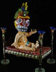
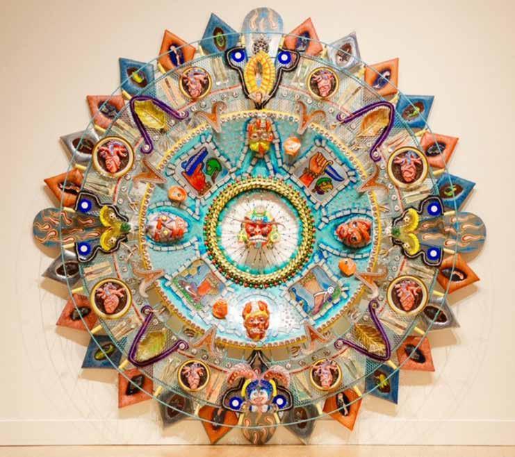
Oxymodern (Aztec Calendar), a 10-foot, circular mixed-media wall installation, replete with Mesoamerican painted symbols and contemporary objects, hangs at the entrance to Collidoscope, a “retro-perspective” of the art of Jamex and Einar de la Torre. Its outer ring consists of a table setting for eight guests, whom we can only imagine. Cutlery is set on peso banknotes beside modern plates serving what appear to be sacrificial offerings, Aztec-style, of human hearts in mole sauce. A butterfly shape, contoured with pearls, separates the settings from one another, an homage perhaps to the monarch whose annual migration from the U.S. to Mexico is paralleled in the artists’ weekly travel between their San Diego and Tijuana studios.
Since Oxymodern seems to reference Judy Chicago’s seminal The Dinner Party, it would be worth comparing Chicago’s recasting of traditionally “feminine” crafts like textiles and ceramics into fine art with how the de la Torre brothers organize unconventional, everyday materials, or even trash—dominoes, painted beer cans, rebar, cement, cigarette butts, hair curlers— into a familiar pre-Columbian structure. The border between past and present disappears through Oxymodern’s sheet metal backing with blown glass Aztec gods framed in a bicycle wheel. The brothers grew up in Guadalajara, Mexico, and often played around an Aztec calendar coffee table in their living room. This ubiquitous calendar can be found on Mexican coins, the national soccer team’s jerseys, and reproduced on the walls of many Mexican homes and restaurants.
Having grown up in two countries with dual citizenship, the de la Torre brothers possess a native understanding of both Spanish and English along with an ability to see each culture with a critical eye. Their artworks enact a collision of changing, kaleidoscopic images seen from either side of the border into the “collidoscope” of cultural hybridity in the exhibition’s title. Even their practice of working with blown glass, traditionally a craft material that must be manipulated by two people, reflects another duality that informs their work. Glass itself is neither a liquid nor a solid, but rather an amorphous solid existing in two states of matter at once.
Additionally, their bilingualism and love of puns contributes to multifaceted interpretations of their art. Humor is often used as an entry point into the de la Torre brothers’ works, so it is no wonder they found a staunch supporter in comedian and art collector Cheech Marin. They connected with Marin when he purchased Oxymodern, and they installed the artwork in his San Francisco home. Marin’s Center for Chicano Art & Culture in Riverside, California, known as “The Cheech,” houses one of the largest collections of Chicano art in the world. In 2022, Collidoscope was the first temporary exhibit to open at The Cheech, for which the de la Torre brothers created a monumental 26-foot tall lenticular print to greet visitors at its entrance.
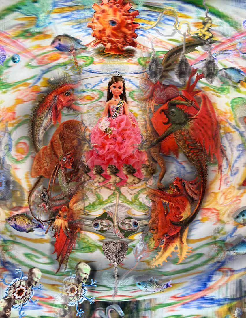
Their lenticular prints, calculated arrangements of two images in one with an animated 3D effect, allow for further bilateral perspectives within a single artwork. Viewers’ movements affect which image they see, giving them agency to control their viewing experience. Miss Mito (short for “mitochondria”) centers upon a female doll, dressed as a beauty queen, that morphs into an older, bearded man wrapped in pink string who is being attacked by medieval-style monsters—a visual pun on “the Middle Ages” that plays upon the link between mitochondrial DNA and aging. The work’s lavender aluminum
11 REVIEW
//
CONTINUED
OPPOSITE // Einar de la Torre and Jamex de la Torre, Miss Mito (detail), 2020, archival lenticular print, waterjet-cut aluminum and resin | Ariana Jakub Brandes. All artworks ©DeLaTorreBrothers
and resin frame is modeled on the mitochondria’s inner membrane, whose negative space creates curving gray shadows on the wall surrounding the work.
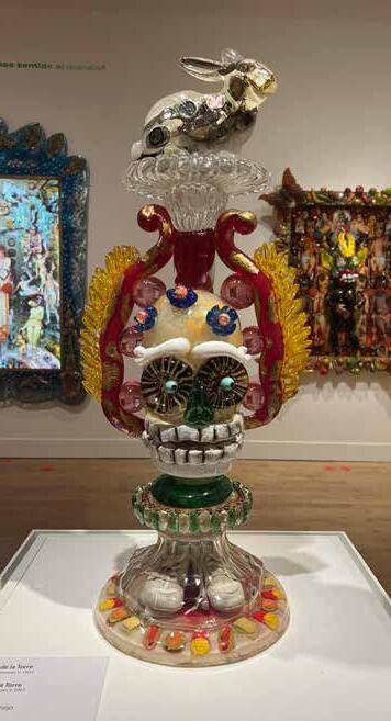
Each time I visited the show, I stopped in front of Rabbit Test (Prueba de conejo), a milky white glass rabbit with wristwatches suspended in its body. The animal balances atop a golden glass skull, below which miniature hamburgers and french fries surround a pair of baby shoes. When my sevenyear-old son joined me, Disney references ripe in his mind, he asserted it was the White Rabbit from Alice in Wonderland
Another point of view came from an older docent who, as she showed students the sculpture, noted that now women can just use a strip to find out whether they’re pregnant—referring
to a pregnancy test from long ago that involved injecting a woman’s urine into a rabbit and then dissecting it. Created in 2013, Rabbit Test’s effect becomes more complicated when viewed in a post-Roe America.
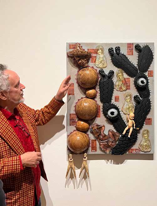
I met Einar de la Torre in front of M’ezcalera al Cielo, one of the more painterly works in the exhibit with a cactus made from rubber tire huarache soles, glass eyes, and glass castings made from provocatively shaped mezcal bottles that pun upon the title’s playful translation of “stairway to heaven. He carefully told me how each part of the artwork was constructed unlocked layers of meaning. Even if these remain unknown, no matter where one begins in the exhibition, or the background knowledge one brings, there is an invitation to
REVIEW
12
Einar de la Torre and Jamex de la Torre, Oxymodern (Aztec Calendar), 2020, blown glass and mixed-media, 120” x 120” x 12” | Courtesy of the Cheech Marin Collection and Riverside Art Museum. Photo provided by the Philbrook
connect through familiar objects (dominos, coins, cigarettes) or systems (the Aztec calendar, mandalas). Several museum guards told me that Collidoscope has been their favorite show to work because they are always noticing something new.
At the very end of the exhibit is a board where visitors can share their thoughts on the show. “It looks like the inside of my soul,” one visitor wrote.
While the de la Torre brothers tend to resist explaining their works, they reveal their intentions in a manifesto published in the exhibition catalog. In it, they describe their approach as “more poetic than direct,” and ending with their assertion of “positive nihilism” feels right here. In their art, they write, they strive “to expose a connectedness in everything—to nature,
to matter, and to each other. In these connections is, perhaps, the only meaning we can really hope for. The endless search for the visible ‘invisible’ can yield kernels of gleaming truths masquerading as dirt or trash.”
You can see Collidoscope: de la Torre Brothers Retro-Perspective at the Philbrook Museum of Art through April 25. For more information, visit philbrook.org.
ARIANA JAKUB BRANDES is an artist, educator and writer living in Tulsa, OK. She teaches art at Cascia Hall.
13 REVIEW
LEFT // Einar de la Torre talks about M’ezcalera al Ciela at the Collidoscope opening, February 2, at the Philbrook. | Ariana Jakub Brandes; RIGHT // Einar de la Torre and Jamex de la Torre, Rabbit Test, 2013, mixed media with blown glass | Ariana Jakub Brandes
GATHERING OURSELVES
REFURBISHING MARK DION’S CABINET OF WONDER
by Sallie Cary Gardner
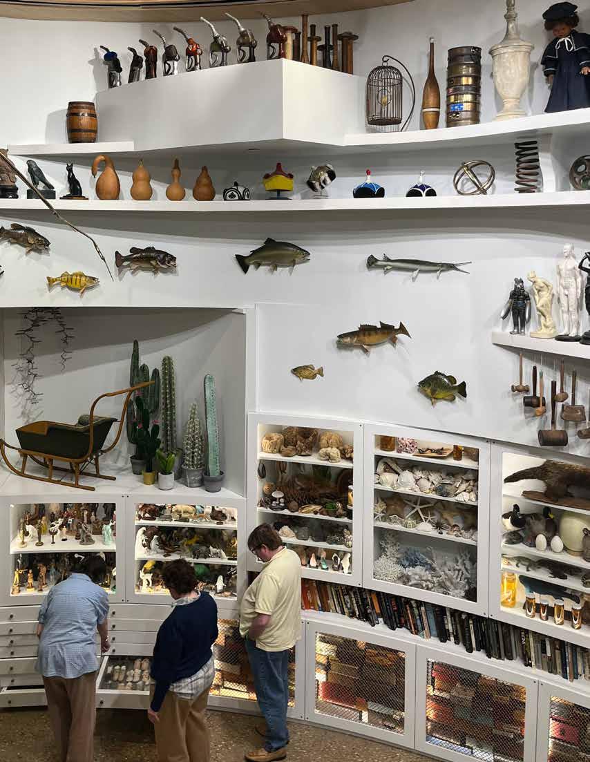
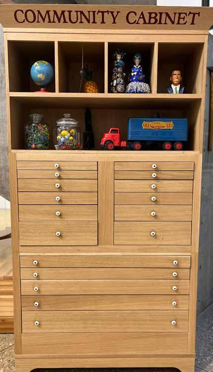
When Oklahomans visit Tulsa’s Gathering Place this spring, they won’t want to miss the park’s Cabinet of Wonder on the first floor of the boathouse. Visitors will be treated to some new additions to the Cabinet’s ever-expanding collection: new books, a Children’s Cabinet, new objects in the black light room, and a Community Cabinet. Visitors have so loved the Cabinet of Wonder, since its installation six years ago, that they gave dozens of their own treasures to it. So, during the Cabinet’s first refurbishment last year, the Community Cabinet was created to display the small toys and handmade artworks donated.
The popular myth in Tulsa, even among some Gathering Place employees, is that the Cabinet of Wonder is a timeworn, treasured private collection that an anonymous wealthy collector donated to the park. Although the project did fall to one man—artist Mark Dion, who, working with his team, created the Cabinet of Wonder from scratch—the rest of the legend is fiction. This stunningly ordered, visually pleasing museum displays the most ordinary objects, which one might find in any small-town Oklahoma museum, but also extraordinary objects from around the world.
The Cabinet of Wonder has delighted and excited thousands of visitors who take in its visual smorgasbord every visit. Dion’s concept for the cabinet was to make a “cosmological arrangement of Oklahomans’ universe of things,” and he has met his goal. Although there are some outstanding objects in it—a skeletal reproduction of a prehistoric bird with a 12-foot wingspan and a cast of the skull of a 11,000year-old saber toothed tiger—the real star of the Cabinet is the curation.
At first sight, the Cabinet seems a little hidden away, but that just adds to its mystique. It’s a three-story, light-filled
space with exquisite cabinetry housing dozens of objects reflecting Tulsa and Oklahoma’s colorful pasts and global histories. There are no labels in the Cabinet of Wonder, which gives parents a lot of leeway (and potential fun) when explaining unfamiliar objects to their children.
Visitors are allowed to take books off the shelves of one of the cabinets but otherwise aren’t supposed to touch the artifacts. However, the lower part of the room is filled with shallow drawers that people can open and view collections of small items in clear plastic covers such as Girl Scout badges, swizzle sticks, and old yearbook photos.
Dion was commissioned to create the Cabinet because, although he’s had major exhibitions at museums such as New York’s Museum of Modern Art and the Tate Gallery in London, his approach is accessible, according to Sarah Van Zandt, education and guest services director. The Gathering Place’s Cabinet of Wonder was the first time he was assigned to create a new collection. He started by testing the Kaiser organization.
He said that his first purchase for the Cabinet, at $10,000, was purposely expensive. “I needed to find out quickly if this project was going to be hell on earth or if they actually trusted me,” Dion said. “I bought the horse skeleton from Bones Clones and sent them the very first receipt to see if they’d flinch, if I’d get a phone call. I didn’t, and I knew the project was well funded.”
Dion spent two years scouring Oklahoma’s antique malls, thrift shops, and junk stores to collect the objects in the Cabinet. Based in New York, he planned his trips to Tulsa around the schedules of the flea market at the Tulsa State Fairgrounds. He also stayed in his Tulsa friends’ guest rooms and even rented a house within walking distance of the Gathering Place.
PROFILE 14
//
CONTINUED OPPOSITE // Visitors peruse artifacts in the Cabinet of Wonder at The Gathering Place in Tulsa.
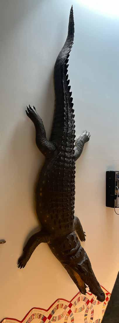
In addition to the horse and bird skeletons, another strikingly large artifact is a crocodile hanging high on a wall. “When the workmen were hanging it, they started a rumor that Will Rogers had won it in a poker game,” Dion said, “and this is not true. It’s one of the few things I found on Ebay.” Dion said that displaying stuffed crocodiles on the wall has been a tradition in such collections since 1599.
Globally speaking, cabinets of wonder have a long history. Also called “cabinets of curiosities” or Wunderkarmmen in German, they comprise dozens, hundreds, or even thousands of objects amassed by private collectors for contemplation and enjoyment. “In the 16th and 17th centuries,” Dion said, “unusual objects started appearing in Europe. Their religion and literature depicted the world as a small place, but it was much broader than they ever imagined. They used objects to understand and expand their framework.”
In the Renaissance, collectors divided their objects into categories such as those based on the elements (earth, air, ether, fire, and water) or the bodily humors (black bile, blood, yellow bile, and phlegm). Dion uses these categories in his Cabinet of Wonder as well as the senses and the seasons. Large jars of powdered pigments satisfy viewers’ appetite for color, and a row of perfume atomizers appeals to their sense of humor with the stuffed skunk, a living atomizer, that crouches among them. Another sly joke sits on the highest shelf: a collection of gas-pump handles. “It’s a tribute to the oil industry,” Dion said. “After all, that’s where the Kaisers first made their money.”
Although the Cabinet looks like a young boy’s dream of the best museum ever, Dion experienced only one museum as a child, the New Bedford Whaling Museum in Massachusetts, where he grew up. “It was an astonishing experience. It somehow changed my life,” he said.
Dion maintains that some people who come to the Cabinet of Wonder will be scholars, but the unscholarly will find something that speaks to them as well. “The Cabinet is a welcoming artwork for all people. I wanted to make a work that in every way is very generous and welcoming, in step with the park itself. I want people to delight in the Cabinet and for it to be a joy and a pleasure.”
Mission accomplished.
You can visit the Cabinet of Wonder in the ONEOK Boathouse at Tulsa’s Gathering Place, 2650 S. John Williams Way, during regular park hours. For more information, visit gatheringplace.org/cabinet-of-wonder.
SALLIE CARY GARDNER is retired from a long career in writing and public relations. She enjoys contributing to the Oklahoma arts scene through her work with the Tulsa Artists’ Coalition Gallery and in collaboration elsewhere.
17 PROFILE
OPPOSITE // A curiously large dummy of a crocodile hangs along the wall.
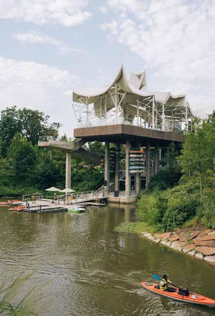
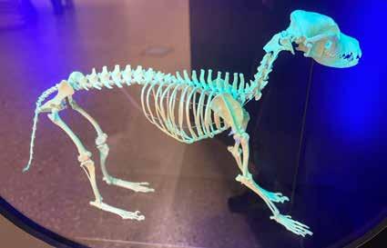
TOP LEFT // The Community Cabinet was installed in 2023 to house small items donated to the Cabinet of Wonder. TOP RIGHT // Exterior of the ONEOK Boathouse; ABOVE // A skeleton in the Cabinet’s black light room
TRAVEL MY WAY, TAKE THE HIGHWAY // THE OTHER SIDE AT LIVING ARTS
by Ryann Bee Gordon
When you think of the historic Route 66, what comes to mind?
Vintage scenery from thriving cities across the Midwest. Old couples on road trips, posing next to landmarks and eating in ‘50s-style diners. America’s thriving past, glorified. Well, that’s not what you’re going to see at The Other Side exhibition.
Showing at Living Arts in Tulsa, April 5-20, and traveling to OKC to the Paseo Arts and Creativity Center on a smaller scale in September, The Other Side features the photographs of VC Torneden and Melinda Green Harvey as they capture Route 66 in a new light. Rather than focusing on the nostalgic past of one of America’s oldest highways, these two artists dial in on the darker, forgotten aspects of this historic route.
“It just became as we photographed, everything was shifting around us. There’s a lot of inequality that comes from that,” says Torneden, who has been photographing Route 66 since she first moved to Oklahoma in 2004. “There’s some good change and some that’s probably not so hot. We decided to just start documenting that.”
The two artists’ original plan for The Other Side series was to focus on their respective home states—Oklahoma for Torneden and Texas for Harvey—and compare the pictures they took over a two-week span. Moving forward, they found themselves enraptured by the many once-thriving, now-lost towns and landmarks that line the highway’s historic path, and the politics of revitalization projects that seemed so heavily focused on intercity areas. The two-week plan turned into a five-year project, which is now halfway through. Wrapping up in 2026 for Route 66’s centennial, they plan to begin exhibiting in cities nationwide, beyond those just along the Route 66 path. Both Harvey and Torneden have driven all of the 2,400plus miles of Route 66, exploring and photographing stretches outside of the original 1920s-era portions of the route. Now,
three shows down the line, the Living Arts exhibition is their biggest one yet, featuring 100-150 photographs of different sizes meant to capture the essence of the more realistic side of Route 66.
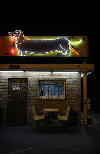
These two artists came together due to the similar styles and subject matter of their photography that often captures images of ghostly towns, decaying architecture, and other rustic subjects. Their works are presented in different color schemes for this particular show—Torneden’s in color photography and Harvey exclusively in black and white—but their representations appear distinct in more ways than one. Torneden’s collection brings the intensity, with pops of color and artistic angles that run counter to its subject matter. Many photographs focus on run-down storefronts, eroding paint, broken signs, and other scenes seemingly lifeless to the naked eye. Color and light is often fragmented across barren subjects, giving her works an ironic, eerie feel. A rusted billboard reduced to a frame takes center stage in front of a bright blue sky with clouds in The Other Side No. 049 (Stafford, MO) The Other Side No. 045 (Albatross, MO) looks through the window of a seemingly vacant, decrepit building with boards hanging behind the glass, barely revealing a shiny, vintage car and motorcycle in pristine condition within, looking out of place as if they were Photoshopped into the frame.
Many of her shots position the horizon low in the frame, providing a sense of unease and abandonment as the sun sets on many of these once-thriving regions. Neon signage seems to flicker through various still frames, giving pops of vibrant color amid desolate settings. In The Other Side No. 082 (Albuquerque, NM) a fluorescent wiener dog sign glows at night above an empty, roadside restaurant with bars on the door and window; The Other Side No. 008 (Amarillo, TX), on the
18 PREVIEW
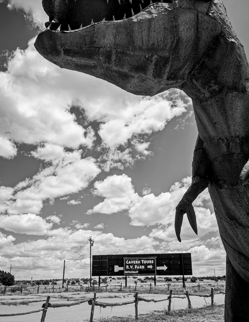
CONTINUED OPPOSITE // Melinda Green Harvey, The Other Side No. 073 (Grand Canyon Caverns, AZ), 2023, photographic print
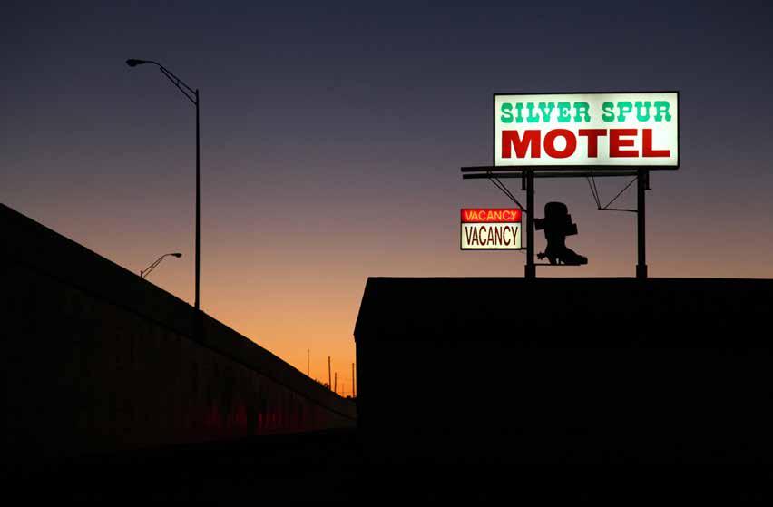
other hand, shows a lighted vacancy sign above a dark motel with an ombré sunset illuminating the deserted highway passing by it.
Melinda Green Harvey’s photographs feature longer, more distant overview shots of run-down locations or detailed images of desolate spaces, sometimes layered with forgotten artifacts. “Don’t plan to see cute stuff,” says Melinda Green Harvey. “When you say Route 66, people instantly think they know what it looks like. They think diners decorated with old records, pink and black and white color schemes. They won’t see any of that stuff. That’s not what we think is really the story of Route 66. The parts that struggle, little towns that don’t have a lot going on right now.”
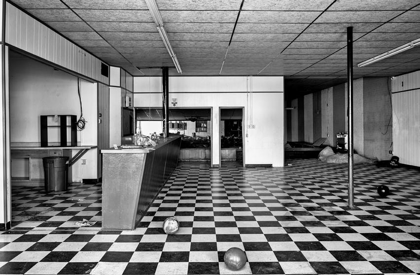
Harvey’s images have a hauntingly surrealist tone, illustrating a different kind of emptiness like the literal dust left behind along many areas of Route 66. Life looks to have simply evaporated in many of the abandoned facilities she captures, like The Other Side No. 013 (Sayre, OK), which features an
abandoned bowling alley with checkered floors and three bowling balls positioned strangely on the floor as if abruptly left there. This theme of sudden abandonment persists in exterior shots, like The Other Side No. 073 (Grand Canyon Caverns, AZ), which features a neglected roadside attraction. A massive, fiberglass T-rex statue juts into the frame in front of a sign directing motorists to cavern tours, a rugged, barelystanding fence separating the sign from the dinosaur. As its title suggests, The Other Side gives a representation of the other, less glamourous face of the historic highway. The exhibition, which includes photographs from all eight states that Route 66 runs through, offers insight on forgotten parts of the nation obscured by images of middle America’s nostalgic past as that past itself deteriorates.
“I genuinely hope no one comes in expecting to see the car hop on roller skates and the ‘57 Chevy, bubble gum colors, because you’re not going to get that,” says VC Torneden. “You’re going to get a lot of irony and dark irony at that. You will have to look at
20 PREVIEW
how things have been left behind in pretty cruel ways, especially with regards to some of the small towns’ more rural or poor populations.”
The Other Side can be visited at Living Arts in Tulsa from April 5 through April 20. For more information, check out livingarts.org.
RYANN BEE GORDON is a multifaceted writer who lives in Tulsa.
Author of the novel The Bridge Inside and host of the podcast What Daddy Doesn’t Know, she contributes creative writing, journalism, copywriting, and design for leading periodicals in Oklahoma and Texas. After attending the University of Oklahoma, she began writing for publications such as the Dallas Observer, Preview Magazine, and Katy Trail Weekly, where she represents the face of the “Uptown Girl” column.
 OPPOSITE // VC Torneden, The Other Side No. 008 (Amarillo, TX), 2021, photographic print; ABOVE // Melinda Green Harvey, The Other Side No. 013 (Sayre, OK), 2021, photographic print; RIGHT // VC Torneden, The Other Side No. 082 (Albuquerque, NM), 2022, photographic print
LUST FOR LIFE // BIOPHILIA AT MAINSITE CONTEMPORARY ART
by Olivia Dailey
“To develop a complete mind: Study the science of art; Study the art of science. Learn how to see. Realize that everything connects to everything else.” — attributed to Leonardo da Vinci
A group show representing artists, scientists, and nature enthusiasts, Biophilia will be on display at MAINSITE Contemporary Art, with support from the Norman Arts Council, from May 10 through July 15. In conceiving the show, curator Haley Prestifilippo connected with each of the participating artists through her art course on scientific illustration at the University of Oklahoma. Some took her class, while others were consultants, references, or presented for it. The show gets its name from the ancient Greeks, who recognized humans’ instinctual love of all living things (bio = life, philia = love of).
Science and art are sometimes seen as opposed (the left brain vs. the right brain), but they have more in common than not. Both disciplines house treasures in museums, but more importantly, scientists and artists have an insatiable curiosity and unique ways of interpreting the world around them. All of Biophilia’s artists love and respect nature, and all stress that humans should not be removed from it. As animals ourselves, we are part of nature. Separating ourselves makes it easier, as a species, to exploit our so-called natural resources, to see nature as an object instead of many, many subjects.
Thinking of “scientific illustrations” can conjure images of Victorian botanical prints, perhaps showing the development of a plant in cross-section, but there are many applications of this artistic style and skill. Notable ornithologist John James Audubon, of Audubon Society fame, is remembered more in some circles for his artwork from his book The Birds of America. His illustrations of birds were accurate but still artful. The colors, the composition, and the details make the birds feel alive, not something stuffed as only an object to study. Similarly, each of Biophilia’s artists brings specific perceptions and experiences with nature (past, present, and future) into their works that allow them to breathe.
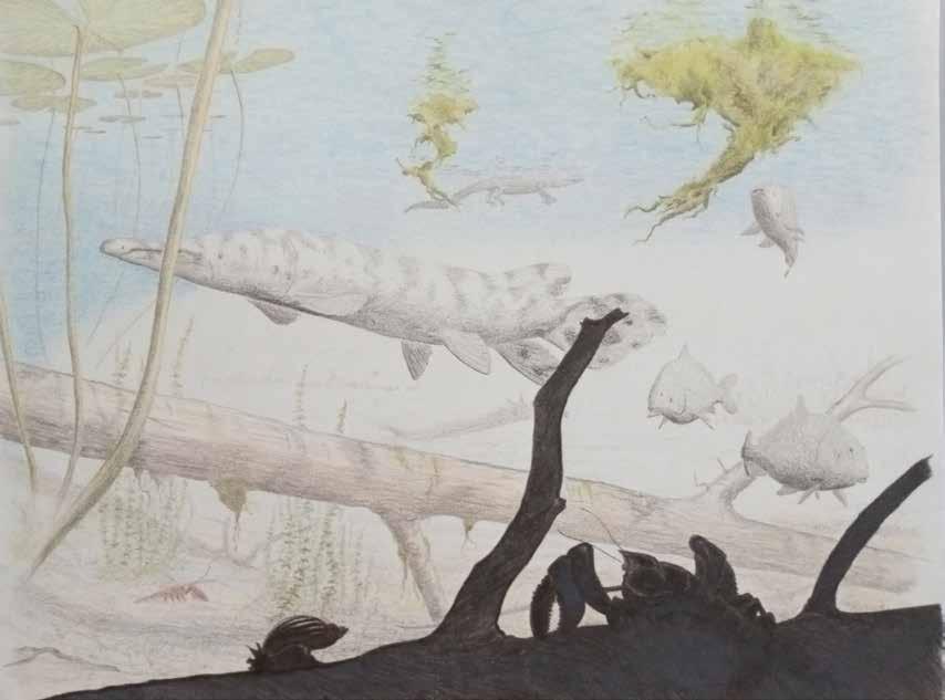
Nature is about life, which is inherently also about death. Dr. Nick Czaplewski has a perspective you can only get from studying the extinct. A vertebrate paleontologist and now curator emeritus at the Sam Noble Museum of Natural History, where he spent 30 years of his career, Czaplewski brings not only his vast knowledge of fossils and prehistoric mammals to Biophilia, but his artistry as well. He refers to his drawings as “life restorations” that let him “honor the living being that the fossil belonged to.” An aquatic Miocene scene in particular exhibits color, depth, and framing that together create an immersive effect.
Jennifer Larsen is the vertebrate paleontology collections manager at Sam Noble and worked with Czaplewski for over 20 years. Both are showing their art in an official capacity for the first time. Larsen created two installations using found natural items (bones, leaves, etc.) as well as her drawings. Larsen asks: “Why do we call fallen leaves ‘leaf litter,’ why is an ‘undeveloped’ space referred to as an ‘empty’ space?” She says that her works “play off of each other, addressing the richness of the natural world and how we decide to place value on things.” She says her art intends to point out both interconnectedness and double standards in our systems.
Hannah Harper is a contemporary wildlife artist in Norman. For Biophilia, she is showing a grid of nine Oklahoma landscapes plus a few additional paintings. She specializes in plein air basically, painting what is right in front of you, outdoors in the open air. Plein air is a naturally present practice—painting what is now, what undeniably is. It can be a reminder of how quickly things change, sometimes just for a year, like autumn colors, or sometimes permanently, like a mountainside excavated for minerals. Her non-landscape paintings focus on wildlife, native to the state of Oklahoma, paired with its primary food
23 PREVIEW
CONTINUED
//
|
OPPOSITE
Lauren Rosenfelt, Coyote Akin (detail), 2021, ink pen, graphite, acrylic and mica on plywood, 24”x24”
All images courtesy of Haley Prestifilippo and the Biophilia artists
sources, like cottontail rabbits and dandelion greens. The enemy of one (human) creature’s pristine lawn becomes another creature’s midnight snack. Harper’s painted animals look like something out of a children’s book but are, in fact, a product of field study. The artist says she aims to “portray wildlife through realism and accuracy while retaining a sense of whimsy and wonder.”
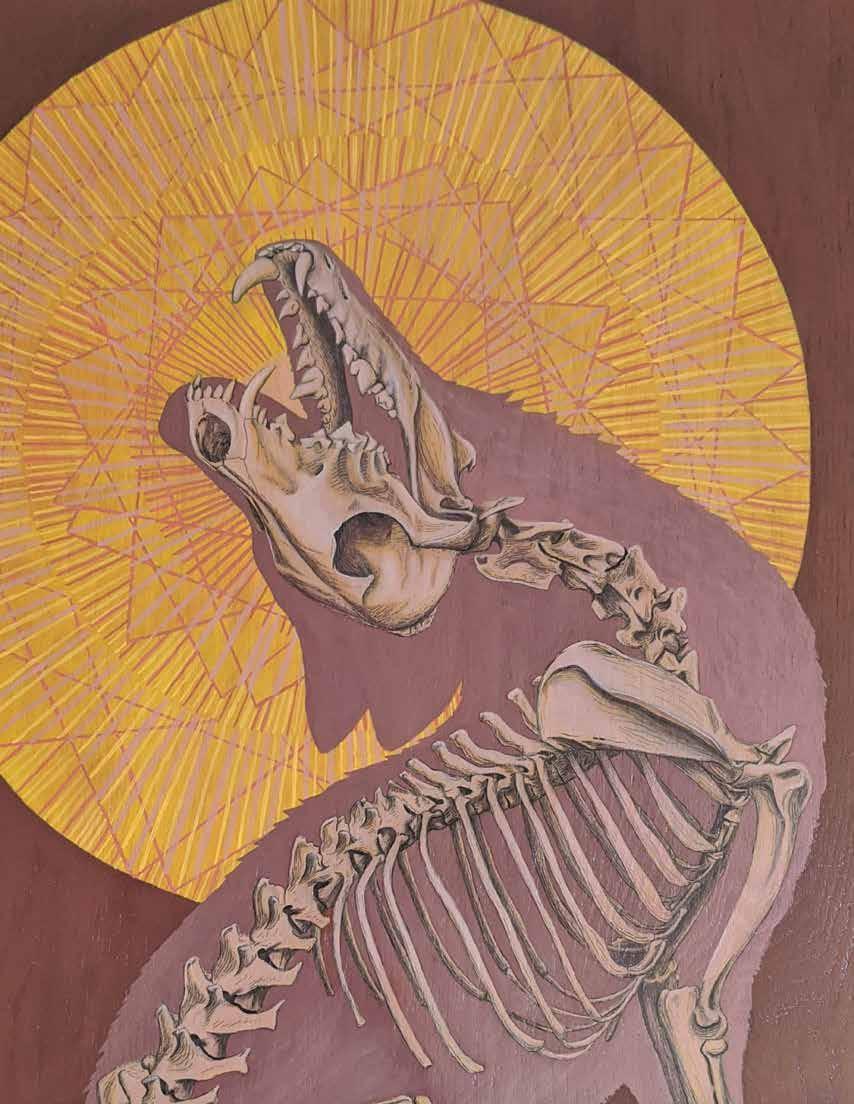
Now a working artist and graduate student of plant biology at OU, Lauren Rosenfelt graduated with an art degree and then found her niche in scientific drawing. For a highly visible project for the Norman Public Library Central, Rosenfelt designed informational signage about the library’s native plant garden and its many benefits. Where the average person might have seen dead and straggly stalks, Rosenfelt saw biodiversity, habitats, and carbon sinks worth preserving—underlining the point that you cannot protect what you do not understand. As a more formal student of plants now, Rosenfelt realizes the more she learns, the more she understands how little she knows. For Biophilia, Rosenfelt deploys native plants in an installation alongside drawings
of animals—like a coyote and a roadrunner—that reveal their bones within.
If other artists in Biophilia present a clear depiction of time in terms of past, present, or future, then Grace Potter’s ceramic works seem to sit squarely outside of it. There is an ethereal quality to her porcelain pieces. Mausoleum for a Studio Fly—a six-inch white structure adorned with mushrooms, rays, and cutouts in a fly-wing pattern—memorializes a house fly, gilded in gold leaf. Potter’s idea to make artful final resting places for dead bugs was inspired by Robin Wall Kimmerer’s seminal Braiding Sweetgrass. In a passage about showing gratitude for the Earth’s abundance, Kimmerer’s “everyday acts of practical reverence” resonated with her. Describing the process for Reliquary for a Cicada, Potter says, “I chose to outline their bodies and then repeat the outline to emphasize their tiny forms, but also as a metaphor for the ‘ripple effect’ of every life and its importance in the greater ecosystem.”
Although each artist in Biophilia has a passion for nature and preserving it, Prestifilippo says the show aims simply to invite the viewer to look at nature anew and wonder rather than incite any action directly. “Nature is an old idea, eternal, original—it has been with us since the beginning. How does this show,” Prestifilippo asks, “inspire new engagement with a subject we all have an intimate connection to already? And maybe lead to a positive reimagining of our relationship with it?” With Biophilia, nature emerges as a persistent, yet subtle, muse and teacher.

Biophilia will be on display at MAINSITE Contemporary Art in downtown Norman from May 10 through July 15. Visit mainsitecontemporaryart.com to learn more.
OLIVIA DAILEY
Oklahoma.
25 PREVIEW
has a BA in Journalism from the University of
She works as a program manager at a transportation research center in Norman.
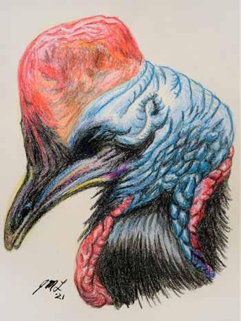
OPPOSITE, TOP // Nick Czaplewski, High plains gator and rhinos (Miocene), 2024, colored pencils on vellum, ~9" x 20"; OPPOSITE, BOTTOM LEFT // Jennifer Larsen, Cassowary, 2021, crayon, 14” x 16.5”
RIGHT // Hannah Harper, Midnight Snack, 2024, oil on canvas, 20” x 20”; BOTTOM RIGHT // Grace Potter, Mausoleum for a Studio Fly, 2023, porcelain, glaze, gold leaf and found fly, 3” x 4” x 6”
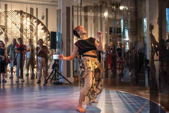
INTERMEDIA – EXPLORING VISUAL POETRY // AN INTERVIEW WITH CRAG HILL
I first learned about Crag Hill’s work in visual poetry (or “vispo”) about 15 years ago during my time with the experimental poetry collective Atlanta Poets Group. A professor of English Education at the University of Oklahoma for more than 10 years and an educator for 34, Hill has published widely in diverse subjects, including as an editor of several visual poetry anthologies. In 2020, he curated an exhibition at MAINSITE Contemporary Art that featured more than 90 works of visual and concrete poetry from around the world, and he’s eager to show them again. Interested venues should contact the editor at johnmselvidge@outlook.com, and I will put you in touch.
How would you define visual poetry as a genre?
Visual poetry lies between the visual arts and literature and is a poetry of materials. Visual poems can consist of words, alphabetic letters, fragments of letters, drawings, collaged and/or manipulated photos and many other possible media. In textual poetry, poems are read one word at a time before the poem falls fully into place, but with visual poetry, the poem must be read as a whole, simultaneously, before a close reading of its parts.
What about its history? When and how did vispo emerge?
Visual poetry is the umbrella term under which contemporary visual poetry, concrete poetry, and asemic poetry now reside, but the term was not in use when visual poetry originated. Contemporary visual poetry arises out of post-World War I Dada, Italian and Russian Futurism, Russian Constructivism, and the concrete poetry movement that began in the late 1940s.
There were as many strategies for combining text and image as there were concrete poets, but many of the poems that caught the public’s eye performed on the page what the letters and words of the poem denoted—like with Ian Hamilton Finlay’s “acrobats” where the horizontal, vertical, and diagonal patterns and positioning of the letters a-c-r-o-b-a-t-s suggest the movements of acrobats in motion.
How is concrete poetry different from contemporary vispo? I would argue that concrete poems are more legible than other visual poems and retain more alphabetic features (letters, words, phrases, recognizable fragments of text). They can be read aloud, with all their features easily voiced. Concrete poems balance text and image more evenly than visual poems, which tip the scale further to the visual and often allow their alphabetic features to completely disappear.
Tell me more about the visual poetry show you curated in 2020.
Concrete and visual poetry are not new to central Oklahoma. Frank Parman, long-time publisher of Point Rider Press out of Norman, curated at least three concrete poetry exhibits in Norman and OKC in the 1980s and 90s, but I knew there hadn’t been anything recent. Especially since the Mark Allen Everett Poetry Reading Series at OU hosts readings at MAINSITE in Norman, curator Erinn Gavaghan was immediately receptive to a visual poetry exhibition.
I sought a range of visual poets for the show and ended up including ten: from Canada, England, Israel, Portugal, Scotland, and the U.S. Here, I can talk about three of them.
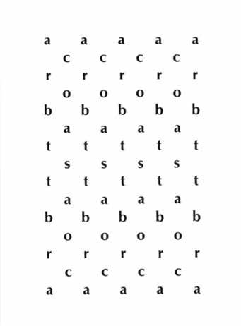
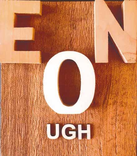
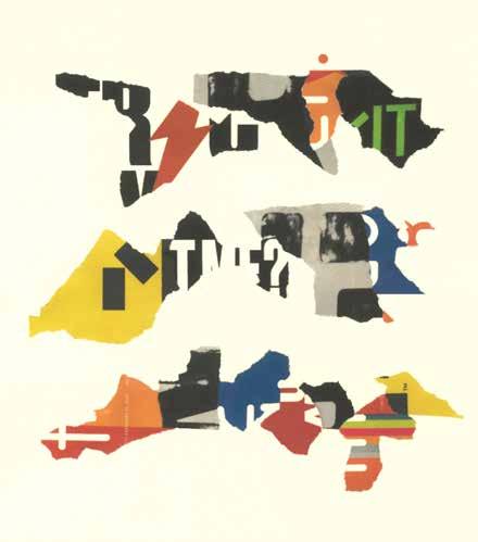
K. S. Ernst, in many ways, follows in the footsteps of Ian Hamilton Finlay since both are conscious of the materiality of letters and words and have built, as much as written, visual poems with a three-dimensional presence. Enough (which could be read as “O Enough”) thrusts the finality of that expression at the viewer. The “UGH” at the bottom visually and aurally underscores the exasperation.
Scott Helmes submitted works from a haiku series he had been producing for ten years. As he wrote in his exhibit notes, “while not expressly following the typical 5-7-5 format…the three-line finished works visually remind the viewer of the compact language of a haiku.” I immediately appreciated the notion of visual haiku and thought of abstract painters like Mark Rothko. I found Haiku #139 especially striking in the fierce gestures of the collage, accentuated by a deft arrangement of red, yellow, orange, and blue.
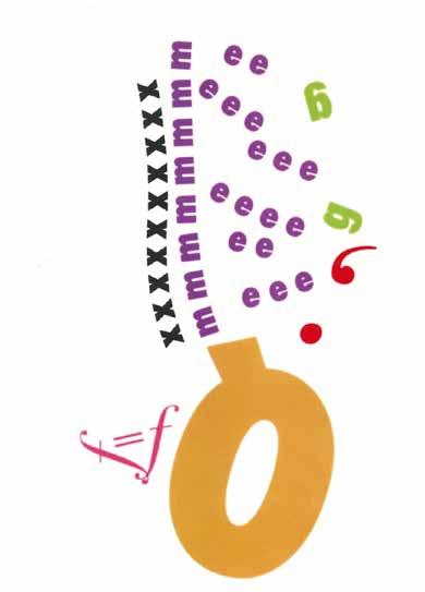
Nico Vassilakis has been one of the most generative visual poets in the last 30 years. He has been laser-focused on the lives of letters and, as he wrote, “what they find themselves doing before and after forming into words. For a moment they’re autonomous and independent with no restrictions, so they navigate or are drawn toward one another to form new and unrealized results.” In many of his poems, letters overlap, layering into a mass, a mega-letter. In the untitled poem below, the letters have room to march, to walk side by side, up and away from an upside-down letter Q.
26 INTERMEDIA
27 INTERMEDIA
CLOCKWISE FROM TOP LEFT // Ian Hamilton Finlay, Acrobats, 1964; K.S. Ernst, Enough, 2020, sculpted wood, 12” x 12”; Scot Helmes, Haiku #139, 2019, collage on paper; Nico Vassilakis, untitled digital print, 2019 | All images courtesy of Crag Hill
P A S E O A R T S A S S O C I A T I O N ANNUAL JURIED EXHIBITS Providing artists opportunities to connect with the community P A S E O A R T S & C R E A T I V I T Y C E N T E R 3 0 2 4 P A S E O SMALL ART SHOW Apply August - October | Exhibit in November PAA MEMBER'S’ SHOW Apply November - January | Exhibit in February THE MARCH SHOW Apply January - February | Exhibit in March PRINT ON PASEO Apply May - June | Exhibit in July PASEO PHOTOFEST Apply July - August | Exhibit in September PIZZA AS BIG AS YOUR FACE NY STYLE PIZZA BY THE SLICE ORDER ONLINE!
ROOTS CULTURE HISTORY ROOTS CULTURE HISTORY
The Works of LaQuincey Reed & Markus Muse
On Display: March 8 - June 1 in the Tulsa World | Lorton Family Gallery
BECOME AN OKLAHOMA INSIDER.
Get events info and behind-the-scenes stories about Oklahoma’s food, travel, events, and culture sent to your inbox. Sign up for Oklahoma Today’s newsletters at


Newsletter.OklahomaToday.com.
Non Profit Org. US POSTAGE P A I D Oklahoma City, OK Permit No. 113 1720 N Shartel Ave, Suite B Oklahoma City, OK 73103 Visit ovac-ok.org to learn more.
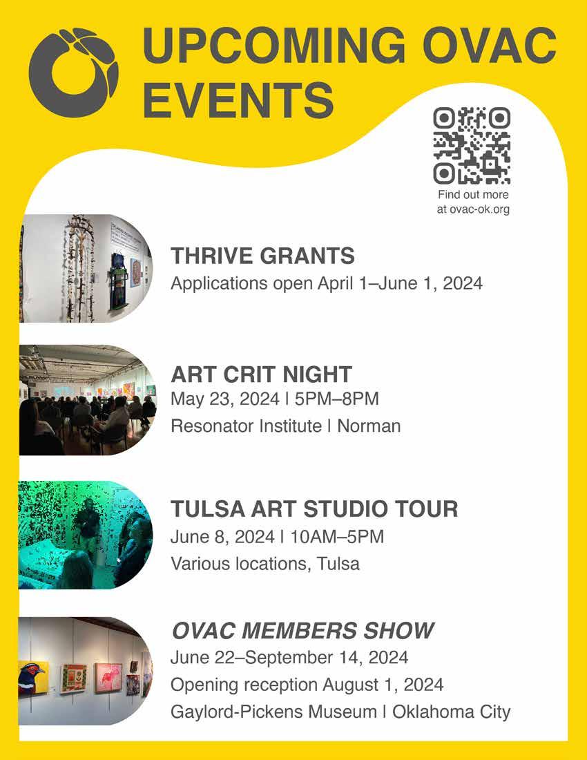
TO KNOW WHAT ART HAPPENINGS ARE COMING UP IN OKLAHOMA? View upcoming OVAC and community art events and artist opportunities through the Oklahoma Arts Resource Calendar. ovac-ok.org/okartscalendar SAVE THE DATE LSA ART S DIO TOUR JUNE 8, 2024 Connect with and purchase artwork by artists who live and work in Tulsa. Get an intimate look at their studio process while you experience them creating and discussing their work! This public event is pay-what-you-can. Visit: www.tulsaartstudiotour.org for more info, including tickets, the artists and donations.
WANT
