SUMMER 2021
Barbara Cleveland Kanchana Gupta Julia Gutman Joanna Lamb Naminapu Maymuru-White Alex Seton Tim Silver Michael Zavros
Editorial Directors Ursula Sullivan and Joanna Strumpf Managing Editor Alex Pedley Senior Designer & Studio Manager Matthew De Moiser Designer Angela Du Proofreaders Harriet Reid Mariia Zhuchenko Administrative Support Beau Cummins Production
SYDNEY
799 Elizabeth St Zetland, Sydney NSW 2017 Australia P +61 2 9698 4696 E art@sullivanstrumpf.com SINGAPORE
P +65 83107529 Megan Arlin | Gallery Director E megan@sullivanstrumpf.com
sullivanstrumpf.com @sullivanstrumpf @sullivanstrumpf @sullivanstrumpf sullivan+strumpf
polleninteractive.com.au
Advertising Enquiries art@sullivanstrumpf.com or +61 2 9698 4696 Subscriptions 6 print issues per year AUD$120 Australia/NZ $160 Overseas Subscribe at sullivan-strumpf.myshopify.com
Sullivan+Strumpf acknowledge the Gadigal people of FRONT COVER: Tim Silver Untitled (heartbeats) J.M, 2021 copper infused Forton MG 12 x 20 x 14 cm Photo: Aaron Anderson
the Eora nation, the traditional custodians on whose lands the Gallery stands. We pay respect to Elders, past, present and emerging and recognise their continued connection to Culture and Country.
Australasia’s Premier Art Fair
sydneycontemporary.com.au
Lo c a t e d i n r e g i o n a l N SW, M o na Fa rm i s a u n i qu e c u r a t i o n o f c ont e mp o ra ry a rt , c o u n t ry l i f e a n d l u x u r y a cco mmo d a t i o n.
mo na@mo na f a rm.c om. a u ( 0 2) 720 2 5638 Ph o t o: K i m be rle y Low
SUMMER 2021
A Year in Between Ursula Sullivan+Joanna Strumpf
The end of the year means Summer—heading out of this weird blurry year and striding happily into our biggest issue yet. First launched in May 2020, it started as an initiative to help us communicate with our community of friends, artists, collectors, and fellow art world colleagues, a mere 31 pages long. It has become a good way to stay in touch, a way to connect in times when face-to-face interactions have not been possible, whether we have been locked down or travelling the world.
This has not been lost on Tim Silver, our cover boy, whose November show can be seen as a meditation on such Inbetween Days as these. Amongst new works, Tim has created a series of sculptures that memorialise the intimate and modest moments shared between people; a pair of feet intertwined, a hand caressing another under the covers. Julie Ewington’s essay on the exhibition articulates the work so beautifully, ‘Touch is everywhere here. And that touches me’. Image courtesy the artist and Buku Larrŋgay Mulka. Photo: David Wickens
Naminapu Maymuru-White, Milŋiyawuy (Nami) (detail), 2021, bark painting, 139 x 90 cm,
Staying in touch, and indeed, the very sense of touch is something that we need and crave as humans, and has, in many cases, been difficult to achieve lately. We have mused over this idea recently as our relationship with touch has radically transformed.
Michael Zavros’ current exhibition Z Garden receives in-depth investigation though the lens of British writer, Harriet Flavel. She steers us through understanding how this artist combines a deep regard for his ancestral history, and the Classical period, with a tongue in cheek irreverence. Joanna Lamb has produced her saturated paintings of everyday Australian urbanscapes and gardens, scenes from pre-lockdown travels to Adelaide and others from her local Perth environs. In her November exhibition One long moment, scenes of suburbia, give detail to the mundane and Joanna is asking us to participate in a conscious action of looking.
Barbara Cleveland marked the opening of their incredible Museums and Galleries NSW (MGNSW) touring exhibition Thinking Business online at Penrith Regional Art Gallery in October. A survey, in many ways, of the last ten years of the collective’s practice complemented here by Tara McDowell’s musings on the historical danger of female powerhouse relationships. Moving forward to next year, we look at our line-up for Singapore Art Week in late January, which includes a major solo exhibition by Kanchana Gupta, and not one, but two art fairs—S.E.A Focus, and the inaugural Art SG—crossing fingers that we might actually get to attend! We celebrate Naminapu Maymuru-White, whose debut exhibition with us kicks-off 2022 in February. This brief overview is a mere introduction to her history, and we are looking forward to the NGV’s Bark Ladies: Eleven Artists from Yirrkala opening 22 December which presents their extraordinary collection of work by Yolngu women artists from the Buku Larrngay Mulka Centre (Buku), in Northeast Arnhem Land. We meet the newest artist to the gallery, Julia Gutman, also debuting in 2022—and we delve a little deeper into her fascinating practice which draws from her deep connection to textiles. We hear from Alex Seton, as he readies himself for his March solo exhibition. Alex tells us about his favourite material, marble, and why it might just save the world (!). We also take a look at just some of the year’s many highlights for S+S artists, including the landmark National Gallery of Australia commission for Lindy Lee, a truly historic moment. The last word goes to Barry Keldoulis and Sarah Hetherington of Sydney Contemporary—online for the second year in a row, as they reminisce about art fairs past and look forward to art fairs to come. So, settle back and enjoy the magazine, enjoy the summer, enjoy some freedoms, happy Christmas, Hanuka, Festive Season and Happy New Year! Jo & Urs
7
SUMMER 2021
16
26
48 32
Contents
10
Introducing: Julia Gutman
16
Michael Zavros: Narcissus became a flower
26
Celebrating Nami: Naminapu Maymuru-White
32
Tim Silver: Touching
40
Singapore Art Week
48
Joanna Lamb: A Vernacular of Place
58
In the Studio: Alex Seton
62
Barbara Cleveland: This Thinking-Business
68
Year in Review
78
Last Word: Barry Keldoulis & Sarah Hetherington
82
Quick Curate: Sydney Contemporary
88
Up Next
68
9
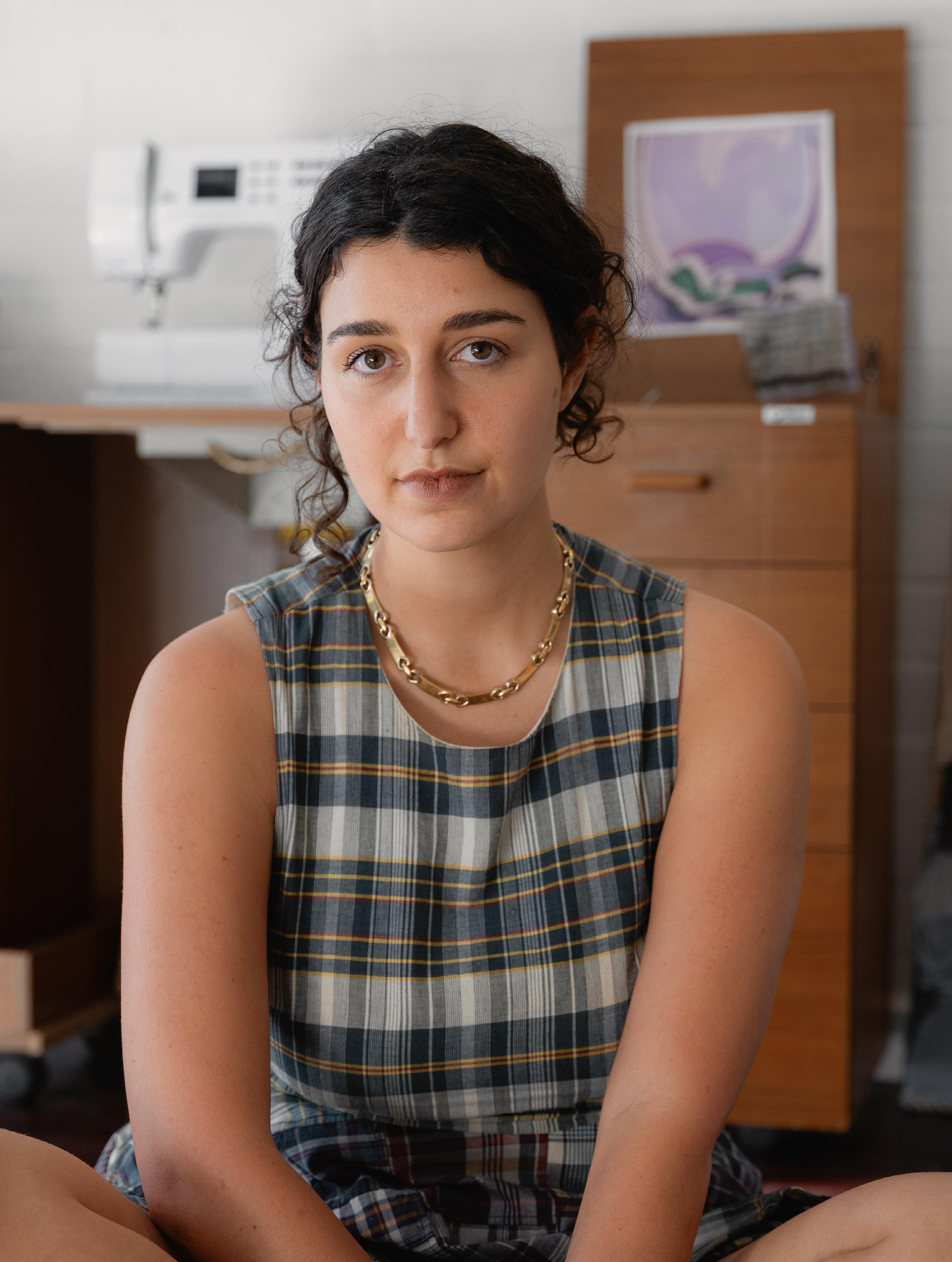
Julia Gutman in her studio, 2021 Photo: Grégoire Lière
Introducing:
Julia Gutman By Harriet Reid
Fabric plays an important role in Julia Gutman’s life. Gutman has an expressive relationship with clothes, the act of layering colours and prints, and pairing unexpected pieces together makes her feel, in her words, ‘absolutely myself’. Originally trained in painting (UNSW Art & Design), it was the experience of studying sculpture at the Rhode Island School of Design that got her thinking deeply about materiality: those objects with which she ‘makes’ and how these inform the conceptual basis of her work. Found textiles, including clothes, worn and donated by friends and family are cut up and re-stitched together, they become vehicles for storytelling and transform these lived materials into narrative pieces of art.
“Gutman uses the medium of textile as a way to negotiate loaded precepts of femininity, tradition and expectation.”
Gutman refers to them as ‘patchworks’ and at their core they are acutely personal. Our clothes are pieces of charged memorabilia, worn and loved, imbued with memory. The stories and images that make up these figurative patchworks become gestures of personal narrative. For Gutman, relationships and people are everything, the sewing together of disparate but meaningful textiles becomes an act of physical and spiritual restoration, an exploration of memory, intimacy
and‘…those pieces of ourselves that we leave behind in each other’.1 A sentiment from Louise Bourgeois lends itself to the deep-seated emotional process Gutman feels when making, ‘[t]he process of sewing has to do with binding and stitching things together. It is a prevention against things being separated. The form and the process must always be connected to the psychological’. 2 Gutman’s work also interrogates the deeper meaning of textile use and its long gendered association as a frivolous amusement or decorative craft. Gutman uses the medium of textile as a way to negotiate loaded precepts of femininity, tradition and expectation. Her works refute the aesthetics of preciousness, the edges are rough, the seams are wonky, images frayed and they have an overall appearance of a collage roughlyhewn. Sometimes, her works are so thick they break her needle. Other times, she has to cut a work up and sew it back together because it becomes too heavy. The way Gutman sews (with a big ‘fuck-off’ needle that leaves puncture wounds across her skin) and the roughness with which she renders her images contrast playfully with the methodical labouriousness of her overall process. There is something a little punk about this work. Her patchworks are part of the changing perception around textile making, they are ‘a weapon of resistance to the painful constraints of femininity’ in which women are ‘managing to make meanings of their own in the very medium intended to foster polite selfeffacement’.3 Issues surrounding women’s, gay/queer and racial liberation have all utilised textiles and the diverse techniques of sewing such as quilting, weaving,
11
Introducing: Julia Gutman
LEFT: Julia Gutman No one Told Me the Shadows Could Be So Bright (detail), 2020, clothes worn and forgotten by Gutman’s friends, found tablecloths, wire, thread, wooden frame, Industrial chains, 160 x 100 cm, 140 x 100 cm. Photo: Document
SUMMER 2021
RIGHT: Julia Gutman, Visual Arts Emerging Fellowship (exhibition view), 2020 Artspace, Sydney. Photo: Document
embroidery, stuffing, appliqué and beading to perform agency, defy gender norms, create community and beyond. Nick Cave’s ornate sculptures and soundsuits, Faith Ringgold‘s narrative quilts and Sarah Lucas’ stuffed pantyhose from the Bunny Gets Snookered series are well-known examples of artists who have helped push textiles beyond the conventions of containment and submission. Gutman, in her practice, wishes to underline that even the personal is determined by systemic, institutional and political structures of the public sphere. Gutman’s works are made richer in the way they connect to the history of painting. The poses of her friends directly reference paintings of women created by men from the modernist canon such as Cézanne’s Three Bathers, Balthus’ The White Skirt and a range of paintings by Gauguin. A thematic to be explored in her first solo exhibition at Sullivan+Strumpf mid next year.
A finalist in the 2021 Ramsay Art Prize and Create NSW 2020 Visual Arts Emerging Fellowship, Gutman has already created a body of work that has been exhibited across Australia, the US and more recently at the T293 gallery in Rome, Italy. This trajectory shows an artist who, much like some of her art idols before her, will no doubt go on to make ground-breaking work in contemporary negotiations of gender and connectivity.
1. Chloe Wolifson, “The tragedy that changed everything for artist Julia Gutman,” The Sydney Morning Herald, November 10, 2020, https://www. smh.com.au/culture/art-and-design/the-tragedy-that-changed-everythingfor-artist-julia-gutman-20201110-p56d79.html. 2. Rhonda Sonnenber, “Louise Bourgeois: Stitching Salvation,” Fiberarts, September/ October, 2006, 36 – 39. 3. Rozsika Parker, The subversive stitch: embroidery and the making of the feminine (London: Women’s Press, 1984) via “Louise Bourgeois: Subversive Stitching,” Roman Road Journal, last modified June 1, 2018, https://
+ EMAIL ART@SULLIVANSTRUMPF.COM TO REQUEST
romanroadjournal.com/louise-bourgeois-subversive-stitching/.
A PREVIEW
13
Introducing: Julia Gutman
LEFT: Julia Gutman The Black Jeans, 2021 clothing worn by the artist and her friends, embroidery cotton and polyester thread on calico 140 x 188 cm Photo: Simon Hewson
SUMMER 2021
RIGHT: Julia Gutman The Black Jeans (detail), 2021 clothing worn by the artist and her friends, embroidery cotton and polyester thread on calico 140 x 188 cm Photo: Simon Hewson
15
Michael Zavros Discobolus with a Z, 2021 black patinated bronze, 54 x 92 x 31 cm Photo: Mark Pokorny
Michael Zavros: Narcissus became a flower The lake was silent for some time. Finally, it said: ‘I weep for Narcissus, but I never noticed that Narcissus was beautiful. I weep because, each time he knelt beside my banks, I could see, in the depths of his eyes, my own beauty reflected.’ — Paulo Coelho, The Alchemist By Harriet Flavel
Exhibition: Z Garden, October 21 - November 13, 2021
+ TO SEE AVAILABLE WORKS BY MICHAEL ZAVROS ACCESS THE VIEWING ROOM BY ENTERING YOUR EMAIL ADDRESS
17
Michael Zavros Summer Garden with a Z, 2021 oil on canvas 200 x 200 cm Photo: Michael Zavros
19
Michael Zavros: Narcissus became a flower
Z Garden is Zavros’ second solo exhibition with Sullivan+Strumpf. His first, A Guy Like Me, presented in Sydney near the end of 2020, was a series of eight LightJet print photographs. The photographs capture Zavros’ doppelgänger mannequin, christened Dad, in scenes ostensibly drawn from Zavros’ life. Dad-as-Zavros is staged in turn by his pool, in his car, at the beach, with his three children and with his horses. Dad is a self-portrait in plastic, embodying not just the self, but the self as we wish or strive for it to be. In the artist’s words: ‘He’s a better version of me—6”3, broader, more cut, a bit younger, and a lot smoother’. The perfect self, captured in perfect vignettes from his perfect life.
SUMMER 2021
All of Michael Zavros’ works are self-portraits, in one sense or another. They are also interrogations of the form and function of self-portraiture. The integration of front-facing cameras in smartphones and of the internet in our lives is complete, gifting the means and motive for self-portraiture to the masses. What, then, is the purpose of a self-portrait in 2021? So asks Michael Zavros. A Guy Like Me makes manifest the interplay between Zavros’ self-concept and (what he imagines to be) others’ perception of him. The photographs examine the interactive, durational performance piece that is the self—on Instagram, in the artworld, and living in 2021. The artist is nothing if not self-aware. The artifice
is apparent—we can see the labour and the seams. The Ken doll’s expression is vacant, his perfect body as stiff as a board. The joins between his perfectly proportioned limbs are gaping, and his flawless skin and hair look waxen and slippery. Dad is a stand-in, an avatar for consumption. Maybe the doppelgänger is a humanoid offering made by Zavros to the gods, to the people, to his eager audience, to his ego—a bait-and-switch, to rescue his ‘self’ from Erysichthonian desire and destruction. This kind of double vision runs as a thread through Zavros’ practice, whose clever inversions, subversions, and trompes l’œil reflect on the cultural conditions of forever and today: identity, vanity, narcissism, perfectionism, desire, beauty, youth, and death, among others. Though he is best-known for his photorealistic paintings, of which there are two in Z Garden, he works across painting, drawing, photography, moving image, performance and sculpture. Zavros draws from European and American painting traditions, and from ancient and contemporary Greek references (Zavros is, as his name might suggest, Greek-Cypriot). His visual language is beautiful, opulent, and darkly funny. Horticulture, architecture, décor and objects of consumer culture figure alongside animals, fabled creatures, children, skeletons and the artist himself.
Michael Zavros Narcissus with a Z, 2021 oil on board 28 x 15.5 cm Photo: Michael Zavros
21
SUMMER 2021
Michael Zavros: Narcissus became a flower
LEFT: Michael Zavros
Temple of Poseidon with a Z, 2021 dry charcoal on paper 120 x 80 cm Photo: Michael Zavros RIGHT: Michael Zavros Mock Orange, 2014 oil on board 40 x 35 cm Image courtesy the artist and Starkwhite, Auckland. Photo: Michael Zavros
Everything in Z Garden either is or contains a ‘Z’—for Zavros. This tongue-in-cheek mode of self-portraiture recalls Zavros’ painting Mock orange, 2014, in which the loosely coiled peel of one semi-nude orange trails down from a stemmed silver compote, filled with oranges, leaves, and blossoms. The painting references a tradition of Dutch still-life painting, in which painters depicted peeled citrus to flex their talent or skill. Zavros’ orange peel falls in the shape of a Z. Zavros’ paintings are obsessively intricate. The scale of the labour is so overwhelming and the realism so absolute that they defy belief in their human origin. They must be magic. Summer Garden with a Z, 2021, is one such turn. It is a major work in every sense, measuring four square metres, in which Zavros has replanted the North Parterre of Versailles, using found imagery from an ‘80s coffee table book, in the shape of a Z. In an Instagram post documenting the painting in progress, a foraging bumblebee mistakes Zavros’ painted marigolds and begonias for the real thing. Life imitates art imitates life, with Zavros’ bee an anthophilous inversion of the tale of Vasari’s fly.
In Discobolus with a Z, 2021, a near-life-size bronze sculpture, the familiar figure of Myron’s Discobolus is whittled to a Z. The original Discobolus (disc-thrower) was created in bronze, around 460-450 BCE, by the Athenian sculptor Myron. It belongs to the Classical period of Ancient Greece—a golden age of art, architecture, philosophy, science and mathematics. The sculptures of this period are remembered for the technical advances they demonstrate, and as examples of Polykleitos' Canon, a treatise on the ideal mathematical proportions, balance, and symmetry for representing the human body in sculpture. Myron’s Discobolus is a renowned example of these Classical ideals—an anthropomorphised Fibonacci spiral in marble, whose tightly-wound, perfectly-balanced, beautiful form echoed across millennia. The Discobolus is also an example of the ways in which ideals can be appropriated and weaponised. A Roman copy of the disc-thrower was owned and adored by Adolf Hitler, who loathed ‘degenerate’ Modernist art. He paid 5 million lire in cash for the Discobolus and gave it as a gift to the German people, citing it as the ideal of progress, beauty and perfection towards which the
23
SUMMER 2021
Michael Zavros: Narcissus became a flower
Herrenrasse must strive. Rendered (in this case) in pure white marble, the disc-thrower was co-opted as the pin-up boy for Nazi eugenics and mythology. In both Classical Greece and Nazi Germany, the Discobolus symbolised, to their subscribers, all that is good and right and true: how a person should live and be. Zavros purposefully reappropriates these ideals in Discobolus with a Z, remaking the Discobolus in his own Z-shaped image. The artist heightens the reappropriation, and the tension between the naturalistic and idealistic, by simultaneously augmenting the discthrower’s ‘ideal’ qualities—adding muscle and definition, and its resemblance to himself—reworking the hands and veins to echo his own. Discobolus with a Z recalls the works from A Guy Like Me—the self not as it is, but as we wish or strive for it to be. We are compulsive and insatiable. This culture of relentless self-optimisation extends beyond physical appearance and encompasses every dimension of the self. But there is no one, fixed ideal. We choose, construct, edit and validate our self in relation
Michael Zavros Z, 2021 etching on paper 27 x 17.5 cm Photo: Michael Zavros
to shifting ideals and ideas. We live on the shifting sands of reality, truth and facts. The more we learn about the dual behaviour of matter through quantum physics, and the more the spoils of technological ‘progress’ are weaponised in deepfakes and disinformation-for-hire, the more the structure we rely upon slips through our fingers. What if there is no good, no right, no true, no real? Who are we? What are we all doing? We can only believe what we see, and we can only see ourselves. No matter where you go, there you are. We are trapped in a house of mirrors, and there is no escape. Far from claiming to be the virtuous one, Zavros offers himself up on a silver platter for critique. But, of course, we can only see ourselves. Is Zavros Narcissus, and we the lake, or is it the other way around?
Exhibition: Z Garden, October 21 - November 13, 2021
+ TO SEE AVAILABLE WORKS BY MICHAEL ZAVROS ACCESS THE VIEWING ROOM BY ENTERING YOUR EMAIL ADDRESS
25
SUMMER 2021
Celebrating Nami: Naminapu Maymuru-White
ABOVE: Portrait of Naminapu Maymuru-White with her work, Buku Larrŋgay Mulka, Yirrkala, Northern
Territory, Australia 2021. Image courtesy the artist and Buku Larrŋgay Mulka. Photo: David Wickens LEFT: Naminapu Maymuru-White, Milŋiyawuy 4 (detail), Bark Painting, 140 x 86 cm. Image courtesy
the artist and Buku Larrŋgay Mulka. Photo: Aaron Anderson
By Will Stubbs
27
Celebrating Nami: Naminapu Maymuru-White
Naminapu Maymuru-White’s father Nänyin and his brother Narritjin Maymuru were two of the giants of Yolŋu art from the golden era—the late fifties through to the seventies. It was during this phase that a handful of American, European and Australian institutional collectors became aware of the unique artistic vocabulary and expression of the Yolŋu culture and these two were at the forefront of the Yolŋu creative response. Commissions and collections ensued, and the family were positioned to respond with Narritjin establishing a studio and private gallery in a lean-to shed on the beach at Yirrkala. As a child, Naminapu used to sit for hours patiently watching her father paint. At about the age of 12, she began to learn herself, and was fortunate in being taught by her father’s brother, Narritjin Maymuru, as well as by her own father, Nänyin Maymuru. Both men were extremely able and well-known artists, whose works hang in many Australian and overseas museums. As one of the first Yolŋu women to be taught to paint miny’tji (sacred creation clan designs), she was part of the historic adaptations by the Elders of the Yolŋu in the last forty years. This includes the revelation of previously restricted designs in pursuit of justice in the Land Rights struggle (for example The Bark Petition and The Yirrkala Church Panels).
SUMMER 2021
Naminapu Maymuru was born a member of the Mangalili clan, at the Yirrkala mission station in Northeast Arnhem Land in Northern Australia in 1952. After attending the mission school, she worked for some time in the store and craft shop, and also helped out in the local bank. When the Homeland Centre of Gurka’wuy was established in 1973, Naminapu went to live there with her husband and young family of three children. These were the early days of the Homeland Movement, which included the establishment by Narritjin of the Mangalili
homeland of Djarrakpi (extensively documented by Ian Dunlop of Film Australia in the twenty-two films of the Yirrkala Film Project). During the years she spent there, Naminapu worked as a teacher trainee and later, on her return to Yirrkala, completed her teacher training. When she later married Leon White OAM, a teacher in the Northern Territory, Naminapu went to live for several years in Melbourne and Darwin. She has travelled within Australia quite extensively as well as to Japan. In 1985, Naminapu returned with her husband and family to live in Yirrkala, now no longer a mission station but a locally governed Aboriginal community. Following her return, she taught art to the children at the local school and then began working at the Craft Shop attached to the Buku-Larrnggay Arts Centre. In 1990, she was appointed Curator of the recently established Art Museum attached to this Centre, a position that she held until 1996. Naminapu’s works were exhibited very successfully with those of Bandak Marika, another Yirrkala woman artist, at a dual exhibition held in Warnambool and Sydney in 1990. Her works are also frequently included in group exhibitions in Australia and overseas and she is now herself represented in most major institutional collections in the country. In August 1996, at the 13th Telstra National Aboriginal and Islander Art Awards, her limited-edition lino print triptych Nyapilingu was chosen as the ‘Best Work on Paper’. In 1998, she was selected as the National Indigenous Heritage Art Award Joint Runner-up Normandy Art Award (for her bark Maŋgalili). One of her memorial poles with the Milŋiyawuy (or milky way design) won the Wandjuk Marika Memorial 3D award at the 2005 Telstra National Aboriginal and Torres Strait Islander Art Awards.
Naminapu Maymuru-White painting her Larrakitj, Buku Larrŋgay Mulka, Yirrkala, Northern Territory, Australia 2021. Image courtesy the artist and Buku Larrŋgay Mulka. Photo: David Wickens
29
Celebrating Nami: Naminapu Maymuru-White
With numerous solo and important group projects behind her, Nami has recently accelerated her rate of innovation. As one of the first to adopt printmaking, her work has always been distinguished from artists brought up solely in the strict canon of dhuyu (sacred) bark painting. It requires different tools, techniques and vision to create a lino, screen-print, woodcut or collagraph. Her compositions have recently become even more fluid and unrestrained and this distinguishes her as unique amongst other Yolŋu artists. During 2019 and 2020, Naminapu’s works were featured in sell-out solo exhibitions, River of Stars at Salon Art Projects, Darwin and Approximately Infinite Universe at The Cross Arts Projects, Sydney. Her works were recently acquired for the RESONANCES exhibition at Fondation Opale, Switzerland in 2020; added to the Kerry Stokes Collection of significant larrakitj from 2001-2021; acquired by the National Gallery of Victoria (NGV) to be shown in a major survey of female bark painters from North East Arnhemland, entitled Bark Ladies (forthcoming, 2022); as well as commissioned for acquisition by Kluge-Ruhe Collection for inclusion in Madayin-eighty years of bark painting from Yirrkala, a major US touring exhibition slated for 2022. This flurry of recent activity culminates in her new partnership with Sullivan+Strumpf, Sydney, which will see her able to share her recent evolutions with a wider audience at a level she has long deserved.
Exhibition: February 17 - March 12, 2022
+ EMAIL ART@SULLIVANSTRUMPF.COM TO REQUEST A REVIEW BEFORE FEBRUARY 17
LEFT: Naminapu Maymuru-White
Milŋiyawuy 4, 2021 Larrakitj 160 x 21 cm Image courtesy the artist and Buku Larrŋgay Mulka. Photo: David Wickens Naminapu Maymuru-White Milŋiyawuy River of Stars (detail) Bark Painting 140 x 86 cm
SUMMER 2021
Image courtesy the artist and Buku Larrŋgay Mulka. Photo: Aaron Anderson
31
Tim Silver: Touching Tim Silver’s sculptures beg to be touched. And we want to touch them, even though we know that we cannot, which is part of the point. Instead, we reach out in our imagination. More, we reach out with every sense of our corporeal being. By Julie Ewington
Exhibition: Inbetween Days, November 25 - December 23, 2021
+ EMAIL ART@SULLIVANSTRUMPF.COM TO REQUEST A PREVIEW BEFORE NOVEMBER 25
Tim Silver Untitled (Inbetween Days), 2021 copper infused Forton MG 17 x 52 x 45 cm Photo credit: Jek Maurer
33
Tim Silver: Touching
SUMMER 2021
All sculptors work with touch. Shaping, smoothing, persuading, building up, paring back. Whatever their materials and methods, sculptors work with their hands, the reach of their arms, their height, cajoling new forms of life out of dumb material. It’s an old story: the Greek myth of Pygmalion and Galatea has long been relegated to the dustbin of aesthetic history but it does contain one kernel of truth—what the artist makes comes alive, and what is made out of physical substance matters in ways that are irrefutably proximate to us, that are particularly emotionally charged because they exist alongside us, in the same physical space. The physical intimacy of sculpture is intensified with Tim Silver’s life casts. These living humans captured with modern moulding material are only several millimetres away from us, a measure of the thin skin of those casts.1 The mirroring of human form that all figurative sculpture embodies is here precisely positioned on that fine interface (that cast skin), exploring what the British psychoanalyst Donald Winnicott called a potential space between ‘inner and outer reality’, which he argues is fundamental to negotiating life.2 Palpably real, yet simultaneously strangely distanced, these entwined cast pairs of feet—Untitled (Inbetween Days)—or clasped hands—Untitled (Close to me)—stand in for the entire person; at the same time, their luminous pale green colouring, a happy accident of copper powder in the casting mixture that Silver uses, guarantees that what we are seeing is not simply a naturalistic representation of the body. It is something much more—an approximation of life, a thinking through of existence.
What sort of life, though, what sort of existence? Lockdown has introduced a repertoire of unfamiliar experiences, emotions, reactions, habits; we can all recite a litany of deprivations and losses, but we can also recount attempts at fortitude. Tim Silver offers a gamut of reports from the psychic front of lockdown, from the yo-yoing hand of Untitled (hang with me), which drily gestures to the volatility of the current emotional climate, to the tender affection of two hands poking out from between the sheets in Untitled (Close to me), based on an image of affection between men that he found on Instagram and treasures for its banal and sustaining beauty. These works are remarkably open to interpretation: shall we read the blanketed feet as enjoying happy privacy or withdrawing from the world? Is one state better than the other? And who can tell? These fragments of human beings holding to each other for comfort are not the only form of life here. The remnant tree stumps, and the oddly amorphous donut forms, which were once knotty burls where a branch detached from a tree, were found near Silver’s family home in Tasmania. They propose a particular sort of doubling: for these works, whether from the ‘Trauma’ or ‘Scar tissue’ series, perfectly replicate the partial remains of once tall trees, now diminished by time, or fire or other effects of settlement, bringing them back to life in mourning dress. They are doubled, too, in their legibility but also in their formlessness. Are these things, or nothing at all? This elegiac project, now over a decade in duration, is a specific reference to land that Silver knows well, and to the environmental challenges
Tim Silver Untitled (Trauma) #10 (detail), 2015 cast pigmented polyurethane 20 x 28 x 48 cm Photo: Jamie North
35
SUMMER 2021
Tim Silver: Touching
LEFT: Tim Silver
Untitled (heartbeats) J.M, 2021 copper infused Forton MG 12 x 20 x 14 cm Photo: Aaron Anderson RIGHT: Tim Silver Untitled (Inbetween Days) (detail), 2021 copper infused Forton MG 17 x 52 x 45 cm Photo credit: Jek Maurer
37
Tim Silver: Touching
that it continually faces, but is also a long song of lament for the passing of time. Here too is deliberate doubling that worries away at the nature of nature: look closely and you will see that there are two of some casts, either on the wall or placed on the floor throughout the gallery. Moreover, Untitled, 2021, is the original Scar Tissue of 2013, now cast in reverse and placed upside down. This is a resurrection of sorts. Running right though Tim Silver’s Inbetween Days is a palpable oscillation between stillness and movement. Alongside these sculptural objects is Cacophony, a suite of drawings with black text on thick cream watercolour paper, insistent script skittering and chattering across each sheet. Line after regular line, each page filled. Paradoxically silent, perhaps silenced. This is handwriting, the artist’s angular cursive, but it’s not legible—here and there one finds the definite article, the ‘I’ that wrote these ‘texts’, but little else can be made out. It’s an elegant evocation of the moment, ‘a cacophony of voices’, as Silver says, or perhaps it is the familiar contemporary overload of information that is white noise, rather than functional communication. Each sheet is nevertheless quite distinct: here the pace is more frenetic, there it is quieter, less troubled; here the words coalesce in black clumps, elsewhere they flow limpid across the sheets. Again, there is evidence of direct touching: each sheet is an emotional seismograph, registering how the artist was, at that time, on that day, in these in-between times, his hand on the pen, on the paper, marking time that always moves on, but also, simultaneously, always seems to be standing stock-still.3
The Cure’s lyrics for Inbetween Days might be an anthem for these Covid times, for the curious warping of time, as much as the song’s recounting of a love triangle gone pear-shaped, yet, with all that, the song pulses with rhythmic life. And Tim Silver opts in to life. Here, on a set of tall individual shelves, Tim has cast his hand clasping the hands of friends and studio pals, all different, all dear to him. Brief, precious moments from this year starved of human touch have been filed away for future reference, so we may remember that compassion and care, love and fellowship did not die in these Inbetween Days. Memorials are not made out of desperation; on the contrary, they are affirmations of hope. They gesture, most importantly, to continuity, to beginnings rather than to endings. Touch is everywhere here. And that touches me.
Exhibition: Inbetween Days, November 25 - December 23, 2021
+ EMAIL ART@SULLIVANSTRUMPF.COM TO REQUEST A PREVIEW BEFORE NOVEMBER 25
NOTES: 1. Forton™ MG or FMG is a four component system consisting of an alpha gypsum blended with three additives. Silver has used this plasticised plaster for various works since 2017; it is far more pliable and sturdy than traditional plaster. 2. See, among other texts referring to human development in conjunction with objects, D. W Winnicott, Playing and Reality, London: Tavistock, 1971.
SUMMER 2021
In 1985, the English band The Cure wrote, in the wry lyrics of the oddly upbeat chart-topping song that titles this exhibition: ‘Inbetween without you Without you Without you Without you.’
3. See ‘Last Word: In-between Days of Tim Silver’, an interview with Alexandra Pedley, in Sullivan & Strumpf, Sept.-Oct. 2021, pp.72-6.
Tim Silver Untitled (Cacophony) #8, 2021 ink on St Armand Watercolour Paper 75 x 55 cm Photo: Simon Hewson
39
Singapore Art Week:
Kanchana Gupta
SUMMER 2021
By Savita Apte
Kanchana Gupta with her latest series of tarpaulin works, Singapore, 2021. Photo: Shawn Wu
Sullivan+Strumpf presents a solo exhibition of Indian-born, Singapore-based Kanchana Gupta at Gilman Barracks during Singapore Art Week in January 2022, where the artist continues her visually and conceptually rigorous explorations of the humble tarpaulin. Gillman Barracks, Singapore Singapore Art Week 14 – 23 January 2022
Kanchana Gupta’s latest exhibition pays homage to the humble tarpaulin. For her solo exhibition at Gilman Barracks during Singapore Art Week, Sullivan+ Strumpf present Gupta’s dexterous interweaving of the potentialities of process and materiality—coupled with her indomitable spirit. Originally from India, Gupta currently lives and works in Singapore and her practice connects the two countries in unexpected ways. The two megacities of Singapore and Mumbai, each of which the artist has called home, offer, via the medium of her works, the means for a personal exploration of, and a thoughtful response to, the urban environments she inhabits—resonating with inhabitants not only of these metropoles but with any person who has ever lived the peculiar and changeful existence of the very large city. The global metropolis appears to reverberate, construction and development trending entire precincts towards residential gentrification—with a concentration of phototropic skyscrapers bracketed within the parameters of newly imagined business districts. The rapid urbanisation of Singapore, visually tracked by the swathes of tarpaulin that colour the city state’s skyline, mirrors Gupta’s memories of Mumbai’s own momentous building spurt and the subsequent proliferation of tarpaulin covered urban slums that created a collaged horizon in blue. It is specifically this material, indexical of transitional sites, that continues to inform Gupta’s practice.
Over the last half a dozen years, Gupta has pursued her fascination with the materiality of paint with the excavational zeal of an archaeo-anthropologist, directing her investigations into the physicality of the medium. Examining it through processes such as heating, burning and tearing, creating flattened, wall-based works and sculptural installations. In each series, Gupta continues to explore the potentialities of studio practice juxtaposing oil paint in with culturally loaded matter like vermillion powder, henna, silk and sandalwood powder, or otherwise her more quotidian materials such jute and tarpaulin. Her process involves a continuous mining of weaves, textures, patterns and structures through which she mediates an ongoing social commentary on the conditions and visibility of migration. In an earlier series, Works-In-Progress, 2017, the artist focused attention on the plight of migrant labourers who facilitate urban transformation, only to be marginalised themselves by the gentrification. In 458.32 Square Meters, 2019, unexpected appositions of iconic identity and social symbolism are in turn manipulated, to express the accrual of lived experience and the psychological landscapes of rupture. Pushing her limits, Gupta stacked, heaped, and folded these industrially compressed sculptural forms, cleaving to the exposed personal geologies of loss and longing contained therein. Gupta’s laborious interventions, harness both studio and industrial process to underscore the tension between deconstruction and reconstruction. In each work,
41
Singapore Art Week: Kanchana Gupta
she contemplates a series of investigations, and each series becomes the foundation for the next. The upcoming solo presentation, during Singapore Art Week, extends Gupta’s earlier meditations on sculpture and intentionally oscillates between two-and threedimensionality.
SUMMER 2021
In her studio, in preparation for the exhibition, Gupta manipulates paint in an unhurried, meditative ritual. Layer after layer, paint is loaded with studied repetition onto a tarpaulin base to form skins. The accumulation created through this process, often amounting to thirty-five coatings or more, is diligently, almost ceremonially flayed. The delicate accretions, with the exposed cutis, (which now retains the traces, patterns and memory of the tarpaulin substructure) are grafted on both sides of a construction canvas. In the process, the inverted order of the membranes renders the cutis uppermost, exposing the texture and patterning of the parent tarpaulin. These dermal constructs are then industrially printed to introduce pigmentations, in turn reflecting the authentic colour combinations of contemporary construction site tarpaulin. The ragged edges of the dermal layers are trimmed and cropped, and the selvages are folded to create the thicker hems required to receive the eyelets. In a departure from her earlier series, the skin tarpaulins here are strung up, splayed out, held in place by steel suspension wires which affix them to steel frames. Their very monumentality blurring the line between painting and sculpture, the real and ersatz, accentuating the importance of context.
All through, whether within studio or industrial process, the handmade-ness is never masked, never suppressed, it shouts silently from the margins. Despite this, there is an alchemist’s sleight of hand—at first glance, visually and texturally, the tarpaulin sheets look deceptively like found objects—discarded tarpaulin lifted from construction sites. In reality, however, they are the culmination of meticulously controlled transformations. Gupta consistently addresses powerful and evocative themes—urbanisation, labour and migration. With this series Gupta excavates further and deeper, to examine the relationship between skin and identity. Far from being a simple surface, skin plays a key role in the fundamentals of meaning and identity. Perception of skin weighted with pre-conceptions can lead to false suppositions, as Gupta so accurately asserts through her tarpaulin works. The works in this series explore questions of identity using a subtle visual vocabulary and a simplicity of form that belie deeply reflective thought processes and introspection. With her dermal tarpaulins, Gupta commences an interrogation into the complex social interactions whereby identity is both externally conferred and internally assembled—and it is the tension caused by the encroachment of one over the other that Gupta seeks to emphasise. Excerpt from the catalogue essay accompanying the exhibition.
Kanchana Gupta Edges and Residues 22 - Steel Blue, Cadmium Red and White on Paynes Grey and White (detail), 2020 stacked oil paint skins burnt and stripped off jute, mounted on wooden structure 73 x 131 cm Photo: Kanchana Gupta
43
Singapore Art Week:
S.E.A Focus
SUMMER 2021
Sullivan+Strumpf is delighted to participate in S.E.A Focus 2022, presenting key works by Dawn Ng, Enggar Rhomadioni, and Sarah Isabelle Tan. S.E.A. Focus showcases contemporary art from Southeast Asia, bringing together a curated selection of internationally respected galleries to foster and advocate for a deeper appreciation of contemporary art in the region. In 2022, S.E.A. Focus returns providing its signature intimate setting and hybrid format of S.E.A. Focus Curated and S.E.A. Focus Digital.
Enggar Rhomadioni Tabon, 2021 acrylic on canvas 170 x 230 cm Image courtesy the artist and Ace House Collective, Yogyakarta.
45
Singapore Art Week:
Art SG The highly anticipated ART SG will take place from 20 – 23 January 2022, with a VIP preview being held on 19 January. The 2022 edition of ART SG will be held at the Marina Bay Sands Expo and Convention Centre in Singapore and will welcome 95 leading international galleries from the Asia Pacific region and internationally. The ART SG Art Fair provides galleries with an opportunity to tap into the significant buying power of the Southeast Asian region and will offer international art lovers a clearer focus of the dynamic and culturally rich works on offer within the area.
SUMMER 2021
Sullivan+Strumpf at the first ART SG 20 – 23 Jan 2022 Singapore
Dawn Ng Heart of Glass (detail), 2021 archival pigment print 112 x 146 cm
Presenting works by: Dawn Ng Kanchana Gupta Irfan Hendrian FX Harsono Yang Yongliang Ramesh Mario Nithiyendran Kirsten Coelho Lindy Lee
47
SUMMER 2021
Joanna Lamb Trigg House (detail), 2021 acrylic on board 46 x 61 cm Photo: Nicholas White
Joanna Lamb: A Vernacular of Place Known for her hard-edge renderings of the urban environment, Joanna Lamb admits she has ‘always wanted to paint gardens.’ If nothing else, being in lockdown has brought the importance of nature to the forefront of her mind and informed a whole new direction for her work. In typical Lamb fashion, these works invite the viewer to stop, slow down and reflect, even for just a moment. By Nyanda Smith
Exhibition: One long moment, November 18 - December 23, 2021
+ EMAIL ART@SULLIVANSTRUMPF.COM TO REQUEST A PREVIEW BEFORE NOVEMBER 18
49
SUMMER 2021
Joanna Lamb: A Vernacular of Place
Joanna Lamb Raven, 2021 acrylic on board 46 x 61 cm Photo: Nicholas White
Joanna Lamb approaches the representation of place as a process of distillation. Within her paintings, components of a view are streamlined and rearranged, colour minimised and distorted. Ubiquitous structures of the everyday—houses, apartment blocks, shops, sporting fields—are canonised. While primarily portraying the artist’s local environment—the suburbs of Perth—representations are deindividualised, so as to appear as symbols of an Australian vernacular. ‘I want the images to be generic enough so that people can respond to them on their own personal level’, Lamb explains. A cloudless azure sky hugs a searing seventies chocolatetiled roof. The curves of a street-parked, early-eighties Falcon glow in dusky light. Shadows dance upon the surface of a glossy cerulean swimming pool. In the traditions of artists such as David Hockney, Ed Ruscha and Howard Arkley, Lamb immortalises the ordinary, manmade environment. Depicted as devoid of people, the places remain inherently shaped by human intention and presence. Small details—an air-conditioner protruding from a wall, a carefully-stenciled housenumber on a curb—gesture to absent inhabitants. Influenced by hard-edged abstraction and pop art, Lamb’s stylised sensibility centres on a formal interrogation of colour, shape and line. Colour is investigated to extreme saturations, contrasted and inverted; crisp segments convey gradients and tones. The methodology of printmaking is also a central influence. ‘I’m interested in simplifying images as much
as possible, to just before they become completely flattened. I break the view down into shapes and colours and arrange it. It is not necessarily connecting the image back to the original place, it is often quite removed’. Winding across architectural periods and function, Lamb’s works reflect back to us the composite forms of our contemporary built world. Existing as extracts of place—as not-quite-real figments—they tap into a shared experience and collective understanding and memory. For Lamb, the choice is foremostly visual, selecting scenes that resonate for their form—including those that she remembers from childhood for their aesthetic provenance. Vegetation and foliage as components within the architectural landscape appear across Lamb’s oeuvre. Shaggy palms tower over a house; a Morton Bay Fig casts looping shadows across a wall; neatly mown lawns form sharp lime blocks. Her recent body of work, however, features a shift to representing vegetation in its own right. ‘I’ve always wanted to paint some gardens’, she explains. Producing the paintings during a period of Covid-19 lockdown in 2020 provided the impetus to explore this long-held interest. ‘Being stuck inside, the importance of nature, and in surrounding ourselves with it, was at the forefront of my thinking’. The works are also larger and more detailed than Lamb’s regular practice, again marking a shift during the confined period. ‘I reacted to the feeling of slowing down and having less time pressure by adding more detail’.
51
Joanna Lamb: A Vernacular of Place
Some of the works are based on photographs taken during a trip to Adelaide. Botanic Gardens, 2021, a large painting measuring 152 x 200cm of the Adelaide Botanical Gardens is a vista of cascading lush, manicured vegetation. A dense bed of buttery gladiolas forms a foreground; a sliver of water segments the composition. Mounds of foliage are intersected by converging European trees. Rust-coloured soil and a muted blue sky frame the stippled assemblage; darts of light striking petals and leaves to form soft patches, conveying the movement of the landscape.
In Airport 012020, 2020, a small airplane rests at the Adelaide commercial airport—photographed quickly by Lamb from a taxi on the way past. The work explores the forms of the industrial, adding to the discourse provoked by the work of Australian modernist Jefferey Smart. A clear blue sky dominates the perspective—an opaque, solo, high-up cloud. Buildings and shrubbery structurally contain the view; behind lacy barbed wire, the shape of the craft cuts a relief against the blue; orange-tipped propeller, and red-painted traffic sign reflecting the swatches of industry.
Glass House, 2020, depicts the Garden’s iconic Victorian-era Palm House. The building is shown from the side from a low viewpoint, with its surrounding vegetation of equal stature—arching cacti framing the structure, foliage viewed through the glass windows, partitioned by the iron frames.
The Adelaide paintings specifically evoke the intensity of the visitor’s gaze, and the acumen of this perspective. ‘I get a lot of inspiration from the experience of being an outsider in an environment—I notice that I’m noticing. When you are walking around your normal environment you are switched off to what you are seeing—it’s there but you are not really looking. When it’s all about seeing, there’s not an emotional connection, so it is largely a viewing experience.’
Crested Pigeon, 2021, also focuses in on the natural within the urban. A resplendent bird is poised, nonplussed, upon a bed of organic and human detritus—bitumen, crisscrossing couch grass, a cigarette butt and pine needles; leaves overhead casting deep shadows.
SUMMER 2021
Lamb’s work calls attention to methods of perception through exploring the idea of a conscious action of looking. Elements selected by the artist, to retain within a scene, are bestowed with a symbolic intensity. Repeat motifs of reflection and transparency–within bodies of water, through glass–point to the mechanisms of visual processes.
Processes of responding to place through actions of viewing is further deconstructed in Art Gallery 012021, 2021. The painting represents an interior view of a room within the South Australian Art Gallery. A representation of representations. The painting features renderings of artworks including Marjorie Fletcher’s bronze sculpture Kathleen, 1933, and paintings by modernists Ralph Balson and Grace Crowley. The tall Victorian-era archway and skirtings, the modern plinths, slice the composition into segments of form and colour.
Joanna Lamb Airport 012020, 2020 acrylic on superfine polyester 92 x 122 cm Photo: Nicholas White
Joanna Lamb Botanic Gardens, 2021 acrylic on superfine polyester 152 x 200 cm Photo: Nicholas White
53
Joanna Lamb: A Vernacular of Place
Since her first solo show in the late 1990s, Lamb has exhibited regularly, primarily with painting, but also printmaking, collage and sculpture. Her painting process is structured and methodical, an approach that borrows from the mechanics of printmaking, and which she has slowly refined over time. Working from photographs, planning and drawing for the painting is undertaken using a drawing-based computer program. The image is then transposed to the canvas or board with a meticulous application of acrylic paint, using stencils and rollers. The result intentionally removes all signs of the artist’s hand. Her approach reflects her early introduction to printmaking, growing up spending time at her dad’s off-set printing business, Lamb Print, a cornerstone of the Perth publishing sector. ‘I am interested in the way colours are reduced for economy for print media. The way I paint and lay down colour is like that manufacturing process in miniature. I feel it links back to my dad’s printing business, which I like, so I keep doing it, and try to refine it’. Exhibition: One long moment, November 18 - December 23, 2021
+ EMAIL ART@SULLIVANSTRUMPF.COM TO REQUEST A
SUMMER 2021
PREVIEW BEFORE NOVEMBER 18
Joanna Lamb Glass House, 2021 acrylic on super fine polyester 92 x 122 cm Photo: Nicholas White
55
SUMMER 2021
Joanna Lamb Art Gallery 012021, 2021 acrylic on board 46 x 61 cm Photo: Nicholas White
57
In the Studio:
Alex Seton
SUMMER 2021
Portraits of the artist in his studio, Sydney, 2021. Photo: Vasili Vasiliades
In the last few years, I’ve been thinking a lot about the ethics of my chosen medium: marble. Our environmental age requires that we consider the ethics of all the materials we use. There’s a lot to consider, with factors like sustainability, toxicity, accessibility and impact in both the long and short-term. This gets particularly interesting when it comes to art materials, given that their relationship to cultural meaning moves with us. Artists have always chased new mediums that resonate with the times. So, the architect Harry Seidler was wrong! Well sort of...turns out his beloved concrete at the same time as being a new, amazing and affordable structural material, that hailed modernity without the imperial and colonial overtones of elemental substances like marble, is also terrible for the environment—a polluter of the topsoil and one of the main producers of carbon dioxide. Marble though, with its history of class and wealthsignalling, in the light of the Anthropocene, regains some egalitarian status as sustainable, recyclable and non-toxic, an all-in-all environmentally friendly material. Harry refused to work with marble, rightly citing its history in the Western canon of privilege. However, considering the environmental credentials of the two materials, you’d swipe right on marble—It’s one of the more plentiful minerals of the earth, it’s relatively low-impact to procure, and its waste can be used as a fertiliser.
The owner of one of the biggest marble quarries in Carrara, Italy, once told me that most of the world’s marble is not used for architecture or art, but in the chemical and pharmaceutical industries. He told me this with a particularly sardonic glee as I watched the most perfect crystalline block I’d ever seen be broken down as part of the 40 trucks of marble going to Pfizer daily from there. Powdered calcium carbonate is used as a benign stable filler in many medicines and pills. It’s easily digested, and the rest is flushed away to join the calcium carbonate marine invertebrates that make the next generation of marble. It’s the main ingredient in many antacid products, and is an additive in many common products. Yup, you’ve all been eating your way through a teeny bit of Italy, whether you like Italian food or not. So, I’ll continue to source old stones and slabs sitting in quarries and yards, giving away the rubble waste to be used by the good folk at Second Edition to be made into bench-tops and recycled products, and the dust goes to several artists to use in their castings or as painting ground in their canvases. Once, an assistant of mine came excitedly bouncing into the studio declaring that she’d been cured of her hypocalcaemia diagnosis (too little calcium in the blood) after working in my studio for three months, despite years of prescriptions. Marble saves lives. Alex Seton Exhibition: March 24 - April 16, 2022
+ EMAIL ART@SULLIVANSTRUMPF.COM TO REQUEST A PREVIEW BEFORE MARCH 24
59
In the Studio: Alex Seton
SUMMER 2021
LEFT+RIGHT: Marble from Cairns Marble, Chillagoe Quarry, Queensland, 2021. Photo: Alex Seton
61
Barbara Cleveland One Hour Laugh (exhibition view), 2020, Thinking Business, Goulburn Regional Gallery (Museums and Galleries New South Wales, touring). Photo: Silversalt Photography
Barbara Cleveland: This Thinking-Business Thinking Business speaks not only to the Barbara Cleveland collective’s unique style of cooperation but, equally, to larger themes of female friendship, collaboration and artistic labour over the last 15 years...
SUMMER 2021
By Tara McDowell
63
Barbara Cleveland: This Thinking-Business
Dear Diana, Frances, Kate and Kelly,
SUMMER 2021
When I first set out to think about female friendship, I turned to philosophy and found hardly anything there. Don’t get me wrong — there’s a rich philosophical tradition limning the contours of male friendship, from Aristotle to Montaigne to Derrida. I suppose I shouldn’t have been surprised at the exclusions (whether unwitting or wilful suppression) inherent in the fraternity bit of liberté, égalité, fraternité, but what was so striking was the vehemence with which female friendship was rejected. That vehemence barely conceals an ontological othering and a paralysing fear. Nietzsche’s is my favourite: ‘Are you a slave? Then you cannot be a friend. Are you a tyrant? Then you cannot have friends. All-toolong have a slave and a tyrant been concealed in woman. Therefore, woman is not yet capable of friendship: she knows only love.’1 There’s so much to tease out here. That woman can contain—no, conceal—the seemingly unreconcilable figures of slave and tyrant. That this renders woman capable of love, but incapable of friendship. This is because, for Nietzsche, woman can’t be independent— she is always in relation to another.2 This myth of independence or autonomy has gotten us into a lot of trouble, while the truer fact of relationality, rather than positionality, as Mary Graham would put it, becomes more absurdly evident every day, despite late capital’s attempt to keep us self-dosing, atomised.3 (Would it be an overstatement to say the most famous example of collaboration in modernism is that of Georges Braque and Pablo Picasso, in the south of France that one summer, jointly producing Cubism, as they painted side by side? Later, of that episode, Picasso would say ‘Georges Braque, c’était ma femme’—thus denigrating his collaborator from man to woman, but also from friend to wife. It’s an exquisite burn, full of misogyny and ownership and dismissal and erotics.)
I’m not the first person to notice this absence, or this gendered exclusion, in philosophies of friendship. My friend Céline Condorelli wrote a beautiful, dialogic, searching, generous book about it, The Company She Keeps, in which she asks: ‘How would a discourse on friendship that includes women be structured?’4 Avery Gordon, one of Céline’s interlocutors (and dear friend), speaks of the friendships of excluded and marginalised people—women and African-American slaves, in particular—that ‘provide one of the richest archives of friendship practices throughout history’.5 It’s just that philosophy never thought to look there, or to ask. There’s a connection between this refusal to admit the possibility of female friendship and the systematic, violent suppression that occurred throughout much of Western history of ‘wise women’, the healers and midwives that were later called witches and murdered en masse. That shared thing is knowledge. And, back of that, power. Female friendships remain unthinkable because they are simply too dangerous. They threaten to unravel an entire world order of patriarchy, empire and submission. I love the title of the work by the way—This is a stained glass window—and how sweet and simple its metaphor is: redolent of rose-coloured glasses, conjuring the ways in which glass, like friendship, is always in a liquid state, even though it looks solid. I love how the work alternates between banal, slightly goofy shots of Frances or Diana walking across the floor dragging Chux Superwipes on their feet, cleaning the white backdrop, to a dreamier state of piano tones and voiceover, in which we see each of you suddenly at a distance, or through the scrim of coloured filters (red, yellow, blue). As if it is an inner monologue, the voiceover reminisces about beginnings—When we first met, she was wearing a green angora jumper. Her directness put me on edge—and mulls over the nature of these friendships.
Barbara Cleveland, Meeting Time, 2020, ink on paper, 87.5 x 61.5 cm or 91 x 64 cm (framed). Photo: Aaron Anderson
65
Barbara Cleveland: This Thinking-Business
For how long have we been looking at each other? For how long have we been looking to each other? For how long have we been looking through each other? (This made me think of a raw, time-stopping moment in The Gleaners and I, when Agnes Varda holds out her aged hand in front of the camera and says, ‘This is my project: to film one hand with the other hand. To enter into the horror of it. I am an animal.’ But of course, yours are eight, not two, hands.) Frances told me you read The Company She Keeps too, and liked the quote Céline included by Hannah Arendt, describing her friendship with Mary McCarthy. ‘It’s not that we think so much alike’, Arendt explained, ‘but that we do this thinking-business for and with each other’.6 I hold onto this offhand remark like a lifeline, wanting it to dilate and expand and become the riposte to all of that writing on male friendship, which, of course, is hardly fair to Arendt. Recently I had the deliriously pleasurable experience of listening to Jack Halberstam speak. He recommended an essay by Saidiya Hartman, The Anarchy of Colored Girls Assembled in a Riotous Manner, a critical fabulation of the lives of young black women who had been surveilled and incarcerated but who remained essentially ‘unthought’, their history thus untold. ‘To appreciate the beautiful experiments of Esther Brown and her friends’, Hartman writes, ‘one needs first to conceive something as unimaginable and unprecedented as too fast girls and surplus women and whores producing “thought of the outside”, that is, thought directed toward the outer bound of what is possible.”7
SUMMER 2021
The outer bound of what is possible—isn’t that where we most need to be? But we’re already there. My old home, California, is burning, and so is my new one, Australia. A sixth mass extinction is underway, Australia is stricken with drought and floods, refugees are detained in offshore prisons,
and authoritarian rule is on the rise. We are clearly at the end of something—an entire way of being in the world that has manifest as the Hydra of patriarchy, empire, capitalism and religion (what the queer poet Robert Duncan referred to as the monstrous ‘Daddy Sunday’). Thought of the outside would be the thought of all those who have been left outside: indigenous people, refugees and migrants, slaves, non-humans, para-humans, nonbinary humans, fast girls, surplus women, whores, and all those who fall outside the traditional systems of classification erected by Daddy Sunday. When I read this line by Hartman—thought of the outside—it reminded me of something that the poet Bernadette Meyer wrote in her own wild, sprawling yarn, written from inside the fever dream of new motherhood, The Desires of Mothers to Please Others in Letters. ‘Women’, she wrote, ‘can still wind up writing some unheard of things don’t you think, I mean things that have never been written yet’.8 Well, yes. Not only might there be something to be written yet about female friendship, but some unheard-of things, some thought directed toward the outer bound of what is possible, is what is urgently needed, as though all of our lives depended upon it. Yours, Tara Tour: Barbara Cleveland Thinking Business
+ EXHIBITION TOUR DATES
01
02
01. Barbara Cleveland excerpt from One Hour Laugh, 2009. 1 channel HD video, 60 minute loop. Edition of 5. Concept, Direction and Performance: Diana Baker Smith, Frances Barrett, Kate Blackmore and Kelly Doley. Video Editing: Kate Blackmore. Sound: Frederick Rodrigues. 02. Barbara Cleveland Meeting Time (exhibition view), 2020, Thinking Business, Goulburn Regional Gallery (Museums and Galleries New South Wales, touring). Photo: Silversalt Photography 03. Barbara Cleveland What is suspended between us can also shatter 3, 2019 c-type photographic print 30 x 45 cm or 32.5 x 47.5 cm (framed), edition of 5 (#2/5)
03
04. Installation view, Know My Name: Australian Women Artists 1900 to Now Part One, 2021, National Gallery of Australia, Canberra, 2021, featuring: (left to right) Barbara Cleveland: Frances Barrett, Kate Blackmore, Kelly Doley, Diana Smith, Bodies in time, 2016, Choreography and performance: Angela Goh; Videography: Gotaro Uematsu; Video editing: Kate Blackmore; Original sound: Andrew McLellan; Production: Bev Shroot; Hair and makeup: Sophie Roberts; Esme Timbery, Bidjigal people, Shellworked slippers (detail), 2008, Museum of Contemporary Art Australia, Sydney. Purchased with funds provided by the Coe and Mordant families 2008 © the artist, photograph: Karlee Holland 1. Friedrich Nietzsche as quoted in Céline Condorelli, The Company She Keeps, Book Works, London, 2014, p. 14. 2. Cathryn Vasseleu, “Not Drowning, Sailing: Women and the Artist’s Craft in Nietzsche”, in Nietzsche, Feminism and Political Theory, ed. Paul Patton, Routledge, London, 1993, p. 82. 3 — Mary Graham, “Aboriginal Notions of Relationality and Positionalism”, Global Discourse: An Interdisciplinary Journal of Current Affairs and Applied Contemporary Thought, vol. 4, no. 1, 2014, pp. 17–22. 4. Condorelli, p. 12. 5. Condorelli, p. 36 6. Condorelli, p. 36. 7. Saidiya Hartman,“The Anarchy of Colored Girls Assembled in a Riotous Manner”, The South Atlantic Quarterly, vol. 117, no. 3, July 2018, p. 471. 8. Bernadette Meyer, The Desires of Mothers to Please Others in Letters, Hard Press, New York, 1994, p. 19.
04
67
Year in Review Twenty, twenty-one is done. It was a year that included so many successes, large and small—and we count them all. They included major commissions, exhibitions and achieving genuine gender parity in our artist representation. Despite a hugely disruptive time of cancellations and postponements across Australia and the Asia Pacific, we have selected just a couple of phenomenal moments to bookend our magazine for the year. There were, of course, too many to choose from but, then again, every magazine and each exhibition is an occasion to celebrate, so we raise a glass to you at this end of year as we look to summer and a well-earned break for our artists and our team—perhaps even a well-earned holiday somewhere? Lindy Lee’s Ouroboros, a historic commission by the National Gallery of Australia, Canberra The commission is one of national significance representing the largest single artist commission in the NGA’s history. We congratulate Lindy Lee and our collaborators UAP on this monumental undertaking which will support an entire ecosystem of Australian arts workers as only projects of this scale can and to the NGA for their visionary championing of such a bold artist and ambitious project. We look forward to seeing it come to life! Lindy Lee, Ouroboros (artist’s impression), 2024. Image courtesy the artist, UAP, Brisbane, and the NGA, Canberra.
69
Year in Review
Alex Seton’s For every drop shed in anguish, a major commission by the Australian War Memorial, Canberra Alex Seton’s proposal was unanimously selected by veterans and their loved ones to produce a field of sculpted Australian pearl marble droplets entitled, For every drop shed in anguish. Made over the next two years to be then installed in the Sculpture Garden in 2023, it will be a place for visitors to grieve, to reflect on service experiences, and to remember the long-term cost of war and service. The commission is not only momentous for this calendar year but is also a major achievement for the artist’s career.
SUMMER 2021
Alex Seton, For every drop shed in anguish (artist concept). Photo: Mr.P Studios
71
Year in Review
Lynda Draper’s Flowers of the Night Lynda Draper blew us away this year with her exquisite oneiric wanderings translated into sculptural beings that guarded the gallery in our absence. While the physical presence of these works will always be impossible to faithfully translate online, these works struck a chord. Including institutional acquisitions through Wollongong Art Gallery and the Powerhouse Ultimo – Museum of Applied Arts and Sciences (MAAS) earlier in the year.
SUMMER 2021
Lynda Draper, Here comes the dawn, 2020, ceramic, various glazes, 95 x 63 x 63 cm. Image courtesy the artist and Wollongong Regional Gallery. Photo: Simon Hewson
Tony Albert’s Conversations with Margaret Preston Tony Albert held his solo exhibition Conversations with Margaret Preston earlier this year and the beautiful Christmas Bells, 2020, was acquired by the National Gallery of Australia, Canberra. It is a major and important body of work that explores the reclamation of Indigenous motifs. The success and resonance of this exhibition will be shortly followed by the much-anticipated miniature mixed textile works on canvas, which continue his exploration of the Conversations with Margaret Preston series with over 100 additions to the Interior Compositions series. Tony Albert, Conversations with Preston: Christmas Bells, 2020, acrylic and vintage appropriated fabric on canvas, 300cm x 400cm (2 panels, each 300 x 200cm). Image courtesy the artist and the National Gallery of Australia, Canberra. Photo: Aaron Anderson
Maria Fernanda Cardoso’s Gumnuts and Sandstone Maria Fernanda Cardoso’s Gumnuts and Sandstone, 2021, was a monumental exhibition and a testament to the tireless work of exhibition making for an artist and their team. Pictured here is Woody Flowers Vertical Garden 2021, a work of fine art in every way. The delicateness of each gumnut as a singular entity and the monumentality of its organic yet geometric display, is but an example of beauty being very much in the tireless detail! For this reason, it was absolutely a stand-out show. Maria Fernanda Cardoso, Woody Flowers Vertical Garden, Flindersia australis seedpods, metal pins, 300 x 700 cm. Photo: Mark Pokorny
73
Year in Review
Ramesh Mario Nithiyendran, major acquisition by the Art Gallery of New South Wales, Sydney
SUMMER 2021
For Ramesh his much-acclaimed Avatar Towers project at the Art Gallery of New South Wales (AGNSW) last year resulted in the acquisition this year of over 70 of his works by the institution. This is surely one of the largest single acquisitions of work by a living contemporary Australian artist. We were absolutely thrilled for Ramesh! His sell-out solo exhibition The Guardians is open at Sullivan+Strumpf, Sydney, until November 13. Installation view featuring Ramesh Mario Nithiyendran Avatar Towers, 2020, Archie Plus, Art Gallery of New South Wales. Image courtesy the artist and Art Gallery of New South Wales. Photo: Mark Pokorny
Dawn Ng Into Air, 2021, was S+S artist Dawn Ng’s largest solo presentation to date—from nearly every standpoint. The exhibition took place in a former shipyard, a cavernous and neglected space with beautiful walls washed with the patina of age and many industrial lives lived. The series of works began in 2017, as an act of remembrance and an ode to transience and impermanence. Overwhelming support for the show saw almost the entire exhibition sell out before the doors closed, it was an incredible achievement for the artist and the gallery to start the year. Dawn Ng, Into Air (exhibition view), 2 Cavan Road, Singapore, 2021. Photo: Sarah Isabelle Tan
75
Year in Review
Yang Yongliang’s Imagined Landscapes Yang Yongliang transported us through the clouds and back through time in this and other stunning lightbox, video and digital photographic works from his exhibition Imagined Landscapes, 2021. The titular work of the exhibition pictured here gives us some understanding as to the subtle spirituality, bound up in the elements, of this absolute master.
SUMMER 2021
Yang Yongliang, Imagined Landscapes (exhibition view), 2021, featuring Chasing Clouds, 2021, 4K video, 6 mins 15 seconds, edition of 7 plus artist’s proofs (#2/7). Photo: Aaron Anderson
77
Last Word: Barry Keldoulis & Sarah Hetherington
Sydney Contemporary acknowledges the Gadigal people of the Eora nation, who are the traditional custodians of the land on which we operate, and pay our respects to their elders, past, present and future. SH/ Barry! BK/ Sarah, so good to see you! Is my soft filter working? SH/ Let’s jump right in. The sixth edition of Sydney Contemporary will return to Carriageworks, Australia’s largest multi-arts centre, from 7-11 September 2022, showcasing leading galleries from around the region and presenting new ambitious, cutting-edge contemporary art by a diverse range of artists from emerging to the established. How has the Fair grown since 2013, and what are you most proud of?
SUMMER 2021
BK/ In 2019, I was visiting a gallery as they were installing a new show. In conversation with the gallerist, their installer, who is an artist himself, overheard our conversation and piped up and said, ‘Sydney Contemporary – that’s the artists’ Christmas!’. What I love about that is its stark contrast to the attitude of the artists I first took to an art fair two decades ago who were aghast that their ‘babies were being shown in a meat market’! In all of the hullabaloo and fanfare that goes with an art fair, for me, what is really important to remember and makes me proud is that it’s ultimately
about selling work so that artists can continue their practice and feed their children, if they are silly enough to have them (!). I’m also proud of the fact that the Fair is a ‘whole of scene’ fair, in contrast to many international fairs which concentrate on the ‘blue chip’ end of the market, or in some cases, the unrepresented end of the market. At SC we welcome all sorts of exhibitors: from art schools and ARIs through young galleries to established. And we show the whole range of artistic expression, and are one of few fairs to highlight performance art. SH/ What is your favourite moment from over the years? BK/ The tsunami of people arriving in 2013 at the inaugural Opening Night. It is hard to beat that, people still talk about it as being Sydney’s best party, when they closed Redfern station due to the sheer number of people, and there was traffic chaos across a 10km radius, Sydney’s first ‘art traffic jam’. People had said Sydney wasn’t ready for a premium art fair; we certainly proved them wrong. The buzz continues, and the consistently high standard of works presented makes me proud to be part of such an engaging and diverse visual arts community here in Australasia. How about you? SH/ For me, it is the privilege of being able to see it all up and ready, on Tuesday evening – the night before Christmas – to use the artist’s expression. Each morning,
Opening Night, Sydney Contemporary 2019. Photo: Zan Wimberley
79
Last Word: Barry Keldoulis & Sarah Hetherington
to walk around the Fair to see the works, see the sold dots going up… the impact the Fair has on artists’ livelihoods. Whilst the Fair is an ephemeral event and experience for us all, the art continues to exist in private collections, museum collections well after our doors close. BK/ Funnily enough, speaking of duration, early on, one of our walling builders once asked me how many months the Fair was up for! The next day, a curator from a regional gallery came up to me and said, ‘This is an amazing exhibition, is any of it for sale?’ I responded with, ‘it’s all for sale, go for it!’. SH/ Due to the circumstances, this year Sydney Contemporary has pivoted to Explore – a newly designed and custom-built digital platform to generate artwork sales, maximise online exposure and expand audience reach for galleries and artists. Held online from 11-21 November 2021, the platform will allow visitors from around Australia and overseas the opportunity to view gallery presentations, discover new artists, enquire about artworks and connect directly with gallerists for purchasing. What are you most looking forward to?
SUMMER 2021
BK/ I am really looking forward to the extraordinary diversity of creativity that Explore will showcase. After that, next year re-engaging with art in the flesh!
SH/ I’m with you, there is something very special about seeing and experiencing art IRL. Whilst we know Explore will make a splash before Christmas, nothing can replace the real Sydney Contemporary. BK/ Indeed! We are also very fortunate to have a dynamic team with whom it is a pleasure to work. Even during times of great stress, such as rescheduling or when it gets close to the real event, we are all very supportive of one another. SH/ And deliver this remarkable event together. Barry, do you want to have the Last Word? BK/ Explore will feature Australasian galleries presenting hundreds of new works from over 450 artists. Although people are unable to travel, art can. But this year, I will miss seeing the faces of gallerists, collectors and visitors when they arrive with a sense of anticipation and excitement. International gallerists and visitors repeatedly say Carriageworks is the best venue for an art fair in the world. September 2022 will be here before we know it! SH/ We look forward to seeing everyone online this year and in real life next year! BK/ At the artists’ Christmas!
TOP: Gregory Hodge for Sullivan+Strumpf, Sydney Contemporary 2019. Photo: Zan Wimberley BOTTOM: Michael Lindeman Thanks (Installation view), 2018 rejection letters, clear vinyl, decals, Sydney Contemporary, 2019. Photo: Zan Wimberley
81
Quick Curate:
Sydney Contemporary
LEFT: Maria Fernanda Cardoso Actual Size VIII (Maratus lobatus), 2021 Pigment print on premium photo paper 300 gr. Focus stacked from 1104 source images Print Size: 152.4 x 152.4 cm Image Size: 126.4 x 140 cm $22,000
SUMMER 2021
RIGHT: Yang Yongliang Goose, 2021, Giclee Prints on Hanemühle Photorag Paper or Premium Backlit Transparencies in dimmable LED Light Boxes 130 x 90 cm USD $16,000
RIGHT: Karen Black Deep Adaption, 2021 oil on canvas 210 x 200 cm Photo: Mim Sterling $35,200 LEFT: Ramesh Mario Nithiyendran Pointy Gold Head, 2017 24k gold plated bronze 63 x 61 x 26 cm $25,300
83
Quick Curate: Sydney Contemporary
LEFT: Glenn Barkley Love calls you by your name, 2020 earthenware 69 x 50 x 31 cm $6,250
SUMMER 2021
RIGHT: Gregory Hodge Okay Glow, 2021 acrylic on canvas 160 x 200 cm $22,000
LEFT: Lynda Draper Sprite, 2021 ceramic, various glazes 135 x 46 x 46 cm $14,000 RIGHT: Lara Merrett
Towards the Summit, 2018 acrylic and ink on cloth and linen 184 x 175 cm $16,500
85
CONFLICT IN MY OUTLOOK_
WE METBE ONLINE DON’T EVIL
30_ JUL_2021 - 22_ JAN_2022
ZACH BLAS & JEMIMA WYMAN_ KATE CRAWFORD & VLADAN JOLER_ SIMON DENNY_ XANTHE DOBBIE_ SEAN DOCKRAY_ FORENSIC ARCHITECTURE_ KATE GECK_ ELISA GIARDINA PAPA_ MATTHEW GRIFFIN_ EUGENIA LIM_ DANIEL MCKEWEN_ ANGELA TIATIA_ SUZANNE TREISTER_ KATIE VIDA_
UQ ART MUSEUM
Image: Simon Denny, ‘Document Relief 19 (Amazon Worker Cage patent)’, 2020. Inkjet print on archival paper, glue, custom metal wall mount, 29.7 x 21 x 13.5cm unique edition Collection of The University of Queensland, purchased 2021. Courtesy of the artist and Fine Arts, Sydney
DISTILLED IN MARRICKVILLE
Enjoy Poor Toms Responsibly.
Up Next
JOANNA LAMB ONE LONG MOMENT 18.11.21 - 23.12.21
TIM SILVER INBETWEEN DAYS 25.11.21 - 23.12.21
SUMMER SHOW 13.01.22
NAMINAPU MAYMURU-WHITE 10.02.22 - 12.03.22
ALEX SETON
SUMMER 2021
24.03.22 - 16.04.22
Joanna Lamb Donnybrook House (detail), 2021 acrylic on board 46 x 61 cm Photo: Nicholas White
89
Jemima Wyman Billow 1..., 2021 hand-cut digital photos 122 x 123 cm Photo: Ed Mumford
SYDNEY 799 Elizabeth St Zetland, Sydney NSW 2017 Australia P +61 2 9698 4696 E art@sullivanstrumpf.com
SINGAPORE P +65 83107529 Megan Arlin | Gallery Director E megan@sullivanstrumpf.com
Melbourne Convention & Exhibition Centre
Polly Borland, Morph 12, 2018, archival pigment print Small: 92 x 78.5 cm. Large: 200 x 162.5 cm. © Polly Borland. Courtesy the artist and Sullivan+Strumpf.
Discover and purchase art from Australasia’s leading contemporary galleries
Tickets on sale now melbourneartfair.com.au/tickets