#54
PANTONE
OFFICE LIGHTING
THE CANTABRIAN MARITIME MUSEUM, SPAIN STEVEN ESHLEMAN, AVROKO
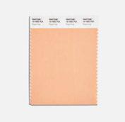
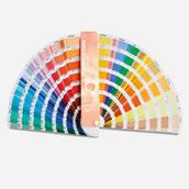
PEACH FUZZ
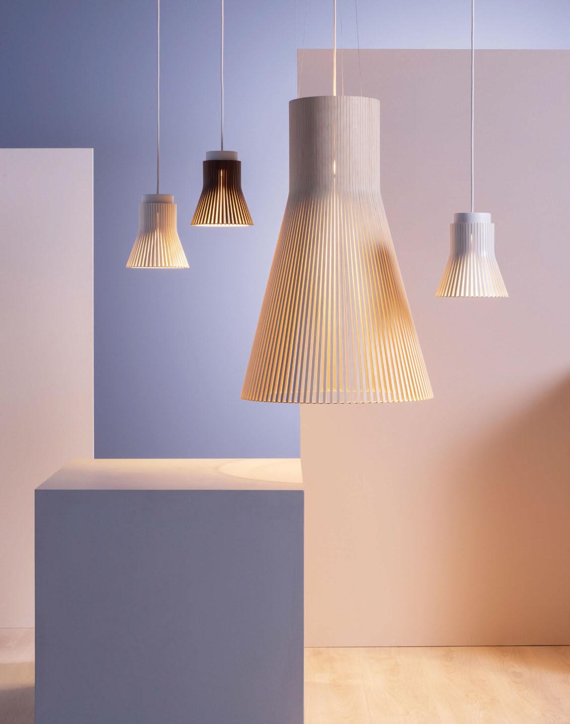
Built of harmony
The Secto Design lighting collection is designed by the award-winning architect Seppo Koho. The diligent handwork is carried out by highly talented craftsmen in Finland from top-quality local birch wood.
www.sectodesign.fi
WELCOME
 Sarah Cullen • Editor
I feel like I blinked and was straight back on print deadline with this next issue of darc. Such is life when you’re the hottest publication for decorative lighting and all the international events want to distribute you...! It has been an intense month of travel so far, starting with the [d]arc media team heading to Frankfurt to attend Light + Building at the beginning of March. It was so nice to meet up with industry pals and see some lovely new product launches. When it was time to take our tired little feet home, unfortunately a group of us were stung by the German transport strikes when they cancelled our flight home mere minutes before boarding. Team arc were fortunate enough to have had prior warning and fled the country like an Italian Job in an Uber to Brussels to get a flight home. Our experience, however, unravelled into a slightly stressful period of going back and forth to Lufthansa customer service desks in between buying new wardrobes and toothbushes while our suitcases were held captive in the system of conveyor belts. We eventually, and gratefully, staggered home on our rebooked flights three days later.
Please don’t mistake my tone for being anti-strikes. I am all for workers fighting for what they believe they deserve! We were just the unfortunate ones who were caught in the maximum-impact aim of the workers’ walkout.
I mentioned in the last issue that we would be featuring a roundup of our time at Light + Building, however, we decided as an editorial group to let our newest member of the team, Online Content Creator Ellie have a crack at doing a digital overview of our time in Frankfurt. Keep an eye out for darc’s newsletter and online to find out more.
Also in March, I had the opportunity to visit Occhio in Munich on a press trip to its showroom, experience hall, and live project at the Haus der Kunst art gallery. Along with a select number of other design journalists, I had the chance to get to know the faces behind the brand over an intimate dining experience at the very special two Michelin star restaurant, Tohru that was illuminated by Occhio’s Sento sospeso suspended luminaire. What a treat!
To finish off the month, we will be donning our glad rags ready for the highly anticipated [d]arc night party celebrating the winners of this year’s [d]arc awards. At this year’s party we’re going all-out with a 1980s theme! I look forward to seeing the industry’s fancy dress efforts and awarding the best-dressed prizes on the night.

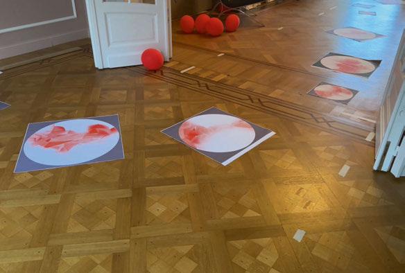
| 2/3 COVER: CANTABRIAN MARITIME MUSEUM ZOOCO
/darcmagazine | @darc_mag
FEATURED
034
Interview: Steven Eshleman
darc chats to Steven Eshleman, Director of Industrial Design at AvroKo, to find out more about his career at the New York interior design studio, and his design approaches when it comes to creating light fixtures.
050
Feature Interview: Harsha Kotak
To open our Office and Task Lighting feature, darc’s editor sat down with Founder and Director of Women in Office Design and Sustainable Design Collective, Harsha Kotak to discover more about her industry initiatives.
055
Feature Comment: Charlie Bark-Jones
Workspace Design Show returned to London in February. Charlie Bark-Jones, founder of the show, shares insights and trends from the event, as well as biophilic lighting considerations.
062
Feature Products: Office Lighting darc’s selection of task lighting products that are wellsuited to a workspace environment.
074
In Focus: Lysabel
Designer Lorenzo Truant discusses his latest collection for Intra Lighting, Lysabel, which was inspired by scenes from Sci-Fi classics, Star Wars and the lightsabre.
PROJECTS
008
Focal Point
Treehouse, Dubai
010
Focal Point
Al Mamlaka Social Dining, Saudi Arabia
012
Terrazzo Aperol
Terrazzo Aperol, a small Venetian bar in Italy, has undergone a renovation by architectural firm Vudafieri-Saverino Partners.
016
The Cantabrian Maritime Museum
Architectural studio Zooco has transformed the hospitality venues inside the Cantabrian Maritime Museum, creating an elegantly simple destination that celebrates the building’s original architecture.
022
Enso
UK-based interiors studio Ekho has entered the Purpose-built Student Accommodation scene for the first time with its project Enso, located in Colchester, UK.
056
Matrix Studio
As part of our Office Lighting feature, we cover Alex Dauley’s workspace scheme for Matrix Studio.
INSPIRATION
028
Materials: Lodes x Ron Arad
Italian brand Lodes recently released Cono Di Luce, a sculptural piece designed with Ron Arad. Darc’s Editor Sarah Cullen finds out more about the design process.
042
Products: Pantone Peach Fuzz
A selection of decorative lighting in warm peach hues.
046
Interview: Guillaume Bottazzi
Visual artist Guillaume Bottazzi has been linking neurology and art in our living spaces, focusing his work on wellbeing. Here, he tells darc about his latest collection, Nutty.
060
On The Board: Align Design and Architecture
Ben Pressley, Senior Designer and Laura Palmer, Designer and Furniture Specialist, talk us through their design concept for a well-known British DIY brand’s new office space in South West England.
064
Interview: Women in Lighting
As part of our commitment to celebrate Women in Lighting and International Women’s Day, darc posed a series of questions to women working in decorative lighting, about their working lives.
04/05 | CONTENTS THE MAGAZINE Managing Editor | Helen Ankers h.ankers@mondiale.co.uk +44 161 464 4750 Editor | Sarah Cullen s.cullen@mondiale.co.uk +44 161 464 4750 Contributing Editor | Matt Waring m.waring@mondiale.co.uk International Sales Manager | Tristan Blowers t.blowers@mondiale.co.uk +44 7392 895771 Online Content Creator | Ellie Walton e.walton@mondiale.co.uk +44 161 464 4750 DESIGN Artwork | Dan Seaton d.seaton@mondiale.co.uk Editorial | Mel Capper m.capper@mondiale.co.uk FINANCE Finance Director | Amanda Giles a.giles@mondiale.co.uk Credit Control | Lynette Levi l.levi@mondiale.co.uk CORPORATE Managing Director [d]arc media | Paul James p.james@mondiale.co.uk Marketing & Events [d]arc media | Moses Naeem m.naeem@mondiale.co.uk Chairman Mondiale Publishing | Damian Walsh [d]arc media ltd | Strawberry Studios, Watson Square, Stockport SK1 3AZ, UK | Printed by Buxton Press, Palace Road, Buxton, UK ISSN 2052-9406
CONTENTS
 THE GENEVIEVE 60cm SCONCE
Leading lighting designs. Delivered to the world.
modistore.co.uk
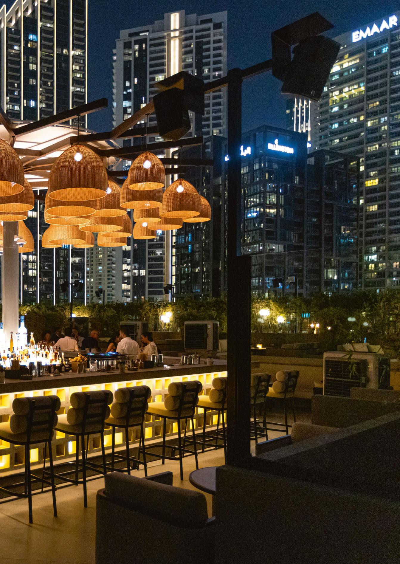
TREEHOUSE
Embarking on a journey through the Taj Hotel, Business Bay, Dubai, the recent refurbishment for Treehouse, by Prospect Design International, is a perfect example of how lighting plays a key role in design storytelling. The design team recognised lighting as a pivotal element in the narrative of the venue. In the realm of interior design, lighting creates ambiance, and immerses guests in a multi-sensory experience.
Situated on Taj Hotel’s rooftop, Treehouse is a bohemian-inspired retreat blending charm with high-energy allure against the bustling city backdrop. The design ethos embraces a boho-chic aesthetic created with natural materials for a cosy and friendly atmosphere. The space is divided into two levels; on the upper deck, a central bar steals the crafted from natural concrete block façade elements adorned with a bespoke tree made of woven lights by lighting consultants Skyelume, a playful nod to the venue’s overarching story. The bar, surrounded by lush greenery and two tiers of comfortable sofas, becomes the focal point, creating an inviting arena where guests can both see and be seen, elevating the overall experience of this rooftop sanctuary. www.prospect-design.com
Image: Jimmy de Paris
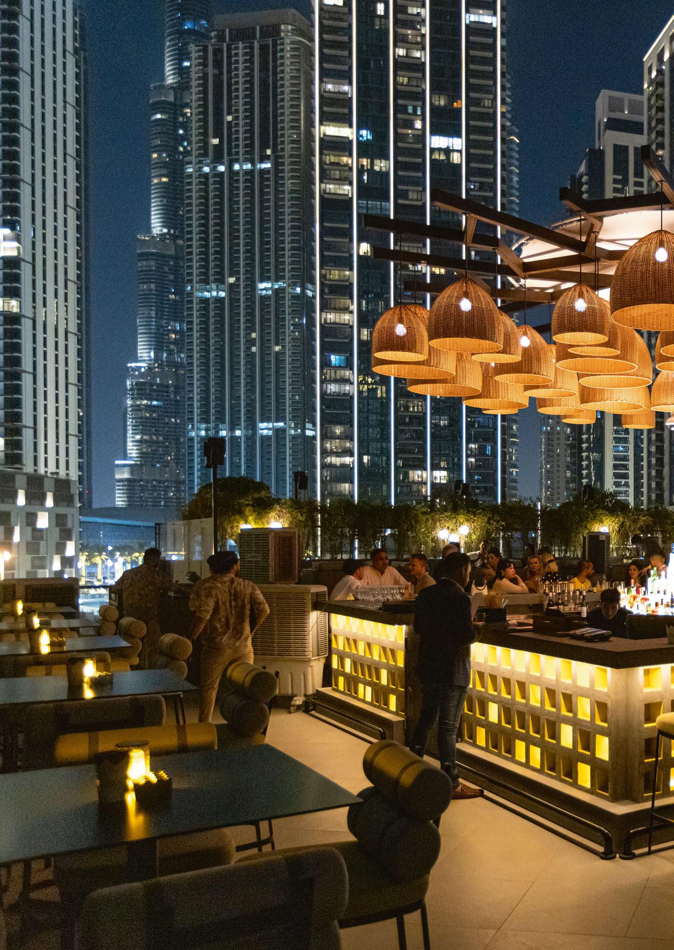 BUSINESS BAY, DUBAI
FOCAL POINT 8/9 | FOCAL POINT | TREEHOUSE
AL MAMLAKA SOCIAL DINING
Al Mamlaka Social Dining is a new multicuisine food experience in the Saudi Arabian capital of Riyadh. Located inside the Kingdom Tower, a striking skyscraper, Al Mamlaka is the first restaurant in Riyadh where diners can experience high-quality global cuisine under one roof, around the clock.
Working alongside lighting designers Lighting Design International (LDI) for the project was interior design studio TGP International.
A central focal point for the designers was the coffee and cocktails station. With it being the first sight guests see on entering the restaurant, the goal was to leave a lasting impression.
The team at LDI team used linear lighting around the canopy of the coffee counter, which offers a continuous ray of light. To complement LDI’s plinth-level lighting alongside lighting at the front of the counter, TGP specified Bonbon pendants by Danish furniture brand HAY in the dining area, with the decorative lights made of fabric, partnered with rattan pendants. All of the linear lighting was 2400K, which adds a warm depth. The architectural lighting is 2700K, and the Zico Lighting lamps inside the pendants are 2200K. It
was important for LDI to create warmth from the pendant, coupled with the accent lighting on the tables.
Arianna Ghezzi, Associate at Lighting Design International, says: “As the project entailed reworking an existing building rather than a new build, we had to work within several constraints and limitations.
“We have created a multi-discipline scheme that oozes sophistication and sets Al Mamlaka apart from every day, standard food halls. As an almost 24-hour establishment, we needed to move the lighting along as the day faded and the nighttime set in.
“We achieved this by programming all of the lighting across the hall, with four different scenes. These are lighter during the day, with more atmospheric, moody lighting during the night. A podium and a stage can be added to the space, so the lighting needs to support a party mood for these occasions.
“The new dining experience of Al Mamlaka is certainly something unique, and the lighting is a key part of making guests know they are somewhere special.”
www.lightingdesigninternational.com
www.tgpinternational.com
Image: Gavriil Papadiotis
RIYADH, SAUDI ARABIA
FOCAL POINT 10/11 | FOCAL POINT | AL MAMLAKA SOCIAL DINING
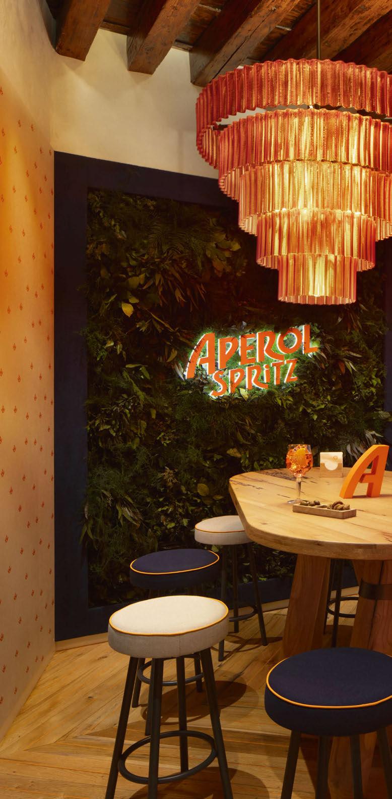
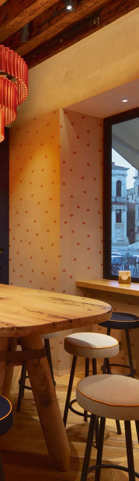
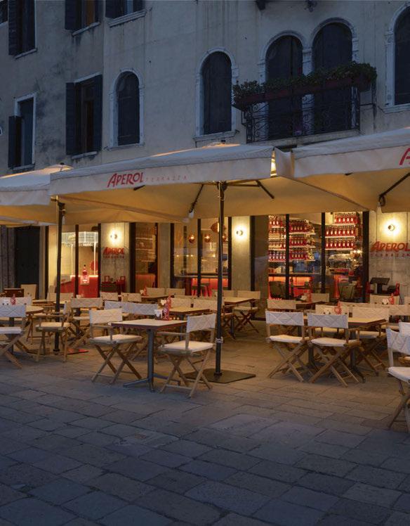
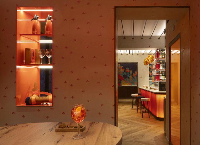
TERRAZZO APEROL
Terrazzo Aperol, a small Venetian bar in Italy, has undergone a renovation by architectural firm Vudafieri-Saverino Partners, which has injected a lively orange palate with matching decorative lighting accents.
Terrazza Aperol, located in the heart of Venice, Italy, is characterised by the distinctive orange tones of an Aperol Spritz, a refreshingly vibrant Italian cocktail that hails from the Northeast of the country.
Milan-based architectural firm Vudafieri-Saverino Partners initially designed the interiors and recently returned to transform the 70sqm space into a successful fusion of a traditional bacari - Venice’s small local bars - with the contemporary allure of a cocktail bar.
Architects Tiziano Vudafieri and Claudio Saverino have given a modern makeover to traditional Venetian materials and elements in order to give an authentic experience to the Italian-style aperitivo ritual and socialising. They managed this through enhancing the bacaro and bar and creating a social room.
Blue accents from the Aperol brand have been introduced throughout to add notes of personality alongside neutrals and orange details.
“Inside the Bacaro, where the famous Venetian “cicchetti” appetisers reign supreme, a counter in
12/13 | PROJECT | TERRAZZO APEROL
PROJECT
ribbed canaletto walnut teams with tops in warm white Corian to lend a decorative touch to the interiors and, together with orange details and bright lines, it creates a warm relaxed mood reminiscent of traditional Venetian bacari.”
Pendant lights above the bar are from Muranobased brand Barvoier & Toso and are a custom-made modification of its Hanami model. Their rich orange tone pair nicely with the 3D-printed recycled plastic chandelier, produced to a design by the architects that recalls classic blown glass chandeliers, situated in the social room.
Elsewhere, technical lighting includes spotlights by Modular and LED ceiling strips by Immenso Luci d’Autore provide functional illumination.
“Ideal at any time of day, from coffee to after dinner, the bar continues to be the beating heart of Terrazza Aperol, the ideal place to enjoy a perfect Aperol Spritz and admire the beauty of this city through the large windows overlooking Campo Santo Stefano.” www.vudafierisaverino.it
14/15 | PROJECT | TERRAZZO APEROL
TERRAZZO APEROL
Interior Design: Vudafieri-Saverino Partners
Lighting Specified: Barovier & Toso, Custom 3D printed chandelier Images: SantiCaleca
Cocktail bar Terrazzo Aperol celebrates the vibrancy of an Aperol Spritz, interjecting the distinctive orange and blue colours of the Aperol branding throughout its furnishings and decorative lighting.
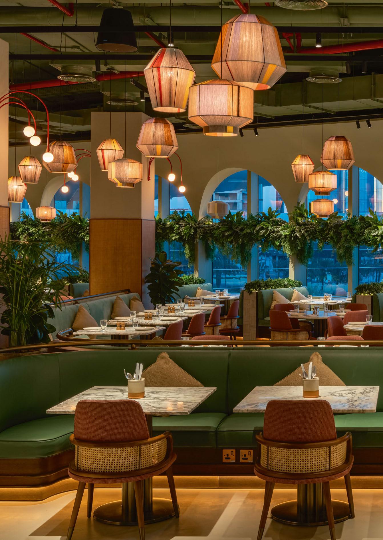
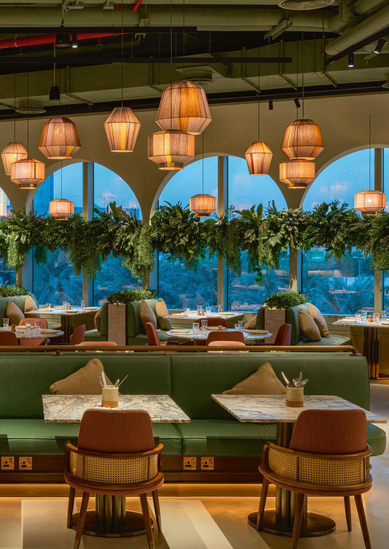
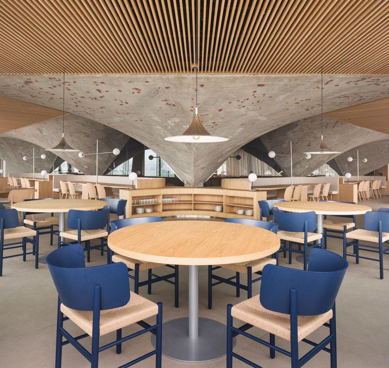
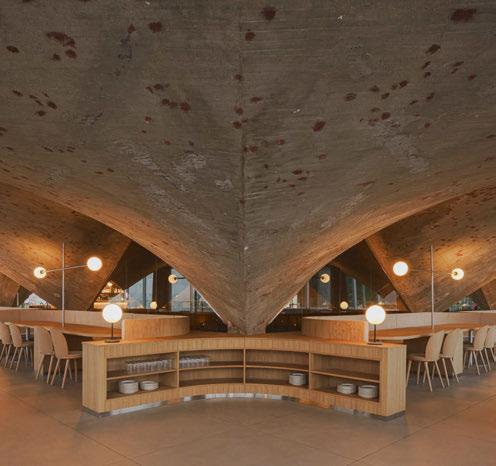
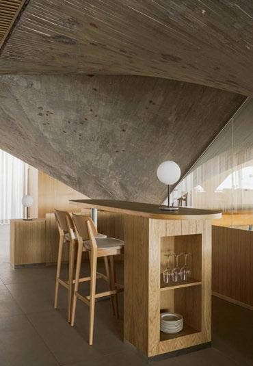
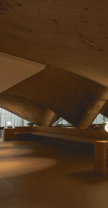
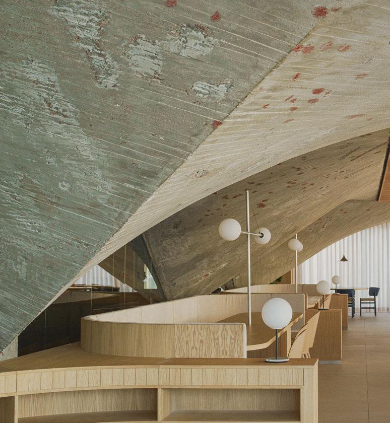
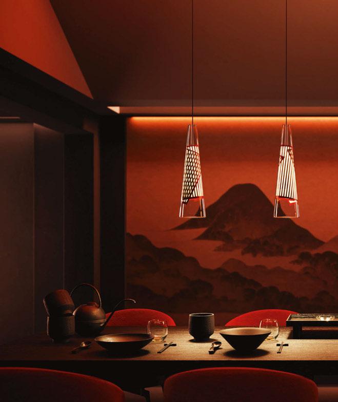
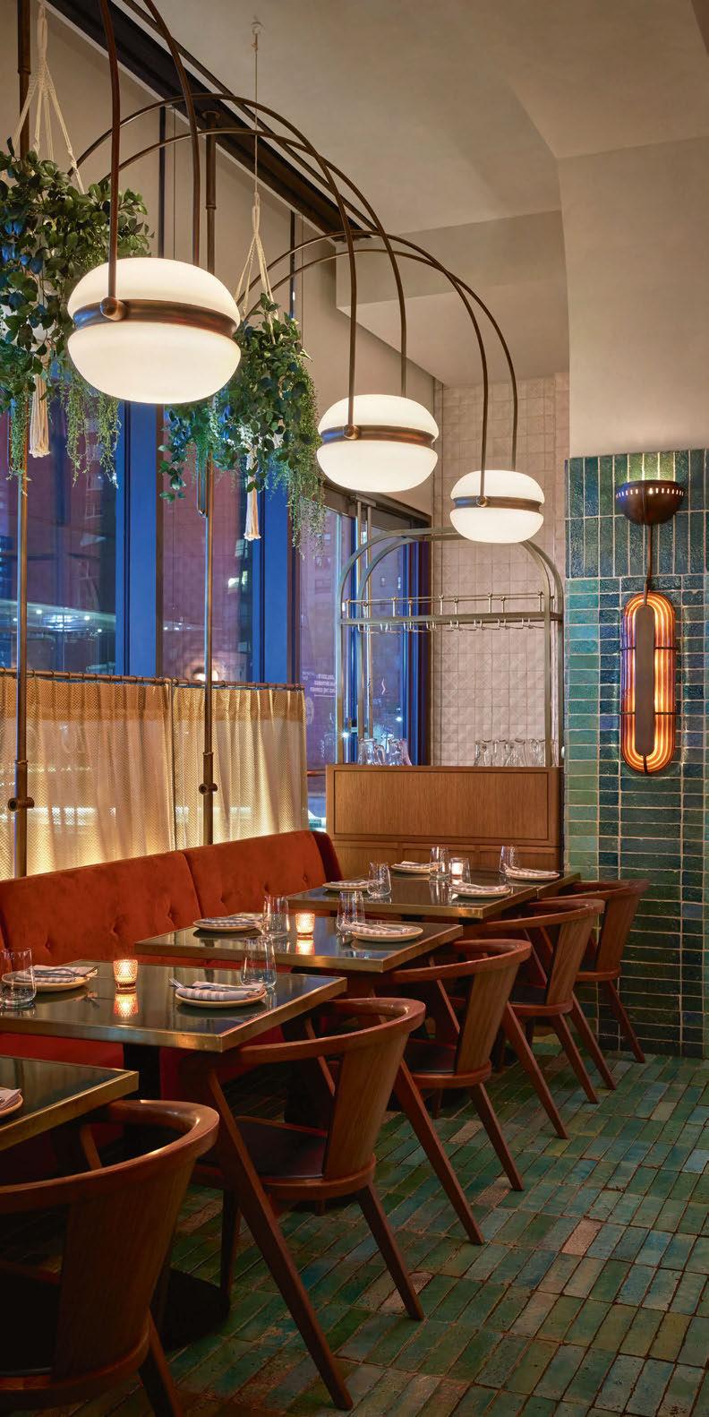
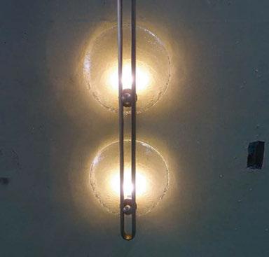
CANTABRIAN MARITIME MUSEUM
Architectural studio Zooco has transformed the hospitality venues inside the Cantabrian Maritime Museum, creating an elegantly simple destination that celebrates the building’s original architecture.
The Cantabrian Maritime Museum, Spain, was conceived as part of an architectural complex together with the Oceanographic Center, designed by Vicente Roig Forner and Ángel Hernández Morales and built between 1975 and 1978.
The original building consists of two square bodies connected by a canopy, with a concrete structure. The interior is distributed over three floors around a central courtyard covered by a vault of paraboloid membranes. In 2003, a renovation and extension was carried out, which included the extension of the west façade and the roof of the terrace with a pyramidal aluminium structure, thus altering the initial conception of the building.
Madrid-based architectural studio Zooco was brought on board initially to rectify issues of dampness in the roof and façade of the building. This later developed into the team designing and creating a new space of the museum on the second floor, which houses its restaurant and terrace. When describing their involvement in the project, Miguel Crespo Picot and Javier Guzmán Benito, two of the three founders of Zooco, explained how fortunate they were that the client granted them complete freedom when it came to shaping the design of the restaurant.
“Throughout the duration of the project, the integrity of the design remained unaltered, preserving its originality and functionality without undergoing any changes.”
The geometric properties of the space helped define the approach to the restaurant’s interiors. The square morphology of the restaurant’s volume is the result of four additional triangles that regularise and complete the concrete paraboloids of the original building.
“The original building had a terrace on the third floor, where the concrete structure was completely outside and functioned as the roof of the museum’s central patio. In 2003 the building was renovated and within this intervention, the paraboloids were covered with a new roof and the
16/17 | PROJECT | CANTABRIAN MARITIME MUSEUM
PROJECT
SANTANDER, SPAIN
space between them, and the perimeter of the building was closed with glass, generating a covered space where there was previously a terrace. From the outside, the original cover can no longer be seen, and from the inside it is covered by paint or coating,” explain the two founders.
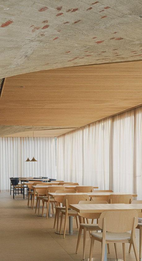
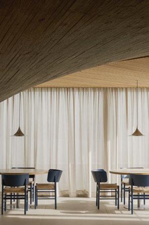
“Our intervention focused on recovering the original essence of this significant construction element. To do this, the coating and paint were removed, and the inclined green glass was replaced with vertical transparent glass. In this way, the paraboloids appear in their pure state and a perimeter terrace is recovered along the entire space.
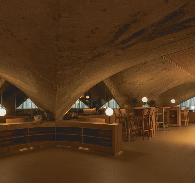
“The geometry of the existing structure conditions the space, because its height in its lower part is impractical, so a large bench was arranged around the entire contour that allowed us to take advantage of that space and organise the distribution of the rest of the floor plan.
“We wanted the concrete paraboloids to be the absolute protagonists of the space. To do this, we looked for a floor finish that was as neutral as possible, that adapted to the existing conditions and did not compete with the main element of the project.
“To enhance the original structure, we decided to use a wooden roof that framed the perimeter of the paraboloids. The wooden slats bring warmth and friendliness to the space, while allowing us to solve all the technical needs for air conditioning, heating, and lighting, leaving them hidden. In this way we ensured
18/19
“The luminaires, in their varied forms, become not merely sources of light but protagonists in the narrative of design, illuminating not just spaces but also the nuanced interplay between permanence and flexibility, aesthetics and functionality.”
that all these elements did not interfere with the dialogue of concrete and wood, which were presented as continuous and clean elements.
“This geometry became a recovered element, a vestige of the past, and the protagonist of the restaurant’s interior. Treated as an artistic element, the triangular wooden false ceilings frame it.
The museum’s location also played a key role in the design strategy for Zooco. “We could say that it influences 100%,” says Guzmán Benito. “We are at the Cantabrian Maritime Museum, a museum dedicated to the sea, which is practically on top of the water. When we are inside, the feeling is the same as when we are inside a boat, there is only water around, and that is why we used clean glass from floor to ceiling, generating a perimeter terrace as if you were on a boat.”
“The use of wood and steel for all the furniture is reminiscent of the materials used in ship building,” continues Crespo Picot. “The wood is arranged in small boards just as it is used in the hulls of boats and the furniture has slight curvatures that are reminiscent of the aerodynamic shapes of boats. Likewise, the lamps are inspired by the masts for ship sails.
“The dialogue between the concrete container in grey tones, on the one hand, and the glass envelope that allows a total visual connection with the outside, generates great spatial harmony. Everything is completed and harmonised with all the oak wood furniture and stainless steel accessories.”
The role of decorative lighting was integral to achieving
PROJECT | CANTABRIAN MARITIME MUSEUM
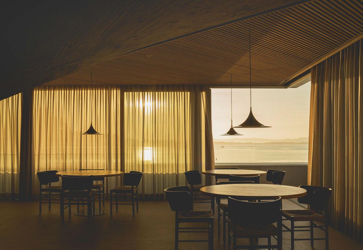
the minimalist aesthetic the team were working towards for the dining area. Along with fixtures from Arkoslight, Menu and Gubi, Zooco also created a custom piece called the MMC Lamp.
“The concept behind the design of the MMC lamps stemmed from a specific necessity – the quest for a lighting solution that seamlessly emerged from the table surface, eliminating the need to suspend it from paraboloids,” explains Crespo Picot. “This innovative approach aimed to preserve the integrity of the concrete structure, ensuring a harmonious blend of functionality and aesthetics. In addressing this challenge, the lamps were meticulously crafted to not only fulfil their illuminating purpose but also to become an integral part of the architectural composition.”
Discussing the various considerations for lighting placement, Guzmán Benito says: “First, in this luminous spectrum are the suspended fixtures, gracefully poised from the ceilings adorned with wooden slats. Second, the MMC Lamps that emerge from the table, and thirdly the recessed spotlights, which are strategically placed to illuminate pairs of tables, creating intimate pockets of radiance.
“[Decorative lighting is] as important as any main element of the design. The luminaires, in their varied forms, become not merely sources of light but protagonists in the narrative of design, illuminating not just spaces but also the nuanced interplay between permanence and flexibility, aesthetics and functionality.”
When asked how this project differed to others in Zooco’s portfolio, Guzmán Benito explains that the task of rehabilitating the existing concrete structure was a point of difference for them. “This challenge added layers of complexity to the process, requiring a meticulous approach to preserve and strengthen the structural integrity while undergoing rehabilitation. “Zooco designs everything. Our philosophy consists of approaching any type of assignment, regardless of its scale, budget, and programme, with the same attitude and creative ambition. Applying the same process searching the most appropriate and valuable solution, both from an artistic and functional point of view.”
www.zooco.es
Taking inspiration from the geometric shapes of the new restaurant’s architecture, the decorative lighting throughout the space mirrors the clean lines and simple aesthetics, resulting in an elegant atmosphere.
20/21 | PROJECT | CANTABRIAN MARITIME MUSEUM
CANTABRIAN MARITIME
MUSEUM, SANTANDER, SPAIN
Interior Design: Zooco
Lighting Specified: Arkoslight, Gubi, Menu, Zooco Images: Zooco
Featuring six large edge-lit LEDs nestled amongst unique modern brass finish metalwork designed using a forged process. Other finishes available. ATMOSPHERE
|
(0)20 7351 0863 | sales@christopherhyde.com | | EST.
LONDON
DUBAI +44
1995 ROSETTE PENDANT
the
COLLECTION Discover
complete collection at christopherhyde.com
PROJECT
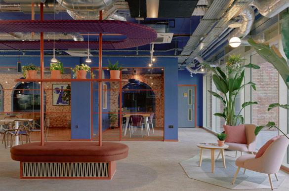
ENSO
COLCHESTER, UK
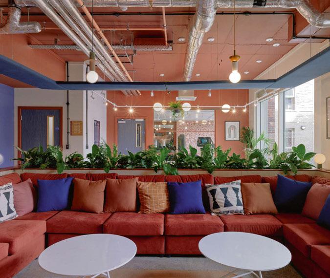
UK-based interiors studio Ekho has entered the Purpose-built Student Accommodation scene for the first time with its project Enso located in Colchester, UK. Managing Editor Helen Ankers discovers more about the studio’s design scheme.
Ekho Studio has completed its first student accommodation project, as the interiors consultancy enters the PBSA (Purpose-built Student Accommodation) market. The project is a new-build scheme called Enso, located in the heart of Colchester, UK and just minutes from the University of Essex campus.
The joint clients on the project were UK real estate fund manager Moorfield, with whom Ekho Studio Founding Partner Rachel Withey had already worked on several occasions at previous agencies, plus project developer Melberry. The Ekho Studio design team also liaised throughout with operator CRM Students.
The brief for the interior was first to create a bright, airy, and light-filled student amenity space on the building’s ground floor, incorporating thoughtfully designed communal spaces aimed at encouraging social interaction. The amenities needed to promote relaxation and wellbeing and offer a sense of balance to residents, with co-working spaces for individual study and team collaboration, lounge, and seating areas, as well as a gaming area, and gym. The second part of the brief was to create the look and feel for the scheme’s 282 student rooms, devising a colour palette that would tie in harmoniously with the amenity concept. The overall design was also to be environmentally low-impact, prioritising materials with strong recycled or recyclable credentials and low-energy manufacture and use.
For the project concept, Withey and her team took inspiration from a sense of place, focusing particularly on Colchester’s rich historic past. The city was known as ‘Camulodunum’ – translated as the ‘Fortress of the War God Camulos’ – during Roman times and was immortalised by Pliny the Elder as Britain’s first recorded settlement and, later, as Britain’s first city and capital. Certain forms and elements from that period remain intact, standing out as a common thread through the city’s history and architecture, from Roman arches to the town’s layered brick walls.
Ekho Studio took these key visual and architectural elements and used them to formulate a consistent design language for the scheme that translates right across the interior spaces. Simple forms, particularly the ‘arch’ motif, were used horizontally and vertically to create interest, while a series of layered vistas add a sense of depth, with repeat patterns, sometimes with a woven form or fringed edge, suggesting the reveal of layers in the old city.
A second design thread is nature, with Colchester and the surrounding countryside full of strong textures and dramatic forms and colours. The colour palette fuses Roman-era references with local natural colours, celebrating earthy and warm tones.
“By using these tones as ‘block’ colours, we created a vibrant, bold colour palette that works well with the forms but also has a softer feel,” Withey says. “We emphasised the toasty burnt oranges and varying shades of pink that cloud and streak the traditional earthenware material of terracotta and complemented this with the natural greens/blues that reflect Colchester’s surrounding countryside.”
Ekho Studio collaborated with branding agency J2 on the scheme, with the latter creating the project’s unique Enso branding, mining a direction inspired by the interior design narrative. The lower case ‘enso’ of the brand features an ‘n’ that alludes to the simple form of the arch, for example, with the ‘n’ additionally used by Ekho Studio within the scheme as a playful standalone marque/art feature, filled with planting, in both small and large iterations.
As Ekho Studio was involved in the project prior to construction, the team was able to request minor alterations to the space plan from the point of view of flow, including, for example, more external doors into the courtyard. Other changes included moving the reception further away from the arrival doors and swapping the internal ply laminate doors to blue for the amenity space, while they are in light oak elsewhere. Ekho Studio also proposed locating additional gym equipment outside in the courtyard space, in addition to the ample internal gym located at the rear of the games area.
“Courtyards are lovely to look at and great sources of natural light but are often under-used and passive in nature,” Withey says. “By locating part of the gym outside in the healthy fresh air, we also made it into a more active space, with the added benefit of liberating indoor space for other uses.”
The amenity space features two distinct areas: a social space at the top of the plan with a games area, including a pool table, and access to the gym, with this potentially noisier area located the furthest from ground-floor student residences. At the bottom of the plan are the reception, tea point, lounges, study room, and smaller enclosed study room. The ground floor bedrooms are located beyond the study spaces to ensure the quietest possible adjacency.
22/23 | PROJECT | ENSO
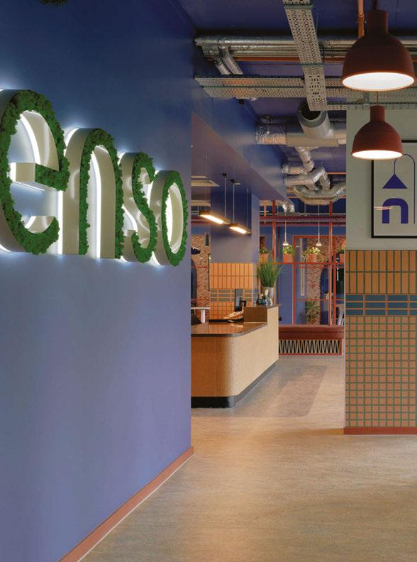
When students and their visitors enter the ground floor amenity space, they are immediately greeted by the site-specific enso branding on the wall opposite, backlit and in lower case, with the four letters in-filled with planting to establish an immediate outsidein biophilic connection. The two dominant concept colours – blue and terracotta – are also immediately introduced in the form of a blue-painted wall with terracotta skirting at its base; complementing this are several Muuto Unfold pendants, also in terracotta. The playful take on the arch shape of Enso’s letter ‘n’ also has its first iteration here as a wall decoration, both super-sized as a large arch and as a smaller, inverted ‘n’, with the bottom of the shape aligned to the top of the wall. Both are edge-lit and either infilled or surrounded with reindeer moss. Flooring here and throughout is in Marmoleum tiling in varying patterns and colours, while the ceiling is exposed to create maximum height, with white-coloured track lighting throughout.
As students or visitors approach reception, they see the space’s first structural column, treated decoratively, and clad in a pattern of terracotta and blue tiles with a feature green grout. Above the tiling is the scheme’s first artwork, incorporating both an arch and a pottery shape. The bespoke reception desk to the left features
a Hanex top and a cork frontage, while two pendant lights are featured above – the Cortina – Big Pendant Lamp from Dam-Green.
“The primary intent with this light fitting was ensuring it worked for the functionality of the desk to light the solid surface evenly for 24/7 working use,” Withey tells darc. “We also wanted to balance this with sustainable material choices and ensure that such a prominently located fitting worked with the design aesthetic and language – no small feat! The main material is cork to suit the desk itself, while the long, arched form followed the design language, and the length functionally gave the user the desired lighting levels they needed without compromising on aesthetic and cost.”
A reception waiting area features furniture arranged on two different rugs that tie in with the scheme’s blue/green and terracotta colour palette, with the first large-scale plants here adding drama and scale. Vibia’s Palma 3724 pendant lights with planters feature in this space – lining the internal side of the glass façade. As the space opens, a tea point follows round to the left, with laminate cladding to the front in a terracotta tone, though the focal point in this area is a bespoke joinery seating lozenge. This features at its base a zigzag brick pattern, with deceptive depth, with the same material and pattern also used on the back wall
“The
traditional earthenware material of terracotta links to the design language throughout Enso with the warm toned colour and linking back to the Roman history conceptual thread. The terracotta pendants sit against the blue background, which created the striking colour contrast we were aiming for.”
24/25 | PROJECT | ENSO


An extensive range of cream textured fabric shades nestled within aged brass finish fittings

franklite.co.uk | hello@franklite.co.uk | +44 (0)1908 691 818
CLIFTON
of the tea point and later in the scheme for the screens that lead to the games area.
Above the banquette seat – and extending over the whole tea point area – are three inbuilt display shelves for planting, with a single lozenge-shaped raft at the top, featuring on its underside a geometric patterned textile in blue and terracotta. The tea point is lit by four Blush pendant lights in white from Northern; according to Withey, this fitting needed to contrast against the vibrant blue slab but also be small enough to hang between the raft elements.
“We sourced something that was a block colour tone to create the contrast but also had an arch-like profile to tie in with one of our key aesthetic concept drivers,” she says.
Opposite are two sets of four-person table seating arrangements that feature Rigatoni pendants in indigo from Hand and Eye Studio. “The Rigatoni fixture was utilised for above the dining/study tables and continue our theme of utilising natural materials where possible. The blue and terracotta combination emphasises the wall finish palette and complements the blue sprayed slab colour. These light fixtures were chosen to create a focal grounding to the tables below.”
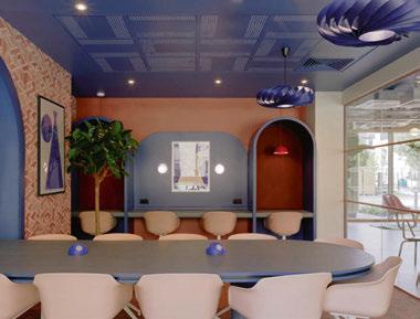
Then, behind these, there is a long, glazed wall announcing the large co-working and the smaller quiet study spaces. These include chairs in complementary colours and a variety of worktops and booths, with a large central table as the focal point of the co-working area. This bespoke blue table with a triple edge with a central inset layer is in the shape of the arch motif, playfully inset into a wall arch, as if it has just
been leveraged out. The booth areas feature a fabric backing, while the acoustic ceiling grid in the space has been painted blue and arranged at angles in an ontheme geometric styling. Two feature pendant lamps in blue by Tom Rossau feature here and are made of bent ply. A graphic wallpaper incorporates a city wall pattern in shades of terracotta and, once again, offers a playful sense of depth. Flowerpot VPI pendants from &Tradition feature in the individual booths in a deep terracotta colour.
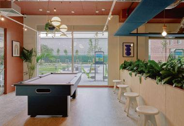
In the gaming area of the ground floor amenity space, the use of terracotta and blue is flipped for subtle differentiation, with the walls and ceiling in terracotta rather than blue. A U-shaped, large sofa in dark terracotta is dressed in a variety of plain and patterned cushions that fit with the colour palette. The feeling of a new zone is aided by a square suspended ceiling raft in blue over the sofa area, enclosing four feature Junit pendant lights from Schneid Studio.
Commenting on the use of these fixtures, Withey says: “The oversized bulbs with simple stacked timber shapes were selected to zone the TV and games area while also creating visual interest in a fun way. The simple pieces, we felt, were reminiscent of Roman architectural forms but with a quirky twist as to how they are threaded together; the selected colour tones suited the overall palette.”
Behind the sofa, a large-scale, laminate-clad planter with a terracotta top edge creates a zonal screen, with a pool table located directly behind. The adjoining wall here also features the same large arch and small inverted arch as used on the entrance wall. A rectangular track light from Lightforms demarcates
26/27 |
the pool table area, while feature lighting directly above is provided by the Palma 3736 pendant light with planter by Vibia.
“Due to the ceiling height and architectural façade grilles at high level, we wanted to specify a pendant that dropped low enough to be seen from the outside, but which also worked internally,” adds Withey. “Located above table and chair settings where users can sit, work, or socialise, we wanted to keep the tabletop clear for the students’ use but also to soften the setting. This fitting meant we could have a biophilic plant dressing element to create a softer area while maintaining the working space below.”
Commenting on other lighting elements within the space, Withey tells darc, the K table lamp from Vitamin, used for the reception desk and in the TV area, “ended up being a particular favourite of the client. The fitting style is simple in form but with a clever twist in terms of how those two forms interact with each other. We were drawn to this fitting for the scheme not just for the colour and form but also because it is like a fantastical character with the ‘hood’ pushed back to reveal the light within. It had a playful feel we thought would be perfect for the games and social lounge.”
Additional lighting from Hand and Eye was also used in the TV lounge area of the scheme, Withey comments: “We are huge fans of the terracotta pendant range and have used this in other schemes. The traditional earthenware material of terracotta links to the design language throughout Enso with the warm toned colour and linking back to the Roman history conceptual thread. The terracotta pendants sit against the blue background, which created the striking colour contrast
we were aiming for.”
From recycled and sustainably sourced materials, through to natural design features and landscaped gardens that bring the outside world in, every corner of Enso has been designed to celebrate and help protect its environment. Sustainable materials used in the scheme range from recycled wallpapers to waterbased paint finishes, the use of cork for joinery and feature walls; biophilic interiors with air-filtering plants at low levels; living walls made from moss; terracotta tiles, joinery and light fittings made from 100% natural recyclable material and manufactured with energy efficiency; durable and sustainable Marmoleum natural flooring throughout; ceiling tiles and plasterboard with ACTIVair technology to improve air quality; recycledcontent furniture with FSC timber accreditation – plus fabrics made from hemp and nettle.
Heiko Figge, Head of Operational Asset Management at Moorfield Group comments on the final scheme: “We are delighted to have worked with Ekho Studio on Enso and several other projects within our portfolio. Ekho Studio was responsible for the interior design, look, and feel of the development and we are delighted with the outcome, which captures a stylish and contemporary character while respecting the heritage and architecture of the local area. Ekho Studio understands our brand standards, design brief and budget, and were always willing to go above and beyond what is expected. The team are creative, deliver inspiring concepts and designs, and pay attention to detail.”
www.ekho.studio
PROJECT | ENSO ENSO COLCHESTER, UK Interior Design: Ekho Studio Lighting Specified: &Tradition, Dam-Green, Flos, Gubi, Hand & Eye, Muuto, Northern, Shneid Studio, Tala, Vibia, Vitamin Images: Gunner Gu Sustainability was one of the core aims of this project, with the design needing to be environmentally low-impact, prioritising materials with strong recycled or recyclable credentials and low-energy manufacture and use. Every corner of Enso has been successfully designed to celebrate and help protect its environment.
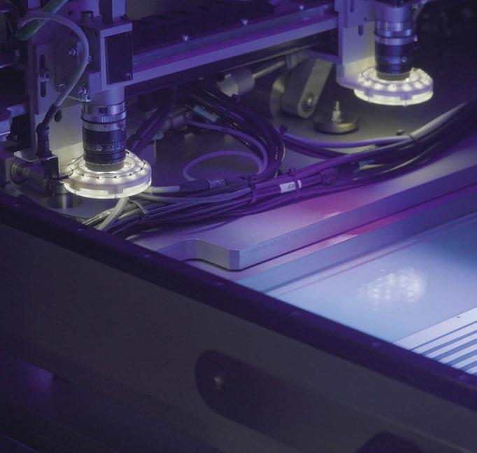
28/29 | MATERIALS | LODES X RON ARAD
MATERIALS
LODES X RON ARAD
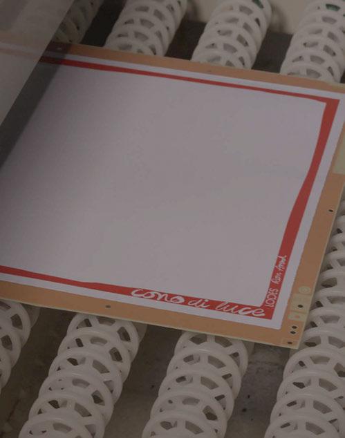
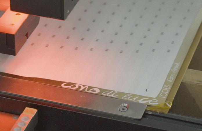
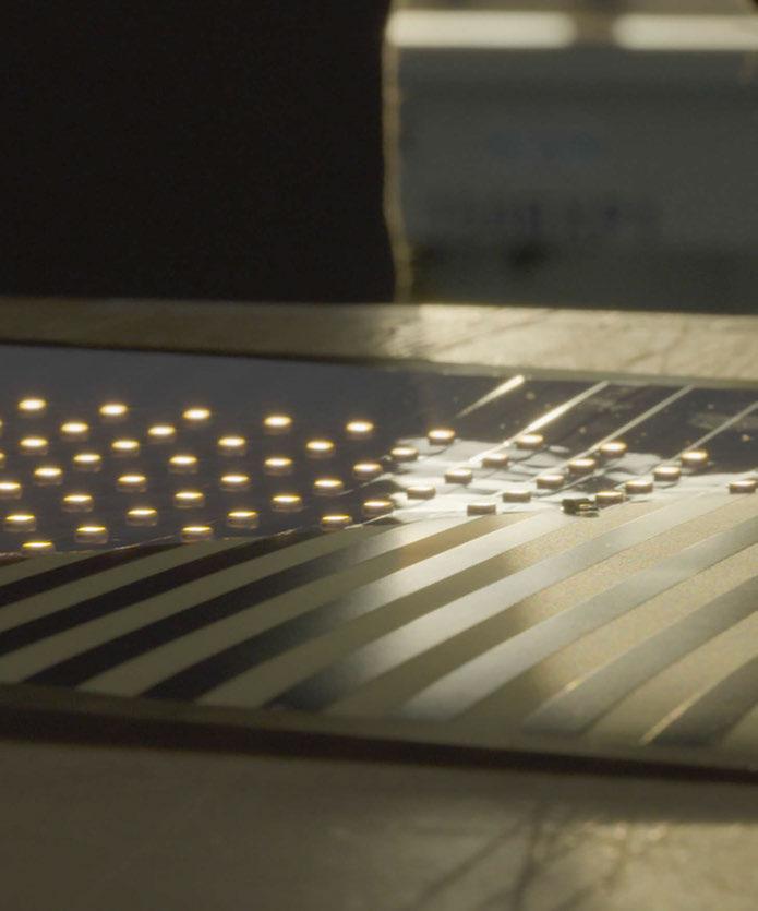
CONO DI LUCE
Italian brand Lodes recently released Cono Di Luce, a sculptural piece designed with Ron Arad. Darc’s Editor Sarah Cullen finds out more about the design process.
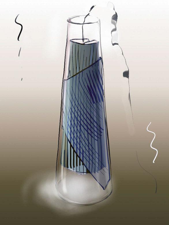
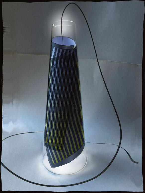
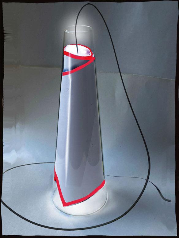
Cono di Luce is one of the latest pieces from Italian lighting brand Lodes. A grahpic and sculptural light created in collaboration with internationally renowned British-Israeli artist, architect, and designer, Ron Arad. Arad is best known for his iconic industrial pieces that have won multiple awards and been exhibited in the world’s most prestigious institutions.
Firstly, Lodes set a challenge, tasking designers to use borosilicate glass to create an iconic object. “We selected Ron Arad for his disruptive approach – as someone who blends art, architecture and design – he is able to uncover new realms in which objects break out of their typical typologies,” explains the brand. Arad’s proposed design was a slender, truncated cone shape as the archetype, with a light source placed on top, hence its name meaning “cone of light”. From concept to completion, the project took two and a half years of bringing Lodes’ technical knowledge together with Arad’s designs to produce the unique Cono di Luce design.
The first design concepts submitted were not the direction the brand wanted to explore initially. It did, however, bring to light that an already existing piece of technology, PCB (printed circuit board), could be utilised for a different purpose. In this case, as a design feature of the lamp. A continuous exchange between Lodes and Arad enabled them to explore a different design path, which led them to the final piece we see today.
“PCB technology is well-known in the industry, but it is usually hidden, it is rarely shown as part of the design. What was innovative and unexpected in Cono
di Luce was to realise the decorative potential of this technology – exposing the PCB board by wrapping it inside the glass cone,” explains the brand.
“We harnessed the material’s opaque and translucent areas to create stripes in line with Arad’s drawings - Arad played with the dark and light bands and the moiré effect given by the overlapping of the stripes. We were then able to employ this aesthetic to design an electrical circuit connecting more than 200 LED chips.”
The PCB is the result of a process that includes 33 steps and several layers composed of fiberglass and copper for the LED chip electric circuits, which by nature have both translucent and opaque areas. A sheet of fiberglass, which is extremely thin, flexible, and insulating, on which a copper path is smeared, acts as a conductor of the electrical polarity, which on reaching the LED allows them to emit light.
The white, rigid PCB frame performs three functions: refracting light so that the luminous effect of the lamp can be uniform, connecting electric circuits that give power to the LEDs and thirdly, acting as a mechanical suspension of the product itself to ensure the sheet remains at the right height inside the cone.
“The initial proposal was very different to the final piece,” says Lodes. “We had to revisit the project multiple times to make it technologically viable – after a year of trying to redefine the initial concept, we produced Cono di Luce!”
The light fixture is available in two versions - a pendant and table lamp - and three finishes, red, grey, and gold.
The pendant measures 45cm and 65cm, making it well suited to sit above countertops as a group or solo.
“Lodes harnessed the material’s opaque and translucent areas to create stripes in line with Arad’s drawing - Arad played with the dark and light bands and the moiré effect given by the overlapping of the stripes. We were then able to employ this aesthetic to design an electrical circuit connecting more than 200 LED chips.”
30/31 |
MANUFACTURING PROCESSES
MATERIALS | LODES X RON ARAD
A sheet of fiberglass, which is extremely thin, flexible, and insulating, on which a copper path is smeared, acts as a conductor of the electrical polarity, which on reaching the LED allows them to emit light.
The table version is available at 50cm and features a black dimmer switch.
Arad prioritised the red version to offer an impactful statement piece, featuring his signature on the outer flap. The grey version is more subtle, with the signature and product name positioned discreetly on the inside of the sheet, allowing the product to adapt to various settings. There is also a third version which features a grey finish on the inside and a gold finish on the outside, obtained through the deposition of gold, to give the product its preciousness.
“Cono di Luce differs aesthetically from the Lodes catalogue,” explains the brand, “but it also marks a first for the industry. There is, however, a correlation in the use of Pyrex (a very flexible material used throughout our catalogue) as well as the colours selected for the frame that recall our CMF [colours, materials, finish].”
Arad comments: “When you look at it (Cono di Luce), first of all, I’m very happy that it’s legible. You can you look at it and think you understand what you’re looking at. There’s a page locked in the glass cone. However, this page is providing light through the cone and becomes sort of glowing in itself. There are lines which create a moiré.
“Sometimes you start with an idea and in the process of making it, you lose something. In this case, I don’t think we lost anything. If anything, we gained something. I am very happy to see this, and I am very happy that through the interesting journey that we had getting here, you can still look at the original sketches and compare it with the end product and think that it’s the same.”
www.lodes.com
www.ronarad.co.uk
32/33 |
Images: Kinonauts, Mattia Balsamini, Ron Arad

MATERIALS | LODES X RON ARAD
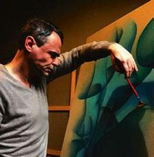
STEVEN ESHLEMAN
Interior design studio AvroKO is not only well known for its stunning interior schemes, the firm also has a product design arm, which is led by Director of Industrial Design, Steven Eshleman. darc chats to the designer to find out more about his career at the New York studio, and his design approaches when it comes to creating light fixtures.
American interiors studio AvroKO is well known for some of the most beautiful hospitality projects spanning across the world. Established in 2001 by four close friends, Kristina O’Neal, Adam Farmerie, William Harris and Greg Bradshaw, the studio prides itself on four foundational values; create as a collective, work macro-to-micro, be hospitable, and think sideways.
“As we’ve grown as a firm, this idea of “connection” has extended beyond just the four of us, our studio, and even the end result of the work,” says the firm. “We orchestrate experiences that envelop patrons through a combination of design-driven programming and contextual references.
“This ultimate goal of connectivity in our design is to ensure that hospitality backdrops are not simply passive reception spaces where people dine or sleep, but that they create emotionally transcendent experiences, however tiny or even subliminal, allowing the energy of the spaces to shift and evolve timelessly.”
Along with delivering outstanding interior schemes for hotels, bars and restaurants, the studio also provides product design services.
New York, and a Bachelor of Arts degree in industrial and product design from Parsons School of Design. Alongside his design career, Eshleman gives us a personal insight into his side line hobbies: “In recent years, I can admit that I’ve fostered an addiction to collecting and caring for unusual houseplants. At the same time, I’ve cultivated a budding interest in writing horror fiction on themes surrounding technology and climate change. Curiously, these hobbies are the functions of perceivable light and conceptual darkness.”
“I don’t think I consciously desired a career in design, life moves fast, and I just leaned in; I do remember I wanted to be a mortician or to work in advertising. Early on, I was told I had a penchant for sketching, collaging, and anything that involved crafts.”
“A big part of the design of our spaces is focused on the magic of custom lighting and furniture pieces, elements that often define the experience of a space. We pride ourselves on our passion for developing these custom furniture, case good and lighting components inhouse and turning them from visions into production pieces.”
To discover more about the product design arm of AvroKO, darc’s editor spoke with Steven Eshleman, Director of Industrial Design at the studio.
“I spent my formative years in Hong Kong, and subsequently in Toronto, Canada,” he tells darc. After high school, he obtained a bachelor’s degree in environmental studies at The New School university in
Perhaps this self-confessed interest in the dark side explains one of his intriguing original career aspirations, to work with the dead. “I don’t think I consciously desired a career in design, life moves fast, and I just leaned in; I do remember I wanted to be a mortician or to work in advertising. Early on, I was told I had a penchant for sketching, collaging, and anything that involved crafts. That led me to an arts education, which led me to an arts-focused university. After the first year in school, a professor urged me to major in 3D design based on what he observed of my work. From there, everything seemed to point towards industrial design.
“Before disbanding for higher education, I developed and capitalised on a quick-service food concept with a few schoolmates. In university, I interned for a fledgling pet product design company, and had another internship at a furniture and lighting design atelier. At one point, I had the opportunity to teach a college course by myself. Afterwards, I worked in sourcing and procurement for an eco-fashion start-up. My career could have very well ended up on any of those paths.” Eshleman joined the AvroKO team in 2019 as Senior Furniture and Lighting Designer before progressing to Director of Furniture and Lighting in 2022, and now Director of Industrial Design in 2023.
34/35 | INTERVIEW | STEVEN ESHLEMAN
INTERVIEW
“My current role is pretty novel at AvroKO in that it demands a multidisciplinary approach to the work, the mentorship of younger designers, and the conceptual pollination of future projects.”
“My current role is pretty novel at AvroKO in that it demands a multidisciplinary approach to the work, the mentorship of younger designers, and the conceptual pollination of future projects. The work is micro in scale but has macro impacts if not executed thoughtfully; the princess will feel the pea. On a typical day, I’m still involved in ideation, sketching, and 3D modelling just like any member of our furniture and lighting team. We take Hospitable Thinking very seriously for our clients as well as our staff; I emphasise a place of empathy and collaboration for my team so that they can be empowered to succeed in every project they tackle. Outside of client-based projects, we also wear various hats in product development for our own lines of furniture and lighting with collaborators and partners like Visual Comfort and Stellarworks.”
The concept of Hospitable Thinking referenced by Eshleman is a phrase coined by AvroKO that describes its philosophy to approaching projects. The studio describes it further: “AvroKO believes that hospitality transcends languages, industries, and borders, it’s a collection of small moments that can have a powerful, positive impact on how people feel. Human needs are universal. They transcend geography, race, religion, culture. They are wired into our very DNA, informing our decision-making and shaping our reactions to the world around us. They are few, finite, and classifiable, and have remained constant throughout history and human culture. By understanding and fulfilling these
fundamental human needs, brands and businesses can resonate with consumers on a deeper, more profound level, resulting in a strategic approach that maintains relevance and longevity. It’s an approach we call Hospitable Thinking. We bring the philosophy of Hospitable Thinking to all of our projects in order to foster remarkable experiences and ultimately form more meaningful connections between people. This process integrates timeless core truths, behavioural sciences, and environmental psychology to maximise hospitality experiences.”
Looking more closely at Eshleman’s product design journey, he reflects on his design style over the years and how his various experiences and education have influenced this. “In my early career, I gravitated towards the mid-century modern, as many of us are guilty of. But in an effort to diversify, I’ve focused on the perennial aspects of design rather than a specific period or place. What makes a product or design alluring to a person apart from its period or place? This question allows us to focus more on form and design rather than a point in time that might fall out of fashion. Perenniality in creativity is identifying inspiration from the past just as well as works from today; it does not discriminate between Eastern or Western styles. This certainly has an influence on AvroKO interiors because our work cannot be defined by a particular era — let alone be replicable by others. What is old becomes new again can describe others’
36/37 | INTERVIEW | STEVEN ESHLEMAN
CHELSOM.CO.UK
“Good designers employ a blend of critical, conceptual, and technical thinking. It answers the “what,” “why,” and “how” through tangible designs and use cases. There is really no prescribed “good” product design, only if it solves a need; the need can be met with experiential and practical products.”
38/39 |
works, while our designs live in the nostalgic tension between the old and the new.
“In product design, the light we work with is promethean and basic, but that doesn’t mean it’s easy or elemental. The conjuring of new light is heavily influenced by memories of past experiences. A new design for a sconce, for example, only emulates all the light that has ever been. When we describe our work, we often propose that a light fixture evokes a place, a time, or a snapshot. We ask questions like, “should the light be diffused and spray like shattered crystals up a column? Or should it peak and dance through reveals in an opaque shade?” Light itself is fickle and intangible in the most romantic way. It reminds us there is a past, and plants us squarely in the illuminating present.
“I have always been drawn to the works of H.R Giger, Carl Auböck and Eero Saarinen. All of their works remain steadfast and unflinching through grace and brutality; timeless in execution, skewering passing fads. Today, I’d say my inspirations can come from a concept or idea derived from tangible thematic research. I often find
myself in decrepit flea markets flipping through books or trawling the recesses of strange Tumblr pages trying to draw connections from one idea to another.”
With reference to his first degree, he continues: “Environmental studies is a broad topic that encompasses everything from urban landscape design to cartography in the service of disaster research. At AvroKO, it has helped me to understand the macrolevel impacts of the furniture and lighting industry. We promote a workflow where we encourage our clients and vendors to think globally but act locally. Not everything we design must be manufactured and sourced from oceans away, it’s up to our team to resource that homegrown industry given the renewed need for a repatriated supply chain. With that, I have always seen hospitality environments as the most eco-friendly way of experiencing good design; in the lifetime of a hotel, for example, thousands of people can experience a chair rather than the creation and
delivery of thousands of chairs in as many homes. We can elevate the product through diligent material selections and design engineering, thus ensuring a longer product life; many of our works can be refinished or refurbished for a new life after the original project.”
In Eshleman’s experience, good lighting should above all be functional. “No one wants to be blinded by a phone camera in a restaurant with medieval light levels and miniscule menu fonts. Light imagines and maps memories onto space, whether the memories are filled with contentment or melancholy is entirely up to the guest and user. Through materiality and geometry, a simple point of light through tinted glass panes can be manipulated to evoke the green flash at the ocean’s horizon, for example. At its core, lighting reflects one’s histories, and those illuminating histories bring nostalgia.”
In order to balance aesthetic appeal with functionality, Eshleman and his team work through iterative sketching. “Yes, we can make it beautiful, but we can be thoughtful in the way it can be manufactured,
assembled, and serviced too,” he explains. “If we see that the aesthetics or function of a product is eclipsing the other, then that is when we reorient. Many times, it’s a simple stroke of the pen or just omitting a detail to bring those aspects to a harmonious design. “Good designers employ a blend of critical, conceptual, and technical thinking. It answers the “what,” “why,” and “how” through tangible designs and use cases.
There is really no prescribed “good” product design, only if it solves a need; the need can be met with experiential and practical products.”
With regards to technological developments, he believes that technology is “simply a tool in our primitive hands”. “Tools can be helpful, or they can be abused. We designers have been using tools long before generative AI, and we will be creating long after our current arsenal of software becomes obsolete. I’d instead reframe the question to, “how do we empower designers to create their works without stripping them
INTERVIEW | STEVEN ESHLEMAN
IMAGES: PREVIOUS PAGE & LEFT: ZOU ZOU’S, NYC, USA. IMAGE CREDIT: GARRETT ROWLAND
ABOVE: BESPOKE WALL SCONCE DESIGNED BY ESHLEMAN
of their nuanced experiences and cultural context?” Perhaps the worst outcome is that we would fail to see the subtleties of organic design or the sophistication of the beholder. The best outcome? We keep designing.”
Walking us through the design process of creating a new decorative lighting product, Eshleman describes how he and his team are immersed into “three distinct conceptual pillars” from which they ideate. He continues: “The conceptual triumvirate informs us of the site, its relative history, as well as any associated muses as a contextual backdrop. From there, we research and unearth unexpected themes that we can incorporate into the larger story. We fold those findings into our hand sketches and ideations. For example, we reimagined the form of a proto-handloom from premodern Korea as details in a series of lighting for a new hotel in Chicago. When the schedule permits, we frequently prototype our designs for our clients and internally for quality control. All of this culminates into the delivery of an original product that is truly oneof-a-kind, with notes of the past and a foot into the future; AvroKO’s designs today are tomorrow’s coveted vintage finds.”
When it comes to the relationship between technical architectural lighting and decorative lighting in the world of interior design, Eshleman refers to the topic as somewhat controversial. “There seems to be two schools of thought, the architectural design perspective is prescribed to run in opposition to the visions of interior designers. Architectural lighting can create a sleek and modernist tableaux, but a liberal use of which creates a sense of coldness and frigidity. It’s up to interior and lighting designers, engineers included, to negotiate and identify the utility of the space in question. While we can all agree that programming for lighting is straightforward for boutique hotels or the healthcare space, it is the transitional and transformative spaces that need careful consideration. These require us to be cognizant of what the space is used for at different times of the day or night, and in changing social contexts. In short, it’s finding the optimal balance because nothing is as jarring as ghastly lighting temperatures in otherwise thoughtfully designed welcome spaces.”
Reflecting on one of the most significant moments in his career, Eshleman describes the moment he “professionally stepped into the Idlewild at JFK airport”, which has since been recast as a public space for the TWA hotel. “It remains the most reverent project that I have been a part of since I have family who are of Finnish descent. At parties, the topic is a tried-andtrue icebreaker because chances are, someone had a layover or made the pilgrimage to the iconic site.”
Looking at design trends across products and interiors, Eshleman has seen a shift to “loose, relaxed, soft, and comforting” due to the “current atmosphere of stress reckoning”.
“Design trends reflect the attitudes of the entire creative ecosystem, which encompasses the industries with the most cultural influence, such as fashion and film. As a generalisation, the next generation of designers are inclined to foster a sense of protectiveness and soothing in their works, as opposed to the brash or restrictive. What this translates to is plush and enveloping furniture and lighting that is blushed and elemental, at its core, approachability, and a sense of tranquillity. I’m not sure where design is going next, but I think you need to look out a restaurant window, feel the sentiment of passersby, and eavesdrop on current issues.”
As for the future of AvroKO and the direction the studio is moving, Eshleman concludes: “There is much to be done in the realm of mindful hospitality and all the industries that it touches. Nothing is off the table because everything is some function or experience of conscious design. With that, do stay tuned for AvroKO’s forays into the product world with many collaborations ahead…”
www.avroko.com
40/41 | INTERVIEW | STEVEN ESHLEMAN
IMAGES LEFT & BOTTOM RIGHT: EL PRESIDENTE, WASHINGTON DC, USA. IMAGE CREDIT: CHRISTIAN HARDER
IMAGE TOP RIGHT: ANDIRON, HOUSTON, USA.
IMAGE CREDIT: JULIE SOEFER
SKYE Pendant Quintiesse Collection
Merchants of Light since 1969
INTERIOR & EXTERIOR LIGHTING | CEILING FANS
enquiries@elsteadlighting.com | elsteadlighting.com
FEATURE
PANTONE PEACH FUZZ

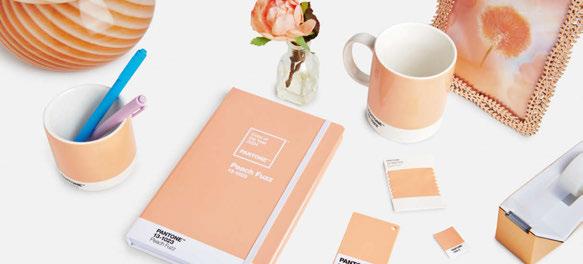
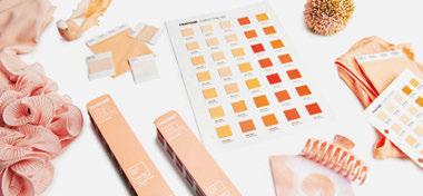
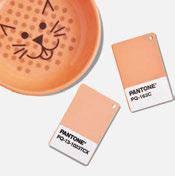


Pantone has selected Peach Fuzz as its colour of 2024 and we are here for it! So much so, that darc’s Editor Sarah Cullen has been inspired to source a selection of decorative lighting products that are channeling warm, peachy hues.
Pantone 13-1023 Peach Fuzz marks the 25th anniversary of the Pantone Colour of the Year programme. Described by the colour experts, the new tone is “subtly sensual”. It is a “compassionate and nurturing soft peach shade conveying a heartfelt kindness.
“At a time of turmoil in many aspects of our lives, our need for nurturing, empathy and compassion grows ever stronger as does our imaginings of a more peaceful future. A warm and cosy shade highlighting our desire for togetherness with others and the feeling of sanctuary this creates, Pantone 13-1023 Peach Fuzz is a heartfelt peach hue bringing a feeling of tenderness and communicating a message of caring and sharing, community and collaboration.”
Leatrice Eiseman, Executive Director at Pantone Color Institute says: “A cosy peach hue softly nestled between pink and orange, Pantone 13-1023 Peach Fuzz brings belonging, inspires recalibration, and an opportunity for nurturing, conjuring up an air of calm, offering us a space to be, feel, and heal and to flourish from whether spending time with others or taking the time to enjoy a moment by ourselves.
“Drawing comfort from the tone, we can find peace from within, impacting our wellbeing. An idea as much as a feeling, Pantone 13-1023 Peach Fuzz awakens our senses to the comforting presence of tactility and cocooned warmth.”
According to Pantone, introducing the hue into home interiors creates a welcoming ambiance. Promoting feelings of gentle warmth whether appearing on a painted wall, in home décor, or acting as an accent within a pattern, Pantone 13-1023 Peach Fuzz infuses our most personalised worlds with a comforting presence. www.pantone.com
Images Left: Courtesy of Pantone
42/43 | PRODUCTS | PANTONE PEACH FUZZ
Zona d’ombra Knikerboker
An irregular, hand-beaten sheet of steel illuminated by a beam produced by a spotlight creates alternating flashes and shadows that chase each other capturing the onlooker’s gaze.
Zona d’ombra is now available in a brand new colour: antique pink, which was successfully presented by Knikerboker at the Lighting + Building 2024 exhibition in Frankfurt.
www.knikerboker.it
Globe Curiousa
The Globe table lamp from British lighting studio Curiousa provides a striking addition to any desk or side table. The lamp features a semiopaque coloured glass orb and visible customisable fittings, providing a contemporary look and a warm and sumptuous glow. Each lamp is bespoke and free-blown, without the use of moulds, using just the skill of hand and eye to guide each shape using recycled glass. Available in over 22 glass colours in sizes small, medium and large.
www.curiousa.co.uk

Array Vibia
Array, a collaboration between Vibia and Umut Yamac, explores the potential of threads to form lightweight, dynamic light sculptures. Yamac manipulates technically-processed threads into three-dimensional volumes, balanced by aluminium rings for a delicate yet solid form. The concealed light source within the lower ring produces a captivating gradient effect, combining soft downlighting with an enchanting upwards glow.
www.vibia.com
madco Ambientec
In collaboration with designer Elisa Ossino, Ambientec introduces madco, a contemporary lantern that combines warm, emotional, and minimalist elements. The spherical luminous body sits atop a visually slender, 360° rotatable structure, allowing for varied light configurations. The lower cover, concealing technological components and the driver, comes in five shades: Oliva (olive), Pesca (peach), Cacao (cacao), Mostarda (mustard), and Ciliegia (cherry). With USB type-C recharging and IP66 rating, madco is ideal for various settings.
www.ambientec.co.jp

The I-Model by Anour is a testament to refined craftsmanship, featuring a sleek copper surface. Each lamp is individually handcrafted, ensuring a unique patina that grows richer over time. Designed with a minimalist aesthetic in mind, the lamp harmonises with both contemporary and classic interiors, casting a warm, inviting glow. It is a statement piece that celebrates the enduring beauty of copper. www.anour.dk
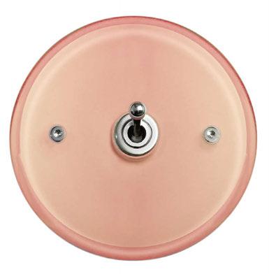
Over and above their functional role, the electrical fittings of Meljac’s luxury switches and sockets provide the perfect finishing touch for beautifully designed interiors. The peach fuzz copper-finish brass and tinted glass models create a sense of well-being in a peaceful, cosy space, with poetic notes that blend perfectly into a contemporary atmosphere. www.meljac.com
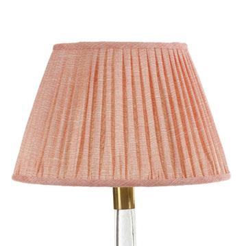
Lampshade Fermoie
Fermoie lampshades are available with suitable fittings and shade carriers for UK, EU, and US standards.
“Our lampshades are both elegant and beautiful and offer tremendous possibilities. Handmade using specially produced Fermoie fabrics and our intricate pleating and finishing techniques, they’re a wonderful demonstration of our inhouse design, craft expertise and attention to detail,” says Jamie Shawcross, Director. www.fermoie.com
Perla Nulty Bespoke
The elegant Perla wall sconce can be produced in peach and has a unique mosaic effect. The feature luminaire can be affixed to the wall to emit a soft glow and works as a standalone piece or can be arranged in a larger bespoke configuration resulting in soft, graceful illumination that enhances surrounding interiors. www.nultybespoke.co.uk
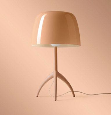
Foscarini’s Lumiere Nuances designed by Rodolfo Dordoni was one of the brand’s first pieces. A contemporary restyling of the classic bedside lamp, Lumiere has become a design icon throughout the years. Distinguished by its blown glass diffuser and tripod base, the lateset addition to the collection, Lumiere Nuances, highlights the classic design in new colourways. www.foscarini.com
In case you’re in need of a spark of warmth, Preciosa is excited to share some lighting inspiration featuring Pantone’s Peach Fuzz. Its internal designers experimented with Peach Fuzz on a few of its Signature Designs (of which there are nine: Raw Crystal, Crystal Grid, Crystal Spin, Diamond Cloud, Inspiral, Pearl Drop, Breath of Light, Pearl Wave, and Pearl Curtain) and were very pleased with the purity and sophistication the designs showed.
www.preciosalighting.com
I-MODEL Cordless Pendant Anour
Pearl Curtain Precosia
Pierrot Meljac
Lumiere Nuances Foscarini
44/45 | PRODUCTS | PANTONE PEACH FUZZ
WWW.DESIGNHEURE.COM contact@designheure.com +33 (0)467 539 963
LUSTRE TRIO 5x2 MOZAIK Designer : Davide Oppizzi Credits : Jared Chulski Photography
46/47 | INTERVIEW | GUILLAUME BOTTAZZI
INTERVIEW
GUILLAUME BOTTAZZI
For more than a decade, visual artist Guillaume Bottazzi has been linking neurology and art in our living spaces, focusing his work on wellbeing. His works aim to modify our brains and help us to live happier lives. Here, he tells darc about his latest collection, Nutty.
Guillaume Bottazzi is a French visual artist, born in 1971, who has had a permanent studio in Brussels since 2012. For the last 30 years, he has worked predominantly in Europe, Asia, and the United States. Recognised as a pioneer of the neuroaesthetics movement, he has signed more than a hundred artworks for public spaces.
His most recent installation is a permanent collection designed for a Beaux-Arts-style building listed as a heritage site by the city of Brussels. The new pieces are described by some as having “the power to enhance our ability to live better and feel good. These luminous works of art in situ reduce our heart rate, stress, and anxiety, and help us to put our thoughts in order. They have the power to soothe and strengthen us, to put us in a good mood by activating neurotransmitters such as dopamine, which send us rewards commonly known as the ‘happy hormone’. They help to make the viewer happier, more elegant, and stronger”.
darc asked Bottazzi to tell us more about his research and latest creations, including the technical design details behind the new lamps, which support his findings on the connection between mental health and art.
He states: “According to the ‘Assises de la santé mentale et de la psychiatrie’ (conferences on mental health and psychiatry), one in five people are affected by a mental disorder every year; a total of 13 million people in France. The OECD (Organisation for Economic Co-operation and Development) warns that mental health problems among employees could increase further as a result of stress and pressure at work.
“Among other things, the lights we use in our daily lives are harmful to our mental health and our eyesight.”
In 2019, WHO (World Health Organisation) confirmed that art can improve mental health. Ten years of research into art and the brain by neuroscientists Helmut Leder and Marcos Nadal from the University of Vienna in Austria, has shown that the works realised by Bottazzi help us to feel better and be happier. His works modify our organism, and the involvement of these sensory experiences has a powerful effect that impacts our biology, the way we live, feel, and hear the world around us.
“We make many mistakes with regard to our surroundings, and we do not use the full scope of our knowledge to compensate for this. Among other things, the lights we use in our daily lives are harmful to our mental health and our eyesight.
“They were designed to be as close as possible to daylight, but the white of the lights used are aligned with the blue spectrum, with short waves, whereas we need long waves to give the eyes’ pupils a rest. The risk is that this light can damage our eyesight and, what’s more, it produces anxiety and a dependency that prevents us from sleeping.
“Neuroscience professor Glen Jeffery from the Institute of Ophthalmology, Faculty of Brain Sciences at the University of London, has shown that, using a simple torch to which he has attached a piece of plastic tubing
“According to Nobel prize winner for medicine Eric Kandel, these luminous creations immerse the viewer in an unreal universe that encourages us to distance ourselves more from the things that surround us and encourages our creativity. ”
and a red filter, he can boost retinal function by four to five days just by shining the light on the eyelid for three minutes. This device regenerates the mitochondria responsible for transforming light waves into electrical signals.
“I’ve been an artist for over 30 years, and I’ve been dreaming of painting with light for 15 years. My dreamlike aspiration sees the magic in this material.
“For more than a decade, these lighting systems have been providing complete, integrated solutions. These in-situ creations adapt not only to the spaces in which they are installed, but also to the needs of the users. This unifying approach reconciles art, design and architecture, an alliance lost since the beginning of the last century.
“My new Nutty collection is limited to 150 pieces. The dreamlike, organically inspired light creations invite us to travel to an unreal world and recreate what we see. They are located in a Beaux-Arts-style building, in a room with a view overlooking a garden, a place of exchange, conviviality and reflection, where employees meet for lunch and coffee.
“Green makes it easier to concentrate and helps us
to put our thoughts in order. Yellow is an optimistic colour that makes us feel good, which is why it is used in tranquillisers. Blue is used for sleeping pills, reduces heart rate, and encourages creativity. White is a constant for artists, allowing architecture to breathe and enhancing the viewer’s creativity through its evanescent quality.
“These lights are made using enamel, a natural material composed of powdered minerals fired with glass. The bases are made of wood or metal, and the low-energy LEDs comply with the standards used for public spaces. The low-energy LEDs are tuned to be close to long-wave.
“According to Nobel prize winner for medicine Eric Kandel, these luminous creations immerse the viewer in an unreal universe that encourages us to distance ourselves more from the things that surround us and encourages our creativity. And, according to Leder, they reduce our anxiety and strengthen our capacity to live.
“These creations are suitable for residential, office and hotel buildings, but also for health centres, museums, towns and cities in Japan, China, and Europe.” www. guillaume.bottazzi.org
48/49 | INTERVIEW | GUILLAUME BOTTAZZI


 A captivating exhibition merging artistry, craftsmanship, and sustainability, showcasing international brands embodying contemporary design culture.
Voliere by Bodo Sperlein
Script Series by Bodo Sperlein
A captivating exhibition merging artistry, craftsmanship, and sustainability, showcasing international brands embodying contemporary design culture.
Voliere by Bodo Sperlein
Script Series by Bodo Sperlein
@menu.milan
15th - 21st April. 10am to 7pm Convento Sant’Angelo. Piazza Sant’Angelo 2, 20121, Milano
50/51 | INTERVIEW | OFFICE LIGHTING - HARSHA KOTAK
HARSHA KOTAK
To open our Office and Task Lighting feature, darc’s editor sat down with Founder and Director of Women in Office Design and Sustainable Design Collective, Harsha Kotak to discover more about her industry initiatives.
Kotak is an international interior designer and workplace consultant who has been practicing in the workplace design industry in the US, India, and the UK for more than 20 years. Some of her notable projects include the White House and Pentagon in the US, as well as FedEx and the US Embassy in India. Alongside her design career, Kotak is also the Editorial Director of the Sustainable Design Magazine and has been a keynote speaker at various international design events.
Over the years working across three continents, Kotak noticed a disparity in gender representation in architecture, and began to question why this was.
“I was researching for an article that I was writing for a magazine in 2018 and found that most architecture and design schools have about 60-65% of female students, but when you look at the numbers in the professional industry this drops down to only 30-40% women. And out of that, only 5% of the top executives are women – I questioned this disparity.”
Off the back of these findings, Kotak went on to establish Women in Office Design (WOD) with the aim of empowering female designers and architects and give them a platform to showcase their work. Today, WOD is a growing global community with chapters across the UK, Europe, and India.
have support from a lot of senior leaders and experts from our industry.
“When I first launched WOD as a community group on LinkedIn, I was unaware of its potential and need. But slowly as more and more women joined hands and as we started hosting knowledge sharing events, the industry took notice. At first, there was a bit of an apprehension as the industry looked at it as just another women’s group. But soon it was apparent that our vision was to empower women through knowledge sharing events and thought leadership.
“Our events got a lot of visibility through design festivals like the London Design Festival, Clerkenwell Design Week, Madrid Design Festival, and Milan Design Week. We started getting invited to speak at other shows and it became a more collaborative effort.
“I started WOD as a personal mission but was soon joined by other women who were looking for a community and some who had a similar vision as I did.”
“I started WOD as a personal mission but was soon joined by other women who were looking for a community and some who had a similar vision as I did. This helped me in forming core teams and ambassador networks in different cities globally.
“[The aim was] to give women the visibility and power and looking back we have been able to empower many female designers, architects, and consultants through our workshops, presentations, and events.
“[Another] vision for WOD was to give young designers access to thought leaders and experts in the industry and over the last five years we have been fortunate to
“Today WOD is a well-respected organisation in the industry and our events are open both to men and women.”
As part of WOD, a series of wellreceived seminars focussed on sustainability were held, but Kotak recognised they didn’t result in longer term outcomes. This led her to establishing the Sustainable Design Collective (SDC), a “think tank group of architects and designers to promote and applaud achievements and, more importantly, to create a forum of knowledge sharing and exchange”.
“I worked with my co-founder and WOD’s sustainability manager, Joanna Knight together with existing members of WOD to build SDC. Our professional relationships were formed by a shared passion to drive change.
“The positive response was immediate! Many designers recognised the frustrations of lack of knowledge and understanding about greater sustainability and wanted to join. It became a collective effort as no one likes to work in silos. Slowly the community grew and
INTERVIEW
“All SDC members were united to help accelerate the pace of change in developing a more sustainable approach to workplace interiors. All members were happy to endorse and accept the spirit of non-competition.”
today we are a group of 35+ top A&D firms in the UK and India.
“All SDC members were united to help accelerate the pace of change in developing a more sustainable approach to workplace interiors. All members were happy to endorse and accept the spirit of noncompetition. We all recognised that we are working towards the greater good – ultimately to reduce our climate impact.
“The Collective meetings are practical sessions focussed on discussing key topics, which have the greatest impact on companies working in the office design field. Members are encouraged to highlight ‘best practice’ and describe hurdles and difficulties. We publish a report at the end of each meeting, which is available on an ‘open source’ basis.
“We have already progressed far beyond the original ambition to host meetings and reports. We now hold regular events, panel discussions, interactive workshops, and other activities, including an online training academy and magazine, to help support knowledge sharing. Last year, we also hosted our first event in India.”
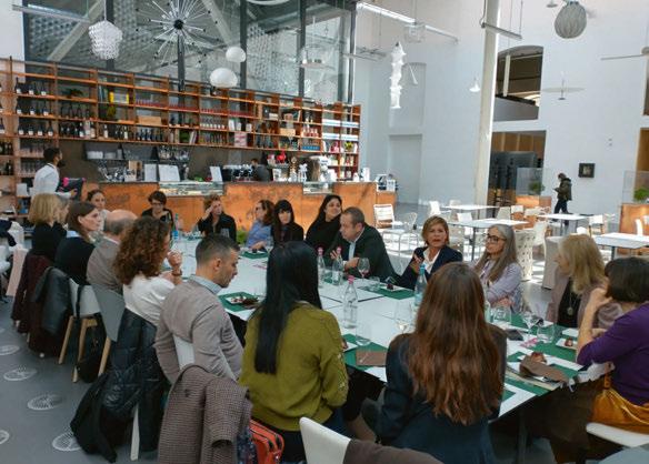
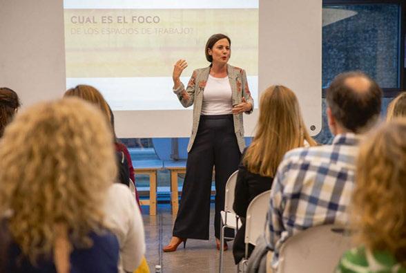
The future for the initiatives includes further growth and promotion. “We will continue to develop new and innovative ways of promoting greater equity and diversity in the industry through WOD’s various initiatives. Meanwhile, SDC’s goal is to educate and grow the understanding of improvements to sustainability. In the short term, we will be expanding the offer within the training academy as well as developing our online magazine.”
An upcoming event Sustainable Design Forum will be held in London on 25 of April and is an event curated “By the Designers For the Designers”. It’s a day for designers and architects to meet with suppliers and manufacturers and also to learn from experts in sustainable design. An immersive sustainable materials lab will be held as well as interactive workshops and discussions around topics like “How to include sustainable products in your projects” and “Focusing beyond carbon”.
Register and attend for free by visiting www.thesustainabledesigncollective.co.uk/forum/ To become a free member of Women in Office Design, visit www.woduk.com
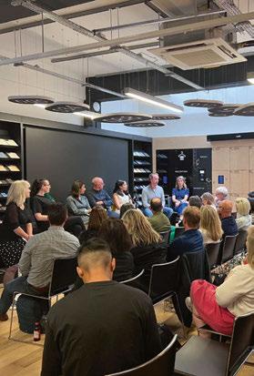
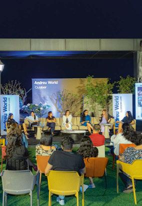
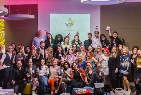
52/53 | INTERVIEW | OFFICE LIGHTING - HARSHA KOTAK

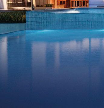


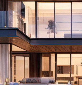
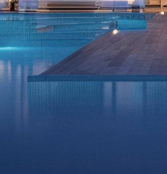


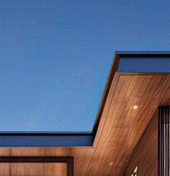
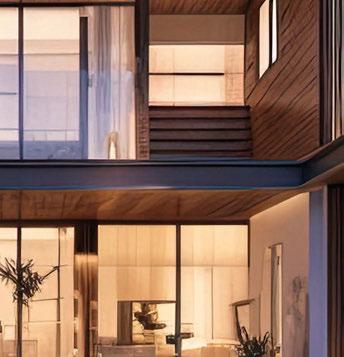


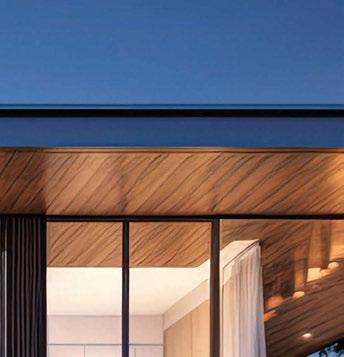
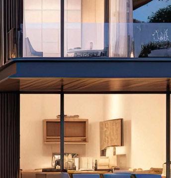
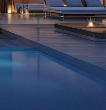


Are you an Architect, Interior Designer or Buyer? Join our Trade Program! Archiproducts is the global source for Architecture and Design with over 700 international brands and more than 50,000 products on sale. Every day, thousands of professionals choose Archiproducts to find inspiration and discover the best design solutions. Our Trade Program is the affiliation program for Architects, Interior Designers, and Buyers. It offers exclusive benefits and reserved prices on the largest catalog of the industry to make your work easier and focus on your projects. START NOW business.archiproducts.com/trade-program

600+ exhibitors showcasing thousands of new products. Fresh insights from 150+ inspiring speakers.
Meaningful connections through unparalleled networking.


Don’t miss this year’s HD Expo + Conference. It’s three days of discovery and learning.
Register today at hdexpo.com


april 30 - may 2, 2024

Use code DAPMDARC for your complimentary pass


CHARLIE BARK-JONES
Workspace Design Show returned to London in February with a theme of ‘Bloom – Exploring the Thriving Ecosystem of Work Life’. Charlie Bark-Jones, founder of the show, shares insights and trends from the event as well as biophilic lighting considerations.
This year, the Workspace Design Show showcased a diverse range of lighting exhibitors, ranging from emergency lighting from Daisalux and acoustic lighting from Luxxbox, as well as Stoane’s bespoke pieces and Synergy Creativ, which specialises in biophilic lighting. There was also unique wall lights from Reon, flexible spotlights from Erco, as well as acoustic pendants from Ricoman. In short, we’re delighted that this year’s event really runs the gamut of commercial lighting.
We’ve seen a variety of lighting trends coming through this year. The emergence of sustainability as a priority in lighting will come as a surprise to no one. This year, however, it is evident there is a newfound enthusiasm for reusing products, hence the thinking behind the talk at this year’s show ‘The new aesthetic of repair and re-use in lighting design: Why we need a mindset shift’. We assembled an expert panel to discuss this, including Dan Lister, Associate Director, Lighting, Arup: Ruth Kelly Waskett, Project Director, Hoare Lea: Simon Fisher, Founder & Director with F Mark; and Kristina Allison, Senior Lighting Designer at Atkins Global.
With the sector’s increased focus on reducing carbon emissions, lighting designers are and must be increasingly focused on developing sustainable methods and long-term solutions, ensuring products work to achieve energy-efficiency targets. For example, exhibitor Stoane Lighting is launching a new division called ‘ReNew’ which has been set up for just this purpose. Its products are designed so that they can easily be disassembled, have internal components replaced, upgraded and eventually parts recycled.
Our theme for this year’s Workspace Design Show theme for 2024 was ‘Bloom’, reflecting the huge increase in biophilic design in the built environment. In design terms, biophilia seeks to integrate elements of the natural world indoors, fostering a deeper connection to the natural world. This trend was exemplified by our exhibitor Synergy Creativ, which specialises in design lighting fixtures such as living walls. In this way, it incorporates greenery to promote this connection with nature, promoting wellbeing and productivity by cultivating a serene atmosphere that visually connects inhabitants with flora and fauna. We expect to see more and more biophiliainspired lighting in the next few years as in other areas of interiors.
Statement lighting has long been an asset in the designer’s arsenal. Unique and eye-catching lighting fixtures can take centre stage to entice workers back to the office, think dramatic atriums or areas where a big impact needs to be made such as a town hall or shared kitchens. Designers often
focus on creating bespoke, statement pieces that not only provide illumination but also serve as artistic elements to elevate a space. Manchester-based brand, Ricoman Lighting, has created Flow Curved Linear Lighting, which allows for countless dramatic possibilities. This system consists of straight and curved basic modules, which can be combined in different ways to create unique lighting projects. The modules can also be configured to classic circular luminaires, rounded rectangles, continuous waves, or other abstract shapes. Providing even more possibilities, single or continuous luminaires can be suspended or mounted on ceilings and walls with the light directing downwards, inwards, outwards, and also twisting, making this product range ideal for larger spaces that desire a theatrical suspended lighting configuration.
Lighting is also becoming more experiential with dynamic lighting effects, with colour gradients, motion sensors, and interactive elements able to create engaging and immersive experiences in both commercial and residential settings where the boundaries between light and art blur. Light fixtures can also serve as works of art themselves, featuring beautiful sculptural forms, and innovative use of materials to really bring out the brilliance in an interior. Lighting is also working harder than ever before with products having the ability to provide acoustic baffling or even sprinklers or M+E systems. Human-centric lighting is also set to continue its rise in popularity into 2024. This concept involves designing lighting systems that mimic natural light patterns to positively impact human health and well-being. This includes adjusting colour temperatures throughout the day to support circadian rhythm. At home, this means keeping the light out when you need to sleep and ensuring you let the light in when you need to wake up and stay energised. In commercial interiors, whether that’s a workplace or other commercial environment it could mean providing a range of lighting from brighter lights to warmer tones, depending on the time of day.
This fits in nicely with the idea of personalisation in lighting, another key trend set to continue. This not only includes overhead lighting but also the use of desk lamps, allowing individuals to customise the amount of light required on their individual workstations, as well as making an attractive addition to the physical desktop.
Lighting is a key product category for us here at Workspace Design Show and as we move forward with the show, we look forward to visitors exploring the thriving ecosystem of work life, including lighting up offices in a multitude of ways. www.workspacedesign.com
COMMENT | OFFICE LIGHTING - CHARLIE BARK-JONES | 54/55 COMMENT
56/57 | PROJECT | OFFICE LIGHTING - MATRIX STUDIO
MATRIX OFFICE
Alex Dauley tells darc about her workspace scheme for Matrix Studio. Combining luxurious colours and furnishings, she has created a stunning and professional environment.
After two years of pandemic-induced remote work, the return to the workplace has left companies and their employees stuck at a crossroads. On one hand there is a positive attitude to the familiarity of routine and the welcome escape from home confinement, bringing back a natural rhythm to life. On the other hand, the comfort of our own abode is sorely missed when forced to work the nine to five in the same bland environment complete with squeaky swivel chairs and sterile lighting.
Matrix Studios, an office, studio, and co-working space, nestled in West London, is one of many companies changing their perspective of post-pandemic workspaces. Embracing the idea of being a “home away from home” Matrix has invested in its interior landscape to make employees and clients enjoy working in the space. Interior Designer Alex Dauley of Dauley Design was tasked with the ambitious endeavour to transform the space. Dauley, already having a longstanding relationship with the client, brought a wealth of expertise to the project with her knowledge of the company and working with many commercial projects since the pandemic.
“The office is used by two music industry companies, 2 Tone Entertainment and Stellar Songs. They are publishers and artist management. Their brand is very strong and the image they needed to project to their clients and artists informed the design direction. It needed to feel opulent, sophisticated, and professional yet relaxed,” says Dauley. Previously the office was a stereotypical white box with little character, thankfully the client was open for a complete transformation, leaving Dauley with a blank canvas. Her design emerged from her observations of how the team worked and through thorough research of the client’s brief. In response to the clients wishes to have a SoHo House inspired look, the design process unfolded with a nuanced approach aiming to establish sophisticated feel to it’s hospitality. Using a layered approach to textures and tone, Dauley designed a neutral backdrop using stone and wood, which were juxtaposed against bronze mirror, brass accents, and reflective surfaces. Each element was meticulously created not only for its visual appeal but also its practicality in conjuring the kind of productivity for a
PROJECT
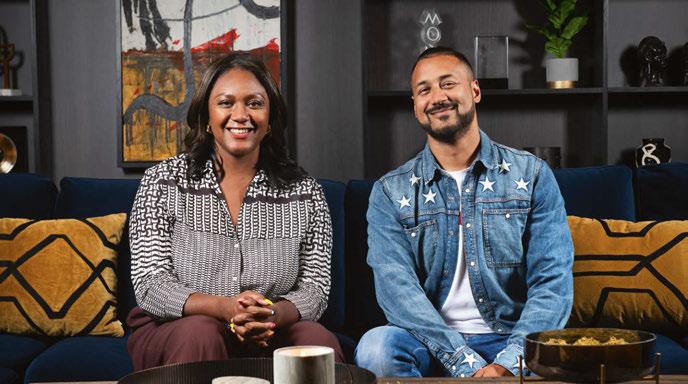
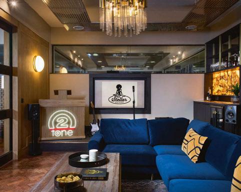
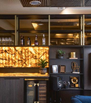
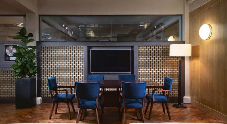
music company. The overarching aesthetic sought to strike a balance between opulence and fostering an atmosphere that will nurture creativity. Take for example, the chairs, upholstered in a vibrant blue velvet, injecting energy while blue can simultaneously bring peace and calmness.
Dauley explains: “This space was about creating a vibe, a space that allowed for creativity and entertainment, alongside the day to day running of the business. It had to function on several levels. Technically we had to soundproof the entire office so music could be played without causing too much disturbance. The space needed hot desks, a group meeting area, break out spaces, a private meeting room, bar, and stage for client performances. We fitted a lot into a small space.”
Alongside textured materials and warm metallics, the look is complete with ambient light such as Andrew Martin floor lamps positioned in the corners of the room, while Andrew Martin’s tubular chandelier takes centre stage from the ceiling. The wall lights are vintage and bought from Crystal Palace Antiques, washing the walls with a warm glow.
Dauley adds: “I wanted the space to feel like you were
at home. The lighting was residential lighting placed into a corporate space. It needed to be softer and more tactile to create that ambience.”
According to Dauley, decorative lighting is one of the crucial components when achieving a dynamic look in workspace environments to add both comfort and luxury. She says: “The lighting played a huge role, again to help it move away from feeling too corporate. Layered ambient lighting, lamps, vintage wall lights and statement pieces added to the relaxed aesthetic and the mood could change depending on the lighting used.”
The shift in workspace design since the pandemic has been notable to Dauley, with most of her commercial projects requesting to move away from corporate looks and instead prioritising comfort. The reason for this is crystal clear to Dauley as she explains from her experience: “I think companies want to entice people back into the office environment and have realised the importance and benefit of creating a space people want to spend time in and that promotes wellbeing and happiness.”
www.alexdauley.com
58/59 | PROJECT | OFFICE LIGHTING - MATRIX STUDIO MATRIX OFFICE Interior Design: Dauley Designs Lighting Specified: Andrew Martin, vintage sourced from Crystal Palace Antiques. Images: Tom St Aubyn Dauley Designs has created a luxurious and opulent workspace for Matrix Studios, successfully blending home comforts with practical design.
Lighti n g 21-23 may register for free
the UK's leading design festival
@clerkenwelldesignweek cdwfestival clerkenwell.design.week
Furniture
@clerkenwelldesignweek cdw2024 clerkenwelldesignweek.com &more
Surfaces
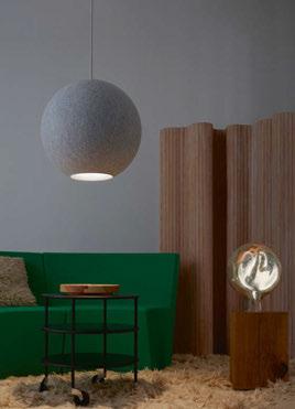
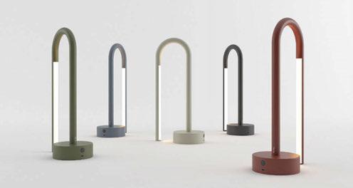
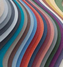
On our drawing board right now is a workplace scheme to house the digital team of a major British DIY retailer, whose HQ is located in South West England. The 500sqm space needs to combine two previouslyseparated teams and accommodate an agile working scenario. High on the agenda is sustainability and a space plan that can work for all the team’s needs and missions and will include collaboration, meeting and open-plan working spaces.
Our concept separates the space into three zones, with a flexible spine down the centre and the quietest space – the open-plan desking area, and the potentially noisiest space – the collaboration area, sitting to either side of the spine. Unsurprisingly, acoustic separation will also be key to the project’s success.
For the spine itself, we’re specifying the ‘Pavilion O’ modular system by Kettal [1], with our own added detailing. This offers great acoustic separation, will help define the structure of the space, and is easilydismountable. Designing for end-of-project life is increasingly a part of our role.
The space features a fairly new 600mm grid square ceiling, so we’re not looking to replace it, but to improve its acoustic properties and break up its uniformity. We’re thinking of working with Turf Design [2] on a bespoke box cube solution using their rainbow-coloured range of materials to achieve this.
For the walls, we’re looking to Keim for paint colour. They not only offer an extensive colour range featuring textural and matte finishes, but their paints are also ecological and low-pollutant, which improves air quality. We’re also looking into Muraspec’s brand new slow-printed wallcovering [3] for the breakout areas, which will add texture.
When it comes to lighting, we’re looking at two pendant lights and one task light for desk working. The pendants are the Wire Pendant [4] by Milan Illuminacion, which has acoustic lining and is really playful and fun, and the Moon pendant [5] from Abstracta. For the desk lamps, we’re keen on the Bow Lamp [6] by Nexia, which is adjustable, dimmable and pleasingly architectural-looking. It’s also popular because of the soft and warm lighting it provides - and how good it makes people look on camera! For the architectural lighting, we’re thinking of using can lights from Stoane Lighting, which have really good sustainable credentials.
ON THE BOARD 60/61 | ON THE BOARD | OFFICE LIGHTING - ALIGN DESIGN AND ARCHITECTURE
1 5 2 3 4 6
ALIGN DESIGN AND ARCHITECTURE
Ben Pressley, Senior Designer and Laura Palmer, Designer and Furniture Specialist, Align Design and Architecture, talk us through their design concept for a well-known British DIY brand’s new office space in South West England.


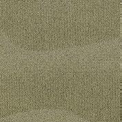

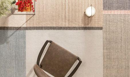
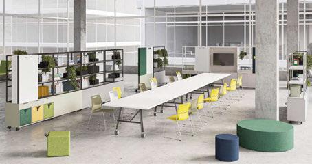
Office flooring needs to be very robust and with the potential to be used as a form of intuitive navigation to differentiate zones. The Transition Tiles from Ege Carpets [7] are perfect for this, both for defining areas and introducing pops of colour. When it comes to adding character, there’s nothing better than something handmade, so the Folklorico handmade rug by Warli [8] will be a great addition – with each rug design both complex and unique.
Flexibility is the number one requirement for furniture on the scheme, so spaces can remain fluid for every potential mission. Workagile’s ‘On the Move’ range and its ‘Nimble’ table [9] would be ideal here, along with the Xpresso Stackable Chair by Connection, which we intend to
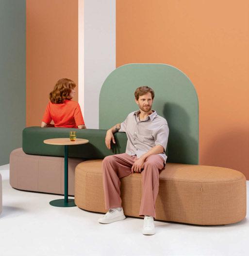
use for the collaboration space, featuring colourful upholstery in a sustainable fabric.
Another great range in our eyeline is the Profim Revo office furniture system by Flokk [10], made up of benches and stools, partitions, cushions and tables in various sizes and heights, which can be assembled into 96 different configurations depending on individual requirements. The system recently won a Red Dot Award and its credentials are excellent, with the design based on recycled polypropylene instead of plywood, with no glue or staples used for assembly, which facilitates later reuse and reduces the weight by 40%. www.aligngb.com
7 7 8 10 9
OFFICE TASK LIGHTING FEATURE
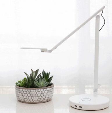
Humanscale Nova
Designed to complement any work surface and enhance any workstyle, the Nova task light offers endless adaptability in a striking, sculptural form. The custom lens and LED array create a uniform pool of glare-free light that can be adjusted exactly to each user’s preference. Energy Star-certified to benefit people and the planet, Nova is a lighting solution for today and the future. www.humanscale.com
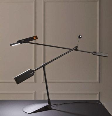
Halley Stilnovo
Halley, created by German designer Richard Sapper in 2005, returns in a new version, maintaining its operating principles unchanged, while sporting a new modern, unmistakable look. The heirs of the designer, Cornelia and Carola Sapper, affirm that the “technologically sophisticated lamp allows unlimited movement and positioning of the light, without cluttering the workspace.”
www.stilnovo.com
Rest Chelsom
Rest (Pictured in Satin Black with Brushed Brass) from Chelsom is one of the hero desk lamps from the new collection, Edition 28, which launched last year. Rest is a striking contemporary desk lamp whose slender arm passes through a heavy cylindrical base. The LED light source emits a warm light onto the desktop below. www.chelsom.co.uk
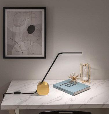
Gioia Equilibrio Occhio
Italian for “balance”, Gioia Equilibrio is like a kinetic sculpture that can be moved into several positions. The table lamp features a stem and ringshaped LED light that freely moves at 360°, with no restriction from wires or joints. Alongside Occhio’s Joy of Use technology, Gioia Equilibrio also offers the “focus light” function, which allows you to concentrate the light on a specific area - making it ideal for studying.
www.occhio.com
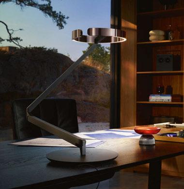
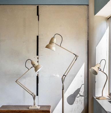
Original 1227 Anglepoise
For over 90 years, the Anglepoise lamp has illuminated many workplaces. Its design, featuring a spring-balanced arm and tilting shade, offers exceptional flexibility and ergonomic comfort.
Recently, the brand has collaborated with Sir Kenneth Grange to create more modern icons for discerning desks as well as with Paul Smith, Margaret Howell and the National Trust to develop curated collections of colourful lamps. www.anglepoise.com
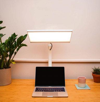
WPL
Stoane Lighting
WPL, or “The Workplace Light” is designed as a clean looking, easy to install response to the growing body of evidence suggesting many of us spend too long in sub-optimum lighting conditions. It efficiently satisfies not only immediate ergonomic and phycological expectations of such a luminaire, it also addresses physiological requirements leading to verified improvements in mood, alertness and subsequent sleep quality.
www.stoanelighting.com
62/63 | PRODUCTS | OFFICE LIGHTNG
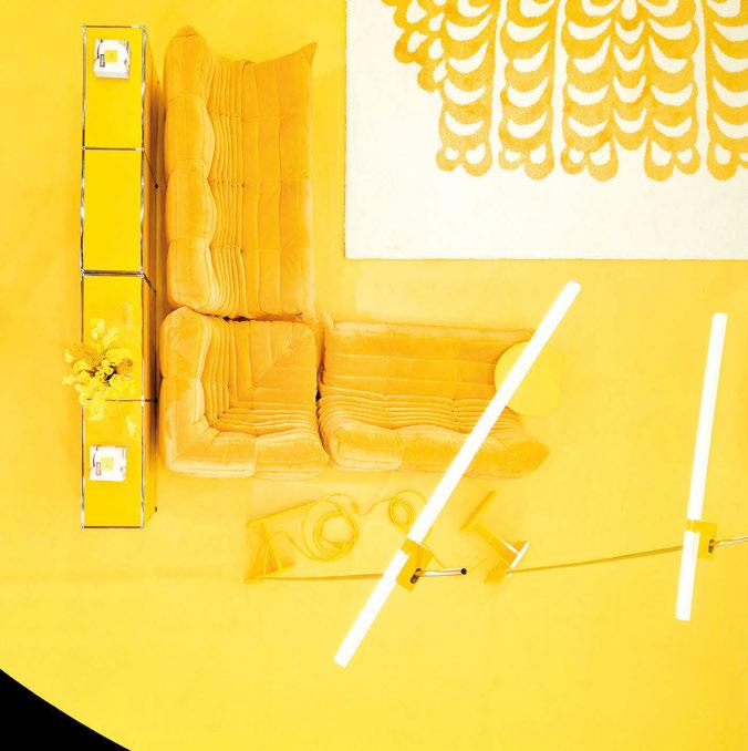
MAY 19-21 2024
JAVITS CENTER NYC
DARC READERS: YOUR PASS IS COMPLIMENTARY WITH PROMO CODE: DAPMDARC
Register at icff.com NORTH AMERICA’S SINGULAR PLATFORM FOR INTERNATIONAL DESIGN.
WOMEN IN MANUFACTURING
As part of our commitment to celebrate Women in Lighting and International Women’s Day, darc posed a series of questions to women working in decorative lighting, about their working lives. The aim? To better understand their experiences of being in roles that have, historically been held by men.
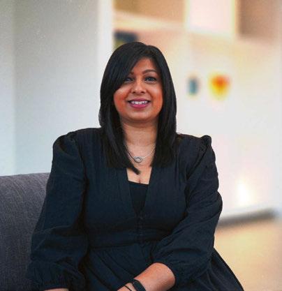
How long have you been involved in the lighting industry? I have been in the industry for 17 years.
Have you always been involved in the manufacturing side?
I was exposed to the lighting industry when I started my first job at Lutron straight after university. Since then, I have been lucky enough to work across several business functions, including supply chain, quotations, and project management until I decided to specialise in sales.
Have you noticed more diversity in sales, manufacturing, and marketing over the past two decades?
Over the last few years, I have seen a positive shift within marketing where this field seems to attract more women. Whereas the sales and manufacturing side still has a way to go. This is further emphasised when I visit a trade show for example – seeing saleswomen at a stand is still uncommon.
What reasons do you think there are so few women working for manufacturing companies? What obstacles do women come up against?
I think the manufacturing industry has been a largely male orientated one and often perceived as needing technical ability, especially when you notice that most engineers are male. Women can be just as technical, but I think society makes us believe this is the male domain, which I believe is the barrier that needs to be broken. There have been occasions that I’ve attended meetings and I’ve asked a male engineer to join me, as I was often perceived that I don’t know what I was talking about. Women often need to prove themselves before they are taken seriously, whereas a man can walk into a meeting without reservations.
How do you think more women can be encouraged into this side of the lighting industry? What can
manufacturers do to encourage a diversity of applicants for roles in sales and product development for example? Absolutely more women should be encouraged. I’m fortunate to be working in a company where a majority of the UK sales team are female, which is truly empowering. But to change the mindset of this industry being a ‘man’s world’ we need to be encouraging women earlier on in their career. I do think manufacturers are diverse with having women on their teams. I moved into a sales position around nine years ago, and I don’t think I would have felt comfortable before that as I would have been too worried about feeling intimidated or spoken down to. The move for me came with age, experience, and confidence in what I was doing.
What are the positives of working for a manufacturer?
What are the negatives?
The positives for me are being out and meeting new people every day, coupled with the excitement and energy of being involved in such an amazing project. There is a sense of pride in knowing that you have been a part of delivering some great iconic projects.
I would say that a negative is that there are some real oldfashioned views out there of what women can and can’t do, which need to be washed out. There is a new wave of people, and when we embrace this, the more diverse and more creative we can be.
Is there anything else you would like to add?
I love what I do and if I didn’t, I wouldn’t do it, it’s that simple. It’s important to believe in yourself, show confidence in yourself and your abilities. The only way this industry will change is if we talk about it, so I thank you for bringing light to this important subject.
www.astrolighting.com
64/65 | INTERVIEW | WOMEN IN LIGHTING
VIRDI
WOMEN IN LIGHTING
RAMINDER
PROJECT SALES MANAGER, ASTRO LIGHTING
CARLOTTA DE BEVILACQUA CEO, ARTEMIDE
How long have you been involved in the lighting industry?
Light has always been my passion.
Have you always been involved in the manufacturing side?
My relationship with light has evolved over the years. I began my career as an architect, working with light as a material for the construction of spaces.
Then a meeting with Ernesto Gismondi (Founder of Artemide and lifelong companion) led me to approach light in all the aspects.
Designing light then transformed in the following years into doing business thanks to the teaching and daily experience I gained from Ernesto. It was a natural evolution.
In my professional life and as a woman, I have always considered my duty as trying to introduce better quality and alternatives to what already exist.
I have tried both as an architect and designer through the design of spaces and light as an indispensable material for life, and as an entrepreneur through vision and innovation to “distribute” “useful and beautiful” products, tools, and solutions to educate the present and contribute to the future.
Have you noticed more diversity in sales, manufacturing, and marketing over the past two decades?
Light has experienced and is still experiencing a great revolution with the introduction of LEDs and electronics. It is increasing in science, parametric measurement, and interaction. We no longer think about just the product but about shedding light more broadly on its management, and for a positive energy balance.
Light is energy and sustainability parameters have become fundamental.
Especially thinking about the current context, I have never experienced such a complex period. Just think of the war, the increase in the costs of raw materials and energy, and the environmental crisis.
Resources are exhausted, we must educate the responsible use of lighting, and we must do with lessless materials, less energy...
Today it is crucial to reaffirm a vision, to be able to understand the new technological and cultural frontiers, to reflect on the needs of a global world that needs to be
reinterpreted and respected to offer flexible, qualitative, and accessible responses.
In this, women’s sensitivity is important. Women work above all for the long term, for tomorrow. Attention to “taking care”, a predisposition that is transmitted in the use of what is designed, in the relationship that objects have with man, and in the relationships they create. What reasons do you think there are so few women working for manufacturing companies? What obstacles do women come up against?
Time is a central theme for our professionalism. This reality of imbalance between the female and male presence depends, as we often know, on social and cultural conditions that link the role of women to family commitments and responsibilities, limiting and impeding freedom in managing dedicated times and spaces.
Even if the gender distinction now seems outdated, the history of our society is anthropologically based on models that place limits on women’s freedom in time management, even if not openly, an element that subsequently tends to penalise their active role in the profession.
How do you think more women can be encouraged into this side of the lighting industry? What can manufacturers do to encourage a diversity of applicants for roles in sales and product development for example? At Artemide we are exactly equal! As we also declare in our sustainability report, women make up 46% and their presence is distributed across all roles.
Is there anything else you would like to add?
I think that within an ethical, cognitive, human, and often tiring professional path, it is talent that provides solutions and skills and, when you are able, also beauty. I don’t think it just depends on gender.
I have never imagined that there is a female, male or other gender approach to tackling a project, I believe in the different personalities, talents, study, and commitment to doing.
Creativity is neither male nor female, because it is the ability to synthesise and realise an idea with a project, whether a small or large dream.
www.artemide.com
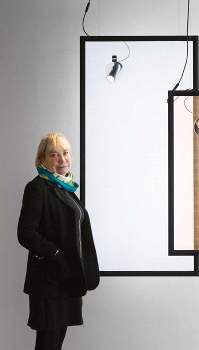
IMOGEN SPRY
HEAD OF PROJECTS AND SALES, CAMERON DESIGN HOUSE
How long have you been involved in the lighting industry?
Originally, the interest in lighting design began during the final project of my Product Design degree, working with a lighting brand to design adaptable bathroom lighting. Designing and prototyping this was a fascinating blend of technical application and design freedom, which strongly influenced my search for roles within the industry. I have been working with Cameron Design House for over seven years now.
Have you always been involved in the manufacturing side, or have you come from another part of the industry?
I’ve always been drawn to making and designing, which strongly influenced my choice of degree. However, my experience at Cameron Design House has provided me with a significant insight into the manufacturing industry.
Have you noticed more diversity in sales, manufacturing, and marketing over the past two decades?
Over my time in the lighting industry, I have had the pleasure of working with a diverse group of people from many different backgrounds.
This collaboration has allowed for not only a creative development of all aspects of the lighting design process, but also a hugely enjoyable work culture.
What reasons do you think there are so few women working for manufacturing companies? What obstacles do women come up against?
Interestingly, I have not seen a lack of women in my area of the industry. We have had three workshops over the years as we have grown, and in each location, our team has been equally divided within both the design and production team. How do you think more women can be encouraged into this side of the lighting industry? What can manufacturers do to encourage a diversity of applicants for roles in sales and product development for example?
It is important to see the value in what someone can bring to the whole process and I certainly have learnt so much since starting as an intern all those years ago.
Offering opportunities to learn and develop in manufacturing roles opens up the process to new ideas and perspectives, so there is equal benefit to those interested in learning and manufacturers.
What are the positives of working for a manufacturer? What are the negatives?
As we design and fabricate all of our own products, we see the very beginning developments of manufacturing methods. This has led to a number of new products within the Cameron Design House collection as well as the development of what is possible with the application of these designs.
This certainly keeps us all on our toes, but it is really enjoyable to see a concept developed with clients result in beautiful, custom and unique chandeliers. www.camerondesignhouse.com
66/67 |
ESTHER PATTERSON FOUNDER , CURIOUSA
How long have you been involved in the lighting industry?
I launched my lighting business in 2010 so essentially I’ve been involved in the lighting industry for 14 years.
Have you always been involved in the manufacturing side, or have you come from another part of the industry?
I originally trained as a graphic designer but I also enjoyed ceramics, drawing, and printing. I progressed these interests and immersed myself in a Decorative Arts Degree in my late thirties and graduated in 2009.
I’ve always loved designing too and combined this with being quite hands on - making is in my DNA. I think this helps me see a problem as a challenge, and from experience, I know solutions are always a logical journey. For me the same issues occur whether I’m constructing a clay vessel or working with an engineering company - you can work solutions through and I really enjoy that process. Have you noticed more diversity in sales, manufacturing, and marketing over the past two decades?
When I got involved in the lighting industry over 14 years ago there didn’t seem to be much going on that was female led. For instance colour is my thing and most lighting was white, grey or black, probably mostly designed by men. I felt there was a real niche in the market at that time - colour needed embracing and I think instinctively women are less scared of colour. I think slowly there are a smattering of women getting more involved but not enough. What reasons do you think there are so few women working for manufacturing companies? What obstacles do women come up against?
I think women are really inspired to design for the lighting industry but when it comes to manufacturing there’s quite a hill to climb. When I wanted to make my first slightly ambitious chandelier, I went to a steel engineering and fabricating company to help with the suspension part of the piece. The owner rather condescendingly referred to my plans as pretty pictures! As a woman you have to be quite tough to overcome preconceived ideas about what you can achieve. Fortunately I’ve not allowed this negativity to get in the way and there are plenty of good people and companies out there that want to help. Over time I’ve
managed to build around me a small team of seven people. Including myself, there’s six women and just two men. Four women actually get their hands dirty and make the lights in our workshop, the other two are in sales and dispatch. All the roles in our company are seen as open game for men or women or gender non-specific.
How do you think more women can be encouraged into this side of the lighting industry? What can manufacturers do to encourage a diversity of applicants for roles in sales and product development for example? When we advertise for some roles we will typically only get men applicants and that’s not great. I’d say to the owners of any businesswhen a job becomes available, look around at your female staff. You know the bright sparks you already have, maybe they can be challenged to train up and fill those gaps in your business. Do this before you even think about putting a job advert out. Sometimes women can be conditioned to think they can’t achieve in certain men-dominated areas, but believe in them and they can achieve so much and more! We’ve done this at Curiousa and I’ve been astounded at their commitment and determination to train on the job and make it work for themselves and the business.
What are the positives of working for a manufacturer?
What are the negatives?
The positives are that it’s very satisfying designing and also making the final product. We make very bespoke lighting and you can get very attached to the piece you are part of making. We nurture them at each stage - the careful grinding, polishing and constructing, the precise packing and sending them off into the world. There’s a great deal of satisfaction in a job well done. The down side can be if you have a person down through illness and you’re a small manufacturer it’s hard to juggle.
We now have a policy of two people within the team need to train up on each major task whether that’s making a large stacked sculptural light piece, packing or sales. Having backup feels pretty essential. www.curiousa.co.uk
INTERVIEW | WOMEN IN LIGHTING
MÓNICA LAFUENTE
FOUNDER AND GENERAL MANAGER, LET’S PAUSE

How long have you been involved in the lighting industry?
In 2013, I established Let’s Pause in Barcelona with a clear vision of bringing natural contemporary design to life. Our initial product range included furniture, decor accessories, and lighting. Over the years, our focus has evolved, honing in on the crafting of lighting pieces using organic materials and sustainable artisan techniques. We’ve even embraced the practice of upcycling natural elements that Mother Nature discards. Prior to founding Let’s Pause, my involvement in the design and lighting industry dates back to 1999 when I founded SmartDeco, a press agency specialising in design. Since then, I’ve been immersed in communicating design and lighting themes, actively participating in events within this creative realm.
Have you noticed more diversity in sales, manufacturing, and marketing over the past two decades?
Absolutely, over the last two decades, I have witnessed a significant expansion of diversity in sales, manufacturing, and marketing within the design and lighting industry. As for sales, there’s a heightened appreciation for unique, handcrafted pieces, and consumers are increasingly drawn to sustainable and organic options. On the manufacturing front, there has been a notable shift towards embracing traditional artisanal techniques and a greater emphasis on using
organic materials, reflecting a broader commitment to eco-friendly practices. In terms of marketing, the landscape has evolved with a more nuanced approach, acknowledging and celebrating the diversity of design styles, materials, and crafting methods. What reasons do you think there are so few women working for manufacturing companies? What obstacles do women come up against?
In the design and lighting industry, the representation of women in manufacturing roles has historically been limited, but there has been a noticeable shift in recent years. One reason for the underrepresentation could be attributed to traditional perceptions of certain manufacturing roles as male-dominated. Overcoming these preconceptions and fostering an inclusive environment are crucial steps toward encouraging more women to pursue careers in manufacturing.
Obstacles that women may encounter include stereotypes and biases that associate certain tasks with gender, making it challenging for them to break into traditionally male-dominated fields. Additionally, there may be limited access to mentorship and networking opportunities for women in manufacturing, hindering their professional growth. Addressing these challenges requires a concerted effort to challenge stereotypes, promote inclusivity, and provide mentorship and support programmes to encourage and empower women to thrive in manufacturing roles.
HEIDI LEONELA
DIRECTOR OF SALES NORTH AMERICA & FRANCE, SECTO DESIGN
How long have you been involved in the lighting industry?
I started working in the lighting industry in 2017 so I still consider myself as relatively new in the field.
Have you always been involved in the manufacturing side, or have you come from another part of the industry?
My experience in the lighting industry is purely from the manufacturer side.
Have you noticed more diversity in sales, manufacturing, and marketing over the past two
decades?
Unfortunately I can only speak for the years that I have been in the industry. Working for a Finnish company obviously has an impact on my opinion when it comes to the question of diversity. At Secto Design we have both women and men working in the manufacturing, administration, and sales. Secto Design is a design brand concentrating on decorative lighting, which surely also influences the big portion of women working in the company. Let’s not forget that the company’s founder and owner is a woman called Tuula
68/69 |
How do you think more women can be encouraged into this side of the lighting industry? What can manufacturers do to encourage a diversity of applicants for roles in sales and product development for example?
At Let’s Pause, we actively promote women’s participation, with the majority of our team across various departments being composed of talented women. Encouraging greater female involvement in the lighting industry requires proactive measures from manufacturers. Cultivating an inclusive and diverse company culture is paramount, as well as prioritising mentorship programmes and networking initiatives tailored for women, offering crucial support for navigating careers in our industry.
Engaging in educational initiatives is another avenue to inspire young women towards lighting careers, emphasising both creative and technical aspects. Collaborating with educational institutions and industry organisations facilitates the creation of talent pipelines, providing exposure to diverse career opportunities. Transparent and unbiased recruitment processes are essential. Actively seeking out diverse candidates ensures job descriptions are inclusive. Additionally, training and development programmes help empower women with the skills and confidence to excel in their roles within our company. What are the positives of working for a manufacturer?
What are the negatives?
In the case of Let’s Pause I would say the positives are: Artistic Fulfillment: Working for a manufacturer in our niche allows employees to actively contribute to the creation of sustainable, aesthetically pleasing, and unique lighting products. The use of natural materials and handmade techniques often provides a deep sense of artistic fulfillment.
Hands-On Craftsmanship: Employees have the opportunity to engage in hands-on craftsmanship, working closely with skilled artisans and incorporating traditional techniques. This not only enhances their skill set but also fosters a connection to the heritage and authenticity of the products.
Sustainable Practices: Many individuals find it rewarding to be part of a company that prioritises sustainability. The use of natural materials and a commitment to handmade techniques often align with eco-friendly practices, contributing to a positive environmental impact.
Innovation and Creativity: Team members are often involved in problem-solving, experimenting with new materials, and pushing the boundaries of design possibilities.
And as for the negatives:
Time-Intensive Processes: Handmade techniques and the use of natural materials can be time-consuming. Meeting production deadlines may become a challenge,
and there might be a need for careful planning and coordination to balance creativity with efficiency.
Limited Scalability: Depending on the intricacy of handmade techniques, scaling up production may be challenging. This can impact the company’s ability to meet high demand, potentially leading to longer lead times for customers.
Skill Dependency: The craftsmanship involved may require specialised skills, and finding qualified artisans can be a challenge. The business may be vulnerable if there’s a shortage of skilled personnel or difficulties in passing on the techniques to new generations.
Market Perception and Pricing: Handmade and natural materials often contribute to premium pricing. This might limit the market to a specific demographic, and some consumers may perceive these products as expensive compared to mass-produced alternatives. www.letspause.es
Jusèlius and also the CEO position is held by a woman. What reasons do you think there are so few women working for manufacturing companies? What obstacles do women come up against?
I am sure that historically the lighting industry has always been more male-dominant. Often, when we talk about lighting in general I believe it is seen as something more technical, which surely impacts the male/female ratio within the industry. This is not to say because women were not capable, but maybe technical fields are not as appealing to women as they are to men. In Finland, when you look at the portion of women versus men studying in the electrical engineer programmes, the female students count for only about 10% university level and even this number varies depending on year. However, I am always delighted to see at the trade shows around the world that there are a number of women representing lighting manufacturers, especially
in the decorative lighting.
How do you think more women can be encouraged into this side of the lighting industry? What can manufacturers do to encourage a diversity of applicants for roles in sales and product development for example? I strongly encourage all women having the passion to work in the lighting industry to pursue their dreams despite the fact that the industry is dominated by men. I am a strong believer in diversity within the employees and that it is an asset to any company. The manufacturers should definitely be encouraged to promote equal opportunities to both men and women and also find ways to attract more women to enter the lighting industry. How this can be done, however, is a much more complex question.
What are the positives of working for a manufacturer?
What are the negatives?
I would say there are only positive factors when working
directly for the manufacturer. The transparency of the company’s functions at all levels contributes to the motivation. In my sales role I find it extremely beneficial to be able to work closely with all functions within the company. I have a better understanding of our brand and products as a whole, which contributes to sales directly. Acting as the face of the company when meeting customers, working with different partners, and exhibiting at trade shows not only require me to communicate the message of the manufacturer but also provides me with valuable feedback from the customers. Working directly for the manufacturer ensures that my message to the outside is in line with the brand but also that the message from the customers actually reaches the manufacturer.
www.sectodesign.fi
INTERVIEW | WOMEN IN LIGHTING
MONICA POLONIO FOUNDING DIRECTOR, ROCK & SOAR
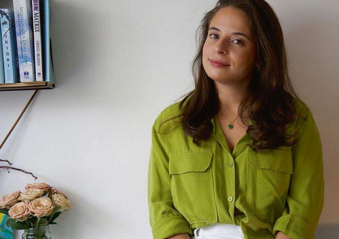
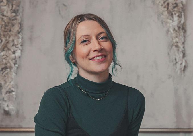
ALISON SMITH
FOUNDING DIRECTOR, ROCK & SOAR
How long have you been involved in the lighting industry?
Monica: six years ; Alison: 10 years
Have you always been involved in the manufacturing side, or have you come from another part of the industry?
Monica: I come from a sales background, and when I joined the lighting industry, I had little knowledge of the complexity of lighting. It was through the process of being part of a small team that specialised in bespoke lighting that I learned more about its beauty and the design process.
Both Alison and I are now heavily involved in the design and manufacturing process of decorative lighting. We have also become experienced and knowledgeable in areas such as architectural lighting, which allows us to design decorative lighting that is also functional and works with other lighting in interior spaces.
Alison: Yes! My background stems from sculpture and craft, so I’ve always been in the realm of making. My research is
always based on materials and their reaction with light, so I’ve spent a lot of time with manufacturers and makers to understand techniques and processes.
Have you noticed more diversity in sales, manufacturing, and marketing over the past two decades?
Monica: Prior to joining the lighting industry, I came from the textiles and furniture industry where I represented luxury brands in the UK, Europe, and Russia. My sales background in the luxury industry spans over 10 years. In my experience, when working with beautiful luxury products, the salesperson is typically female, whereas when dealing with architectural or technical products, the salesperson is usually male. So, no, I don’t think it’s changed much.
I have represented more architectural-based products, and personally, I disliked it as it lacked creativity and I found it very boring. But I believe that companies and managers, when recruiting, seem to think that men are more suited for one style or product and women for another.
70/71 |
Alison: There’s still the lingering cultural conditioning of ‘men being better at handy work, engineering, and technical design’ and ‘women are suited to cleaning, cooking, and aesthetics.’ So manufacturing and product engineering fall under the ‘male’ remit. While there is progression, it still feels that stepping out from gender roles in society is seen as going against the status quo when, really, it should just be the norm.
What reasons do you think there are so few women working for manufacturing companies? What obstacles do women come up against?
Monica: Is it that women are choosing not to work in these sectors, or is it that they want to but are not chosen when applying for jobs? Could it be that they are afraid to say they would like to work in a sector such as manufacturing and therefore do not even pursue it as an option, which therefore roots back to our society, schools, and what is seen at home?
I believe manufacturing companies and managers might see women as too fragile or too weak to manage certain machinery.
Alison: I agree that it begins with educational and societal development. If you choose to progress in education as a female in a male-dominated sector, it can be daunting; you can be judged, and it can fill you with self-doubt.
If you take a CV of a female compared to a male, for example, a male is likely to have pursued an education in construction, engineering or product design due to feeling comfortable in that sector. As an employer, regardless of knowing the gender of the CV, you are more likely to pick this person because of their background. You then get a male-orientated industry. If 90% of applicants for a job are male, the probability of a male being employed is far greater. You also have the prospect of gender motivations of the employer, but I do think this is becoming more neutral. We need to recognise the importance of equity here - where women are allocated the exact resources and opportunities needed to reach an equal outcome in our industry and feel comfortable taking on the routes of design technology, engineering, and construction. You have to push for women to have a voice in the industry.
How do you think more women can be encouraged into this side of the lighting industry? What can manufacturers do to encourage a diversity of applicants for roles in sales and product development for example?
Monica: I believe the work needs to be done at an early stage in a young female’s life. Design and manufacturing companies should be visiting colleges and universities and encouraging diversity.
Alison: This is something Mon and I are really keen to
promote. I recently went to Nottingham Trent University to give a panel talk on ‘Finding Your First Role and Early Career Progression’ to share insight into the manufacturing industry and product design as a female. It is our hope that we can encourage others to pursue their careers and know that other women are out there too.
An interesting observation I came across when working as a DT & Art Technician for a secondary school in 2014 is that when teaching the students in Year 7 (ages 11-12) how to use the machinery, all boys were confident using these for the first time, whereas many of the girls lacked confidence and were extremely reluctant to participate. If young adults witness other women in this industry who are comfortable and passionate, we can fast-track gender diversity. Whatarethepositivesofworkingforamanufacturer?What are the negatives?
Monica: Being able to explore a wide scope of materials and techniques as well as working with tangible objects. There is obviously the laborious side of doing repetitive tasks, but that’s the case in most industries.
Alison: We love the collaborative approach to our work. You meet so many craftspeople, engineers, and designers, giving you the opportunity to discover so many new and wonderful ways of making. A negative aspect is having to deal with sexist remarks from time to time, but it’s a chance to challenge and educate others in this area.
Is there anything else you would like to add?
Monica: Many of the men I have met in the construction and manufacturing industry have ended up in these roles from an early age, dropping out of the educational system and feeling like these sorts of roles were the only option for them. Do we have an influx of males in these roles because there simply isn’t enough resources to support young boys and young girls who struggle to adapt to a traditional education system?
Alison: It’s a slow burner, but we’re getting there! I also encourageeveryonetoread‘InvisibleWomen:ExposingData Bias in a World Designed for Men’ by Caroline Criado Perez asitiseye-openingatjusthowinsanelyapparentitisofthe lack of data on women, leading to a male-oriented society.
We’ve also recently become a member of The Women’s Chapter, a platform to provide professional women with the means to come together to create meaningful connections, find solutions to business challenges, be inspired, and build a work life aligned with their purpose.
wwwrockandsoar.com
www.womeninlighting.com
*This article is a continued conversation from our sister magazine arc, issue 137 in collaboration with Women in Lighting.
INTERVIEW | WOMEN IN LIGHTING


20 & 21 November 2024 • Business Design Centre • Islington • London www.lightexpo.london STEP
The UK’s only dedicated trade show for designers working with light Interested in Exhibiting? Contact: John-Paul Etchells on jp.etchells@mondiale.co.uk archiproducts 53 Atelier Anaka 5 chelsom 37 C hristopher Hyde 21 clerkenwell Design Week 59 De signheure 45 Elstead 41 Franklite 2 5 HD Expo 54 ICFF 63 Intra Lighting 75 LiGHT 24 72 L ZF 49 M odi Store 6/7 Se cto Design 2 Sl eeper Media 73 Za fferano 7 6 Zico Lighting 15 AD INDEX PORTFOLIO PROUDLY SUPPORTING
INTO THE…
The leading brand for hospitality experience and design
Inspiring magazines and community-driven events to connect those creating exceptional hospitality experiences around the world.
www.sleeper.media
POWERED BY PORTFOLIO

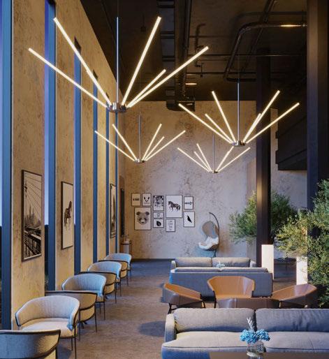
What is the design concept behind Lysabel?

Lysabel was born as a straight line, hypothetically infinite, radiating its light 360°. The primal idea of Lysabel originated from the beautiful images of laser sabre battles in well-known science fiction movies. The whole project was illustrated through compelling images, reminiscent of the epic saga, with numerous characters wielding the lamp attached to the power cord. For example, the robotic multi-armed Grievous from Star Wars (who wielded four lasers) lent itself to being associated with the adjustable multi-armed Lysabel chandelier or the “en guard” position of one of the knights approaching the floor lamp. The collection grew with the thought of light like a gash in the darkness, like a weapon to be wielded in a dark space to illuminate it, like a battle between opposing entities such as light and darkness.
How long have you been working on the collection?
The Lysabel collection was born in 2019 and developed over a few months with increasingly elaborate concept sketches and an initial 3D-engineered design equipped with all the essential components. In 2020, it was sent to Intra lighting, with the first prototypes unveiled in 2022.
What was the most challenging aspect of this project? Managing the uniformity of light along the light rod. In my initial drawings, I identified both a 360° spread and a predominance of light on one side, without compensating for the opposite side. The hypothesis could only be checked in the prototyping phase, thanks to the photogoniometer provided by Intra. This device allowed us to assess optimal light diffusion with precise data, without bothering the view.
Another challenge involved designing the connection between the light rod and the power cord. The detail borrowed from the particulars of irons has been simplified and embellished. This detail personalises the lamp and makes it ready to become a horizontal, vertical or tilted element as desired.
What materials and design processes are used?
The basic materials are aluminium and acrylic glass (PMMA), both of which are 100% recyclable. The profile of the acrylic glass is obtained by an extrusion process that easily allows for varying lamp lengths and improves production by optimising it in terms of assembly time and production adjustment. High-quality LED strips can be cut to size, allowing for high production flexibility. The light sources have high-quality parameters: Hi flux LED strip, CRI>90, MacAdam<2, and with a wide range of colour temperatures: 2700K, 3000K, 3500K, 4000K. The design process begins with imaginative assumptions. These ideas converge into thoughtful formal choices that undergo verification in the engineering and prototyping phase. Subsequently, they are further examined in the photometric results, utilising tools such as the photogoniometer. This meticulous approach aims to achieve optimal functionality and manageability.
What technologies are used?
The frosted opalescent acrylic glass tubes are extruded by calculating the exact coverage of the opalescent compound so that the light is diffused evenly without the bright dots of the LEDs being visible, but without the diffuser finish being able to cover too much of the light emission. The aluminum body, including the ball joint and all visible metal details, is offered with a choice of finishes: gold, onyx, and bronze in coated or brushed variants. The components are of high quality, and the ballast operates at 24V, maintaining a constant voltage. The light source consists of long flexible webbing that can be cut at will, carrying on board numerous LEDs juxtaposed one to the other and electrically connected.
Despite its slender appearance suggesting fragility, the collection is surprisingly resilient and manageable.
www.intra-lighting.com
lighting IN FOCUS 74/75 | IN FOCUS | INTRA LIGHTING
Lysabel Lorenzo Truant intra
It’s main feature is the possibility of rotation. For a pleasant indirect light you simply rotate it with one move. intra-lighting.com/Gramm Gramm
The lightest light