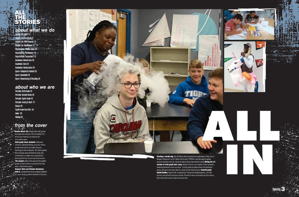
MIDDLE SCHOOL SECTION
HE Y, WA I T A MINUT E .
Dear self-proclaimed yearbook pros, don’t skip out on this section.
Older doesn’t always mean wiser when it comes to this group. We can attest that these books — in their own ways — demo some serious YBK skills. Find yourself inspired by their creativity and storytelling.
Don’t write off the little guys.
ANTHOLOGY 228 GALLERY 258 COVERS+ ENDSHEETS 258 THEME PACKAGE 260 COVERAGE 264
P28 divider XXX 227


 Adviser: Ximena Lopez
HJ Reps: Vicky Aguirre, Ashley Cuervo and Jose Otero
Adviser: Ximena Lopez
HJ Reps: Vicky Aguirre, Ashley Cuervo and Jose Otero
CONCOLOR CLOSING COVERAGE COVERAGE
Ruben Dario MS MIAMI, FL
Stand-out features:
SQUARE ONE STARS: This Concolor volume provides a perfect example of a Square One yearbook. Its clean eyelines, various coverage devices and visible hierarchy make our designer eyes happy. Headline and subheadline packages are balanced in size, and we can see where a style guide kept the staff consistent.
SMART COLORS: The four colors seen on the cover make their way into the book. Starting with the green on the endsheet, the book kick-starts the student life section with its dedicated pink, and blue takes over in the academics section. A mix of all four is used in the people section, and then green and yellow identifies sports and reference, respectively.
A+ PHOTOGRAPHY: The photography — noted in the colophon as taken by the staffers — adds just as much interest to spreads as the coverage. While we say avoid posed photos to the best of your ability, the Concolor staffers provided new and interesting photo angles to make up for it. Talking heads used images with clean backgrounds and great head-to-shoulder cropping. They made it easy to “Just Look At” them and enjoy what we see.

DIVIDER COVERAGE ANTHOLOGY | Ruben Dario Middle School 228 229
Castle Rock MS CASTLE ROCK, CO
CRUSADER
Adviser: Gina Claus
Editors: Alexandra Zents, Taylor Graham and Sadie Canaday


HJ Rep: Rebecca McGrath
 ENDSHEET
PORTRAITS OPENING CLOSING
Stand-out features:
FUN FOLIO: The tilted and playful typography follows from the front lid to the well-executed folios. For this chronological Crusader, the folio section is the month — but it doesn’t stop there. The traditional section is listed along with the topics covered on those spreads. Just as an example, the September folio includes page numbers, sections of student life, clubs and events listed — and topics like streaming platforms, the mask tree, Labor Day and fall play. What a reader service.
SUPERB PORTRAITS:
The nine-spread portrait section includes additional coverage to make students


“Look At It This Way” with the “it” being students and their untold stories. Did you know Abbey has her own original oatmeal chocolate chip cookie recipe? Or Mr. Martin was once an award-winning news producer for the Colorado State basketball teams? And to make us love the section even more, the Crusader staff included those not pictured with each grade.
THEME DREAM TEAM:
Both the opening and closing spreads support the prominent theme statement on the cover. The opening gives us a list of ways Castle Rock students are motivated and focused after a year of struggling with COVID. That same optimistic voice continues in the ample copy packages. Then, to sum up the great 25th volume, the single closing spread shares how the year looked to students as they “built, explored, engaged” and made the best of the year.
COVERAGE DIVIDER COVERAGE PROFILE ANTHOLOGY | Castle Rock Middle School 230 231
HO’OILINA
Adviser: JT Su
Editors: Caitlin Arinas, Robert Cabanting and Natalie Coone
HJ Rep: Paulette Suwa
 Ewa Makai MS EWA BEACH, HI
Stand-out features:


A TO Z: This volume of the Ho’oilina had a serious plan. Rather than following a chronological, traditional or obvious umbrella organization, the book is alphabetical. Yep, you read that correctly. Kicking off the plan, the two-spread opening copy emphasized words that followed — you guessed it — the alphabet. As you move through the book, the spreads follow an umbrella approach where the folio assists you with what letter you’re in. The section of “C” coverage includes “choices” and “cafeteria talks” while section “S” includes “student and staff style ”
BIGGER, THE BETTER:
With the alphabetical theme, it makes visual sense for letters to be prevalent in the design. The staff made sure to design other coverage and content elements with intention. The letters aren’t overkill, and they also aren’t just décor. They simply work. We can appreciate a wellthought-out design strategy.


HAVING FUN WITH IT:
There’s no doubt in our mind that this staff had fun while creating this book. Even the cover, with its simplistic design still shows the intention around each element. The Mattelaminated cover features an image of a letterman’s jacket, but the staff added their own pizzazz with a custom-designed adhesive chenille patch. Love it!

COVERAGE PORTRAITS FEATURE FEATURE OPENING COVERAGE
ANTHOLOGY | Ewa Makai Middle School 232 233
INNOVATION: CHENILLE PAW
IMPERIUM
Adviser: Michelle Hamon


Editor: Kate Kuehn

HJ Reps: Susan Heffran and Jaclyn Holman
 Iron Horse MS SAN RAMON, CA
OPENING
COVERAGE ENDSHEET FEATURE
Stand-out features:
LOVELY LABELS: The Imperium staff went for renamed traditional sections — and they’re perfectly labeled and named on the front endsheet. “Same Fun, Different Day” gives us student life coverage, “Same Classes, Different Rooms” gives us academics, “Same Groups, Different Crowd” gives us sports and clubs while “Same Kid, Different Year” wraps up the people section. The small adjustment to their section titles proves that this staff knows how to match their theme to their coverage.
GIVING GRADIENTS: A big trend of 2022: gradient color. The Imperium designers had a plan in place with a blend of blue to purple to peach hues. Inside the book, the gradient acts as a background for mods and spreads — it’s even included in headline packages. But for an extra bonus, the staff offered a split cover, making two versions by flipping the gradient. We love a trendy design element applied with intention.

ALL THE TALKING HEADS:
It’s amazing to see the index of this yearbook. Most students listed have at least two page numbers beside their names. It’s obvious this staff prioritized student inclusion. To push coverage to a new level, almost every content spread includes a “But Different” mod that includes a section-specific question and four to eight talking heads for ultimate student coverage. In the student life section, the question “What makes you happy?” made the mods while the academics section included “What decade would you want to live in?”


ANTHOLOGY | Iron Horse Middle School 234 235 FEATURE PORTRAITS COVERAGE DIVIDER
INGENIUM
Adviser: Jennifer Parsons


Editors: Maizy Pulsipher and Logan Richter


HJ Rep: Megan Sebold
 Greenfield Junior HS GILBERT , AZ
OPENING COVERAGE ENDSHEET COVERAGE
Stand-out features:
ONLY THE BEST: The oneword theme “Only” provided so many coverage paths. And, this staff took it and ran with it. You’ll find the word in not only the opening and closing copy — five times in each, if you’re wondering — but also sprinkled in mods and headlines. When working with one word, it’s easy to get repetitious. Though, this volume is far from it. The theme-advancing moments support it while also serving a purpose. And what a great time to cover kids without siblings — only children!


COPY THAT: The Ingenium writers provided well-written long-form copy. The perfection “comma, quote, name said” makes our journalist hearts swoon. We’re equally impressed by the captions. Including the “need to know” and “more about the image” details, the caption lead-ins are some of the best. They’re both creative and diverse. We can even see that staffers avoided starting with a gerund to the best of their ability. Way to go!
PHOTO PACKAGE PROS:


To support their superstar captions, both the photography and photo packaging deserve an A+. There’s a mix of large and small images with obvious dominant photos thanks to internal margins and sizing. Plus, a sprinkling of cutouts ties each visual together nicely.

FEATURE COVERAGE PORTRAITS DIVIDER INDEX ANTHOLOGY | Greenfield Junior High School 236 237
JAMBOREE


PORTRAITS


 Adviser: Julia Bayles
HJ Rep: Sara Cowan
Toby Johnson MS ELK GROVE, CA
Adviser: Julia Bayles
HJ Rep: Sara Cowan
Toby Johnson MS ELK GROVE, CA
OPENING
ENDSHEET COVERAGE
Stand-out features:
THEY’VE GOT SPIRIT: The Jamboree cover — with its Matte lamination — packs a big punch, but not at first glance. The staff opted for Photochromic UV on the mascot as a visual element of their theme “Imagine” — with a pop of Silver foil on the theme word as well. The sunlight on the UV brings the jaguar to a subtle blue-violet color. We’re a fan of the mascots used in unconventional ways on covers.

WHAT IF?: We can tell that this staff brainstormed their one-word theme. “Imagine” can take a book down many coverage paths. The staffers found multiple ways of unifying the theme. “What’s Happening,” “What’s Possible” and “What’s Next” included the traditional sections organized under its umbrella-type coverage. From there, themeadvancing mods including a “What if…” prompt and quick quotes — some with talking heads and some without — united the book.
MORE SPACE WORKS: Where most schools opt for a half-pica grid, this book used a one-pica internal margin for a little bit of extra space. While many think that white space should be filled with content, the Jamboree works it onto spreads with intention and balance. Plus, it helps with the use of their AHJ Arizona font which needed a bit more space to be legible.


FEATURE COVERAGE DIVIDER ANTHOLOGY | Toby
238 239
INNOVATION: SILVER FOIL AND PHOTOCHROMIC UV
Johnson Middle School
LA CRESTA
Adviser: Kristi Diaz


Editors: Ava Suave and Angela Spitz

HJ Rep: Megan Sebold
 Desert Ridge Junior HS MESA, AZ
OPENING ENDSHEET COVERAGE
Stand-out features:
HAPPY ANNIVERSARY!:
The 20th volume of the La Cresta celebrated its students and school history. “Because of You” is a theme we can get behind. Stories and mods focus on students claiming victories and navigating obstacles from the year — all while including so much coverage. If you’re looking for a good example of theme voice, this book is one to check out.


WE LOVE THIS: Photo effects were applied to images with a purpose. A mix of cut-out photos, duotones and two-color drop shadows made this book visually interesting. To start off the design, this size seven book features a school-color-focused cover with seven images with the duotone effect. And, we love the Raised UV on the white front-lid elements and the Matte lamination on the remainder of the cover.
BRACKETS AND BOXES: This staff did some prolevel work with them. The slab serif AHJ Square Serif provided an anchor for the brackets in headline and subheadline packages and then for the squares around mods. It’s important to use these with a purpose and not throw them on a spread as unplanned décor. Shout-out to La Cresta staffers for this design victory!
ANTHOLOGY | Desert Ridge Junior High School 240 241 COVERAGE FEATURE
COVERAGE
COVERAGE
Ranch View MS HIGHLANDS RANCH, CO
PAW PRINTS
Adviser: Jed Palmer
Editor: Kerrigan Kreimeyer

HJ Rep: Rebecca McGrath
COVERAGE


REFERENCE
FEATURE

Stand-out features:

OPENING STARS: “Yeah, we’re middle schoolers.” And yet, the Paw Prints staff knocked our socks off with their thematic opening copy. They started with things their school community might already know: Ella’s special “bye” at the end of announcements or catching Abbi at the King Soopers Starbucks. But then, they switched their focus to stories not yet told, preparing us to get into the coverage that follows.
TYPOGRAPHY PROS:
The mixture of both sans serif and slab serif adds to the sass of their theme. AHJ Function — in its condensed variation — acts as the dominant font choice while AHJ Litho Antique comes in for the assist in headline packages. The consistent packaging is seen in the all-coverage device at the bottom of each spread. “Did you know?” in its thick slab brings the attention to the bottom to learn more from the students’ responses.
QUOTES ON QUOTES:
You’ll find spreads full of pull quotes from students on different topics in this volume of Paw Prints Student life spreads include typical activities and fun spots in the neighborhood or backpack essentials, while academic spreads include students sharing their favorite design electives as well as taking the stage in choir, band or drama.


ANTHOLOGY | Ranch View Middle School 242 243
CLOSING DIVIDER COVERAGE
ENDSHEET
SENTRY


 Adviser: Adrienne Forte
HJ Reps: Kara Petersen and Lexie Dracos
Robinson MS FAIRFAX, VA
Adviser: Adrienne Forte
HJ Reps: Kara Petersen and Lexie Dracos
Robinson MS FAIRFAX, VA
OPENING COVERAGE PORTRAITS
Stand-out features:
COVERAGE GALORE:
This staff understood the importance of alternative coverage. A strong balance of photo and caption packages met their match with talking heads and quotes. The variety of designs helped the staff introduce new coverage avenues. Some cutouts included a posedfor-a-purpose moment while others were only head-andshoulders. And to top it off, the cutouts were anchored perfectly with blocks of color or white space.


PALETTE PERFECTION:
Showing us the colorful palette on the front cover, the book showcases two color combos on each spread. Plus, a lighter tint mixes things up while still providing cohesiveness. A great example is the use of fullstrength purple and orange for headlines on the March calendar spread, while the two mods include a lighter tint of both. Well done!
TAKE THIS TIP: Not only are captions and copy written to make the journalists smile, but they also include a small detail that packs a punch. For every caption, the student, faculty or staff member s name is highlighted in the spread ’s main color. The Sentry staff had a careful eye when designing to provide a rockstar reader service.
COVERAGE FEATURE ANTHOLOGY | Robinson Middle School 244 245
Excelsior MS
BYRON, CA
THE FALCON
Adviser: Louise Colbert
Editors: Lucas Leon, Natalia Cervantes Palomares and Rylan Farley
HJ Reps: Susan Heffran and Jaclyn Holman

Stand-out features:
BRIGHT AND NEON: The Falcon cover is one that stands out. With its large, block letters and bright neon colors, it kickstarts the typography and overlapped headline art found in the book. Plus, each spread finds almost every color from the cover for a happy tone of being “Better Together” throughout.


NON-TRADITIONAL COVERAGE: Where the staff passed on longer copy packages, they adopted extended captions and plenty of talking heads and quotes. In the prime location for an all-coverage device, The Falcon staff added a question-and-answer mod to the bottom of spreads — adding as many as 12 students to a spread. Varied lead-ins and clever miniheadlines made extended captions even stronger.


THERE’S ANOTHER WAY: The staff opted to not print on their endsheets, but that doesn’t mean they didn’t provide a table of contents. Instead — on pages 2 and 3 — they listed the book’s chronological dividers and shared quotes from students on what it means to be “Better Together.” A great way to include a book necessity!


COVERAGE COVERAGE PORTRAITS COVERAGE OPENING DIVIDER COVERAGE ANTHOLOGY | Excelsior Middle School 246 247
Harvest Park MS PLEASANTON , CA

THE PATRIOT
Adviser: Leslie Galliano
Editor: Rachel Schmidt


HJ Reps: Susan Heffran and Jaclyn Holman

COVERAGE ENDSHEET OPENING
Stand-out features:
ACD LOOKS GOOD TO ME: Staffers took the coverage challenge and ran with it. On each content spread, you’ll find an all-coverage device adding 12 more students in the same location. Wow! The extra coverage lets us know things like what kind of animal the students wished they could be, their favorite thing about Harvest Park or the most exciting thing about returning to school after COVID.


INFOGRAPHICS WITH INTENTION: Many spreads feature information graphics in different formats. You’ll find a “What time do you get up in the morning?” pie chart alongside a line graph on “Which names are most common among students?” — all in the people section. With this coverage device, we’re able to find interesting facts and stats about the school community. Because how else would we know there are five boys named Ryan in the seventh grade?
INTERNAL MARGIN
EXPERTS: The designers on staff had a careful eye for planning out each element of their spreads. Photo packages — coupled with well-written captions — have a consistent half pica between elements. An A+ for knowledge of internal margins and their purpose. And to top it off, The Patriot staff understood the importance of copy package hierarchy, clearly delineating headlines, subheadlines and body copy.
ANTHOLOGY | Harvest Park Middle School 248 249 PORTRAITS CLOSING
OPENING
PORTRAITS


ADS
Powell MS LITTLETON, CO
THE PROWL
Adviser: Yvette Manculich
Editor: Isabel Mudd


HJ Rep: Rebecca McGrath
COVERAGE

Stand-out features:


ALL THE FEELS: The cover has so much going on — in a good way. The large type and ripped edges give a nod to the grunge design inside the book. Brush grain is applied to the Matte-laminated cover everywhere but the yellow strips. On the yellow, you’ll find a Gloss UV to add a touch of shine. Then, to finalize this tactile experience, the gray sections are embossed. Wow!


THANKS FOR THIS: Opening to the endsheet, The Prowl ’s book structure is clearly stated. One side ”We’re Livin‘ Our Best Lives” lets us know that the main book contents are in chrono order. And, we appreciate that they provided a full contents listing in what we would consider the traditional sections such as academics, student life and sports. The other side of the endsheet is “Our Lives As Pumas” letting us know all that will be in the reference section. So much good info.

VISUALLY, WE’RE HERE
FOR IT: The modern grunge from the cover is just as we expected inside the volume. While there’s a lot happening, it doesn’t feel that way. Each visual — from the sans serif and handwritten font selection to the color palette — is intentional. The rips are featured on some dominant photos or color bars for the copy. Plus, the loud-andproud headline packaging brings a hierarchy and cohesiveness to each spread.
FEATURE
ENDSHEET COVERAGE INDEX ANTHOLOGY | Powell Middle School 250 251
INNOVATION: BACK COVER GRAIN AND GLOSS UV
ENDSHEET COVERAGE


Short Pump MS
GLEN ALLEN, VA
Adviser: Matthew Cross
Editors: Holli Hopkins, Caroline Kiniry and Kelsey Boughton


HJ Rep: Denise Miller
PORTRAITS

THE PROWLER OPENING
Stand-out features:
GET GLOWING: When Canva joined the eDesign family, The Prowler editors were ready to take on the challenge of typography as art. And they did just that. The cover — using Pantone neon inks — started the glowing effect which moved through the book. Where some spreads featured the effect in headline packages, most included the repeated “What Makes Us” package from the front lid as a theme-advancing mod.


HELLO MIXED
COVERAGE: The book includes five sections and each describes what makes a SPMS student: “Diverse,” “Curious ,” “Involved,” “Competitive” and “Uniqu e ” While the dividers list spread topics within each, they are a mix of both umbrella and traditional coverage. The topics in “Diverse” include picture day, trends and outside-of-school sports while “Competitive” covers mainly in-school sports.


INDEX BONUS POINTS:
The book’s index does its job of identifying students, but The Prowler staffers added their theme-advancing mod to make use of the white space. They had fun with it by making each mod “What Makes Us The Best Ryan” and we had the opportunity to hear from the nine Ryans in the school on why they’re the best. Bonus points for making clubs, classes and organizations bolded and a different color in the index for easier searching.
COVERAGE FEATURE DIVIDER INDEX ANTHOLOGY | Short Pump Middle School 252 253
Westfield MS WESTFIELD, IN
THE SCRAPBOOK


Adviser: Allie Staub

Editors: Dani Montgomery, Khadiga Moawad, Addison Huff and Keira Rantanen

HJ Reps: Kim Minnich and Nicole Laughrey
ENDSHEET OPENING COVERAGE COVERAGE
Stand-out features:
A LITTLE SHINE: This cover is a fun one. From the duotone image to the list of hangout spots, the balance of each design element is fire. The theme package “We Like It Here You Might Too” is hit with silver metallic spot ink for the cherry on top. Opening the front lid, the front endsheet perfectly complements the cover — with the same elements and expert balance. And for a little something more, the metallic ink also finds its way onto the endsheet. What a great way to level-up without overcomplicating the design.
DUOTONES FOR DAYS:
One of the big design trends of 2022 was using a duotone effect on images. (Thank you, Canva!) The Scrapbook not only incorporates a singular image with the edit on the thematic moments — such as the cover, endsheet, title page, opening, dividers and closing — but you’ll also find duotone photos on typical coverage spreads. Here’s where the staff changes things up. A mod on crazy deliveries as an office assistant — with four quotes and three images — has the blue duotone effect applied.


THE RIGHT WORDS: The Scrapbook staff — including both seventh- and eighthgraders — created headlines to be proud of. Using Adobe Photoshop, they put in the extra work for the headline packages, with eDesign’s fonts providing an assist for body copy and subheadlines. The headlines are both informative and punny for each spread topic. This yearbook is an example to check out if you’re looking for headline help.


CLOSING COVERAGE DIVIDER ANTHOLOGY | Westfield Middle School 254 255
INNOVATION: SILVER METALLIC SPOT INK
Brookville MS LYNCHBURG, VA
Adviser: Sarena Wellman
Editors: Raghen Grishaw, Jaliyah Gunn and Addison Wray


HJ Rep: Olivia Nicholson

FEATURE OPENING COVERAGE
THE STINGER
Stand-out features:
UMBRELLA STARS:
The Stinger staff opted for umbrella coverage with sections “Like Before,” “Never Before” and “Before You Go.” The first section “Like Before” provides the stories that happened almost every year like cheering on the football team. “Never Before” shares with us students from around the world. To wrap up the volume, “Before You Go” gives us everything we want to know from portraits to the index. And, we appreciate the section titles in the folio for an extra service.
STRATEGIC SIMPLICITY:
The all-black cover is clean with only the theme text in color — with Raised UV on the theme and its drop shadows. Faint in the background are words that apply to the different school activities, such as “adjust,” “determined” or “compete ”
Applied with blind Gloss UV, the stroked AHJ Avalon Bold has shine as you pay close attention to what’s listed. With a closer eye, you’ll even notice these words are used in both the opening and closing.
THANKS FOR THIS:

The portrait section is full of so much bonus coverage. Clubs, sports and academics coverage not reported previously on similar topic spreads found its way on the portrait pages. We learned more about yearbook, Anime Club and Team Max, a club to support an injured classmate. Way to make use of extra space!

DIVIDER PORTRAITS ANTHOLOGY | Brookville Middle School 256 257


 BURNS MS BRANDON, FL
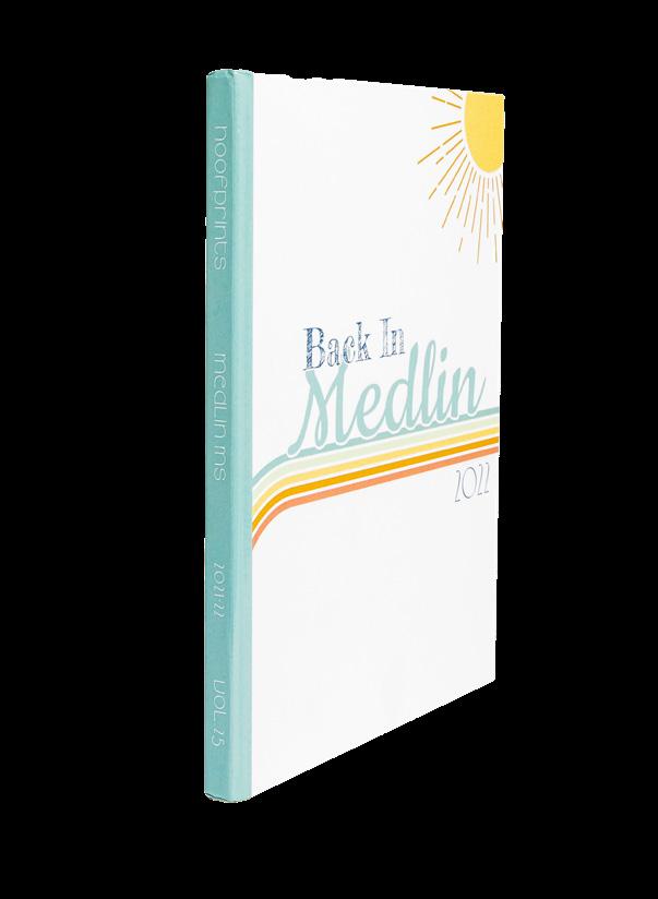
MEDLIN MS Hoofprints | TROPHY CLUB, TX
TROY SOUTH MS MOSCOW MILLS, MO
GEORGE WASHINGTON MS Surveyor | WAYNE, NJ
WASHINGTON MS WASHINGTON, MO
MARTINEZ MS The Mustang | LUTZ, FL MILL CREEK MS Mustang Memories | LENEXA, KS
BRIARCLIFF MS MOUNTAIN LAKES, NJ
AKIMEL A-AL MS The River | PHOENIX, AZ
GLENN H. BARRINGTON MS The Current | LITHIA, FL
NORTH DAVIE MS MOCKSVILLE, NC
COLEMAN MS The Cobra | TAMPA, FL
BURNS MS BRANDON, FL
MEDLIN MS Hoofprints | TROPHY CLUB, TX
TROY SOUTH MS MOSCOW MILLS, MO
GEORGE WASHINGTON MS Surveyor | WAYNE, NJ
WASHINGTON MS WASHINGTON, MO
MARTINEZ MS The Mustang | LUTZ, FL MILL CREEK MS Mustang Memories | LENEXA, KS
BRIARCLIFF MS MOUNTAIN LAKES, NJ
AKIMEL A-AL MS The River | PHOENIX, AZ
GLENN H. BARRINGTON MS The Current | LITHIA, FL
NORTH DAVIE MS MOCKSVILLE, NC
COLEMAN MS The Cobra | TAMPA, FL


MIDDLE SCHOOL | gallery 258 259
SOMERS MS Pathways | SOMERS, NY
FLOWING WELLS JUNIOR HS Mustang | TUCSON, AZ
PLEASANTON MS Panther Tracks | PLEASANTON, CA
SONORAN TRAILS MS PHOENIX, AZ
CLAY MS Reflections | CARMEL, IN
SELKIRK MS LIBERTY LAKE, WA
SOUTH VALLEY JUNIOR HS GILBERT, AZ
BRONXVILLE MS BRONXVILLE, N Y
PARKWAY CENTRAL MS Stampede | CHESTERFIELD, MO
WESTAMPTON MS WESTAMPTON, NJ
MONROE-WOODBURY MS CENTRAL VALLEY, NY
ROCKWOOD VALLEY MS Knightwatch | WILDWOOD MO


 MONTICELLO TRAILS MS SHAWNEE, KS
COOPER MS Pathfinder | M c LEAN VA
NIU VALLEY MS HONOLULU, HI
NEWCASTLE MS Racers | NEWCASTLE, OK
DOVER MS Dovarian Junior | DOVER PLAINS, NY
BENNETT’S MILL MS Hoofprints | FAYETTEVILLE, GA
WENTZVILLE MS Indians | WENTZVILLE, MO
TRUMAN MS Explorer | SAINT LOUIS, MO
WOODRIDGE MS HIGH RIDGE, MO
DUNCAN MS The Flame | DUNCAN, OK
BOYERTOWN MS WEST BOYERTOWN PA
LONG VALLEY MS LONG VALLEY, NJ
MONTICELLO TRAILS MS SHAWNEE, KS
COOPER MS Pathfinder | M c LEAN VA
NIU VALLEY MS HONOLULU, HI
NEWCASTLE MS Racers | NEWCASTLE, OK
DOVER MS Dovarian Junior | DOVER PLAINS, NY
BENNETT’S MILL MS Hoofprints | FAYETTEVILLE, GA
WENTZVILLE MS Indians | WENTZVILLE, MO
TRUMAN MS Explorer | SAINT LOUIS, MO
WOODRIDGE MS HIGH RIDGE, MO
DUNCAN MS The Flame | DUNCAN, OK
BOYERTOWN MS WEST BOYERTOWN PA
LONG VALLEY MS LONG VALLEY, NJ
HIGH CONTRAST: We see what you did here, Tiger’s Roar. Each color from the front lid theme copy is found in the renamed traditional sections. Bonus points for using “sight” keywords in the section titles too.


COLOR SPLASH: Starting off, the pop of orange in the question on the front lid finds its wow moment in the full-bleed endsheet background. Then, we caught the circles on the endsheet playing off the question mark dot. And to wrap it up, the renamed “We’re...” sections answer the question, “What’s Up, OIS?” Love these full-circle moments. WE’RE TOTALLY INSPIRED: This staff was so inspired to convey their theme throughout their book that they came up with corresponding section names, all including [RED]. And, the use of consistent colors, use of brackets and even the height of the black bar are featured on the endsheet. Way to go, Rabun County.

NOT OUT OF THE BLUE: We’re here for the blueprint. The Wib staffers placed their school at the forefront of their design. We love how the table of contents for this traditional (and more!) structure lined up perfectly with the outer edge of the blueprint.


MIDDLE SCHOOL | gallery 260 261
W.R. THOMAS MS | Tiger’s Roar | MIAMI, FL
ORINDA INTERMEDIATE SCHOOL | Scenario | ORINDA CA
RABUN COUNTY MS | Wildcat Den | TIGER, GA
PARKWAY WEST MS | Wib | CHESTERFIELD, MO


 BENNETT’S MILL MS | Hoofprints | FAYETTEVILLE, GA
CRESTVIEW MS | Amphoria | BALLWIN, MO
COOPER MS | Pathfinder | M c LEAN, VA
BARNWELL MS | The Bulldog’s Tale | S AIN T CHARLES, MO
YUKON MS | The New Miller | YUKON, OK
GLENN H. BARRINGTON MS | The Current | LITHIA, FL
PLEASANTON MS | Panther Tracks | PLEASANTON, CA
BURNS MS | BRANDON, FL
BENNETT’S MILL MS | Hoofprints | FAYETTEVILLE, GA
CRESTVIEW MS | Amphoria | BALLWIN, MO
COOPER MS | Pathfinder | M c LEAN, VA
BARNWELL MS | The Bulldog’s Tale | S AIN T CHARLES, MO
YUKON MS | The New Miller | YUKON, OK
GLENN H. BARRINGTON MS | The Current | LITHIA, FL
PLEASANTON MS | Panther Tracks | PLEASANTON, CA
BURNS MS | BRANDON, FL


MIDDLE SCHOOL | gallery 262 263
WOODROW WILSON MS | Bulldog Book | TAMPA, FL
WENTZVILLE MS | Indians | WENTZVILLE, MO
JARRELL MS | Cougar Roar | JARRELL, TX
PLEASANTON MS | Panther Tracks | PLEASANTON, CA
ORINDA INTERMEDIATE SCHOOL | Scenario | ORINDA , CA
RABUN COUNTY MS | Wildcat Den | TIGER, GA
JEFFERSON MS | Unleashed | SAN GABRIEL, CA
LESLIE M. STOVER MS | Prowl | ELGIN, SC


 COOPER MS | Pathfinder | M c LEAN, VA
COUNTRY CLUB MS | The Eye | HIALEAH, FL
BETHANY MS | BETHANY, OK
NIPHER MS | The Knightbook | KIRKWOOD, MO
SIERRA MS | Eagle Eye View | PARKER, CO
LADUE MS | Image | SAINT LOUIS, MO
WOODRIDGE MS | HIGH RIDGE, MO
AKIMEL A-AL MS | The River | PHOENIX, AZ
COOPER MS | Pathfinder | M c LEAN, VA
COUNTRY CLUB MS | The Eye | HIALEAH, FL
BETHANY MS | BETHANY, OK
NIPHER MS | The Knightbook | KIRKWOOD, MO
SIERRA MS | Eagle Eye View | PARKER, CO
LADUE MS | Image | SAINT LOUIS, MO
WOODRIDGE MS | HIGH RIDGE, MO
AKIMEL A-AL MS | The River | PHOENIX, AZ


MIDDLE SCHOOL | gallery
GEORGE WASHINGTON MS | Surveyor | WAYNE, NJ
WENTZVILLE MS | Indians | WENTZVILLE, MO
SELKIRK MS | LIBERTY LAKE, WA
WOODROW WILSON MS | Bulldog Book | TAMPA, FL
CLAY MS | Reflections | CARMEL, IN
SOUTH VALLEY JUNIOR HS | GILBERT, AZ
JEFFERSON MS | Unleashed | SAN GABRIEL, CA
264 265
BARNWELL MS | The Bulldog’s Tale | SAINT CHARLES, MO


 CRESTVIEW MS | Amphoria | BALLWIN, MO
YUKON MS | The New Miller | YUKON, OK
COUNTRY CLUB MS | The Eye | HIALEAH, FL
ORINDA INTERMEDIATE SCHOOL | Scenario | ORINDA, CA
CINNAMINSON MS | CINNAMINSON, NJ
GEORGE WASHINGTON MS | Surveyor | WAYNE, NJ
BRONXVILLE MS | BRONXVILLE, N Y
NORTH KIRKWOOD MS | KIRKWOOD, MO
CRESTVIEW MS | Amphoria | BALLWIN, MO
YUKON MS | The New Miller | YUKON, OK
COUNTRY CLUB MS | The Eye | HIALEAH, FL
ORINDA INTERMEDIATE SCHOOL | Scenario | ORINDA, CA
CINNAMINSON MS | CINNAMINSON, NJ
GEORGE WASHINGTON MS | Surveyor | WAYNE, NJ
BRONXVILLE MS | BRONXVILLE, N Y
NORTH KIRKWOOD MS | KIRKWOOD, MO


MIDDLE SCHOOL | gallery
LLT ACADEMY SOUTH BAY | RUSKIN, FL
TRUMAN MS | Explorer | SAINT LOUIS, MO
BETHANY MS | BETHANY, OK
DOUBLE PEAK K-8 SCHOOL | SAN MARCOS, CA
HUNTINGTON MS | El Cazador | SAN MARINO, CA
TUTTLE MS | Lil Tiger | TUTTLE, OK
CLAY MS | Reflections | CARMEL, IN
266 267
MONTICELLO TRAILS MS | SHAWNEE, KS


 AKIMEL A-AL MS | The River | PHOENIX, AZ
CRESTVIEW MS | Amphoria | BALLWIN, MO
MIDDLESEX MS | Tidings | DARIEN, CT
CLAY MS | Reflections | CARMEL, IN
CRESTVIEW MS | Amphoria | BALLWIN, MO
NIPHER MS | The Knightbook | KIRKWOOD, MO
WOODROW WILSON MS | Bulldog Book | TAMPA, FL
SOUTH VALLEY JUNIOR HS | GILBERT, AZ
AKIMEL A-AL MS | The River | PHOENIX, AZ
CRESTVIEW MS | Amphoria | BALLWIN, MO
MIDDLESEX MS | Tidings | DARIEN, CT
CLAY MS | Reflections | CARMEL, IN
CRESTVIEW MS | Amphoria | BALLWIN, MO
NIPHER MS | The Knightbook | KIRKWOOD, MO
WOODROW WILSON MS | Bulldog Book | TAMPA, FL
SOUTH VALLEY JUNIOR HS | GILBERT, AZ


MIDDLE SCHOOL | gallery
WOODRIDGE MS | HIGH RIDGE, MO
CLAY MS | Reflections | CARMEL, IN
BARNWELL MS | The Bulldog’s Tale | SAINT CHARLES, MO
JARRELL MS | Cougar Roar | JARRELL, TX
JEFFERSON MS | Unleashed | SAN GABRIEL, CA
BURNS MS | BRANDON, FL
BRONXVILLE MS | BRONXVILLE, N Y
268 269
ORINDA INTERMEDIATE SCHOOL | Scenario | ORINDA, CA
