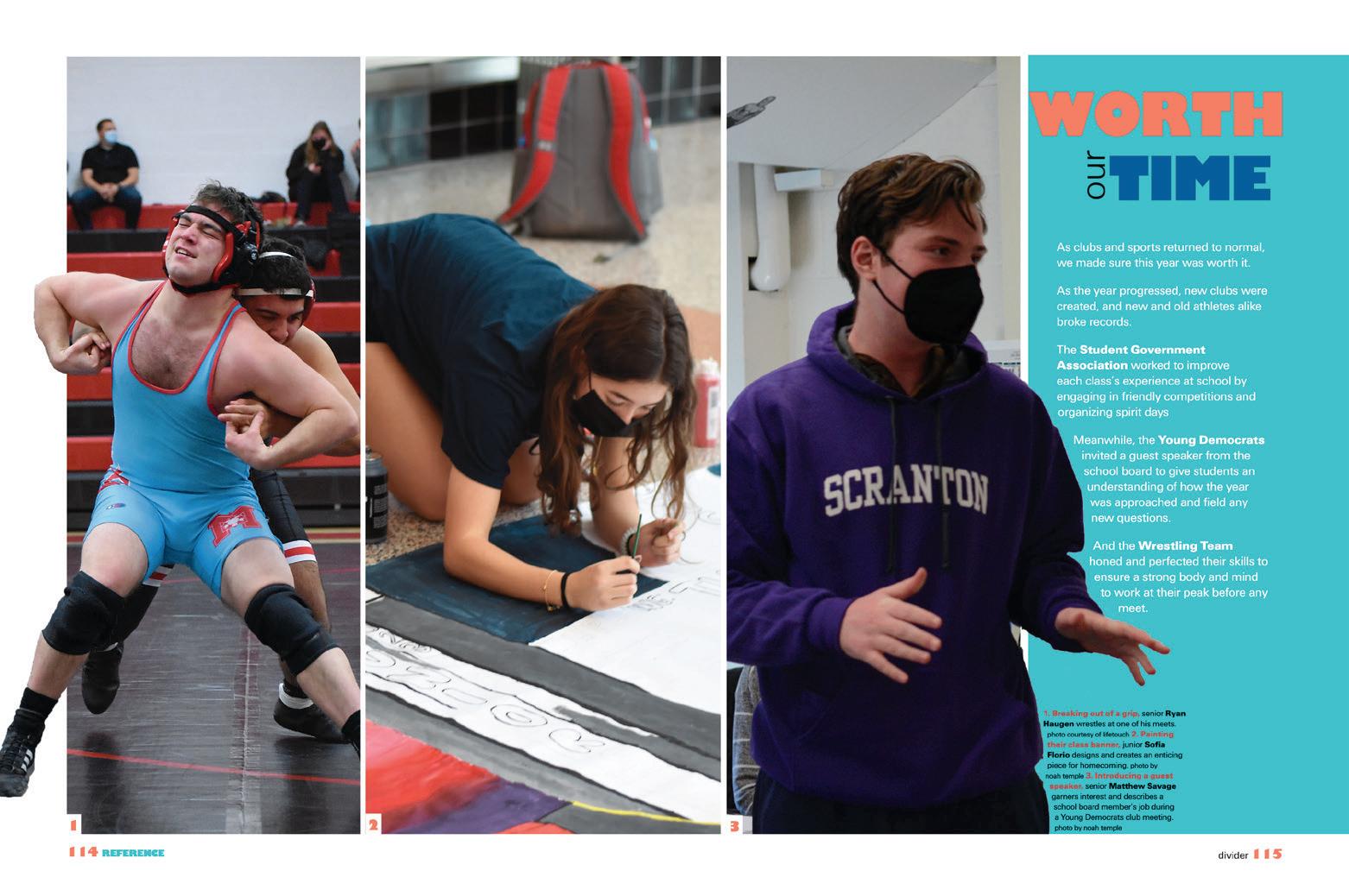
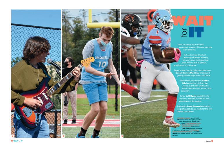
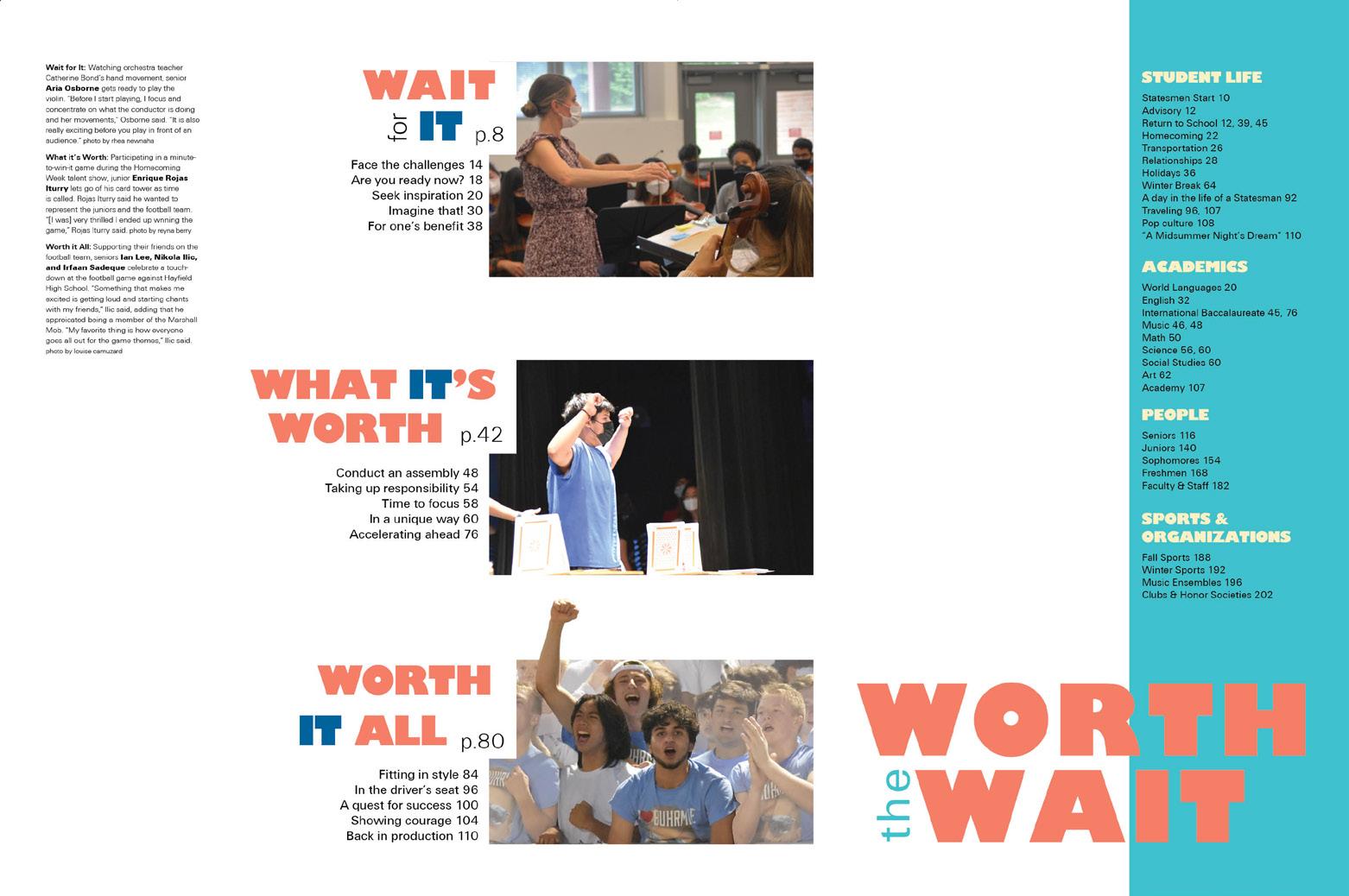
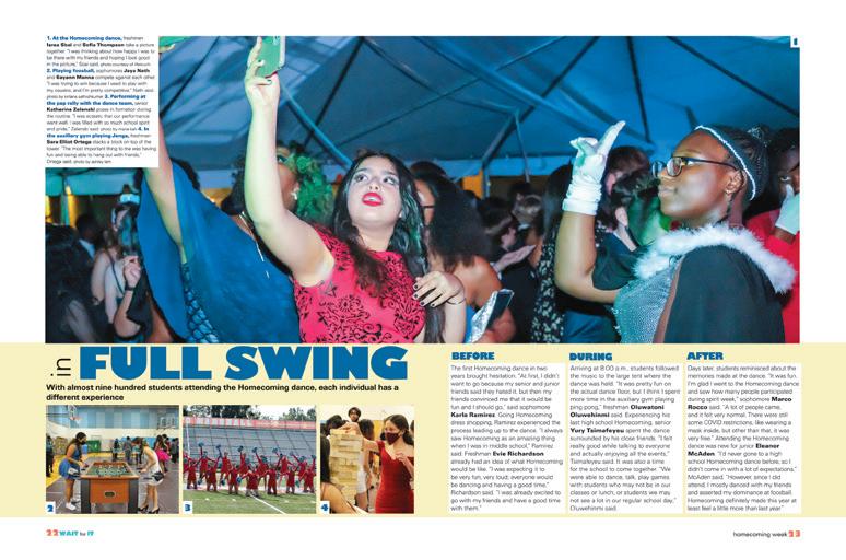
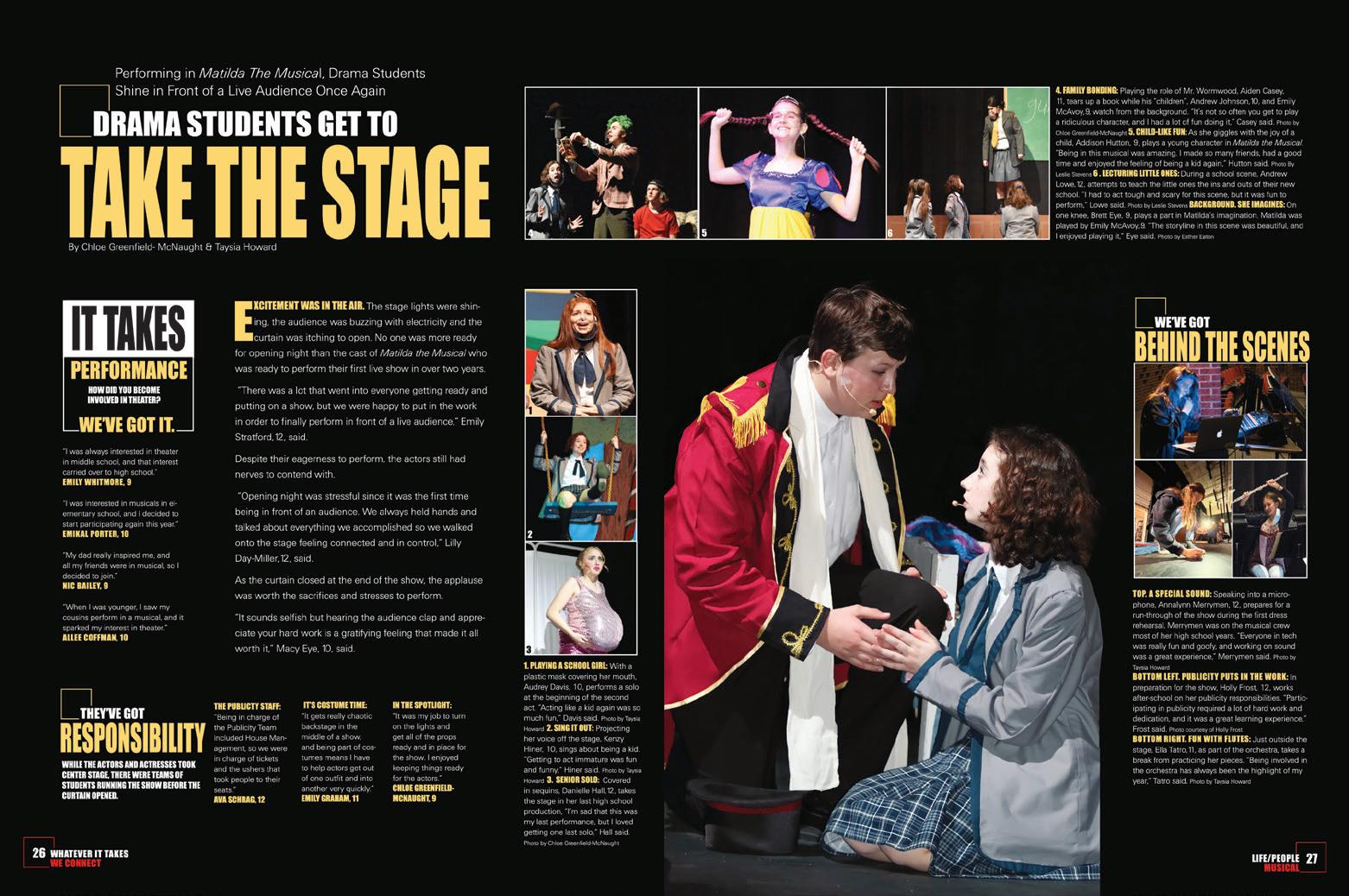
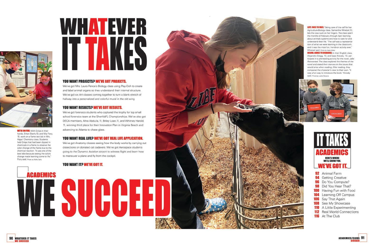
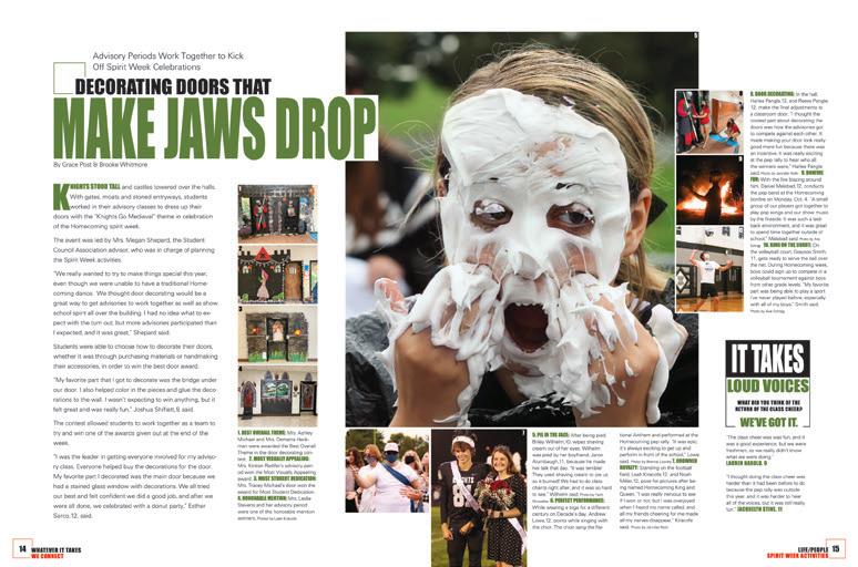
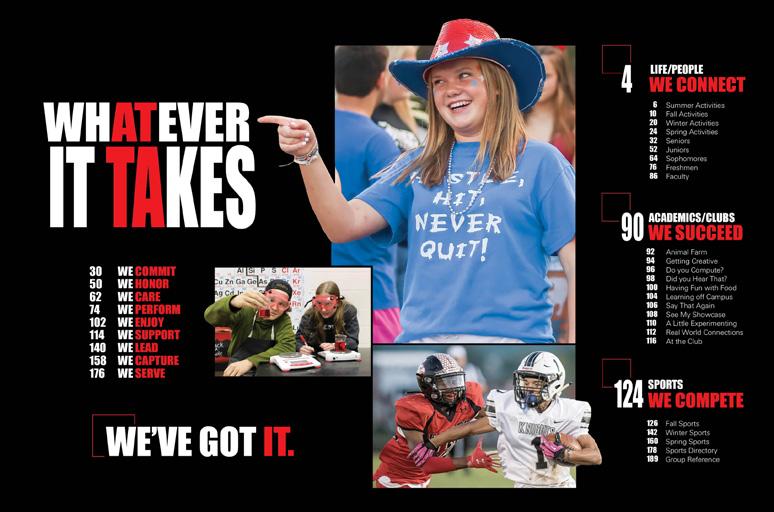
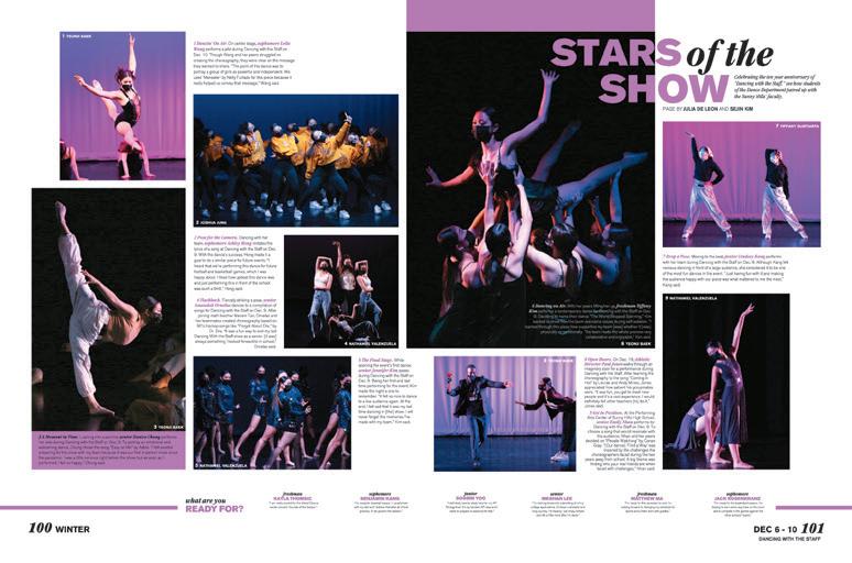
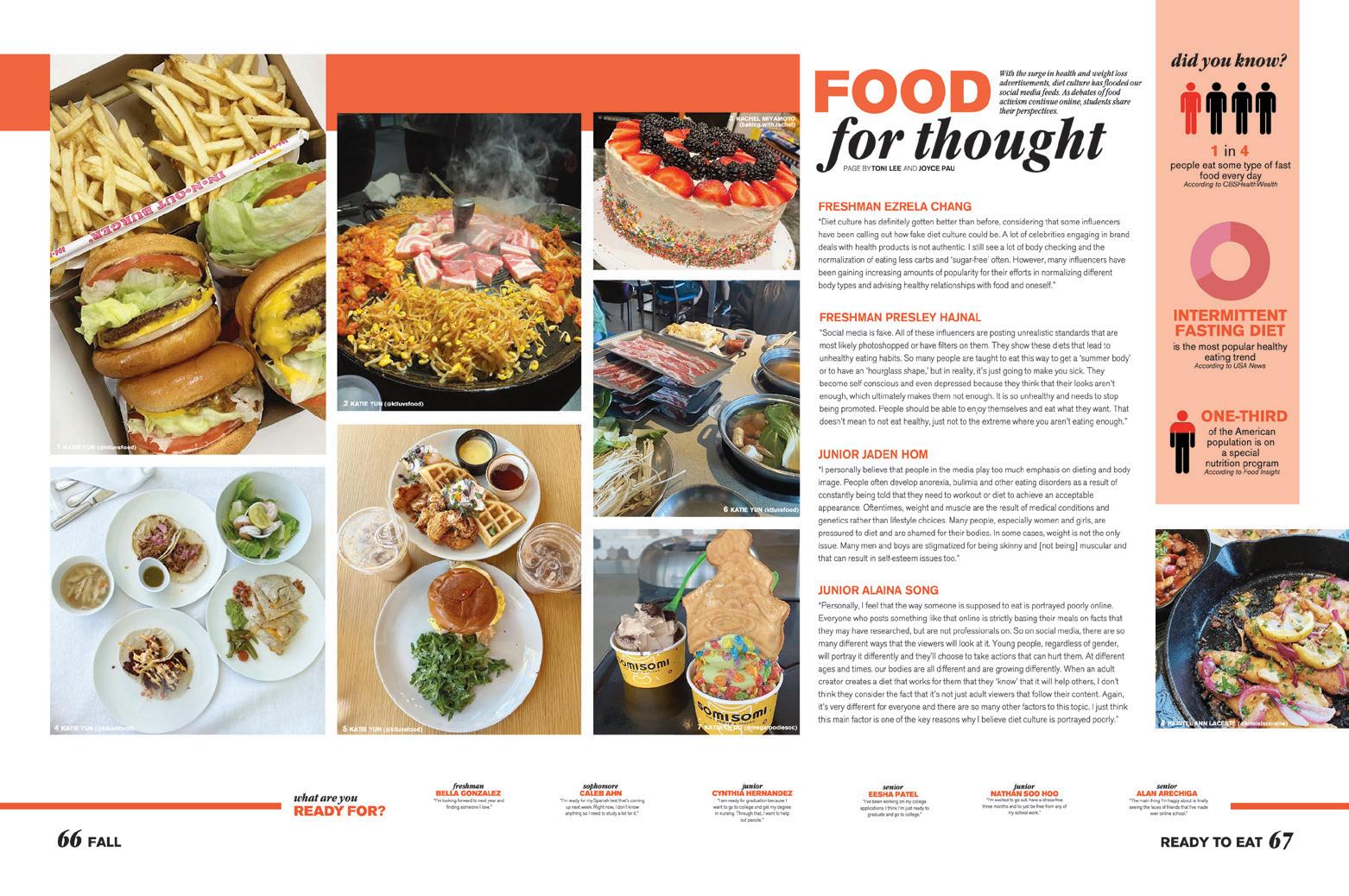
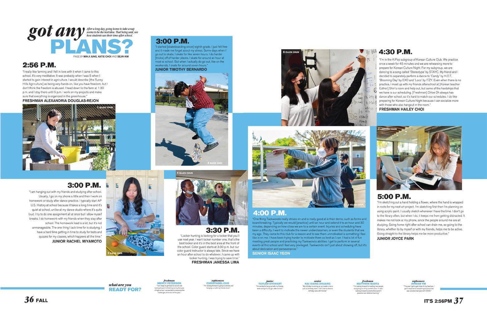
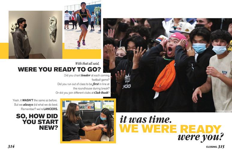
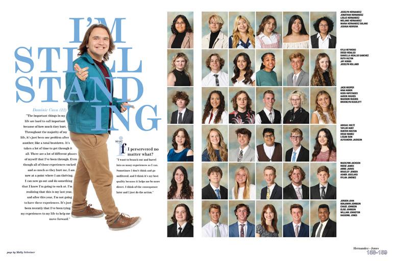
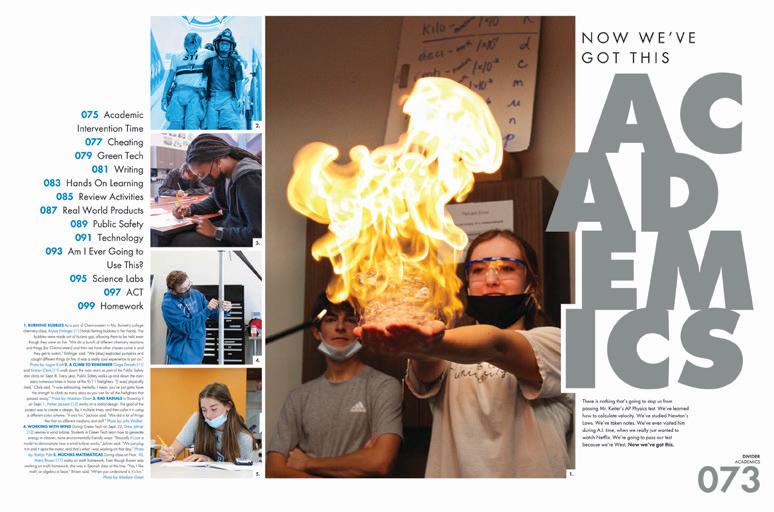
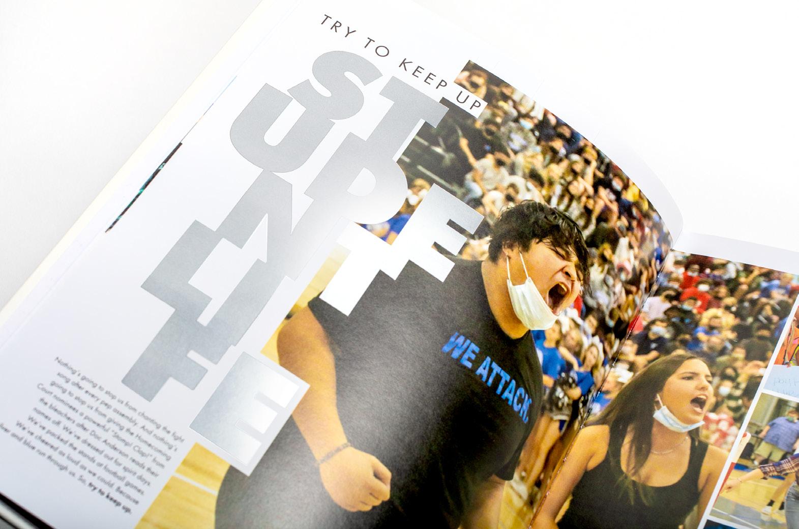
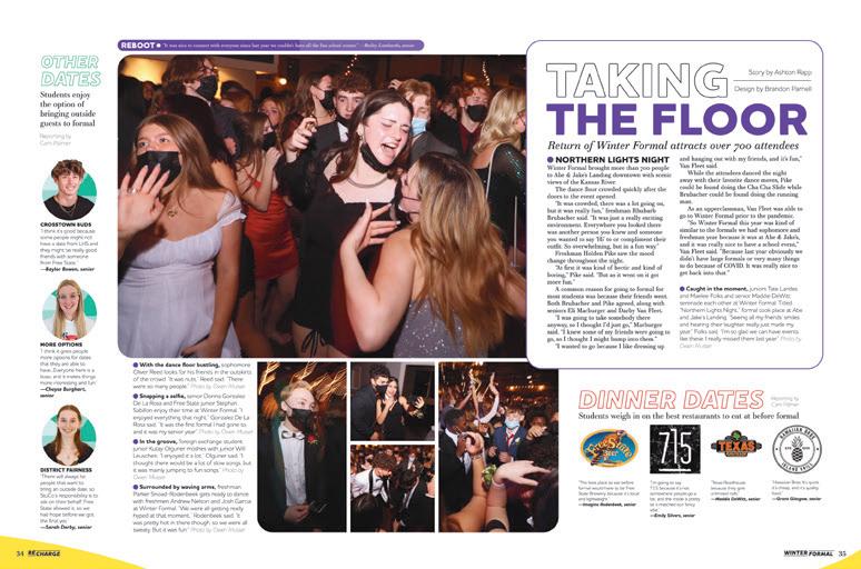
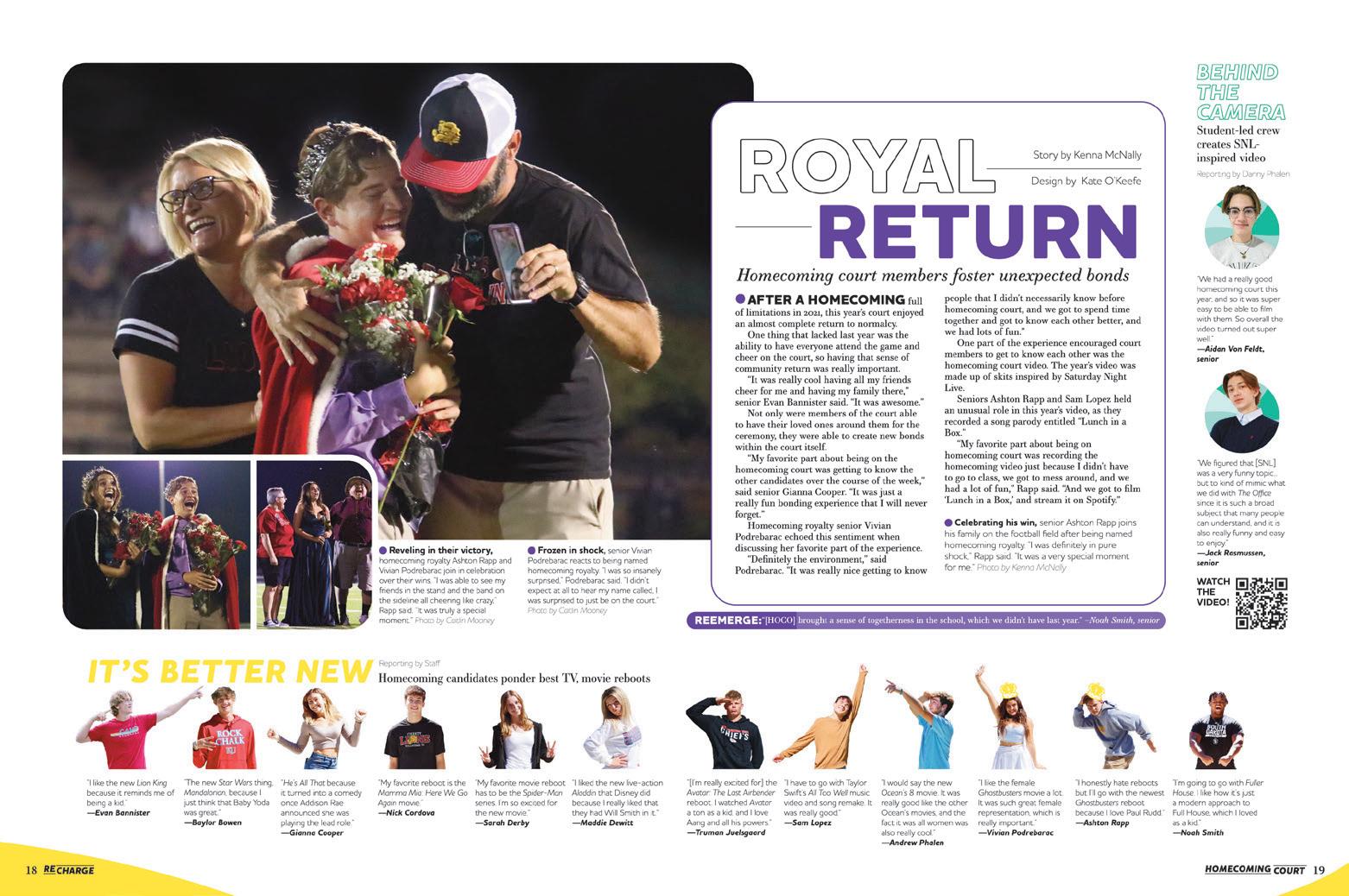
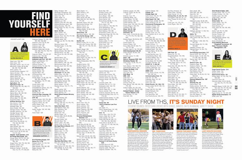
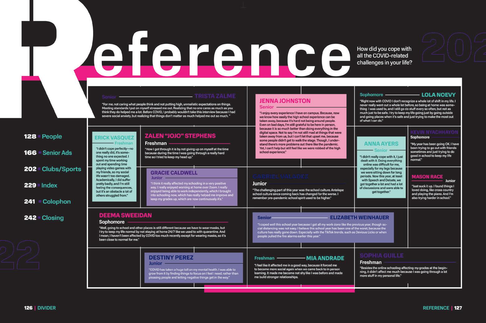
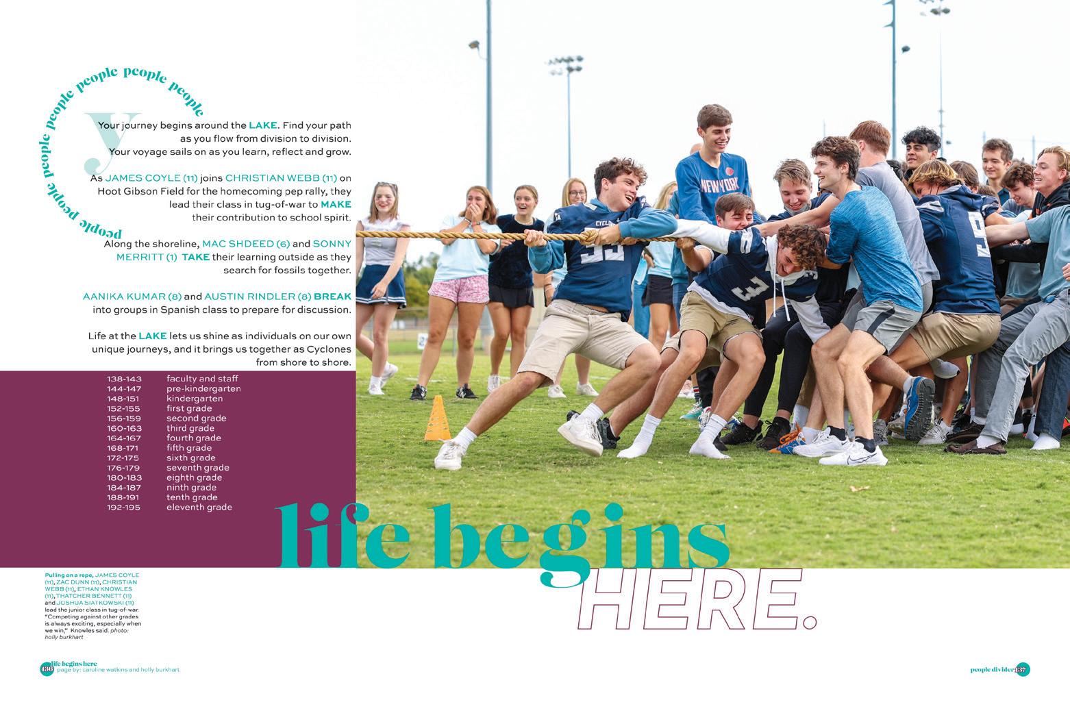
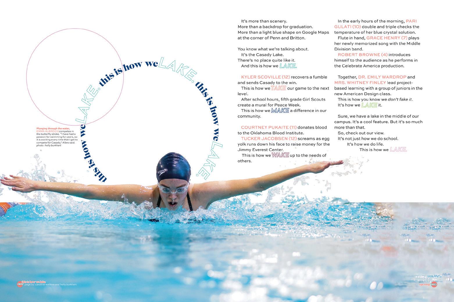
ANTHOLOGY: TOP ONE PERCENT
HIGH SCHOOL 010 UNIVERSITIES 114 MIDDLE SCHOOL 226
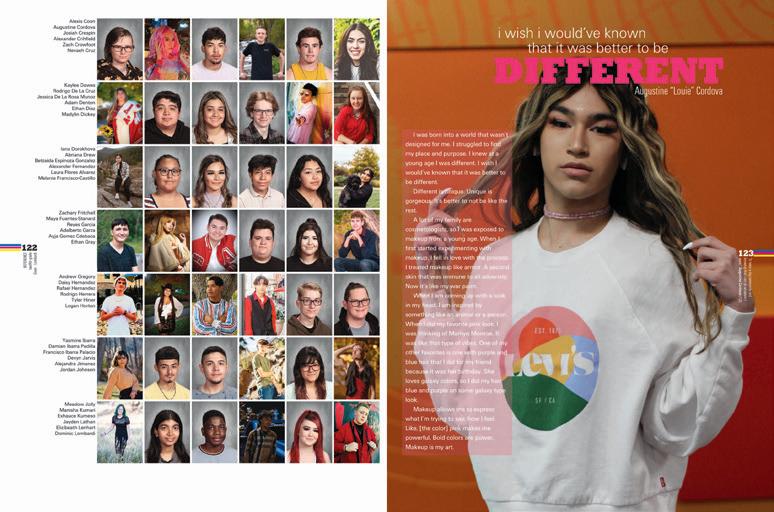
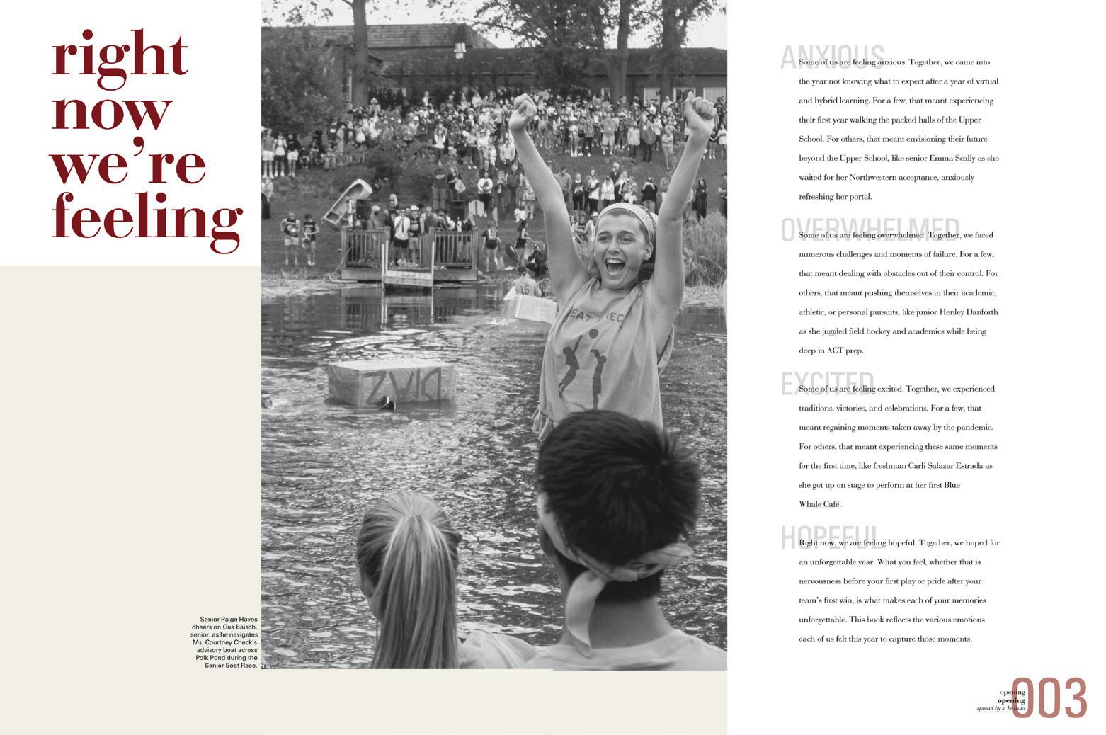
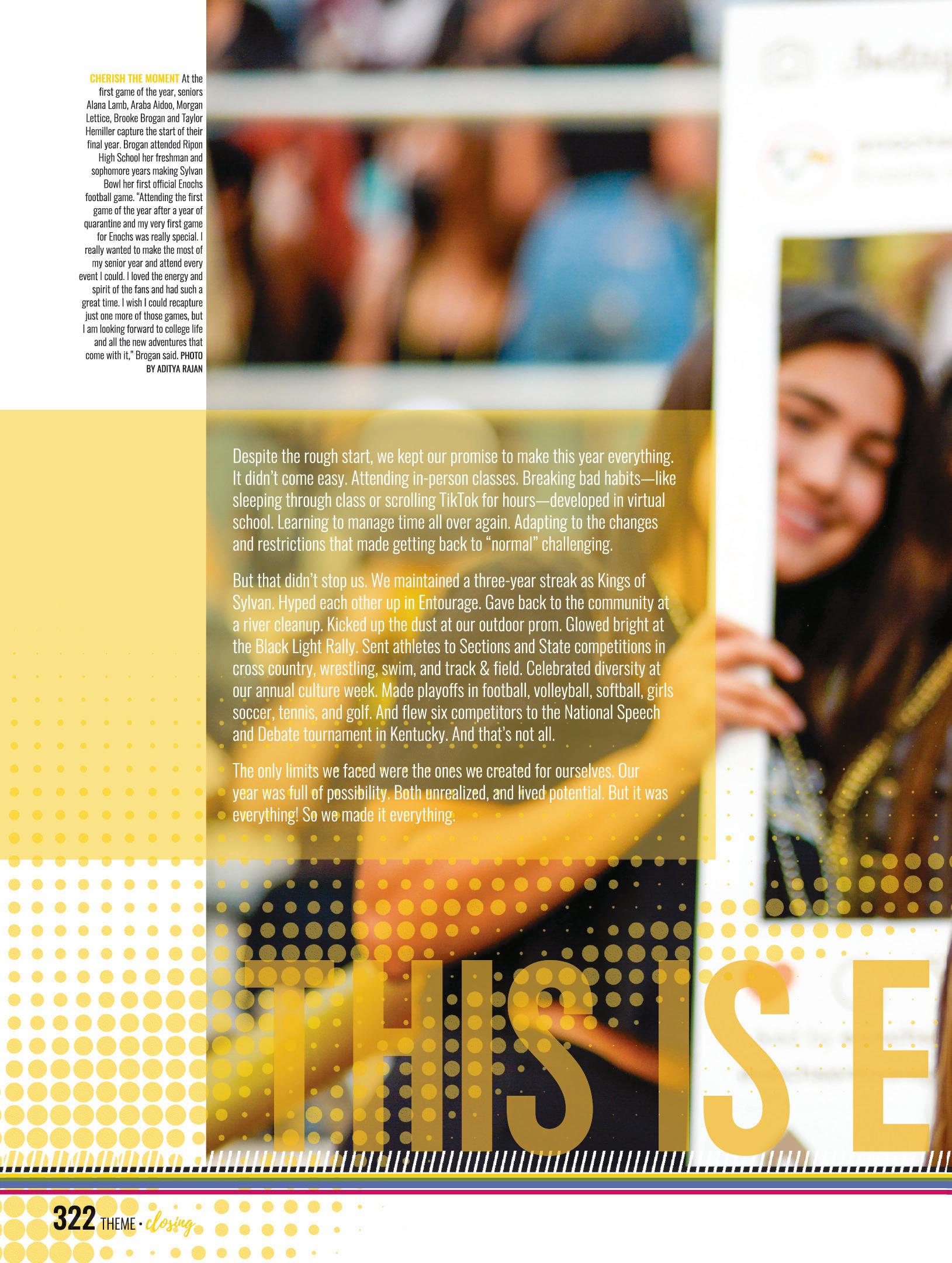
IT’S OKAY TO STARE.
Here are the yearbooks that checked the boxes and didn’t stop there.
We see the intention, the detail and the meaning behind every decision. The theme? We understand it. The design? We’re here for it. The copy? We vibed with it.
These yearbooks will launch ideas and offer inspiration.
Absorb what’s best for you and save the rest for another time. This inspo isn’t going anywhere.
P28 divider 008 009
COVERAGE
OPENING
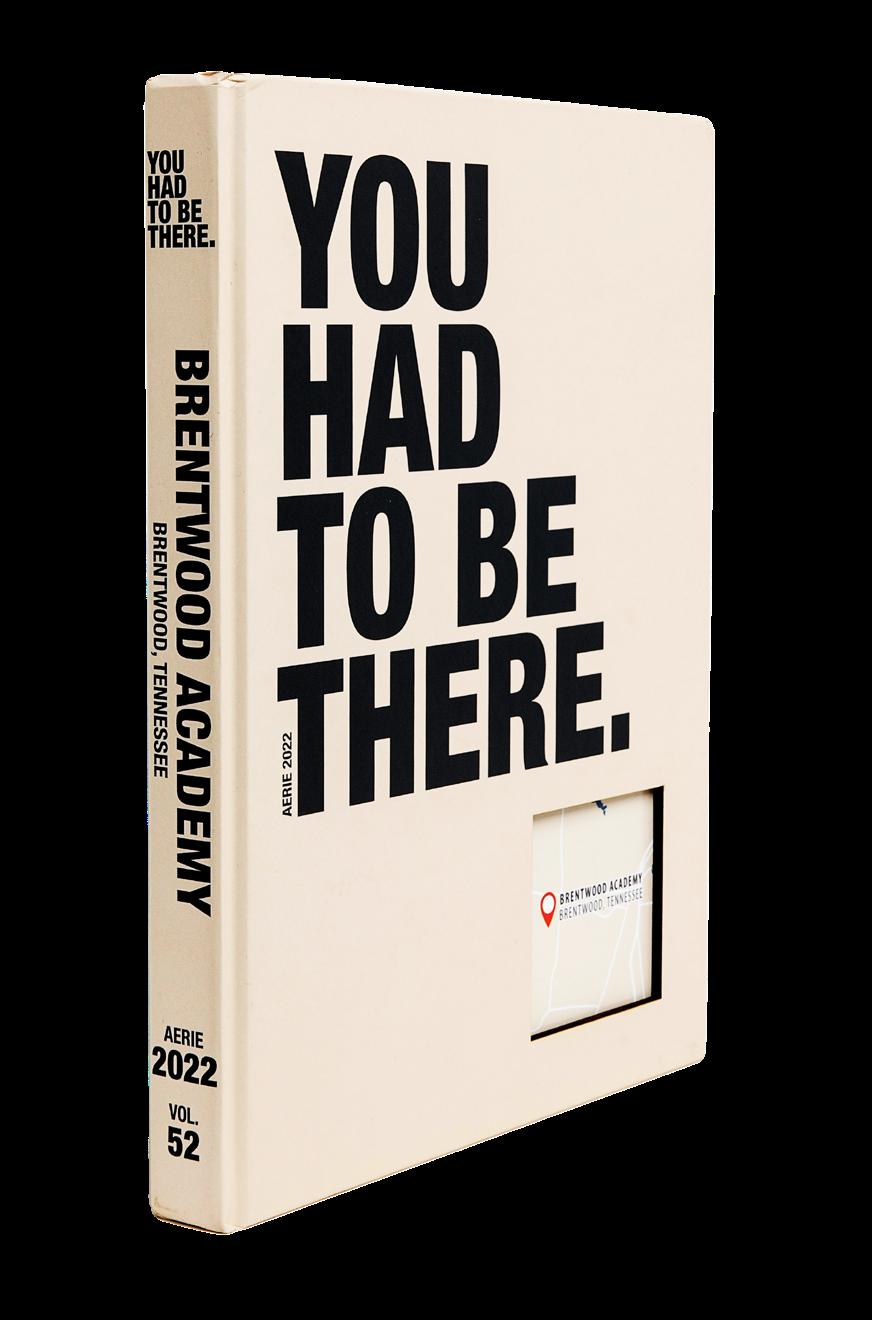
Brentwood Academy
BRENTWOOD, TN
Adviser: Anna Kathryn Berkompas
Editors: Julianne Ross, Kate Williams, Annabelle Ashburn and Elizabeth Powell
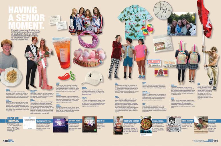
HJ Rep: Mary Harris
FEATURE
REFERENCE
FEATURE
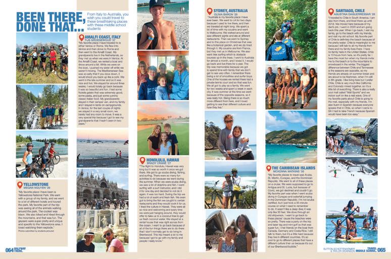
AERIE
Stand-out features:
THEY’RE ALL IN:
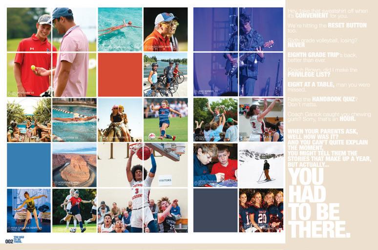
We can just tell. This was a “go big or go home” kind of yearbook. Our first hint was the ginormous type on the cover — and the clever laser-cut peekaboo to the map on the endsheet. But it keeps going. There are five theme-o-riffic chrono coverage divisions:
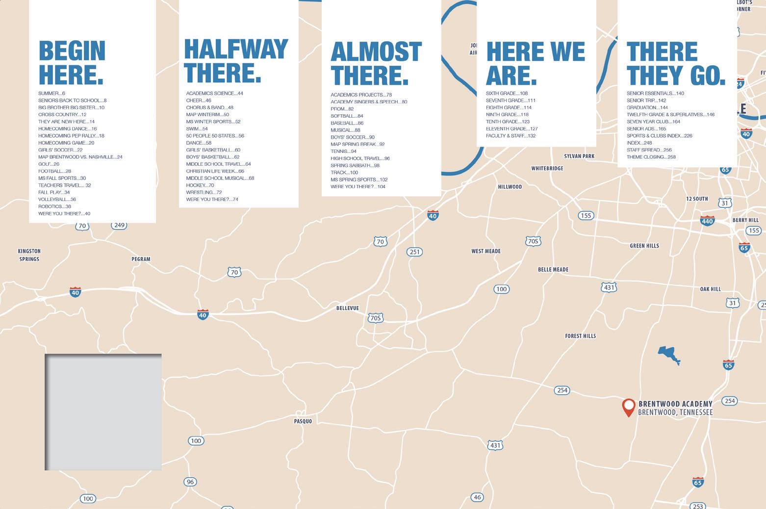
“Begin Here.” “Halfway There.” “Almost There.” “Here We Are.” “There We Go.” Plus, stories focus on where the new kids came from and where students took vacations, while monthly recaps appear under the heading “Were you there?” The staff worked the concept of time/ place/involvement into every nook and cranny of this impressive book.
HIERARCHY HIGH-FIVE: Conquering one of the most difficult skills for young designers, this staff was consistently spot-on with how photos and copy elements are sized in relation to each other. The copy is readable, and the photo sizes are varied and follow a clear hierarchy — except when they are not meant to, such as on the theme and feature spreads.
CROWD APPEAL:
This theme lends itself to coverage that unites groups of students through shared experiences. So, whether it’s a fun spread about essential elements of the senior year or one of the many stories about travel, there’s a lot of fun to be had. Visually interesting at every turn, this book has a lot of personality.
010 011 ANTHOLOGY | Brentwood Academy
DIVIDER COVERAGE FEATURE
ENDSHEET
Arvada HS ARVADA , CO
ARVADAN
Adviser: Sergio Luis Yanes
Editors: Sydney Huyser, Barnaby Atwood and Elisha Allen
HJ Rep: Genise Cushman

Stand-out features:
WHO’S GOT AN ATTITUDE?: With a theme like, “You Can Ask, We’ll Do Whatever It Takes,” your tone has to be a little pushy. Throughout the book, mods, captions and folios ask and answer the question: “What does it take?” Having such a multi-purpose theme generates plenty of spinoffs in headlines and mods, which advances the theme throughout the book.
POWER TO THE PEOPLE: Arvada is a school that cares about people and the unique characteristics of each member of its community, and the yearbook reflects that. This volume includes full-page senior profiles in the portraits section, interrupter spreads in the editorial section and talking head mods — all to tell as many unique stories as possible. Bravo!
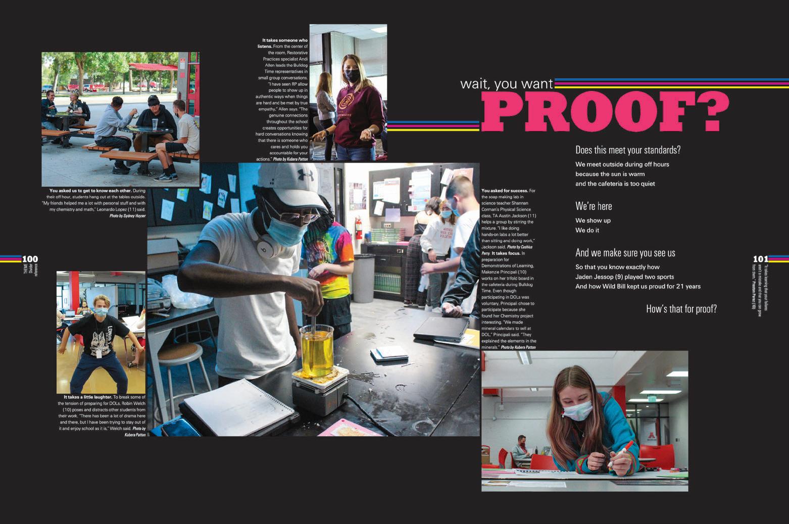
CHRONO COMBO:
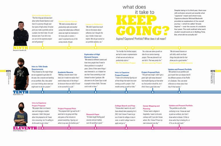
The Arvadan is organized into two main sections: chronological and reference. The table of contents also provides a secondary structure of features: the “What does it take to…” spreads, which are sprinkled throughout the chrono section. These features focus on broader topics than what you’d find in typical chrono coverage, which can be more event-based rather than topic-based. For example, “What does it take to keep going?” focuses on the academic timelines for three students at different grade levels as they progress through the school’s capstone program.
ANTHOLOGY | Arvada High School 012 013
FEATURE CLOSING FEATURE ENDSHEET
COVERAGE
DIVIDER
PORTRAITS
ASH-À-WÜT
Adviser: Philip Zamora
Editor: Elizabeth Chou
HJ Rep: Mimi Orth
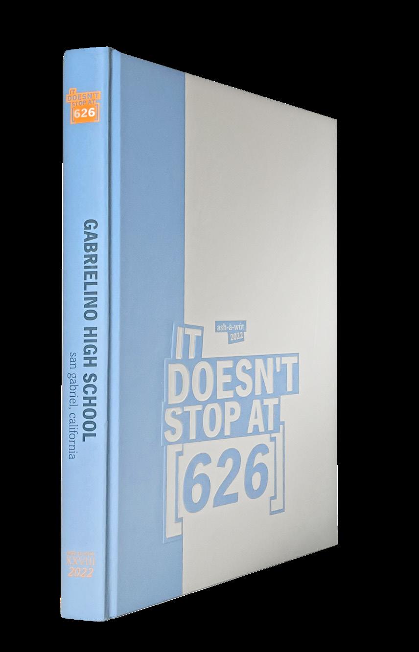 Gabrielino HS SAN GABRIEL, CA
OPENING FEATURE COVERAGE
Stand-out features:
FIND YOUR COOLNESS: The cover graphic — block letters in overlapping boxes and brackets — finds its way right into the book. Dominant type packages get the overlapping treatment, and the brackets become half-boxes for mods, lines and color bars. The screened-back colors create a vibe for each spread. The overlap idea also finds its way to photos that show up on dividers and the text boxes overlapping photos on editorial spreads.
ALT COVERAGE: People’s quotes and opinions can be represented without a head-and-shoulders photo. The Ash-à-Wüt staff chose full-spread photos of “stuff” and quotes to describe why students find their stuff important. Topics include a thrift shopping haul, sports gear and tech/gadgets.
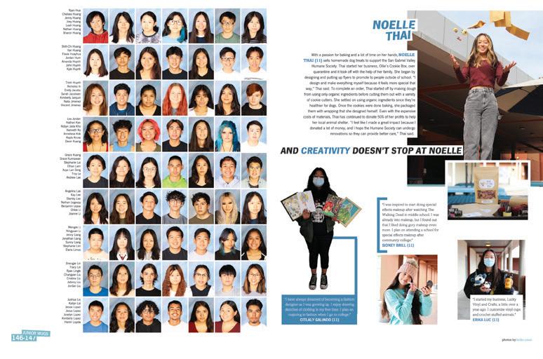
DON’T STOP: Profiles in the people section are pretty standard but this staff took it a bit further by choosing a primary student to present an idea and then selecting other students to provide different takes on the same idea. So, we get to read about Noelle Thai and her love of baking, but learn that “creativity doesn’t stop at Noelle.” Then, we get to read about Citlaly’s love for fashion design, Sidney’s attraction to special-effects makeup and Erika’s business making custom vinyl cups.
ANTHOLOGY | Gabrielino High School 014 015
FEATURE PORTRAITS
COVERAGE DIVIDER
Arapahoe HS
CENTENNIAL, CO
CALUMET
Adviser: Greg Anderson
Editors: Amelie Daberkow and Aaron Zancosky
HJ Rep: Rebecca McGrath
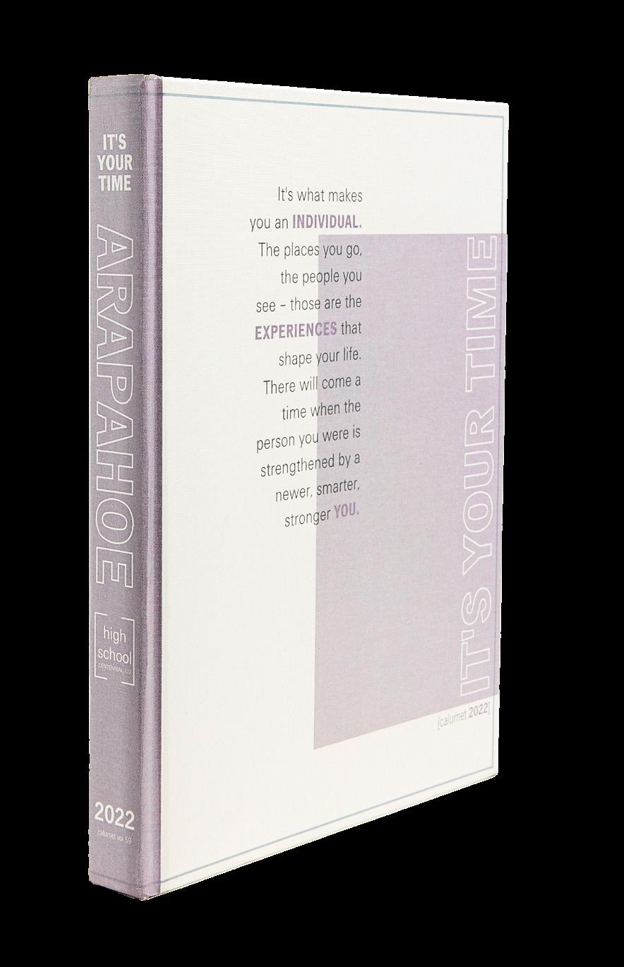
OPENING PROFILE
Stand-out features:
THE PEP TALK: Starting with the stellar opening, this volume of Calumet speaks directly to the studentreaders in a conversational and personal way. Many staffs attempt this approach; this one succeeded. Spread after spread, they pull the reader in with headlines, subheads, coverage and mod choices that use “you” and “your” to involve the reader in the story.
DEEP DIVES: The Calumet writers put some serious work into presenting indepth stories on interesting and influential members of their school community. Nearly 20 full-spread profiles focusing on students and faculty members are placed as interrupters in the portraits section. Featuring these individuals fully supports the theme, “It’s Your Time,” and the layouts, which include more than a dozen theme spin-off phrases projected on the subject of the interview, make sure you don’t forget which book you’re reading.
THE LONG AND SHORT OF IT: This staff did a great job of mixing long-form copy with digest spreads that present bite-sized information. This approach matches our attention spans and reading styles, making this book fun to read and peruse for years to come.

ANTHOLOGY | Arapahoe High School 016 017
COVERAGE REFERENCE
FEATURE
INNOVATION: SPLIT-ORDER ENDSHEETS
Walnut HS WALNUT, CA
CAYUSE
Adviser: So Hee Tan
Editors: Jennifer Chang, Kristin Lam, Kevin Lu, Shani Su, Kelvin Wong and Amber Zhao
HJ Rep: Mimi Orth
ENDSHEET OPENING COVERAGE COVERAGE
Stand-out features:
LET’S BE HONEST:
This book speaks some #truth as Cayuse takes thematic copy to the next level. Not only does it explain why students at Walnut are some of the best, it offers a realistic viewpoint as well. They set their goals high, but they recognize their faults. How often do you see a school highlighting their wins and calling out the missed shots?
COLOR CONSISTENCY:
The design showcases the power of pink. Yes, pink — a surprising color that plays well with others. You’ll find each spread with its trademark pop and a secondary throughout. There’s no question that the designers understood how one color can dominate but provide surprising contrasts. Plus, a singular duotone image on each spread ties everything together with a bow — figuratively, of course.
POWER OF VARIETY:
Where color is consistent, you’ll find design to introduce variety. The oversized sans serif type goes well with its serif lead-ins. A classy, yet bold approach. Spreads follow a clear hierarchy, while also showing new ways to pack in student coverage. The Cayuse staff had their readers in mind as they offered new approaches to modular content.
ANTHOLOGY | Walnut High School 018 019
FEATURE CLOSING COVERAGE DIVIDER
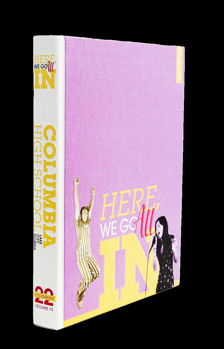
Columbia H S LAKE CITY, FL
COLUMBIAN
Adviser: Michael Malcom-Bjorklund
Editor: Kelsey Sherman
HJ Reps: Michelle Frakes and Katy Hoffstatter
COVERAGE
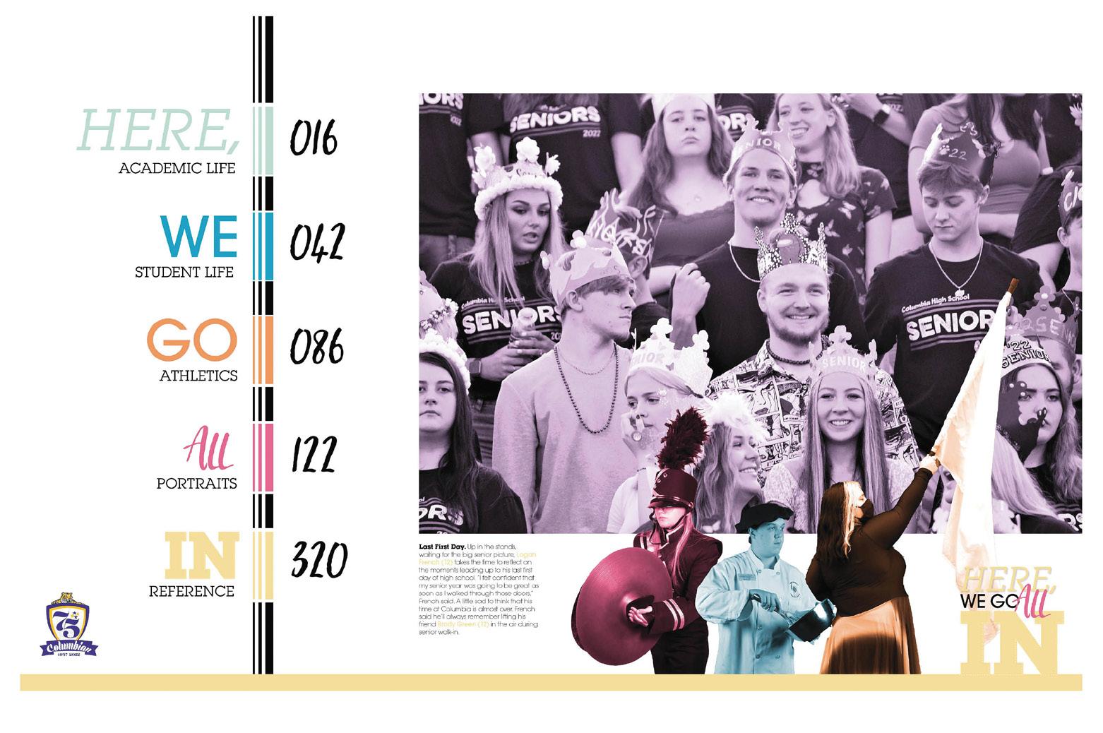
ENDSHEET
FEATURE CLOSING
Stand-out features:
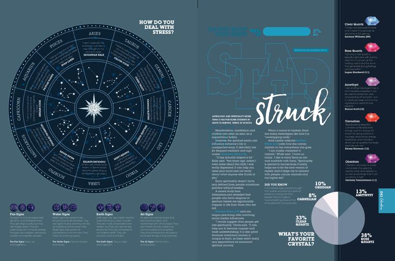
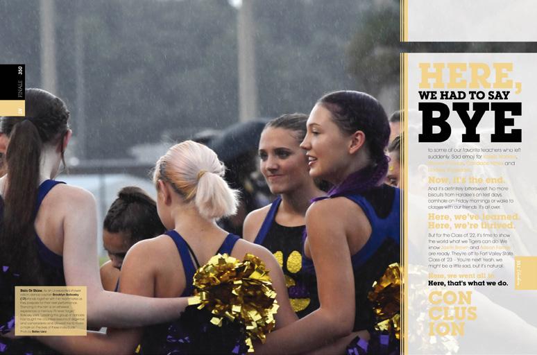
A FEAST FOR THE EYES: This book is loaded with variety. Good luck finding two spreads that look exactly alike. The five sections coordinate with each word of the theme statement acting as standins for traditional section labels, and color-coding for each section helps hold it all together — plus, each has a different dominant font. There is no boring in this year’s book.
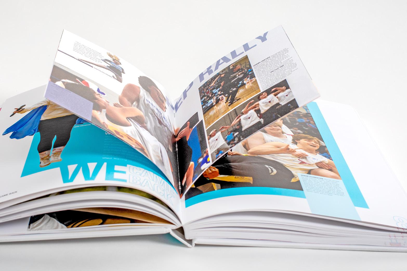
A LITTLE MORE FUN: Dividers include a gatefold tip-in to form the right-hand page. Each is packed with photos, stories, stats and a mini table of contents for the section. The extra paper makes the section division easier to locate in this hefty volume. It’s expert-level reader service.


COVERAGE GALORE: Sure, there are stories about the typical things — sports, events, classes and interesting students — but there are also stories about astrology and spirituality, caffeine addiction and hair dye, climate change and the school’s janitorial crew. It will hold up in years to come as a timestamp of the media program’s 75th year.
ANTHOLOGY | Columbia High School 020 021
INNOVATION: GATEFOLD DIVIDER COVERAGE PORTRAITS FEATURE OPENING REFERENCE
INNOVATION: GATEFOLD DIVIDERS
COLUMBIAN
Adviser: Daniel Reinish
Editors: Ashley Lam, Torrie McNabb and Aarya Gokhale
HJ Rep: Pam Tripp
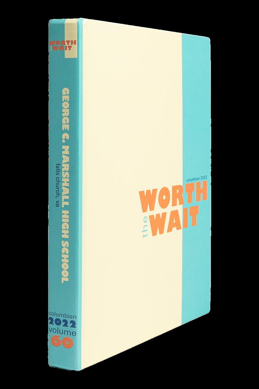
 George C. Marshall H S FALLS CHURCH, VA
ENDSHEET
DIVIDER DIVIDER COVERAGE
Stand-out features:
DESIGNS THAT SHINE: The Columbian staff did a great job following design principles — making sure spreads have an eyeline, being consistent without becoming super repetitive, leaving adequate white space around mods and grouping like items together into dominant packages. All that and a bag of chips.
EXTRA SHOTS: There’s a bonus tidbit of coverage on nearly every spread. A student quote is featured with a simple waist-up, cutout. This allows the staff to add about 100 additional students to their coverage tally.
WHAT THE WHERE?: Going with umbrella coverage can be a bit risky. A lot of times, students just want to find themselves in the book and don’t take the time to understand the concept of non-traditional organization. In this case, the staff was careful to include not just a mini table of contents for the three umbrella sections, which are spinoffs of the theme, but they also included a traditional contents listing on the endsheet. It’s always good when you can find yourself.
022 023 ANTHOLOGY | George C. Marshall H igh S chool
COVERAGE COVERAGE CLOSING FEATURE
COVERAGE
OPENING
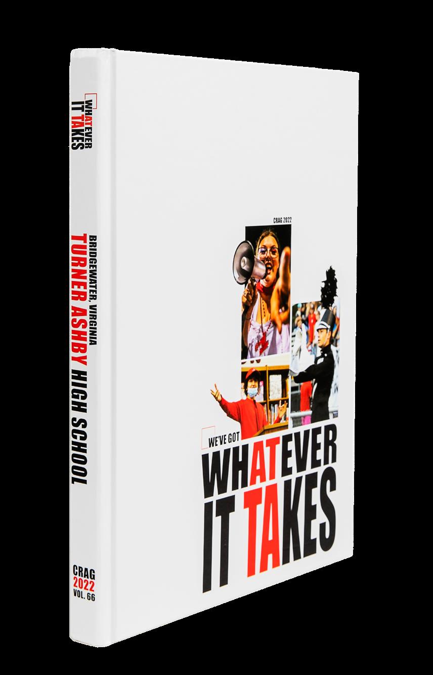
CRAG
Adviser: Leslie Stevens
Editors: Jennfier Roth, Hannah Baugher and Ava Schrag
HJ Rep: Kara Petersen
COVERAGE
INDEX
PORTRAITS
Turner Ashby HS BRIDGEWATER, VA
Stand-out features:
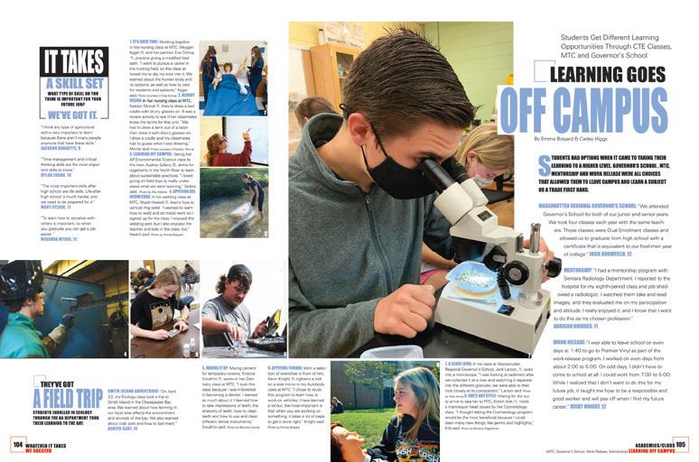
THEME THROUGHOUT:
“Whatever It Takes” is a theme that supports the idea that this school is up for a challenge. The Crag staff took it and ran with it. The theme lends itself to an all-coverage device to share what Turner Ashby students can take. You’ll even find small connections that use the dominant headline to continue the theme beyond the obvious places. Here’s to a job well-done.
SO MUCH COVERAGE: If you’re looking for a book that checks the box for “packed full of coverage,” it’s this one. The Crag staff succeeded with the mantra “no wideopen space left behind.”
Printing on the D-side of the endsheet provided room for info-packed captions for featured cover, endsheet and title page photography. Their dividers not only provide the perfect mini table of contents — which we love to see — but they also introduce the excitement of the section to come.
PICTURE VARIETY:
We give this volume an A+ for understanding that photo size does matter. Mixing large, dominant images with small, yet still interesting images on a spread can be tough, but the partial cutouts and layering support the visuals throughout.
In the portrait section coverage, copy overlaps large photos for yet another demonstration of how photos can work in a layout.
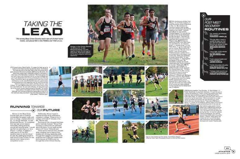
ANTHOLOGY | Turner Ashby High School 024 025
COVERAGE
DIVIDER
COVERAGE
ENDSHEET
FELIDAE
Adviser: Kristen Case
Editors: Zoe Craig, Devin Prieto and Samantha Chambers
HJ Rep: Morgan Miltner
OPENING ENDSHEET PROFILE
Wharton H S TAMPA, FLORIDA
Stand-out features:
SHINE ON: It’s no surprise that the Felidae staff took every chance to tell us that their students shine. With a theme of “Illuminate,” you can feel the celebration of their school as a light in the darkness. Dominant copy and headlines — along with the sprinkling of mods — incorporate a callout to the brightness and brilliance at Wharton.
COVERAGE MEANS MORE: The portraits section offers coverage to support their idea that everyone is more than meets the eye. “The Light Within” mod challenges their students to share something another student would have never known. Life lessons, definitions of success and favorite memories give stories to enlighten the readers. See what they did there?
RAZZLE DAZZLE:
If there’s ever a time to play into the idea of reflection, the rainbow gilded edges were totally the way to go. (See how it shines in the Innovation section starting on page 270.) Plus, HJ7SF Ombre foil on the front lid is a textbook example of visual and verbal. Throughout the pages, the font AHJ Cycle offers a new take on a thin but fun sans serif while AHJ Craft Gothic is its trusty best friend.
COVERAGE PORTRAITS 026 027 ANTHOLOGY | Wharton High School
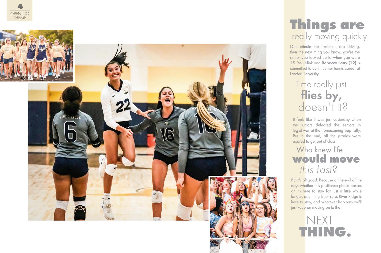
River Ridge HS WOODSTOCK, GA
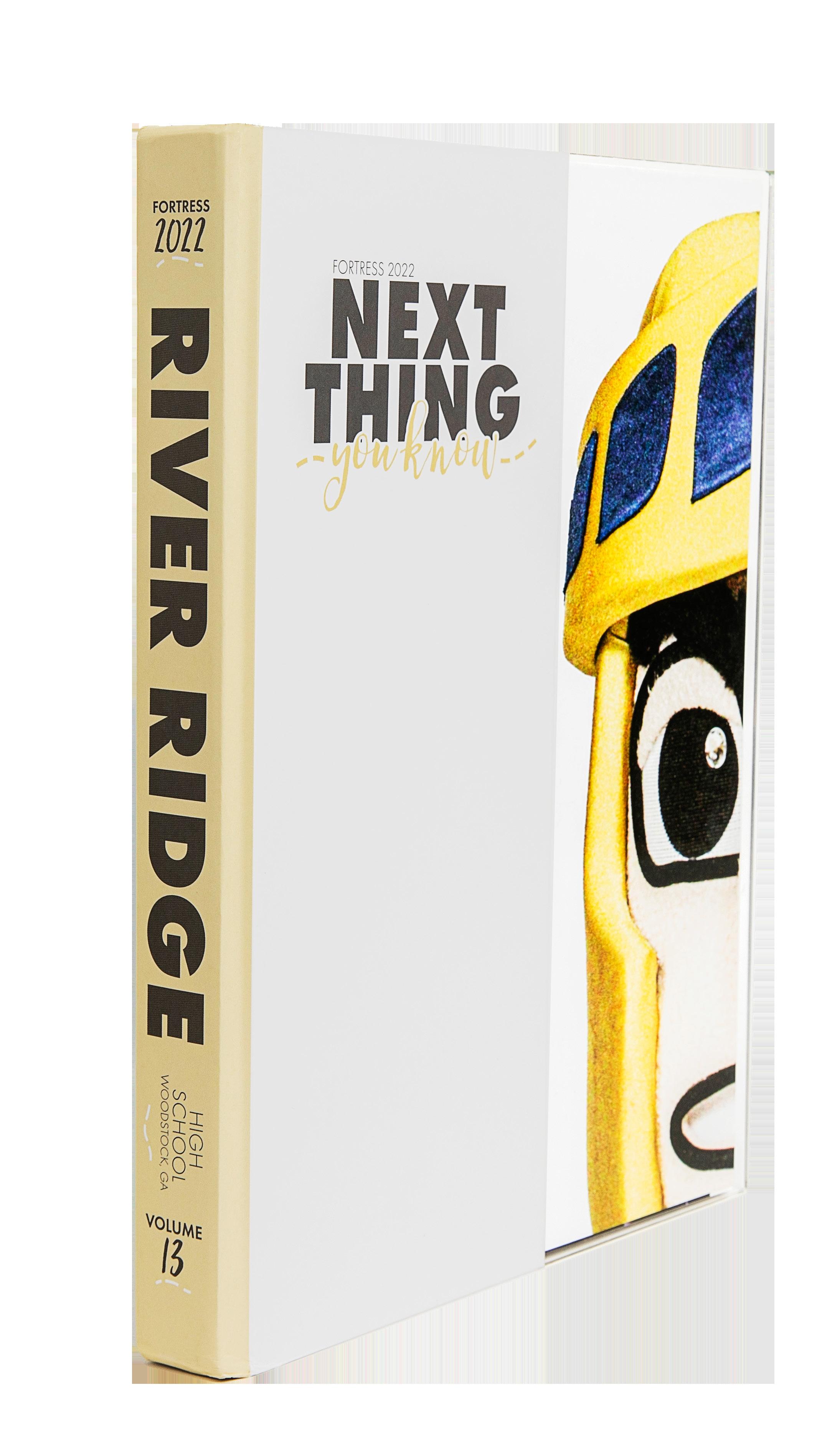
FORTRESS
Adviser: Michelle Chamberlain
Editors: Tyler Williams, Riley Zacherl and Miranda Rodriguez
HJ Reps: Megan Morris and Elyse Cleveland
Stand-out features:
PERFECT PACKAGING: We love seeing a successful mix of type throughout a book. This volume features a handwritten-style script font and block sans serif — and a detail of a dashed line brings it home. Plus, the stroke on AHJ Molly Bee makes for the perfect layered headline.
PICS FROM PROS: The staff — while using professional studio photography — used it with intention. The moments served a purpose as you see them throughout the book in both features and profiles. If you’re able to incorporate studio photography for a thematic reason, this book is a great example.

GIVE US GRADIENTS: The staff used Insta-style filters to create a subtle gradient effect on dominant photos. This conveys the themeadjacent idea of movement, almost like the photos — and the moments they capture — are fading in. This subtle but intentional technique is a great demo of how deep a theme and concept can be taken.
OPENING REFERENCE
ANTHOLOGY | River Ridge High School 028 029 COVERAGE CLOSING FEATURE DIVIDER
PORTRAITS: SENIOR CASUALS
Sunny Hill s HS FULLERTON, CA
HELIOS
Adviser: Lindsay Safe
Editors: Joyce Pau and Jacky Kim
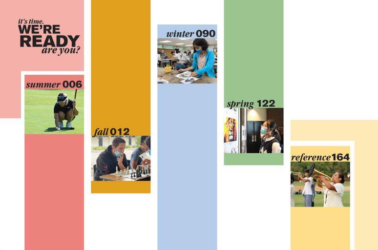
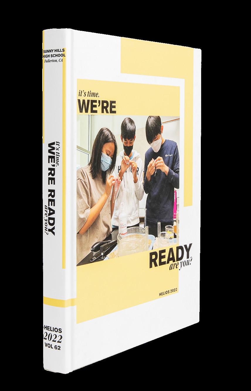
HJ Rep: Mimi Orth
OPENING PROFILE
DIVIDER
ENDSHEET
Stand-out features:
“THEY ARE” FABULOUS: The “You Are” profiles follow a question-and-answer copy format and provide a take on more traditional coverage in a chronological book. Students sharing stories of passions outside the classroom welcome an entry to student life and the freshman superstar tennis player adds to sports coverage. Placed at intervals in the book, these “You Are” moments include folio labels that indicate that the spread is dedicated to themeadvancing coverage.
OH, WE’RE READY: Killin’ it at coverage, the Helios includes a topic and quotes coverage device on almost every spread. The color bars used as part of the mods match the color palette of the page — and the colors show on the page edges, which is a cool trick for giving readers a faux table of contents.
HEADLINE SUPERSTARS: Headlines are hard. We feel you there. But if there’s a prime example of wellwritten headlines (and subheads!), it’s this book. They check all the boxes by accurately identifying the context of the spread. And, they score bonus points for still giving a verbal connection to the theme.
“It’s Time. We’re Ready. Are You?” provided many coverage connections.
ANTHOLOGY | Sunny Hill s High School 030 031
FEATURE FEATURE COVERAGE CLOSING
COVERAGE
FEATURE
COVERAGE
Hatboro-Horsham HS HORSHAM, PA
HI-HATTER
Adviser: Lauren Nash
Editors: Sarah Brifo, Abigail Davis, Alice Hall, Morgan Kirby, Morgan Long and Abigail Roesing
HJ Rep: Tracy Gearhart
FEATURE
Stand-out features:
IN YO’ FACE: With headlines this big, you better make them good because they jump at you. Appropriately sassy, funny and punny, we know it takes work to make them just right. And, we kind of like the equally ginormous page numbers, but appreciate the full folio information that’s part of each right-hand page.
A NEW FORMULA: The Hi-hatter staff organized this volume into traditional sections — with a twist. Clubs comes first, then athletics, student life, performing arts and academics. A big reference section finishes it up. For the first five sections, the divider is as expected — picking up the theme “Nobody Does [Section Title] Better” and presenting support for that statement to preview stories found in the section. There’s also a mini table of contents. Bonus points! Here’s the cool factor. The divider is followed by a full-spread profile, each sharing the headline, “We do it better, and so do they.”
COLOR-CODED: Picking up the colors from the cover, each section is color-coded, and a screen of the section’s hue runs along the right page from top to bottom. This creates a book you can flip through and find each section just by looking at the page edge. That’s pretty handy.
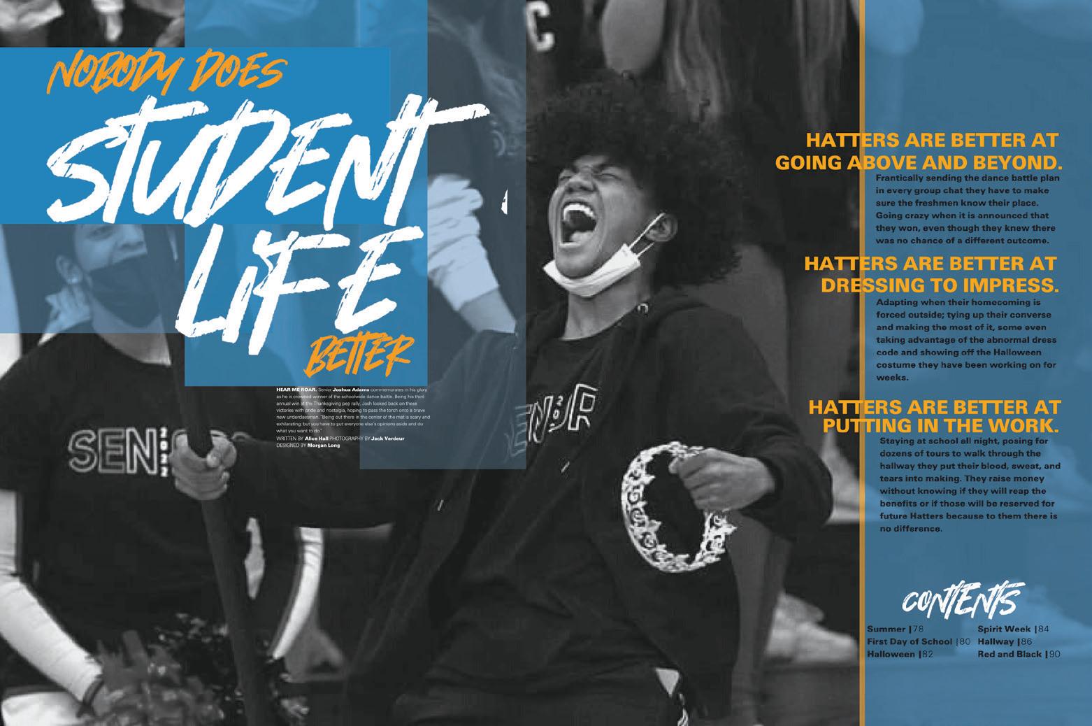
032 033
ANTHOLOGY | Hatboro-Horsham High School
COVERAGE ENDSHEET
DIVIDER PORTRAITS
INSPIRATION
Adviser: Isabel Ojeda
Editors: Sarbia Molina and Nicole Nagamine
HJ Reps: Vicky Aguirre, Ashley Cuervo and Jose Otero
 Barbara Goleman Senior HS MIAMI LAKES, FL
Stand-out features:
FOCUSING ON INDIVIDUALS: People coverage eclipses events coverage throughout the book, and it makes a huge difference. For the most part, photos feature a single student, and the copy matches. This staff didn’t shy away from longer copy, as the theme “Prose” dictated.
PHOTO-FORWARD DESIGN: It’s refreshing to see such awesome photography, even when the topic is not that earthshattering. And it’s even better to see appropriately dominant photos on interesting and varied spread layouts. Another thing that makes this book unique: the small mod photos are excellent and show action and personality. They make the reader want to look closer to see what’s going on. No boring mug shots here.
SEEKING BALANCE: For every dominant photo and longer copy block, there are mods to add coverage and visually balance the spread. Mods appear in different shapes and sizes, clearly chosen to accent the dominant elements on the spread.
ANTHOLOGY
034 035
|
Barbara Goleman Senior High School
OPENING PORTRAITS COVERAGE COVERAGE ENDSHEET DIVIDER COVERAGE
Ward Melville HS EAST SETAUKET, NY
INVICTUS
Adviser: Camryn Baum

Editors: Jessalyn Murphy and Caroline Woo
HJ Rep: Mark Mandrakos
COVERAGE COVERAGE COVERAGE
Stand-out features:
SIMPLICITY IS
STUNNING: White space is never wasted space when executed properly — with intention. The Invictus staff supported this design idea with hierarchy and balance. Spreads welcome a consistent half-pica structure for layers of coverage. The natural and muted palette accentuates the staff’s design concept. And, the cover is striking in the fact that it’s simple. The Suede lamination meets its match with Raised UV on the theme.
COVERAGE GALORE: Reader aids and graphics give the volume a tasteful variety of coverage. The Invictus staff embraced infographics and illustrations and used them judiciously. This approach makes each spread exciting without being over-decorated, which can be the case.
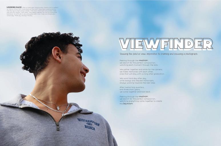
SIMPLE THEME, COOL
TRICKS: We love a “we see what you did there” moment, especially when it’s clear the students would get it too. The “Big Picture” comes into focus with these renamed sections, which are all tied to photography terms. Student Life is “Candid,” Academics is “Focus,” Sports is “Blur,” People is “Exposure” and Reference is “Capture.” Plus, theme moments are easily identifiable with their fullbleed, single-subject images and extended captions.
ANTHOLOGY | Ward Melville High School 036 037
PORTRAITS CLOSING
COVERAGE
OPENING
Mill Valley HS SHAWNEE, KS
COVERAGE
Adviser: Kathy Habiger
Editors: Elise Canning, Abby Steiger, Allison Seck and Damara Stevens
HJ Rep: Barry MacCallum
CLOSING
PORTRAITS
JAG
Stand-out features:
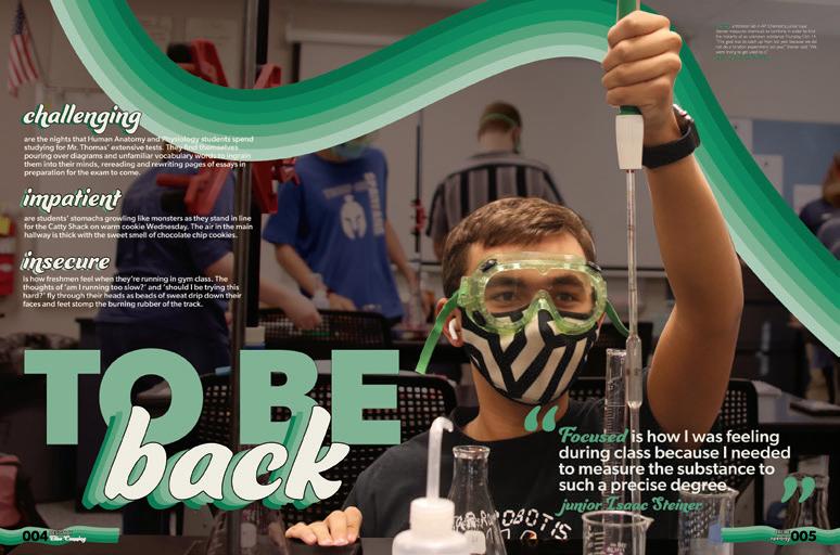
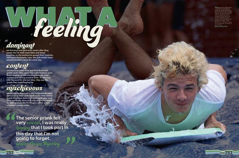
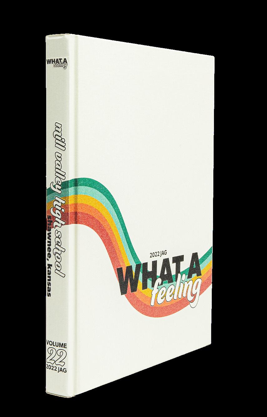
KICKIN’ OFF STRONG: This opening is one to be proud of. The obvious connection between both its verbal and visual identity lets us know the story of the year at Mill Valley. The theme is clear in the three-spread opening with its headline, single-image photography, three adjectives and the copy to wrap it all together. Plus, we love to read the opening spread headlines as they transform the cover statement into a full-book concept: “What a Feeling… To Be Back… Together Again.” Wow.
GRAPHICS FOR DAYS:
The JAG staffers used illustrations and graphics to bring some variety to their spreads. The continuation of the artwork from the cover is showcased throughout with intention. We can tell that this staff put thought into its use. Plus, illustrations, graphics and item photos are inserted among the traditional-layout spreads. That’s a practice we can get behind — very magazine-y.
THANKS FOR THIS: Where some spreads included little to no candid photography, other spreads welcomed full-bleed images in the background with photo packages on top. And to add to it, photo packages were consistently well-executed and topped off with A+ captions. If you’re looking for a book as an example of spread diversity, check this one out!
ANTHOLOGY | Mill Valley High School 038 039
OPENING FEATURE DIVIDER FEATURE
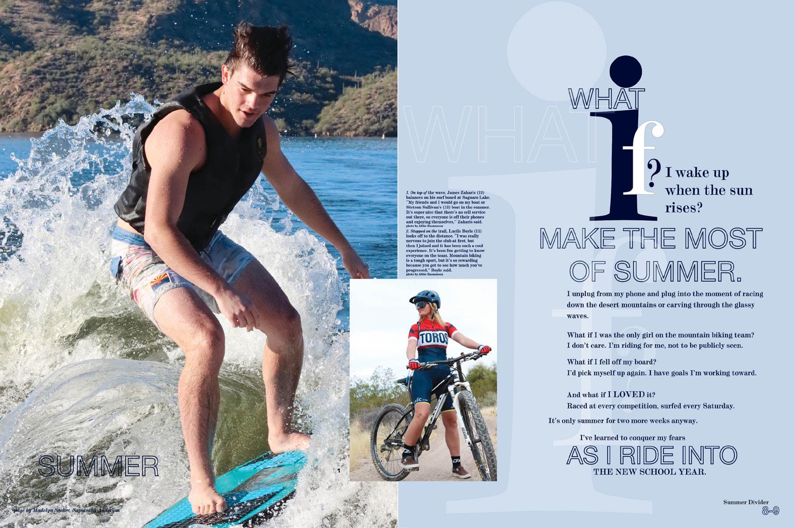
Mountain View HS MESA, AZ
LA VISTA
Adviser: Landon Wrather
Editors: Samantha Anderson and Maddy Staker
HJ Rep: Mary Titus

COVERAGE
ENDSHEET COVERAGE
COVERAGE
Stand-out features:
JUST THE RIGHT TYPE: This volume gives the right amount of everything when it comes to type choices and packaging. Moments of a beautiful serif appear in headlines and body copy with moments of its italicized option in subheadlines. Plus, we can’t forget the outlined sans serif that brings it all together. The elegant serif next to the modern sans serif provides an interesting display that simply works.
MOD MANIA: The theme “What If?” provides a direct pathway to quick and easy coverage opportunities. The “What if I [question]?” and corresponding answers are easily slotted into mod headlines galore and onto dividers. One of our favorites was “What if I focused on others instead of myself this season?” which was followed by a story about helping others during the holidays. What a great way to highlight an awesome student’s work in (and outside of) school.
LET’S PLAY: The portrait section is full of additional coverage — including senior profiles — and even playful, interactive moments. The “stories behind the shoes” gave us nine more students featured on just one page! An A+ for a fun book with amazing coverage.
ANTHOLOGY | Mountain View High School 040 041
DIVIDER COVERAGE PORTRAITS PORTRAITS OPENING COVERAGE OPENING
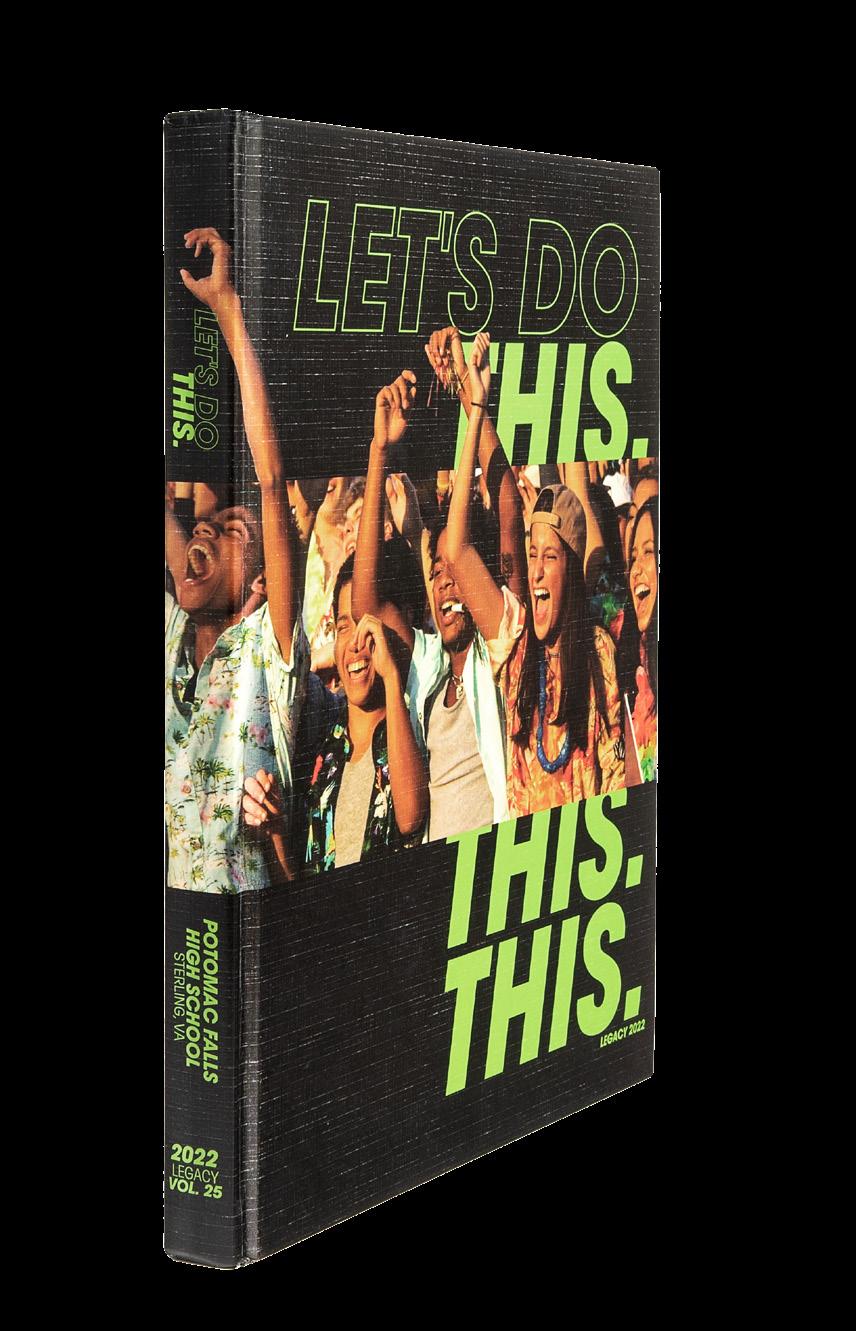
Potomac Falls HS STERLING, VA
LEGACY
Adviser: Emily Everett
Editors: Yana Arora, Emma Buytenhuys, Molly DeHaven, Tess Durham, Madison Hansma, Christina Precht and Meadow Swanson
HJ Rep: Kara Petersen
ENDSHEET OPENING COVERAGE
Stand-out features:
OH, WE LOVE THIS: Printing on textured Kivar as their base material and adding Matte lamination on all but the type provided a linen-like texture. Raised UV on the front lid type created an awesome tactile element. And on the outlined text?! Yes, please.
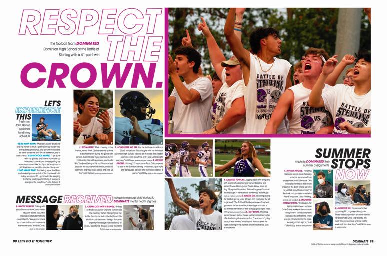
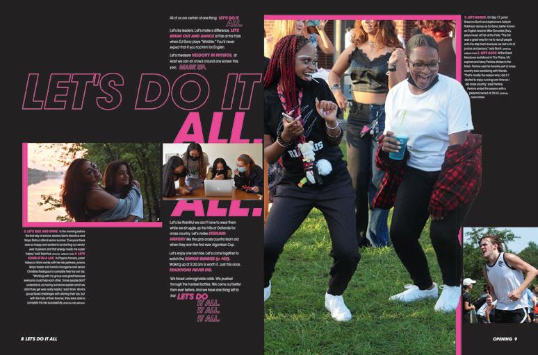
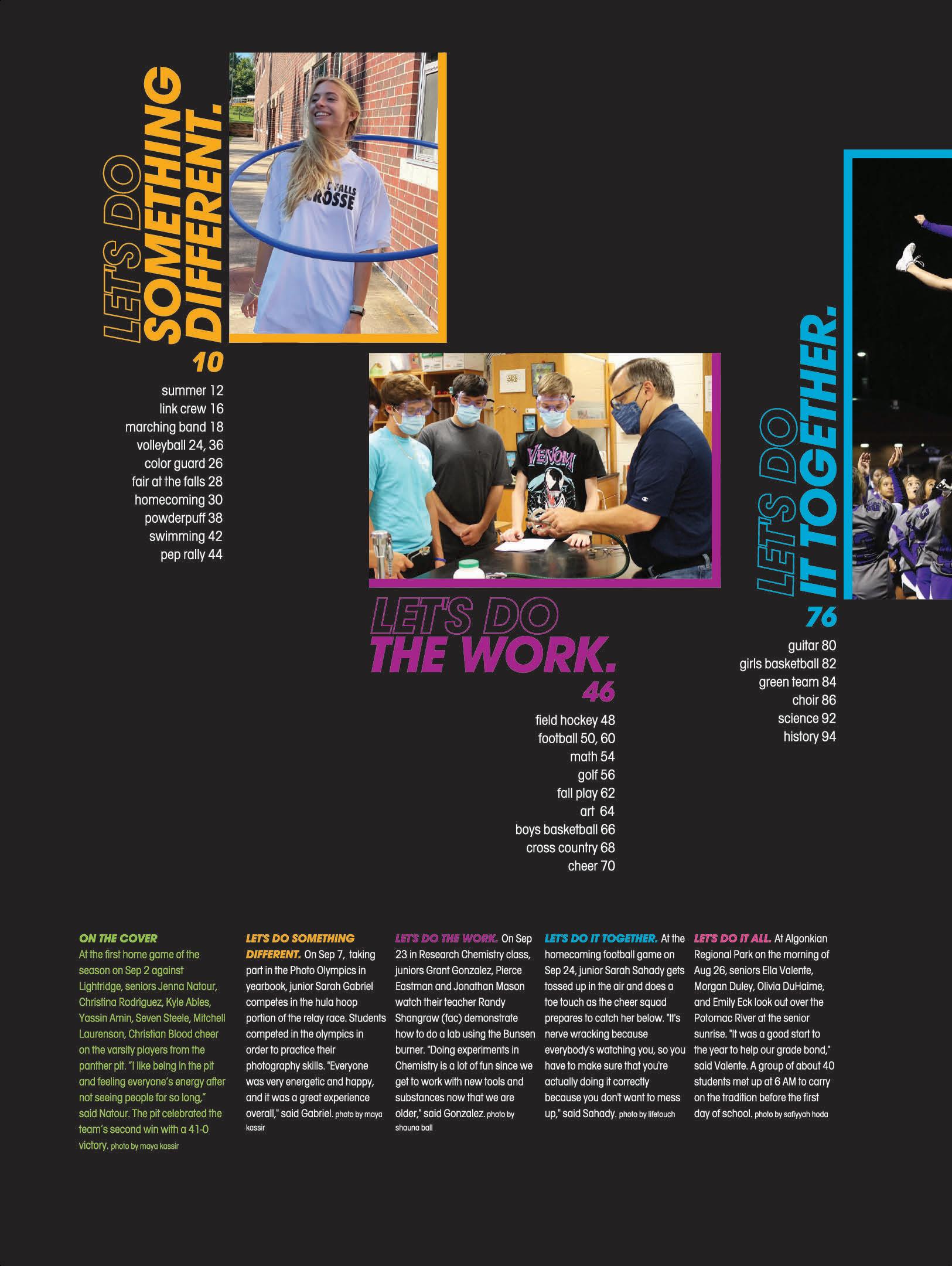
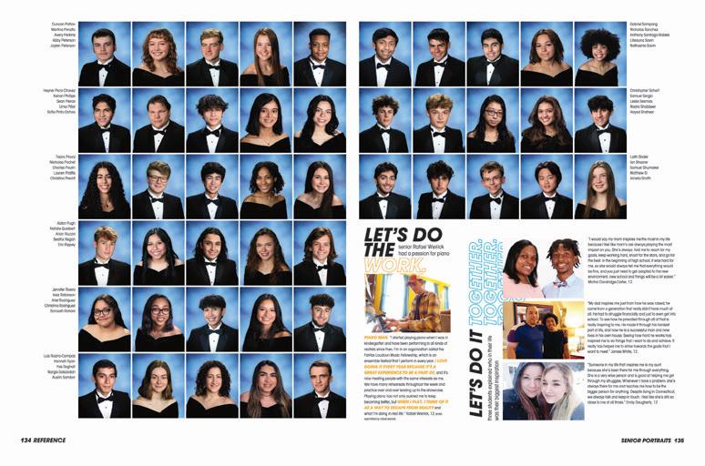
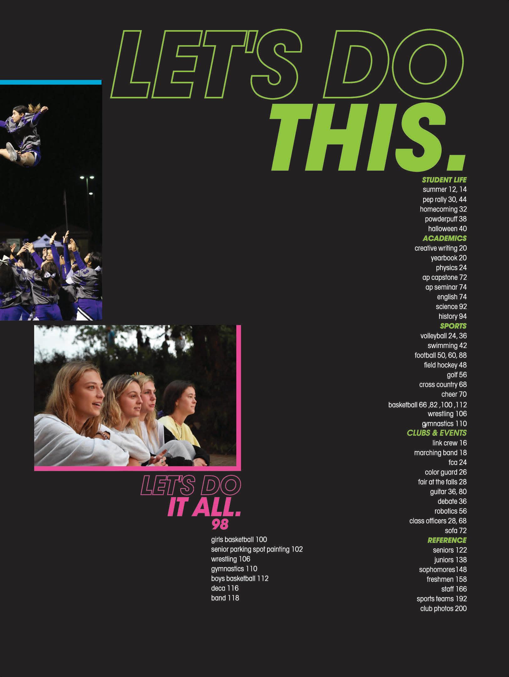
THEY DID THAT: With a theme of “Let’s Do This,” you better be prepared to tell it. And the Legacy staff did just that. The endsheet introduces umbrella coverage with renamed sections of “Let’s Do Something Different,” “Let’s Do the Work,” “Let’s Do It Together” and “Let’s Do It All.” Including a table of contents in traditional sections also leads readers directly to coverage they’re looking for. Bonus points for detailpacked captions with the section title as the lead-in.
HEADLINE PROS: The book gives us superstar headlines — both in its design and copy. Starting with the design, the sans serif AHJ Avalon Bold Oblique was the perfect choice for large, dominant headline packages. And, we love the outlined type moments. The headlines also do a great job of capturing the essence of both the spread and theme. The period at the end on features and dividers adds an emphasis to “Let’s Do This” because they did that. Period.
ANTHOLOGY | Potomac Falls High School 042 043
FEATURE PORTRAITS
LIO N ’S ROAR
Adviser: Heather Nagel
Editors: Lucy Ellis and Sophie Nabors
HJ Rep: Mary Harris
PORTRAITS
Christ Presbyterian Academy NASHVILLE, TN
ENDSHEET
OPENING COVERAGE
Stand-out features:
OCD IS GOOD WITH ME: Starting with the endsheet and continuing into the opening spreads, dividers and closing we get the theme — and the organization of the book. The theme “All In. All Together. All the Time” is explained in the brief copy on pages 2-3, but then the next two spreads explain that the traditional sections have been renamed and how they work. Student life is “Unity,” sports is “Commitment” and arts is “Expression.” Each is subtly assigned a color, which helps orient readers to the upcoming content.
WRAP IT UP FOR US:
The color-coding helps us differentiate the sections, but the type and headline packages unify the book and provide a distinctive look. Outlined letters combine with solid color type and the ever-present subheadline to make neat (and descriptive) dominant type packages. Bylines are part of the headline package, which means almost all of the info you need to start exploring the spread is right there on top.
PICS ME UP: The Lion’s Roar benefits from two obvious advantages. First, the robust staff boasts some excellent photographers — and designers who know what to do with a great photo. Second, the staff takes full advantage of the cute kids that are members of their preK-12 school community. There are lots of great photos in this community-centric book.
ANTHOLOGY | Christ Presbyterian Academy 044 045
COVERAGE CLOSING DIVIDER FEATURE
PANTERA
Adviser: Makena Busch
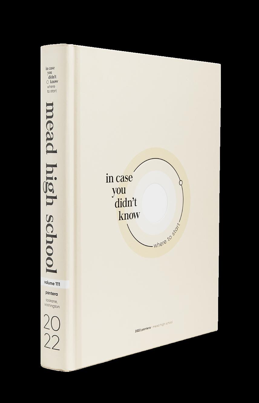
Editors: Oliver Hammond, Spencer Sandberg, Dalyn Springer and Annalise Thackston
HJ Rep: Tim Benton
 Mead HS SPOKANE, WA
COVERAGE FEATURE ENDSHEET OPENING
Stand-out features:
400-PLUS PAGES OF GREATNESS: This is a big book and every page is filled with the same purpose: covering their school. The Pantera staff welcomed so many avenues of coverage from talking heads, surveys and bite-sized quotes — just to name a few. There’s so much to be found in a variety of ways that truly tell the stories of the year. What a winner!
COMING AROUND: Intentional shapes help bring this book full circle… literally. The circles create a visual-verbal connection of the theme “In Case You Didn’t Know Where To Start” because they simply show you. Within the design, everything has a purpose — even if it’s subtle. Circular elements and dots bring attention to headlines, quotes, folios and more. And, a factoid that students would likely pick up on, the circles reference the school’s common meeting space (“The Pit”) with its shape of — you guessed it — a circle.
JUST THIS ONE: You’ll see as you flip through the pages, there’s a design choice not common in other volumes: one, singular color. As shared in the colophon, the staff opted for one swatch to symbolize how it can be easy to find where to begin... even if you find yourself in another crazy year. This volume encompasses so many elements to reflect how minimalist design can be multi-layered and nuanced — and still have fun. The restraint and attention to detail is wildly impressive.
ANTHOLOGY | Mead High School 046 047
PROFILE FEATURE INDEX COVERAGE COVERAGE COVERAGE DIVIDER
ENDSHEET
Munster HS MUNSTER, IN
PARAGON
Adviser: Sarah-Anne Lanman
Editor: Riley Ramirez
HJ Rep: Betty Samples
COVERAGE CLOSING
COVERAGE
Stand-out features:
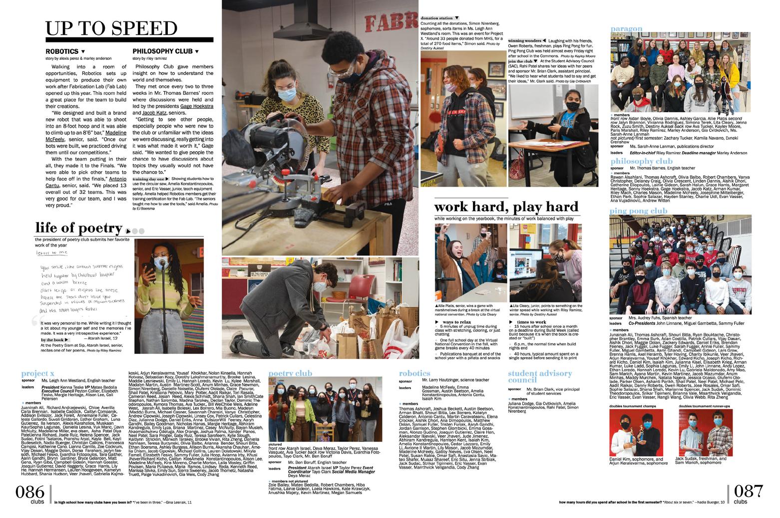
RIGHT ON TIME: With a time-centric theme, the Paragon staffers gave us exactly what we want — lots of time-oriented elements. Dividers introduce the timestamps as they clock into the school day or spend time outside of school. And, the staff kept it going by adding other time-focused moments here and there in both mods and headline packages. Love it.
LOOKING TRENDY: We love different angles for student life spreads, and the staff gave us that while still incorporating both their time- and numberfocused design. Spread topics include 22 trends or 22 moments of the year for 2022. Yes, please!
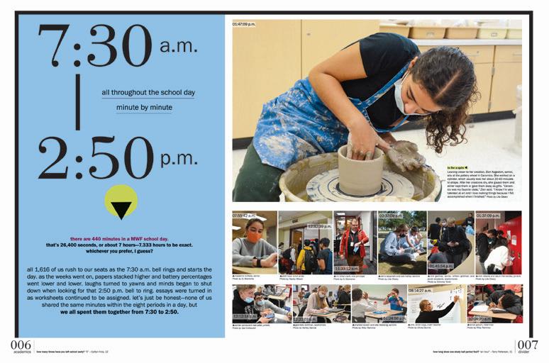
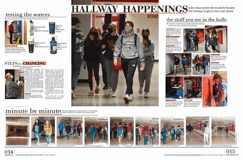
THESE STUDENTS MATTER: While this volume doesn’t have a dedicated clubs reference section, it still provides the crucial information: club rosters. Sprinkled throughout their coverage, you’ll find full listings of sponsors, leaders, councils and members. This approach ensures everyone is included and makes their 2022 book a complete historical record.
ANTHOLOGY | Munster High School 048 049
OPENING PORTRAITS COVERAGE DIVIDER
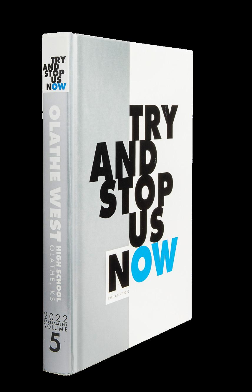
Olathe West HS OLATHE, KS
PARLIAMENT
Adviser: Julia Walker
Editor: Audrey Snider

HJ Rep: Molly Baker
OPENING FEATURE ENDSHEET COVERAGE
Stand-out features:
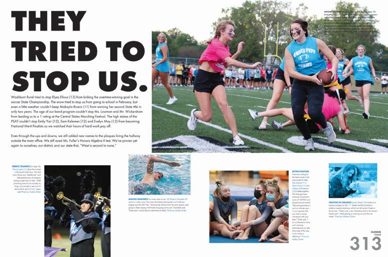
LET IT SHINE: The staff opted to include silver metallic spot ink — as found on the cover — inside their entire book. It’s on theme statements (we love!), the page number on the folio (oh yeah!) and in other moments that need a time to shine (pull quotes?!) This little design element makes a big impact.
WRITING FOR DAYS: The writers on the Parliament staff showed their chops in journalistic copywriting. Long-form copy for their features and profiles made us keep reading about a new student or college baseball recruit. Captions gave us everything we needed, too. They provided the perfect details of what was happening in the photo along with things we couldn’t see. Plus, we found talking heads and quick quotes supporting the inclusion of so many students.
LITTLE MOMENTS = BIG IMPACT: The spreads are structured with clear eyelines and overall hierarchy, but it’s the smaller elements that leave a lasting impression. Content spreads welcome a single duotone image as found in the twospread opening. And to add to it, the same treatment appears on the dividers to bring everything together.
ANTHOLOGY | Olathe West High School 050 051
DIVIDER PROFILE COVERAGE CLOSING
INNOVATION: SILVER METALLIC SPOT INK
Parkway West HS BALLWIN, MO
PAWESHI
Adviser: Debra Klevens
Editors: Lily Francis, Claire LeDuc, Mallory Stirratt and Megan VanValkenburgh
HJ Reps: Dan Mueller, Leah Blase and Danielle Corgan
COVERAGE
PORTRAITS
ENDSHEET
COVERAGE
Stand-out features:
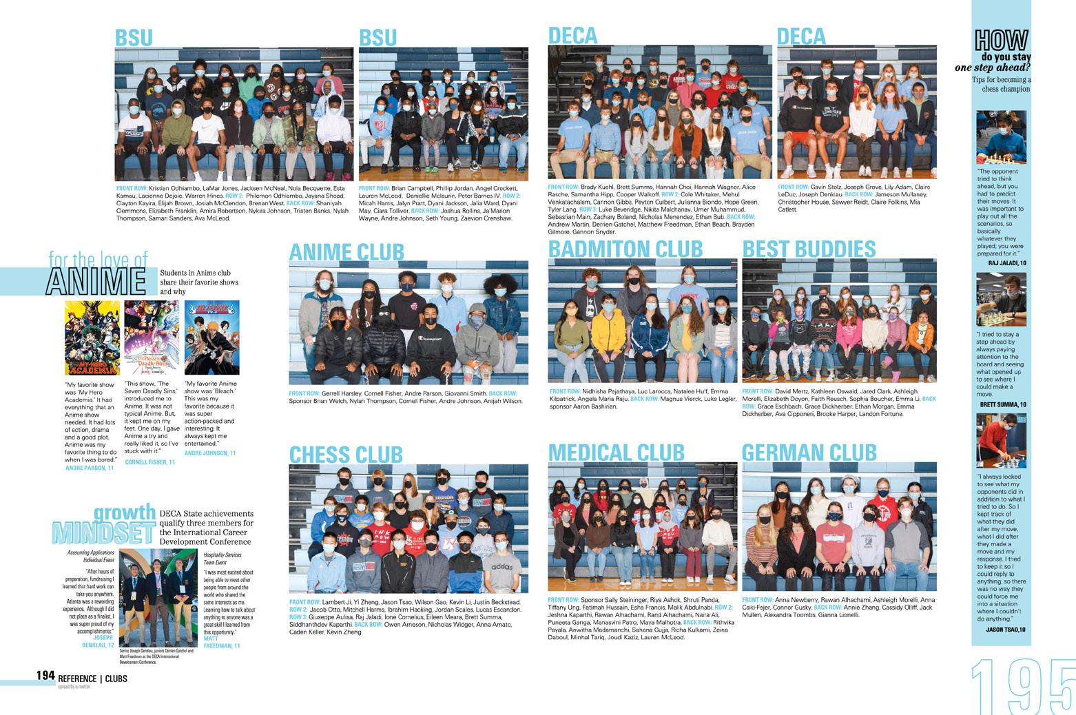
BACK LID MOMENT: This cover is a great one with its Matte lamination, Gloss UV and both embossing and debossing, but we also love how you find theme moments on the front and back. “It All Starts With West” is seen on the front with emphasis on the WE — both in look and feel. Then you find on the back “WE” with six verbs: Stay Active, Innovate, Push Limits, Lead, Invest and Speak Up. Just this small moment lets us know what we’ll find in this Paweshi — stories of how Parkway West knows how to make a difference.
DESIGNER PROS: It’s clear that the designers understood the importance of hierarchy in both spreads and photo packages. This book checks all the boxes of traditional spread design but gives us variety throughout for something new to look forward to in mods and alternative coverage design. Each spread tackles a variety of students and angles — even the spread on the school’s new scheduling system includes more than 20 students in its coverage.
PICTURE THIS: Paweshi photographers executed amazing photography in both composition and design. The balance between partial and full cutouts is a nice touch. It’s obvious that a careful eye perfected these. Simply put, this book provides photography worthy of sharing for years to come.
ANTHOLOGY | Parkway West High School 052 053
REFERENCE DIVIDER COVERAGE
INNOVATION: CUSTOM-SIZE TIP-IN
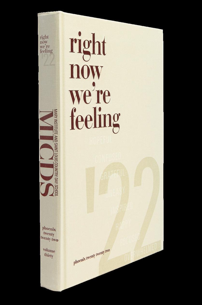
Mary Institute and Saint Louis Country Day School ST. LOUIS, MO
PHOENIX
Advisers: Katie Voss and Colleen Williamson
Editor: Siri Battula
HJ Reps: Dan Mueller, Leah Blase and Danielle Corgan
DIVIDER
OPENING COVERAGE COVERAGE
Stand-out features:
BEAUTIFUL TYPE:
The use of AHJ Bodoni Display provides such great typography in this volume of the Phoenix. From the student quotes on dividers to magic in the headlines, the staff created dramatic packaging that we love. Plus, the small pops of sans serif on content spreads mixed in with headlines and subheadlines worked beautifully. Bravo!
MUTED COLORS: The staff opted for a subdued color palette that balanced nicely with its emphasis on type. The cream — as they called it — is perfectly matched with accent colors of blue, pink, green, maroon and orange. And, kudos for continuous use of the maroon found on the cover in the folio, which features student quotes on the spread topic.
FEATURE
PORTRAITS COVERAGE COVERAGE
ANTHOLOGY | Mary Institute and Saint Louis Country Day School 054 055
COVER STAR: This cover truly sets the tone for the volume. From the typography and colors to its theme call out, it gives us exactly what we expect in the book. The Frost linen — along with subtle Raised UV — creates the perfect start for this yearbook. FEATURE
PHOENIX
Adviser: Benjamin Yadon
Editors: Brenna Dupries, Aubrey Phillips, Olivia Scioscia, Natalie Pedrianes-Echevarria, Victoria Peters and Anna Wheeler
HJ Reps: Michelle Frakes and Katy Hoffstatter
Stanton College Preparatory School JACKSONVILLE, FL
Stand-out features:

THE THEME IS NO
THEME: The Phoenix staff decided to take it all visual and no verbal when it came to theme. The fact that their visual theme does include phrases, like “Because We Are” and “A Community Of Learners Dedicated To Excellence,” makes it seem like there’s a theme, but the staff wrote that they wanted more room for creative freedom. Vibe on.
UN-FORMAL: Shrugging off the templated formality they had seen in their own previous books (and in others) meant that the color palette and typefaces had to do all the work of making the book feel cohesive. Mission accomplished. Both are consistently present.
ONE AND ONLY: One thing this staff set out to do was to celebrate individuality. They did this with lots of studentcentric coverage. They did cover all of the typical topics (still kept the homecoming special fold-out section), but they also made sure to do lots of little profiles — and some are just visuals without the verbal explanation. It’s an interesting mix.
ANTHOLOGY | Stanton College Preparatory School 056 057
COVERAGE PROFILE COVERAGE CONTENTS LISTING DIVIDER COVERAGE
INNOVATION: DOUBLE GATE-FOLD
COVERAGE
COVERAGE
Redondo Union HS REDONDO BEACH, CA
PILOT
Adviser: Kerri Eastham
Editors: Madison Brandon, Erin Davis and Brooke Goldman
HJ Rep: Andria Rosas
PROFILE
COVERAGE
ENDSHEET
Stand-out features:
IT IS THEIR WAY: And with this design, we know where to follow. The thin-stroke line provides a great guide in a variety of ways. You’ll find its multi-purpose use in arches, circles and straight lines to lead you right where they want you to go. We adore seeing elements like this for a purpose — not just décor. Plus, the doodles on the endsheet, profiles and dividers make sure there’s no boredom.
LET’S GO HERE: The Pilot staff opted for chronological coverage following each season and all that it brings. An extra reader service with the folio lets us know to “turn to page 60” for more coverage like this. What a great (and easy!) way to let your readers know where to find similar content.
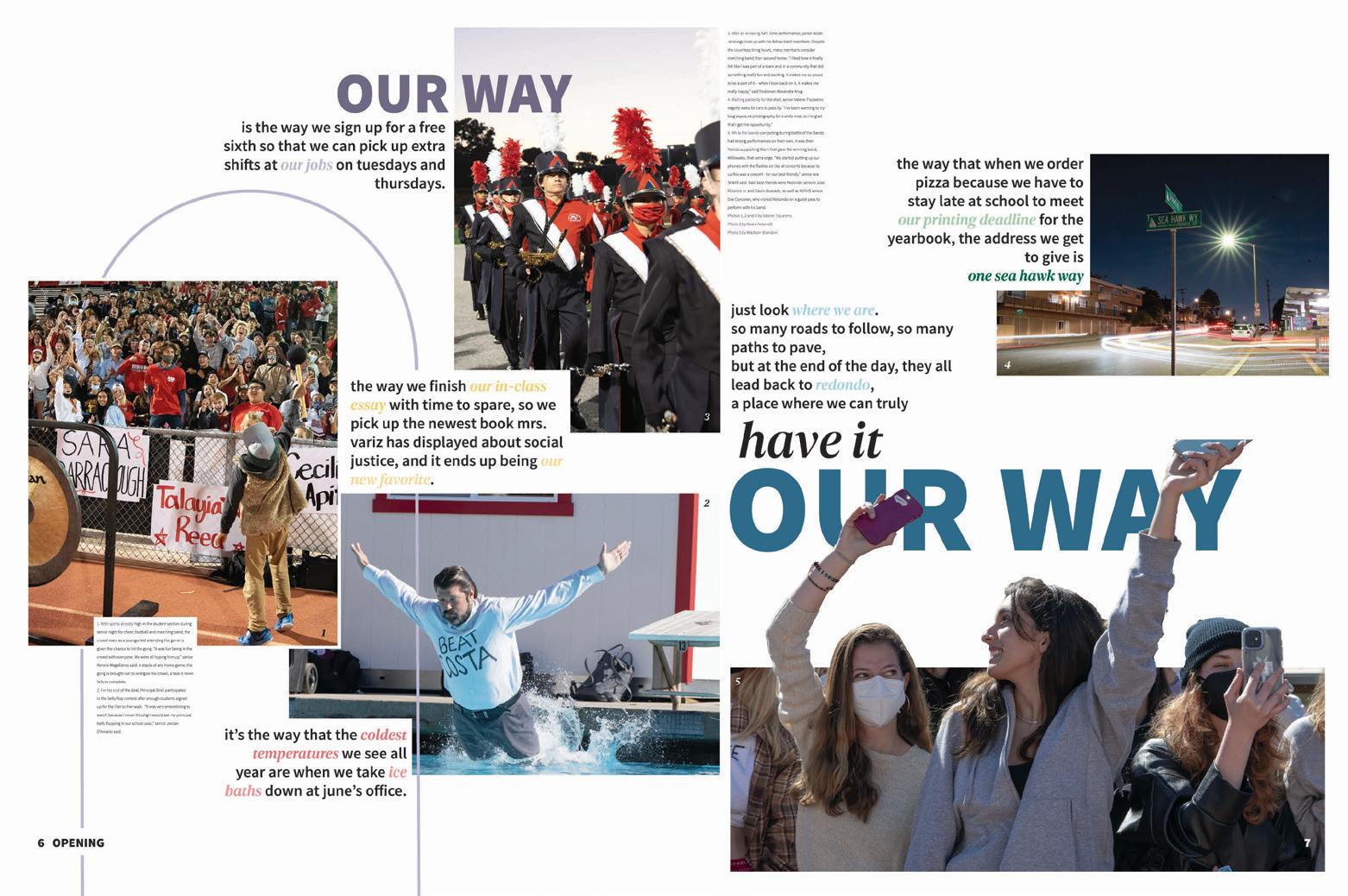
PHOTOS, PHOTOS, PHOTOS: When you live at the beach, it’s likely you’ll take photos that will make us jealous. The Pilot photographers not only gave us great pictures, but they also introduced a variety of images — ranging from awesome studio shots, new angles in school and partial cutouts to make our design hearts happy. Way to go!
ANTHOLOGY | Redondo Union High School 058 059
OPENING COVERAGE COVERAGE DIVIDER
ENDSHEET COVERAGE
Longmont HS LONGMONT, CO
PRIAM
Adviser: Annie Gorenstein-Falkenberg

Editors: Ella Jackson, Sophie Jennings and Emma Stasko
HJ Rep: Genise Cushman
COVERAGE
OPENING
Stand-out features:
SANS SERIF FOR DAYS:
AHJ Craft Gothic is one of our faves. With its many family options, the Priam designers used each strategically and consistently. Each package welcomes a mix of thin, condensed and bold. Plus, we love to see the emphasis words “you” and “us” in the type to reinforce the theme.
FULL THEME AHEAD:
The theme’s bold yet heartfelt nature tells readers that each student leaves an impact. The two-spread opening gives direct examples of moments that should make every Longmont student proud. You’ll continue to find the theme on dividers — where events and activities that take place during the season are highlighted. A great way to push thematic coverage from cover to cover.
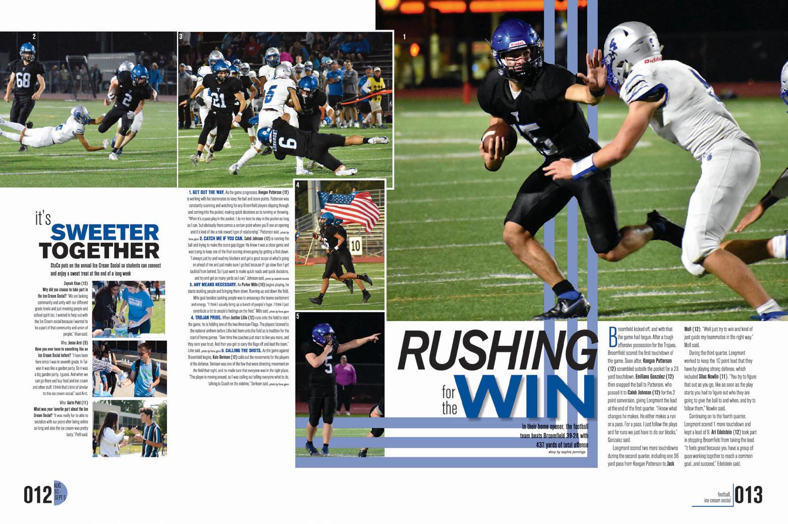
SO MUCH COVERAGE:
This size eight book packed its chronological sections with coverage. So many students were featured in body copy, talking heads and mods. And, bonus points for including additional coverage on larger profiles. Highlighting the 500th win of the head basketball coach didn’t mean telling only his story. They added multiple points of view with mods, stats and sidebars. If you’re looking to expand your coverage, you’ll find great examples here.
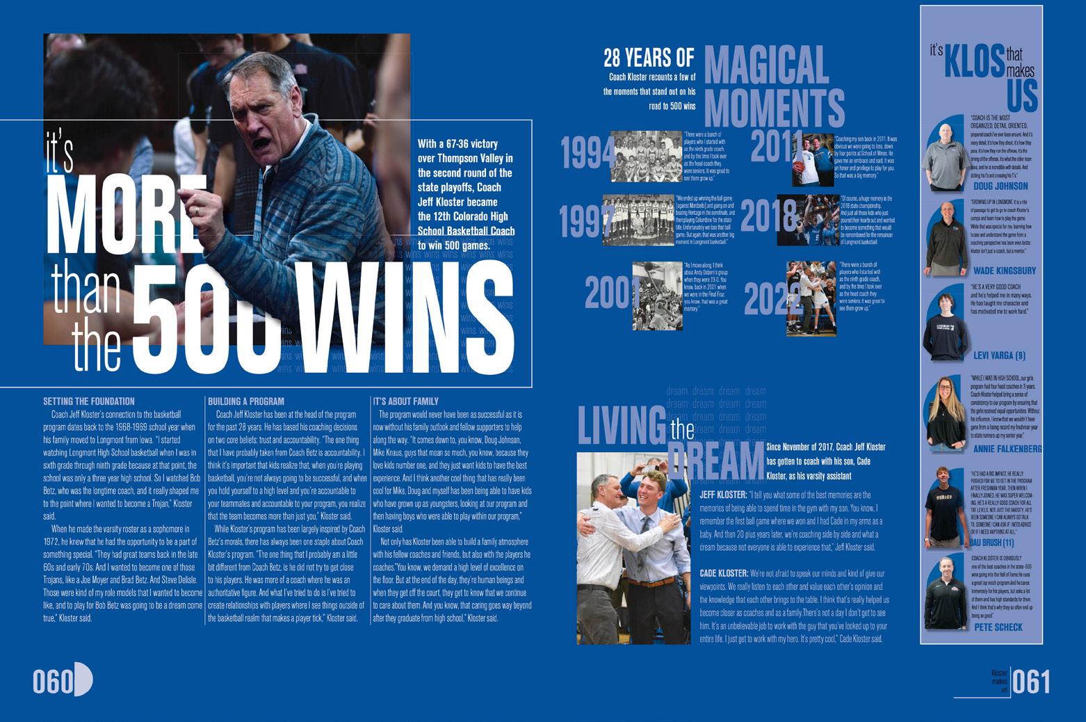
ANTHOLOGY | Longmont High School 060 061
COVERAGE
COVERAGE
DIVIDER PORTRAITS
Franklin HS
ELK GROVE, CA
PRIDE
Adviser: Allen Maxwell
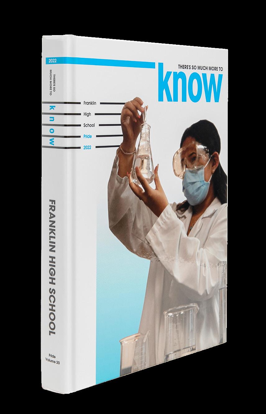
Editors: Nick Kraemer, Laila Ali, Navi Singh, Chiara LaVine, Evan Chau, Julie Fang, Olivia DeMelo, Samantha Hall and Calista Greatreaks
HJ Rep: Sara Cowan
ENDSHEET
COVERAGE OPENING DIVIDER
Stand-out features:
INSPO AND INFO: Full-page photos were our first clue that this staff was inspired by a magazine, but it’s a nice touch that the colophon includes a photo of the source of the inspiration. We get to see how a Turkish magazine supplied the cyan and black color palette on the cover and the horizontal lines.
FAMILY TIES: It’s not evident at first look, but this volume uses just one font family, AHJ Craft Gothic. An extremely versatile and easy-to-read gem, it’s a good bet when you want to stick with a modern sans serif. In the blockier forms, the lower-case letters have nice rounded shapes, and the allcaps thinner versions provide an obvious contrast.
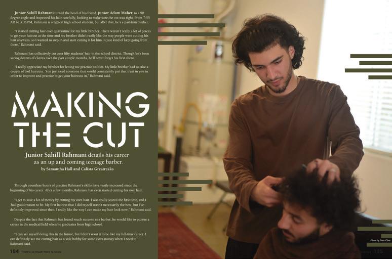
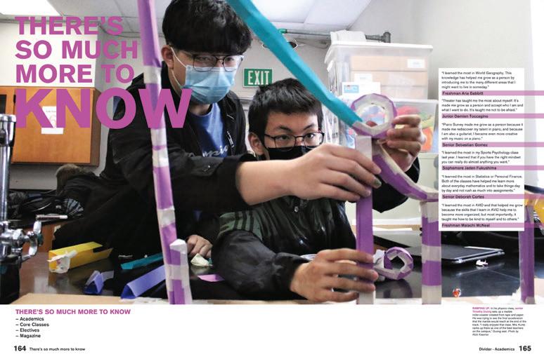
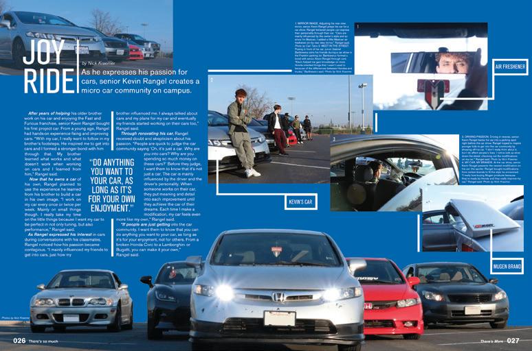
FUN FEATURES: Take a joy ride through the impressive array of feature spreads, and you’ll find something that interests you for sure. Like the staff said, “There’s So Much More To Know,” and they were going to make sure to tell you all the things.
ANTHOLOGY | Franklin High School 062 063
DIVIDER FEATURE FEATURE COVERAGE COVERAGE PROFILE
COVERAGE
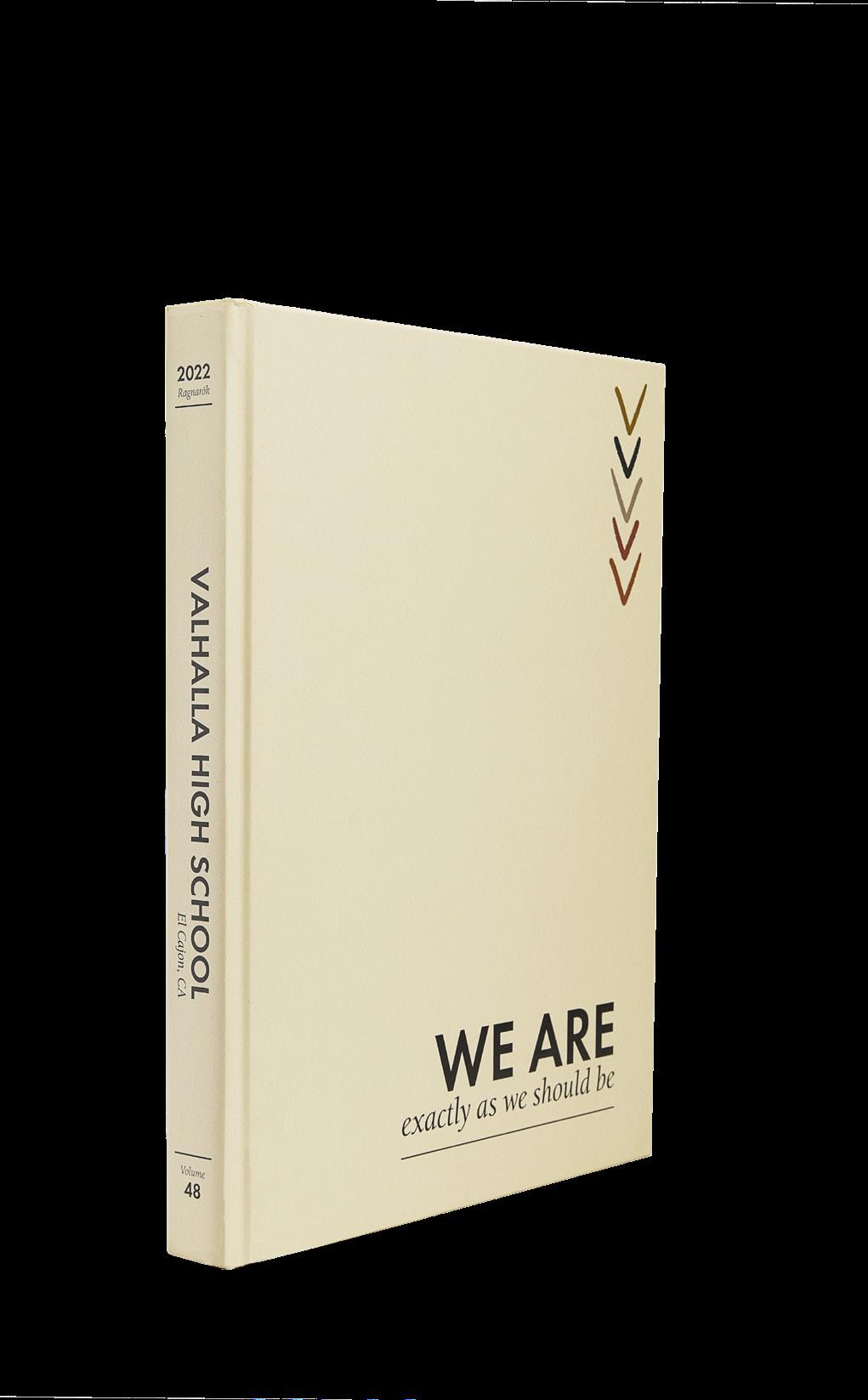
Valhalla HS EL CAJON, CA
RAGNARÖK
Adviser: Steena Harriman
Editor: Abby Powell
HJ Rep: Elizabeth Doebler
PROFILES ENDSHEET COVERAGE
Stand-out features:
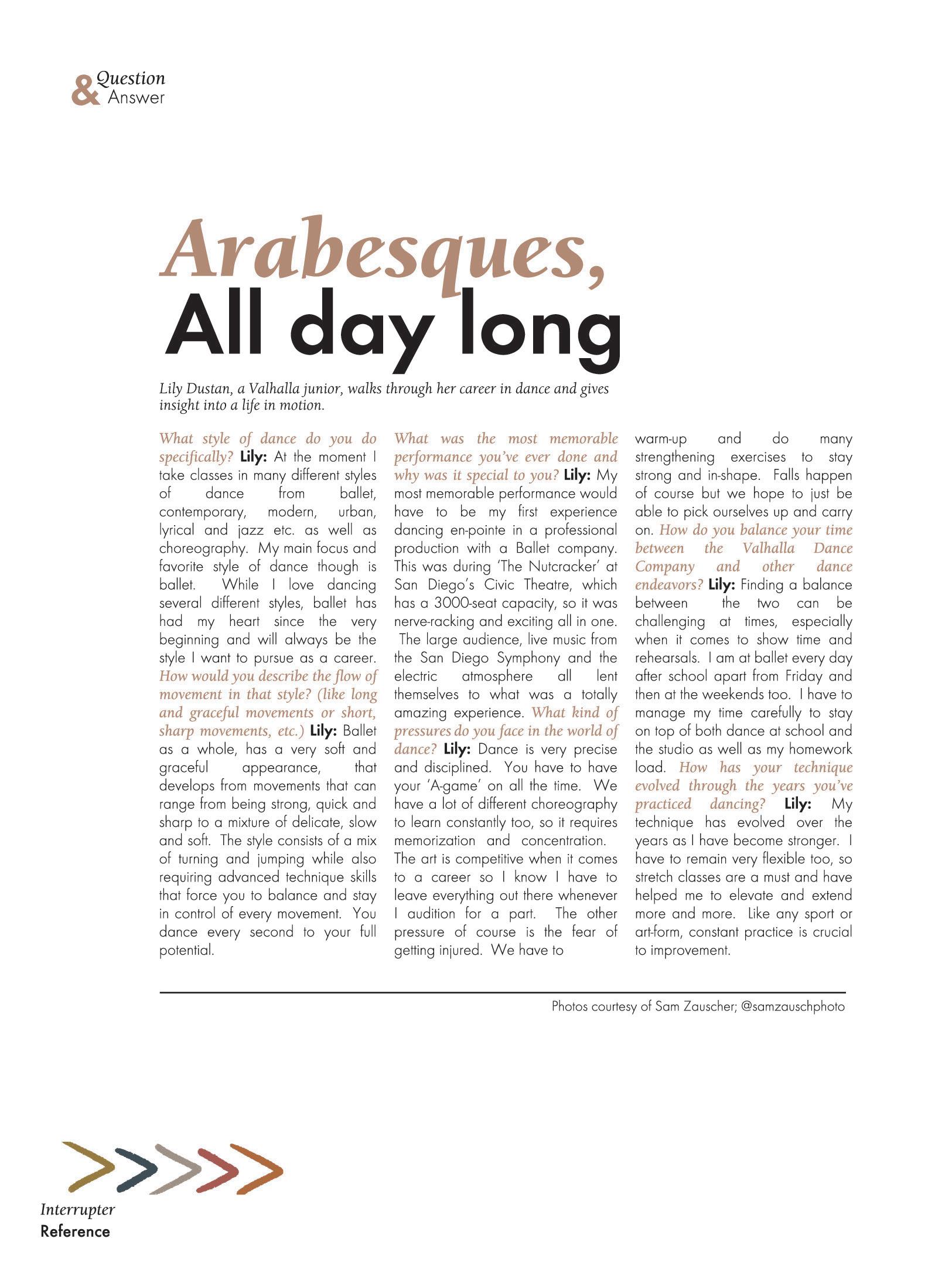
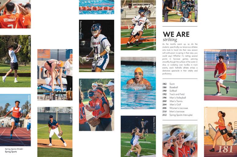
LAYERS OF COVERAGE:
The writers on the Ragnarök staff knew what they were doing. Long-form copy is not only well-written but follows the inverted pyramid structure — a sign of strong journalism. And, here’s a bonus salute to their complete captions. Spreads welcome a variety of mods to add coverage and visual balance. Talking heads, pull quotes and extended captions highlight more students.
FULL-SPREAD PROFILES:
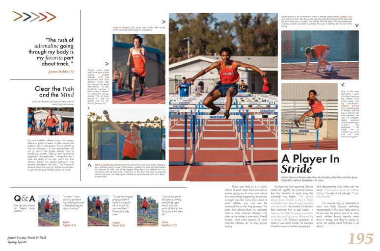
As we said before, these staffers knew how to give their readers diverse coverage. Full-spread profiles help interrupt the flow of portrait pages but introduce a new copy approach: question and answer. These profiles tell the stories of individual students being authentically themselves — a nod to the theme “We Are Exactly As We Should Be.”
ALL THE COLUMNS:
The endsheet, opening and dividers welcome a gallerystyle presentation of worthy photography. A clear eyeline is an indication of the well-designed spreads throughout the entire book. Short labels (student names and grades) complement the already great coverage elements in this volume of Ragnarök
ANTHOLOGY | Valhalla High School 064 065
DIVIDER COVERAGE
RAMBLER
Adviser: Sarah Kirksey
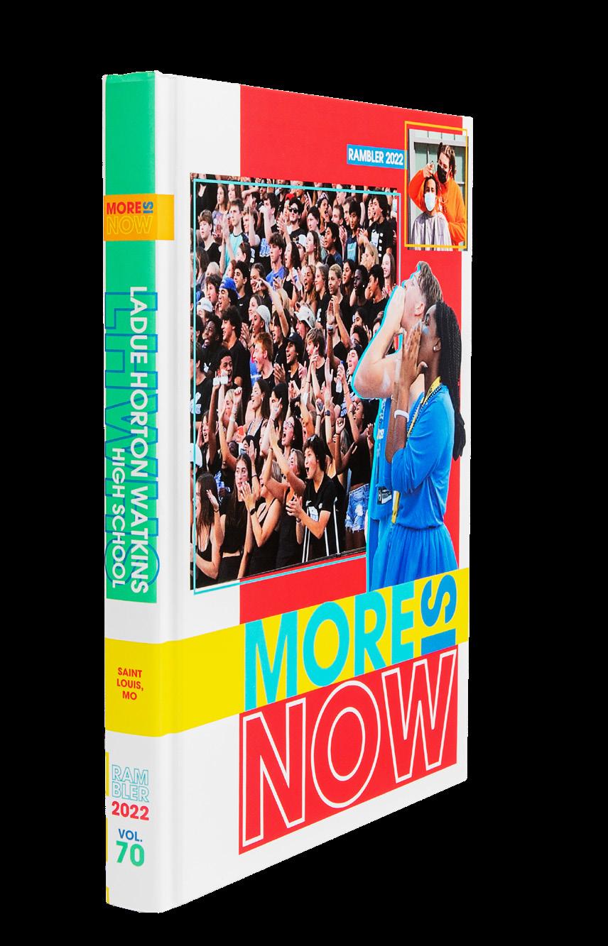
Editors: Fiona Ferguson, Dylan Melnick and Emerson Linden
HJ Reps: Dan Mueller, Leah Blase and Danielle Corgan
 Ladue Horton Watkins HS ST. LOUIS, MO
CLOSING COVERAGE DIVIDER FEATURE
Stand-out features:
INNOVATION STATION:
Ladue made this volume super interactive by adding a bunch of extra foldouts and tip-ins, so when you’re going through, there are many MORE reasons to stop and look. The front endsheet has a fold-out flap, there’s a mini-mag tipped in between pages 2-3, a double-gatefold for homecoming and a single-gatefold at the start of the senior section. So many cool features — each supporting the theme!
COLORAMA: The bright palette for the book is so “everywhere” that you can definitely tell the staff was going for pop. Here’s the thing: The color explosion is done with purpose — and never keeps you from being able to read copy. Sometimes it’s a big block of ink and other times it’s an outline or box. Either way, the colors are used with intention. Bravo!
THERE’S JUST A LOT: We talk about visual variety a lot — and it really is important. But holy moly, this book has so much variety because the theme calls for it. It’s clear the staff went the extra mile to make a yearbook that would be interesting and appealing.
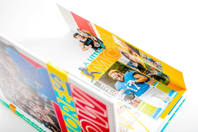
ANTHOLOGY | Ladue Horton Watkins High School 066 067
INNOVATION:
INNOVATION:
FEATURE PORTRAITS COVERAGE COVERAGE
INNOVATION: FOLD-OUT ENDSHEET AND DOUBLE-GATEFOLD FEATURE
FOLD-OUT ENDSHEET
CUSTOM-SIZE TIP-IN
RAMPAGES
Adviser: Melissa Cameron
Editors: Emily Polich and Gabriella Ramirez
HJ Rep: Annette Johnson
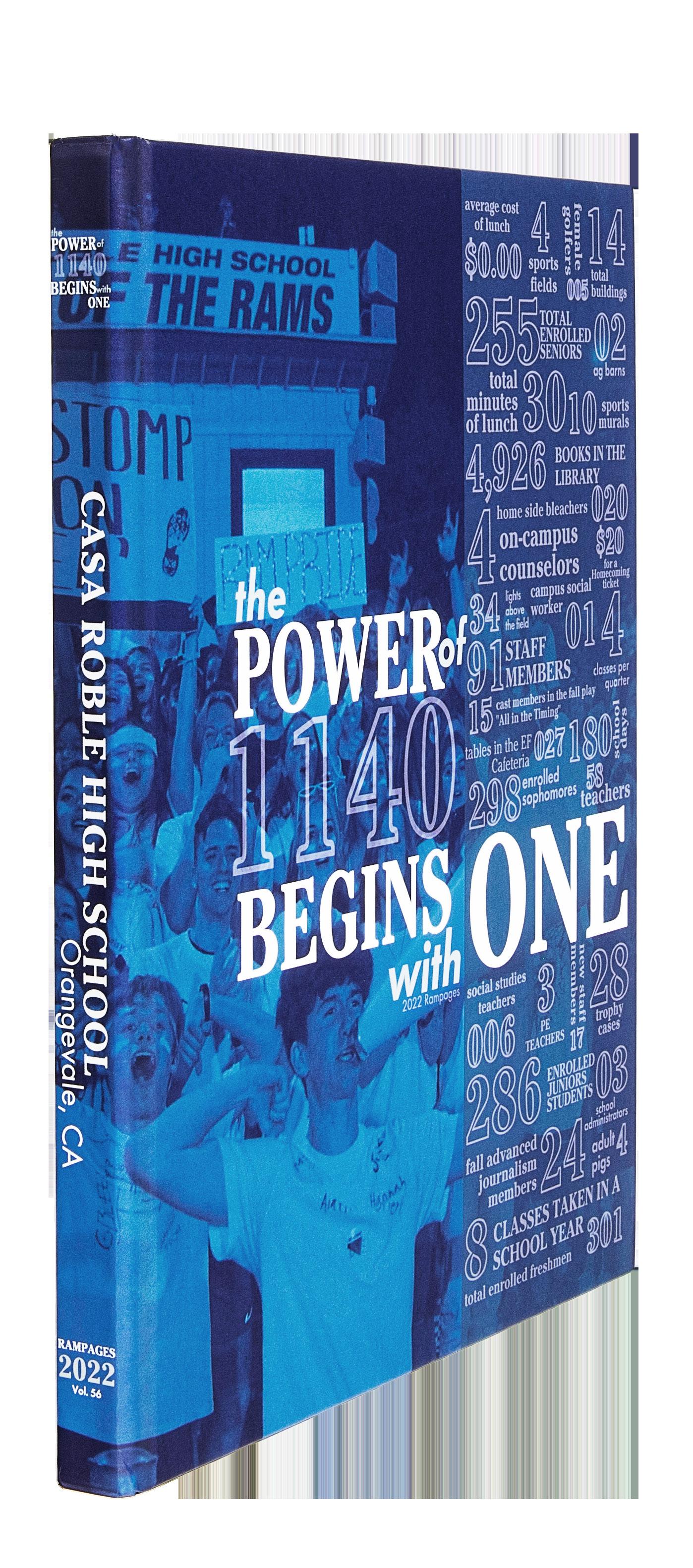 Casa Roble HS ORANGEVALE, CA
Stand-out features:
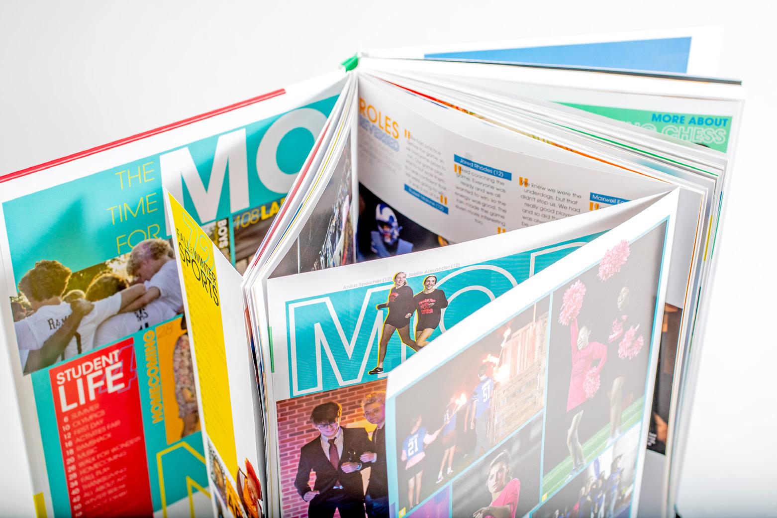
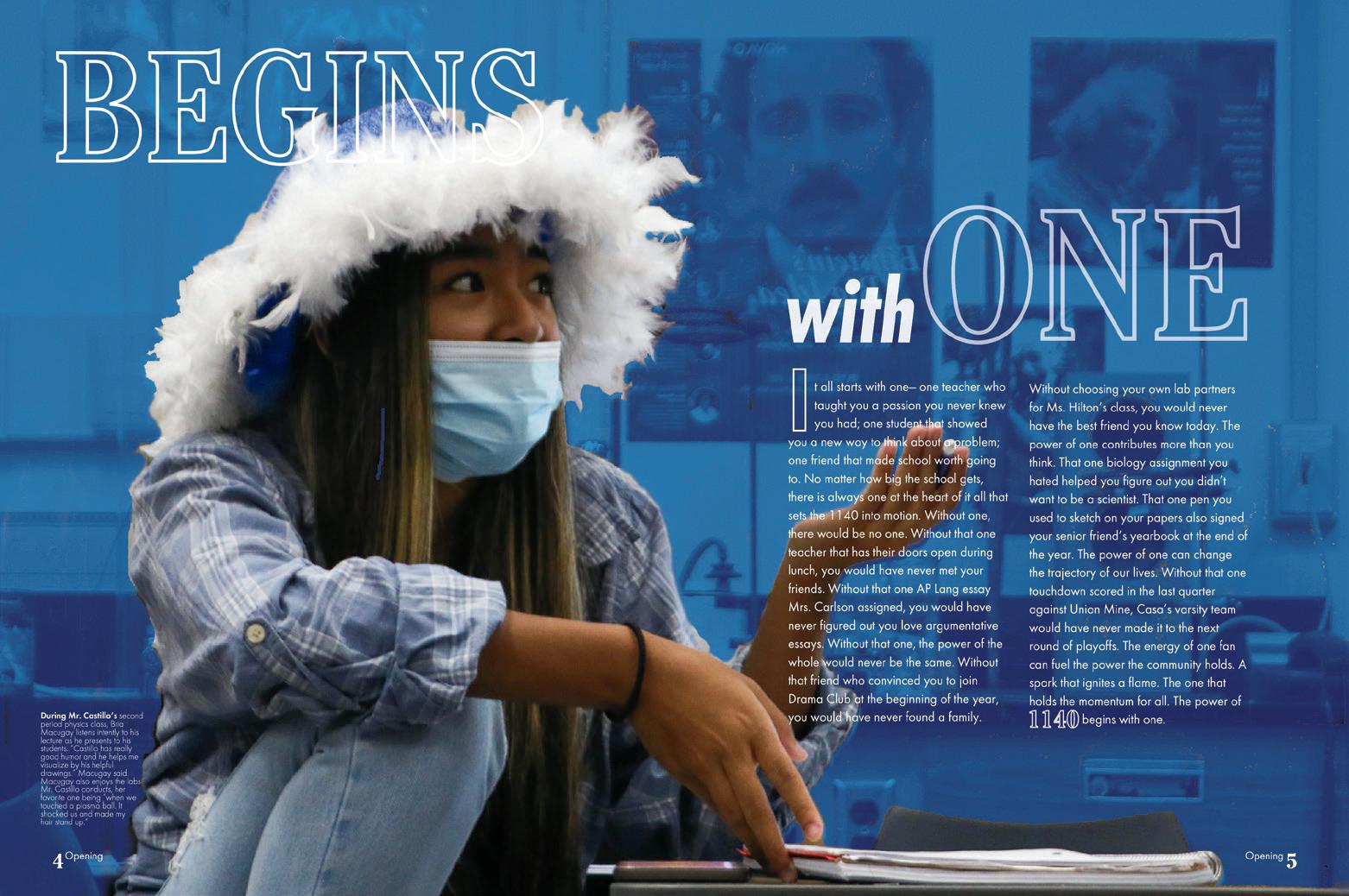
TAKE A NUMBER (AND RUN WITH IT): This numbers-based theme is front and center throughout. From the stats called out on the cover and dividers to numbers included in headlines and stories, this staff kept its focus. The opening copy nails the concept of the book, “The Power Of 1140 Begins With One,” as it recounts the first day back in school — “18 months, 18 days and 21 hours” after the COVID shutdown began. Perfection.
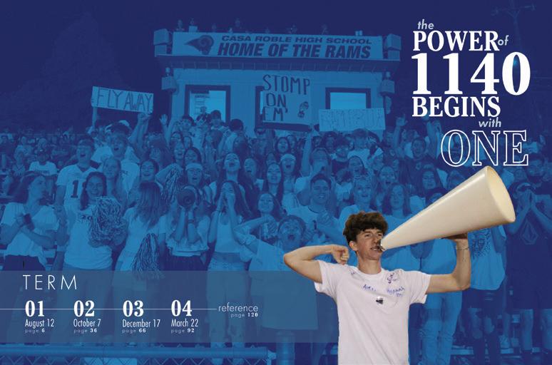
MEANINGFUL MODS: Of course, they used numbers for mods and spin-offs. “One member” is used for talking-head stories and “We can count on” is the header for mods that list four different takes on a topic. Using numerals in headlines and divider graphics helps make that all-important visual-verbal connection.
RULE-FOLLOWERS: Sizing, spacing and use of white space are picture-perfect on all of the editorial spreads. Even better, that consistency we’re attracted to includes a lot of variety. The reader doesn’t ever get the sense that they are seeing the same template filled in over and over again.
ANTHOLOGY | Casa Roble High School 068 069
OPENING COVERAGE PROFILES COVERAGE ENDSHEET DIVIDER COVERAGE
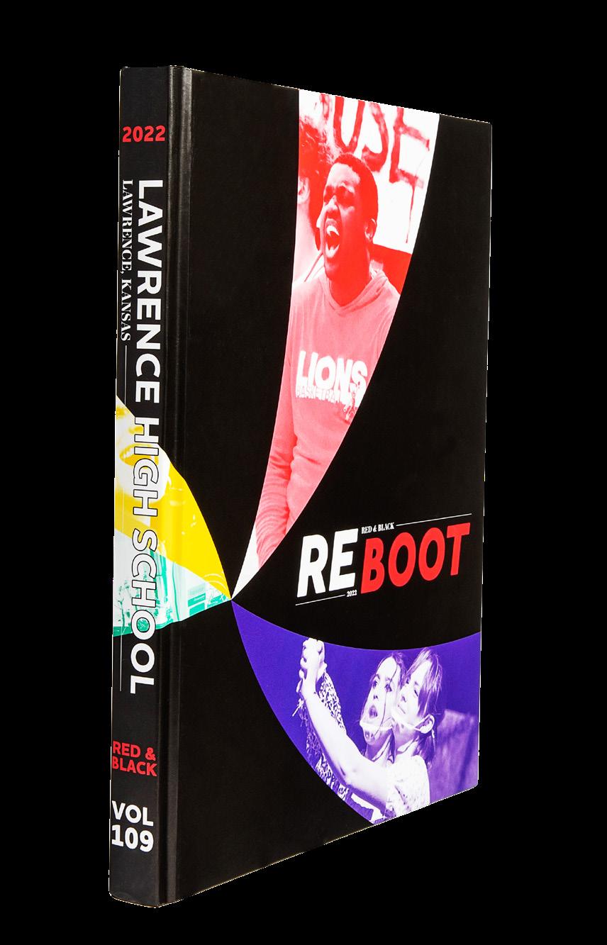
RED & BLACK
Adviser: Barbara Tholen
Editors: Kenna McNally and Kate O’Keefe
HJ Rep: Barry MacCallum
OPENING
COVERAGE
PORTRAITS
PROFILES
 Lawrence HS LAWRENCE, KS
Stand-out features:
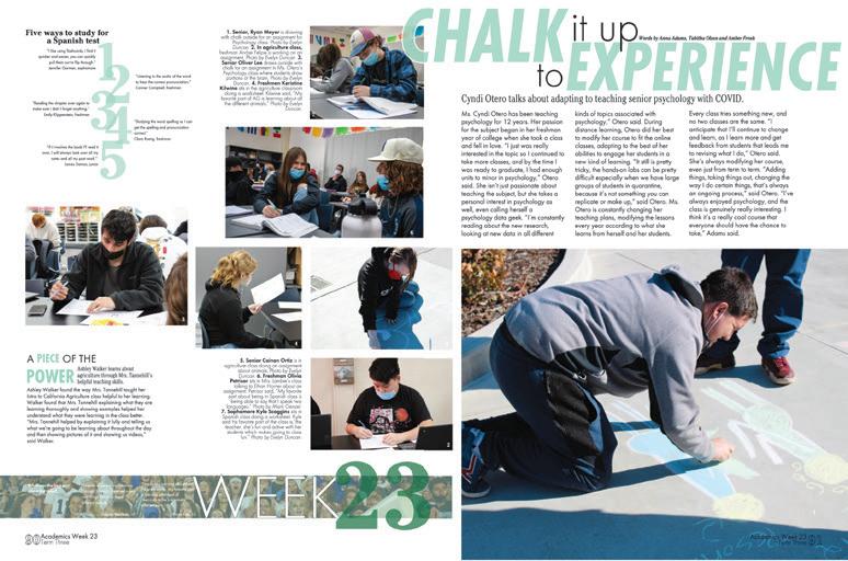
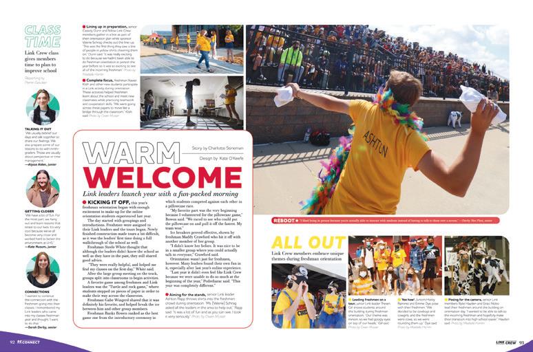
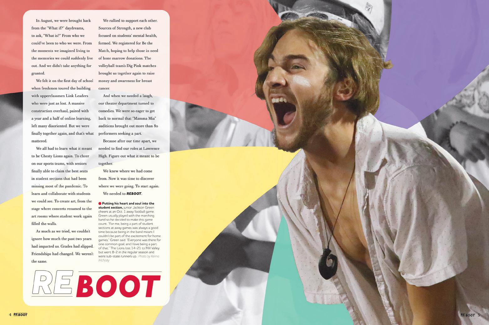
COOL CONCEPT: In the colophon, the staff said they chose the theme “Reboot” to represent their return to school after COVID, but “we weren’t jumping in where we left off, and we weren’t starting completely fresh,” they wrote. So true. The only problem is the word “reboot” conjures up visions of stalling computers — and that’s where the swirling wheel graphic comes from — the spinning loading wheel on Macs. They wrote, “The symbol is both bright and fun — and also frustrating.” And that’s how the year felt to them.
LOOK AT ME: Here’s one way to make sure your readers see the dominant copy package as separate from the mods. The Red & Black staff designed them as a package unto themselves on the spreads, always surrounded by a rounded, thin-stroke box and always the biggest, brightest piece on the page. A slight overlap with the dominant photo completes the visual connection.
ALL THE CUTOUTS: This staff went with cutouts in a big way, but not always in the same way. Kudos for that. Sometimes they’re just heads and shoulders, sometimes they are tiny fullperson cutouts. Sometimes they are on the spinning ball graphic, and sometimes not. Variety is the spice of life.
ANTHOLOGY | Lawrence High School 070 071
COVERAGE INDEX CLOSING ENDSHEET COVERAGE COVERAGE COVERAGE
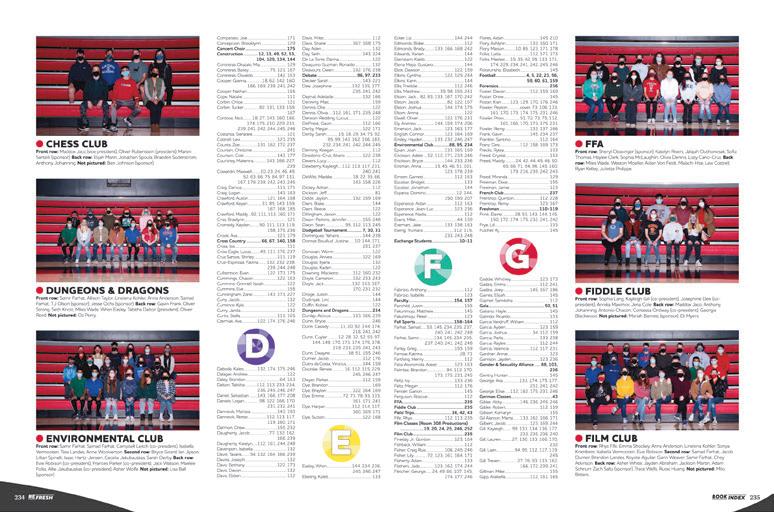
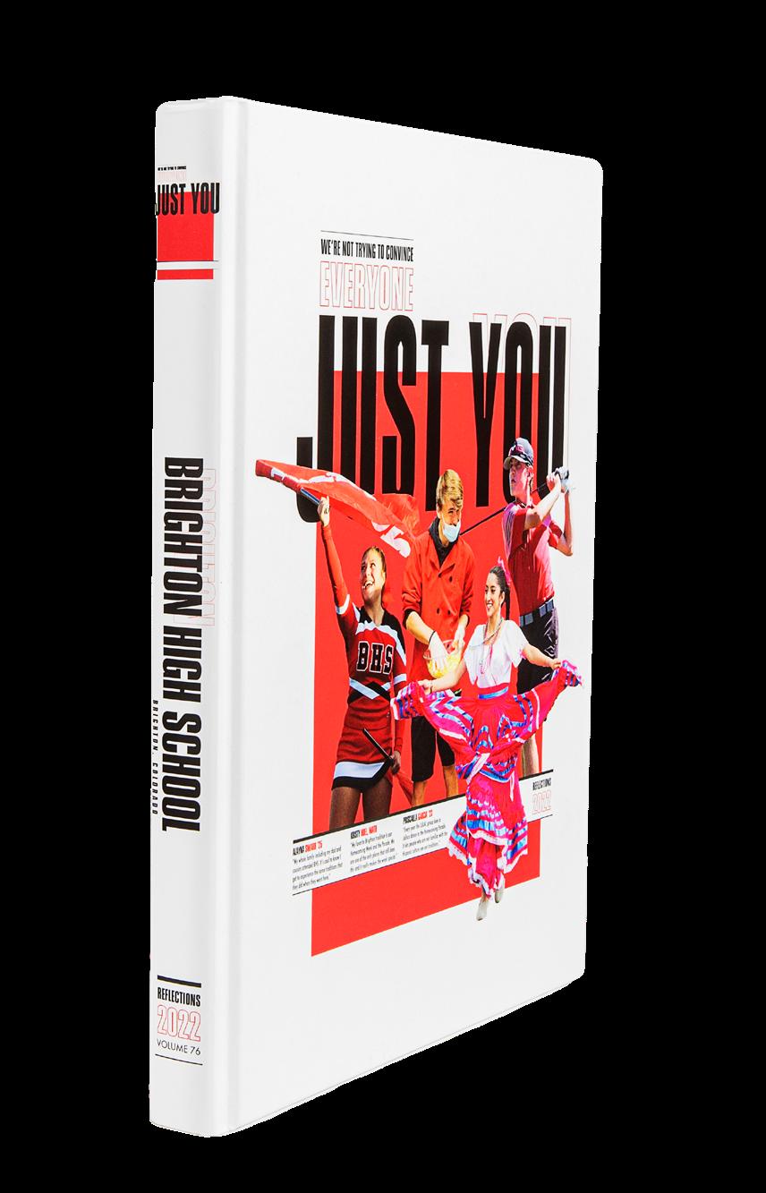
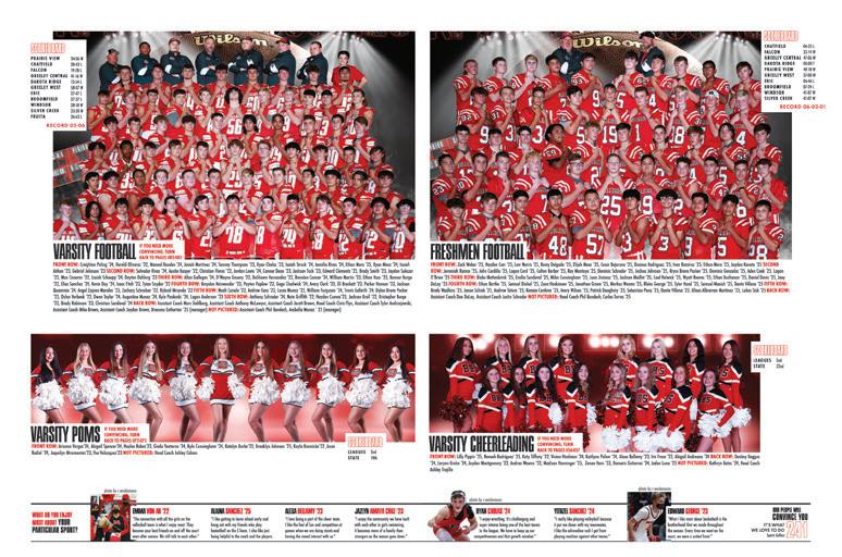
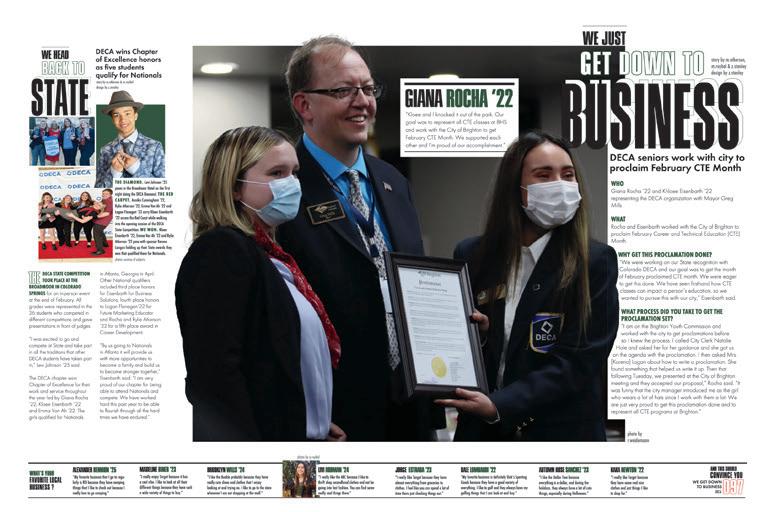
Brighton H S BRIGHTON, CO
REFLECTIONS
Adviser: Justin Daigle
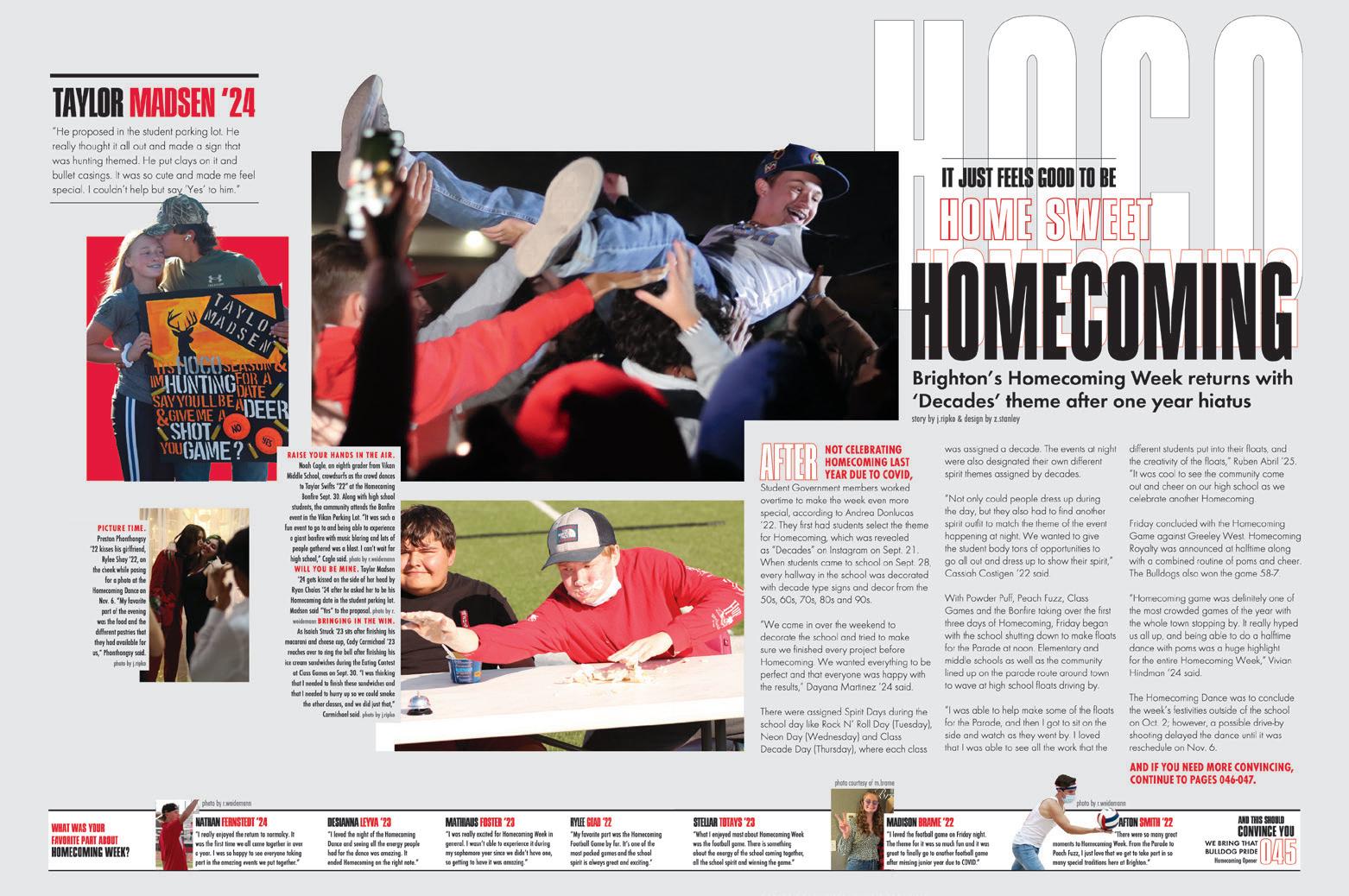
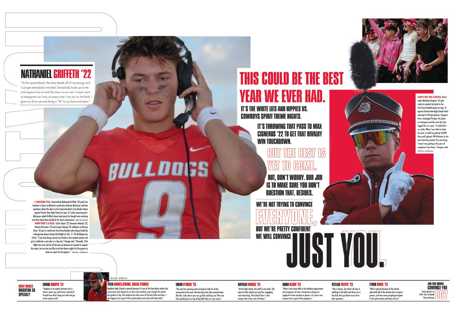
Editors: Jenaya Ripko and Zoey Stanley
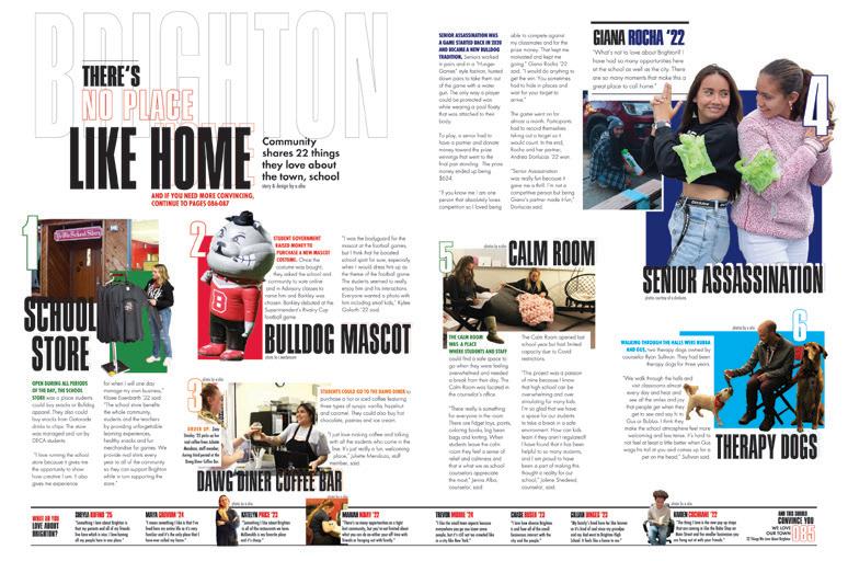
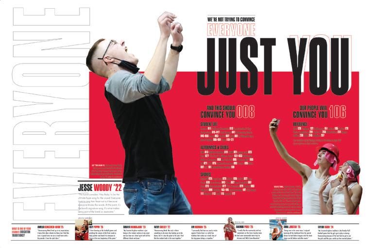
HJ Rep: Ray Slye
OPENING FEATURE ENDSHEET FEATURE
Stand-out features:
EVERY LITTLE THING: The Reflections staff produced a book that judges just love. How do they do it? By not leaving out a single thing. All of the details — from informative folios to topic listings in the index to great headlines and copy — add up to immense reader service. If you need a reference on how it’s done, this is one of the best.
COVERAGE: Quotes and talking heads running at the bottom of spreads make sure SO MANY students are included, and they run from endsheet to endsheet, which is kind of amazing. Actually, scratch that. Technically, this all-coverage device begins with three quotes on the front cover and includes two more on the back. The even-cooler aspect of including quotes on the cover is that they subtly explain the context of the photos chosen for this honor.
DISTINCTIVE DESIGNS: You’d never mistake a spread in this volume for one from another school. The combo of thin, outlined type with condensed sans serif and partial-cutout photos set the visual vibe throughout the book. Color accents on type add to the structure. There are so many extras to make the book special. Just one is the 12-page homecoming section, which covers the fan-favorite week entirely, starting with dance “promposals,” including all of the different festivities and ending with the dance itself. To make it extra extra, the staff included a light gray background on these specialtopic spreads.
ANTHOLOGY | Brighton High School 072 073
OPENING INDEX COVERAGE REFERENCE
Mauldin H S MAULDIN, SC
REFLECTIONS
Adviser: Beth Ward
Editors: Annabella Chesare and Elizabeth Radecki
HJ Rep: Devon Swale

ENDSHEET
COVERAGE COVERAGE COVERAGE
Stand-out features:
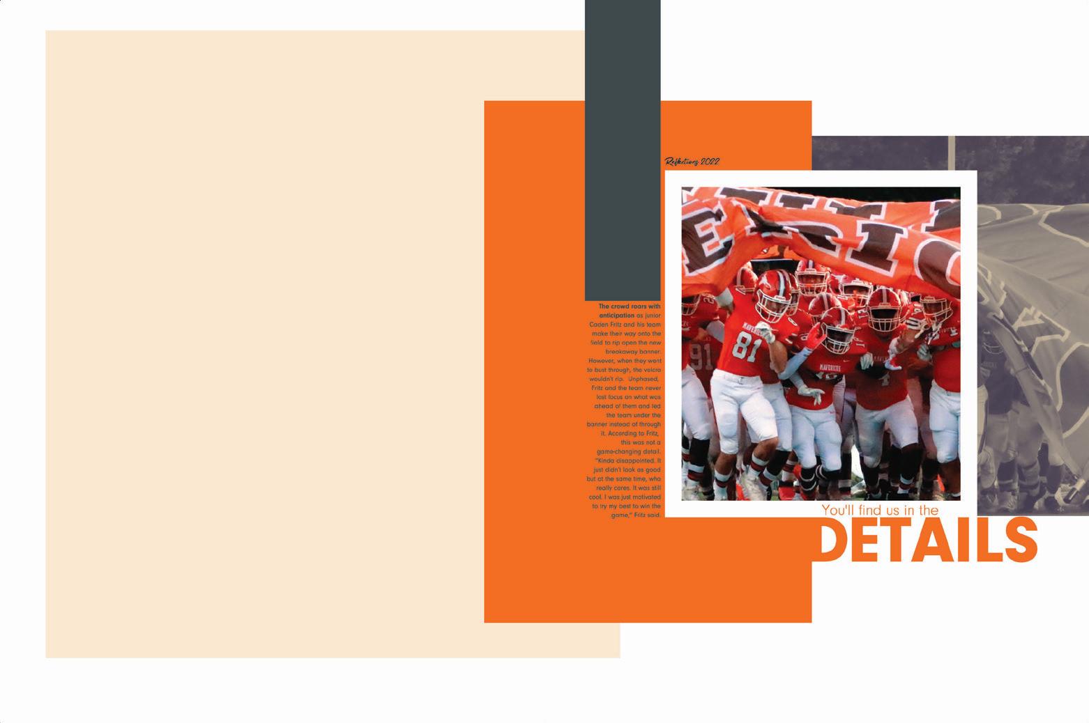
“YOU’LL FIND US IN THE DETAILS.” Challenge accepted — and met. The staff repeated certain elements to bring our attention to the finer details of this volume: Modular coverage on spreads with the perfect eyeline. Squares behind photos or content. Color blocks to anchor content. These features make for a great, cohesive book.
SO MUCH CONTENT: The Reflections staff surrounded their dominant photo/caption packaging with eye-catching, mini-story moments. The headlines of the other coverage played an important role in tying each level of coverage together. The short stories were written in such a small amount of space, but they packed a big punch.
SIMPLE START: The white brackets on the clean but impactful cover provide an important hint to the dominant nature of the graphics used throughout the book. They say, “Look. This is important” as they appear on the endsheet, opening, dividers and dominant photos throughout. The orange accent shapes serve as anchors for headlines, copy packages and mods, but they are never repetitive. They lend an element of movement and variety to the spread designs.
ANTHOLOGY | Mauldin High School 074 075
DIVIDER FEATURE COVERAGE COVERAGE OPENING CLOSING COVERAGE
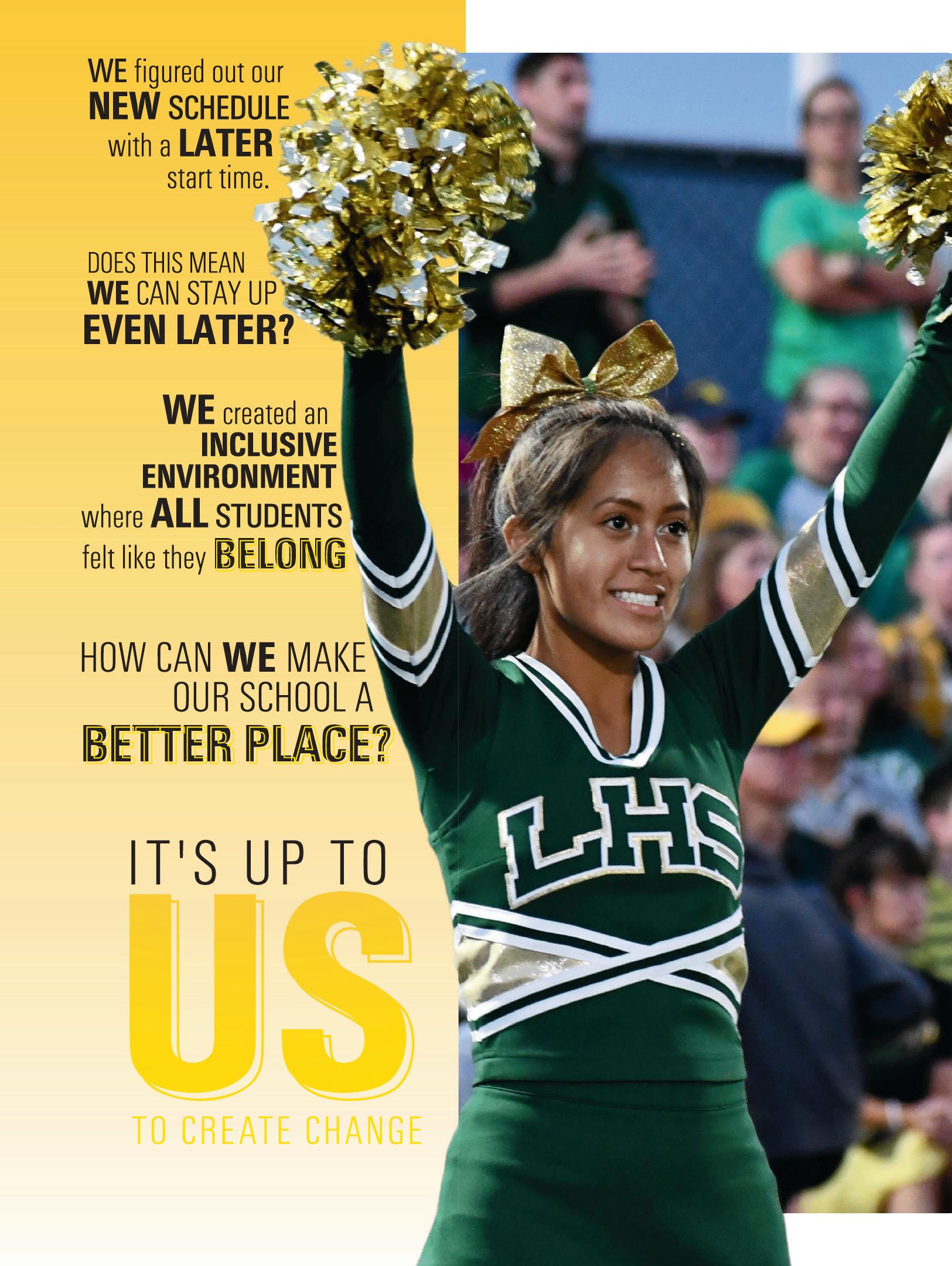
Lindbergh HS
ST. LOUIS, MO
SPIRIT
Adviser: Carrie Rapp
Editors: Grace Herzog and Ashley Dickey
HJ Reps: Dan Mueller, Leah Blase and Danielle Corgan
ENDSHEET COVERAGE
OPENING
Stand-out features:
TELL US A STORY: We love opening theme copy that clearly and concisely tells the tale of the year — with just the right amount of umph and without too many clichés or overly dramatized language. The Spirit staff did just that. It’s easy to see from the beautiful opening spreads that this is a book about how students deal with the inevitable changes they face. (And there will be pretty pictures.)
A WORKABLE FORMULA:
In the portraits section, the staff did a great job of coming up with several ways to include coverage and pulling them out of their toolkit as each story required. There are examples where mods stack atop each other to fill the space, others with a giant photo and profile, and still additional options with varying space for copy and a photo. AND there are stripes of quotes placed vertically between the photo panels. Lots of extra coverage.
DID WE MENTION THE PHOTOS?: When you have great photos, by all means, run them big! This book does a great job of cashing in on the powerful images.
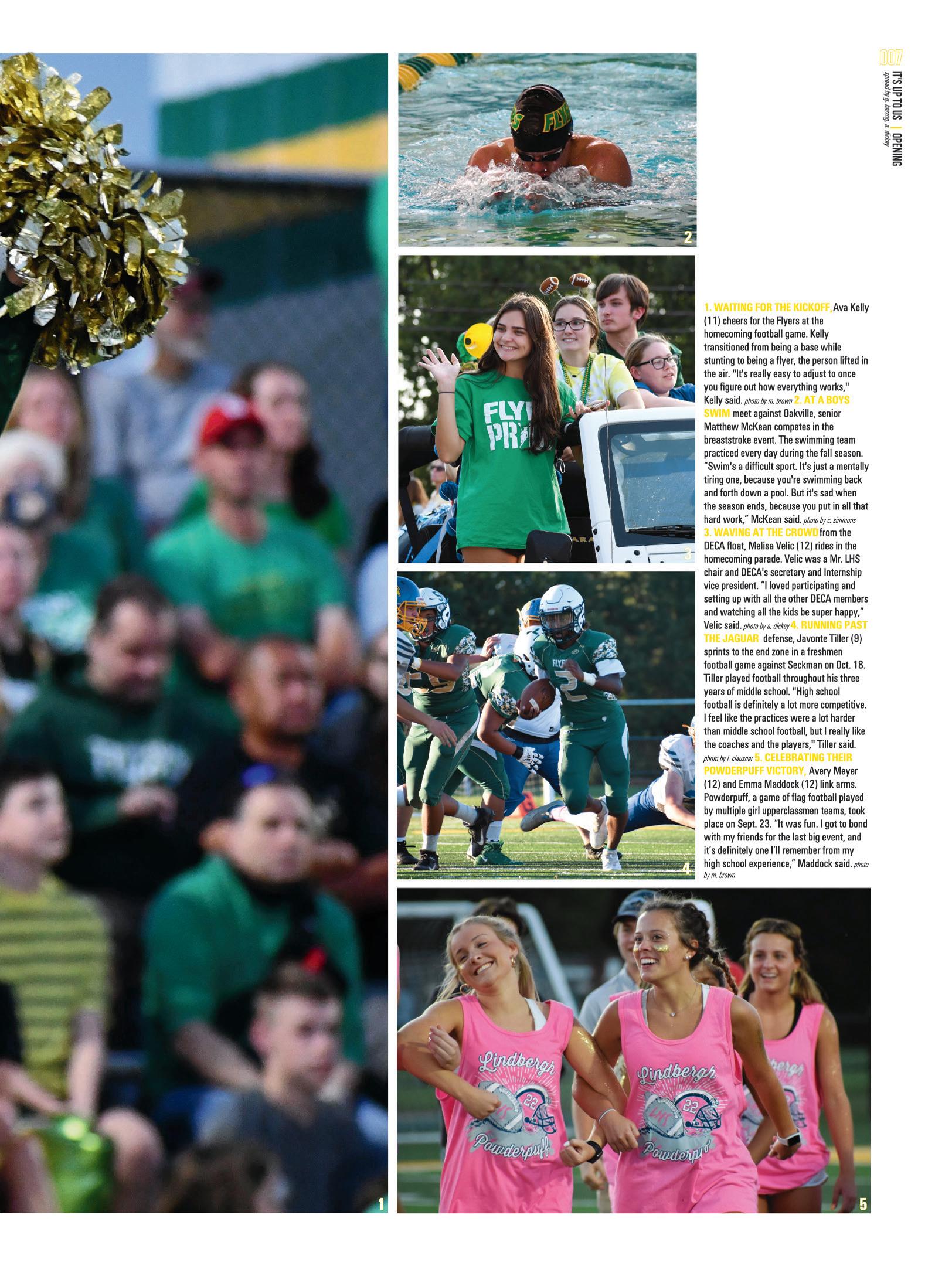
ANTHOLOGY | Lindbergh High School 076 077
DIVIDER PORTRAITS
PROFILES
COVERAGE
California School of the Arts — San Gabriel Valley ORANGEVALE, CA
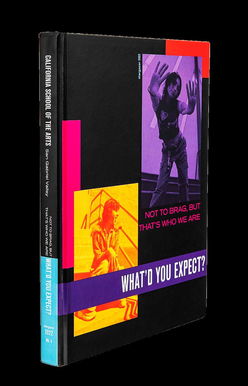
STARGAZER
Adviser: Jane Noh
Editors: Moriah Contreras, Christie Chen, Eva Phillips, Charlene Hsu, Sivan Gilbert, Claire Thompson, Cecilia Alves and Sophia Ko
HJ Rep: Mimi Orth
DIVIDER
PORTRAITS
SENIOR PORTRAITS
Stand-out features:
COLOR OVERLAYS: Creating a bold palette, the staff mixed regular photos with those overlaid with a commanding color from the palette to set the tone of their sassy “Not To Brag…” book. These make a strong visual statement, but don’t appear on every single page, so there’s no chance they become an overwhelming factor in the design.
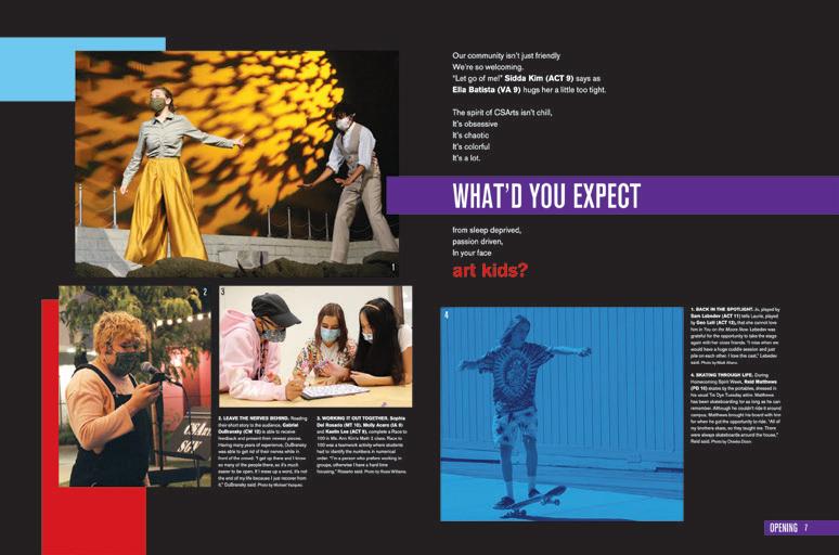
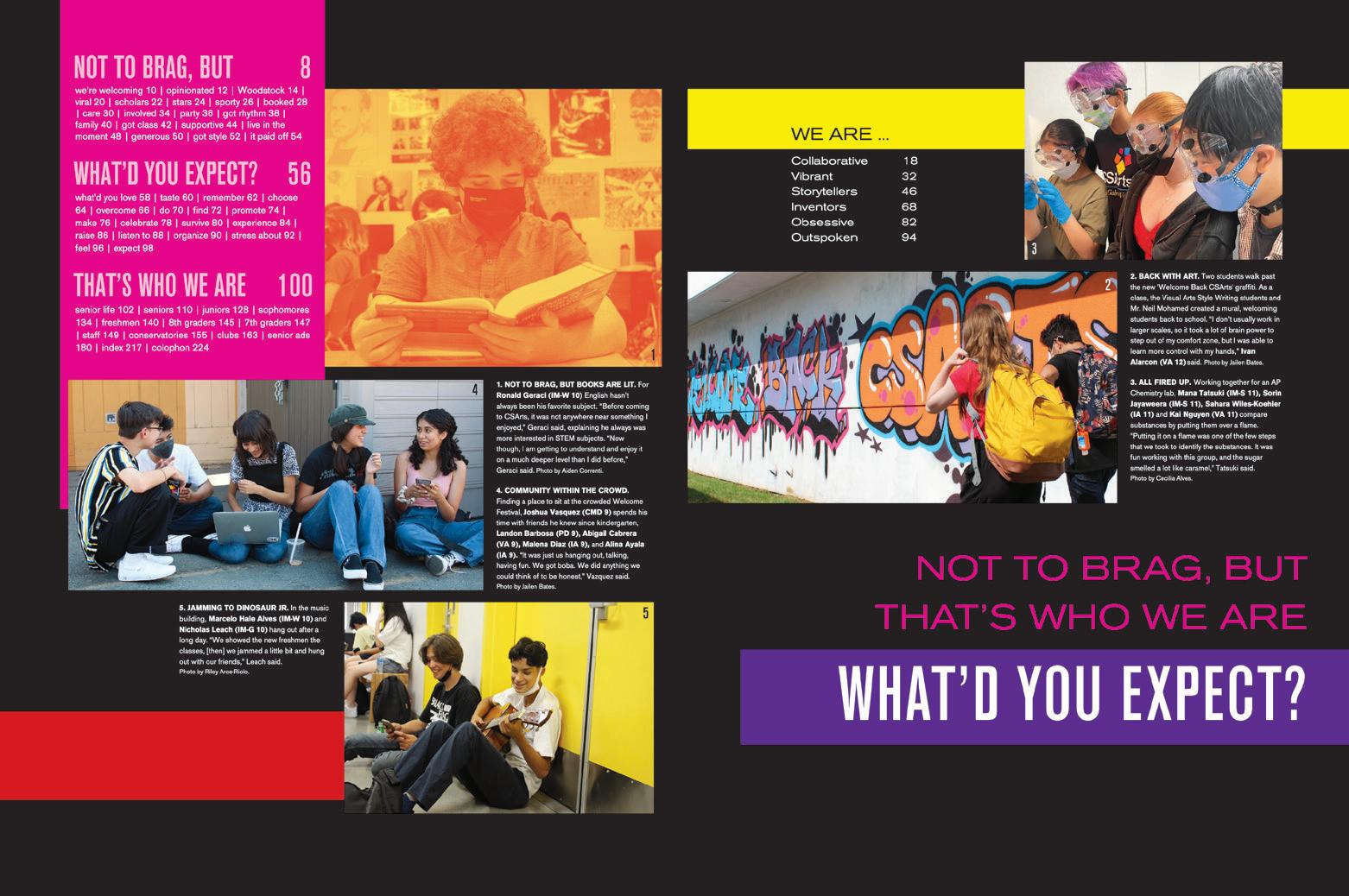
UNDER THE UMBRELLA: Theme-based organization is on display in the Stargazer Three sections are laid out on the front endsheets, and they are dictated by the three phrases of the theme, “Not To Brag, But What Did You Expect? That’s Who We Are.” Then, there are six more “We Are…” pages referenced. These are their interrupter spreads: Collaborative, Vibrant, Storytellers, Inventors, Obsessive and Outspoken.
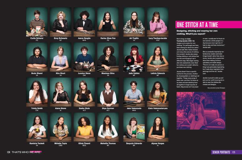
STAY AWHILE: Seldom do you see a portrait section that inspires such inspection as the Stargazer’s. First, there’s the senior section, wherein the seniors had the opportunity to bring a prop (even the meowing or barking type) to uberpersonalize their last high school yearbook portrait. What a joy to see. Then, there are the coverage modules through the whole section which cover an interesting array of topics. It’s fascinating.
ANTHOLOGY | California School of the Arts — San Gabriel Valley 078 079
ENDSHEET
OPENING COVERAGE
PROFILES
Smoky Hill HS AURORA, CO
SUMMIT
Adviser: Carrie Faust
Editor: Angelicah Rosier
HJ Rep: Ray Slye
OPENING
COVERAGE ENDSHEET DIVIDER
Stand-out features:
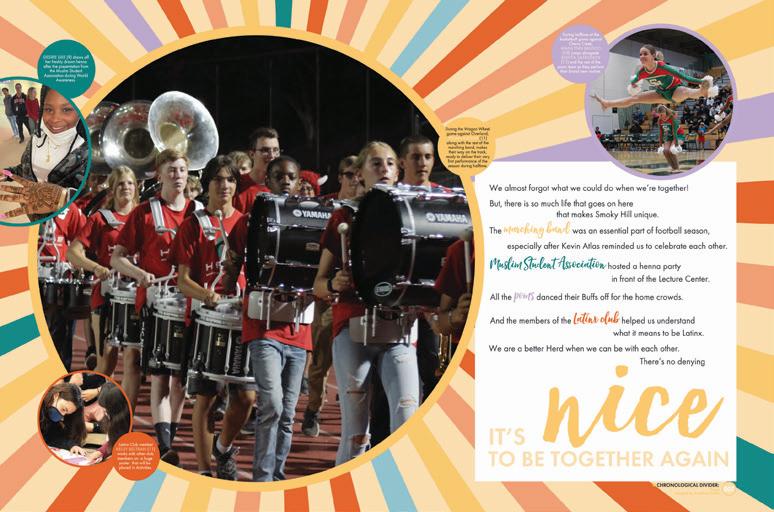
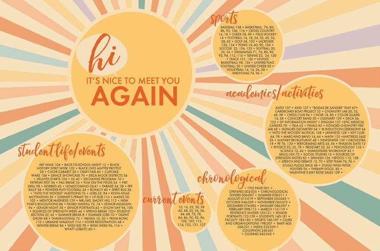
ROUND AND ROUND: When your main design element is a circle, it’s important to first and foremost plan its purpose — then execute. The Summit staff put their circles to work, drawing attention to captions, quotes and photos, leading the eye to accents and reinforcing the look established on the cover. Plus, we love the visual connection to speech bubbles sprinkled throughout the book in mods and pull quotes — a testament to their conversational theme.
ONE GREAT SIZE EIGHT: A coverage-packed size eight book shows us that the Summit staff understood the importance of designing with purpose. The staff used all extra space and used it well. Plus, their quickturn supplement let us see student events through April. What a great solution to ensure that almost every event is covered.
IT IS NICE TO MEET
YOU: To start, you’re welcomed into the book with a comforting cover and info-packed endsheet. In the opening, the theme is introduced in a way that made us feel like we were Smoky Hill students. (We wish.) Mods and profiles throughout allow the students to “meet” others and bring their school community back together.

ANTHOLOGY | Smoky Hill High School 080 081
PROFILE COVERAGE ENDSHEET
PORTRAITS
Liberty HS
LAKE SAINT LOUIS, MO
TALON
Adviser: Jonathan Hall
Editor: Rhett Cunningham
HJ Reps: Dan Mueller, Leah Blase and Danielle Corgan
COVERAGE
PROFILES
OPENING
DIVIDER
Stand-out features:
CONTRAST IS COOL: This book demonstrates great examples of contrast. Start with how the Matte and Gloss elements interact with each other on the cover and on pages where Gloss UV hits photos and graphics, or not. Then, consider the pairing of the super-skinny, tall sans serif font with a wider serif. Finally, the four-line graphic from the cover pulls it all together as an accent for dominant photos and pull quotes. Nice job.
SQUARED OFF: This book is also a solid example of Square One. It has great eyelines and use of white space — more space to separate major elements and smaller space for elements that go together. The same spacing regimen is also applied to the opening, closing, dividers, reference, etc… It lends a certain amount of calmness to the book.
HAPPY HYBRID: While the content is labeled with three traditional section titles (Life, Sports and Reference), the Life section includes events, organizations, academics and features coverage chronologically by week. A pair of dividers provides internal contents listings, and major event interrupters provide space for big photos and longer stories.
ANTHOLOGY | Liberty High School 082 083
INNOVATION: BLIND GLOSS UV ON ENDSHEET OPENING PORTRAITS COVERAGE COVERAGE
TALON
Adviser: Whitney Huang
Editors: Anika Mani and Shinjan Ghosh
HJ Reps: Michele Paolini and Carla Hansen
 The Harker School SAN JOSE, CA
OPENING ENDSHEET DIVIDER
Stand-out features:
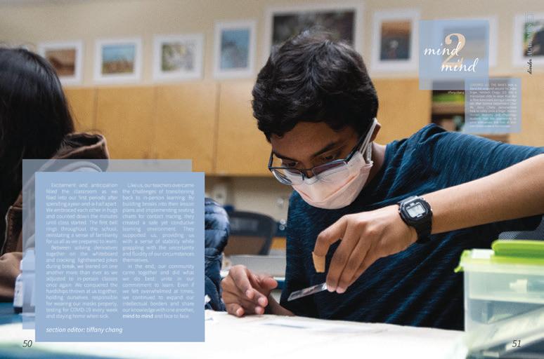
COVER 2 COVER:
The theme “Face 2 Face” presents many paths. The Talon staff mastered using thematic [thing] 2 [thing] moments throughout their book. Smaller mods highlight the comparison of two items of the same topic. Plus, traditional sections are renamed with [thing] 2 [thing] to advance the theme along. And because they’re just so good, theme copy on dividers ends with both the section title and theme phrase of “face to face.”
MIX IT UP: Designers of this volume created visually pleasing looks, balancing both photo-heavy spreads and spreads filled with mods, talking heads and stats. Long-form copy is met with illustrations to achieve a successful hierarchy in places where you wouldn’t expect it. Some spreads don’t feature what we would call a traditional structure, but the designers knew to operate with an obvious use of the grid, something we all can appreciate.
PARTY IN THE BACK:
And, it’s a party we all want to be invited to. This reference section is one to pay attention to: Themesupporting coverage on portrait pages. Well-executed senior dedications. Index with additional coverage. Sports pages with complete scoreboards and season records. (All the reference section heart eyes.) Plus, the well-written colophon even includes their HJ reps in the same way as their staffers. What a nice touch.
ANTHOLOGY | The Harker School 084 085
COVERAGE COVERAGE
TECHNIQUES
Adviser: Erinn Harris
Editors: Jessica Feng, Yeefay Li and Kritika Kumar
HJ Rep: Kara Petersen
 Thomas Jefferson HS for Science and Technology ALEXANDRIA, VA
OPENING COVERAGE ENDSHEET COVERAGE
PORTRAITS
Stand-out features:
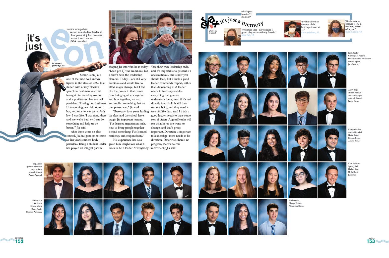
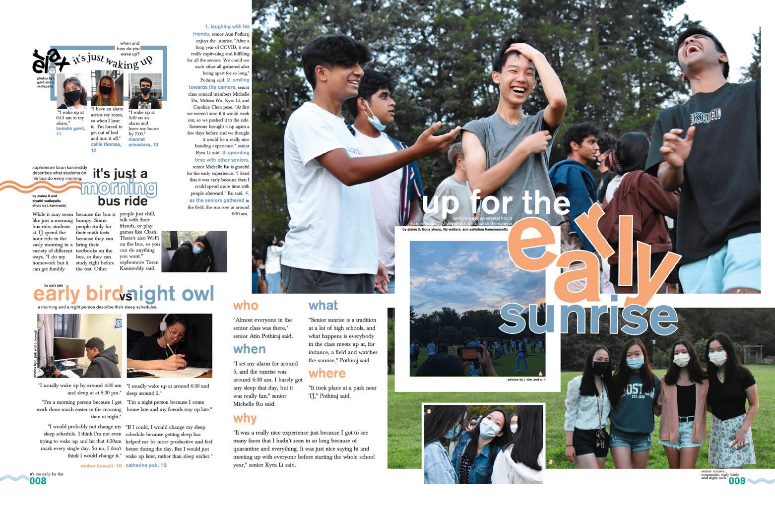
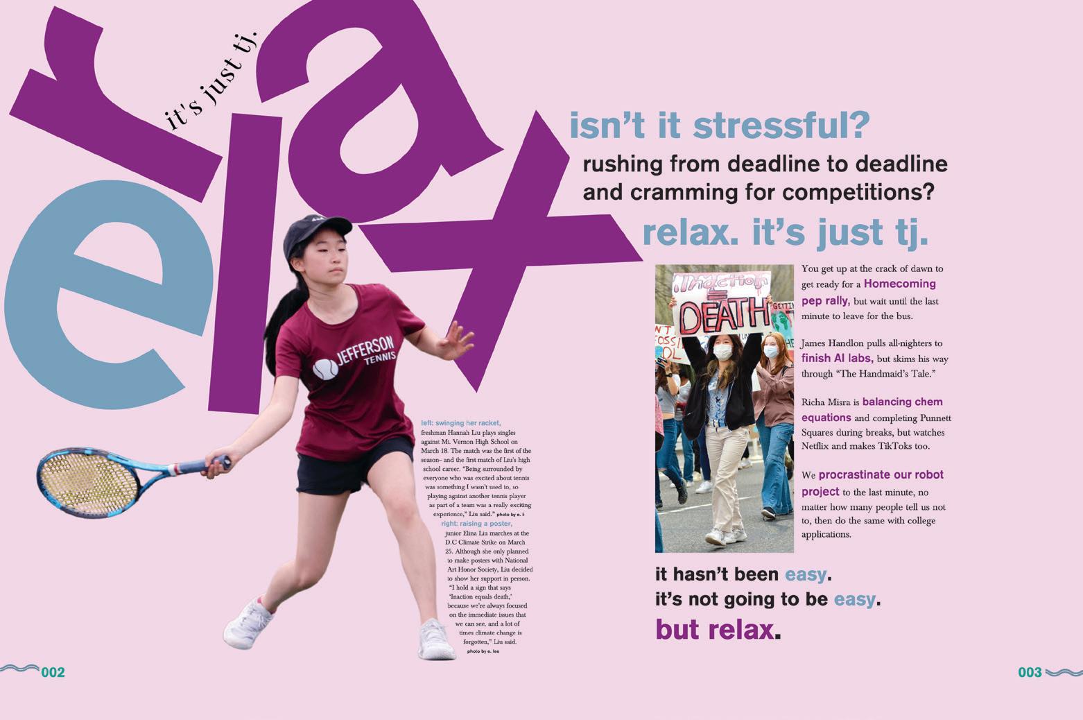
WELL-EXECUTED THEME: We love the rotated “tumble” type, the squiggle line and type on a path — all things that make readers twist and turn. But the staffers at TJ knew the game they were playing with the theme “Relax. It’s Just TJ.” It’s a bold statement that also requires a strategy — and it could go south quickly. But not with this volume. The fun, visual identifiers are clear as a sunny day while the verbal finds its way into headline packages and mods — without being overdone.
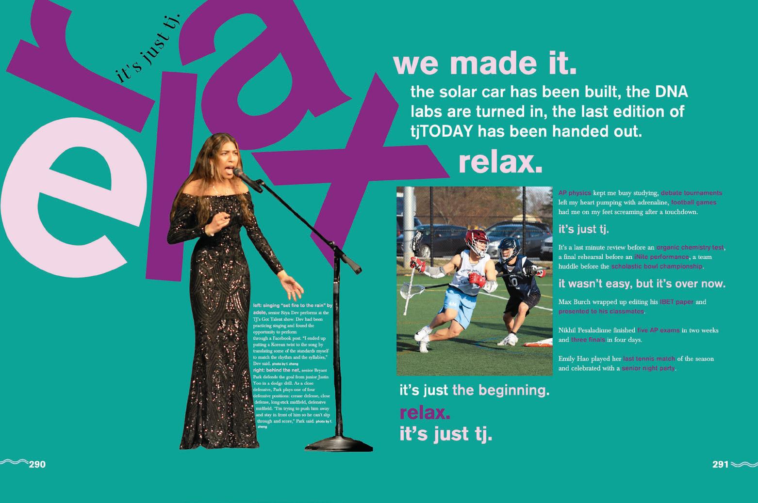
DIVIDER
AN ENDSHEET FOR THE MASSES: Relax, it’s just umbrella coverage. Starting off their 37th volume with an endsheet that makes you look, the Techniques staff remembered their audience and provided an additional table of contents for those who want to know quickly where to find themselves. Plus, the captions for the images on the front and back lids are right where you can find them.
ANTHOLOGY | Thomas Jefferson High School for Science and Technology 086 087
CLOSING
EXTRA SOMETHIN’ SOMETHIN’: There are many ways to take your portrait pages to the next level. Enhancing student coverage with mini-profiles or talking heads is always a great start. The staff added Gloss UV on only the senior portraits to offer a small but mighty change in a section that deserves a few enhancements. REFERENCE
ENDSHEET
Temple City HS
TEMPLE CITY, CA
TEMPLAR
Adviser: Lynn Alvarez
Editors: Vienna Lopez, Keith Tran, Ashley Peng, LeAnn Trac, Ashley Duong, Ivan Rim and Maya Lipski
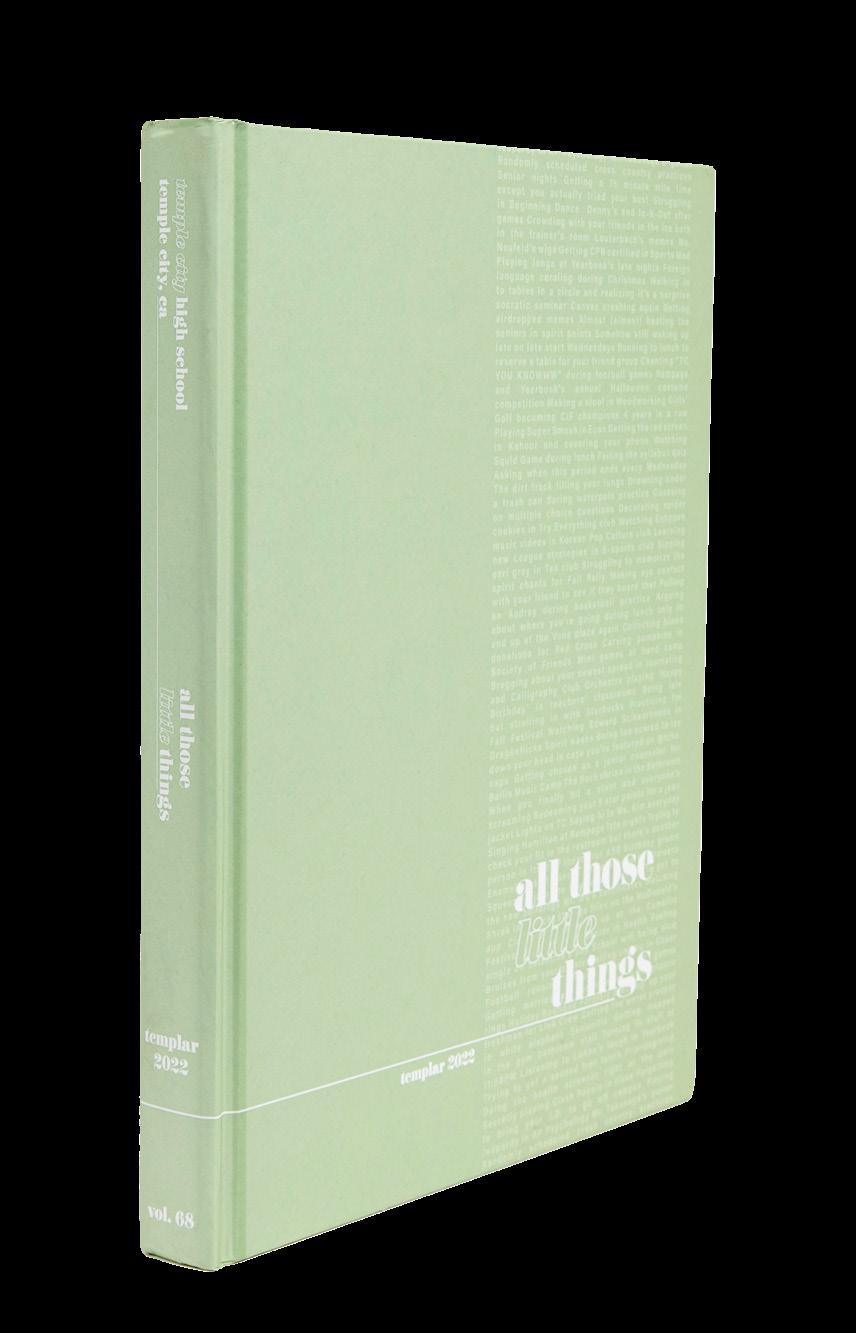
HJ Rep: Mimi Orth
DIVIDER
FEATURE
COVERAGE
FEATURE
PROFILES
Stand-out features:
ALL THOSE LITTLE THINGS: The staff sprinkled theme copy throughout the entire book, a “little thing” that matters when executing a theme successfully. You’ll catch spin-offs like “Here’s The Thing,” “All The Little [insert your word here]” or “All In The Details.” Almost all spreads feature a repeating mod: a talking head cutout and a short quote about something that matters to that featured student. Such a perfect way to increase student coverage.
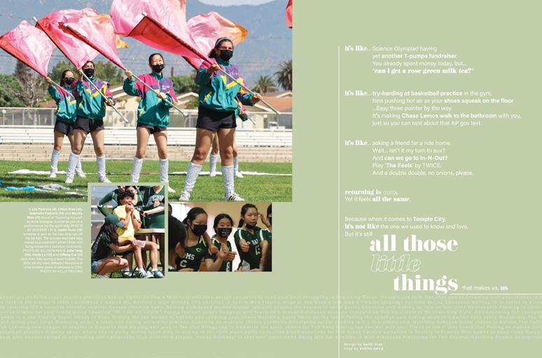
CHECKING OFF THE BOXES: One of the best parts about this volume of Templar is that it’s easily identifiable. If we had to match the cover to the pages in a mountain of paper, we’d be able to. The simple — yet fresh — Suedelaminated cover design is echoed on spreads with skinny transparent columns of pull quotes. A “little thing” with major design power.
COLUMNS CONTROLLED WITH CARE: Here and there, the staff experimented with wider-than-normal copy blocks while sticking within their modular coverage spreads. Visual hierarchy is in play with an assist from thin-stroked lines to lead your eye around the spread. It takes a strong design team to make something like this work, and the entire Templar staff should celebrate.
ANTHOLOGY | Temple City High School 088 089
FEATURE OPENING COVERAGE
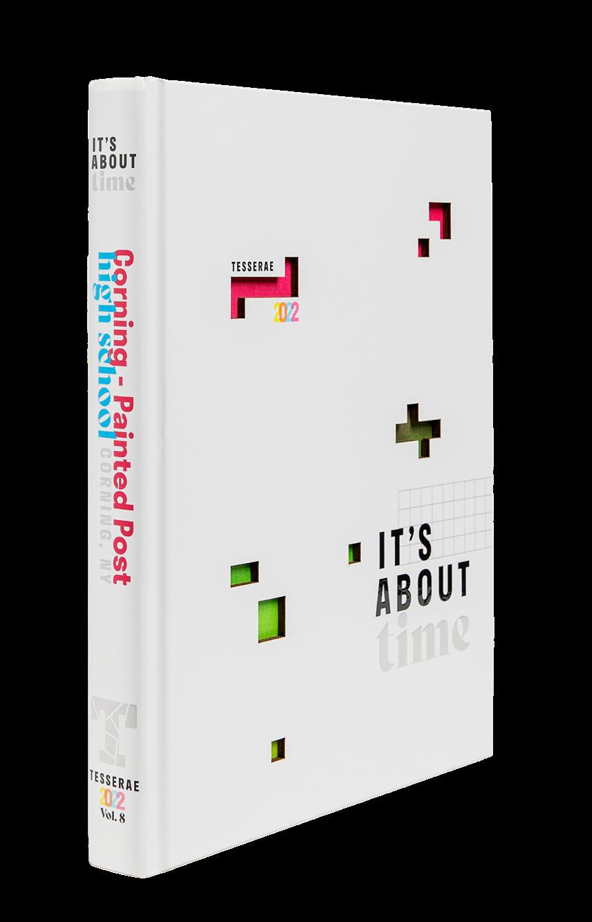
Corning-Paint ed Post HS CORNING, NY
TESSERAE
Advisers: Michael Simons and Katie Paulison-Harris
Editors: Alivia Jiang, Kaitlin Chung and Adah Gray
HJ Rep: Jim Mielty
OPENING FEATURE CLOSING COVERAGE
Stand-out features:
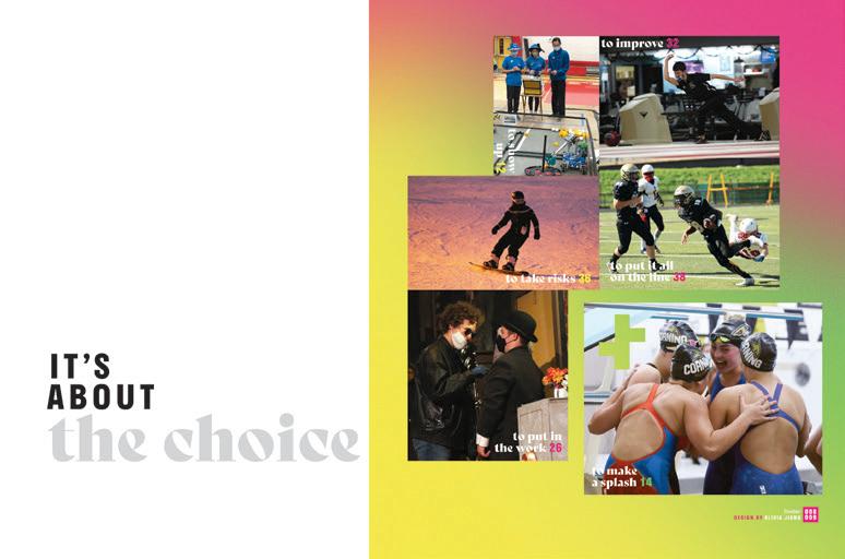
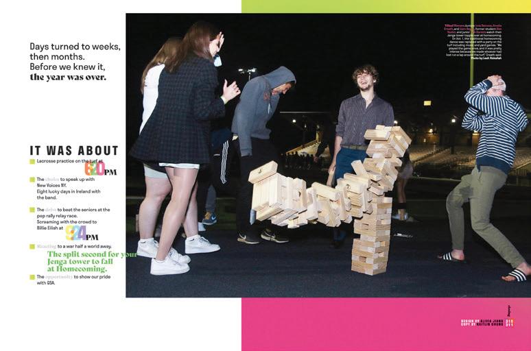
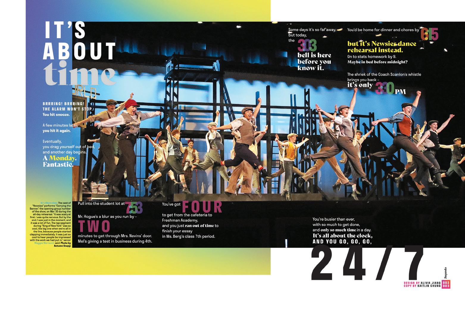
THAT’S A FLEX: We love a theme that is really workable and malleable. This one comes into play in so many ways. There’s time, like the time on a clock and in a school schedule. There’s time, like the time you spend doing important things. And then, there’s the concept of “It’s About Time,” as in “are we there yet?” You can bet this staff made the most of the different shades of meaning. Hold on, they weren’t done. There’s the “It’s about” part of their theme. Their umbrella coverage is gathered up into four categories related to what they’re about: “The Choice,” “The Drive,” “How We React” and “The Opportunity.”
RUNWAY READY: If you’ve been in the yearbook world for a minute, you probably know Tesserae. But did you know their theme copy is so good that it serves as a script for their theme video? There’s a good test to apply to your own copy. Does it pass the script test? Need to see what we mean? Go to tesseraeybk. com or YouTube and search for Tesserae theme video.
OH, I GET IT NOW: Umbrella coverage, which gathers content by a shared element, is not the easiest to explain, understand or pull off. Here’s a great idea for making this organizational structure more straightforward. The book lists (on the back cover and inside) eight times of day. Inside, there are eight feature spreads that include the things that happen at that time. So, 3:52 is about the things that happen after school — jobs, clubs, weight lifting and tutoring, etc…
ANTHOLOGY | Corning-Paint ed Post High School 090 091
COVERAGE COVERAGE REFERENCE DIVIDER ENDSHEET OPTION ENDSHEET OPTION ENDSHEET OPTION
Classical Academy HS ESCONDIDO, CA
THE CHRONICLE
Adviser: Barak Smith
Editors: Jessica Sather, Annelies Vlugt, Karina Ho and Seth Brown
HJ Rep: Elizabeth Doebler
DIVIDER
REFERENCE
ENDSHEET
COVERAGE
Stand-out features:
TELL ME A STORY: This staff didn’t shy away from telling complete stories about the students in their midst. There’s long-form coverage everywhere and especially in the people section. As a result, even years from now, the students who own this yearbook will be able to go back to a moment in time and really understand exactly what was going on and what their peers were thinking.
FOR YOUR REFERENCE:
It’s not every day you find yourself thinking, “Ooh. This is pretty!” when flipping through the reference section of a yearbook. If you are looking to make a crisp, clean, oh-so-professional reference section, here’s a great example.
VERTICAL VIBES:
Starting with the dividers and continuing throughout, The Chronicle’s designers opted for layouts that used vertical dominant photos and lines, as opposed to horizontal configurations. It’s subtle, but it makes the book seem taller and gives it a vibe that’s different from many others.
ANTHOLOGY | Classical Academy High School 092 093
PROFILE PORTRAITS INDEX PROFILE FEATURE FEATURE DIVIDER
ENDSHEET DIVIDER
Pleasant Grove HS TEXARKANA, TX
THE HAWK
Adviser: Charla Harris
Editors: Tori Scoggins, Landry Trammell, Caroline Maynard and Kendall Johnson
HJ Rep: Bridget Sherrill
COVERAGE
OPENING
Stand-out features:
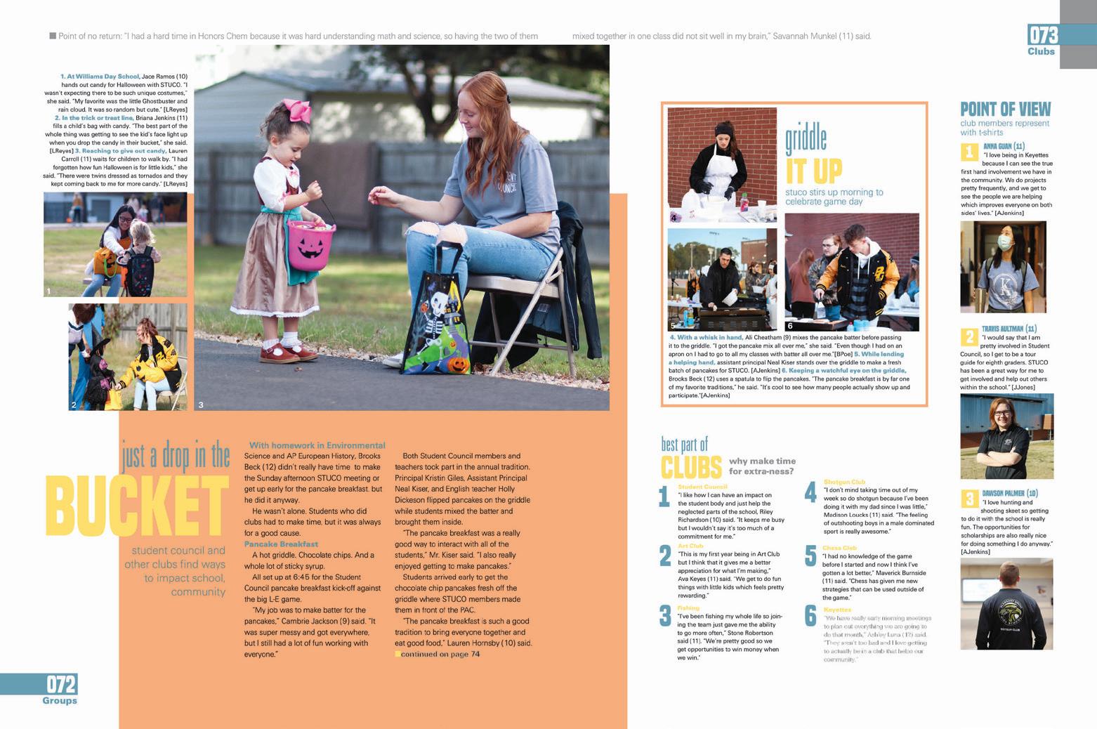
PAGE ONE HAD US HOOKED: Your title page doesn’t have to be boring. Of course, it should provide all the important information. School name, address, admin and enrollment totals — a few basics. The Hawk staff gave us that and more. Such a strong visual and verbal connection to the theme “And That’s The Point” with an image of a finger pointing to the main design element seen throughout the book. Plus, his fit matches the book’s colors. Boom! Talk about perfection.
THEY MADE A POINT: This staff chose a great theme for word play and spin-off coverage. Headlines varied from “point of view,” “strong point” and “breaking point” — just to name a few. We love when extra student features also provide a great verbal connection to theme.
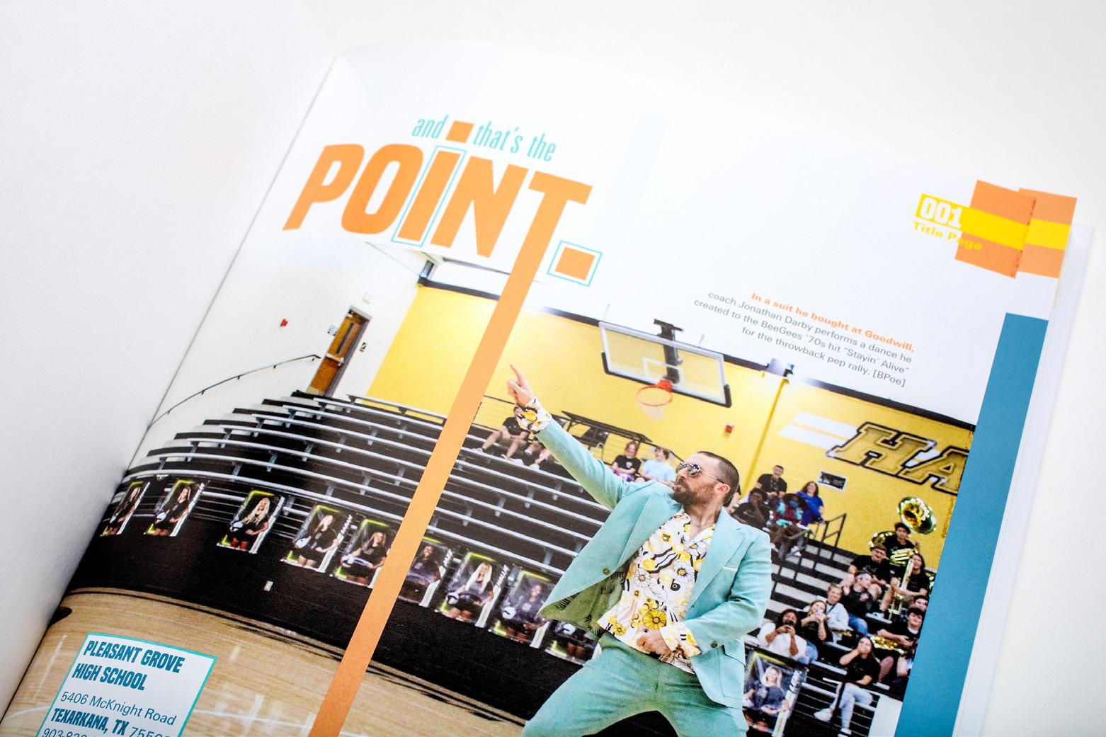
A+ COLOR AND SPACE: The well-balanced color palette doesn’t distract from these coverage-packed spreads. The extended line from the cover offers an anchor opportunity for mods and other coverage devices. Plus, we love to see the same width of space in between content and a good eyeline.
ANTHOLOGY | Pleasant Grove High School 094 095
TITLE PAGE PORTRAITS COVERAGE CLOSING
DIVIDER
ENDSHEET
Cheyenne Mountain HS COLORADO SPRINGS, CO
THE TALON
Adviser: Erik Austin
Editor: Edyn Webber
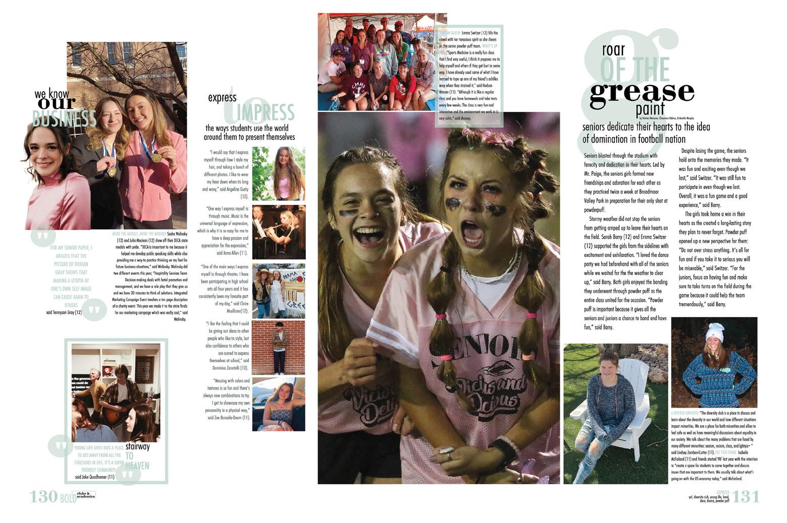
HJ Rep: Rebecca McGrath
COVERAGE
PROFILE
Stand-out features:
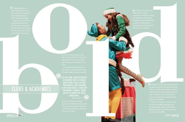
GO BOLD: From the theme, which is definitely a bold statement, to the four-section organization, The Talon is all about bold statements. The dividers are where we see giant versions of the section labels: “Zeal,” “Peak,” “Bold” and “Hope.” Each renames a traditional section: student life, athletics, clubs and academics, and people and reference, respectively. The big, beautiful type is joined by partial cutouts as well as copy — and a color to match the section’s palette as defined by the endsheet.
PARDON THE INTERRUPTION:
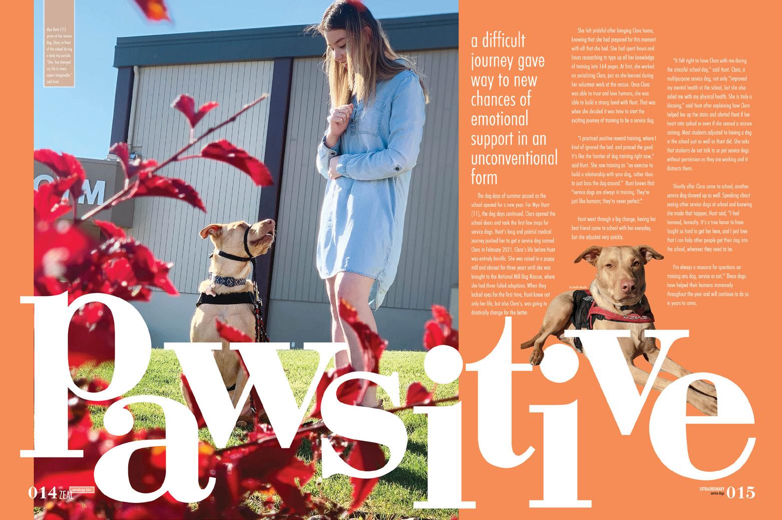
Actually, praise the interrupter spreads. Playing off the theme word “extraordinary,” these spreads call out topics or students the staff chose for the honor — everything from the show choir to a student who drives race cars to service dogs. (Who doesn’t love a puppy?) With heavy coverage on the adjoining spreads, these interrupters ensure the reader is rewarded for their time.
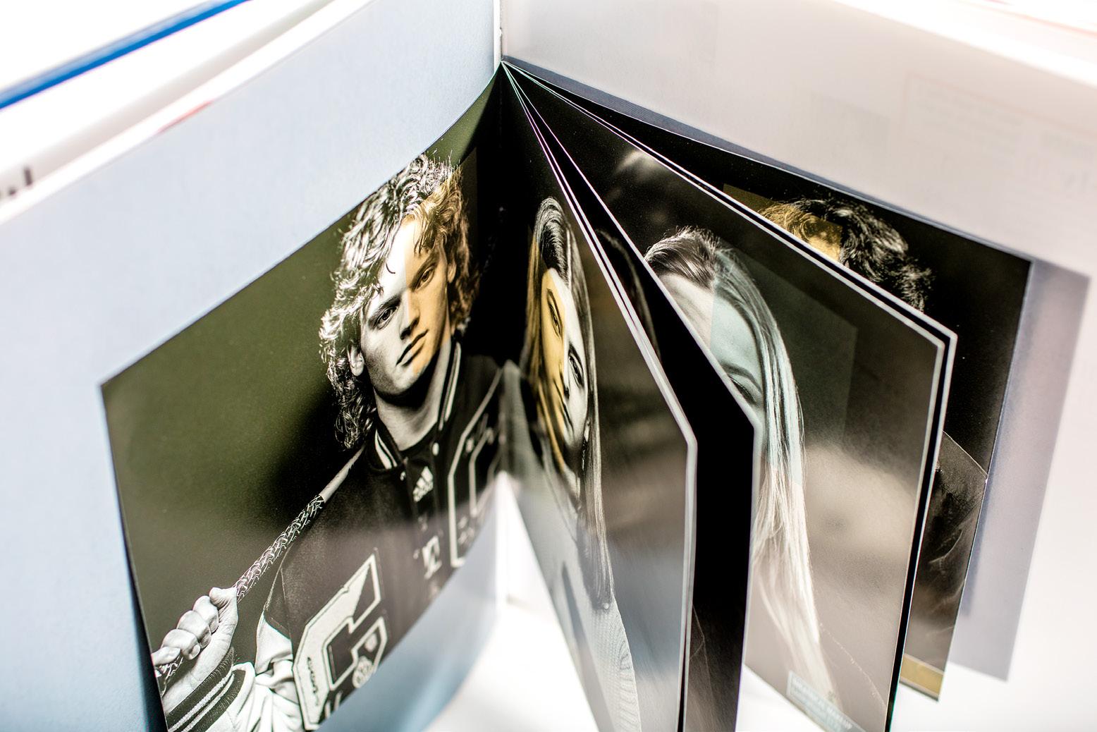
MINI-MAGNIFICENT:
To drive home the theme, a tipped-in mini-magazine of artful studio photos appears after the first sig. Each student has a color block over an eye to emphasize that aspect of the theme statement.
ANTHOLOGY | Cheyenne Mountain High School 096 097
PORTRAITS CLOSING FEATURE FEATURE DIVIDER COVERAGE
INNOVATION: CUSTOM-SIZE TIP-IN
INNOVATION: CONTENTS LISTING ON ENDSHEET D-SIDE
COVERAGE
PROFILES
Texas HS TEXARKANA, TX
TIGER
Advisers: Rebecca Potter and Clint Smith
Editors: Will Carter, Ellison Davis and Helen Clark Hays
HJ Rep: Bridget Sherrill
COVERAGE
Stand-out features:
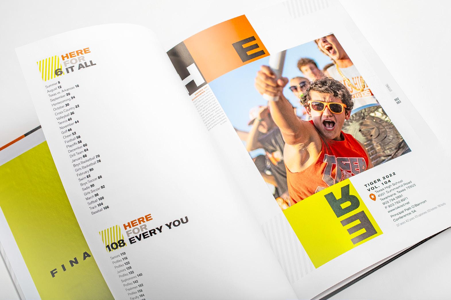
WE SEE WHAT YOU DID THERE: In the first flip through, you may be questioning why there are rotated letters on the cover and spreads. A random design choice? Not from the Tiger staff. The design element is intentional — they really want you to recognize that something’s up. These stories introduce change: TikTok trends, more game cancellations from COVID and the volleyball team dressing up for Halloween practice, just to name a few. So smart!
“HERE,” IT ALL WORKS: This Tiger volume sticks with a color palette of five colors and five colors only: an orange, what we’d call a lime green, black, white and gray. Going exclusive with one color palette can be hard when you want to welcome variety, but the staff went for it. The blocks of color behind content and mixed into headline packages are a chef’s kiss. Plus, the use of stripes and squares create a grid and eyeline to bring a tear to every designer’s eyes.
TAKE THIS TIP: The staff opted for chronological coverage with datestamps in headline packaging. (Check the box for this yearbook serving as a complete historical record of the year.) The combo-chrono structure is also broken up with full-spread topics that took place in that month. Love it!
ANTHOLOGY | Texas High School 098 099
COVERAGE OPENING DIVIDER INDEX
TITANIAN
Adviser: Jose Caire
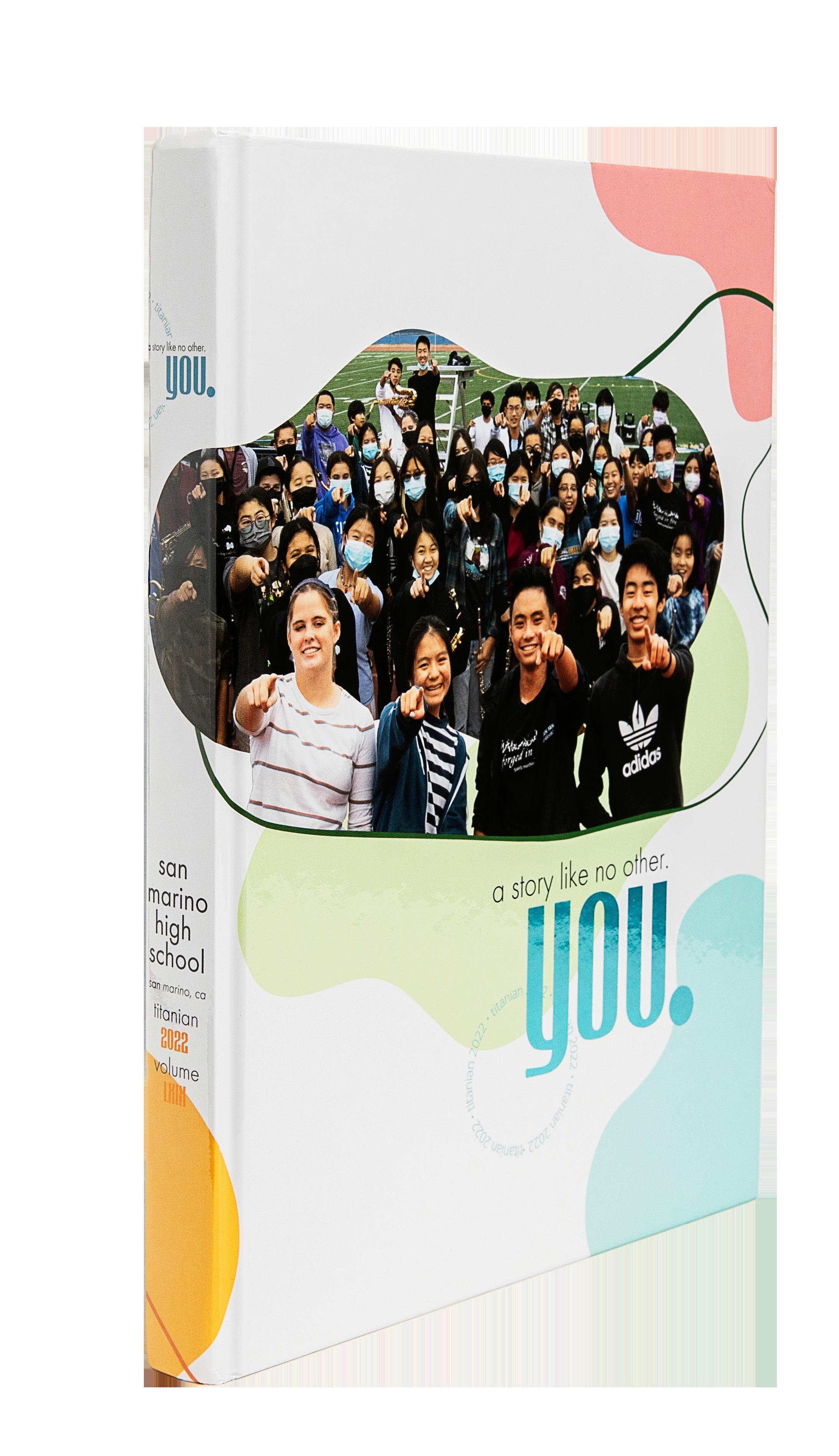
Editors: Hetty Chen, Sean Chan and Elaine Shew
HJ Rep: Mimi Orth
San Marino HS SAN MARINO, CA
Stand-out features:
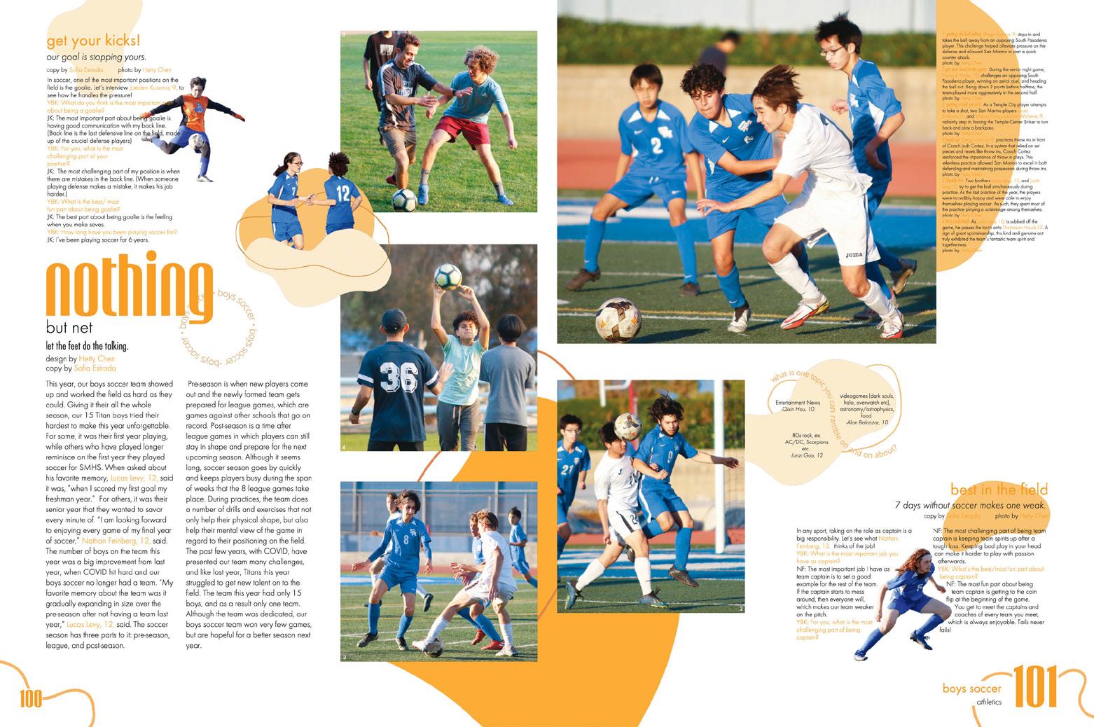
NO SAME OLE SAME
HERE: We understand the struggle of coming up with new story angles. What happens if that history teacher does the same project every year? Not a problem for the Titanian staff as they took academics coverage to a new level. Instead of focusing on the class content, they focused on students — one example featured students talking about books they were reading. And to add to it, mods asked questions such as “If you could teach a class on any topic, what would it be?” We love to see it.
WE LOVE SENIORS: OK let’s back up. We love everyone, but we do love a good senior dedications section. And this is one to pay attention to. The staff started it off with a heartfelt letter, then moved into welldesigned ads — ranging in size and color. What a great way to include your theme visuals from cover to end.
COPY WITH A PURPOSE: With a theme “A Story Like No Other. You,” the staff knew to kick-start their book with storytelling copy. It not only explains the theme, it also highlights both school and individual successes. It’s refreshing to see a positive and warm theme that is translated well throughout the entire book.
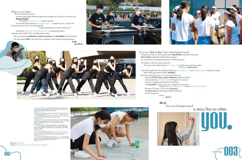
ANTHOLOGY | San Marino High School 100 101
COVERAGE
COVERAGE
OPENING DIVIDER ENDSHEET COVERAGE
SENIOR ADS
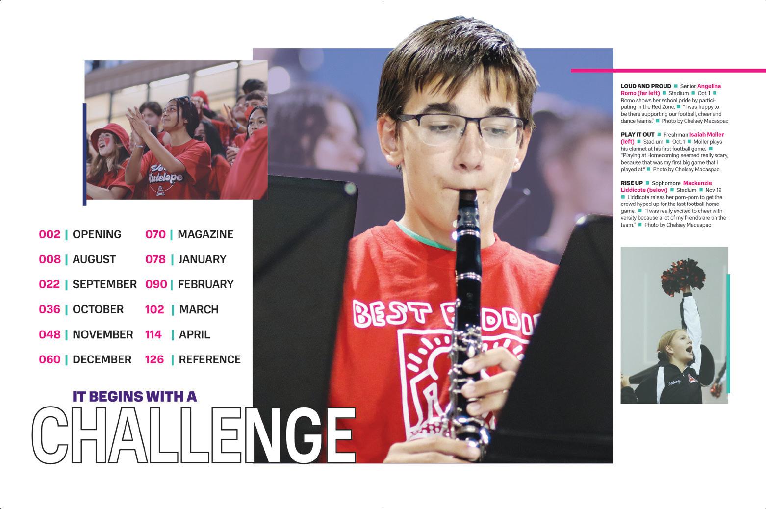
TITANIUM
Adviser: Pete LeBlanc
Editors: Aerianne Collantes and Chelsey Macaspac
HJ Rep: Annette Johnson
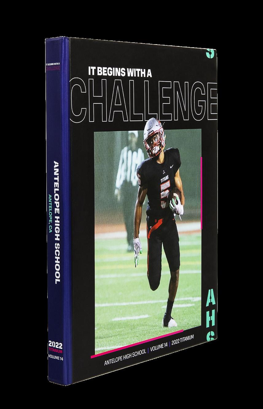 Antelope H S ANTELOPE, CA
ENDSHEET
FEATURE COVERAGE
COVERAGE
Stand-out features:
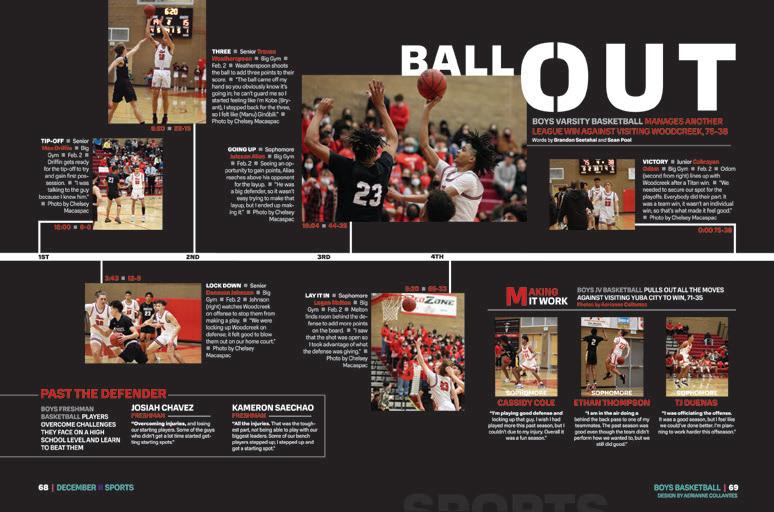
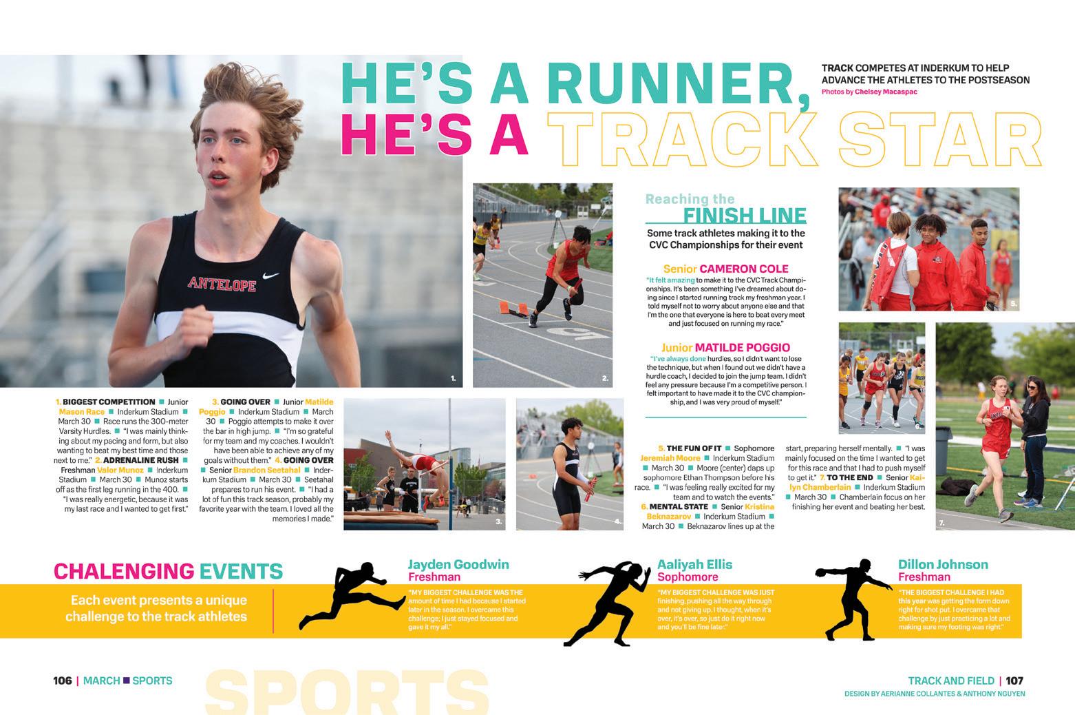
SIZE EIGHT GREAT: Designing size eight books is a bit more difficult than size nine books, and for that reason, we’re always on the lookout for great examples. The Titanium staff gave us just that with well-designed spreads filled with plenty of coverage and no overcrowding.
COVERAGE?
CHALLENGE ACCEPTED: Using every pica to its advantage, this volume packs in extra coverage in the reference section. In-depth Q&A mods grace the index spreads, themeoriented quotes are placed alongside scoreboards on the teams and organization spreads, and editorial spreads include a variety of coverage types.
CHRONO TOUCHES: Organizing a yearbook by month is certainly nothing new, but extra touches make the Titanium staff’s approach stand out. The most obvious extra is found on the dividers, which are designed to look like calendars and include callouts of the more notable events from that month. The dividers act as both a table of contents for the following section and a preview of the coverage ahead.
ANTHOLOGY | Antelope High School
102 103
OPENING FEATURE OPENING REFERENCE
DIVIDER
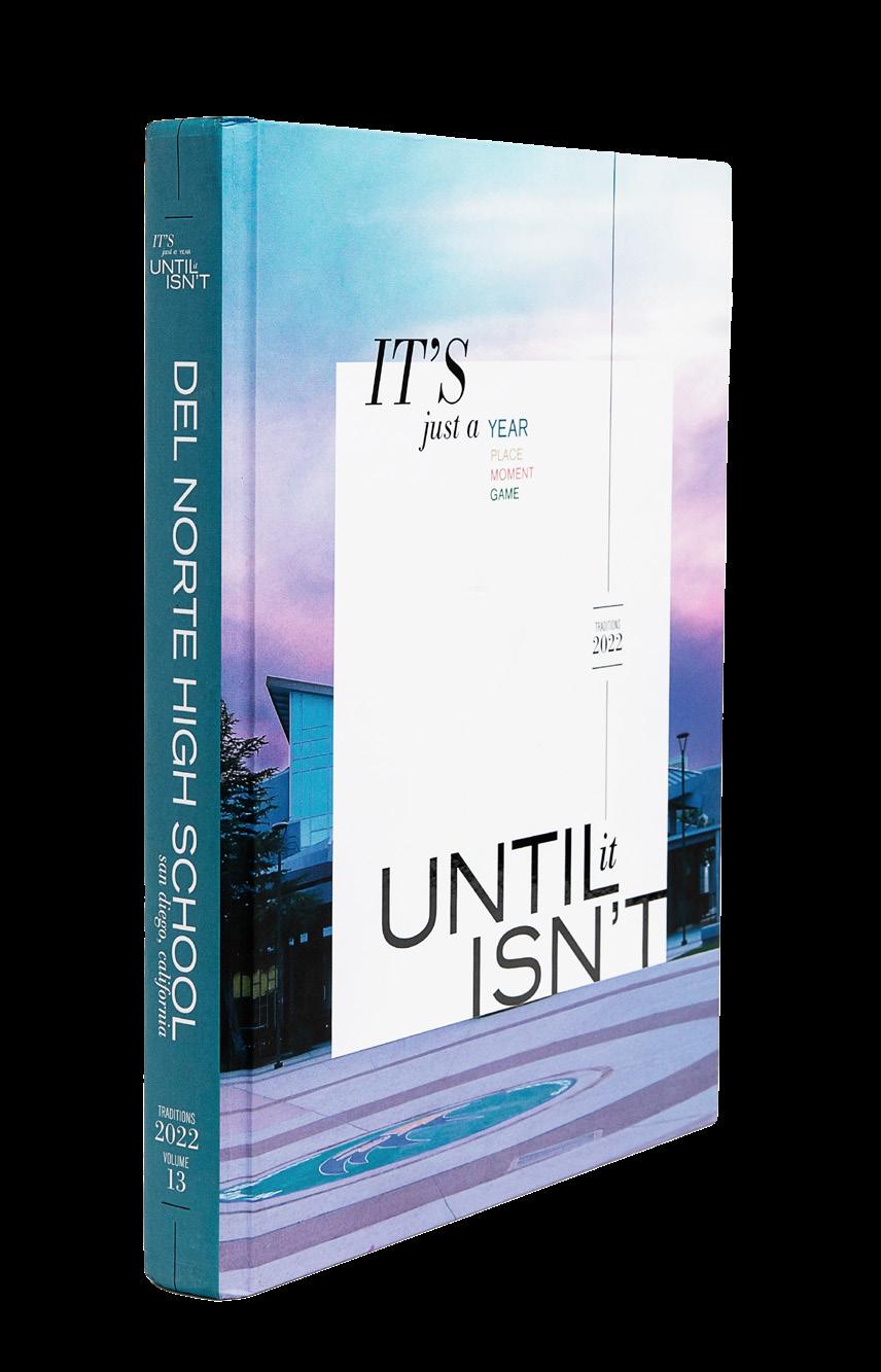
Del Norte HS SAN DIEGO, CA
TRADITIONS
Adviser: Robin Christopher
Editor: Allison Huang
HJ Rep: Elizabeth Doebler
OPENING ENDSHEET INDEX COVERAGE
Stand-out features:
FONT LOVE: The twopart type treatment goes perfectly with the two-part theme, and the serif/sansserif combo is clean and modern. (It’s Bodoni Recut and Craft Gothic, if you’re wondering.) The Traditions staff did a great job making sure their headlines, copy and photos are all sized correctly — that’s called hierarchy, and it’s not as easy as it looks.
METHOD TO THE MODS: This volume showcases especially good and eye-catching mods. Using student photos, object photos or special typography, the mods correspond perfectly to the other coverage on the spread. Sports spreads include mods on equipment, sidebars with stats and personal profiles. Other spreads include surveyresult infographics, ministories and Q&As.
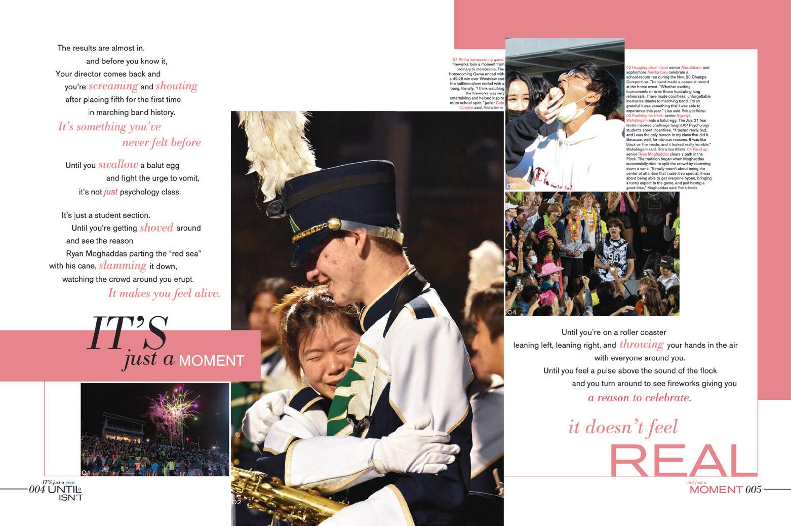
TAKE THIS TIP: There’s an “Until You’re Here” tip-in inserted at page 24 which focuses on the big events that create the school’s culture. Not only is it beautiful, with stellar photography and welldesigned layouts, but it serves as an extension of the theme.
ANTHOLOGY | Del Norte High School
104 105 INNOVATION: SHORT-TRIM TIP-IN ON SPECIAL PAPER COVERAGE OPENING DIVIDER OPENING COVERAGE PORTRAITS
TRILLIUM
Advisers: Jordan Miller and Andrea Lorenz
Editors: Teresa Joseph and Lizzie Steeves
HJ Rep: Kristina Gisonde
 Trumbull HS TRUMBULL, CT
FEATURE COVERAGE COVERAGE
Stand-out features:
FUTURISTIC: Here’s a cover that uses an off-thebeaten-path foil to great effect. The front lid and spine feature HJ 5SF Sleet Specialty Foil. The effect is the kind of futuristic look we think they were going for. The angled boxes and bullseye arrows are repeated throughout to add to their plan.
UPPING THE COVERAGE: A sidebar mod of a question with several different students answering ups the coverage ratio, and that’s a good thing. Even if you don’t have room for a bunch of talking heads — or the spread doesn’t give you that flexibility — there’s usually room to tuck in a few extra quotes.
IT’S THE LITTLE THINGS: People really do appreciate the little things a yearbook has to offer: Identifying a person whose name is on the tip of your tongue. Reminding you of the win/ loss ratio of the JV football team. All important. The Trillium included in their index a list of all of the colleges students had committed to attend with the names for each. They also listed the departments and classes next to faculty portraits, included a robust not-pictured list and added lists and group pics for their custodians, food service staff, security and board of education. Students might look right over that today, but they’ll appreciate it later.
ANTHOLOGY | Trumbull High School
106 107 INDEX CLOSING
PORTRAITS
COVERAGE
Casady School OKLAHOMA
CITY, OK
TWISTER
Adviser: Dr. Bonnie Gerard
Editors: Caroline Watkins and Holly Burkhart
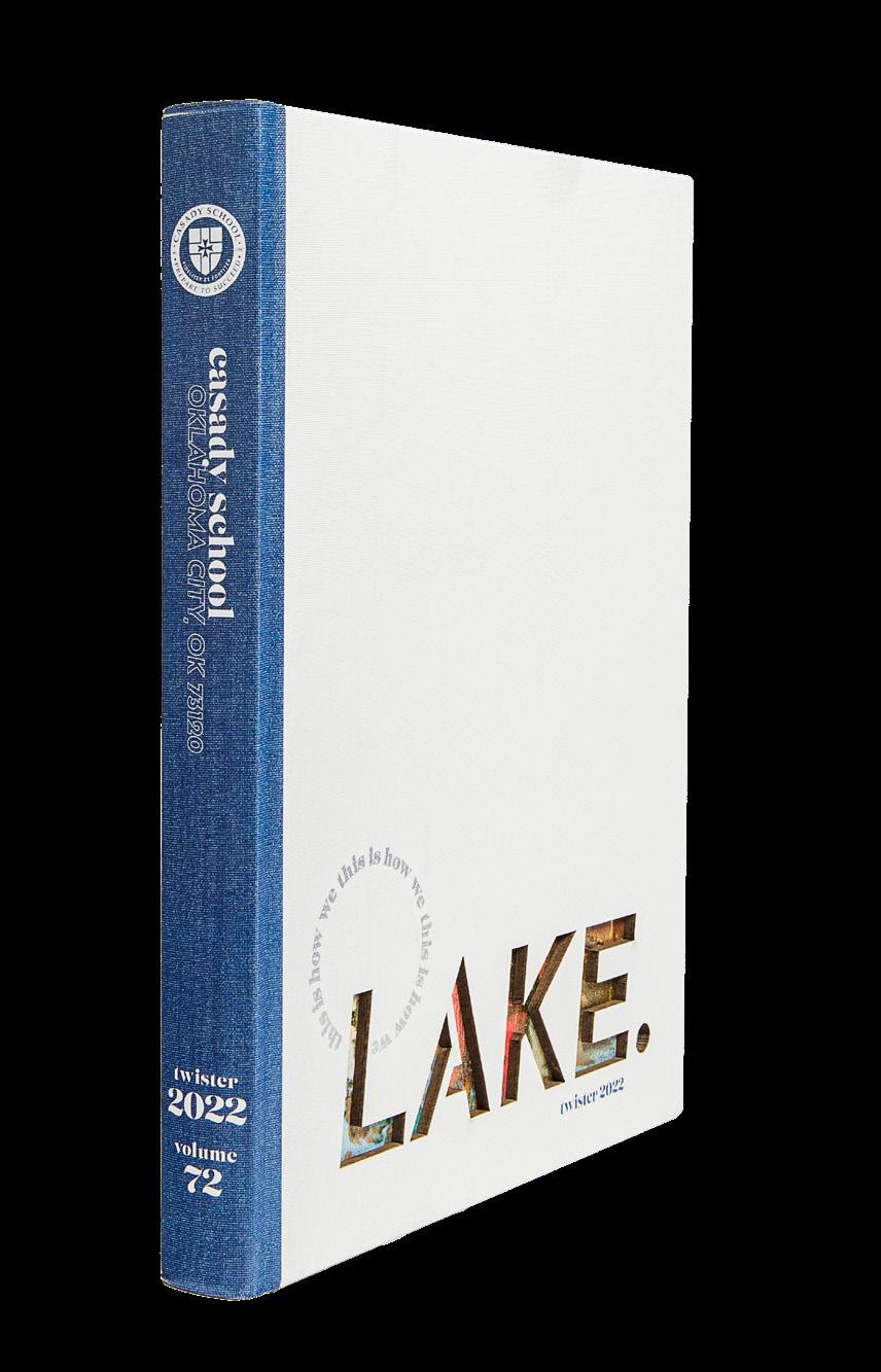
HJ Reps: Charles Cook and Stacy Gose
DIVIDER
OPENING
Stand-out features:
UV ENVY: This staff knew how to put UV coatings to work to make their coolest photos stand out. The front endsheet features Gold Glitter UV over the surface of the lake on campus and gloss on the remainder of the photo. Gloss UV can be found all through the book — on profiles, great photos and cutouts.
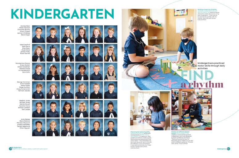
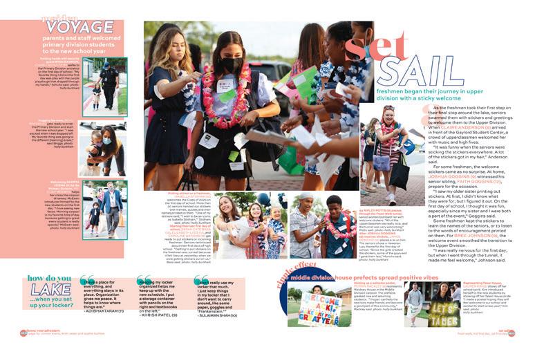
LETTING IN THE LITTLES: Casady School is preK-12, and their yearbook staff did a great job of including students of all ages in the publication. (There’s nothing more fun than conducting an interview with kindergartners!) So, on the orchestra spread, there are sixth-grade musicians included, and on the summer spread, there are photos of little kids at camp. You get the picture, and they did too. Cover your community, whomever it includes.
SPECIAL TOUCHES: This book has so much to offer its readers: cool theme packaging, cutouts in the opening and closing, interesting type packages, great reader resources and complete folios. We love the full-spread profile/ interrupter spreads, which display great photography and in-depth reporting.
ANTHOLOGY | Casady School
108 109 INNOVATION:
GLITTER
UV ENDSHEET DIVIDER PROFILE COVERAGE INDEX
LASER-CUT COVER WITH
AND GLOSS
Blue Valley Southwest H S OVERLAND PARK, KS
VISION
Adviser: Rachel Chushuk
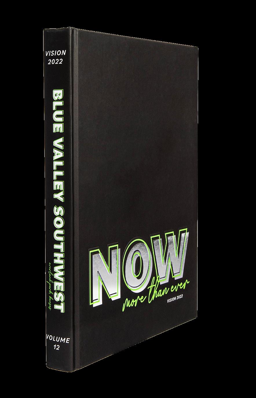
Editors: Marissa Cart and Kelsey Schnettgoecke
HJ Rep: Barry MacCallum
COVERAGE
DIVIDER
COVERAGE
PORTRAITS
Stand-out features:
SHINE ON: Sophisticated font choices, contrasting colors and textures and a healthy dose of silver foil really leave an impression on the cover and again on the back endsheet. (Love those embossed letters.) Flood Gloss UV on the opening and closing spreads makes the stellar photos pop. It’s great when all of these choices come together to create a cohesive look.
CONSISTENCY IS KEY: Again with the well-chosen fonts and use of layers, the Vision staff created consistent headline packages and used color outlines and accents to provide visual unity without creating boredom. Numberfocused mod designs are used to help balance the copy blocks. This book is crisp and clean. Did we mention the ad section? Chef’s kiss for that one.
MORE THAN EVER: The portraits section is full of coverage in each pica. It’s obvious that the staff carefully chose a variety of coverage formats to keep the spreads interesting and add bonus content. Infographics, long-form profiles and mod-like designs keep the reader looking for more.
ANTHOLOGY | Blue Valley Southwest High School 110 111
CLOSING COVERAGE COVERAGE
SENIOR ADS
WINGSPAN
Adviser: Tamra McCarthy
Editors: Aditya Rajan and Jazmyn Muhammad
HJ Rep: Joan Selna
 James Enochs HS MODESTO, CA
CLOSING ENDSHEET OPENING
Stand-out features:
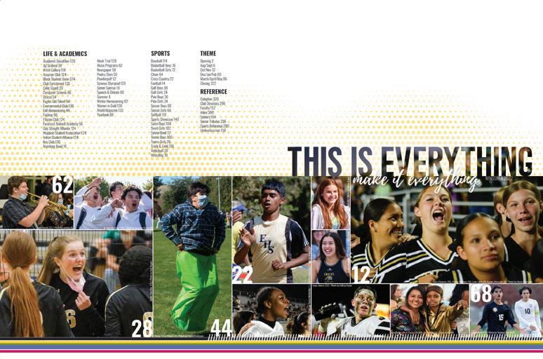
SENIORITIS (THE GOOD KIND): The senior section of this book really stands out. There are so many profiles, and the portraits are stunning. We’re pretty sure the senior parents would love a framed copy of their precious child’s half- or full-page moment in the spotlight.

SEE ALSO: At the bottom of the pages where it applies, the Wingspan staff included a note directing the reader to additional coverage. In many cases, this starts on sports coverage and leads the reader to the team photo and scoreboard. It seems small, but we know crossreferencing is work AND it’s an amazing reader service. Bravo!
BRIGHT AND SHINY: This book is so solid and checks so many boxes. (That’s why the judges love it!) But it’s also a showstopper with the Raised UV patterns on the cover, and continuing inside — check out those first two sigs an their Gloss UV. This is a book that makes a school proud.
ANTHOLOGY | James Enochs High School
112 113 COVERAGE PROFILES
ARBUTUS
Adviser: Jim Rodenbush
Editor: Izzy Myszak
HJ Reps: Kim Minnich and Nicole Laughrey
ALL GROWN UP: While there are spreads in the Arbutus that could go in a high school book, more often, the design sets it apart as a coffee table book. From the gorgeous full-bleed photos and gallery-style photo spreads to multi-spread stories with photos and illustrations, this is clearly the next step in the evolution.
NOT ALL FUN AND GAMES: The IU editors included stories their student body cared about, even if they weren’t the most schoolspirited and fun. Giving real estate to the controversial topics of the school year (5-7 spreads!) is a trait of great college yearbooks.
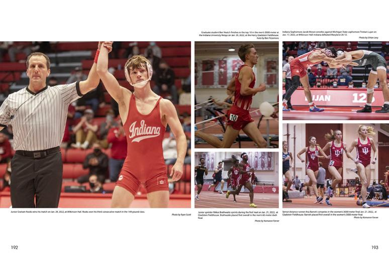
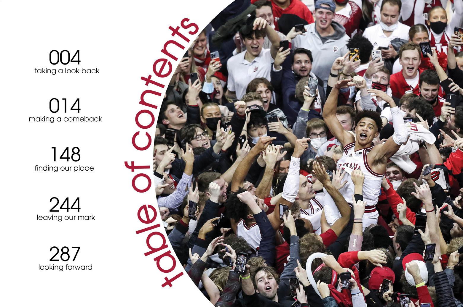
PHOTORIFIC: Big pictures capture the big moments, and that means this book is one that students will go back to and relive their best times on campus. For these yearbook buyers, landscapes and more artsy photos are part of the appeal. They’ll have those photos on hand forever.
 Indiana University BLOOMINGTON, IN
ENDSHEET MULTI-SPREAD FEATURE COVERAGE
COVERAGE
University of Michigan MARYVILLE, MO
MICHIGANENSIAN
Adviser: Kathy Ciesinski
Editors: Dyanna Bateman, Josephine Graham, Lily Kleinknecht, Sofia Olgado, Dominick Sokotoff, Gabriella Ceritano, Sydney Verline, Sabrina Nash, Grace Watson, Rachel Harrik, and Kathy Hu
HJ Rep: Greg Morrison
FOLLOW THE LEADER: The layouts and designs of the Michiganensian aren’t at all repetitive, but they consistently make use of visuals introduced on the cover. The stripes, colors and yellow bracket all find themselves on spreads throughout the book.
LIT MAG: The yearbook editors incorporated 16 spreads of content traditionally found in literary magazines, creating a student media section. Not only are photos, art, poetry and short stories on display, but there are also QR codes leading to short film entries.
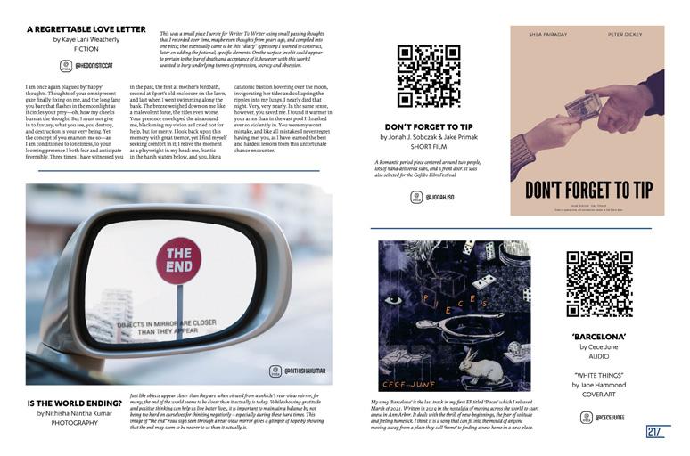
SERIOUS STAFFING: On a campus of more than 50,000 students, the yearbook staff of 38 brought a huge array of photos, stories and topics together in the 408-page book. They embraced creativity, complexity and chaos — that’s what the college experience is like.

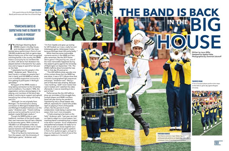
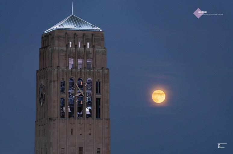
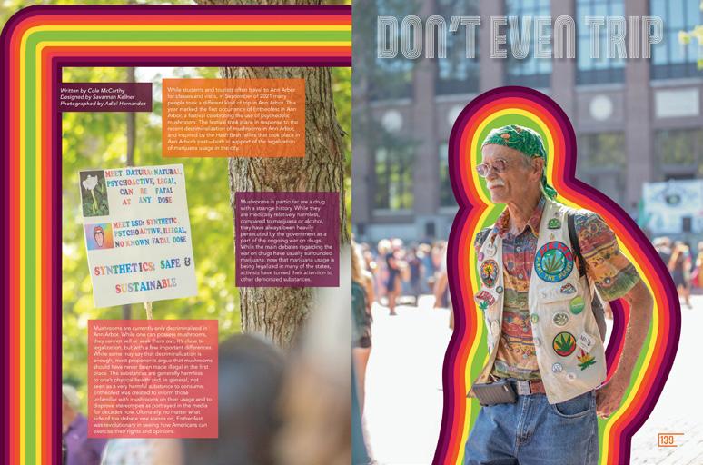
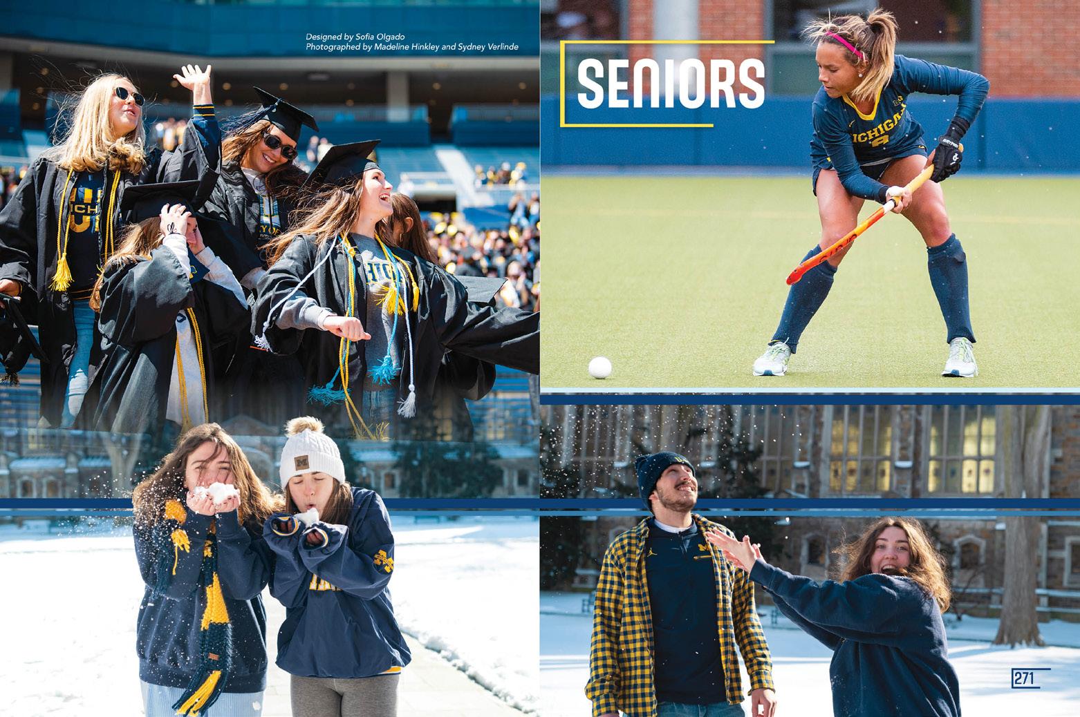
114 115
LIT MAG LIT MAG
OPENING
OPENING
DIVIDER
COVERAGE
COVERAGE
ANTHOLOGY | Universities
ROYAL PURPLE
Adviser: David Levy
Editor: Hallie Everett
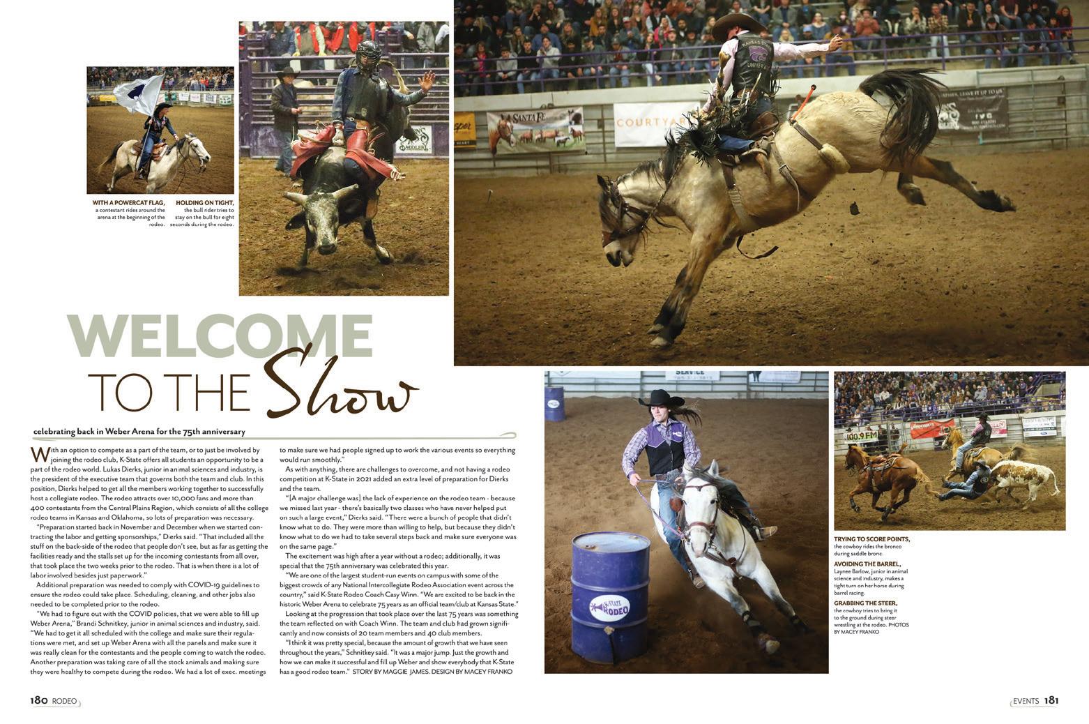
HJ Rep: Barry MacCallum
USE IT IF YOU GOT IT: When you have show-stopping photos, you know what to do. Run them big and take every advantage of what they offer — whether it’s leading lines, patterns or fantastic lighting. This book is a photo gallery that captures the best views of the year.
WE SEE YOU, WILDCATS: First impressions are everything and so are the profiles in this volume of the Royal Purple Amazing environmental portraits pair with engaging copy and consistent type packages. We can’t ask for more.
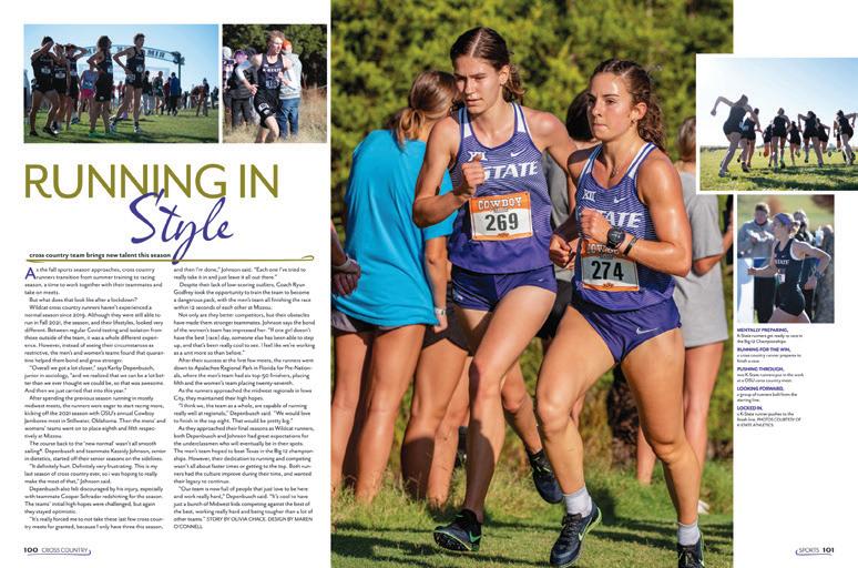
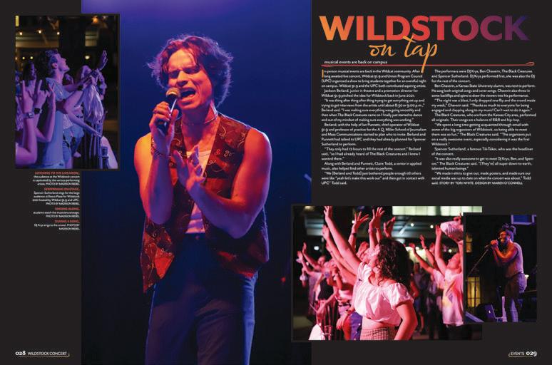
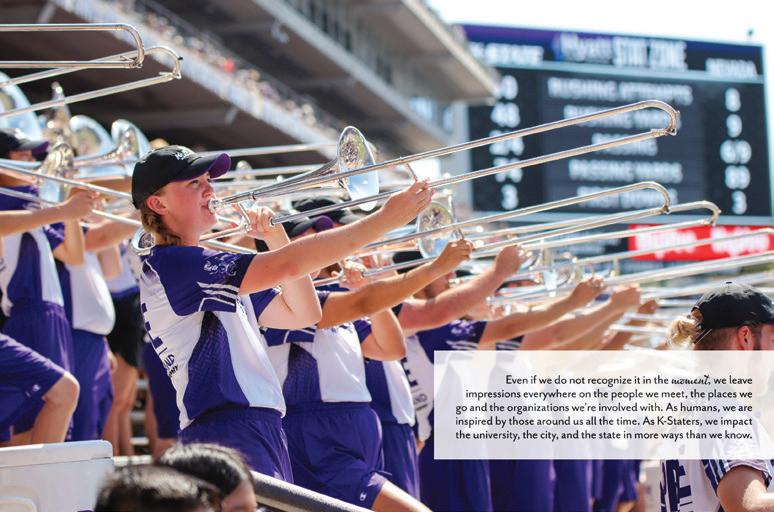
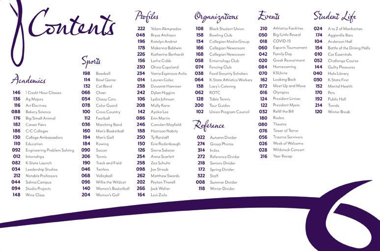
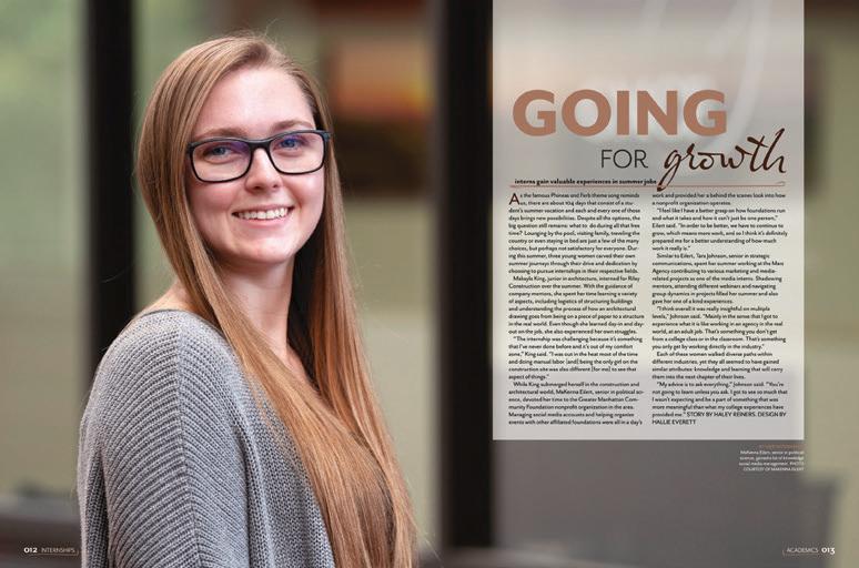
NEVER GETS OLD: Whether you are yearbooking in middle school or in college, weaving in subtle details is never boring. They made the headline on the Olympics page match the five ring colors. They mirrored the lighting in a concert photo into a headline’s gradient. We love it all.
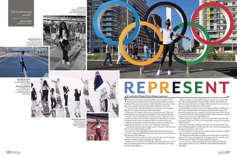 Kansas State University MANHATTAN, KS
PROFILE COVERAGE ENDSHEET OPENING COVERAGE COVERAGE
COVERAGE
Northwest Missouri State University MARYVILLE, MO
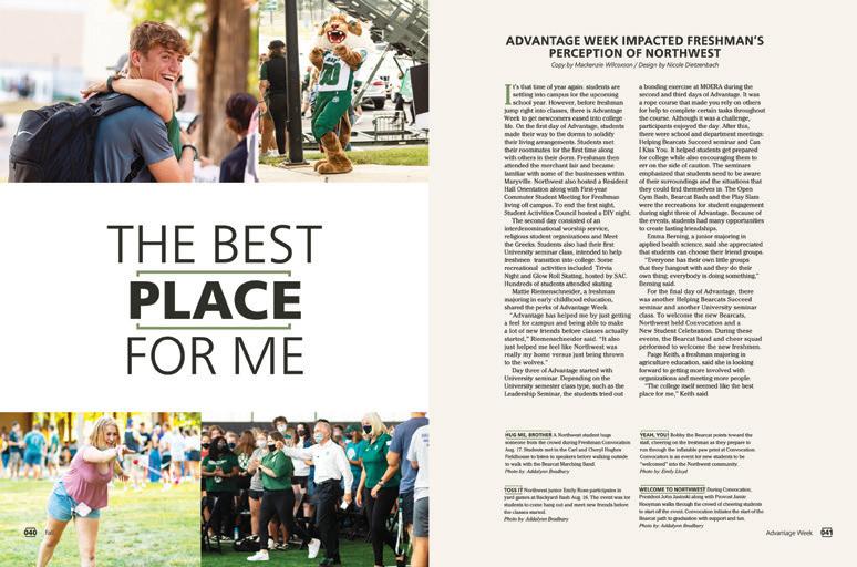
Adviser: Steven Chappell
Editor: AJ Bradbury
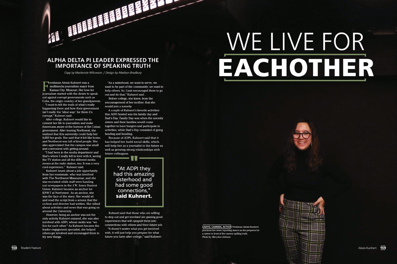
HJ Rep: Molly Baker
PICK-ME-UP: Headline packages mirror the blind embossed brackets from the cover, and they grace every dominant story. It’s a strong and unified message, and we’re here for it.
TO THE POINT: Rather than a multi-spread opening, this volume begins with a dramatic shot of the library, a simple table of contents and brief opening copy. There are stories galore in the 336-page book, and these editors didn’t make us wait.
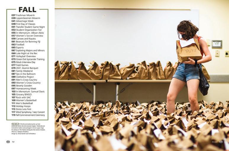
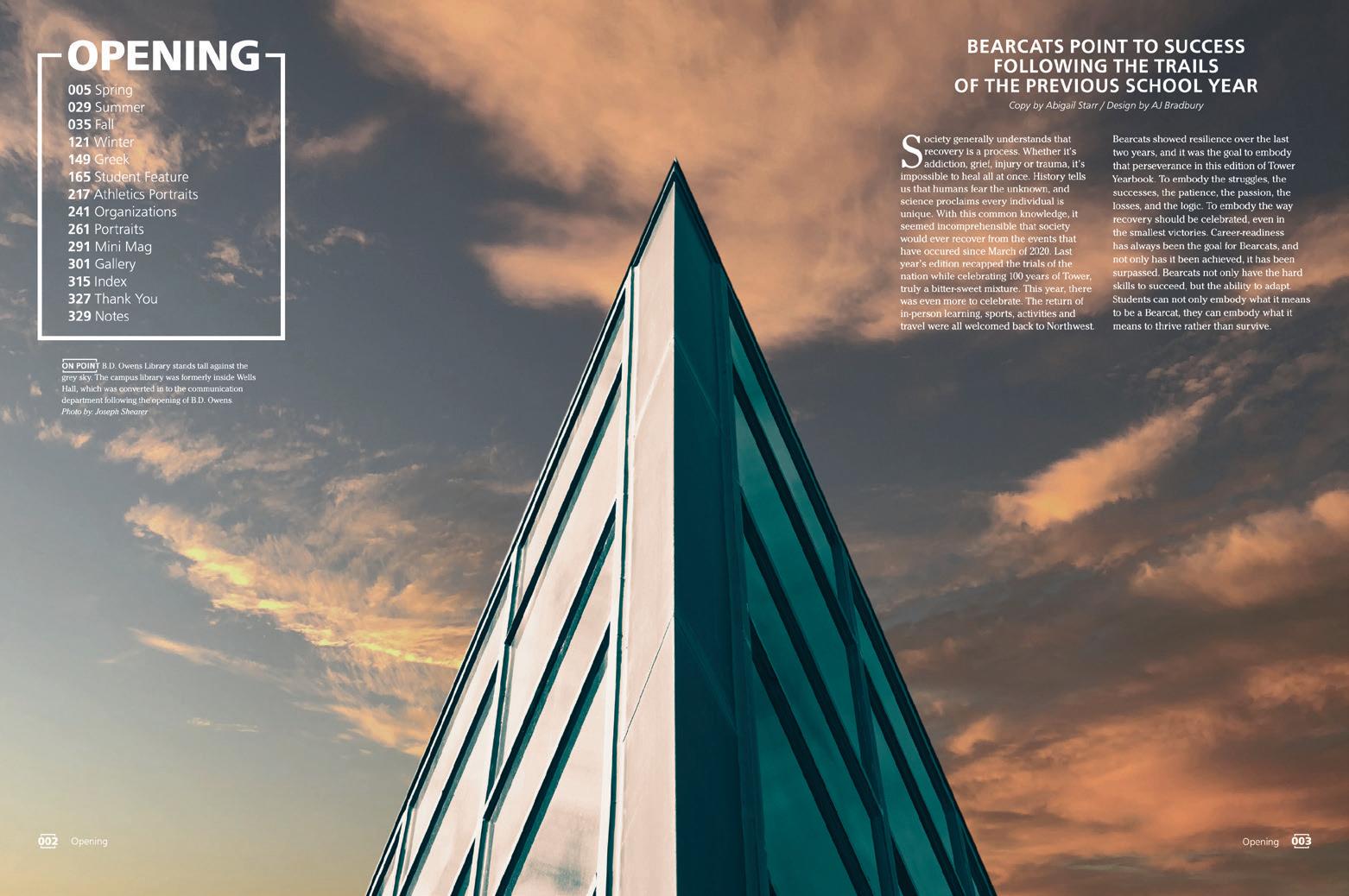
WORTH A READ: Where some books have veered away from long-form copy, the Tower staff embraced longer accounts. But, because of the judicious use of white space, the stories aren’t actually that long, and they’re great reads.
116 117
PROFILE
COVERAGE
TOWER OPENING
DIVIDER
ANTHOLOGY | Universities
