
SCHOOLMIDDLE
middle
P27 divider 226 227 YOU MADE AN IMPACT You stepped up and showed us that you are every bit as amazing as your high schoolNoNoYoucounterparts.arefantasticyearbookersandhere’stheproof:Anentiresectiondedicatedjusttomiddleschool.lesspoignant.lessimpactful.Noless anything than the Evenothers.asyou stand out, you’re in great company. We know you’ll be as inspired as we were. school ANTHOLOGY | 228 THEME | 246 GALLERY | 258
ENDSHEETCOVERAGEDIVIDER FEATURE I n a year full of questions, Crusader editors chose to ask one more — repeatedly — and they provided a consistent answer every time. With a palette of five brights and a single large font family, the cover establishes the theme package of overlapping blocks and rule lines, the use of cut-out images and the centercut-outpackageoverlappingfoundationrepeat,asaccentedwithcolors,featuresThebychronologicallywillthatlistingthethroughout,variedtheybecomesfrontpositionsareWhenpatterns.capitalizationcontrastingthecolorsindifferentontheendsheet,itclearthatwillbeusedincombinationswhilecontentsannouncesinformationbedeliveredseason.opening,whichallfiveincludescopyspecificdetailsincolorthecolorblockscreatingtheforanphotoandthedominantofinterest»


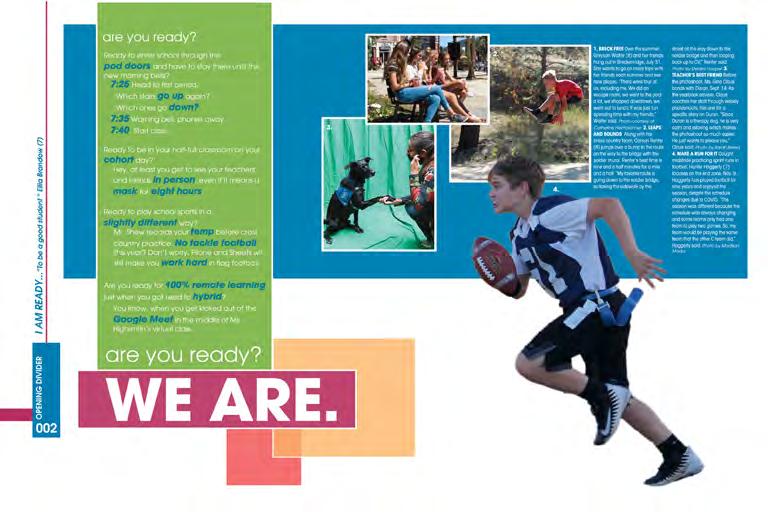
228 229 OPENING COVERAGE PEOPLE |ANTHOLOGY SchoolMiddleRockCastle Demonstrating more design flexibility, the seasonal yeartwistsreadyRock—studentasstudentthatstorysection,throughdisplays.spreadstraditionaltoonacoloralsoCoverageincludeverticalfromofdisplayaspecificschool-showcasedividersmoreandyear-detailsinsimilarlystyledasthefeelthespreadshiftshorizontaltoinordertolargerimages.spreadsusethebrightblocks,pairingcoupleofhuesmostspreadscreatebothlayeredandfeatureAllthewaythereferenceavarietyofforms—manyleanheavilyonvoicesaswellcrowdsourcedandstaffphotosprovethatCastlewasindeedforwhateverandturnsthepresented. TAKE NOTE The folio/ACD package incorporates a pair of colors, the thematic color bars/rule lines and an “I am ready” student quote, adding dozens of voices to theme development. Adviser: Gina Claus E ditors: Sarah Breed and Lizzie Horner Castle Rock MS CASTLE ROCK, CO CRUSADER


ENDSHEET O n the cover alone, five emphasesdifferentof Eagle Eye View’s theme font appear, along with rule lines in different colors and weights running vertically and horizontally to create “turns” to represent the withoutsectionbutfromsectionleftlabeledTheandablackredbackgroundstheme-coloredcopyspreadsandThefornoteseachaThereference—andOucoverageThreestructureunexpectedlistingTheyearcircumstancesunexpectedthedelivered.contentsrevealsanbookaswell.sectionsof“StandtWhatsHot”“Essentials”precedethesection.listingteasespairofspreadsinsectionandspreadtopicstheentirevolume.bookopenscloseswithtwoofstylizedlayeredover—oneandtheother—alongsidesinglelargeimagequotedisplay.coverageisinthetop-cornerwiththedescriptorstheendsheet,flowsfromtosectiondividers» CLOSINGFEATURE Adviser: Jed Palmer E ditors: Ashlyn Burgess, Billie Fall and Abby Valverde Sierra MS PARKER, CO EAGLEVIEWEYE


It was not just a splitcover order with a red option and a black one; the dominant color of the endsheets was the accent color. The redcovered books had black endsheets and vice versa. Great attention to detail thoughout!
Content teademonstratepagesthem’sunderstandingofadvanceddesignprincipleslikehierarchy,scaleandintentionaluseofwhitespace.Theyalsoshowthestaff’sabilitytopivotawayfromthespreadsthatappearinyearbooksmostyears”tofeaturesthatcapturethestoriesoftheyearandallowmorestudentstoshareimagesandopinions.Theconceptuallabelsontheopening(TheFogandTheHike)andclosing(TheStoryandBrightSpots)indicatetheshiftinmindsetfromthestartoftheyeartotheend,wheretheread-outheadlineshiftstensestocompletethefinalsentenceofclosingcopy“Weknowthisyearwasspecial,itread.“WelivedtheimpossibleandweFoundOurOwnWayThrough” TAKE NOTE
COVERAGECOVERAGEFEATUREOPENING |ANTHOLOGY SchoolMiddleSierra 230 231


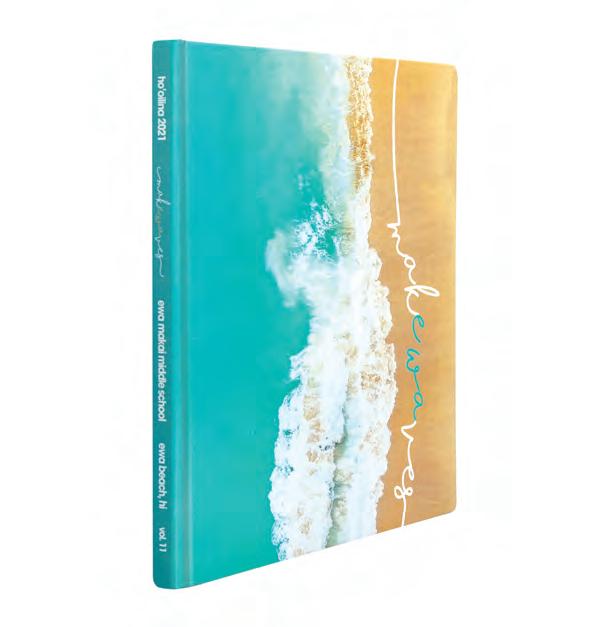
DIVIDERCOVERAGE FEATURE F rom the cove r, i t s difficult to guess whether the theme is based on location, change or pride. The best answer is all of the above!” Every block of theme copy creates a connection to another aspect of school life. There s a donelayeredtheatowavespagecampusarchingFromsurroundsnaturalreadersimagespowerfulpagescover,(butAsstrongcombinethelikepalette,Thetheconnectionnaturalbetweenvisualidentifiers.beach-ythewave-graphicsandflowingscripttocreateaislandvibe.onthesimplehigh-impact)thethemepresentfull-bleedthatremindofthebeautythatthem.arainbowovertheonthetitleandrollingintheopeningasunnyswimandsunsetcelebration,imagesarewithwell-themecopy» Adviser: JT Su E ditors: Erylan Alejandro and Naturelle Koa Ewa Makai MS EWA BEACH, HI HO’OILINA


Coverage
Logically,
The heavily leaded copy showcases not just the cover’s script, but often different sizes, weights and emphases of its sans serif companion used through the book. the brand color is included on all pages, both calling attention to headlines and spanning the bottom margin where student quotes add to the book’s coverage of as many students as possible. spreads showcase an array of fresh design styles and tell stories of traditional topics as well as those reflecting the bycircumstancesunusualcreatedthepandemic.
PEOPLE INDEX
TAKE NOTE Like the toeverythingAnd,designedalongsidesupplementalandblack-and-whiteoutSilhouetteddelightsurprisescomponentsexpectedthechangingpredictable,ocean’syetever-waves,staffcombinedyearbookwithsometoengageandthereaders.andcut-images,occasionalphotosQRcodesleadingtocontentrunmasterfullyphotopackages.topicsincludefromwhimsicalserious. |ANTHOLOGY SchoolMiddleiMakaEwa 232 233


COVERAGE A custom theme font, created by adding handdrawn, in-line accents to each character and cropping a bit off the bottom, makes the sans serif pagaccentstypeechoinghand-drawncaptions.photosinformation,allistypeMorebusy-nessopenAswhitethestructure,booitdistinctivestandard—and,strengthenstheksvisualidentity.Beginningonthecover,school-colorgreenisapowerfulbrandcolor.Whileit’salsoaverycommonpick-upcolorbecauseofthetonesintheimages,othercolorsareincorporatedintotheschemeaswell.Plus,theversatiledesignallowedfortheultraboldsansserifcomponenttobeeitherblackorreversedtype.Theendsheetrepeatstheoffset,stackedtypeandrevealsthebook’schronologicalrepeatingcover’sgenerousspace.soonasreadersthebook,thebegins.largethemeonthetitlepageaccompaniedbyoftheessentialthreeandcompleteThelinethethemeadditionsalsooneofthee’simages» CLOSINGENDSHEET Adviser: Jennifer Ann Parsons E ditor: Avery Hull Greenfield Junior HS GILBERT, AZ INGENIUM


showy,
The opening and dividers continue the established patterns of large theme type, stacked and running low on the threeaccompaniedspreadbyphotos,one of which is bordered with the hand-drawn green line. The color green prevails, and detail-filled body copy is supplemented by a green true,
quote. In
thecoveragesections,respiteprovidingthemeWithconsume.easyvariedspaceuseperthanandofmanypagesfashion,even-busierthecontentsfeatureasasfourlayersverbalcoverageaveragemore10imagesspread.Greatofseparationmakesthecomponentstoidentifyandthesimplerpagesabriefbetweentherobustcapturedyearasitwas. TAKE NOTE Ingenium is such a powerful history book! It’s designed with the reader in mind. The staff created complete folios, required lengthy reporting workedeverythingfindmakesperfectincludedidentificationcaptionsnumberedcaptions,images/foreasyandatextbook-indexthatiteasytoeveryone—and—theysohardtocover.COVERAGEDIVIDERINDEXPEOPLE |ANTHOLOGY HJuniorGreenfieldighSchool 234 235


COVERAGEOPENING DIVIDER T he type and graphic elements on traditionalContentbookandphotostocoverschool-coloredthetranslatewelltheinside,whereareaddedthethree-partisexplained.fromsections is combined to create sections titled “Here” (academics and clubs), “Right” (people) and “Now” (student life and sports), and the endsheet’s dominant photo is also divided into three parts. As on the cover, the theme logo’s generous size in the opening overallofintoincorporatingthewordShowcasingthoseimagesbackgroundThespreadsmarginstoppresentingcoverpackagingrepeatsofcopy.andtheattention,commandsshowcasingdecorativefontconcludingtheThedesignallthemepagesthehorizontalfromtheandendsheet,expansiveandbottomtosetthoseapart.dividers’purpleandsingledistinguishspreads.theone-sectionaltitleinthemefontandthateachparagraphthecopymagnifiesimpact» Adviser: Julia Bayles E ditors: Emma Chang, Sherisa Chen and Audrey Fong Toby Johnson MS ELK GROVE, CA JAMBOREE


|ANTHOLOGY SchoolMiddleJohnsonToby
Layered coverage pages scale back the size of the theme font in headlines. And, while they include theme colors, most heads also add a new tone to echo colors from the image s
COVERAGE REFERENCE 236 237
Because California schools spent so much of the year learning remotely, the stories and images reflect that. Rather than repeat class photos in quote bars or group shots, the staff sometimes used student avatars alongside the verbal content. Look what they did on the club photos pages. What a solid timestamp of the school year!
TAKE NOTE Masters of reader aids and theme-based mods, Jamboree has great folios and includes repeating mods labeled “There’s No Place Like...,” “There’s No One Like...” and “Here’s the Question.” The inclusionary device — “Especially Here,” “Especially Right” and “Especially Now” — is tailored to the section and adds nearly 400 voices and 50 avatars to the coverage.


FEATURE T he Prowl staff crafted a theme that exclamationspreadlogobeforereiterateofandcoverageisThebrightopeningTheaccordingly.andthestoriesknewyearplansbeforeinterestsoffilledaThe(reference).“Betterandacademics,FortwopresentssanstheThethemeslicesdiagonaltypecolors,full-strengthwhite,thepracticeIntoencouragedpositivityinvitedandstudentsspeakout.truebest-s”fashion,cover’suseofsilverandprocessthebolddesignandthelinesandcreatethelook.endsheetrepeatsthemelogo,quotes,andcoverageinsections,“BetterIt”(studentlife,clubssports)andTogether”decisiontocreateverypersonalbook,withthestoriespeopleandtheirwasmadeconcretefortheschoolwere.Thestafftheycouldfindnomatterhowyearunfoldedplannedfeaturestwo-spreadisbold,andblocky.bodycopylargerthanonpagescolorfulpopsthemelanguagetheideaalargethemeonthesecondservesasanpoint» COVERAGEENDSHEET Adviser: Yvette Manculich E ditor: Keira Kou Powell MS LITTLETON, CO THE PROWL


commitment!training,justbelieveAndtoinformationhierarchyunderstandingclearofmaketheeasyconsume.youbetterthatdoesn’thappenwithoutrevisionand TAKE
mods
eachbook-specificadsthemeaningfultheallopportunitiesinclusionaryaredesignedtorelaythemeandaddcontenttopeoplesection.And,clearlyfeaturealookforyear.COVERAGEOPENINGDIVIDERCOVERAGE |ANTHOLOGY SchoolMiddlePowell 238 239
The dividers continue the vibe, and the closing mirrors the opening, adding images and details from later in the year. It ends with the same substantial theme logo, followed by a sign-off mirroring the title Coveragepage. pages include similar visuals, adding blocks of color inspired by the theme branding. Graphic and type style guides create the desired structure and allowingconsistency,flexibility for the available content to drive the design. No matter how many photos or separate stories are included, great use of white space and a NOTE
The attention to detail in portraits and ads is consistent — and impressive. An array of profiles, themed and


OPENINGCOVERAGE COVERAGE U nder the conditions,correct The Prowler ’s cover literally requires readers to heed the theme. At first glance, the subtle Matte white cover seems understated. The theme is blind embossed on the front flap and the spine type is complete, but small. When exposed to sunlight, though, the stacked theme type unmaskeandstudentsCaptionedandthecopythroughintroducesinthree-coloropeningAcolorthetrueOnattention.commandingorange,becomesimmediatelytheendsheet—tothetheme—phrasechangesinandlocation.singlespreadofpresentsthepaletteitsentiretyandthethemeheavilyleadedthatrecordsyear’schallengesopportunities.imagesofoncampusoff,maskedandd,provideyear-specificvisuals.Andthen,thecoverageoftheyearbegins.Allthreehues—shadesofpaprika,tealandhoney,aswellasthethemestatement—arefoundintheinclusionarydevicethatspansthebottomofthespreads» Adviser: Matthew Cross E ditors: Ella Hastings and Lucy Sandvig Short Pump MS GLEN ALLEN, VA THE PROWLER


FEATURE COVERAGE 240 241
In addition, each spread incorporates one of the three colors to unify the look. Whether a spread covers a single topic or several, most feature three to five mods of Incoverage.addition
crowdsourcingto photos of students taken by friends and family members, staffers used lots of talking heads and visualizationdatato include student voices.
On the portrait pages, the “This or That?” features advance the theme while including additional students.
TAKE NOTE While a single font is used throughout, the staff wisely selected an expansive family. And, for the sake of variety — as well as being true to the theme, they flexed their type design muscles, using different sizes, weights and emphases of the singular family to create a cohesive look. Variety in capitalization patterns and color offer even more options.
|ANTHOLOGY SchoolMiddlePumpShort


COVERAGE C ommitted to capturing the year as it was, the staff knew that planning coverage would be difficult, as theyAfterchangedcircumstancesfrequently.wonderinghow’dlookbackontheyearwhentheywereolderandwhatotherswouldthinkabout2021inthefuture,theylandedontheideaofalettertothefuture,chroniclingtheyearseventsandcapturingmemoriesandstudentreactions.Journal-esqueindesign,thecoverhintsattraditionalbindingtechniquesandroundedcornerswhilefeaturingapairofdistinctivedisplayfonts.Eventhecover’scolorwiththeaccentpaletteofdustypastelsevokescontemporary,yetretrofeelings.“DearFuture”isachronological,thoroughhistoryoftheyear.Theopeningweavesspecificdetailsoftheschoolyearwithquestionsforthefuture,thencontinues“Here’swhatweknowsofar”addingnewsynotesandstudentquotesbeforecleverlyclosingwith“Andthat’sjustthebeginning...”Dividers(forsummer,eachoftheschoolyear’sthreequartersandreference)featurean“updating”headline,asinglemassivephotoandacompletesectionalcontentslisting.And,theyshowcasethe“Here&Now”inclusionarydevice,whichaddsmorethan150voices» CLOSINGCOVERAGE Adviser: Allie Staub E ditors: Alyssa Pazdernik and Layla Ryan Westfield MS WESTFIELD, IN SCRAPBOOKTHE


Whether spreads are It’sopeningemployedquestionsthebeforeimportantachievementshappene“Thenewsspecificquotehavenumerous“Inheadlines.withpackageseasilydesignedandtheorsingle-topiclayeredtraditionalcontent,featuresahybridoftwo,imagesquotesareintoconsumedofcontentthemefontadditiontotheHere&Now”ACD,spreadsadate-stampedmodtiedtoholidaysorevents.letterconcludesSothat’swhatdlistinganddatesrevertingtoconversationalalsointhecopy.signedSincerely,Us TAKE NOTE The reference section, introduced with the phrase “Here’s everything else you need to know,” includes masterclubforaseasytopicalindexaclubteamsectionminiHowthanaccompaniedportraitsbymoreadozen“Here’sI/We...”Q&Aprofiles.Thecontinueswithphotos,completerosters,adsandtextbook-perfectwithaseparatelistingforaccess,aswellbold-facedentriesevents,sports,andclassesinthelisting.COVERAGEOPENINGINDEXFEATURE |ANTHOLOGY WestfieldMiddleSchool 242 243


THE STINGER Adviser: Sarena Wellman E ditors: Emily Edson and Allison Ferguson
COVERAGECOVERAGE
Brookville
S o many aspects of the year pointed to the theme. While brainstorming began virtually from home, and even hybrid students did some at-home learning, there was more to it than that. School is a second home to many. Staffers imagined a proud theme that would celebrate the community reuniting after time apart and started leaning toward school colors maroon and Ponderinggold. the phrase Home is where the heart is” led to a pair of decisions. The theme itself would be simply Hom e, and sections could tie logically to “directions.Here”covers oncampus events, “There” the community and beyond, and “Everywhere” includes those topics without specific locations. A nod to their mascot, the bee, The Stinger staff die cut several hexagons on the cover, creating the opportunity for repeated use inside » M S LYNCHBURG VA


COVERAGE
TAKE NOTE
sporadically.spread—ofeventsallpackageswell-designeddifferentCoverageeachheadlinesandfeatures,adividerstextureThetheadditionalinsidereferswhoaboutopeningtheirtheportraitsenvironmentalbeautiful“locate”subjectswhereheartsare.Thefeature—twobrotherskeepbees—readersfurtherthebookwhereimagesofpairappear.honeycombsetstheapart,creatingfoundationforthelargeimagestheme-fontthatopensection.spreadswithstoryforms,photoandmodsoftypescapturetheandmemoriestheyearasitwasandadditionalfull-profilesappear
Their layered slab serif hints to the three sections, and they replaced the O” with a location marker icon. Following the title page, where the cover image is layered with content, the theme logo and essential details,
|ANTHOLOGY SchoolMiddleBrookville 244 245
OPENINGDIVIDER
The 11-quote all coverage device — asking students an array of questions (some themepandemic-related,or but most not) — includes nearly half of all students an additional time. Other repeating mods add to coverage as well. The map point graphic is used consistently with talking-head mods where athletes and club members respond to a topical question, and “’Moji Match” allows students to guess the teacher’s avatar.
COVERAGE


MIDDLESEX MS Tidings | DARIEN, CT
COVERAGECOVERAGEOPENING
DIVIDER COHESIVE CREATION If the combo of squares, arrows and bright colors wasn’t cool enough, the Tidings staff opted for Raised UV coating on the outlines of selected graphics for both the front and back lids of their cover. The application adds a dimensional element that makes the squares and arrows pop. Using the arrow as a stand-in for the “E” in “New Normal” was another great choice. It’s easily repeated to carry the theme onto the inside. Headlines include “New routines,” for a story about attending school in a pandemic and “New learning models” for a collage of homebased school spaces. The color palette, squares and layered rectangle are found on section headers, in the people section and in many other places, creating a cohesive and pleasing book overall.


CONCOLOR ADAMS MS Ebb Tide | REDONDO BEACH, CA ELGIN MS The Hoot | ELGIN, OK NIPHER MS Knights | KIRKWOOD, MO
TAKE NOTE Totally embracing the yearbook’s role, Concolor went above and beyond to be a permanent record. With individual headshots for clubs when group photos weren’t an option and robust coverage of the pandemic/other news events, they definitely have the year covered. Adviser: Ximena Lopez FL
A n example of powerful, unifying theme execution, this Concolor cover introduces both verbal and visual identifiers. From the thematic blue and graphic blocks to the condensed sans serif font accented with a casual script, the theme look prevails.
|SCHOOLMIDDLE coverstheme, We Got You Covered
The four-word theme led to the pattern of four photos, a color progression on theme pages and four sections, each labeled with a four-word title.
246 247 Ruben Dario MS MIAMI,
The opening and closing both feature one large photo, a repeat of the cover’s theme type treatment and heavilyleaded copy packed with year-specific details. Dividers also showcase the four shaded squares and stacked theme type, but the single photo bleeds top, bottom and left to help distinguish the Coveragecontent.pages employ the sans serif font, adding six bright hues and a spin on the use of color blocking to create visual Contentvariety.wisely includes both traditions and annual topics, as well as spreads on safety protocols and distance learning that wouldn’t have appeared in previous volumes.
PEOPLE


colors red and purple,
The single-page closing couldn’t be more powerful. With blocks of theme using closing reads,
both fonts and the colorful graphic wave, the
Watch Us/We’re All In T here’s so much great work in this book. The design is fresh. The coverage is inclusive. And, the theme package provides a foundation that was easily built upon. The horizontal division of the cover accentuates the two-part theme and the visuallycoveringcreativitythevariouswithoutbelongtheThere’sintroducesingle,bothwhereverticalopeningfromThecontentaexplainingtwothelistingboth.conclusion,phrasesweavesTheconnections.providesandthrough“movement”Usingbetweenconnectioncomponents.twofontsandtheofcolorbothgradientsgraphicwavesadditionalvisualopeningcopythetwoverbalintoapowerfulcombiningPlus,thecontentsontherightallowsspreadtoanswerneeds.Inadditiontothetheme,it’sreader’sguidetothethoughout.horizontalredbarthecoverandbecomesondividers,gradienttype,themefontsandalargephotoclearlyeachsection.nodoubtthatcoveragepagesinthisvolume;overusingtheirgraphicdevices,designsshowcaseandinclusivity,theyearbothandverbally. TAKE NOTE
“We are inquirers, thinkers, communicators and risk takers — who are balanced, caring, reflective, knowledgeable, principled and open-minded. This year we went all out ” OPENING Adviser: Maika Nagata Ni u Valley MS HONOLULU, HI LANCER PARKWAY CENTRAL MS The Stampede | CHESTERFIELD, MO MILL CREEK MS Mustang Memories | LENEXA, KS POLO PARK MS | WELLINGTON, FL


page inventiveWhatandmakingexperimentingstuckthemestaffbyuniquenessThethesprinkledandrecipesongoing.own”and“AccountingHeadlines,headings.suchasfortaste”“AflavorallourkeeptheideaAndtheicingthecake:Favoritefromstudentsteachersarethroughoutpages.closingdisplaystheoftheyearrevealingthatthedreamedupthiswhileeveryoneathomewaswithbananabreadsourdoughstarter.adeliciouslyidea!FEATUREDIVIDERFEATURE COVERAGE 248 249 GEORGE WASHINGTON MS Surveyor | WAYNE, NJ
letters
LET’S EAT Taking its cues from the world of magazine design, this elevated cover features a litho-printed wood background with Raised UV over the words on the front lid. By design, “Food for Thought” reminds everyone at GW that they have a seat at the table. The wood graphic is throughoutused(but not too much) in headline as art placed outlined and on
|SCHOOLMIDDLE coverstheme,
in
packages


DIVIDER PEOPLECOVERAGE Adviser: Susan Weiss E ditors: Josslyn Grover and Emma Wong Orinda Intermediate School ORINDA, CA SCENARIO TIGER TIME A friendly tiger mascot not only brings the school together to cheer at events, but in this case, it provides the thematic axis for the yearbook. With school colors blue and gold and continued cameos from favoriteeveryone’stiger,the book is brought together. The display font and sans serif combo from the cover is also continued for headline packages and page Theheaders.divided but connected look of the boxes and bars drives home the theme “Together While Apart ” Terrrrrific! LESLIE M. STOVER MS Prowl | ELGIN, SC


COVERAGECOVERAGECLOSING
COVERAGE
|SCHOOLMIDDLE coverstheme,
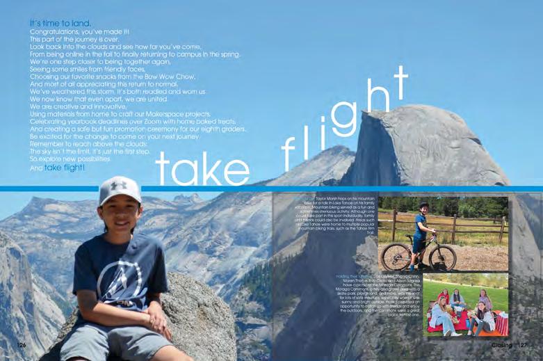
Take Flight T he Scenario staff wasted no time on getting started on the 2021 book. According to the colophon, the editors started planning in April 2020 — as they normally would have — even though they had no idea how the coverage year would unfold. Here’s what they did know: there would be a 2021 yearbook, having a plan would give them the best path to success and the students at OIS would have stories to share no matter what happened. So, they selected a theme that offered flexibility, went with traditional sections and they started to design. When classes began virtually in the fall, they trained the staff and took off — compiling mods, collecting quotes and requesting the submission of photos. With airy coverage-strongpackagesthemelinking interior spreads, the cohesive volume flows well. And, it’s easy for readers to know when they reach another theme moment — and that the content is about to change.
TAKE NOTE The paper airplane from the cover — and the flowing dotted line representing its flight path — continues on the front endsheet where sectional titles like “Flying Together” (student life) and “Meant to Soar” (academics) advance the theme. Though they later made a change to accommodate pandemic cancellations, the staff pivoted well, creating “Can’t Cancel Us,” a section including topics such as online learning, COVID pastimes, quarantine festivities and more. What a great history of the year!
250 251


COVERAGECOVERAGEOPENING FEATURE WENTZVILLE MS Indians | WENTZVILLE, MO NORTH KIRKWOOD MS KIRKWOOD, MO PARK VIEW MS The Talon | YUCAIPA, CA


PEOPLE DIVIDER FEATURE
TAKE NOTE While eDesign allowed the staff to submit the bulk of their book before students first returned to campus in March, they completed the final deadline three days early — just weeks after inperson learning resumed. Adviser: Adrienne Forte Robinson MS VA
|SCHOOLMIDDLE coverstheme, Headed in a New Direction W hat a great use of assets from one of the Herff Jones Book Styles! While the Woodblock offering includes pre-designed covers, endsheets and layouts galore, Sentry used only the letter forms and other graphic symbols from the Ascollection.theyhave with decorative theme fonts in the past, they created a completely custom theme identity by pairing the stylized letters with a rounded sans serif that echoes the same geometric feel. With a diagonal color bar used on most theme pages and a color palette of pastels and related jewel tones, the look was Consistentcomplete. use of the decorative type, the fun colors and clear-cut styles for headlines, copy and captions made the book cohesive. The use of peopleyeartellingtoathatCircumstancesstudentswellhobbiestime,includeallowedrequestsGoogleCrowdsourcedthingsspreadsthefeaturesmagazine-stylealongsidetraditionallayeredofcoveragekeptinteresting.photos,formsandtextedforcontentthestafftoimagesoffreedistancelearning,andmore,asasquotesfromandteachers.requiredthestaffers“headinnewdirection”inorderachievetheirgoalofthestoriesofthebycoveringasmanyaspossible!
FAIRFAX,
SENTRY 252 253


OPENING/TABLE OF CONTENTS COVERAGECLOSING DIVIDER WHO WE ARE Getting behind the school theme, “One Prep,” the cover radiates pride by including the Thetheirconveyteachersstudentsadjectivesandtheiraspiretothroughwork.colorgradient of teal to white on the blue background is continued inside with light blue accents and just a touch of the gold stripe from the cover. The single, light color palette lends a modern and elevated look to the inside pages. The combination of the bold serif and sans serif fonts used on the cover and inside adds to the pleasing look of this 50th anniversary volume. THE PREPARATORYCHARLOTTESCHOOL Pro Vita | CHARLOTTE, NC


TAKE NOTE In most years, a complete contents listing on the endsheet guides readers to coverage inside. Knowing the school year would be anything but normal, the staff waited until they’d be able to create a helpful listing and placed that immediately following the title page (and before the opening) to make the content they created easier for readers to find. The complete index is a powerful reader aid as well.
254 255
THE FALCON MARTINEZ MS The Mustang | LUTZ, FL BOK ACADEMY SOUTH Excalibur | LAKE WALES, FL MONROE-WOODBURY MS Crusaders Junior CENTRAL VALLEY, NY
Recreate. Redefine. Reimagine. A simple, graphic cover — featuring six calming colors, a distinct but versatile shape and both serif and sans serif fonts — introduces the challenges and opportunities.
The school community found themselves living the theme as they needed to “Recreate • Redefine • Reimagine” most aspects of their school and personal lives. Use of the rounded graphic provides a strong visual identity, and the changes in size and in the combinations of colors and shapes prevent the unifier’s use from becoming redundant. Used subtly on every spread as the folio, the curved dome also accompanies quotes and serves as a reader entry point on many mods. With three to five mods of content on most coverage spreads, the staff was able to include lots of voices, faces and points of view to show the many ways the theme fit the school year.
PEOPLE Adviser: Louise Colbert Excelsior MS BYRON, CA
|SCHOOLMIDDLE coverstheme,
Because the entire school was virtual most of the year (some students returned to campus in the spring), submitted quotes and photos play an important role in the stories told.


OPENINGCOVERAGEOPENING OPENING CHINA GROVE MS CHINA GROVE, NC CLAY MS Re f lections | CARMEL, IN MIAMI LAKES MS Goliath | MIAMI LAKES, FL


Adviser:
DIVIDER ENDSHEET INDEX
Javier Hernandez E ditors: Angel Crespinpineda, Lida andPatriciaLlompart,MorejonClaraTeixidor W.R. Thomas MS MIAMI, FL TIGE R ’S ROAR 256 257
colorandthewhiteairier,Coverageasingledifferent,inThereinforcement.visualopeningwhilewithrevealstone.threeThethedetailshavingimagesbalancedthan-usualless-bright-tonesarebypowerfulofstudentsfunlearningandofsuccessesinnewnormal.simpletheme’swordssettheTheendsheetthreesectionslogicalspin-offs,athree-spreadprovidesandverbaldividersaresimilardesignbutdistinctlyfeaturingaimageinsteadofphotopackage.spreadsarewithintentionalspaceseparatingmodsofcoverageasingleaccentperspread. TAKE
|SCHOOLMIDDLE coverstheme, We Got This E verything was more complex in 2021, from changing rules and unitytheremindinglayersAcknowledgingcircumstancesdaygaloreuncertaintiestothewayeverywasdifferentasshifted.theofchallengesandreadersofpowerofpositivity,andpassion,
Tiger ’s Roar staffers embraced their theme and started creating. The theme’s layered type and NOTE
Spin-offs are a great way to help readers understand the theme — but most others don’t understand the nuances great yearbook staffers do. Following best practices for renamed traditional sections, they showcased the theme-based section labels and listed the traditional section names (for ease of use) on both the endsheet and the dividers.


MEDLIN MS | Hoofprints TROPHY CLUB, TX SOMERS MS | Pathways SOMERS , NY GLENN H. BARRINGTON MS The Current | LITHIA, FL STEWART MS | FORT DEFIANCE, VA LADUE MS Image | SAINT LOUIS, MO CHESTATEE ACADEMY The Eagle | GAINESVILLE, GA DESERT RIDGE JUNIOR HS | La Cresta | MESA, AZ GOT IT COVERED Desert Ridge has checked all the boxes. Cover essentials on both the front flap and the spine help create a moments,changesthemerecord,completeandtheisimmediatelyintroducedbothvisuallyandverbally.Awell-plannedphotoincludesboththebigandthesmallandthevisualidentifiersforthebookareclearlyestablishedfromthebeginning.Plus,agreatstaffwillalwaysconsiderthepreviousvolumeandworktomakeeachnewbookvisiblydifferent.


A YEAR OF CHANGE School is always about learning and growing, but change uncertaintyandaffected the 2021 school year more than ever before. Without question, the students would evolve through the same seasons, so the seasonal structure made sense.
True to the cover’s promise of what readers would find inside, Farrier is personal and colorful.
brightintroduceconnectionscirclesoffs,sectionstraditionalwithspin-rulelinesandcreateliteralandapaletteofcolors.
The cover and endsheet work together to introduce the theme, and the
The mascot and school colors play a major role in the theme visuals, but so do a pair of contrasting fonts and layered shapes. The visual details combine to create an identifiable theme look and provide possibilities for connectionsadditionalinside.
From the quotes and casual script fonts to the shapes, gradients and bright tones, the vibe is obvious!
A TWIST TRADITIONON
|SCHOOLMIDDLE gallery HORNER MS | Echoes | FREMONT, CA PLEASANTON MS | Panther Tracks | PLEASANTON, CA THE MIRMAN SCHOOL | Farrier | LOS ANGELES, CA DOUBLE PEAK K-8 SCHOOL | SAN MARCOS, CA 258 259 CONNECTIONS — AND CONTRAST
PACKAGINGPOWERFUL


GEORGE WAS H INGTON MS | Surveyor | WAYNE, NJ MIDDLESEX MS | Tidings | DARIEN, CT YUKON MS | The New Miller | YUKON, OK D R. PHINNIZE J. FISHER MS | Firebird | GREENVILLE, SC THE NEW NORMAL With nearly 30 students pictured or quoted on this opening spread, the theme’s fit is clear to all. A pair of paletteusedconsistentlyfontsandaofyellow,greenandbluedominate.Usingtheoutlineversionofthesansserifkeepsthingsfresh—andreplacingthe“E”in“NEW”withanarrowprovidesatheme-specificgraphicthatcouldbeusedthroughout.Thisopeningisagreatintroductiontothethemeandthepersonalityoftheentirevolume.


|SCHOOLMIDDLE galleryTHE MIRMAN SCHOOL | Farrier | LOS ANGELES, CA PARKWAY CENTRAL MS | The Stampede | CHESTERFIELD, MO 260 261 FOOD THOUGHTFOR Sometimes the unifier is developed more conceptually than aourandincludeOther—and“Aopeninglistingpresentson“FoodBeginningmessagetoideasakeyRatherthematically.thanrepeatingwordsorsymbols,staffwillconnectandtexturescreateaunifyingandtone.withforThought”thecover,amenuthecontentsbeforetheheadlines—seatatthetable”“ThatGWflavor”continuetheidea.headlines“Asliceoflife,”“We’vegotalotonplates.”Nowthat’sconcept!


THE MIRMAN SCHOOL | Farrier | LOS ANGELES, CA PARK VIEW MS | The Talon | YUCAIPA, CA COOPER MS | Pathfinder | M c LEAN, VA MORE TIME WITH THEIR PETS Because there were no back-to-school or on-campus activities in the fall, most staffs covered different aspects of student life. Many shared stories and submitted images revealing more about students’ homes, families, favorites — and pets! Incorporating their theme’s colorful gradients, Farrier staffers created a feature-style spread introducing the pets of nine upper school students and asked their owners to share some details alongside the cut-out pet images.


|SCHOOLMIDDLE galleryADAMS MS | Ebb Tide | REDONDO BEACH, CA CREEKSIDE MS | The Prowl | CARMEL, IN MIAMI LAKES MS | Goliath | MIAMI LAKES, FL CREEKSIDE MS | The Prowl | CARMEL, IN LAWTON C. JOHNSON SUMMIT MS | Spotlight | SUMMIT, NJ THE CHARLOTTE PREPARATORY SCHOOL | Pro Vita | CHARLOTTE, NC BETHANY MS | BETHANY, OK PLEASANTON MS | Panther Tracks | PLEASANTON, CA 262 263


LESLIE M. STOVER MS | Prowl | ELGIN, SC MEDLIN MS | Hoofprints | TROPHY CLUB, TX COOPER MS | Pathfinder | M c LEAN, VA PLEASANTON MS | Panther Tracks | PLEASANTON, CA FALL CREEK J U NIOR HS | FISHERS, IN DEER CREEK MS | LITTLETON, CO BOK ACADEMY SOUTH | Excalibur | LAKE WALES, FL WALTERS MS | Perspective | FREMONT, CA


|SCHOOLMIDDLE gallery HORNER MS | Echoes | FREMONT, CA DESERT RIDGE JUNIOR HS | La Cresta | MESA, AZ FISHERS JUNIOR HS | Nexus | FISHERS, IN COMPREHENSIVECOVERAGE Traditional, layered coverage showcases submitted images from summer activities while collected quotes add to both the long-form copy and the inclusionary device, which spans the bottom margin. While students spent the summer sheltering in place with their families, Echoes staffers created systems to reach out for story ideas, data for polls and content in order to document the year — and include as many students as possible. This spread shows or quotes 23 students! 264 265


CREEKSIDE MS | The Prowl | CARMEL, IN LADUE MS | Image | SAINT LOUIS, MO NIPHER MS | Knights | KIRKWOOD, MO REALITYREFLECTING The vibe of The Prowl was bright and wild — as you d expect with the theme, “Nowhere Near Normal.” Lots of color and an array of icons and shapes — both geometric and organic — marked the craziness of the year. (On most pages.) The sports spreads were an backgroundsfull-bleedexception.obviousWithblack—and showcasing headlines in school-color red — sports spreads in both the fall and winter sections were rigorrepresentingmorestructuredtraditionally,theanddiscipline of athletic training.


|SCHOOLMIDDLE galleryFISHERS JUNIOR HS | Nexus | FISHERS, IN ADAMS MS | Ebb Tide | REDONDO BEACH, CA GLENN H. BARRINGTON MS | The Current | LITHIA, FL CLAY MS | Re f lections | CARMEL, IN D R. PHINNIZE J. FISHER MS | Firebird | GREENVILLE, SC DESERT RIDGE JUNIOR HS | La Cresta | MESA, AZ WENTZVILLE MS | Indians | WENTZVILLE, MO CRESTVIEW MS | Amphora | BALLWIN, MO 266 267


PARK VIEW MS | The Talon | YUCAIPA, CA NORTH KIRKWOOD MS | KIRKWOOD, MO DOUBLE PEAK K-8 SCHOOL | SAN MARCOS, CA MONTICELLO TRAILS MS | Timberwolf | SHAWNEE, KS ALICE B. LANDRUM MS | The Pride | PONTE VEDRA BEACH, FL GEORGE WASHINGTON MS | Surveyor | WAYNE, NJ MIAMI LAKES MS | Goliath | MIAMI LAKES, FL PINE VALLEY MS | The Puma | SAN RAMON, CA


|SCHOOLMIDDLE gallery PARKWAY WEST MS | CHESTERFIELD, MO POLO PARK MS | WELLINGTON, FL NIPHER MS | Knights | KIRKWOOD, MO EASY TO YOURSELFFIND Reference sections of 2021 yearbooks were not necessarily all that different from those in years past. The best portrait pages are paneled and provide some additional content. Ads sections showcase collections of family tributes. The index is an important reference tool that allows any reader to easily locate all people in the yearbook. Using thematic visuals to separate the listings adds to a cohesive feel — and extra content is a great way to include more images. 268 269


