NADAAA and HDR expand the University of Nebraska’s College of Architecture page 10

The International African American Museum opens in Charleston page 11

AN lands in Phoenix to appreciate the ecosensitive work of Studio Ma page 14
8

Obit: Robert Mangurian
Four nontraditional projects from across the country offer options. Read on page 16.

Fallout after allegations of sexual misconduct. Read on page 7.
VECERKA/ESTO MARCO CAPPELLETTI ©ALEX FRADKIN/COURTESY RIBA
Glass
We’re glazed and enthused. Read on page 27.
12
60
61
Excerpt: “How Framing Works” from American Framing, published by Park Books page 58 66
Dispatch: Ennead in Turkey
Ellsworth Kelly at 100
Harry Seidler at 100
Essay: Sean Joyner
The Architect’s Newspaper 25 Park Place, 2nd Floor New York, NY 10007 PRSRT STD US POSTAGE PAID PERMIT No. 336 MIDLAND, MI July/August 2023 archpaper.com @archpaper $3.95
The Architect's Newspaper
Adjaye, Accused OMA’s Buffalo Wild Wing Curvy & Brassy
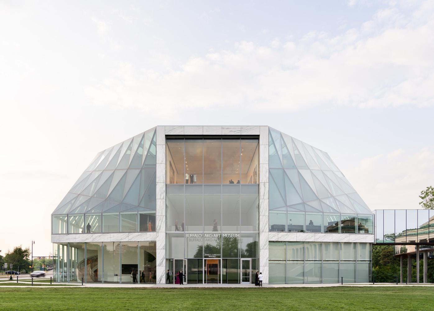
The updated, expanded, and newly renamed Buffalo AKG Art Museum reopens after a $230 million capital campaign. Read on page 28.
© ALBERT VEČERKA/ESTO
Caples Jefferson Architects in Queens. Read on page 6.
©ALBERT
LIVING TOGETHER
©DAVID SUNDBERG
JEREMY BITTERMANN
LEONID FURMANSKY RABER UMPHENOUR
Get a Room
CEO/Creative Director
Diana Darling
Executive Editor
Jack Murphy
Art Director
Ian Searcy
Managing Editor
Emily Conklin
Web Editor
Kristine Klein
Associate Editor
Daniel Jonas Roche
Associate Newsletter Editor
Paige Davidson
Assistant Editor
Chris Walton
Contributing Products Editor
Rita Catinella Orrell
Editorial Intern
Charles Gebbia
Vice President of Brand Partnerships (Southwest, West, Europe)
Dionne Darling
General Information: info@archpaper.com
Editorial: editors@archpaper.com
Advertising: ddarling@archpaper.com
Subscription: subscribe@archpaper.com
Vol. 21, Issue 6 | July/August 2023
The Architect’s Newspaper (ISSN 1552-8081) is published seven times per year by The Architect’s Newspaper, LLC, 25 Park Place, 2nd Floor, New York, NY 10007.
Presort-standard postage paid in New York, NY. Postmaster, send address changes to: 25 Park Place, 2nd Floor, New York, NY 10007.
For subscriber service: Call 212-966-0630 or fax 212-966-0633.
$3.95/copy, $49/year; institutional $189/year. Entire contents copyright 2023 by The Architect’s Newspaper, LLC. All rights reserved.
Please notify us if you are receiving duplicate copies.
The views of our writers do not necessarily reflect those of the staff or advisers of The Architect’s Newspaper.
My apartment in Brooklyn is almost 11 feet wide. Over the years, I’ve lived, variously, in graduate-student housing in Manhattan, in a 2-floor apartment with a view of the Atlantic Ocean in Brazil, and in a loft carved out of an attic in Houston. I’ve lived in a concrete-floored, modernish backhouse with only barn doors separating me from the sounds of my roommate’s intimate activities and in a former barrack— also with concrete floors—where it was recommended to shake out your shoes in the morning to avoid scorpions. I’ve lived in one half-floor quadrant of a fourplex with enough space that one area passed as a sunroom. Growing up, I lived with my family in a “typical” new-construction home on a “typical” suburban cul-de-sac and, earlier, in a drafty Victorian with a turret and a phone line run along the snowy ground to the house next door, where we previously resided. And the list goes on.
These venues are largely the stages upon which the scenes of my life have played out so far. Such a peripatetic history is common among young people. Today, home signifies everything from a place of psychological comfort and safety to a market unit of real-estate speculation. The reality of one’s home as a financial asset often overrides its capacity for individual expression and responsiveness. Hence, the ubiquity of the modern farmhouse aesthetic and the reign of greige, both of which have been documented by architecture critic Kate Wagner. (Last year, a comment by Jack Self in AN’s September issue also addressed the predicament, which began with an uplifting line—“You can’t afford to buy a home”—and continued on from there.) In an essay about home on this issue’s back page, Sean Joyner writes about a broken door that required multiple trips to Home Depot to fix. Read his text on page 66.
Whereas home can be found in an embrace or a group chat or on a dance floor, housing means the physical locations where we live. When it is taken up as an architectural concern, it also implies multifamily dwellings at different scales and in disparate arrangements. In this issue of the newspaper, we look at efforts by architects to produce housing across the country (page 16). Of the four featured
projects, three are affordable complexes, one is for seniors, and another was designed under the organizational logic of cohousing.
As this issue arrives, the housing crisis remains impossible to ignore. Here in New York, it was estimated late last month that the city passed 100,000 people in homeless shelters. More recently, the New York City Housing Authority revised the price tag for needed repairs from $45 billion in 2018 up to $78 billion, and the City Council continues to battle with Mayor Eric Adams about rental assistance. The problems with housing don’t stem from a lack of design prowess or technology, but instead arise from the trickier arena of political and economic will. To that end, housing expert Samuel Stein opens the feature section with a text about less obvious ways to prompt the creation of more affordable housing in New York. Read his thoughts on page 21.
Home pops up throughout the issue in other stories. See the brief news item about the new venue for the Louis Armstrong Center, across the street from the trumpeter’s brick house in Queens (page 6) and learn about the work of Studio Ma creating housing in Arizona (page 14). We also visit Buffalo, New York, a postindustrial city that’s reinvesting in itself, as seen in the historic revitalization of one of its core institutions: Anthony Paletta reviews the fully renovated digs of the Buffalo AKG Art Museum, designed by OMA/Shohei Shigematsu in collaboration with Cooper Robertson, kicking off our gleaming Focus section about glass (page 28).
At the end of the issue, don’t miss the excerpt from American Framing, published by Park Books and available in the United States in August (page 58). The text by Paul Preissner and photography by Chris Strong—including the image above—take the banal and invisible topic of wood construction as their subject. Most new multifamily buildings in the country are built using this structural logic. That’s not a bad thing. As my father would say to me years ago when we lived together in our family’s “typical” suburban home: “I’m not criticizing, just noticing.” Jack Murphy
Director of Brand Partnerships (East, MidAtlantic, Southeast, Asia)
Tara Newton
Sales Manager
Heather Peters
Assistant Sales Coordinator
Izzy Rosado
Vice President of Events Marketing and Programming
Marty Wood
Senior Program Associate
Ethan Domingue
Program Assistant
Trevor Schillaci
Audience Development Manager
Samuel Granato
Events Marketing Manager
Charlotte Barnard
Events Marketing Manager
Savannah Bojokles
Business Office Manager
Katherine Ross
Design Manager
Dennis Rose
Graphic Designer
Carissa Tsien

Associate Marketing Manager
Sultan Mashriqi
Marketing Associate
Anna Hogan
Media Marketing Assistant
Wayne Chen
Corrections
The architect of A Gathering Place in Tulsa, Oklahoma, is Mack Scogin Merrill Elam Architects, not Mack Scoggins Merrill Elam Architects.
The photographer of Moody Nolan’s work for Alabama A&M was Cory Klein, the photographer of the office’s work for Texas Southern University was Kayla Hartzog, and architects in Moody Nolan’s Housing Studio worked with Hord Coplan Macht to update the program of Thurgood Marshall Hall.
Jacob Reidel is an assistant professor in practice at the Harvard Graduate School of Design, not an associate professor; his course is called Frameworks of Practice, not Frameworks for Practice; one of the students whose work was featured is named Reuben Zeiset, not Zest.
The review about the Vkhutemas exhibition misstated the usage of four contextualizing texts. In addition to being available as press materials, they were also installed on the wall outside the Arthur A. Houghton Jr. Gallery at The Cooper Union. Additionally, the review’s formatting mistakenly integrated a quote from cocurator Anna Bokov into its surrounding paragraph.
The Architect’s Newspaper
CHRIS STRONG
4 Editor’s Note Masthead Info
HANOVER® ASPHALT BLOCK

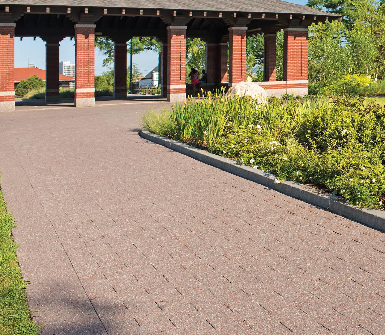
A UNIQUE, PEDESTRIAN-FRIENDLY PAVING ALTERNATIVE


HIGHEST POST-INDUSTRIAL RECYCLED CONTENT

A80055/GROUND FINISH

and
www.hanoverpavers.com • 800.426.4242
Produced
with Post-Industrial Recycled Content, Asphalt Block is a unique paving alternative. Available in several shapes and sizes and a variety of colors and textures, Asphalt Block is extremely durable, soft under foot
spark resistant.
6 Open News
Designed for Wellness Walk the Walk
A new gift shop uplifts rituals of care for hospital users.
Hydra Health
1000 E. Mountain Drive
Wilkes-Barre, PA 18711
San Francisco–based architecture firm Figure traveled to Wilkes-Barre, Pennsylvania, to design a hospital gift shop and wellness studio that breaks the monotony populating much of American healthcare design. The client, Hydra Health, serves the Henry Cancer Center at the Geisinger Wyoming Valley Medical Center campus. Figure worked with Hydra Health and developer Health Hospitality Partners to realize a space that navigates away from the sterile feeling of many hospital interiors, both materially and figuratively.
The young firm, headed by James Leng and Jennifer Ly, began by visiting a number of hospital gift shops as research. Ly told AN that the experience left them “feeling incredibly overwhelmed by all the stuff crammed in these compact spaces,” not to mention the often hectic environments of hospitals.
On the exterior, the cancer center is shaped by a curving glass entrance with vertical orange stripes. However behind the colorful facade, visitors are enveloped in a soft, neutral palette that is often, and unfortunately, omitted from healthcare spaces. The space is set within a new perimeter wall, which Figure designed to address the existing space’s awkward layout.
Hydra Health’s floorplan sets the gift shop near its entrance, with private spaces

accessible through a corridor toward the back. Built-in display shelves and a booth containing a sink and mirror line one side of the front space, while curtain-closed rooms, home to plush benches and tables, line the opposite side. A set of three display tables and a checkout desk fill the space between, warmly lit by a row of hanging lights. Set against custom-fabricated maple millwork with taupe-colored walls, the gift shop feels more akin to a boutique than a healthcare gift shop, with material continuity keeping the space from feeling overcrowded.
In the back, the corridor connects four private rooms that contain couches and a dimmer lighting approach that would feel at home in a massage therapist’s office. Ly said that the team wanted to create “opportunities for rest and contemplation in a soothing environment.”
Covering 1,600 square feet, Hydra Health’s new facilities manage to fill a range of needs without feeling packed in. Figure maintains a contiguous palette between spaces, carefully balancing soft and rigid barriers between programs. Avoiding a clinical feel, Figure’s design creates a more comfortable environment for hospital visitors.
Chris Walton
SOM and James Corner Field Operations deliver a pathway that links New York City’s High Line to Moynihan Station.
A new link has emerged to connect Penn Station to Manhattan’s reimagined West Side: the High Line – Moynihan Connector. The new Moynihan Connector is actually comprised of two bridges, the Timber Bridge and the Woodland Bridge, which offer a unique pedestrian experience. Together they form a 600-foot-long linear park extending out of Manhattan West’s public plaza and down Dyer Avenue to 30th Street, where it links up with the High Line.

A Great Day in Queens
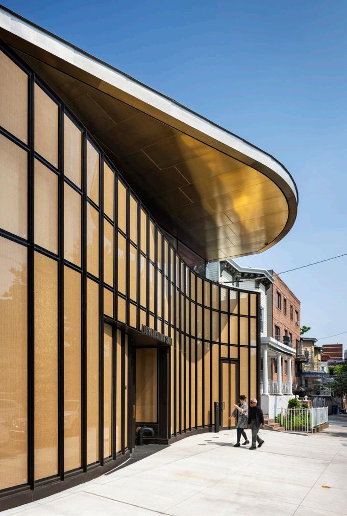
The Louis Armstrong Center, designed by Caples Jefferson Architects, opens to the public.
On a hot day in June, a crowd gathered on 107th Street in Corona, Queens, to celebrate an event that was decades in the making: the opening of the Louis Armstrong Center, a 14,000-square-foot, $26 million new building designed by Caples Jefferson Architects. It’s sited across the street from the Louis Armstrong House Museum, where the world-famous jazz trumpeter and his (fourth) wife, Lucille, lived.
To mark the occasion, elected officials and museum leaders past and present offered messages of encouragement prior to a performance by pianist and artist Jason Moran, who also curated the center’s inaugural exhibition, Here to Stay. The fanfare was briefly interrupted when a man fleeing law enforcement ditched his vehicle and ran through the crowd. He pushed New York State assemblyman for District 35 and Speaker Pro Tempore Jeffrion L. Aubry, who had just finished his remarks, to the ground, injuring him. The suspect was quickly captured down the block.
Police pursuits aside, the new building is a tribute to Armstrong’s art and the community of Queens, then and now. In contrast to the vinyl siding– and brick-clad homes nearby, its facade is shaped by a curving curtain wall and overhead canopy, which reference the bell

The new extension brings the famed walkway closer to Hudson Yards and Penn Station. The recently completed Moynihan Connector is a joint endeavor by SOM and James Corner Field Operations—the latter an original member of the High Line design team. It was led by Empire State Development, the Port Authority of New York and New Jersey, Brookfield Properties, and Friends of the High Line.
Kristine Klein
curves of a trumpet. The IGUs of the former are embedded with a wire mesh that also gives it a brassy, trumpetlike color.
Inside, light enters through skylights and colors are deployed enthusiastically, including a blue-plaster elevator volume, a 75-seat venue finished in wood paneling and red paint, and gold walls on the south side of the building. Upstairs, a secure facility houses the 60,000-piece Louis Armstrong Archive—the world’s largest for any jazz musician. The second floor also includes a balcony, which mirrors the Armstrongs’ home across the street. To close the opening ceremonies, a choir of trumpets appeared on both to fanfare the crowd. What a wonderful world, indeed. JM
The Architect’s Newspaper
JAMES LENG
©ALBERT VECERKA/ESTO ANDREW FRASZ
An Alternate Vision Vornado: Drop Dead
ASTM, HOK, and PAU share more details about their proposal to save Penn Station, including a new facade along 8th Avenue.
Governor Hochul exits developer scheme and shares new images of design by FXCollaborative Architects, WSP, and John McAslan + Partners.
New Yorkers recently got a long-awaited look at the “New Penn” plan. The design proposes a 180-degree reorientation, welcoming passengers from 8th Avenue, across from the Farley Building and the Moynihan Train Hall, but also two train halls connected by a passenger concourse. Removing the former Theater at Madison Square Garden on the 8th Avenue side, along with the entirety of Level B (site of the notorious low ceiling heights), allows for a
grand entrance and generous space for the new western hall, whose 55-foot-high ceiling may relieve the current condition’s oppressive sense of enclosure. The grand gesture of the design, however, is a 105-foot-high arched glass ceiling midblock. Crucially, the scheme leaves Madison Square Garden in place. The New Penn team identifies the theater, not the arena, as the critical obstacle to a better station. Bill
 Millard
Public Response
The architecture community—and Adjaye Associates clients—respond to allegations of sexual misconduct by David Adjaye.
David Adjaye has been accused of sexual misconduct by three former female employees. As originally reported in The Financial Times , the accusations range from harassment to physical assault. The women detailed abuse going back years at his firm, Adjaye Associates, which they alleged had fostered a toxic work culture. Adjaye denies these claims.
The London-based firm, which also has offices in New York and Accra, Ghana, is largely known for its cultural projects. After founding the firm in 2000, Adjaye rose to prominence following the 2016 opening of the Smithsonian’s National Museum of African American History and Culture, which his firm designed. The following year, Adjaye was knighted by Queen Elizabeth II.
The allegations detail grotesque mismanagement throughout the firm, but largely focus on the opening of the firm’s Accra office in 2018. They include not only sexual assault, but failure to pay employees on time as well as visa insecurity. Through his lawyer, Adjaye told FT that there were cash flow issues in the early days of the Accra office, which “functioned as a start-up.”
In a statement provided to AN from Kendal Global Advisory, a communications and crisis management firm, Adjaye said: “I absolutely reject any claims of sexual misconduct, abuse or criminal wrongdoing. These allegations are untrue, distressing for me and my family and run counter to everything I stand for. I am ashamed to say that I entered into relationships which though entirely consensual, blurred the boundaries between my
professional and personal lives. I am deeply sorry. To restore trust and accountability, I will be immediately seeking professional help in order to learn from these mistakes to ensure that they never happen again.”
Almost immediately after the FT story broke (which had been in the works for a year), Adjaye stepped down as a member of London mayor Sadiq Khan’s panel of design advocates and resigned as a member of the Serpentine Gallery’s board of trustees, and Adjaye Associates paused work on the U.K. Holocaust Memorial and Learning Centre (which Adjaye has now stepped back from).
On July 7, three days after the initial investigation was published, FT reported that Adjaye had “disclosed private legal letters and the names of women he allegedly sexually abused to the government of Ghana as part of efforts to save his reputation.” Those names were then leaked to the Ghanaian press.
Other clients of Adjaye, and organizations he was associated with, have canceled projects or verbally showed concern over their association with the architect.
Adjaye Associates’ design of the Princeton University Art Museum continue as the client’s work with the firm is largely complete. In Portland, Oregon, the East County Library was slated to proceed with a local architect and without Adjaye Associates prior to FT ’s report, the client told FT Bedrock, the developer executing the waterfront master plan that Adjaye Associates is working on in Cleveland, said that the firm
At a press conference in late June, New York State Governor Kathy Hochul announced that the state will no longer formally link the real estate developer Vornado’s redevelopment to plans for a new Penn Station. Amid controversy regarding Vornado’s involvement, numerous proposals and aesthetic disagreements over the new station have further marred the public-private partnership project, Hochul said the state would be taking a
stronger leadership position. Newly released renderings from the governor’s office show a brighter Penn Station that is aesthetically contiguous with the new Long Island Rail Road section of the station. Renderings depict a midblock train hall framed under an undulating glass ceiling and multilevel concourse colored with white paneling, though not much seating—the common, and warranted, gripe about Moynihan Train Hall. KK

is reevaluating whether it will continue to work with Adjaye on the project. Adjaye will be stepping away from a planned project in Chicago’s Old Town, developer Fern Hill said, and the de Cordova Sculpture Park and Museum in Massachusetts has placed a planned exhibition of Adjaye’s sculpture work on hold indefinitely. Adjaye Associates was also working on the International Slavery Museum and Merseyside Maritime Museum, for which National Museums Liverpool is the client. The museum told The New York Times that it was taking the allegations seriously, but did not indicate that the project status had changed. A Rice University spokesperson said that the school might end its relationship with Adjaye Associates, which has been contracted to design a new student center. At Vermont’s Shelburne Museum, where Adjaye Associates is designing an expansion to house Native American art, the museum said its work with Adjaye Associates is in early design stages and is being reevaluated. The Africa Institute in Sharjah, United Arab Emirates, has canceled the Adjaye Associates–designed campus announced in 2021.
The Royal Institute of British Architects (RIBA) said that anyone who has been a victim of violations of its code of conduct should report such matters so they can conduct a full investigation.
Clearly, the architectural community’s reaction against Adjaye has been strong. Writing in The Guardian, architecture critic Rowan Moore argued that the cult of worship in architecture, which often results in complicity with starchitect men committing sexual assault or otherwise predatory actions in the workplace, originates in the classroom studio model. Competitive studio culture and unfair compensation contribute to the starchitect myth and power associated with it. Let not the attention on Adjaye give the impression that it is only starchitects who act like this.
On Instagram, former Adjaye employee Ngozi Olojede detailed a highly disorganized workplace in Adjaye Associates’ New York office where employees were pressured to work long hours: a culture that Adjaye himself encouraged. Olojede also said that Adjaye “installed very white senior leadership” and that she had heard about a sexual assault Adjaye allegedly committed against an employee in South Africa prior to its recounting in FT . Another former Adjaye Associates employee, Ewa Lenart, described a similar culture of abuse and strict discipline for workers who “spoke up.”
Olojede crucially noted that workplace protections for women in many African countries are lacking. As Adjaye Associates’ work on the National Cathedral of Ghana and Edo Museum of West African Art in Nigeria seems to be continuing as planned (though much skepticism surrounds the cathedral project), the discrepancies in workplace labor protections and the lack of similar public dismissal by clients cannot be overlooked. As conversations over canceling projects in progress by Adjaye Associates continue, the importance of not reducing a firm’s work to its leader (ship) is important. The work that has gone into these projects has come from employees who have worked incredibly long hours and is seen through by the labor of executive architects and architects of record and, ultimately, the construction workers who install the projects. This is not to say that the work of Adjaye Associates (especially if it retains that name) will not be left untarnished, but that the architectural work attributed to Adjaye was never fully his to begin with. CW
July/August 2023
7 News
COURTESY OFFICE OF GOVERNOR KATHY HOCHUL
Read more on archpaper.com
COURTESY ASTM, PAU AND HOK
A Tower in Outer Sunset?
SCB shares additional imagery of its 50-story tower planned for San Francisco.

Solomon Cordwell Buenz, the architects behind the proposed 50-story residential tower at 2700 Sloat Boulevard in San Francisco’s Outer Sunset neighborhood, has released new renderings that further detail the project’s design. It will include 680 residential units, 110 of which will be affordable. Renderings of the tower show rounded corners with a ridged array of balconies extending from the envelope. A double-height, copper-colored podium brings some color to the otherwise glass and metal facade.
When the project was first proposed in 2020, the San Francisco Planning Department took issue with it and its potential violations of Urban Design Guidelines regarding shadows (particularly over parks and the nearby zoo). The ongoing conflict between the developer,
Attainable Housing
OSD breaks ground on South Cato Springs, a 230-acre development for neurodivergent adults in Arkansas.
Reno, Nevada–based CHPlanning, and the city revolves around whether zoning will permit the project. Juxtaposed with low-rise buildings in the neighborhood, the massive scale of the tower sticks out. The site is currently zoned for small-scale neighborhood commercial use and is home to a small garden center. The tower is also within the Sunset Chinese Cultural District, which, in theory, allows city departments to provide resources for cultural communities that are threatened by displacement.
The project’s future remains uncertain as the developers may continue to make adjustments to proposed designs and appeal to Planning Department decisions, though the project is still far from approval. CW

Snøhetta Votes No on Union
After a public campaign, an attempt at unionization fails despite widespread interest.
Workers in Snøhetta’s U.S. offices, in New York and San Francisco, have voted against unionization, 35–29. Although it was initially reported that the vote was 29–28 against unionization, the National Labor Relations Board revealed that it had omitted ballots from the firm’s San Francisco office in the final count. The uncounted votes from the San Francisco office skewed 6–1 against unionization, raising questions over discrepancies in unionization positions between the firm’s U.S. offices.
The result calls back to failed unionization attempts at SHoP Architects, though workers there never got to an election as unionization efforts slowed. Architectural Workers United (AWU) has been working to organize architects in the U.S., including in the recent efforts at Snøhetta and the successful unionization
drive at Bernheimer Architecture last year. While unionization in the architecture industry is almost nonexistent in the U.S., in Norway, where Snøhetta was founded, over 5,700 architects, landscape architects, interior architects, designers, and planners are members of the Norwegian Union of Architects, which was founded in 1911.
In a statement shared on Instagram, AWU said that Snøhetta had retained Stinson, a union-busting law firm, to drive opposition to unionization among workers.
While the failed vote at Snøhetta is a loss for the unionization effort within architecture, that does not mean that momentum is dead, that workers at other firms are not trying to unionize, or that support around unionization within the larger industry will stall. CW
New York–based OSD (Office of Strategy + Design), nonprofit SLS Community, and developer South Cato Springs Holdings celebrated the groundbreaking of South Cato Springs, a development for neurodivergent adults, in Fayetteville, Arkansas.
SLS Community, which provides support for neurodivergent adults to “thrive through independence and choice,” will oversee “specialized housing and services alongside vocational training, educational programs, and recreational activities” in the development. The project focuses on maintaining a high quality of life through robust transportation infrastructure, “attainable housing” opportunities, limiting suburban sprawl, and revitalizing the downtown with a focus on infill projects.
Obit: Robert Mangurian
SCI-Arc faculty member Robert Mangurian dies at 82.

Longtime SCI-Arc faculty member and architect Robert Mangurian has died. He was a key figure in the school’s early years and directed the graduate program from 1987 to 1997. Mangurian was born in Baltimore, but spent a significant part of his childhood in Glendale, California. After initially attending Stanford University, he graduated with a degree in architecture from UC Berkeley.
Mangurian joined Studio Works Architects after a stint at Conklin & Rossant in New York. It was at Studio Works where he began collaborating with Craig Hodgetts, and his career took off, particularly in response to the postmodern movement. Mangurian worked there with Mary-Ann Ray, who later became his partner, and the two cofounded their own firm, B.A.S.E Studios in Beijing.
Some of his important works are the Gagosian House and Gallery, designed with Hodgetts; the Roden Crater project, on which Studio Works collaborated with artist James Turrell; and a 1980 exhibition at MoMa PS1 called Architecture (Spring 1980): Robert Mangurian and Craig Hodgetts: Studio Works Mangurian also participated in Thom Mayne’s
The 230-acre site is located between Kessler Mountain Regional Park and Cato Springs Road southwest of downtown and will emphasize pedestrian and cyclist circulation over that of cars. This approach will meet accessibility needs while keeping the development at the desired scale.
The overall approach seeks to incorporate influences from the natural landscape of the Ozarks, tying the typologically unique plan to local environmental contexts. SLS’s executive director, Ashton McCombs, said: “Our hope is that the service, employment, housing, and community resources holistically brought together throughout the OSD design will help address the disparity of opportunity that too often exists for neurodivergent adults.” CW
Architecture Gallery, which gathered the likes of Hodgetts, Eric Owen Moss, and Frank Gehry, among others, playing an important role in shaping the L.A. design scene that emerged in the mid- to late 1970s.
Hodgetts praised Mangurian as an educator, saying that “by refusing to compromise on the smallest detail, and demanding larger-than life ambitions from his students, while reminding them of the true greatness to be found in antiquities, he inspired generations of architects whose practice continues to reflect his principles even today.” CW
The Architect’s Newspaper
8 News
Central
COURTESY OSD
COURTESY SCB
COURTESY SCI-ARC
DMA Shortlist


Six teams unveil proposals to reshape the Dallas Museum of Art.


The six finalist teams competing to renovate the Dallas Museum of Art (DMA) unveiled their design concepts today. In April, the 120-yearold institution announced the shortlisted firms vying to reimagine the 1984 Edward Larrabee Barnes–designed museum campus: David Chipperfield Architects, Diller Scofidio + Renfro, Johnston Marklee, Michael Maltzan Architecture, Nieto Sobejano Arquitectos, and Weiss/Manfredi.
The winning firm will be tasked with expanding the gallery spaces, which visitors often find to be outdated and difficult to navigate. This will involve reorganizing the interiors and improving circulation and entrances throughout. The six finalist concepts are now on view at the museum, and the community is encouraged to weigh in. In July, the Architect Selection Committee will interview each of the six finalists and review the proposals, after which the group will make a recommendation to the museum’s board of trustees, which has the final say.
In a statement, selection committee cochairs Jennifer Eagle and Lucilo Peña said: “What are we, the deciding committee, looking for? Well, a brilliant analysis of the complex program, for energy and inspiration, for a deep connection to our communities and Larrabee Barnes’ original intent.”


The six proposals from the shortlisted firms are included at right. KK

David


with HarrisonKornberg Architects (Local Architect), James Corner Field Operations (Landscape Architect), Pentagram (Exhibition Design), Thornton Tomasetti (Structural Engineer), Arup (Services and Lighting), and Atelier Ten (Sustainability).


Diller Scofidio + Renfro (DS+R) with Michael Van Valkenburgh Associates (Landscape Architect), Arup (MEP, Sustainability, and Daylighting Engineer), LERA Consulting Structural Engineers (Structural Engineer), New Affiliates (Exhibition Design), and GFF Architects (Local Architect).
Johnston Marklee with Christ & Gantenbein (Museum Specialists), MOS Architects (Public Realm), Sam Jacob Studio (Exhibition Design), Hargreaves Jones (Landscape Architect), Buro Happold (MEP and Sustainability Engineer), Walter P Moore with Martinez Moore Engineers (Structural Engineer), and Kendall/Heaton Associates (Local Architect).
Michael Maltzan Architecture with Studio Zewde (Landscape Architect), Guy Nordenson and Associates (Structural Design Engineer), Buro Happold (MEP Engineer), Atelier Ten (Sustainability), and JSA/MIXdesign (Exhibition Design and Accessibility).


Nieto Sobejano Arquitectos with Atelier Culbert (Exhibition Design), SWA Group (Landscape Architect), Arup (MEP, Lighting, and Sustainability Engineer), Bollinger+Grohmann (Structural and Facade Engineer), and PGAL (Local Architect).


Weiss/Manfredi with Hood Design Studio (Landscape Architect), WeShouldDoItAll (Exhibition Design), DVDL Design Decisions (Cultural Strategists), Thornton Tomasetti (Structural Engineer), Jaros, Baum & Bolles (MEP/FP Engineer), and Atelier Ten (Sustainability).


July/August 2023
9 News
Chipperfield Architects (DCA)
© JOHNSTON MARKLEE AND MALCOLM READING CONSULTANTS © DILLER SCOFIDIO + RENFRO AND MALCOLM READING CONSULTANTS © DAVID CHIPPERFIELD ARCHITECTS AND MALCOLM READING CONSULTANTS © WEISSMANFREDI AND MALCOLM READING CONSULTANTS © NIETO SOBEJANO ARQUITECTOS AND MALCOLM READING CONSULTANTS © MICHAEL MALTZAN ARCHITECTURE AND MALCOLM READING CONSULTANTS Ventanas PANEL ©2019 modularArts, Inc. Shayle PANEL ©2023 modularArts, Inc. Breeze™ PANEL @2022 modularArts, Inc. Apollo BLOCK ©2011 modularArts, Inc. Zephyr BLOCK ©2012 modularArts, Inc. modulararts.com 206.788.4210 made in the USA
Seamless Feature Walls in Modular, Glass-Reinforced Gypsum. Over 60 designs!
Teachable Moments Nightmare for NIMBYs
NADAAA and HDR design a timber addition for University of Nebraska’s College of Architecture.


California may see affordable housing boom as its “builder’s remedy” law is tested by local developers.
In response to a 17 percent increase in enrollment over the last ten years, the University of Nebraska College of Architecture is expanding its footprint. The first of two phases wrapped up ahead of the fall 2022 semester. It relocated the school’s library, opening up much-needed space for more studio desks. The second phase is now under construction with the same goal of creating additional workspaces for architecture students. It will also add several new public amenities, like a new lobby, gallery, and rooftop terrace, all while improving accessibility and circulation between the new and existing facilities. NADAAA and HDR are collaborating on the flexible, 4-story addition. The expansion adds to a medley of buildings at the College of Architecture, some dating back to the 19th century. The last time the college underwent a renovation of this magnitude was in 1987. The latest expansion will add a timber-framed structure with a
Kalwall-paneled facade. While disparate in their ornamentation, the existing buildings mesh tonally with the new structure’s dark facade paneling. The prefabricated wall panels are tilted to filter in some natural light and staggered to frame views of the nearby Sheldon Museum of Art. At ground level, a series of timber beams introduce the material, which then continues inside. In addition to added studio desk space, flexible interiors will accommodate a range of programs for students and faculty—among these spaces for drafting, model making, and seminars, as well as larger meeting spaces that will include bleacher seating designed for crits and lectures. Outdoor learning spaces will be equally accommodating to a range of uses. A central courtyard and a rooftop deck will create ample space for displaying art. Overall, Phase 2 will offer 33 new and revamped studios, to be completed in January 2024. KK
The numbers speak for themselves: With a 13.2 percent poverty rate and a median home price of $836,110, California is experiencing one of the nation’s most staggering affordable housing crises. While some of the state’s largest cities, like San Francisco, San Diego, and Los Angeles, currently have programs intended to meet Governor Gavin Newsom’s recent goal of creating one million units statewide by 2030, several of its lower-density cities are stymied by local NIMBY groups. In many cases, California’s myriad zoning laws and regulatory statutes, designed with the intent to improve the lives of all residents (such as the California Environmental Quality Act), have been manipulated into prohibiting new building altogether.
As of late, however, developers have discovered a way around these restrictions by citing a law that largely went unnoticed since its creation in 1990. Government Code § 65589.5(d)—nicknamed the “builder’s remedy” law—was written into California’s Housing Accountability Act (HAA) as a means of streamlining the affordable housing development process in cities noncompliant with the Housing Element Law, which states that “all local governments (cities and counties) must adequately plan to meet the housing needs of everyone in the community.”
Given its stipulation that only 20 percent of the units of any new development be affordable, the builder’s remedy law has caught the attention of developers eager to expand their portfolios or otherwise use it as a bargaining chip with city leaders. WS Communities (WSC), the largest developer in Santa Monica, became the first to test the legal waters last year by applying for 14 apartment buildings that could together create over 4,000 housing units. In May, the city council and WSC came to an agreement: In exchange for pulling the majority of its applications, Santa Monica will update its zoning code to encourage developers to work with the city rather than against it through expedited processing and additional incentives on all new affordable housing projects.
Other cities across the state, however, may not make these same concessions in the face of large developers. “For some of the other 80-odd cities in L.A. County [for which this law applies],” said Rayne Laborde Ruiz, an associate at the Santa

Monica–based architecture firm Koning Eizenberg, “its impact will depend on if the locality takes the state seriously in getting a compliant housing element filed in a timely manner and if and how antidevelopment neighbors mobilize. Any large development in notoriously antidevelopment areas is likely to face costly litigation challenges that the proponents will have to weigh carefully, whether they are technically in the right under builder’s remedy or not.”
While several larger developers have confidently strutted the builder’s remedy law, nonprofit housing developers have shown more caution, as a significant portion of their funding typically comes from the very same governmental departments they would be challenging. “This provision has sat unused for decades,” said Scott Sullivan, founding principal of the Los Angeles–based firm Relativity Architects. “That alone should give one a sense of how reluctant anyone’s been to challenge the very local governments that issue permits for their projects. It takes a certain kind of chutzpah to walk up to a planning department counter and tell them that they can’t use local rules to stop us from building a large apartment complex anywhere we like. So, if one is going to take on an adversarial stance with a city from the get-go, that’s probably better left to land-use attorneys.”
The builder’s remedy represents the second avenue by which California has attempted to increase affordable housing by streamlining development. Two bills passed in 2019—AB-881 and AB-68—have recently expedited the process of building accessory dwelling units by rendering existing restrictions obsolete. Yet these two alone might not be enough to reach the state’s one-million-unit goal by 2030. “If recent housing bills and the builder’s remedy are both ways for the state to supersede slowto-adjust or blatantly antidevelopment local control on housing,” Laborde Ruiz argues, “we also need the ‘carrot’ for noncompliant jurisdictions. That means reliable, sustainable funding for affordable and innovative housing. New funds are trickling out for affordable housing, community land trusts, housing on faith-based land, and other explorations—hopefully making these more substantial, lasting streams.”
Shane Reiner-Roth is a lecturer at the University of Southern California.
The Architect’s Newspaper 10 News
ALEXANDER MIGL/WIKIMEDIA COMMONS/CC BY-SA 4.0
COURTESY NADAAA
COURTESY NADAAA
You Can’t Escape the Past
The International African American Museum opens with design contributions from Pei Cobb Freed & Partners, Moody Nolan, and Hood Design Studio.
In the late 1770s, Christopher Gadsden was the imminent heir to his father’s fortune, a slave trade magnate, and the designer of the rattlesnake flag now flown by the ascendant American white supremacist movement. But in that time, he also completed Gadsden’s Wharf. The massive shipping complex became an infamous site where the human depravities of the slave trade were on full display as a bustling marketplace, giving over 840 feet of prime Charleston riverfront territory to ships stacked with enslaved Africans. Six ships could dock at once; on dry land, a thousand enslaved men, women, and children could meanwhile be held in wait to be sold or trafficked to parts unknown. Until recently, to many, the land’s history might also have been unknown. The ground on which an estimated 100,000 Africans were delivered, and its coast off which untold more were drowned, has been an overgrown lot in the shadows of a condo development remarkable only for its grim name, the Gadsden.
For decades, local politicians like Charleston mayor Joseph P. Riley Jr. have pushed for a structural acknowledgment of the city’s centrality to the slave trade and a memorial to those enslaved and killed. Major architectural figures, including the late Harry Cobb of Pei Cobb Freed & Partners and landscape artist Walter Hood, have devised plans, and representatives of local Gullah Geechee people have advised them. Yet politicians like Republican state representative Brian White have withheld promised funding. The South Carolina Heritage Act, signed into law in 2000 by Democratic governor Jim Hodges, makes illegal the removal or rededication of any public statues or areas named after a historic person or event (even as it calls the Civil War the “War Between the States”). Perversely, if the site of the former Gadsden’s Wharf were public land, a memorial like the one that now rises from the water’s edge wouldn’t be possible.
But rise it does, in the form of the new International African American Museum, an elegantly cantilevered, single volume building that embodies Cobb’s vision and serves as a culmination of his firm’s decade-plus-long collaboration with architect of record Moody Nolan. It seems to step out of the Atlantic and pause between the past and the future. Pale yellow brick lightens its monumental horizontality. The building’s ample glazing is cooled by clever louvers made of African sapele, which shade interior spaces from the sun but simultaneously allow for views of the Atlantic coast and the Charleston skyline. “We wanted to make this connection,” said PCF&P associate partner Matteo Milani, “because the story of the site is between the ocean and downtown Charleston.”
The museum’s interiors are almost entirely open. Visitors rise, courtesy of a stone stair, into an atrium. Next, exhibition designer Ralph Appelbaum moves them toward the ocean and through multimedia displays of the region’s history, as if to say, you can’t escape the past. Then come interactive galleries examining modern-day social justice movements, arguing that we can—and must try. In order to make this a living history, the museum also includes a research center, supported by the Center
for Family History, offering a bounty of primary sources and other archival documents so researchers and the public alike can learn about their personal histories.
What separates the IAAM from other worthy institutions, however, is the ground it sits on—or, rather, floats above.
“The site is more important than the building itself,” said Milani. Just plunking down a building, however elegant its form, might compromise that importance, reburying the remains of the wharf. Instead, 18 columns, in two rows, lift the volume some 13 feet off the ground. Each column is clad in oystershell tabby, a mixture of equal parts lime, water, sand, oystershells, and ash. Historians have yet to definitively determine whether northwest Africans developed the material, but the building technique came with colonists to America in the late 1500s, where it became a distinctive part of Southern vernacular architecture, particularly the self-built homes of the enslaved. Today, the unmistakable suspension of shells lends symbolic heft to the columns, which taper in almost religious deference to the weight of the museum. Their shape fends off allusions to parking garages. Their strength keeps the building safe from floods—and also keeps the earth safe from the building. “This is sacred ground,” said
Moody Nolan founder Curt Moody. The plan foregrounds its significance.
It also creates a plaza beneath the building itself, dedicated to public contemplation and organizing. Walter Hood and principal Paul Peters conceived a trio of risk-taking interventions for the plaza and its surroundings. To the north, the studio planted “hush harbors” within mazes of brick walls. These reference the secret gardens planted by enslaved Africans as havens away from their owners. Hood reimagines them in The African Ancestors Memorial Garden, a series of reflective spaces hosting native Lowcountry species like sweetgrass and cypress. Altogether, they outline the historic footprint of the large warehouse in which enslaved people were stored. “They establish this site as an authentic place of arrival,” Hood wrote in a statement. “The site’s hallowed ground and landscape spaces offer contemplation, celebration, and distraught memories.”
This history is brought back to life with parallel walls of reflective black granite, between which cast-concrete figures of African people kneel.
Boldest of all the museum’s design interventions, however, is the a fountain at the water’s edge. Here, at the eastern boundary of the former wharf, a tidal pool seems to join the Charleston Harbor.

When the sun hits, the water casts light onto the museum. But when the tide goes out, the receding water reveals full-scale human figures carved out of concrete and oystershell pavers, in rows that recall the wicked stacking of enslaved people shown in the notorious 1787 Brookes diagram—a document of the horrors enacted by the slave ships Gadsden courted. Museum visitors will work out for themselves whether their witnessing of Hood’s creation revivifies the trauma of the slave trade or in some baptismal way might allow a healing from it. The project’s power might depend upon the idea that the two, at least today, can’t be untangled.
Yet there’s dignity in such difficulty. “We’ve been with this project for 15 years, and there were plenty of chances to give up,” Moody said. “But it was too important, for what it represents and where it is. There are only a few museums that occupy a place with these kinds of connections. The country would be poorly served to have never done this one, on this site.” Charleston, and this country, is well-served by the work.
July/August 2023
11 News
Jesse Dorris is a writer based in New York City and hosts Polyglot, a radio show on WFMU.
© MIKE HABAT
Transparency Behind Closed Doors
Ennead’s U.S. embassy in Turkey is designed for contradictory tensions.

Few buildings are tasked with negotiating complexity quite like the embassy. An embassy’s exterior conveys how a country sees itself, while simultaneously telegraphing how it wants the host country to see it. Embassy interiors must then do all that while also managing the tensions between those two views.

So, it’s a strategically designed achievement that the new U.S. embassy in Ankara, Turkey appears so effortless. Ennead Architects has devised a campus that updates the International Style into what might be characteristic, metaphorically, of 21st-century Americana: Its structure seems to endorse transparency without actually offering much of it, and it’s crafted to recognize local architectural traditions yet remains recognizable to anyone familiar with D.C.’s federal white stacks.
“The number one reason [the U.S. is] building new embassies is that many of them were built a hundred years ago in the middle of cities, and they don’t meet the current security requirements—for instance, a 30-meter setback from the street.” Ennead design partner Richard Olcott told AN . Such concerns are why the U.S. left its lovely 1960 Eero Saarinen digs in Grosvenor Square and moved, in 2017, to a glittering KieranTimberlake cube—partially surrounded by a moat—in Nine Elms. Meanwhile, Saarinen’s building is slated to reopen as a hotel in 2025.
In Ankara, Ennead worked with landscape architects at GGN to fill the now-standard setback with local landscaping, but it was a literal uphill battle, as the nine-acre site rises up a steep slope. “It’s about 75 feet of slope,” Olcott said, “which was quite a difficult problem,
because the whole thing obviously has to be ADA accessible.” The resulting design is, effectively, a continuous ramp from the street to the lobby. That arrival space inaugurates a series of zones inspired by traditional Turkish courtyards. Olcott said the “processional aspect” of Ottoman architecture inspired this sequence: “You go into an inner court, then into the building, which has three courtyards within it: one public, one private, and one very private, which is only for the ambassador.”
Curtain walls were out of the question.
“What you’re talking about is a highly secure environment that needs to appear as though it is as welcome and open as possible,” he said. Before long, the whole complex should nestle comfortably within groves of coniferous trees that recall the site’s long-ago history as a dense forest. But it will remain a sort of bunker, with circulation routes determined by security protocols, themselves in tension between the memory of the 2013 suicide bombing of the former U.S. embassy and growing anxiety over future disasters, man-made or otherwise.
“Literal transparency is almost impossible when you’re using very secure materials,” Olcott said. “I translate it more as creating a sense of welcome. The people who come to the consular areas are often upset, maybe about a family member, or they may have lost their passport. There’s a lot of stress. And so it’s really important to make the kind of environment in which people feel comfortable.” This is accomplished artfully by filling the monumental lobby with art, which was commissioned by both American and Turkish artists and curated by the Bureau of Overseas
Building Operations Office of Art in Embassies. Material choices were made to ensure low environmental impact and prioritize recycled content. However, Turkish masonry defines the project, which is warmed up by ample use of local wood and Marmara marble brought in from its namesake island off the coast of Istanbul. The beautiful stone clads the walls, floors, and even staircase treads. “Every mosque, every palace, and even sidewalks in Istanbul are made of that very strongly striped marble,” he said. It lends a familiar touch to a space that can feel foreign.
In a similar gesture, the main, cantilevering building is golden travertine on a base of silver travertine, both from the southwest of the country. Yet perhaps the project’s flashiest moment is a chancery facade referencing Islamic architecture that creates shade and privacy in the largest courtyard. “It allows the staff to have a wonderful place to go outside without having to go out through the security apparatus,” Olcott said. Its design inspiration stems from the vernacular mashrabiya , an elegant metaphor for the embassy itself: a complicated public contrivance to create extensive privacy. JD
The Architect’s Newspaper
12 Dispatch
Top: The facade employs local materials like Marmara marble.
Left: An inner courtyard offers employees outdoor respite, without security concern.
© SCOTT FRANCES
© SCOTT FRANCES
Ahead of evolution

Bologna, 25-29 September 2023


www.cersaie.it
A showcase of the latest trends in architectural design. A meeting place for architects, contractors and trade professionals from all over the world.

13
International Exhibition of Ceramic Tile and Bathroom Furnishings
In collaboration with Promoted by CONFINDUSTRIA CERAMICA
by With the support of Ministry of Foreign Affairs and International Cooperation
Organized
Out on the Mesa
Phoenix-based Studio Ma draws inspiration from the desert for its sustainable designs.

Studio Ma, an architecture and environmental design firm located in the Phoenix neighborhood Arcadia, has established itself as one of the country’s leaders in sustainable design over the past two decades. The firm was founded by principals Christiana Moss, Christopher Alt and Dan Hoffman in 2003. After graduating from Cornell University, they opted for Arizona’s desert, finding the arid landscape and its mesa formations to be suitable ground for experiment.
“To be in a place like the desert, you really have to think about where the sun is in the sky and your water is coming from and where it goes,” Moss told AN. “And in that process, we ultimately consider how the built environment responds to its place.”
That methodology is imprinted across the firm’s body of work, much of which is located in its home state of Arizona, although several notable projects lie farther afield, such as their work on the Cranbrook Institute of Science in Michigan. Together, the projects effuse a modern Frank Lloyd Wright spirit, who ultimately called this slice of the Southwest home.
Studio Ma’s chosen material palette
complements this desert context and often incorporates local flora. An aspiration to meet net-zero energy goals is embedded in its design approach: Energy responsibility is central to the team’s work and is expressed through thoughtful enclosure techniques and infrastructural detailing that takes advantage of site geography and passive shading strategies.
In addition to work for the federal government’s Bureau of Overseas Building Operations, Studio Ma’s staff of 17 continues to collaborate with the Arizona State University on a number of bold initiatives, such as ISTB-7, a proposed triple net-zero laboratory built of mass timber and studded with an array of photovoltaics. Other recent institutional commissions include a master plan for the University of New Mexico’s College of Fine Arts and work for the new School of Business and Leadership at DePauw University and UC Berkeley.
Matthew Marani, studying city and regional planning at Pratt Institute, writes about architecture and urban design.
The Architect’s Newspaper 14 Studio Visit
3
DAN RYAN STUDIO
1 ASU Manzanita Hall 2013
Arizona State University’s Manzanita Hall was, in the spirit of the 1960s, constructed with few, if any, performance considerations in mind. The 15-story dormitory was once the tallest building in Arizona, and, while a beloved campus icon, was a failing energy hog with poor user experience. A feasibility study conducted by SCB in 2007 determined that the building could in fact be salvaged rather than demolished, and both SCB and Studio Ma were then commissioned to deliver a comprehensive renovation. The original facade was flush with the tower’s distinctive concrete exoskeleton, yet the project team set about liberating the enclosure from that structural system by setting back the new alternating glass and metal facade some seven feet. The project also included the wholesale renovation of the interior, with new dormitory rooms, lounges, and other communal spaces.

2 Xero Studio 2018
Studio Ma also designed its own office, dubbed Xero Studio. The project transformed a drab dentist’s office into a live demonstration of the regenerative potential of bioclimatic design within adaptive-reuse conversions. The original structure was nearly demolished—stripped down to its shell—but was then raised 15 feet and wrapped in continuous insulation. It’s now shaded by a kebonized wooden screen (not dissimilar to the one the duo are specifying for their in-progress Holly6 complex), set back several feet from the building exterior and subsumed by a landscape of local flora. Photovoltaics located on the rooftop more than cover the building’s energy usage, and several skylights provide abundant natural lighting throughout the day. The building also recycles its wastewater, which, in turn, is used by the City of Phoenix as part of its larger effort to harness wastewater to cool the metropolitan area’s nuclear plant.
3 Hollyhock 2019
The Hollyhock is a microcommunity composed of semidetached residential buildings completed in December 2019. In line with the firm’s body of work, the half-acre infill site draws upon a medley of passive and regenerative design principles; extended roofs shade the exterior walls below, heavily insulated perimeter walls reduce overall energy usage, and the windows are oriented to avoid the region’s harsh summer sun. “While working with very simple forms of building, you can still make sure that your orientation is right and that you are only placing glass where you should have glass,” Moss said. “Here, if you look at all six facades, we are working with less than a 30 percent surface area of glazing.” The sustainable outlook of the project is supplemented by low-flow water fixtures and desert-friendly landscaping.


4 Holly6 2018–
Although still under construction, the residential project Holly6 applies many of the same sustainable approaches as Hollyhock. The project is located in a neighborhood characterized by single-family homes, yet it consists of six townhouses that will be passively shaded by a kebonized wooden screen. A solar array on the roof will supply the development’s energy needs. Notably, the six townhouses will also incorporate sustainable cross-laminated timber for both the floor slabs and roof decking.

July/August 2023 15
1 3 2 4
COURTESY STUDIO MA DAN RYAN STUDIO
BILL TIMMERMAN BILL TIMMERMAN
OUTDOOR SPACES • FACADES+ • THE ARCHITECT’S NEWSPAPER • TECH+ LATE EDITION • TRADING NOTES CE STRONG • OUTDOOR SPACES Subscribe archpap er.com/subscrib e FACADES+ • OUTDOOR SPACES • THE ARCHITECT’S NEWSPAPER • TECH+ MONDAY MORNING • CE STRONG BEST OF DESIGN • TRADING NOTES COMPETITIONS • AN INTERIOR OUTDOOR SPACES • CE STRONG LATE EDITION • THE ARCHITECT’S NEWSPAPER • TECH + • FACADES +
• Adaptable to most design shapes

• Using fewer products
• Accelerating the building delivery
• Reducing installed labor cost

more It’s in our name
Learn
Need Solutions to Help with Your Innovative Design? The D-Max Wall Assembly from HBS is an insulation and air barrier solution:
LIVING TOGETHER
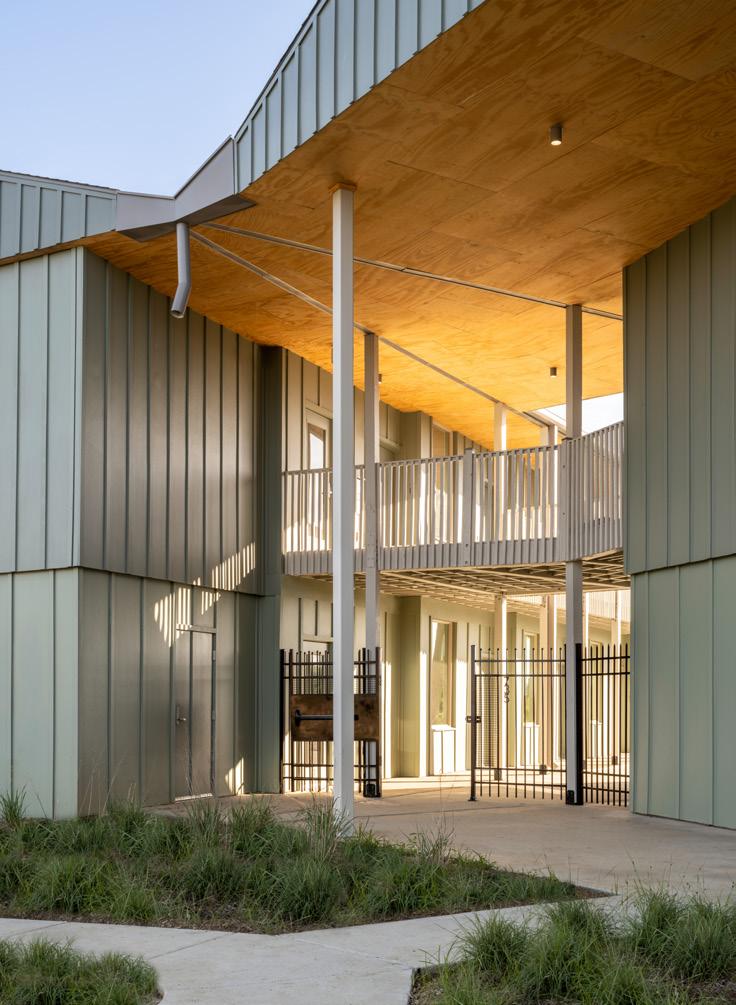
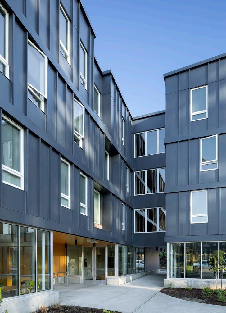
American cities continue to grow, but they’re not welcoming for everyone. Rampant gentrification and sky-high living costs are now the norm from sea to shining sea, prompting many to criticize cities as parking lots for investment monies when they should be places of cultural exchange and community. Against this backdrop, valuable projects deliver affordable housing for a variety of clients, at a variety of scales, and realized in a variety of architectural schemes. In this issue, AN visits four projects that evidence the work of architects to make housing available for everyone: Marvel is delivering 1,700 new residences in New York City’s Far Rockaway neighborhood; Waechter Architecture has created a dense and diverse development in Portland, Oregon, which frames its outdoor spaces; French 2D designed a cohousing complex in Malden, Massachusetts based on collaborative living principles; and in Morgan City, Louisiana, Rome Office just finished a 44-unit complex for seniors.


© NAHO KUBOTA JEREMY BITTERMANN
LEONID FURMANSKY
16 Feature The Architect’s Newspaper
©DAVID SUNBERG
WHAT STANDS IN THE WAY OF AFFORDABLE HOUSING?
Everybody knows that housing in New York is too expensive. Rents and sales prices have climbed far faster than wages, and the amount of housing that’s both accessible and available—to rent or buy—is small. Why that is and what to do about it, however, are more contentious questions.
When looking for forces to blame, there are a few standard culprits that come up again and again in mainstream discourse. The most common answer is zoning that restricts the amount of new housing (at any price point) that can be developed. Under the assumption that denser housing tends to be cheaper than sprawling housing and that a larger supply of housing creates more choice for New Yorkers and leads to lower prices, local zoning laws become a primary target.
When it comes to discourse around increasing the housing stock, perhaps the next most popular punching bags are labor and material costs. This argument blames the rising cost of common building materials (wood, concrete, steel, glass)—all made worse by supply chain disruption set off by the COVID-19 pandemic—and the wages and benefits demanded by building trades unions by forcing developers to set high price points for new housing. (Say what you will about material costs, but if you ever find yourself arguing that manual laborers are paid too much, think twice.)
These are the standard talking points. But there are other factors that we must consider if we want to see a real rise in affordable housing in New York.
It’s not just the price of housing, it’s the price of land. The price of housing is what we all see, but the price of land is a big part of what’s hidden behind it. A 2018 study by Barr, Smith and Kulkarni in the journal Regional Science and Urban Economics found that since 1993, Manhattan’s land values have increased at a compounding annual rate
of 15.8 percent, far faster than the rate of job or population growth. By 2014, Manhattan’s land value—separate from the value of anything on top of it—was estimated at $1.74 trillion.
Some of our existing policies, ostensibly aimed at producing affordable housing, also contribute to land cost inflation. Take 421-a, which was the law of the land in New York from 1972 to 2022 (and, many real estate professionals and some politicians hope, will return in 2024). This program offered an as-of-right tax exemption for virtually any new multifamily housing, costing the city over $22 billion in uncollected tax revenue over the course of three decades. During that time, every seller of vacant or “underbuilt” land knew that the buyer would benefit from millions of dollars in tax cuts. Sellers then priced these savings into their purchase price. The landowners pocketed the bonus; developers took on more debt; the landlords priced that debt into the rents. A program that was supposed to create mixed-income housing did so at a premium for renters, to the benefit of rentiers.
Many New Yorkers would love to see the return of Mitchell-Lama developments: Limited-equity co-ops and reduced-cost rentals that were built around the state in the middle of the 20th century for middle-income households (though over time many rentals have become available to low-income households as well). These tend to be highly coveted among New Yorkers, and those constructed under the Urban Development Corporation can also be among the most architecturally bold. But one reason why the system worked so well was that it assumed reasonably low land costs, which wouldn’t require massive long-term debt payoffs from cooperators and tenants in the form of high maintenance and rent charges. We can, should, and must create a new Mitchell-Lama program, but to do so we’re going to have to grapple with the cost of land in New York City today.
Construction in a relatively small, already built-out area also entails demolition.
Talk of “housing units” makes them seem like abstractions in a spreadsheet, when in reality they are real places, in real space, with real characteristics and affective dimensions. We need to be honest about the fact that housing must go somewhere. In the mainstream discourse discussed above, this question focuses on local opposition to relaxed zoning rules. But in a place like New York City, which is not that big considering its population, which has been subject to hundreds of years of development and redevelopment, we must also focus on the question of what we are willing to lose in order to gain more affordable housing. Yes, there are empty parcels, and some of them are owned by government agencies. The East New York Community Land Trust, for example, has been targeting a vacant lot owned by the city’s Department of Housing Preservation and Development that is currently being used as an informal police parking lot—just about the opposite of what the community needs or wants. But in a lot of places such sites are few and far between.
If we wanted to build a whole lot more affordable housing in a city as dense as New York—ideally social housing, or forms of housing like public rentals, cooperatives, and community land trusts (CLTs) that are decommodified, socially equitable, and resident controlled—some of it is going to go where something else exists. It’s important to remember that the history of urban renewal is largely a shameful one. A whole lot of our affordable housing stock was built by evicting poor people, often Black, Puerto Rican, or Chinese, without any guarantee that they would benefit from the resulting development. There are, however, some interesting counterexamples to draw from. Electchester, the electricians’ union cooperative complex in Queens, was built in 1953 on the site of a high-end golf course. Maybe the next round of urban renewal can focus on high-end blight instead of poor people’s housing. We can’t expect housing to filter and appreciate at the same time.
Much of the discourse around increasing the housing supply assumes that filtering will take place: that people will move out of their current homes and into the new ones, creating space for others to move into their old homes and creating a class-based chain of mobility that allows everyone to access slightly better housing than they were able to have before. This kind of pattern has taken place over the course of decades-long neighborhood transitions. But it was a much more common—if still not universal—phenomenon at a time when housing was expected to depreciate as it aged. Today, developers and home buyers alike assume that housing will be worth more when they sell it than when it was bought. If the price keeps rising, so does the rent. And if the rents keep rising, nobody is filtering through anything.
There’s so much more money to be made in unafforable housing
Finally, we must contend with the fact that building expensive housing is just far more profitable than building affordable housing. As long as our system depends on for-profit actors to build, own, manage, and maintain our homes, good quality affordable housing will always be out of reach. We need nonmarket actors to produce social housing, as well as more robust regulation. This means both building up the capacity of nonspeculative groups (like CLTs and mutual housing associations) to take over existing housing, but also rebuilding state capacity, finances, and political will to both intervene in the market and build social housing once again. While the federal government has historically been best poised to handle this scale of action, its political gridlock and abiding conservatism all but ensure that it will not. Local governments may seem more politically responsive to local demands, but often lack the capacity to act on this scale. State governments may be positioned to take on new social housing development, though most are timid and conservative, if not outright reactionary. Still, if we want a different outcome, we have to know what would produce it: not just a change in the rules around development, but a change in who does development, what powers they have, and what mandates they must follow.
Samuel Stein is a housing policy analyst and the author of Capital City: Gentrification and the Real Estate State
TOGETHER 17 Feature July/August 2023
An expert provides some answers for New York beyond the obvious responses.
NEW CITY
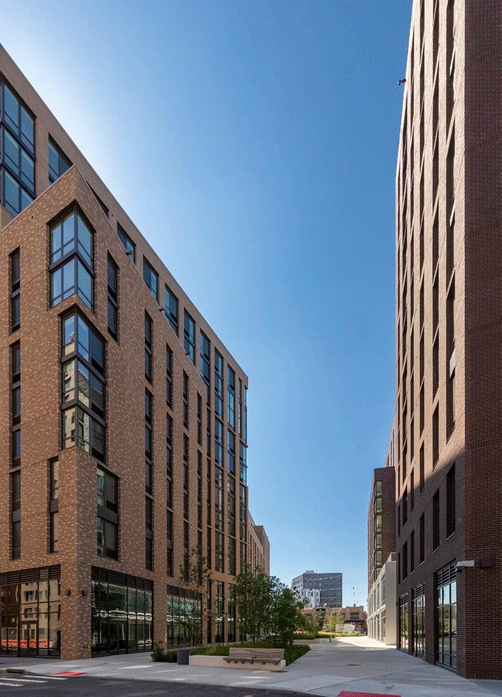
The new brick facades of Rockaway Village stand out from the mostly low-rise blocks of downtown Far Rockaway in Queens. I visited the project on a Friday afternoon earlier this year with architects from Marvel, who designed the housing complex, and leadership from the developer, Phipps Houses. Construction was still underway, but there were early signs of life toward Mott Avenue, the area’s main street, and the available buildings become more bustling each day as residents move in. We idled in the spacious lobby of Building B, where residents are greeted by a 24/7 concierge and can retrieve their mail before continuing up to an elevated outdoor terrace. The landscaping, still in its early stages, defines the perimeter and frames expansive views of the neighborhood. From here, residents continue to individual buildings, each with its own laundry room, before arriving at their front doors. Inside, the units are spacious, well-lit, and equipped with stainless steel appliances. (I eyed the dishwasher with envy.) When fully complete in 2026, the project will deliver 1,700 units across eight buildings, representing about $1 billion in investment. And if I didn’t tell you, you’d never know the complex is 100 percent affordable housing.
Rockaway Village is the largest complex realized so far by Phipps Houses, the city’s oldest and largest not-forprofit that develops, owns, and manages affordable housing for working people. Marvel had worked with Phipps before it was invited to look at this property, largely a strip mall and a surface parking lot between one end of the A train MTA subway line and a terminus of the Long Island Rail Road (LIRR). “It was a crazy site,” Guido Hartray, a founding partner at Marvel, remembered, “because it was just the hollowed-out inside of a block. But over time, [Phipps] was able to acquire more lots on the perimeter to enlarge it and provide access from the street.” In a deal with the property’s owners, retail space equal to what was there previously was incorporated into the ground floor podium, and parking is offered in one of the subterranean parking garages. A new plaza is also operated as a privately owned public space.
A single point of access is a critical part of how Phipps organizes its buildings. Each of the seven lobbies spread across Rockaway Village will be staffed at all times, each offering a place for in-person assistance. Residents then move through shared public spaces up to individual floors, which cluster eight to ten apartments together. These nested thresholds aggregate some services while dispersing others. Associate Magnus Westergren said Marvel’s goal was to minimize conflict and maximize feelings of community.
An interest in community also informs the overall massing at Rockaway Village. The street-facing facades are four stories tall along the development’s outer edges, but residential towers rise up higher toward the center of the site, topping off with two 16-story towers along its spine. (These peaks were capped so as to not interfere with the flight path of the nearby John F. Kennedy International Airport.) Individual buildings vary in height and are formed according to eight principles that vary corners, frontages, and articulations. The ideas were envisioned to operate like “a road map,” said Annya Ramírez-Jiménez, partner at Marvel. “If you have a road map, then you have something to work with.” The guidelines helped establish a set of buildings that are formally related but not too symmetrical or repetitive, “like a dinner party with friends,” Ramírez-Jiménez remarked. The buildings are built with budget in mind, but they are pleasantly blocky, each differentiated through its stepped form, staggered window alignments, and variegated brick mixes. As if another example were needed, Rockaway Village proves the point that affordable housing can—and should—be designed well.
Phipps wanted the buildings to be primarily faced in brick because the material is long-lasting and looks good. Quality is important, as the company will manage the building for its full life span. “It’s our goal to make sure that when you walk into our building, your response isn’t ‘Oh, what a nice affordable housing project,’” Matthew S. Washington, vice president and chief of staff for Phipps Houses, said. “We want people to come in and feel that this is a luxury development, like they would find in Midtown Manhattan.” The concern for this large-scale project was to avoid the look of a stereotypical public housing project: The facades are diverse, but still coherent. Twenty-seven warm-toned brick blends, ranging from light gray to almost black, span the blocks. When finished, the brickwork will complete a full tonal loop around the complex’s central street. The speed is impressive: Construction began in fall 2018, and as of this writing, it is nearly done on the project’s fourth phase, while the fifth and final phase awaits financing.
For Washington, the question was: “How do we accommodate 300 to 400 units in a meaningful way? We don’t

Marvel’s Rockaway Village proves the point that affordable housing can—and should—be well designed.
18 Feature The Architect’s Newspaper
©DAVID SUNDBERG
want to just build 50-story towers; we want to build buildings that are complementary to the neighborhood.” To accomplish this goal, Marvel’s site plan establishes six new city blocks defined by the complex’s main arterial street and two cross streets. The full ensemble fans out from the site’s tighter northern edge (LIRR-adjacent) to a wider full-block massing at its south end along Mott Avenue (A train–adjacent), a main thoroughfare for the greater Far Rockaway neighborhood. Village Lane, the internal street, ends at a pedestrian plaza and widens to meet the entrance to the subway station across the street. Rockaway Village units are available to New Yorkers who make 30 to 80 percent of the area median income. (For a family of three this year, that’s between $38,000 and almost $102,000.) Fifty percent of the units are reserved for local residents, and 15 percent are reserved for formerly unhoused households. At least 50 percent of the complex comprises two- and three-bedroom units, all of which are sized to be as large as they can be under affordable-housing regulations.
Though Phipps Houses owns and manages over 9,000 apartments in every borough except Staten Island, Rockaway Village is part of a growth spurt: Over the next decade, the not-for-profit will add over 7,000 affordable apartments to its roster. Beyond Rockaway Village, Phipps will deliver 1,200 units in East New York in a three-phase complex designed by Dattner Architects, and in The Bronx’s West Farms neighborhood, the company, also with Dattner, is doubling the capacity of Lambert Houses to 1,665 units by sequentially demolishing and reconstructing the 1970s complex and adding a 16-story tower.

At this location in Queens, Phipps’s work is funded through city construction financing and low-income housing tax credits (LIHTCs) offered through the Department of Housing and Urban Development. Washington stated that one of the major limits to the creation of affordable housing across the country is the requirement that to qualify for LIHTCs, the project must be at least 50 percent funded by private activity bonds (PABs) issued by each state. The value of these tax-exempt bonds is capped annually at a number fixed by the IRS. In 2023, the cap was $120 per capita, so for New York State—with a population of 19,677,151—the limit would be about $2.36 billion. Federal legislation is required to change this percentage, and currently a campaign is underway to reduce the figure from 50 to 25 percent as part of the Affordable Housing Credit Improvement Act of 2023, which enjoys rare bipartisan support in Congress. If passed, the reduction would ostensibly double the number of affordable units that could be created. The New York Housing Conference estimates that this could allow an additional 119,890 affordable units to be built in the state over the next decade.
Regulatory improvements enabled the creation of Rockaway Village in the first place. In 2012, Hurricane Sandy’s floodwaters swept across the low-lying Rockaway Peninsula. Far Rockaway, at the east end of the spit, is slightly elevated and therefore fared better, but residents still endured hardships. So in 2015, a campaign to redevelop the area’s downtown began, resulting in an urban renewal area that allows increased building height to encourage denser development. This rezoning to boost density made the numbers work for Phipps. In other
Facing page: View of the central street connecting the Village community
Left: Site plan of Rockaway Village

Top right: A variety of building heights adds to the character of each individual tower.
Center right: A pedestrianplaza opens onto the main neighborhood thoroughfare, Mott Avenue.
Bottom right: Elevated green spaces connect towers in a courtyard style with plenty of benches.


situations, a project of this scale might be considered a disruption, but due to the initial act of community engagement and the need for affordable housing and social services, it has been embraced.
Resilience in many forms is at stake. Though the site crests at about 25 feet above sea level, one City map suggests the northern part of the development will be within the 500-year floodplain in 2050. As sea levels rise, the area will fare better than the surrounding terrain. During Sandy, the nearby public library was a hub for disaster relief. (The 1968 structure has now been replaced by a new facility designed by Snøhetta which doubles the size of the original; like Rockaway Village, it broke ground in 2018, but it is not yet open to the public.) The project adds density in an area that can believably support it for decades to come, even as sea level rise stands to reshape New York’s shorelines.
Another form of resilience arrives in the form of housing security. With a low, fixed cost for rent, it becomes possible to create generational wealth for residents. In time, the complex will be home to thousands of people who have affordable apartments and a supportive place to live. “Rockaway Village is actually a village,” Stacey Berry, a vice president and asset manager with Phipps, said during our tour. Though it’s still a work in progress, its promise is easy to see. JM
©DAVID SUNDBERG
©DAVID SUNDBERG
©DAVID SUNDBERG
19 Feature July/August 2023
COURTESY MARVEL
COURTYARD COMMUNITY
Although the 224-unit, five-building Rockwood Village affordable housing in suburban Gresham, Oregon (about 10 miles outside of Portland), is Waechter Architecture’s largest project in the firm’s 15-year history, the design arguably succeeds by making the buildings a backdrop.

Completed in 2020, the $85.5 million Rockwood Village was designed to be family- and pedestrian-friendly, forming the perimeter of a 7.4-acre site that includes the new Neighbors Park at its center. “It’s awe-inspiring,” said Dena Compton, one of Rockwood’s first residents, who had previously been homeless and now occupies a brownstone-like ground floor apartment with her son. “There’s dozens of children out here playing every single day, and there’s a strong sense of community. When I was sick for a few days and not coming outside, my neighbor knocked on my door to make sure I was okay. That doesn’t happen everywhere.”
A familial atmosphere was indeed evident on my recent summer afternoon visit. A family was picnicking in the shade of tall Douglas fir trees at Neighbors Park, and in the adjacent single-story community center, older children were putting puzzles together in the common room. Its glass garage door opens to the plaza outside, where younger children occupied a landscaped play area designed by Portland landscape architecture firm PLACE. Around the corner, in the community garden near the development’s north entrance, flowers bloomed and greens were waiting to be harvested, as part of a partnership with Mudbone Grown, a local Black-owned, community-based farming enterprise.
Previously the site belonged to a charter middle school. When it halved its footprint and moved to one side, Rockwood Village moved in, promising to offer both high-density housing and open space. A majority of the apartments are three- and four-bedroom—often the most in-demand—and automobile parking is pushed to the perimeter of the property, away from the central park and plaza. “The identity is heavily rooted in the park at its center,” Waechter Architecture founder Ben Waechter said. “And all these windows on the park makes it a really a safe place for kids.”
A 2022 AIA Oregon Architecture Awards winner, the project is located in one of several mass transit–connected enclaves across the Portland metropolitan area. These areas have been zoned for higher density development (up to 40 multifamily housing units per acre). But because of the site’s size and history, and a relative lack of nearby green space, it was also zoned with an open-space overlay, even though there had never been public access there. Instead of lobbying for the overlay’s removal, owner Community Development Partners (CDP) negotiated to have it reduced to 2 acres.
“Instead of having 8 acres that weren’t accessible to the public, you have a 2-acre park that was privately funded, constructed, and maintained, but fully open to the public,” explains CDP founder Eric Paine. Neighbors Park now forms a kind of green space necklace with Vance Park to the south and the Downtown Rockwood plaza to the north. The overlay insulated the developers from eliminating public space, he added. “You would normally use that space for additional rentable square footage.”
Furthermore, the state-subsidized workforce housing project was originally intended only for those making 60 to 70 percent of the area median income (AMI), but as its construction neared completion, Rockwood Village received a $5 million grant from Portland’s regional government, which allowed the project to bring down income eligibility to 30 percent AMI, dramatically increasing accessibility as well as inclusivity.
The Rockwood neighborhood is Oregon’s most diverse, with over 60 languages spoken. To make sure the project met the community’s needs, CDP brought in a local housing nonprofit, Hacienda CDC, as a development partner and engaged the Portland State University School of Architecture’s Center for Public Interest Design to conduct community outreach as part of a master of architecture studio. In a public charrette, participants helped decide how to arrange the open space and emphasized the importance of preserving the tall firs, even if it meant reconfiguring the project’s entrance.
Both Hacienda and the majority of locals favored a courtyard-style configuration of buildings and open space. “When you have buildings around a central space, you can keep an eye on what’s going on there,” said Ernesto Fonseca, Hacienda CDC’s chief executive officer. “It creates that sense of being continuously and consistently invited to come and meet. You are naturally driven by design into the central plaza, and that concept is not something we had to research. It’s been working for thousands of years, from the Romans, the Mesopotamians, and the Persians, all the way to present day places like Mexico, where I’m from. We were very intentional about that.”
Waechter Architecture’s Rockwood Village makes open space its main attraction.
20 Feature The Architect’s Newspaper
JEREMY BITTERMANN
The focus on pedestrian-oriented open space notwithstanding, the site plan also bisects the property down the middle, from north to south, with a reintroduced segment of 185th Avenue. This “slow street” demands reduced speed limits. It forms the eastern edge of Neighbors Park, making Rockwood Village an attractive pedestrian route and adding to its vibrance.

To avoid any sense of monolithic buildings (especially given the negative connotation of midcentury “towers in the park,” like Pruitt-Igoe), Waechter divided the 224 units into a quintet of four-story structures, which also enabled affordable stick-framed wood construction. With a modest per-squarefoot budget, the design took advantage of HardiePanel vertical siding, while “trying to elevate it aesthetically by doing something special at the edges,” Waechter explained. To create more shadow relief and recall traditional board-and-batten siding (and to disguise ventilation ports), 4-inch metal bands demarcate each floor on the facade, while battens separate the panels vertically. Windows have identical heights but vary in width and placement, giving the facade a kinetic balance.
“One thing specifically about affordable housing that really gets us excited as architects is this idea that good design doesn’t have to be expensive design,” Waechter added. “Through various means on Rockwood, I feel it’s proven true.”

Brian Libby is a Portland-based freelance journalist who has contributed to The New York Times, Metropolis, and Dwell.
Facing page: The central park is the heart of the housing project, with buildings forming a protective perimeter.
Left: Old growth trees were preserved on-site.
Below, clockwise from top: The profile of each building gently slopes to add dynamism to the facades; courtyard buildings offer additional program spaces; interiors open directly onto the park and are finished with colorful furnishings.

 JEREMY BITTERMANN
JEREMY
JEREMY
21 Feature July/August 2023
JEREMY BITTERMANN
BITTERMANN
BITTERMANN
TIGER ISLAND RESPITE
Morgan City, a town of 11,000 residents in southern Louisiana, doesn’t fade into exurban sprawl like most cities in the Sun Belt. Surrounded on all sides by lakes, rivers, and bayous, Morgan City has a tight footprint and ends abruptly at the water’s edge.
On the eastern end of downtown, Tiger Island Senior Apartments, a new below-market-rate housing complex, opened in December. The development is configured in an unconventional sawtooth layout that creates a courtyard of native grasses and trees, all overlooking a deep green marshland that terminates at a levee on Lake Palourde. The project is unusually ambitious by any standard: for Morgan City, for 55-plus low-income housing, and for its developer, Renaissance Property Group. In earlier efforts, Renaissance, which specializes in affordable housing, opted
for an off-the-shelf mix of gables, shutters, and porches, attempting to dress multifamily residences in the clothes of a single-family home. By contrast, Tiger Island Senior Apartments, with their contemporary geometric architecture and focus on shared communal space, offer a different, more progressive vision for affordable senior housing. The design is the work of Rome Office, a New Orleans–based firm founded by two alums of the Bjarke Ingels Group’s New York studio. The young firm was started in 2016 when founders Brian Rousseau Rome and Melissa Bauld Rome married and returned to the South to be closer to family. When I visited the principals at their open-plan studio in New Orleans’s French Quarter, I met a duo who finished each other’s sentences and wore black despite the triple-digit heat index.
When I noted Bjarke Ingels’s tagline, “Yes Is More,” both broke out into knowing chuckles tinged with irony. Designing Tiger Island entailed hearing a lot more nos than yeses. A poor town in a poor state, Morgan City’s per capita annual income is less than $25,000; its modest economy is centered on fish and fossil fuels. (It hosts an annual Shrimp and Petroleum Festival to crown a Miss Shrimp and Petroleum beauty queen.) Constructing a below-market-rate development with low-income housing tax credits (LIHTCs) in this context meant sticking to a bare-bones budget of just $156 per square foot—less than $150,000 per unit. Time and again, the Romes had to make hard decisions about what to prioritize as they bounced up against “value engineering,” a bloodless term for nickel-and-diming.
Initially, the firm presented multiple schemes to Renaissance with the overarching goal, as Melissa Rome put it, of “avoiding [the] motel typology” endemic to lowcost schemes: two slabs set at right angles framing a parking lot. The layout the architects most hoped to construct was a finite loop—a circle with a gap at one end—that would form a round courtyard opening onto the green bayou vista. Their backup plan—the one that got built— had two wings laid out in sawtooth formation to frame a

Rome Office completes breezy, affordable apartments for seniors in Morgan City, Louisiana.
22 Feature The Architect’s Newspaper
LEONID FURMANSKY
triangular courtyard. In both designs, every unit extended clean through the entire slab for cross-ventilation, and every front door opened onto the interior courtyard. In the Romes’ ideal circular structure, the units had to be trapezoidal and were, therefore, more expensive to construct; the saw-tooth layout won out since it allowed most units to be perfect, standard rectangles.
To foster community, the architects prioritized common spaces, where neighbors could get to know one another. Circulation occurs on outdoor walkways rather than in interior hallways, taking advantage of the winterless local climate and avoiding the corridors that the designers see as social life killers. A balance of independence and interdependence was also a goal, so the design engineered opportunities for expressions of individuality as well. As a counterpoint to the uniformity of the long, two-story wings, each unit is stepped back, making each doorway legible as its own home.
Visiting upon completion, I saw homes that offer beauty on a budget. Looking down the breezeway, one can see that the geometry of the building—the row of stepped-back units lined up like a well-rehearsed chorus line—contrasts nicely with the wildness of the natural wetland beyond. On the second story, a near-constant breeze made it even more pleasant. Still, in such a setting, it was hard not to ponder why projects built for the poorest people in the poorest places are invariably saddled with the most meager budgets. As social critic Jonathan Kozol observed over three decades ago in Savage Inequalities, “In an ethical society, where money was apportioned in accord with need, these scalings would run almost in precise reverse.”

As I interviewed Tiger Island residents, I found the newcomers making themselves at home in the 40,000-square-foot development. Thirty of the 44 units are already occupied, marked by doormats, wreaths, and patio furniture to personalize them. The effect is homey, not institutional, and it helps residents (some of whom struggle with deteriorating memories) identify home and personal spaces in a facility whose symmetry means most units are identical by design.

In a nation of increasing segregation by race and class, and in a state where many senior residents grew up in a pre–civil rights movement world, progressive goals for diversity and inclusion have been achieved at Tiger Island. About half the residents are white—an anomaly in the context of contemporary social housing in the U.S. today. Education levels range from high school diplomas to medical school graduates. Most units are one-bedrooms, but there are also a smattering of efficiencies and two-bedrooms in the mix, allowing for a range of price points. No units rent for more than $1,000 a month.
Every morning, a group of three women—one white, one Black, and one Latina—convene for coffee in front of their ground floor units. The vertical wooden beams extending down from the roof approximate a Southern front porch. As resident Glinda Jennings explained while playing with her toddler granddaughter, “We clown. We joke. We drink our coffee together every day.”
Often the coffee conversation turns to the complex’s growing pains. The locks on the doors are wonky and sometimes residents can’t get into their units. The buildings opened before sweeps could be installed on the doors, which has allowed bugs inside. (Unfortunately, the operable windows the architects wanted for cross-ventilation got nixed for budgetary reasons, and no screen doors were added.)
In any architect’s project, the ultimate users have minds of their own. At Tiger Island, the native grassland courtyard is not universally loved. One resident, hustling off to a night shift at the local Domino’s outlet, rendered her verdict: “It’s ugly as sin. [The switchgrass] looks like weeds [and the raised beds] look like horse troughs.” One resident, unfamiliar with switchgrass, even took landscaping into her own hands. “The weeds were this high,” Mary Martinez told me, motioning to her shoulders. “I went out there with a butcher knife and I did it really neat.”
When I relayed the story to the Romes, they took it in stride: “Some architects don’t want to hear that because it dings their pride,” Brian told me. “I hope they make the space their own,” Melissa continued. “That’s what it’s meant to be.”
Daniel Brook is the author of several books, including A History of Future Cities. His writing on architecture and urbanism has appeared in publications including Harper’s, The New York Times Magazine, The Nation, and Architectural Record
Facing page: The profile of Tiger Island Senior Apartments is angular and dynamic.

Below: The site plan stages two rows of apartments around a V-shaped courtyard.

Right, from top: The meeting point between the two buildings approximates a front porch; open-air corridors allow for outdoor circulation and socializing; two female residents in their personalized living room spaces on the ground floor.
 LEONID FURMANSKY
LEONID FURMANSKY
LEONID FURMANSKY
LEONID FURMANSKY COURTESY ROME OFFICE 23 Feature July/August 2023
LEONID FURMANSKY
SHARED SPACES
French 2D designs a colorful complex for a cohousing community in Massachusetts.


© NAHO KUBOTA © NAHO KUBOTA 24 Feature The Architect’s Newspaper
When a group called Bay State Cohousing was looking for a venue for its new cohousing development, the modest Boston suburb of Malden met its criteria: a richly varied ethnic population, support for progressive causes, convenient to bus and rail transit, and a surrounding community that likes the idea of cohousing in its midst.
“We met with people in the neighborhood, and it just felt right,” said Lorraine Fryer, an early member of the group. Bay State Cohousing then tapped sister design duo, Jenny and Anda French of French 2D, to collaborate on a design prioritizing the group’s values: The 30-unit, 45,000-square-foot complex looks like a cross between an upscale Caribbean motel and something in New Orleans's French Quarter. The color palette is lively: pastel greens and pinks and dashes of primary color here and there. The New Orleans–style central courtyard is an intentional gesture by the architects to give the building a sense of camaraderie and shared ownership.
A classmate of Fryer’s at Brown University first formed the group, of which Fryer was an early member. Others joined serendipitously—by word of mouth and in response to an informational website.
Oddly enough, the French sisters credit a shared hereditary eye condition for their ability to design the quirky floorplans the residents called for. “My sister and I share a condition called small angle esotropia, and it affects depth perception,” Jenny French said. “We think it gives us a greater appreciation of the importance of designing in plan, elevation, and section.”
Indeed, the building’s unusual massing and odd angles can be disorienting at first. The main facade has an asymmetrical profile punctuated by colorful window jambs and sills; you enter this main portal and are presented with a bright green main stairway designed to promote chatting and interaction. Exterior walkways seamlessly intertwine with interior corridors and embedded common spaces. Breaks and asymmetries in plan create reciprocal connection, seen in a pair of decks at the second levels that exchange views across an open corner of the courtyard. Call it what you will—courtyard, agora, center plaza—it is the heart and soul of Bay State Cohousing.
The cohousing phenomenon began in Denmark in the late 1960s and early 1970s, but only now has a following emerged in the United States. Although loosely defined as an intentional community of private homes clustered around shared space, cohousing designs and layouts vary widely. But all share an interest in breaking down accepted norms of living that prioritize single-family assumptions and individual isolation. According to the Cohousing Association of America (CAA), there are about 170 such communities nationally, and they are set up such that those interested in joining are vetted based on their commitment to cohousing ideals, namely camaraderie, environmental responsibility, and diversity and social equity, to name some common themes.
“The building had to accommodate a wide range of personalities and degrees of personal engagement,” said Anda. To meet these needs, Bay State Cohousing boasts 5,000 square feet of common area, including a central kitchen and dining area for frequent shared meals, along with a children’s playroom, music room, art studio, meditation space, and a shared lounge that has garnered the name “the bar.”


Like most cohousing projects, ownership structures are nontraditional. Bay State Cohousing is set up as a condominium, but began as an LLC in order to manage risks in the development phase. The LLC obtained a construction loan, and the remainder of the funds to develop and build were provided by the members as advance payment on their eventual unit purchases. Thus, each unit is privately owned, but the common space is owned by the group. There is a single HVAC system, with each household paying a portion of the bill for its use and upkeep.
So, how does one join a community like Bay State? “You become a social member first,” Jenny explained. “You come to meetings, you share a meal. It’s a self-selection process.”
While one of the tenets of Bay State Cohousing is access to public transportation, the development fell under Malden’s rule of one parking space for each bedroom in the building. Ironically, a group of progressive residents fell victim to a civic bureaucracy somewhat at odds with their founding principles. But the architects put their own spin on the required parking garage, specifying a green roof surrounded by common gardens that the residents care for. While the project doesn’t have a LEED certification per se, Jenny French said the project is designed to meet LEED Silver requirements. She added that building codes in greater Boston now virtually assure a minimum LEED Silver status.
The region has several cohousing developments, mostly in liberal communities like adjacent Cambridge and Boston's Jamaica Plain neighborhood. The late
guru behind Bay State Cohousing and numerous similar developments was Chris ScottHanson, coauthor of The Cohousing Handbook: Building a Place for Community. He served as a consultant for both Bay State and Jamaica Plain Cohousing before his death in 2022.
The French sisters note the rich architectural history of the surrounding neighborhood, like the library designed by H. H. Richardson located just blocks away from Bay State Cohousing. An red-brick office building adjacent to the development is also in the Richardsonian Romanesque style.
“We found a curious sympathy with the character and details of the Richardsonian Romanesque office building,” Anda said. “We were also inspired by the unapologetic use of color in nearby Victorian ‘Painted Ladies.’ We were working with a unique set of geometries in the design of the interior and exterior arrangements, but we were conscious of speaking to the playfulness and nuance of the local context.”

According to the CAA, there are 25 cohousing developments in Massachusetts, with more planned, giving the commonwealth one of the largest per-capita concentrations of cohousing in the nation. But it’s more than the state’s progressive politics at work: cohousing serves to counter high costs of housing by providing an affordable alternative to the traditional single-family home or “luxury” condominium in a state with some of the most expensive residential real estate anywhere.
Bay State Cohousing’s opening in January 2023 meant that most of the construction occurred during the COVID19 pandemic. Jenny French concludes: “Getting a progressive architecture project built in the middle of a global pandemic and amid mortgage rate increases was something of a miracle.”
Facing
 James McCown is a Boston-based architectural journalist and author of the forthcoming Home Office Space: Pavilions, Shacks, and Extensions for Optimum Inspiration and Productivity, published by Rizzoli.
Facing page, top: View of Bay State Cohousing from the shared interior courtyard.
page, left: The white, pitched-roof facade blends in with the neighborhood.
Above, top left: Pastels add pops of color throughout the complex.
Above, top right: Built-in benches and seating provide respite and unexpected sociability.
Above, left: Informal common areas are available for group activities and meetings.
Above, right: Views from individual apartments all overlook the generous courtyard space.
© NAHO KUBOTA
© NAHO KUBOTA
James McCown is a Boston-based architectural journalist and author of the forthcoming Home Office Space: Pavilions, Shacks, and Extensions for Optimum Inspiration and Productivity, published by Rizzoli.
Facing page, top: View of Bay State Cohousing from the shared interior courtyard.
page, left: The white, pitched-roof facade blends in with the neighborhood.
Above, top left: Pastels add pops of color throughout the complex.
Above, top right: Built-in benches and seating provide respite and unexpected sociability.
Above, left: Informal common areas are available for group activities and meetings.
Above, right: Views from individual apartments all overlook the generous courtyard space.
© NAHO KUBOTA
© NAHO KUBOTA
25 Feature July/August 2023
© NAHO KUBOTA RABER UMPHENOUR
INTRODUCING THE VIRACON IDENTIFICATION NUMBER (VIN):
THE DIFFERENCE BETWEEN “THAT LOOKS LIKE” AND “THAT IS”.
A New Asset Management Tool for Your Glass. At Viracon, we never stop improving our glass or the customer experience. The Viracon Identification Number (VIN) is further proof of this commitment. Discreetly printed on the thermal spacer, the VIN is a unique number that contains all the information you need about an insulating unit installed on a building, including glass type, composition, and finished size. With the Viracon Identification Number, the number of reasons to choose Viracon keeps growing. Learn more at Viracon.com/VIN.

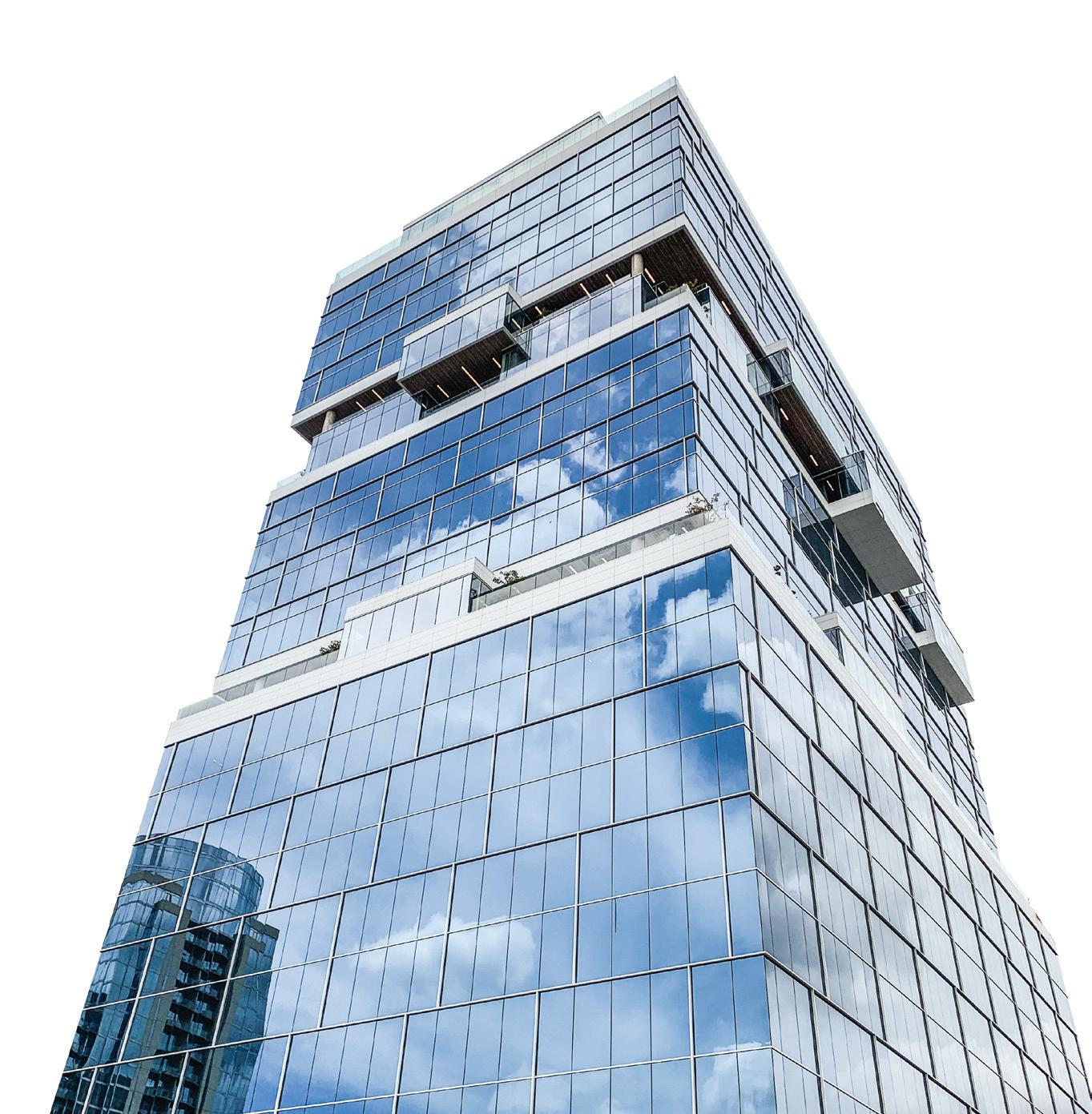

28 Crit: OMA’s Buffalo AKG Art Museum 34 Comment: Clarity Revisited 38 Decorative Glass 40 Structural Glass 42 Case Study: Kuehn-Malvezzi’s Insectarium 44 Speciality Glass 46 High Performance Glass 48 Case Study: Weiss/Manfredi’s MIT Site 5 50 Case Study: OLI’s Ascentage Pharmaceutical Headquarters 52 Case Study: OMA’s Tiffany & Co. flagship 54 Coatings, Films and Spacers 55 Resources MARCO CAPPELLETTI Glass July/August 2023
28 Crit
July/August 2023
Introducing the Buffalo AKG Art Museum

OMA and Cooper Robertson update and expand a historic institution.
Design architect: OMA/Shohei Shigematsu
Architect of record: Cooper Robertson
Landscape architect: Michael Van Valkenburgh Associates
Structural engineering: Arup
Electrical engineering/MEPFP/
Telecommunications: Buro Happold
Civil engineering: Wendel
Lighting design: Arup
Gallery lighting: Litelab
AV/Acoustics: Jaffe Holden
Graphic Design (Signage/wayfinding): Wkshps with Once-Future Office
Facade consultant: Thornton Tomasetti
General contractor: Gilbane
Geotech: McMahon & Mann Consulting
Engineers
Historic Preservation: Preservation Studios
Vertical transportation: VDA Elevator & Escalator
Consulting Town Square Roof, Common Sky: Studio
Other Spaces - Olafur Eliasson and Sebastian
Behmann
Metal/glass curtain wall: The Roschmann Group
Moisture barrier: Grace
Exterior marble: Vermont Quarries
Glass: Glasbel
Entrances: Blasi, Schuco
Metal doors: Steelcraft
Roofing: SBS, Soprema
Waterproofing: Grace, Suprema
Insulation: Rockwool
Acoustical ceilings: Armstrong
Paints and stains: Sherwin Williams
Plastic laminate: Formica
Solid surfacing: Corian
Special surfacing: 3 Form
Floor and wall tile: Daltile, Porcelanosa
GFRG: Formglas
Metal ceiling: Lindner
Furniture: Hay
Upholstery: Kvadrat
Lighting controls: Lutron
Water closets: Duravit
Urinals: Toto
Lavatories and faucets: Lacava
Buffalo, New York, is at last experiencing some happier days. The city has done a decent job of preserving its historical building stock—with works by Louis Sullivan, Daniel Burnham, Eliel and Eero Saarinen, and Frank Lloyd Wright still intact—but the renovation and revitalization of a myriad of other urban sites has picked up as well. From Silo City’s grain elevators to the Trico facilities, which once produced windshield wipers, Buffalo’s industrial relics are transforming into new centers of art and culture. The city is growing, again: It experienced population gain, as registered in the 2020 census, for the first time in 70 years, while adding some 10,000 new apartments in the last decade.
The most recent manifestation of this trend can be found in the cultural anchor of the Albright-Knox Gallery, rechristened as the Buffalo AKG Art Museum with the addition of the new Jeffrey E. Gundlach Building by OMA New York in collaboration with Cooper Robertson. For decades, AKG was composed
of two iconic pieces. The original Neoclassical 1905 Robert and Elisabeth Wilmers Building, designed by Edward B. Green, is based on the Erechtheion in Athens. There are a total of 102 Ionic columns, a grand central portico, and side porches supported by caryatids. The second piece, by contrast, is the 1962 Seymour H. Knox Building by Buffalo native and SOM archduke Gordon Bunshaft, a man with some ideas about how to exhibit Giacometti and Léger, given that he had them in his house. This first addition used the same Vermont Danby marble as its 1905 counterpart but updated the museum’s programming with an open air courtyard and a crowning gray smoked glass auditorium.
The Albright-Knox was well-loved, though the Bunshaft addition suffered from the common high-modernist paradox of providing excellent views of nature while literally obstructing access to it: The courtyard was built astride a former Frederick Law Olmsted–designed path into the adjacent Delaware
MARCO CAPPELLETTI
Facing page: Facade of the new Jeffrey E. Gundlach Building and its uniquely contradictory gently sloping form made from angled glass.


29
Above: The Gundlach Building contrasts with its 1905 and 1962 counterparts on the AKG campus.
CAPPELLETTI MARCO CAPPELLETTI July/August 2023
Left: Lit up at night, the galleries of the new Gundlach Building glow within the faceted envelope.
MARCO
Left: A sculptural stair is visible, from outside the Gundlach Building, traversing all gallery levels and becoming an art object itself.
Above: Playful glass installation techniques create a funhouse viewing effect when looking at other buildings on the campus.
July/August 2023
Park, with an entrance on one side but a blank wall on the other. The museum’s tarring over the front lawn for a parking lot and removal of the original grand stairs was no help. Still, both buildings have aged well and were accepted as cultural institution canon, even if neither was quite willing to extend you a handshake.
After being selected from a shortlist of five firms, narrowed down from 50, OMA New York’s initial plan for the museum’s expansion didn’t land well: Its proposal literally sat atop the Bunschaft-era courtyard. But preservationist outcry thankfully prompted a change of course. The next challenge for OMA, then, was determining just where to place the expansion instead: To the north of the museum there are highway ramps; to the east is the sacrosanct Olmsted parkland; and to the west there is a high probability of disturbing an archaeological site with Indigenous artifacts. Eventually, a portion of the parking lot to the southwest emerged as the winning spot, although the logistical challenge here was how to connect it
to the Wilmers Building at a diagonal. This was solved by the expediency of a Niemeyer-like winding bridge on pilotis, designed to slope at an ADA- and art handler–suitable angle that winds around existing oaks on the site.
One substantial benefit of this location is the creation of a semibounded grand lawn on the space that was once a parking lot. (Cars are now entombed in a garage beneath the grass.) The Gundlach Building now animates a new east-west axis for museum circulation as well, both inside and out. The expansion provides a loading dock, a utility that even the wisest minds of 1905 and 1962 didn’t anticipate. AKG Director Dr. Janne Sirén quipped, “Craning Picassos and Pollocks through snowstorms is not something we really want to be doing.”
OMA’s taste for eccentric geometries and glass shrouds is well-established, and it’s up to more of the same here. Principal Shohei Shigematsu explained in conversation that the firm initially devised a simpler geometric

slant of glass for the structure but eventually veered in a stranger direction to avoid anything resembling the curtain wall of an office building. The resulting Gundlach Building, made possible by billionaire Buffalo native Jeffrey Gundlach’s donation of $65 million, is now sheathed in angled glass. Overall, the capital campaign raised $230 million for the campus’s revision and expansion.
The addition is fronted by a large, two-story marble entrance portal rising from a plinth, both designed to echo canonical elements on the two existing buildings. It’s a formalist gesture that sits a little oddly with the remainder of the facade, characterized by its sinuous, triangulated glass: a waistcoat on a futurist. There’s something remaining of OMA’s torpedoed Chicago Lucas Cultural Arts Museum proposal here, if brought somewhat into line with local probity.

The glass is entirely a good idea. It's basically a cloak not of invisibility but of visibility draped around a central rectilinear
Facing page, top left: Interior views of the stair on the second level, where the design becomes more of a "void" in the space.
Facing page, top right: Circulation wraps visitors around the periphery of the museum, where generous glazing allows for views across the campus and lets in natural light.
Facing page, right: Third-floor gallery works by Tiffany Chung, Martha Jungwirth, Simone Leigh, and Matt Connors.
Facing page, far right: View of the Sculpture Terrace with Ursula von Rydingsvard’s Blackened Word, 2008.
gallery volume inside. You can see all sorts of things from the exterior, a lively contrast to the remainder of the campus. Shigematsu explained his effort to balance the “introversion” of the broader campus and larger spirit of “closed and calm and pristine and authoritarian museums.” The addition also has a contextual inspiration, he noted, in the Crystal Palace and the architecture of botanical gardens.
The glass veil is interesting in itself. A “softness” was the aim, and it was achieved thanks to a complicated structural arrangement, which suggests curves despite largely being composed of triangular panes. Shigematsu wanted “torsion,” and he achieved it.
The Gundlach’s interiors are well-thoughtout and originate from a set of cruciform galleries at the center of the first floor and exhibition spaces. Shigematsu observed that “often a contemporary gallery becomes the victim of all of the infrastructure and all of the operational needs. I thought that art should
30 Crit
MARCO CAPPELLETTI
MARCO CAPPELLETTI
always be at the core—like a building core, like an elevator core.” Where to put the core functions then? Well, at the corners: The elevator, offices, a black box theater, and loading dock are all peripherally located, leaving the galleries as the heart of the museum. Shigematsu expressed frustration over the typical dynamic of gallery walls being exterior walls, almost entirely entailing that they will be blank. This is emblematic of the age-old battle between art and the destructive effects of natural light. These center galleries set up the use of additional galleries along the glassy perimeter, so the second-floor promenade is suited to the display of art objects less sensitive to light than paintings.
A winding central staircase unifies these two conditions. Shigematsu expressed a certain tedium with “the sculptural stair becoming one of the moves that every architect does in every museum.” His aim? “To make it a little less obvious.” The stair spirals on its own to the first level, then connects to the
floor slab on the second floor and spirals on its own again on the third. “The stair is not a freestanding solid stair on the second level.” Shigematsu noted. “It looks like a void instead of a stair, so it has an ambiguity of an object versus a nonobject.” OMA’s was also an effort to unite means of ascent. The elevator lobby is right next to the stair, not down a hallway to the left, as is often the case. Both are deliberately part of the same spatial experience, not a principal tier for the young and mobile in one place and a back up for everyone else, somewhere else. Notably, the elevator shaft is also envisioned as a display for art.
The galleries that constitute the center of the building are spacious and technically sophisticated. Partition walls don’t quite touch the floor; instead, they hover ever so slightly. There’s a double-height space on the ground floor, an easy access to the promenade on the second, and an unobstructed view to the city’s downtown on the third. Red-oak flooring patterns are variable and patterned in concentric


circles on the lower floors; the boards gradually widen as you ascend, and large single planks mark each doorway. Flooring treatment also extends beyond just the new galleries: Cracked marble flooring in much of the Wilmers Building was also replaced with red oak to provide a seamless experience.
In addition to introducing new, world-class design to the Buffalo institution, a major goal of OMA’s expansion was to revamp the AKG’s programming, both physically within the museum spaces and metaphorically in terms of the institution’s relationship with the community. These goals were addressed most directly in the reimagination of the Knox Building’s courtyard and auditorium, as well as the education spaces. The courtyard was formerly surrounded by administrative and donor spaces; now, the perimeter spaces have shifted to public use with these areas turned into a cafe, gift shop, and Creative Commons.
The last of these is sponsored by Lego in its first collaboration with a museum, one of a
range of Scandinavian elements that Sirén, a Helsinki native, has brought along.
The second-floor Bunshaft auditorium was refurbished along precisely Bunshaftian lines and looks excellent. OMA chose to convert its lower floor into an education and community wing, with movable partitions respecting the Bunshaft original. This represents a real improvement on prior educational facilities. Sirén explained, “We had two classrooms that looked like a dungeon. In Finland, we would not put anyone in such a classroom.”
Sirén also spoke of a desire to engage more closely with the community. “We built two things at the same time: One of them is a physical building and the other is our house of ideas. Our idea was a museum that was open for everyone and not just a small number of privileged individuals.” His desire was to create “a welcoming place” that is more easily accessible. (To that end, the Knox Building will not charge an admission fee.) The museum also sought to improve links with the city by
31
MARCO CAPPELLETTI
MARCO CAPPELLETTI
MARCO CAPPELLETTI
July/August 2023
MARCO CAPPELLETTI
32 Crit
creating a leadership-level director of community engagement position. To provide art for those who might not be inclined to visit, an “art truck” has been commissioned, transporting art beyond the gallery walls to support the museum’s Public Art Initiative.
The abiding problem with the Bunshaft courtyard was simply being located in one of the snowiest cities in the United States. It was splendid in theory—and in the summer months—but given the museum’s decades of difficulty in actually using it as a space for hanging art and gathering, OMA’s solution to cap it is pragmatic and agreeable. The peristyle courtyard has a new ceiling that’s decidedly non-Bunshaftian in fashion, but results in an intriguing dialogue. Previously, the courtyard had a single tree, another trapping of a modernist repurposing of nature as sculpture at its essence. Now, it has been replaced by Common Sky , an arboreal installation by Olafur Eliasson and Sebastian Behmann of Studio Other Spaces, which features a
far-from-natural but very fun canopy of acoustic panels covered in reflective skin extending over the space beneath an undulating dome. They also added a second entrance facing Delaware Park, restoring the original Olmsted link between museum and park.


Sirén spoke of a prime interest in restoring this connection: “How do you take down barriers from entering a museum? First of all you make it so easy to come in that it’s almost like you are slipping in; you don't even notice that you’ve entered. It’s free, there’s no one at a desk. If you want to just take a shortcut from east to west, you can do that.”
Let’s not forget the art. The AKG’s collection is strong in many regards, but particularly in abstract expressionism. Ellsworth Kelly, Gene Davis, Richard Hunt, and Tony Ausler have come out of the vaults, and 33 Clyfford Still pieces are on display in the inaugural exhibition, Clyfford Still: A Legacy for Buffalo.
An exhibition of recent acquisitions also showcases pieces by Nick Cave, Ragna Bley,

Tiffany Chung, and more. One Gundlach gallery is named after Marisol, the Venezuelan American Pop art polymath. The AKG was the first museum to acquire her work, and she repaid this favor by donating her estate to the museum; an exhibition is coming next year. Other new notables include installation pieces that activate new and unexpected display spaces, like Cornelia Firelei Báez’s Chorus of the Deep : The aqueous glass tile mosaic in the new courtyard literally shines. And a Miriam Bäckström tapestry is even being installed at the museum’s garage entrance, an admirable use of a space most would ignore.
Museum expansions are intrinsically tricky. The job is always to respect your elders without parroting, and plenty of expansions fail on one or both counts. OMA’s work is ultra-2023 in character, and yet the project does reflect a nuanced attention to what was there and what wasn’t. “I think that modernism was all about flexibility” Shigematsu
ed, “but the 1905 building is all about spatial
character. Both are important, and we need to embrace both. We’re not into compromising flexibility, but we don’t want to make a gallery that’s the same everywhere either. In a subtle way we’re trying to inject a spatial specificity to the place.” By this count, OMA’s new Buffalo AKG genuinely succeeds.
stat-
Anthony Paletta is a writer living in Brooklyn.
Left, top: The newly reimagined covered courtyard entrance.
Left, above: The Ralph Wilson Town Square and Common Sky, 2022, by Olafur Eliasson and Sebastian Behmann of Studio Other Spaces.
Left: Detail of Common Sky.
Above: Common Sky from within the courtyard, beneath the "canopy" protecting the space from the elements.
MARCO CAPPELLETTI
MARCO CAPPELLETTI
MARCO CAPPELLETTI
2023
MARCO CAPPELLETTI
July/August
Time to Update your Door Specifications.
Explore our new 25T/35T/50T thermally broken entrance systems.
Twenty-six states have already adopted ASHRAE 90.1-2019 or the IECC 2021. Both require a 0.63 u-value or lower in climate zones 4-8, with more states forecasted to adopt the codes in the future.
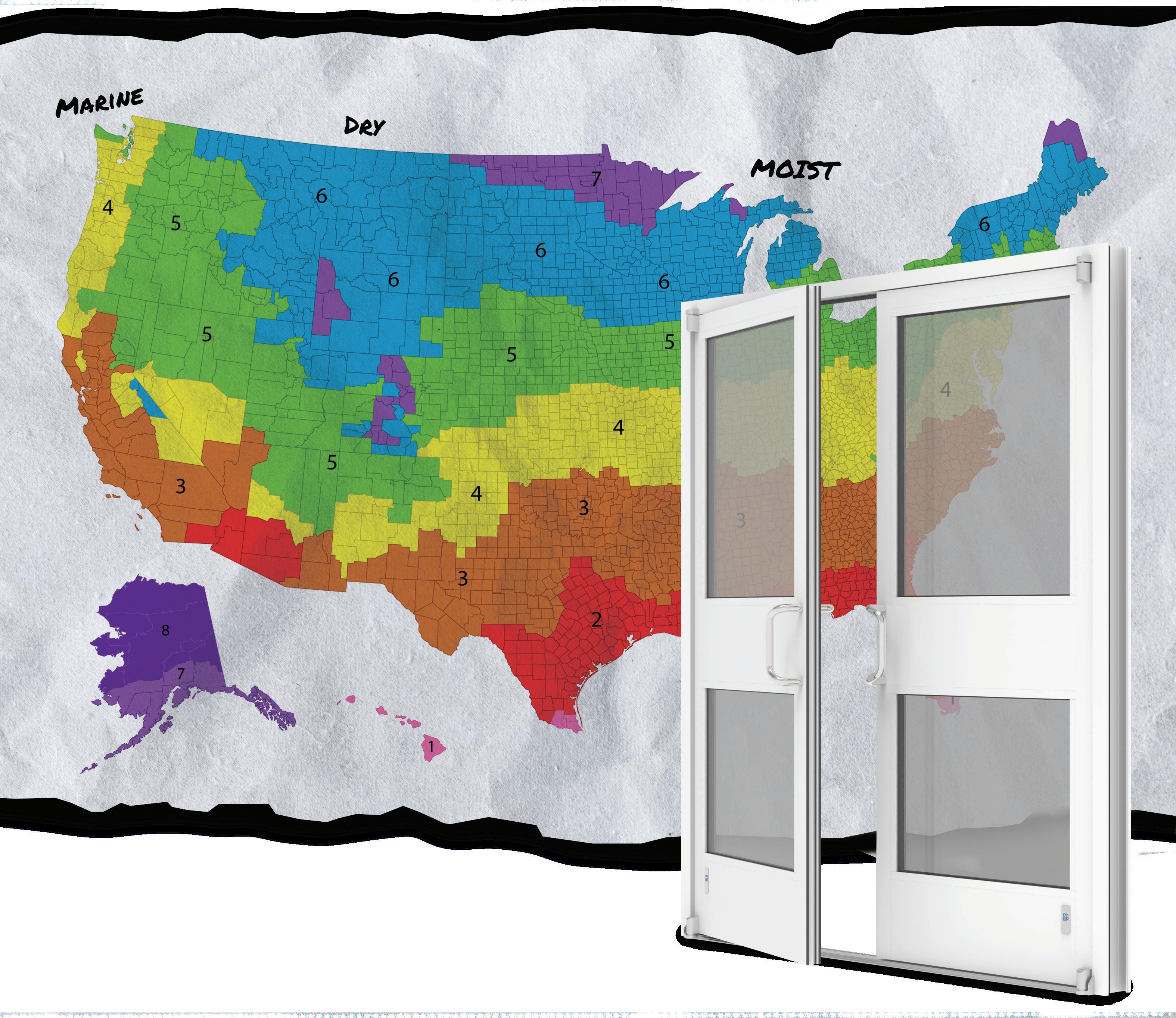


Learn more about our new entrance systems at www.ykkap.com.

Clarity Revisited
Glass transparency and circularity should reshape how the industry operates.
We hit a world record this month: On July 3, the world saw the hottest global temperature ever recorded. But this record was quickly shattered, surpassed only one day later, on July 4. Carbon emissions are directly linked to rising temperatures, weather pattern disruption, and wildfires such as those that kept a third of the U.S. population under air quality restrictions last month. Can the emergence of responsible designs and solutions improve this situation? Recently, innovations in glass and glazing technologies have been used to strike a balance between the development of new technologies and more holistic, circular practices.
At the Glass Performance Days (GPD) conference, held in Tampere, Finland, in June 2023, a collaborative of practitioners participated in a workshop called “Clarity Revisited, (Re)shaping the Future of Glass.”
Part of a one-day event called Opportunities in a Circular Economy for the Glazing Industry, this workshop brought competitors from the industry together to brainstorm new paths forward, honestly addressing the climate crisis and designers’ roles within it. While most of the environmental impact of facades is related to energy preservation, this group focused on embodied carbon emissions related to the fabrication of glazing products. Here are some of the most important takeaways from this working group.
Energy
The amount of energy and its source (renewable or nonrenewable) in the manufacturing process of glass significantly influences the extent of environmental impact. This is highly relevant for the most intensive stages of production, like the float process, which occurs before cutting and processing of glass. These issues are deeply entrenched and therefore difficult to change, but by directly engaging questions of emissions related to primary energy use, we can unlock the highest potential for carbon reduction.
Some successful strategies we discussed as models for future innovation included ongoing work to decentralize energy supply systems. By partially diversifying kiln combustion strategies, implementing recover heat from industry processes, installing photovoltaic panels wherever relevant, and educating all stakeholders about the carbon intensity and design/procurement implications of each relevant step, contractors and designers alike will have more power to designate more responsible standards.
Material Recovery Systems
The use of secondary resources, such as glass cullet—recycled glass sorted based on color—is a great avenue to reduce the melting temperature of glass and thus reduce emissions. In fact, the incorporation of post- and preconsumer glass cullet decreases the emissions related to the production of float glass. (One ton of cullet saves approximately 0.3 tons of CO2.)

However, finding efficient ways to harvest postconsumer flat glass is the leading priority for the industry right now, especially in the flat-glass sector, where these circular practices are not currently common. This would mean that recycling companies
would both collect and sort cullet. But it’s become clear that more specialist dismantlers are necessary to upscale glass reuse and recycling. They also need to be brought into all stages of design development to determine whether today’s designs can be dismantled in the future.
A robust network for glass reuse and recycling could have a massive impact on material life cycles and carbon sequestration, as we know from sophisticated standards in metal reprocessing, for example. But the reusability of glass generally can also be aided by secondary products that can be considered at the time of manufacturing and fabrication. Certain surface sealants and treatments make reuse more feasible for our existing systems: For example, Cutri and Willareth shared recently published research into the reuse of glass in spandrels at GPD that can be aided by the use of fullface sealant, which creates a “safety glass” for at least one more design cycle. Even partially circular considerations and solutions are helping reduce carbon emissions now, which is key to meet Paris Agreement goals.
Data and Communication
Fortunately, the environmental data for flatglass products is growing and increasingly accessible. New products typically have tags or can be equipped with "chips"—sensors that collect data on glazing performance and also store information about where a product was manufactured, by whom, and other specifics that would be important to the next user to know when recycling the material. However, there is untapped potential for even more dynamic technology: For example, using AI to map existing buildings and tag data is currently being researched. Also, communication between clients and designers about environmental qualities and impacts is improving along with awareness, a trend we hope to continue to see.
Design for Disassembly
It’s widely recognized that flat-glass products are attractive targets for disassembly efficiency research. It’s merely a matter of time and tool selection. Equipment solutions are available to deglaze facade products and prepare glass for recycling. By developing dismantling processes and design strategies amiable to recycling or reuse, architectural glass will have more potential to stay within the same market and therefore contribute to its decarbonization.
It is very promising to see that several insulating glass unit (IGU) manufacturers and glazers have developed processes and equipment solutions to take apart existing units, clean the glass, and reform a new IGU. This process, has precedents around the world, including examples in Belgium, the Netherlands, Quebec, and New York City.
But how can practitioners and fabricators enter into discourse about these necessary changes? To support much-needed new collaborations, new platforms for data sharing and material repurposing are needed, though a few already exist in the U.S. and Europe. But beyond building these new platforms, it’s important to also support new generations of planners and engineers from diverse backgrounds. By diversifying the field, we redefine the role of design-
ers as leaders in new bidding and supply chain management efforts. Today, universities are developing circularity courses and programs as part of architectural education: Gone are the days where architecture was seen as a formal exercise devoid of real-world responsibility.
To be not only relevant, but a leader in addressing the climate emergency, the glass industry (including all stakeholders in the entire design and construction process) must nevertheless aim to perform outside of merely using more glass. Project-specific questions must be asked that tailor innovation to the appropriateness of a site. Sustainability must be embedded in a project from the very beginning, from concept all the way to the detailing and fabrication phase. Designers today must ask: What is the whole life carbon of my glass facade design and operation? Is an ultrahigh thermal performance, floor-to-ceiling, transparent glass box a responsible design? Is low-iron glass necessary? How can I design with reused/recycled glass in facades while still delivering high thermal performance? These considerations will yield new design dynamics and aesthetics and certainly whole new architectures.
Sophie Pennetier, associate director of special projects, steers Enclos’s growing sustainability and circularity efforts. She is an adjunct professor at SCI-Arc and involved in several industry focus groups aimed at decarbonizing facades, such as the Facade Tectonics Institute, where she serves on the board of directors.
Lisa Rammig leads the teams in Eckersley O’Callaghan’s California offices. She has played a significant role in its expansion, leading many of the group’s most challenging projects, while also remaining involved in academia and building strong links between research and industry. She is part of the Facade Research Group at TU Delft and is an elected member of the Special Advisory Council of the Facade Tectonics Institute at the University of Southern California.
Linda Hildebrand is a professor of reuse in architecture at RWTH Aachen University. She is an architect specialized on circularity in the built environment and a cofounder of Concular, a platform for digital services to facilitate circularity in the built environment.
LINDA HILDEBRAND
July/August 2023 34 Comment


Let your shower glass shine! 1.800.221.0444 buildingproducts.pna@nsg.com www.pilkington.com/na Pilkington OptiShower™ is an excellent solution for high humidity applications. Our online pyrolytic coating mitigates water stains by preventing sodium leaching and is durable enough to withstand tough environments. Maintain cleaner glass with minimal upkeep by using Pilkington OptiShower™ Pilkington OptiShower™ Scan for more on shower glass solutions


38 Products
Decorative Glass
Designers and manufacturers of decorative glass have a range of techniques at their disposal— from glass tempering and acid etching to back-painting and digital printing—to produce the right colors, patterns, and textures for a project. But decorative glass is not just for show. It can also be specified to meet performance or sustainability goals for applications ranging from elevator cab walls to exterior cladding.

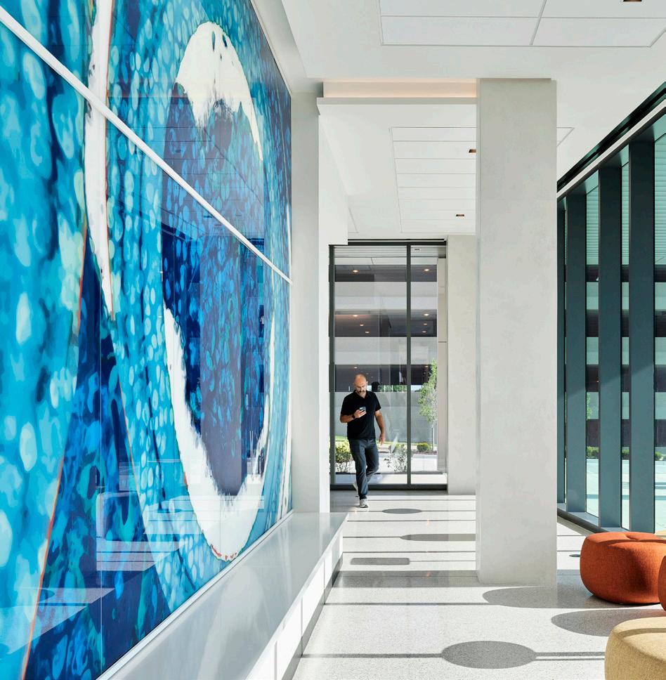

 Rita Catinella Orrell
Quadratti OmniDecor Glass Design omnidecor.it/en
2023 Color Collection 3form 3-form.com
DermaAR Finish Pulp Studio pulpstudio.com
TurnKey Fusion Light Wall Bendheim bendheim.com
Rita Catinella Orrell
Quadratti OmniDecor Glass Design omnidecor.it/en
2023 Color Collection 3form 3-form.com
DermaAR Finish Pulp Studio pulpstudio.com
TurnKey Fusion Light Wall Bendheim bendheim.com
ALL IMAGES COURTESY THE RESPECTIVE MANUFACTURERS July/August 2023
Digitally Printed Glass in New World Pattern Skyline Design skydesign.com
UNVEILING THE GLARING TRUTH.
Introducing Derma AR, an anti-reflective option to our ultra-thin, highly durable DermaGlass. Derma AR is a 1.3mm, low-iron glass that comes in sizes up to 58" × 118". It is exceptionally strong, flexible, lightweight, durable, and scratch-resistant. And it can be used with our Pintura back-painted coating or laminated with graphic interlayers. Making it not only highly resilient, but also
extremely versatile in both architectural and elevator cab installations. It can also be laminated to itself or to honeycomb core for safety. Now that it’s been brought to your a ention, we’ll let you envision all the possibilities.
To learn more, please contact a Pulp Studio sales representative.
2100 W. 139th St. Gardena, California 90249 Tel: 310-815-4999 Fax: 310-815-4990 Email: sales@pulpstudio.com www.pulpstudio.com
More sight, less weight. Our thin, high-strength glass now comes with an anti-reflective option.
40 Products
Structural Glass


Structural glass and glazing need to be tougher than tough, and these frameless glass assemblies take on an portion of the structural load. Typically used for entrances, curtain walls, storefronts, stairs, railings, and flooring, structural glass is not restricted by the size limitations of standard framing systems, allowing for more expansive—and often more innovative—installations. Here are some of the latest structural glass options for projects both big and small. RCO
 CRL DRX Modular Door Rail System CRL crlaurence.com
VetraFin-G Series System Sentech Architectural Systems sentechas.com
Kova Window Wall Kova kovaproducts.com
950SG Therml=Block Window Wall Tubelite tubeliteinc.com
RWW Curtainwall Reflection Window + Wall reflectionwindow.com
CRL DRX Modular Door Rail System CRL crlaurence.com
VetraFin-G Series System Sentech Architectural Systems sentechas.com
Kova Window Wall Kova kovaproducts.com
950SG Therml=Block Window Wall Tubelite tubeliteinc.com
RWW Curtainwall Reflection Window + Wall reflectionwindow.com
ALL IMAGES COURTESY THE RESPECTIVE MANUFACTURERS
25T Thermally Broken Entrance Systems YKK ykkap.com/commercial
Reliance-IG SS Oldcastle BuildingEnvelope obe.com
July/August 2023
KÖDISPACE 4SG
The High Performance Warm Edge System for Increased Sustainability.

Ködispace 4SG is a reactive thermoplastic warm edge spacer with built-in desiccant that replaces the traditional edge system made of spacer, desiccant and primary sealant. Due to its ability to form a chemical bond with the glass and silicone secondary seal, Ködispace 4SG increases the durability of the Insulating Glass and maintains energy performance reducing both embodied and operational carbon. Contact

us
na-glass@hbfuller.com
www.hbfuller.com See us at GlassBuild
for unlimited possibilities!
|
Booth #613
42 Case Study Greenhouse Plus Museum
Montreal's new insectarium breaks down the white box.
Architect: Kuehn Malvezzi / Pelletier De Fontenay / Jodoin Lamarre Pratte architectes
Location: Montreal, Quebec, Canada
Museology: Kuehn Malvezzi
Landscape architects: atelier le balto
Electromechanical engineers: Dupras
Ledoux
Structural engineers: NCK
Civil engineers: Génie+, Lévis
Sustainable Development Advisor: CIMA+
Indoor and outdoor signage: Kuehn Malvezzi with Double Standards
Scenographic and multimedia coordination: Go Multimédia
Execution and site supervision for museology: La Bande à Paul
Special consultant for greenhouses: Capital
Greenhouse
Tree preservation: Nadeau Foresterie
Urbaine
Curtain wall installation: Unicel Architectural
Glass: Multiver
Aluminium: Alumico Architectural Inc.
Structure Hot-dip galvanized steel: Groupe
AESP
Cast-in-place concrete: Coffrage Alliance
Reinforcing steel: Acier AGF
Building services electricity: TBC
Constructions
Plumbing: Le groupe Charbonneau
Building controls: Regulvar
Greenhouse systems, shading system:
Harnois Industries
Shotcrete custom mix: Sika Canada
Reinforcing steel: Acier AGF
Interior systems: Grondin Acoustique
Epoxy floor coating: Les Peintres
Multicouleurs
Fabricated metals steel finishing: Groupe
C&G Beaulieu
In 1976, architect Roger Taillibert’s Montreal Olympic Stadium opened with a tower tilted on a 45-degree angle—the tallest inclined tower in the world. Many of the 1976 Olympics’ facilities near the main stadium were converted into components of Espace pour la vie, or Space for Life, a science museum complex that includes the Montreal Biodome and the Rio Tinto Alcan Planetarium, with other institutions spreading into an adjacent park. In April 2022, an insectarium designed by Berlin-based Kuehn Malvezzi with local firms
Pelletier de Fontenay and Jodoin Lamarre
Pratte architectes joined the city’s natural science ranks.
The Montreal Insectarium’s final form was the result of a seven-year process through design and construction, which began with a 2014 competition. The insectarium’s program is split into two primary spaces: a sawtooth, glass-wrapped greenhouse above ground and a labyrinthine subterranean structure. The insectarium hosts over 3,000 insect species in its specimen collection and over 175 living insect species. The greenhouse is home to an additional 150 living plant species and 3,000 plant specimens.
Kuehn Malvezzi, Pelletier de Fontenay and Jodoin Lamarre Pratte architectes told AN that the design team initially considered a “much more horizontal and fragmented” building, though keeping the landscape and built structure connected guided all design iterations. The surrounding landscaped gardens (designed by atelier le balto) feature winding paths that ultimately bring the visitor
back into the structure without feeling rigid: A path through an exterior butterfly garden, for example, ends at the insectarium’s underground entrance, connecting the all levels of the building to its landscape.
Visitors enter the insectarium through the Pollinator Garden before then proceeding through the Labyrinth, a shotcrete-formed interior that sensorially disconnects visitors from the outside world while leading them through the exhibitions. The architects worked closely with workers in creating a 1:1 mock-up of a cave section, with workers honing a finish that would be applied across shotcrete sections. It took several weeks to install, the architects said, as curing and finishing processes had to be carefully planned and joints between sections that finished at different times had to be smoothed to ensure material uniformity.
Emerging from the depths of insect education, visitors then arrive in the Grand Vivarium— the above-grade greenhouse that defines the building’s glass facade. Gently sloping paths
lead them through a series of microclimates, containing some insects that can move freely, while others are contained in glass. A glass-walled space in the middle of the Grand Vivarium hosts workshops, while also supplying spaces for employees to conduct research.
The architectural team told AN that their approach to designing the glass system— which they knew would define both the structure’s exterior character and shape visitor experiences on the interior—necessitated a shedding of assumptions about standard curtain walls and mechanical systems. In addition to otherwise common considerations like airtightness and R-value, ultraviolet penetration and natural ventilation schemes were crucial for plant growth. These points led to a “performant curtain wall envelope … with clear glass for maximum transparency, combined with automatic operable windows, roof and wall retractable insulated curtains, large overhead fans, and a cooling mist system.” This approach was paired with
July/August 2023
a double-glazed wall assembly and a roof system that combines both laminated and bonded double-glazing with interlayer film, allowing snow to melt.
The integration of mechanical needs within a glass and metal frame leaves these systems largely exposed to visitors. Apart from technical needs, it serves as a reminder of the level of artificial climatic control necessary to show a wide range of biomes in a single structure in Montreal’s cold northern climate. While the typology of the greenhouse and sloping circulation is reminiscent of the nearby Biodome (which was recently renovated by KANVA), the fully transparent walls and roof on the greenhouse break down the traditional opacity of a museum in favor of the lightness of a crystal palace. CW
 JAMES BRITTAIN


43
Facing page: A distinct sawtooth profile innovates on the typical greenhouse form.
Above: Within the greenhouse, winding paths lead visitors subtly up through the space.
Left: The glass envelope allows for sunlight to enter the space from all angles.
JAMES BRITTAIN July/August 2023
JAMES BRITTAIN
44 Products

Specialty Glass
July/August 2023
Certain projects require specialty solutions such as switchable glass, photovoltaic glass, or wind protection for roofs, skylights, facades, doors, and windows. While some specialty glass is very industry-specific, such as radiation shields for X-rays in medical facilities, others work across many different project types, like bird-friendly glass for a wide variety of facade contexts. RCO

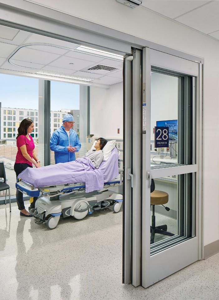

 PurOptima Revolution 54 Plus with Tech Panel Optima Systems puroptima.com
Ocula Frameless Glass Windscreen Sightline Commercial Solutions sightlinecommercial.com
AviProtek Bird-Friendly Glass Walker Glass walkerglass.com
SolarCam Halio halioinc.com
Bird1st UV Glass Guardian Industries guardian.com
PurOptima Revolution 54 Plus with Tech Panel Optima Systems puroptima.com
Ocula Frameless Glass Windscreen Sightline Commercial Solutions sightlinecommercial.com
AviProtek Bird-Friendly Glass Walker Glass walkerglass.com
SolarCam Halio halioinc.com
Bird1st UV Glass Guardian Industries guardian.com
IMAGES COURTESY THE RESPECTIVE MANUFACTURERS
Profiler ICU/CCU Max Telescoping Door System Horton Automatics hortondoors.com
ALL
Curved Laminated and Tempered Glass IGUs Cristacurva cristacurva.com/en


�t rosifol@kuraray.com • www.trosifol.com Now Available: New Improved Designs for Trosifol® and SentryGlas®Bird-Friendly Solutions BirdSecure® Pro
46 Products
High-Performance Glass
July/August 2023
Projects can incorporate high-performance architectural glass to improve fire protection, storm resiliency, energy efficiency, acoustics, and even safety and security. There are options that meet the needs of even the most stringent building codes and regulations, while also giving occupants access to views and natural light. RCO

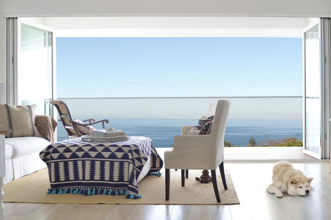


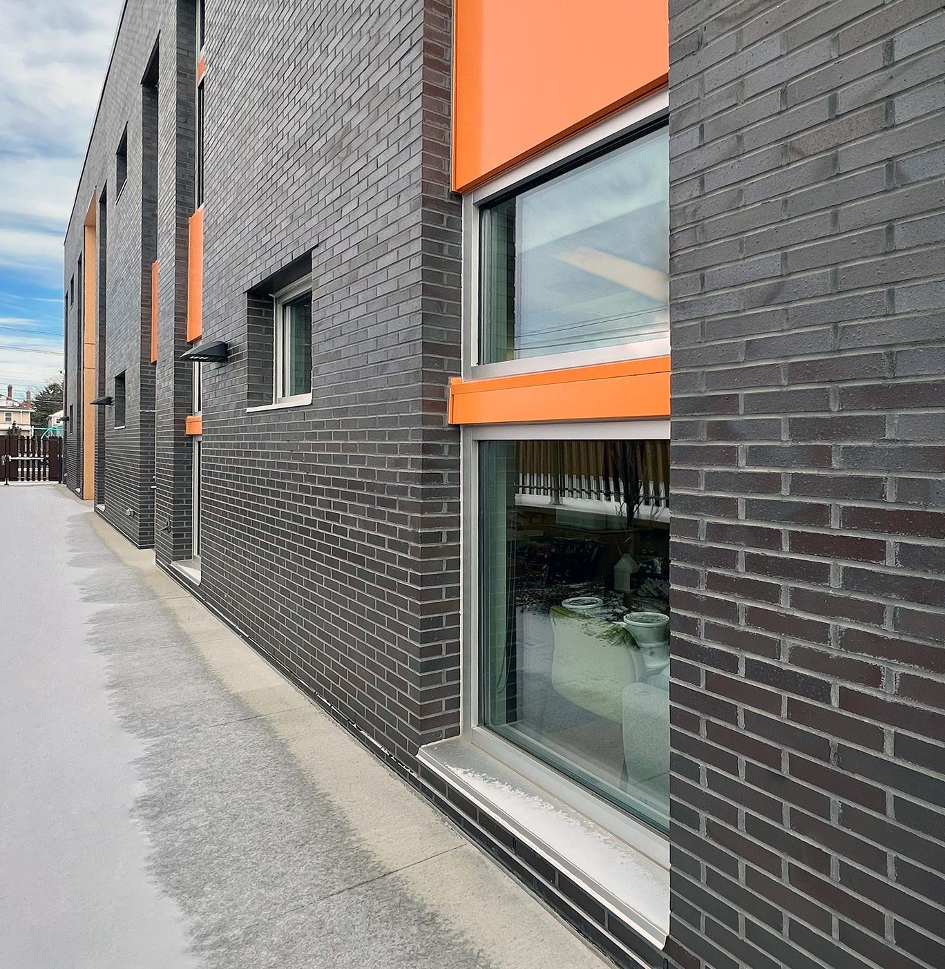 New Patents for SuperClear 45-HS & SuperClear 45-HS-LI Safti First safti.com
Sedak GSP Sedak sedak.com
Designer Guard System Technical Glass Products tgpamerica.com
Coastal Storm Door System Panoramic Doors panoramicdoors.com
VacuMax Vacuum Insulating Glass Vitro Glass vitroglazings.com
New Patents for SuperClear 45-HS & SuperClear 45-HS-LI Safti First safti.com
Sedak GSP Sedak sedak.com
Designer Guard System Technical Glass Products tgpamerica.com
Coastal Storm Door System Panoramic Doors panoramicdoors.com
VacuMax Vacuum Insulating Glass Vitro Glass vitroglazings.com
ALL IMAGES COURTESY THE RESPECTIVE MANUFACTURERS
Make Designs Come to Life

These crisp, reflective neutral coatings manage solar heat gain with exceptional performance. All with a classic aesthetic you know and love.

SNR 35 delivers advanced performance with an ultra-low 0.17 solar heat gain coefficient for captivating exteriors and more sustainable, comfortable interiors.

SNR 50 offers a pleasant balance with a cool 0.25 SHGC, medium reflectance and desirable 48% visible light transmittance creating bright and inviting spaces.
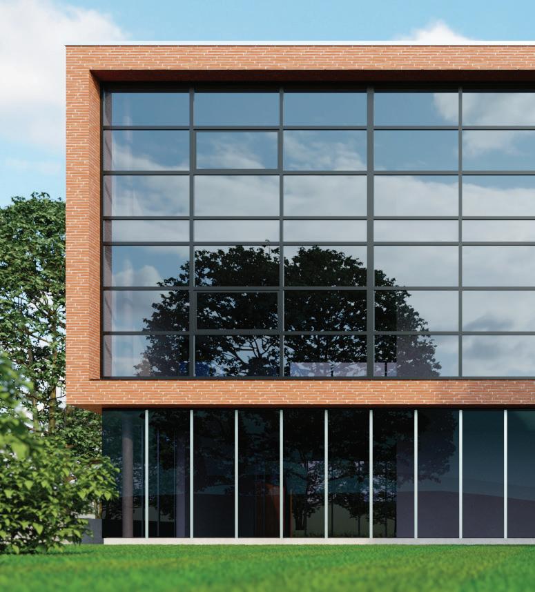
The images are artistic renderings intended to represent the reflected and transmitted color of the glass in real use conditions. Actual results may vary. ©2022 Guardian Glass, LLC
more at www.guardianglass.com
Learn
SunGuard® SNR
Introducing
35 and SNR 50
SNR 35 SNR 50
48 Case Study
Etched in Glass
Weiss/Manfredi uses frits and fins to clad a tower for MIT.
Design Architect: Weiss/Manfredi
Location: Cambridge, Massachusetts
Structural Engineers: McNamara Salvia
Glazing: Heintges & Associates
Elevator: VDA Elevator and Escalator Consulting
Lighting: HLB Lighting
Acoustics: Acentech
Code: Jensen Hughes
Sustainability: The Green Engineer
General contractor: Turner Construction Company
Superstructure: G&C Concrete Construction
Superstructure: Canatal Industries
Exterior glazing/curtain wall: Fabbrica/Massey
Millwork: Walter Furman
Interior lobby glazing: Modern Glass and Aluminum
Interior lobby flooring: DePaoli Mosaic Company
Across the Charles River from Boston, a spate of recent projects has altered the skyline of Cambridge’s Kendall Square neighborhood.
MIT Kendall Square Site 5, designed by New York–based firm Weiss/Manfredi, is one such project, and it makes its presence known with eye-catching massing and a glass curtain wall shaded with a ceramic frit and terra-cotta colored aluminum fins.


Weiss/Manfredi has been on something of a tear when it comes to institutional, and glassy, projects, recently ranging from the curved structural glass of Yale’s Tsai Center to the staggered brick-and-glass form of Kent State’s Center for Architecture and Environmental Design.
In Cambridge, the office’s 17-story tower was completed last year and houses a number of programs, such as the MIT Museum, MIT Press bookstore, and Boeing’s Aurora Flight Sciences research unit. In its massing, the project seeks to blend in with its neighbors. “The building creates a transition from the brick buildings of Main Street to a newly created campus green that will become an important part of MIT’s open spaces,” Weiss/Manfredi cofounders Michael Manfredi and Marion Weiss told AN. “The building responds to these contexts and programs through the sectional articulation of its massing and facade, which are keyed to the datum lines and rhythm of adjacent buildings.”
The 4-story podium consists of a fully glazed ground floor curtain wall to establish a lively presence at street level, and the rhythm of opaque and transparent elements above
July/August 2023
reflects the scale of nearby historic buildings. Above the podium, the 13-story tower is arranged in a bow-tie-like floorplan that magnifies the pleated detailing of the facade system.
For the design team, the layout of the facade is intended to be something of a chameleon, with a motley crew of acid-etched glass, fritted glass, and coated aluminum presenting variegated textures and reflections based on perspective and lighting conditions. “The tower’s acid-etched, color-integral glass, and shadow box panels densify in opacity towards the center of the building’s folds to maximize corner views while providing a high performance and energy efficient curtain wall,” noted Manfredi and Weiss. “The fin depth corresponds to maximize the chromatic effect of the building from different angles and allow changes of light and shadow to occur throughout the day.”
Though the pattern of the facade appears complex, the system behind it is not. A unitized curtain wall proved the most expeditious option to fast-track the project and maintain a tight schedule—the curtain wall and steel were bid out months ahead, which allowed for early shop drawings of superstructure and enclosure. The curtain wall is divided into seven standard panel types, and that simplicity eased construction and fabrication costs. The majority of the panels are approximately 5 feet wide, a standard dimension that proved ideal for both fabrication and installation. They are held to the cast-inplace structural system with industry-standard, adjustable, embed-type anchors located at the top of the floor slab. All in all, the curtain wall was installed in about six months, with multiple crews simultaneously at work across the building.
While the aluminum fins and clever massing act as passive shading divides for the facade, there are several design measures within the unitized panels themselves that helped the project reach LEED Gold certification: thermally broken mullions, low-e coating, ceramic frit, argon-filled insulated glazing, and upper insulated opaque shadow box panels.
The result is an enclosure that maximizes views while retaining high-performance standards and, importantly, in its unique character and massing, acts as a gateway for MIT’s fast-growing presence in this corner of Cambridge.
Matthew Marani, studying city and regional planning at Pratt Institute, writes about architecture and urban design.
ALBERT VEČERKA/ESTO
ALBERT VEČERKA/ESTO
ALBERT VEČERKA/ESTO
skydesign.com

Bird friendly made beautiful
Saflex FlySafe™ 3D PVB interlayer

Where aesthetics and bird safety collide
Saflex FlySafe 3D PVB interlayer protects birds and views worldwide as a highly effective, low-coverage solution for laminated glass.

FlySafe 3D checks off all the boxes:
• Bird friendly
• Aesthetic
• Effective
• Innovative
• Durable
Available in a variety of sequin sizes and colors
Ideal for: Atriums | Balustrades | Cladding | Curtain walls | Exterior doors | Facades | Glass fins | Link bridges | Podium glass | Storefronts | Skylights | Windows


49
Facing page, top left: View of MIT's new Kendall Square Site 5 in its larger campus context, sited at the corner of a landscaped quad.
Facing page, top right: Facade detailing includes different levels of etched glass and bronze colored fins to offer depth and varying degrees of sun protection for interiors.
Facing page, left: The building comes to a bold cantileverd point toward the street.
Above: A detail drawing of the etched-glass facade system.
July/August 2023 Scan for more information on
3D.
COURTESY WEISS/MANFREDI
Saflex
FlySafe
@Eastman Saflex and Vanceva
50 Case Study
Benzene Garden
OLI creates a floating campus in Suzhou with an intricate set of facades realized in glass and GFRC.

Design Architect: OLI Architecture
Location: Suzhou, China
Local design institute: AEPA Architects
Engineers
Project management: QNP
General contractor: Nantong Wujian
Construction Engineering
Curtainwall consultant: Talweg Engineering
Studio
Curtainwall consultant for local design institute: Shenzhen OEC Facade Technology
Floating over a reflecting pool in Suzhou, China, the Ascentage Pharmaceutical Headquarters, designed by New York–based OLI Architecture, stretches upward beneath a unique, parametric exterior facade. Created for a young Hong Kong pharmaceutical company, the glass facade references the hexagonal structure of a benzene ring to create a visually interesting and modern way to skin the interrelated buildings on the new 147,000-square-meter research and manufacturing complex.
The design is influenced by an interesting intersection of modern genetic science and traditional Suzhou scholar’s garden. As in these gardens, the focus of the design brings attention to the water, specifically the black Shanxi granite reflecting pool, which makes the gently curved, transparent buildings of the complex feel like they’re floating. This is juxtaposed with a geometric honeycomb-like pattern on the facade, which through its shape highlights the genetic research performed by the company. The pattern is based on the ring that annotates the bonds between disparate carbon and hydrogen molecules. It was designed using adaptive BIM families and stretches upward throughout the building skin.

OLI Architects principal Hiroshi Okamoto told AN that “the clinical and high-tech feel … is purposefully softened by the careful composition of building scale, height, and facade pattern diversity.” Beyond the pattern, the distinctive use of glass on the facade was envisioned to strike an optimal balance of transparency and privacy. Integrated sun shading and careful interior programming of building floor levels and orientations make maximum use of these high-performance insulated glass units (IGUs): The majority of the buildings employ a double-layer curtain wall system, which uses double silver low emissivity (low-e) insulated glass units on the inner side and varying densities of ultra-high strength concrete panels and aluminum extrusions on the outside—these create the hexagonal overlay.
Due to their various material tolerances and strengths, the installation process of the concrete panels was meticulously planned to protect the installed glass. Glass-fiber reinforced concrete (GFRC) support keels and vertical stack joints also offer support. Additionally, several iterations of the design were developed in order to avoid excessive heat stress differentials, yet acute IGU angles still allow for large, prefabricated components with double curvatures to be assembled safely and efficiently.
Okamoto explained that “as energy performance for buildings enclosures have become very demanding in each successive iteration of the Chinese building codes, we needed to use a remarkably high-performing glass with low a solar heat gain coefficient
[SHGC], blocking a good amount of infrared and UV light, while also preserving high VLT,” or percentage of natural daylight.
This contradictory goal is nevertheless challenging a new generation of architects to innovate and adapt to new building codes that stress more sustainable and energy efficient buildings.
In order to customize IGUs to meet both efficiency levels and overarching design goals, OLI worked with Xinyi Glass, a Hong Kong–based glass manufacturer at the cutting edge of low-e glass products. Xinyi provided glass for the entire project utilizing a special low-e coating that achieved the conflicting goals of letting in as much natural light as possible, with as little solar heat gain as feasible. Together, the manufacturer and designers went through several iterations to perfect the coating for both the curved and double-curved glass, so that everything would appear consistent.
The new headquarters is situated within a growing high-tech science and technology center outside of historic Suzhou. The new facilities will allow the company to continue its cutting-edge research in biotechnology and oncology. Charles Gebbia
SHEN
SHEN
ZHONGHAI
ZHONGHAI
July/August 2023
Above:
Satisfy safety regulations with Aluflam, the key system featuring true extruded aluminum vision doors, windows and glazed walls, fired-rated for up to 120 minutes. Access a wide portfolio of most architectural finishes and indistinguishable products from non-fire-rated doors and windows.


51
Facing page, top: A bold, sinuous ramp resembling a traditional Chinese scholar's garden zig-zag bridge leads researchers over the water and into the lobby.
Facing page, bottom: The water feature acts as a base uniting the different campus buildings and their varying glass and facade patterns.
Top: The corner detailing is a gentle curve, resisting harsh lines that would contrast with the fluidity of the water.
An iteration on the benzene ring facade pattern allows for more glass.
ZHONGHAI SHEN
July/August 2023
ZHONGHAI SHEN
a Great Combination: Your Design and Fire Safety.
Fire-Rated Aluminum Window And Door Systems
Unlock
Aluflam North America 562-926-9520 aluflam-usa.com
Photo: ©Mendoza Photography
52 Case Study
Meet Me at The Landmark
Design architect: OMA/Shohei Shigematsu
Partner: Shohei Shigematsu
Associate: Jake Forster
Project architect: Caroline Corbett, Ninoslav Krgovic
Interior architect (GF–F10): Peter Marino
Executive architect: CallisonRTKL
Structure: WSP
MEP: WSP
Lighting: Tillotson
AV: Theater Projects
Acoustics: Cerami Associates / Henderson
Engineers
Graphics, Signage, Wayfinding: 2x4
Vertical transportation: Edgett Williams
Consulting Group
IT/Data/Security: Tiffany & Co. (In-house)
Sustainability: Paladino
Client Rep/Project Managers/Cost: MACE
Group
General contractor: Structure Tone
Facade: Heintges
Glass: Seele (manufactured by Sunglass)
“Meet me at Tiffany’s” is a phrase New Yorkers may only use when directing hopelessly lost tourists to a rendezvous on 5th Avenue. But the iconic status of Tiffany & Co.'s flagship store far surpasses its starring role as Audrey Hepburn’s go-to breakfast spot. It’s been a landmark for tourists and locals alike since its opening in 1940, though the luxury jeweler has roots going back to 1837, which means that OMA had nearly two centuries of legacy to revamp when it took on the flagship’s renovation, the store’s very first.
The 10-story limestone building at 727 5th Avenue has just been renovated and expanded, finally opening this spring to reveal a “jewelry box” glass topper that seems to hover over the masonry mass. OMA was tasked with the exterior restoration and addition, as well as mechanical system updates, while Peter Marino took charge of the interiors.

On a hot July morning at the jeweler's headquarters, Jake Forster, associate at OMA, explained that the sculptural details found in the new glazed addition crowning the flagship were inspired by Tiffany’s iconic designs—like the cut-crystal drinking glass I held in my hand. Visible on the building’s historic doors and hardware, and especially in its famous Atlas Vase, these art deco bas-relief forms inspired the designer to experiment with slumped glass for the expansion.
The process of making slumped glass was custom to this project and resulted from a close collaboration between OMA and glass manufacturers Seele and Sunglass. Molten glass was draped over a mold, taking on its wavy shape as it cooled, a process that demands the highest level of craftsmanship and customization. It hearkens back to historic glassmaking techniques for making curved glass—special details which were status symbols in 19th-century society. This level of craft is, of course, appropriate for a luxury artisan with iconic glassworks scattered throughout its oeuvre, in equal measure to diamonds.
The 2-story addition’s hovering effect is achieved through the translucent character of two distinct glass types as well as a subtle setback. OMA replaced a previous—and odious—1980s rooftop addition with two new glassy floors that host events, clients, and exhibitions as well as showcase the brand’s history. The bottom is recessed to make way for a terrace with sweeping views of Manhattan and Central Park, and the top
July/August 2023
FLOTO+WARNER
OMA reimagines Tiffany & Co.’s 5th Avenue flagship.
cantilevers above it, slightly wider at the back of the lot and narrowing as it approaches 5th Avenue to allow for more terrace space. “The new design flaunts translucency rather than transparency,” Forster stated. “It plays with the simultaneous needs for privacy yet a desire for weightlessness.” OMA opted to experiment with a slumped glass technique that offers not only privacy but texture, too, in contrast to the mirrored, glassy fronts of the surrounding skyscrapers.

The slumped glass was also chosen for its structural efficiency: It requires less vertical support than more standard applications. The curves are created from one mold

and lifted into place in alternating ABAB patterns to offer more variability, softening the otherwise boxy form. Looking out from within the space, there is also a funhouse effect as it subtly warps the Plaza Hotel beyond at certain angles. It seems like the top floor is draped with a curtain or thick velvet cloth, not unlike the small blue boxes customers bring their Tiffany’s wares home in. The effect is strengthened by OMA’s decision to light the entire glass mass up at night with Tiffany Blue bulbs, making the entire addition an extension of the iconic wrapping.
“The result is a translucent vitrine to signal new flagship activities—a contemporary

bookend to the historic building and symbolic launch of a renewed brand,” Shohei Shigematsu, partner at OMA, offered. During my visit in July, workers were still putting the finishing touches on the interiors, while plants and Tiffany Blue outdoor furniture were scattered about the terrace. But as Forster and I looked over the limestone parapet toward the panoramic view of Central Park, the feeling of being enveloped by the city and its myth of glamour took hold. When prompted, Forster said his favorite details from the project were the thinness of the joints at the northwest corner and the concave piece of aluminum at the building’s
bow that holds the artful glass together. “It’s the things that look the most effortless, or become the most overlooked, that actually take the most work and invention,” he said. This attention to detail is an ethos shared both by OMA and its iconic client. Emily Conklin
53
Facing page: View from 5th Avenue of the Landmark, lit in Tiffany blue lights.
Left, top: The slumped glass offers a subtle change in texture and transparency.
Above: A setback at the 8th floor allows for a generous terrace overlooking the park.
Left: This delicate concave corner detail is designer Forster's favorite.
FLOTO+WARNER
FLOTO+WARNER
July/August 2023
FLOTO+WARNER
54 Products
Coatings, Films & Spacers


Advancements in material technology help coatings and films serve critical roles in architecture. They can prevent injury during storms, fire, or forced entry. They can increase a building’s energy efficiency or offer improved views or added privacy, depending on which is needed. These glazing options can support every facet of a project, whether you’re constructing a storefront, interior display cases, railings, or glass partitions. Additionally, a new spacer offers asset management information for easy glass replacement. RCO
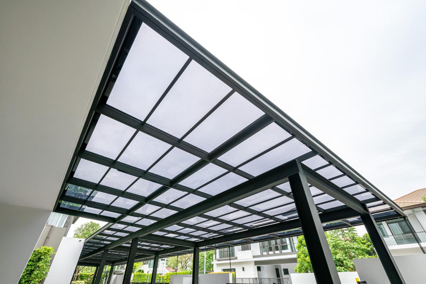 Modular Poly Clear 2 Mil Stackable Window Film Avery Dennison graphics.averydennison.com
BirdSecure Pro interlayer Kuraray trosifol.com
Modular Poly Clear 2 Mil Stackable Window Film Avery Dennison graphics.averydennison.com
BirdSecure Pro interlayer Kuraray trosifol.com
IMAGES COURTESY THE RESPECTIVE MANUFACTURERS
Viracon Identification Number Viracon viracon.com
ALL
Saflex FlySafe 3D PVB interlayers Eastman eastman.com
July/August 2023
55 Resources
Coatings, Films & Spacers
Aluflam aluflam-usa.com
Avery Dennison averydennison.com
DuPont dupont.com
Kuraray trosifol.com
Owens Corning owenscorning.com
Poly Wall poly-wall.com
Saint-Gobain saint-gobain.com
STI Firestop stifirestop.com
Tremco Tremcosealants.com
Safeflex saflex.com
Safti-first safti.com
Unicel unicelarchitectural.com
Decorative
3form 3-form.com
Bendheim bendheim.com
CARVART carvart.com
Galaxy Glass & Stone galaxyglass.com
Glas Italia glasitalia.com
Goldray Glass goldrayglass.com
Lasvit lasvit.com
Lunada Bay Tile lunadabaytile.com
Marazzi marazziusa.com
Nathan Allan nathanallen.com
OmniDecor Glass Design omnidecor.it/en
Pulp Studio pulpstudio.com
SCHOTT North American us.schott.com
Skyline Design skydesign.com
Glazers & Fabricators
Benson/MiTek bensonglobal.com
Consolidated Glass Corporation cgcglass.com
Dynamic Glass dynamicglass.com
Enclos enclos.com
GGI generalglass.com
Giroux Glass girouxglass.com
Glasswerks glasswerks.com
Harmon harmoninc.com
Massey masseysglass.com/
Momentum Glass momentum-glass.com
New Hudson Facades newhudsonfacades.com
Permasteelisa permasteelisagroup.com
The Roschmann Group roschmann.group/en
Seele seele.com
W&W Glass wwglass.com
U.S. Glass and Aluminum us-glass.com
High Performance
Cardinal Glass Industries cardinalcorp.com Eastman eastman.com
Erie AP erieap.com
Faour Glass Technologies faourglass.com
Fenex fenex.com
GAMCO gamcocorp.com
Innovative Glass innovativeglasscorp.com
Kinestral Technologies kinestral.com
Kuraray kuraray.com
Panoramic Doors panoramicdoors.com
REHAU rehau.com
Safti First safti.com
Sedak Sedak.com
Sto Corp. stocorp.com
Technical Glass Products tgpamerica.com
Technoform technoform.com
Tecnoglass tecnoglass.com
Thermalsun Glass Products thermalsun.com
Vitro Glass vitroglazings.com
Viracon viracon.com
Vitro Architectural Glass vitroglazings.com
Xinyi Glass xinyiglass.com/en/
Specialty
Alumil alumil.com
Cristacurva cristacurva.com/en
Dlubak Speciality Glass dlubakglass.com
Formglas formglas.com
Guardian Industries guardian.com
Glasbel glasbel.com
GlasPro glas-pro.com
Halio Halioinc.com
Horton Automatics hortondoors.com
Multiver multiver.ca
Old Castle obe.com
Optima Systems puroptima.com
Pilkington Glass pilkington.com
Saflex saflex.com
SageGlass sageglass.com
Seele seele.com
Sightline Commercial Solutions sightlinecommercial.com
Standard Bent Glass Standardbent.com
TGP Fireglass fireglass.com
Walker Glass walkerglass.com
Structural
C. R. Laurence crlaurence.com
Fabbrica www.fabbricausa.com/
FHC fhc-usa.com
Kawneer kawneer.com
Pielle pielle.tv
Reflection Window + Wall reflectionwindow.com
Schüco Schueco.com
Sentech Architectural Systems sentechas.com
YKK ykkap.com
July/August 2023
Presented by:
Visit our website facadesplus.com Facades+ schedule for the 2023–2024
Image by Midjourney
57 Exhibition Highlights
Leandro Erlich: Liminal


Through September 4
REFRAMED: The Future of Cities in Wood

Through October
Argentine artist Leandro Erlich’s body of work toes the line between the exactitude of architectural modelmaking and the symbolism of sculpture. His site-specific works play on viewers’ most banal, quotidian architectural experiences. They can even be slightly voyeuristic at times, as when an installation offers a glimpse through the drawn blinds of an apartment window. Each piece ends in surprise.
Bruce Nauman: His Mark
The scale and depth of his works make the experience of encounter almost uncanny, largely due to his spatial sensibility: Called an “architect of the uncertain” by gallerist Sean Kelly, his architectural inclinations are on full display in his detail-obsessed oeuvre, which is always bending the rules. How could the everyday be so unsettling? All it takes is detachment and perhaps the rapt attention demanded of a visitor canvassing a museum. EC
Mass timber carries a lot of weight: namely, the weight of architects’ expectations that the building material can be used to design ourselves out of the climate crisis. Though one of the oldest known architectural materials, and one that has been in near-constant use for millennia, timber (through its improved “massive” format) has taken on the mythic proportions previously reserved only for steel and concrete. This show at the Chicago Architecture Center
showcases these changes and potentials by highlighting the buzzy material. Exploring specifically its connections to emergent concepts of biophilic design, the exhibition’s curators cite the integral human connection to natural forms and reasons for seeking these connections. Additional benefits and hopes for the architecture industry to embrace themes like well-being, mental health, and adaptive reuse are on display in the Drake Family Skyscraper Gallery. EC
enFOLD Collective: Black – Still
Through September 11
Through September 10
Few artists practice what they preach when it comes to denouncing a favored medium. But Bruce Nauman, active since the early 1960s, has worked in almost every possible format. Instead, he is known for his subject: his own body, with which he uplifts the messiness of creativity. For his first solo exhibition in New Mexico, His Mark shows a mature artist doing his thing. (The superlative matters as it’s nearly a hometown show: Nauman lives nearby,
outside of Galisteo.) New video works in a familiar single-channel format engage history and politics, while work in a fresher vein utilizes 3D scanning techniques on Nauman’s own form to create immersive video installations. Even at 81, Nauman admits that there is never an easy answer to the question of what an artist is, or how best to be one. EC
Since 2021, Material & Application has hosted summer installations in its courtyard, which it shares with Craft Contemporary. It offers spatial immersion and activation for Angelenos. This year’s iteration takes this mission further: a multisensory installation by enFOLD Collective centers wellness, accessibility, and cultural expression by prioritizing the stories and perspectives of marginalized communities. The installation is made with simple,
familiar materials: Plywood and plaster-andlath walls are painted black, and the mortar oozes out from between the planks, referencing the nearby La Brea Tar Pits, underground oil seeps, and, even, Blackness itself. The texture adds a human feel to the outdoor room, which confounds modernist architectural ideals— predicated on presumed whiteness—to make connections between bodies, the environment, and Los Angeles at large. EC

July/August 2023 Southeast Midwest West Southwest
Pérez Art Museum Miami 1103 Biscayne Boulevard Miami, FL 33132 SITE SANTA FE 1606 Paseo de Peralta Santa Fe, NM 87501 Chicago Architecture Center 111 East Wacker Drive Chicago, IL 60601 Materials & Applications 970 North Broadway Suite 203 Los Angeles, CA 90012 PAOLO FASSOLI SAM WADIEH/COURTESY ENFOLD COLLECTIVE/MATERIALS & APPLICATIONS © NORIKO INOMOTO © 2023 BRUCE NAUMAN / ARTISTS RIGHTS SOCIETY (ARS), COURTESY SPERONE WESTWATER, NEW YORK
58
How Framing Works


Real estate has a different purpose than architecture: it exists to satisfy the requirements of the owner (and sometimes user), and more importantly, it is a place to park money. If you’re going to buy something to park money in, then you do so needing to know that you will at some point find a buyer so you can withdraw your money (ideally with ridiculous profit). Once you decide that your interests in architecture include the ability to withdraw your money from it, then all your concerns about architecture as a practical art and how it works (or looks) are conceded to this future buyer; you’re living in someone else’s house. Since your future buyer is only imaginary until the future, then it follows that all those other aspects you might be concerned with have to be the least problematic or unattractive (in every sense) to the most possible people so that your future buyer might actually exist.
accepting its commodification and relinquishing its responsibilities as a subject (and being operative). This new role of architecture and the architect produced an anxiety that was resolved through a change in the priorities of architecture, privileging the function of delight and novelty. Architecture, which once conditioned the city, became conditioned by the city, and because the city was no longer the planless accumulation of architectural subjects but now ordered by the plan of development (and capital), architecture serves only to create novelty.
This is the existence of architecture as an object and not a subject, of architecture as real estate. The misconception is that this situation pushes architectural choices to only the blandest, the most “beige”—an idea that presumes architecture to be a practice of finishes. In practice this desire to be able to sell produces both blandness and novelty (to be bland enough not to offend imaginary future buyers, or novel enough to delight imaginary future buyers). Which is to say it now primarily appeals to taste in one way or the other. The trouble with taste is that it appeals to class, and further subjects architecture to being conditioned by the city, rather than conditioning it.
Architecture as an object can be anything or nothing and look like whatever it wants (eccentric or ordinary) as long as it’s not difficult. Being difficult requires people to make more complicated choices, and to reexamine priorities, expectations, and assumptions about the world. This (difficulty) was the political power of architecture before capitalism, and has become problematic as a quality of architecture during capitalism. Its purpose, to appeal to the tastes of imaginary future buyers, can handle a full spectrum of superficialities, but has absolutely no room for upsetting priors in any deep way. Architecture as an object needs to be liked or disliked. This simple relationship is a solid requirement for consumer products, of which architecture is now one. Difficulty in architecture produces a deep anxiety that the imaginary future buyer will always be just that, never materializing, and never allowing one to withdraw money from architecture real estate.
groups of individuals, requiring more idiosyncrasy, more intuitions and personal preferences, and weirder propositions about how one might organize social space and private space, producing as a result an architecture that is inherently more difficult to understand, less accommodating to assumptions, and more challenging to the cities it resides in; becoming, again, a subject in the world, and not an object of it. Difficulty in architecture, or difficult architecture, isn’t the same thing as illegibility in architecture or illegible architecture (although sometimes it is illegible). To produce difficult work is to create something that questions existing assumptions about utility, use, appropriateness, politeness, societal morals, concepts of being neighborly, protection of the individual or exposure of the public, what people are asked to do with their time, the nature of labor and the origins of the materials, mythologies of privacy, the politics of domesticity, or the true nature of work and employment, among other things.
In the essay “Toward a Critique of Architectural Ideology” (1969), Manfredo Tafuri identifies the plan as the organizer of space, which orders society, and as a result produces the ideological purpose for the entire enterprise of architecture. The essay traces the migration from the plan as the project of the architect (and therefore architecture) to the plan as the project of the city. Up until recently, he argues, the city developed largely planless, and as a result the city (and therefore society) was conditioned by architecture, whereas in the modern capitalist endeavor, the city (and its plan) began to move architecture from its position as an ideological subject into a materialist object, effectively neutering the political force that architecture (through the plan) could provide. In this evacuation of architectural purpose toward society, and the role of the avant-gardes in hastening the organization of the plan into the plan of capitalist development, Tafuri finds reason to accuse architecture of
If you want an architecture that feels more meaningful than its utility as a place to park money, then it’s worth considering an alternative to the exploration of architectural eccentricity and ordinariness. If both approaches produce genres of architecture entirely susceptible (and more likely, that lend themselves) to being commodified, an alternative would be something that has the ability to more deeply affect, or disturb, expectations about a building, a form of architecture that challenges assumptions about use or appropriateness. Ignoring those demands might make space for vernacular and idiosyncratic work, as a kind of veto on the development plan of the city. The trap to be avoided is trafficking in architectural style, or believing that architecture is about style at all, instead of working with plan, and instead exploring a more forceful and less controllable form of creativity where, rather than eventually domesticating the exotic through normalizing and commodifying what is eccentric, or trading in the well-known through maintaining normalcy, the normal is made weird.
In order to do this, architecture might be thought of less as a thing (or an object) that’s produced, and more as a form of creativity that examines space for an individual or
The Architect’s Newspaper
Excerpt
Paul Preissner’s text from American Framing: The Same Something for Everyone, published by Park Books, examines the way the United States is built.
If the architecture of capitalism requires smoothness and virtuoso complexity and tasteful anonymity and efficiency and thoughtful planning, resulting in something you can like, the characteristics of a difficult architecture should stand in the way of those qualities: it should be rough, dumb, outside taste, clumsy, resulting in confusion. America in the early nineteenth century was undergoing a rapid expansion in both population (from immigration and births) and land (from a belief in Manifest Destiny), and needed a form of architecture not reliant on the European methods of building the colonialists brought over: masonry, heavy timber, etc. The logistics of population growth and settler occupation made traditional methods requiring skilled labor and slow work impractical. Softwood framing originated as a kind of outside solution, one that came about through the simultaneous existence of plentiful and cheap wood ignored by carpenters and timber builders, small, light, and portable pieces of lumber, and cheap nails that could connect framing elements without skillful joinery. Where slow-growth, heavy timber is capable of carrying significant loads through massive beams and columns, softwood framing just calls for more weak wood, multiplying columns to make any individual column meaningless and creating something that has neither the structural clar-
from the pressures of practice by simply not practicing, more interested in the idiosyncrasies of their own quotidian needs. This de-skilled labor initiated an architecture that eventually came to constitute over 90 percent of built housing in the United States. It’s this fundamental sameness that paradoxically underlies the American culture of individuality, unifying all superficial differences, organizing the irrelevant differences in finish that identify tastes. In this way, framing suggests an alternative to the narcissism of architecture open to its own commodification.
At the same time, framing introduces an improvisational creativity seemingly open to all other forms of creative practice, but generally unavailable to architecture. After all, architecture is planned, then drawn, then organized for construction, then built. There’s no ability to move a wall on-site when building with prefabricated steel or engineered reinforced concrete. Framing doesn’t require the same uptight approach to architecture. Lumber arrives on-site and is cut in place to do whatever. It’s easy. Windows and doors can be introduced and removed at will. Walls can be moved or removed with little consequence, or consequences that a few more articles of lumber can resolve in no time. Wood framing allows for immediate and intuitive changes, accommodating desires unknown until realization. Framing is the closest architecture to action painting. The ability to change direction during construction without much effect on delivery time or cost allows for a medium of space that is vastly more mutable, wily, un-precious, and open to idiosyncratic experimentation that satisfies specific individual desires and curiosities. Framing allows architecture to be irrational, risky, and ugly, to make mistakes, creating space that stands in contrast to the industrialization of culture. It’s this constant uncertainty and allowance during its production, its existential impermanence, that develops a space for creativity and architecture that resists the trend toward taste and solidity.
anyone can do it. Framing works by allowing for participation at every level and offering a way to act out architecturally, indulging instinct, accommodating ideas, and seeing where things land.


Paul Preissner is an architect and principal of Paul Preissner Architects. He is professor of architecture at the University of Illinois Chicago and the author of Kind of Boring
Photographs by Chris Strong
The original version of this essay "How Framing Works" appears in American Framing: The Same Something for Everyone, published by Park Books. The new release is available in the United States in August.

ity of a timber column nor the brute force of the masonry wall: the stud wall. The mobility of the 2x4 and ease of wood-frame construction allowed new people to produce architecture, and as a result, to produce space. At roughly the same time that architecture launched the search for novelty as the new pursuit of the architect, wood framing came along to allow architecture by non-architects, kept immune
Subversion can occur where the economic stakes of experimentation are so low that personal, anti-market desires and the unfashionable can be materialized, and normal things altered toward idiosyncrasy. Pressures from the development plan moved architecture to pursue expensive novelty or ordinary tastefulness in order to appeal to the imagined desires of future owners, trading away the future. Framing gets around this pressure through allowing for an architecture that can be impulsive and at times even gross—the result of ad hoc choices—without the consequences (change it again!). This introduces a liberatory creative freedom to architecture traditionally only found in other (cheaper and more immediate) forms of artistic practice. The typical costs of architecture (labor, material, land, time) continually work against architecture’s ability to explore impulse, and instead condition it to be deeply considered and planned. Framing works through crudeness; it’s easy, it’s cheap, everyone can learn it, and
July/August 2023 59
60 Review
Ellsworth Kelly at 100

Glenstone Potomac, Maryland Through March 2024
Arts institutions all over the world have been breaking out their hard-edge abstraction canvases to celebrate the 100th birthday of the late painter Ellsworth Kelly. The Edward Hopper House in Nyack is hanging his lithographs of waterways; the Art Institute of Chicago is showing a collection of portraits; the Philadelphia Museum of Art is displaying early drawings from Paris. But the Museum of Modern Art (MoMA) presented Ellsworth Kelly: A Centennial Celebration in its atrium, notably highlighting Sculpture for a Large Wall (1957), originally created for Philadelphia’s Transportation Building and its Greyhound Bus Terminal. Kelly had first designed brass screens for the Post House restaurant in the Transportation Building. Upon seeing these designs, the building’s architect, Vincent Kling, commissioned Kelly to make a large piece for the building. This piece was originally titled Transportation Building Lobby Sculpture before being rebranded to, presumably, make it more sellable. Forty-four feet of panels tilt and curve at a variety of angles, catching and bouncing the light in new ways throughout the day as the sun moves. While abstract metal wall sculptures have now become commonplace in transit hubs worldwide, Kelly’s work was a blueprint, offering an exciting and upbeat break from tradition when it was first installed.
Public art can grab a commuters’ attention and enhance their day-to-day travels, but it can also fade into the background, functioning as an ambient accompaniment to the wait for one’s bus. Perversely, the MoMA installation— billed as a celebration of Kelly’s career—served as a reminder of this dynamic. For much of the exhibition’s run, the atrium became a queueing spot for museumgoers eager to view the Guillermo del Toro exhibition featuring sets and puppets from Pinocchio. While the stanchioned-off line certainly provided opportunities for visitors to encounter the repurposed Transportation Building sculpture, it certainly wasn’t the main event. People looked at their phones, chatted with each other, and nervously asked gallery attendants just how long the line would take—an experience probably quite like those reading newspapers and killing time while waiting for the Greyhound in 1950s Philly.
Perhaps the most ambitious centennial Kelly exhibition is at Glenstone, a difficult-to-access, private contemporary art museum located about an hour’s drive from Washington, D.C., among rolling hills planted with wildflowers. Spread out across many galleries in Glenstone’s Pavilions space, designed by Thomas Phifer and Partners, the show guides visitors more or less chronologically through the long sweep of Kelly’s career.
The first galleries offer a glimpse into Kelly’s time in Paris in the late 1940s and early 1950s, when he was first compelled to reduce the architecture around him into hard-edged shapes and lines. A Kilometer Marker (1949) becomes a semicircle atop a rectangle; the Seine (1951) is reduced to a grid of black-and-white rectangles that feel almost pointillist. As Kelly’s career progressed, he began to push his works beyond the constraints of the rectangular canvas, incorporating the negative space on the walls surrounding those works, as in 1956’s Painting in Three Panels, and reshaping and embracing a third-dimension, as in 1978’s White Curves II. In a rare act of appropriation, the trapezoidal Green Panel (Ground Zero), from 2011, traces a photograph of the former site of the World Trade Center, offering a quiet, oblique memorial.
The exhibition lovingly surveys Kelly’s career, offering up some perennial hits like 1953’s Tiger and the 2014 installment of his decades-long exploration of Spectrums. At times, however, the exhibition, curated by Glenstone’s director, Emily Wei Rales, seems as concerned with solidifying the institution’s reputation as an important player in the contemporary art world as it does with providing visitors an overview of Kelly’s career. The exhibition is
generally light on didactic text: There are no small labels providing curatorial insight next to individual artworks— only titles, dates, and institutional information, presumably to let visitors take in the works on their own terms. Each room does feature a brief paragraph or two introducing major themes in Kelly’s work and highlighting key pieces of his oeuvre. These key works predominantly come from Glenstone’s collection, not from the collections of some of the notable institutions (MoMA, the Philadelphia Museum of Art, and many more) that lent to the show. Yellow Curve (1990) enlarges Kelly’s earlier shaped canvases to massive scale (25 by 24 feet) and moves from the wall to the floor in a room separate from the rest of the exhibition that seems to be specifically designed to accommodate the work, which was originally commissioned by
and created for Portikus, a contemporary art institution in Frankfurt. While Kelly certainly had many monumental works—the wingspan of the wall sculpture shown at MoMA is even larger than Yellow Curve’s—this work feels uniquely massive. The sculpture’s yellow paint almost glows, as Wei Rales notes in a printed-out email, one of many Yellow Curve–related studies and ephemera in an adjoining room. If earlier works like Painting in Three Panels attempted to incorporate the wall’s negative space into the artwork, Yellow Curve seems to subsume the entirety of the space (the walls, the floor, the ceiling, even the entryway) into the artwork, effectively blurring the line between where architecture ends and artwork begins.

The Architect’s Newspaper
Kevin Ritter is the managing editor of Urban Omnibus
RON
RON
Top: Yellow Curve (1990) Above: Painting in Three Panels (1956)
AMSTUTZ
AMSTUTZ
Modernism Down Under
Vladimir Belogolovsky reflects on the legacy of Harry Seidler, who would have turned 100 in June.

Harry Seidler, who called himself “the torchbearer of modern architecture,” would have turned 100 on June 25. His first built work, Rose Seidler House (1948–50) in Wahroonga, a northern Sydney suburb, single-handedly delivered a complete package of Bauhaus and modernist principles to Australia, his adopted country. The house was the result of years of rigorous education, creative practice, and perhaps most of all, political strife and the displacement he experienced identifying as an Austrian Jew. Despite an early life dotted with setbacks and struggle, Seidler opened up modernism to diverse artistic influences that enriched architecture in ways that are at once surprising and appropriate. Such Seidler civic masterpieces as Australia Square, MLC Centre, Grosvenor Place, and his own residence, Killara House (all in Sydney), are among the most publicly acclaimed buildings in Australia.
Seidler was born into an upper-middle-class Jewish family. His father, Max, and two of his brothers owned a textile factory in Vienna, which was confiscated by the Nazis following the Anschluss. Then 15-year-old Harry fled to England as a refugee, but went on to attend the Cambridge Polytechnic school. His parents joined in November, following Kristallnacht. In May 1940, Seidler’s studies were suddenly interrupted when he was arrested as an enemy alien by British authorities and shipped to an internment camp in Quebec City. He was released 18 months later once he was accepted to the University of Manitoba in Winnipeg, where he received his Bachelor of Architecture in 1944. The next year, after becoming a Canadian citizen and acquiring an architectural license, Seidler continued his studies at the Harvard Graduate School of Design under Walter Gropius and Marcel Breuer, and also at Black Mountain College in Asheville, North Carolina, under Josef Albers.
The architect was not yet 25, apprenticing at Breuer’s Manhattan office, when a letter from his parents arrived in the mail. In a businesslike fashion, it said, “We want you to come not just as a visitor, but to accept a commission to design a house for us.” Agreeing to this challenge changed Seidler’s life, and not only his. After six years of separation, Harry traveled to Australia on what he presumed would be a short trip down: it turned out to be an introduction to his adopted country, where he would cement his legacy.
Seidler accepted his parents’ proposal after setting two conditions: they had to pay for his tickets and he would come via Brazil, where he had managed to get a job for a few months at the office of Oscar Niemeyer. He arrived in Sydney in September 1948. In a tiny apartment where he set up his single-person practice, he put forth an ambitious critique that became his personal mission statement: “Australia’s present-day building practices are outdated. They cry out for rejuvenation. It is the policy of this office to create new standards which will produce a progressive contemporary architecture.”

Once completed two years later, the Rose Seidler House (his mother’s), a vessel for elegant yet affordable modern living, bewildered Sydneysiders, many of whom nevertheless competed to commission the young expat architect to design a house for them. Seidler’s designs were unfamiliar, but they proved to be instantly desirable, a refreshing contrast to local suburban vernacular. Historian Philip Drew asserted, “This house was to become the yardstick of all later Modern buildings in Australia.” After all, despite his young age, Harry had unmatched first-class education and practice experience in both America and Brazil. Suddenly, going back to New York was out of the question. Over the next six decades he completed a staggering 120 buildings across Australia, as well as in Paris, Vienna, Acapulco, and Hong Kong.
Seidler’s buildings exhibit his ability to absorb ideas and skills from a wide variety of sources. From Gropius—confidence, social purpose, and a methodological approach to design. From Breuer—residential types, the power of concrete, and the warmth of wood. From Pier Luigi Nervi—standardized building systems and expressive structural language. From Niemeyer—sculptural fluidity, lyrical forms, and creative collaborations with artists. And from Albers—a profound understanding of how our eyes react to visual phenomena. Seidler’s unique talent for finding the most striking, refined, and convincing forms and balanced relationships between them was extraordinary. That was his unique contribution: to fuse the best ideas into his own rigorous compositions— mathematically generated, articulate, well-proportioned,
consequential, and artistic. Bringing symbolism, complexity, structural considerations, and historical references to his architecture elevated his buildings to an art form always validated by layers of meaning.
All his life, Seidler championed architecture that made the world a more delightful place. To him, architecture was not only a social and environmental tool, but an emotional one. There is a need to create beautiful, inspirational, and memorable spaces that people can enjoy. He believed “every design should be a work of art without compromise.”
July/August 2023 61 Comment
Vladimir Belogolovsky is the curator of Harry Seidler: Painting toward Architecture and the author of two books on the architect, Harry Seidler: Lifework and Harry Seidler the Exhibition
Top: Swimming pool at the Ian Thorpe Aquatic Centre Above: Australian Embassy, Paris, 1973–77
© ERIC SIERINS/COURTESY PENELOPE SEIDLER
© MAX DUPAIN/COURTESY PENELOPE SEIDLER


The Architect’s Newspaper 64 Marketplace COMPANY PAGE Aluflam aluflam-usa.com 51 Avery Dennison graphics.averydennison.com/en/home.html 36 Cersaie www.cersaie.it 13 Eastman www.saflex.com 49 Glasswerks glasswerks.com 37 Guardian Glass www.guardianglass.com 47 Hanover Architectural www.hanoverpavers.com 5 HB Fuller www.hbfuller.com 41 Kuraray www.trosifol.com 45 Modular Arts www.modulararts.com 9 Pilkington www.pilkington.com/na 35 Pulp Studio www.pulpstudio.com 39 SkylineDesign www.skydesign.com 49 Thor Kitchens THORKITCHEN.COM 67 Viracon Viracon.com 26 Vitro www.vitroglazings.com 68 & Backcover Vitrocsa goldbrecht.com 2-3 & 64 YKK AP www.ykkap.com 33 archpaper.com/subscribe Subscribe BEST OF DESIGN • TRADING NOTES COMPETITIONS • AN INTERIOR OUTDOOR SPACES • CE STRONG LATE EDITION • THE ARCHITECT’S NEWSPAPER • TECH + • FACADES +
esto.com Battery
York NY BKSK Architects
Sahar Coston-Hardy
Playscape, New
Care|Design| IMPACT


September 19-21, 2023
Charlotte Convention Center
Charlotte, NC

Architect’s Newspaper Readers receive an additional 15% off using VIP Code AN23

When healthcare, design and construction professionals collaborate, the IMPACT ripples through the community. From patient experience to sustainability, and quality of life to cycle of care – the combined efforts of healthcare design and construction experts change lives. This September, tackle the latest challenges and learn the top trends at the industry’s best networking and educational event. We can’t wait to see you in Charlotte, NC as you join your colleagues, clients and competitors to create IMPACT.

July/August 2023 65
On Doors and Redemption
Sean Joyner learns a lesson in the aisles of Home Depot.
Even though I was angry, I did not slam the door. I closed it slowly and quietly because I did not want to discover what repercussions a slammed door might bring upon me. My mother had just had the final word. She had exercised her authority as ultimate judge and arbiter of our household, which flared up in me a fire of frustration and fed-up-ness familiar to most adolescents. I can’t recall the exact content of the argument, only that it left us at odds, at opposite ends of what we each believed an 18-year-old high school senior should and shouldn’t be allowed to do. I left her, furious, huffing and puffing, and stomped up the stairs to my room, where I did not slam the door.
I squeezed the knob with all my might and pressed it motionlessly, as hard as I could, into the jamb. That wasn’t enough. I wanted to strike something, lash out, dislodge the pestering irritation that electrified my bones. Moping and morose, I threw myself onto my futon. From the mirror across the room my forlorn face looked back at me. You’re not a person who strikes things, it said. But, ruminating on the argument, I grew even angrier. I felt compelled to commit some act of retribution, to bring justice upon the physical world for the wrong that had been done to me.
I made a tight fist, like I was squeezing the juice out of an uncut lemon, stood up, and marched over to my door, meditating on all that irked me about my predicament. Yes, I was 18, but I was an adult, a grown man. I shouldn’t have to listen to my mother anymore. My heart knocked, encouraging me to raise that tight fist, drenched in that lemon juice. I squeezed harder, paused, then plunged my hand through the door. For a moment, I felt powerful, formidable, like a superhero from the movies. Then I was filled with terror. It was only a matter of time before I would hear the drum of my mother’s steps coming up the stairs. But I heard no thumps through the mangled hole in my door.
A surge of embarrassment overcame any kind of outrage I’d had a few moments prior. What had I done? I studied the white powder the door left on my hand and wrist. Blood streaked across my knuckles. Now, I had to go back down the stairs—contrite— to confront my mother, reveal what I’d done, and hope she might show me mercy.
“I don’t know what you were thinking,” she said as I stood sheepishly before her, clasping one of my dangling arms, “but you’re going to replace it.”
I tried to explain that I didn’t know how I was going to do that, that I had no way of getting a new door to the house since my car was too small to transport it. She interrupted my plea and told me that I’d better figure out a way. It was time for me to stop talking and start acting.
Higher Learning in Store
In my senior year, an architect from the local community college visited my high school to speak about a career path in architecture, something I was only vaguely interested in at the time. He shared in detail his professional work and expertise. But it was the architectural models he brought that captivated me. I’d never seen anything like them. During his talk, the architect—who later become one of my college professors—suggested Home Depot or Lowe’s as good companies for young people to earn money and gain practical knowledge relevant to architecture. I applied to Home Depot the same day and was hired a few weeks later.
When I thought of working at Home Depot, I imagined myself in the lumber department, driving forklifts and flipping through construction documents with contractors, so I was dismayed to learn I was being hired as a cashier. But management assured me this was just a way to “get my foot in the door.”
Since cashiers stood at the front of the store, customers would always ask us where things were. It mortified me not to have an answer. What felt like over a hundred times a day, I was peppered with endless queries:
“Where can I get a brass gas valve, 3/8 inch to 1/2 inch?”
“I’m looking for a single-pole circuit breaker.”
“Buddy, point me to your stock molding.”
“Kid, you guys sell epoxy? I want J-B Weld, specifically.”
I had not the slightest clue what any of these things were. There was no reason for me to. What the hell was a gas valve, and did they come in different sizes? A circuit breaker? Was molding some kind of clay? And epoxy?
“Let me find out,” was my stock answer. As I got more familiar with the store, I’d walk customers to the location of the item they sought, or I’d find an associate in one of the departments to answer the customer’s questions. If I could, I’d stay to hear the solution. On my break, I took notes in a little notebook I kept in the orange apron we all wore, transcribing the location of an item and what it was used for. The next time someone had a similar question, I was able to help them.
I’d been with Home Depot only a few months when I destroyed my door. I considered going to Lowe’s to get a new one because I didn’t want to reveal to my coworkers that I’d wrecked mine in a childish fit. But after some reflection, I decided to leverage the opportunity to get to know the
associates in the doors department at my new place of employment.
Up to that point, the only thing I knew about doors was what aisle they were in. As I roamed back and forth through the aisle, I quickly realized I didn’t know what to buy. Did I want a prehung door or just a slab? With hardware or without? And what size was I looking for? It all seems so straightforward now, but then, in my youthful ignorance, I’d never thought much about something as ordinary as a door.
Seeing through a New Lens
A tall, middle-aged man with bushy brown hair and the lurchy disposition of a Dr. Suess character looked down at me and chuckled after I told him I had not measured my door.
“Then how do you expect me to help you find one?” he asked, snickering, both hands stuffed in the front pockets of his orange apron. I laughed, pretending I was in on the joke.
Thankfully, he recognized me as “one of the new kids up front.” He took me back down the main door aisle, explaining each section as we moved through it: the entry doors right at the front, security doors across from them, some sliding door displays in the middle, and, finally, the interiors.
It turned out I needed a slab, just the plain door. Prehung, I learned, were doors sold inside the frame. “That’s if you’ve got studs showing,” he explained. “You don’t want those.”
Back at his desk, he sketched a door elevation on a piece of paper. “Measure the height, width, and thickness of your door and the locations of all the hardware. Go by this sketch,” he said, handing it to me. “Fill it out and bring it back. I’ll help you out.” I folded the paper and slipped it into my pocket. Later that day I carefully measured my door. I copied everything on the sketch and placed it in my lunch box so I would remember it on my next shift.
Before long, I could not unsee them. As subtle as it was, I found myself labeling basic properties of the doors I encountered in my daily life, their different patterns, materials, and hardware, how they influenced the character of a space. Other aspects of my world that I’d taken for granted also became more vivid: how windows sat in walls, the texture of different kinds of carpet, the fabrics on furniture. Even the way light moved through a room began to feel special and noteworthy. I’d begun to see the world with a more profound sophistication, through a lens I would continue to refine in the coming years.
Backdrops of Life
Toward the end of my three-year tenure with Home Depot, I worked in the doors
and windows department. Customers usually came in with a specific request: a red door to “raise the curb appeal” of the house they were selling, a screen door to enjoy the outside air without being pestered by insects, or, one that I still remember vividly, a solid core interior door for a mother who didn’t want to hear her son’s unceasing drum practice.
I found that a door purchase was always a symptom of something bigger, something more significant: Raising curb appeal could be about recalibrating one’s life, a new beginning; a screen door addressed a desire to be more connected to nature; a sound-muffling door gave a frustrated mother some degree of peace and quiet. Whether customers freely divulged information to me or if it was clear from the subtext of their transaction, their door purchases gave me a glimpse into their lives.
A few days after I measured my door, I returned to the store and purchased the cheapest one I could find: a slab that was primed but not painted. A friend with a truck helped me get the door home. Putting it up was easy. I never painted it, but my mom didn’t notice, and I eventually convinced myself that the primer was just matted white paint.
I would get married a few years later and move out, but I’d not yet embraced true adulthood and independence. My mother and I both had our transitional journeys in cultivating the tail end of my adolescent life. My infraction upon her door was one of the rougher episodes of that journey. While we were emotionally reconciled the same day as our argument, I had still destroyed her property. Installing the new door was the final act in my redemptive journey with her.
A door, then, can be much more than a door. It can be a performative prop that one can slam to signal outrage or a bringer of safety that can be locked to provide security. Doors can be backdrops for first kisses or missed invitations inside, sites for eavesdropping or getting caught in the act. There’s a certain dignity in having a door, of being able to open and close one of our own, to have the keys to it, to know that all that we hold dear is guarded by it, keeping away the prying eyes of the outside world.
Or maybe a door is just a thing that slides and swivels and swings.
The Architect’s Newspaper 66 Essay
Sean Joyner is a Los Angeles–based writer. He explores themes in architecture, culture, and everyday life.
DON’T MAKE LUNCH. MAKE THUNDER.

THOR Kitchen: a complete line of full-featured, superbly crafted, stainless steel warriors. Dual fuel, gas and electric options. 4,000–18,000 BTU burners. Infrared broilers. LED panel lights. Continuous cast iron grates. Heavy-duty tilt panel controls. Massive capacities. LightningBoil™ speed. Brilliant blue porcelain oven interiors. And more. The real value in pro-grade performance.

RANGES | OVENS | COOKTOPS | VENTILATION | MICROWAVES | REFRIGERATORS | WINE COOLERS | ICE MAKERS | DISHWASHERS | BBQ GRILLS | PIZZA OVENS
THORKITCHEN.COM MEMBER #COOKLIKEAGOD © Copyright 2023 THOR Kitchen, Inc. | All Rights Reserved. 23TINT01-24-149296-1

Get wall-like R-values with the aesthetic and daylighting benefits of glass With VacuMax™ vacuum insulating glass (VIG) by Vitro Architectural Glass, it’s possible to achieve R-values as high as R16 in a nominal 1-inch insulating glass unit. VacuMax™ VIG —the ultimate thermal insulation in a window. Learn more at VacuMaxVIG.com
R16 These R the same
R16

