The Architect's Newspaper


In late September 2022, a large hall in a former textile factory in Mexico City’s Colonia Doctores was festively decked out. For the uninitiated, the party appeared to be a bunch of people over 30 mingling, with drinks and a good sound system. But to anyone with some knowledge of the architecture world, it was an impressive assembly. Here in the same room were Mauricio Rocha and Alberto Kalach, perhaps Mexico’s most revered living architects, conversing jovially with peers and friends.
Tatiana Bilbao and Martino Stierli—the former was an honoree of the evening— were also present, as were rising and established architects from Munich, London, and Santiago. The lighting (courtesy of Lutron, a sponsor) was considered, the delicious menu created by a star chef, and the fluid, light ambience interrupted only by a few solemn speeches.
The starry affair was a testament to the prestige enjoyed by continued on page 12


In “When the Battle Is Over,” the introductory essay in the catalogue accompanying Young Lords and Their Traces, Theaster Gates explains that the genesis for the exhibition was the loss of two dear friends: curator, writer, and critic Okwui Enwezor and feminist theorist bell hooks. Gates states that with this exhibition, the New Museum temporarily becomes a site of mourning and communing but also mischief and conjuring. The show recognizes the recent loss of a roster of Black Young Lords, including polymath designer Virgil Abloh, theorist Greg Tate, painter Sam Gilliam, and ceramicist Marva Lee Pitchford-Jolly, in addition to Gates’s father, Theaster Gates Sr. It also marks the absence of other influences on Gates’s practice, such as film theorist Robert Bird, painter Agnes Martin, and artist Joseph Beuys.
The power of Young Lords is Gates’s transmutation of both loss and the museum itself. continued on page 49
 The Embrace, by Hank Willis Thomas and MASS Design Group, opens in Boston page 9
The new Lincoln Center David Ge en Hall, designed by Diamond Schmitt and Tod Williams/Billie Tsien Architects, was decades in the works but completed ahead of schedule and under budget since the pandemic forced the closure of the Avery Fisher Hall.

The first priority was to improve and revitalize the acoustics inside the main theater, to make sure it was the best-in-class acoustic experience for the New York Philharmonic. What resulted is a completely new theater inside the building, not just a renovation, creating an intimate and inclusive experience for the audience.
Everything in the building, from door handles to floorboards to railings, feels reassuringly solid. Pulp Studio fabricated over 8,700 square feet of flat and curved, laminated glass railings, using an acid etch glass to meet the design aesthetic and provide an enhanced level of privacy. The bent glass was chemically strengthened for increased surface protection and Pulp Studio’s proprietary Precision Edge® technology was used on all the flat glass for a refined and professional look.
Social/Public Spaces: Tod Williams Billie Tsien Architects / Concert Hall: Diamond Schmitt

Photos: Michael Moran Glass: Lafayette Metal & Glass Company – Hauppauge, NY
Owner Rep: CMDC Consulting, LLC / Acoustics: a-‘ku-stiks/ Theatre: Fisher Dachs Associates
Mechanical/Electrical: Kohler Ronan, LLC


Cofounder and CEO
Diana Darling
Editor in Chief
Aaron Seward
Art Director
Ian Searcy
Managing Editor
Jack Murphy
Web Editor
Kristine Klein
Contributing Editor
Samuel Medina
Market Editor
Sophie Aliece Hollis
Associate Newsletter Editor
Paige Davidson
Interim Associate Editor
The first issue of The Architect’s Newspaper was published on November 10, 2003. It was characterized as a “soft launch,” but that issue set the tone for all that has followed, making 2023 for all intents and purposes the publication’s 20th year. We will be celebrating that milestone in grand fashion come November. In the meantime, it’s worth contemplating what’s changed in two decades of publishing the paper, as it is affectionately known internally.
In that inaugural issue, founding editors William Menking and Cathy Lang Ho wrote in this column that the idea for the paper had been born in part out of “frustration” over the dearth of design coverage in the mainstream media. The flurry of interest that surrounded the competition to design a new World Trade Center from the wreckage of the old only highlighted how little attention was given to architectural and urban projects beyond Ground Zero. Publishing in a tabloid format, with a biweekly schedule, the paper proposed to fill that gap with stories that reveal “how architecture gets built and how a city takes shape.” The sensibility, Menking and Ho proclaimed, was to be catholic, open to the broad range of topics that the design community ought to know to do its work. They even included a list of these topics, indicated as tentative by the inclusion of a question mark: “real estate, landscape, preservation, art, film, ecology, law?” Not to leave architecture itself out, they promised to keep readers informed about new projects, on the boards and coming out of the ground; profile local practices; indulge in gossip from around the design world; review new books, exhibits, and buildings; run listings of design-related events; and provide a platform for voices from the profession.
From that set of ingredients, it seems little has changed in two decades. But of course, so much has changed—not really in the types of things we cover, but certainly in the way that information is shared. While we still publish a tabloid, we no longer do so on a biweekly schedule. The drumbeat of the news is no longer kept by print’s timpani tap, but by the endless EDM of the internet. We disseminate ours online via archpaper.com, a veritable flotilla of email newsletters, and, of course, social media. The print edition of the paper, still a cherished object, comes out only seven times per year, bolstered by its biannual sister magazine AN Interior , which covers the world of interiors by architects, and the end-of-theyear Best Of issue that publishes the winners, honorable mentions, and editors’ picks of our three annual awards programs: Best of Practice, Best of Products, and Best of Design. Menking and Ho also said in their first editors’ note that the paper would be focused on the design community of the New York region. As the paper grew, it did so regionally, with print editions eventually dedicated to covering the West Coast, Midwest, and, finally, Southwest.
While we now publish a single national print edition (and often look beyond the continent for content), we continue to maintain regional focuses through our email newsletters. This regionality is a part of the paper’s DNA, realized by our openness to cover stories both global and local, as in our international economy, any regional focus must necessarily consider broader happenings.
Menking and Ho ended their first editors’ note with a hope that the paper would become a “platform for information, dialogue, and debate.” They also asked readers to “tell us what you think.” From my perspective, here on the cusp of AN’s 20th birthday, their hope has been fulfilled. But don’t take it from me. Turn the page—or if you’re seeing this online, keep clicking—read what’s on offer, and, as always, tell us what you think.
Aaron SewardIn 2003, Bill Menking and I never imagined that our seed idea of starting a regional architecture publication would succeed and grow into one of the world’s best-known architecture media resources. Bill brought the architectural history, and I knew branding, marketing, and finance. It proved to be a winning combination. When I look back now on the first issues, I remember the excitement of developing design ideas for print and websites, working from our loft in Tribeca, making huge efforts to make sure that AN was known wide and far, and scraping together money to cover operating costs and pay employees.
Many things about the business have changed since then, but the basic principle that we started with remains: AN covers the things happening in architecture and design that our AEC audience wants to know about! Over the past 20 years, our business has expanded to include the well-known Facade+ conference; AN Interior ; the continuing-education platform CE Strong; a technology conference, Tech+; and our awards programs.
Time has flown. Sometimes I cannot believe all the challenges we’ve weathered over the past two decades: ups and downs in the economy, the COVID-19 pandemic, and Bill’s death in 2020. I wish Bill could be here to celebrate this anniversary, because he loved architecture, finding the stories, going to parties and events, and keeping up with the gossip. He loved our readers and supporters.
I am still here, each and every day. I love the challenge of the business, and I appreciate the employees who have contributed their time and creativity to making us what we are today. I want to extend a heartfelt thank-you to all who have helped us make AN a success.
Stay tuned for exciting news about our 20th anniversary celebration in November. I hope to see you there. Diana Darling
Audrey Wachs
Vice President of Brand Partnerships (Southwest, West, Europe)
Dionne Darling
Manager of Brand Partnerships (East, MidAtlantic, Southeast, Asia)
Tara Newton
Brand Partnerships (Midwest and Canada)
Neill Phelps
Sales Manager
Heather Peters
Assistant Sales Coordinator
Izzy Rosado
Program Director
Marty Wood
Program Assistant
Chris Walton
Audience Development Manager
Shabnam Zia
Events Marketing Manager
Charlotte Barnard
Business Office Manager
Katherine Ross
Design Manager
Dennis Rose
Graphic Designer
Carissa Tsien
Associate Marketing Manager
Sultan Mashriqi
Marketing Associate
Anna Hogan
Media Marketing Assistant
Trevor Schillaci
General Information: info@archpaper.com
Editorial: editors@archpaper.com
Advertising: ddarling@archpaper.com
Subscription: subscribe@archpaper.com
Vol. 21, Issue 1 | January/February 2023
The Architect’s Newspaper (ISSN 15528081) is published 8 times per year by The Architect’s Newspaper, LLC, 25 Park Place, 2nd Floor, New York, NY 10007.
Presort-standard postage paid in New York, NY. Postmaster, send address changes to: 25 Park Place, 2nd Floor, New York, NY 10007.
For subscriber service: Call 212-966-0630 or fax 212-966-0633.
$3.95/copy, $45/year; international $160/ year; institutional $160/year.
Entire contents copyright 2023 by The Architect’s Newspaper, LLC. All rights reserved.
Please notify us if you are receiving duplicate copies.
The views of our reviewers and columnists do not necessarily reflect those of the staff or advisers of The Architect’s Newspaper.
AN’s Best of 2022 print issue mistakenly included the Churchill Meadows Community Centre by MJMA Architecture & Design as a Project of the Year finalist. The actual fourth Project of the Year finalist was the Church Hill North Community Hybrid by O’Neill McVoy Architects, seen in the image above.

The Invisible Wall - occasionally imitated, never equaled. Proven and tested since 1992, with over 60,000 units installed in over 60 countries. Featuring many beautiful innovations that you would only expect from Goldbrecht.
A cozy bar in East Hollywood by Design, Bitches is a cider lover’s dream. Hear something? Say something: eavesdrop@archpaper.com
Earlier this year, AN published reporting about the latest travails of Alejandro ZaeraPolo, including news about his pending lawsuit and online activities. Zaera-Polo, a former dean and architecture professor at the Princeton University School of Architecture, has registered his distaste for contemporary academia in two different courts: Last August, he filed a suit in Mercer County Superior Court against the Trustees of Princeton University, university administrators, and former colleagues Mónica Ponce de León, Elizabeth Diller, and V. Mitch McEwen, among others, alleging wrongful termination, breach of contract, discrimination and defamation, the creation of a hostile work environment, and other violations.
More recently, Zaera-Polo’s efforts are also being heard in the court of public opinion via a Twitter exchange with McEwen. In a multitweet reply to McEwen, Zaera-Polo led with an apology of sorts and encouraged his former colleague to publicly apologize for her comments in the Daily Princetonian . He added: “Lesson #1: free ride is over, from now
Already 2023 has yielded two improvements in architectural websites.
on white males answer back.”
After AN ’s article was published, ZaeraPolo chimed in on January 12 via Twitter to share his response: Despite not reaching out to him for a comment, AN did “a good job. Everything they write is true.” He continued: “In fact they have done such a good job that they disclose facts that are not publicly available yet. Which means that one of the architects’ defendants has been disclosing information to AN . To the Princeton legal team: you are leaking badly.” Reader, AN ’s sources only included publicly available information.
Zaera-Polo did offer a useful clarification. AN ’s reporting mentioned his Twitter profile picture, a Guy Fawkes mask from V for Vendetta , which has become a symbol for anti-establishment movements, including the hacktivist collective Anonymous. He stated that the mask “has been there since 2013, when I was dean at the SoA, and I organized a conference called ‘Anonymous’, to which, whether you believe it or not, I invited Mitch McEwen. So it was not personal, and it is not a vendetta as AN implies… .” Point taken.
Alma’s 904 North Virgil Avenue Los Angeles
323-522-3362
almasonvirgil.com
Design: Design, Bitches
Early versions of the fermented apple-juice drink now known as cider were being brewed before Jesus Christ was born. Its popularity has waxed and waned over the millennia, but by the 1980s, the historic beverage had gained a reputation as a “cheap loony juice for teenagers to glug in bus shelters,” according to pommelier Jane Peyton. Thanks in part to the craft beer revival and enthusiasm for gluten-free vittles, today cider is one of the hottest beverages in the U.S. market, with more varieties and flavors than ever before.
The cider revival is in full swing at Alma’s, a Los Angeles bar designed by local firm Design, Bitches that squeezes more than 100 ciders into a 558-square-foot storefront in Virgil Village. The noirish, monochrome dark interior, assembled from three shades of blue, puts the focus on gold and amber bevs from all over the world.

Should the eye wander, there’s a parrot tank over the bar and miniature town dioramas under the street-facing seating fashioned by Alma’s co-owner Lee Briante to admire. Decorwise, bright cider bottles and cans shelved from the bar counter up to the wood-paneled ceiling are the center of attention, especially as seen from the clubby backless chairs at the curved wood bar. The funky labels on display are complemented by a space-age chandelier over the bar
extension that sits across from a narrow, wallto-wall banquette lined with tables for two.
Although the space is small, it feels bigger and brighter thanks to diagonal mirrors in the corners that bounce outside light around, while the reed glass on the front door and one of the front windows keeps the coziness locked in.
“We were inspired by the quirkiness of the neighborhood and the owners to create a local bar steeped in references to East Hollywood past and present,” Design, Bitches cofounder Rebecca Rudolph told AN. “It was important to us that it be a world unto itself, brought to life through a monochromatic color palette and custom-designed pieces including three-dimensional dioramas, mirrors, and built-in furniture.”
Alma’s opened slowly and carefully, given the strictures of the pandemic. It quickly became a neighborhood favorite for its signature ciders as well as its hefty beer list and nosh, like cheese plates and mini waffles. “If you love getting drunk on cider, this is the best place in L.A.,” one Google review gushed. “So when the crushing weight of despair becomes too much to carry, head over to Alma's and find sparkling salvation in a bottle.” Audrey Wachs
Earlier this month, BIG debuted a new website. When announcing this update on Twitter, the firm noted that its original website was made during the 2000s Flash era. The new site marks the shift in the company’s direction since its founding. A statement on the website from Founder and Creative Director Bjarke Ingels said, “Our latest transformation is the BIG LEAP: Bjarke Ingels Group of Landscape, Engineering, Architecture, Planning and Products.” (Sustainability is listed on the page as one of the key disciplines of the firm, but this didn’t make it into the new acronym. �� )
True to the old website’s styling, where color-coded projects were represented by pictograms stacked in a Tetris-like, periodic table arrangement, each project on the new site has its own unique icon. The redesign also scuttles the Millennial loading screen, a display programmed in several iterations that spelled out “Loading” in block letters as a percent ticker below gradually inched up to “100%.” While the new site is an undoubted improvement that shows a serious portfolio of built and proposed work, the cheeky big.dk URL remains the same.
Herzog & de Meuron (H&dM) also has a new website design. At the top of the homepage page, site categories (news, projects, monographs) sit in solid oval bubbles above topics/subcategories (art space, sport, residential) in their own dotted-line ovals. On the old site, the menu was on the left side of the page, with projects in a nested menu.
H&dM’s website, topped with navigational “pills,” lands tiles in a grid, while BIG’s opts for the single-column approach. BIG uses custom icons for each project, while H&dM numbers everything in ascending order (they’re up to 578 so far). Beyond that, the home pages are mildly similar, with logos in black top-left and categories in the middle.
The sites compile hundreds of projects for design-forward companies that are now
XL operations: BIG has over 700 employees, H&dM more than 600. It appears that they’ve discarded their more oddball prior expressions for formats that are encyclopedic, professional, and handsome.
These improvements have Eavesdrop missing the early internet days of architecture websites. Who remembers the awkward art-project pages of yesteryear’s starchitects?
Alissa Walker wrote in 2010 that at the time only two of the most recent 15 winners of the Pritzker Prize had websites with “easy navigation and proper URLs.” Jean Nouvel Zaha Hadid, Renzo Piano, and OMA all had Flash-reliant websites that used “label-less maps, wordless grids, sketches and other graphic devices with rollovers as navigation, with no easy way to locate or share projects. Two sites took a full minute to load. One had–gasp!–a pop-up window. It was so 1998!”
In the 13 years since, some quick searches reveal that the situation has improved. Most extant offices have something , even if it’s a straightforward portfolio grid, and the more corporate outfits have massed impressive resources to showcase their work and tell their story. Holdouts remain. SANAA only has a single-slide placeholder. Amateur Architecture Studio doesn’t have a website, nor does Eduardo Souto de Moura. While Glen Murcutt also doesn’t have a website, there is a dedicated domain for his folio, a boutique treatment of his work published by 01 Editions. (The cheaper version is ~$1,250 plus shipping.)
Peter Zumthor, that Luddite, still doesn’t have an online presence. Zumthor.org is operated by one Thomas Bjørkan, who writes: “As an admirer of his works I found it suprisingly [sic] difficult to find good and coherent information online, so I decided to try and make his works more accessible through this private project.” A fan-curated Instagram account of Zumthor’s work has over 114,000 followers.
It’s now 2023. It seems the role of a website for an architecture office—much like that of a monograph or even a building—is in flux, just like everything else.
Snøhetta taps its Norwegian roots for an open-air museum in Iowa. Portland Museum of Art selects LEVER Architecture to design its campus expansion project.
Vesterheim in Decorah, Iowa, houses one of the largest collections of Norwegian-American artifacts, so when the cultural institution was looking to revamp its campus, it naturally selected Norway- and United States–based architecture firm Snøhetta. Vesterheim translates to “western home” in Norwegian, a fitting name for a location that shares the histories and details of Norwegian-American culture and immigration in the U.S. The campus comprises several historic buildings, many of which were built by Norwegian immigrants, as well as facilities for the National Norwegian-American Museum and Folk Art School.
The institution’s history and origin trace back to Luther College in 1877. Laur Laursen, the university’s president at the time, began collecting everyday objects from Norwegian immigrants who had settled in the area. His successor, C. K. Preus, turned the growing collection into an open-air museum, showcasing both objects and buildings.
“As a Norwegian-American company, Snøhetta is grateful and excited to play a part in recontextualizing the experiences, art, and crafts of Norwegian immigrants here in Iowa,” Craig Dykers, Snøhetta founding partner, said in a statement. “We hope and expect that The Commons and Heritage Park will create new opportunities for considering and understanding the experience of immigrants to the United States.”
Snøhetta produced a master plan for the site in 2019 that brings together the extant facilities and buildings with a plan for a “unified campus.” Among the additions to the site are a new 8,000-square-foot building dubbed The Commons and a series of green spaces, part of Vesterheim’s reimagined open-air museum, Heritage Park. The additions are respectful in their scale and materiality so as to match the existing historic structures.
“We began working with Vesterheim in 2018 to envision a campus master plan that reunites and enhances the museum and educational facilities through a memorable campus landscape,” Snøhetta partner Michelle Delk explained. “By adding new out-
door gathering areas that extend Heritage Park to Water Street, Vesterheim Commons creates new interior and exterior public spaces where people can come together to enjoy the museum’s vibrant collections.”
The Commons takes cues from the surrounding wooded landscape. Its mass timber frame will be constructed using wood sourced from Albert Lea, Minnesota, and will be complemented by a brick volume sourced from Adel, Iowa. At street level a wood canopy with a sweeping curvature will shelter the all-glass lobby volume while also creating a striking point of interest.


Within the lobby, windows surrounding the interior will provide views out to the streetscape and the abutting wooded landscape. At the center of the atrium, a woodclad oculus bathes the interior in natural light. The space doubles as an event venue and has passageways leading off to the Westby-Torgerson Education Center and Vesterheim’s Folk Art School.
On the upper floors of The Commons, exhibition spaces will be equipped with digital facilities and a production studio. Galleries on the second floor will accommodate a study room envisioned to work in tandem with the new technology to augment researchers’ experience with Vesterheim’s collections.
Minneapolis-based landscape firm Damon Farber worked with Snøhetta to revamp the green space for Heritage Park, making it an “urban woodland” with scenery that references Norwegian forests and the Driftless Area, a topographical and cultural region in the Midwest comprising northeastern Iowa that lacks glacial deposits known as drift because of a lack of ice coverage in the last ice age.
The reimagined landscape was completed in August 2021 and features permeable pavers, native plantings, and a runoff mitigation and stormwater management system. As for The Commons, construction kicked off on the building in 2022, and Snøhetta anticipates completion this summer. Kristine Klein
The Portland Museum of Art (PMA), a Mainebased art and cultural institution, has selected the team led by LEVER Architecture to realize The PMA Blueprint, a plan that will more than double the size of the 140-year-old museum located in downtown Portland.
The Campus Unification + Expansion International Design Competition, managed by Dovetail Design Strategists in partnership with the PMA, was launched in June 2022 and garnered over 250 submissions. The submissions were whittled down to four finalists: Adjaye Associates, MVRDV, LEVER Architecture, and a team co-led by Toshiko Mori Architect, Johnston Marklee, and Preston Scott Cohen. The four schemes were unveiled to the public in November, entered a public comment period, and were ultimately evaluated by the design jury, with LEVER’s team coming out on top.
The $100 million PMA Blueprint project comes in response to record museum attendance, a diversified collection, and community feedback. Design competition guidelines asked for submissions to most importantly consider inclusivity. The winning design would be one that considered the campus in its entirety but also thought about the larger city and the state of Maine, with a goal of being inviting for all the museum’s communities.
“We were fortunate to be able to respond to a brief that looks at a museum in a way that foregrounds community and thinks about flipping the narrative of how we traditionally think about museums. That was the original brief: How do you create a museum that’s about art for all?” LEVER Architecture cofounder Thomas Robinson told AN
LEVER tapped a team of codesigners and community resources including Simons Architects as executive architect; Unknown Studio as landscape architect; Once-Future Office as signage, graphics, and wayfinding consultant; Studio Pacifica as accessibility and universal design consultant; and a team of engineers and project consultants including Atelier Ten, Guy Nordenson and Associates, Thornton Tomasetti, Altieri Sebor Wieber, Arup, Woodard & Curran, Simpson Gumpertz & Heger, Stuart-Lynn, and Openbox.
Also among these consultants was Indigenous Inclusion Adviser Chris Newell, a Wabanaki consultant from the Akomawt Educational Initiative. The Wabanaki people occupy much of the Indigenous-owned land in Maine. In conversations with Newell, LEVER observed the deep connection the state of Maine and the Wabanaki have with “celestial bodies,” in particular their engagement with sunrise.
“Chris Newell, our Wabanaki adviser, talks about Maine being the ‘Dawn Land’ that the Wabanaki people have inhabited for the last 11,000 years; their focus has been to greet the dawn, and that’s been integral to their culture,” Robinson continued.
To replicate this phenomenon within its design, LEVER has proposed a timber addition with a scooping roofline curved to align with the sun’s positioning on the summer solstice. Similarly, during the winter solstice, the sun beams through the facade facing Free Street and Spring Street, allowing light to enter the museum complex through Congress Square and a new cutout arch on the Pei Cobb Freed–designed Payson Building.
LEVER’s scheme doesn’t just expand the museum by an additional 60,000 square feet, offering more public and gallery space: It will also unify the campus, currently marked by four disparate structures built in different centuries in varying architectural styles. The new archway through the existing Payson Building toward Congress Square will allow visitors to circulate into the sculpture garden, bringing the city into conversation with the entire museum campus.
While LEVER’s plan underwent public comment and a jury review, it is still very much a work in progress, with design and material decisions still to be made. The firm is eager to source timber and terra-cotta for the PMA within Maine.
Robinson noted: “There’s an incredible amount of momentum in the Northeast around sourcing regionally. I think this building could be a catalyst for moving that forward.”
In addition to considering low-carbon building materials, LEVER’s scheme includes a closed geothermal loop system that will harvest heat from deep within the earth.
By creating a seamless circulation pattern from the street through to the buildings and the interstitial locations staged throughout, the entire campus will become more connected and flexible. Large glazing installed within the addition allows visitors to see into makerspace studios and community galleries, and a rooftop deck offers a place for hosting events, staging art installations, or observing the serene landscape below.
“We want to sort of create a design where you can see yourself in the museum and can see activity happening. You can see people sitting on the terrace, and you would actually say, ‘Hey, that’s a place that I feel like I belong, that’s really part of my life and the community as a whole,’” Robinson said. KK
At the end of 2022, Cathleen McGuigan stepped down from the role of editor in chief of Architectural Record, a post she had held since 2011. Josephine Minutillo, who has been with the publication since 2001, has now taken over the job. To celebrate this changing of the guard at the U.S.’s oldest continuously publishing architecture magazine, AN’s editor in chief Aaron Seward spoke with McGuigan to discuss her career, the state of architecture, and her plans for the future. Their conversation has been edited for length and clarity.

tor in chief job in 2011. I was able to bring experience both as a journalist covering the field and as an editor, managing a staff.
AS: It’s interesting that you started at Newsweek, which is obviously a general-interest publication with a broad readership, and then moved to Record, which is a specialized publication with mainly an audience of architects. Did that affect the way you approached journalism? Or do you feel like there was a continuum in terms of the way you cover the subject?
ties of color and how little representation people of color have in the profession.
AS: From our point of view at AN, there’s also a desire to have more representation from different voices in architectural journalism and criticism. Do you see that that’s changed much at Record?
Aaron Seward: Some of our readers might not know you or your background, so could you give us a brief history of how you got into design journalism?
Cathleen McGuigan: After college, I began freelancing for newspapers and little magazines. Then I came to New York and worked at Newsweek , which was great training in journalism. I started as a researcher for the art critic and the architecture critic. I liked interviewing architects because they were good talkers—they have to know how to sell their projects to clients, and in that way aren’t like artists, who often can be at a loss for words. And though I continued to write about various aspects of culture, I kind of revived the architecture beat at the magazine, long after the old critic had left.
I spent a year at the Harvard Graduate School of Design (GSD) as a Loeb Fellow and learned so much more about the field—before that, I used to say that I was practicing architectural journalism without a license. At the GSD, I could indulge in my longtime interest in the evolution of cities and in urban design. I wrote a series of big stories on cities for Newsweek, such as Barcelona preparing for the ‘92 Olympics, and the transition of Berlin from a divided city to the new capital of a united Germany, exploring not only new architecture but how the politics and history of Germany would be reflected in the renewed city. And then for seven years I was also the arts editor, running all the cultural coverage.
I knew Architectural Record, of course— and felt very honored to be offered the edi-
CM: Both. We absolutely have a primary audience of architects, and what we write is at a more sophisticated and professional level than what I did at Newsweek , where, as you say, I was explaining architecture and urbanism to a more general audience. At Record we focus, of course, on what matters to architects, such as structure and materials. That was a learning curve for me. The first piece I wrote for Record was on the Rothschild Bank in London designed by Ellen van Loon of OMA. I was going to be edited by Suzanne Stephens; she is a great editor, and though I was technically her boss, I was terrified I was going to say something stupid or get something wrong. I really worked on reporting the details of the structure and the construction, which was interesting because the building is inserted into an almost impossibly tight site behind a beautiful little Christopher Wren church. It was fun to write about, but challenging because we have such high standards for getting everything right. I brought wider journalistic interests to Record too. I was thinking about identifying trends in the field and also about the larger context of architecture and the question of how we could bring the social and political aspects that surround building to our readers.
AS: Where did you find the architecture profession when you started editing Record? How have you seen the profession change over these years?
CM: In the last decade, we’ve been living through an interesting period in architecture where concerns about urbanism, social issues, and sustainability have grown dramatically. When I was writing about architecture for Newsweek in the late 1980s, critics were mostly writing about buildings as objects, and architects were designing buildings as objects. And though they still are—and that’s fine—our values have changed. Not just in terms of energy savings but also considering the embodied carbon of materials, how design and construction affect the climate crisis, and how architects can have a positive impact. Equity of the public realm and the idea that design is for everybody is something that the whole profession has become more conscious of. We have extensively covered women in architecture, and though I think we’ve not seen enough change, there is still quite significant progress for women advancing in firms and in closing the pay gap, especially after the #MeToo movement erupted. And after the murder of George Floyd in 2020, we had a whole new movement looking at how poorly architecture often serves communi-
CM: I feel that the young journalists really help refresh our vantage point. One of our young reporters actively covered the architecture unionization movement, and she and one of her peers are especially sensitive to issues of gender and race. This is what’s so great about having a robust website. On the one hand, we’re putting out a monthly magazine that’s very carefully considered, and at the same time we’re essentially running a daily newspaper online, and this gives us the ability to cover a wide spectrum of issues, news, and terrific architectural projects.
AS: You came from a world of strictly print, and now we’re in this hybrid world where print is still relevant but digital has taken a huge part of the market share. How do you see these two platforms functioning together today?
CM: They function together, but the biggest challenge is how to better knit them together. Our print issue is still the anchor of what we do. Our owners and our publisher want that. But we have many, many more eyeballs online globally, and that’s very exciting. One of the challenges is when you do certain classic magazine features that might have several pieces to them, how do you present all that content in a digital format so that relevant stories are linked together but it’s not a 5,000-word read? That’s one thing that we’ve been working on and is sure to be a priority going forward for the next editor, Josephine Minutillo—who is great, by the way.
AS: This sounds like what we discuss at AN Speaking of which, in our chat earlier you spoke of Record and AN as “friendly competitors.” Obviously, Record is over 130 years old and AN is just turning 20, but what is your perspective on our publication?
CM: The Architect’s Newspaper became essential reading from the moment it appeared because it is a newspaper, with a wide range of coverage about firms, practice, trends, as well as projects—and gossip, let’s not forget about gossip! I really liked and admired your cofounder Bill Menking for all that he did.
AS: What are your plans now after stepping down as Record’s editor in chief?
CM: I’m going to continue as a consulting editor, and I will continue to run Record ’s Women in Architecture Forum & Awards, which we started nine years ago. I’m very proud of the fact that we honored Carol Ross Barney as Design Leader last October and two months later AIA gave her the Gold Medal; I feel like we’ve been ahead of the curve. We give five awards annually, so at this point it’s a fascinating group of 45 terrific architects doing a variety of really interesting work.
I also have my own independent writ -
ing projects. And I want to continue to be an advocate for some of the areas that we focused on at Record , especially affordable housing, which we all know is at a crisis point. There are solutions in other parts of the world that we find very difficult to bring to the U.S. Obviously, it’s not just a matter of architecture, it’s also a matter of policy and economics, but thoughtful design can have a powerful role.
AS: Could you speak a little bit about the value of having a global perspective when you’re covering architecture?
CM: It’s absolutely essential. It can be really inspiring, if you are trying to design affordable housing in the U.S., for example, to see some of the projects that come from France, Finland, or the Netherlands, where architects manage to create beautiful, humane housing that’s not super expensive. We’ve seen some fantastic architecture come out of China recently. We’ve seen interesting projects come out of Latin America. And we’re turning our gaze toward Africa, which is so exciting, because it’s a part of the world most of us know so little about. The upcoming Venice Architecture Biennale, curated by Lesley Lokko, founder of the African Futures Institute, will be especially interesting, I think. It’s very positive for architects— young architects in particular—to see a whole range of buildings and a variety of viewpoints. And that is the most exciting thing about covering architecture today.
AS: That loops back to our earlier discussion about considering urban and social contexts when we review individual projects. It’s certainly what makes this world of architectural journalism exciting to me: the idea that architecture is something that touches us all and we all have the authority to assess it, to judge it, and to find different things about it that delight us as well as make us upset. Long live architectural journalism.
CM: Carol Ross Barney said that she likes doing public projects not only because she’s an architect but because she’s also the client. She’s part of the public. She’s a citizen. I think that we journalists reflect that audience too—the audience that is in architecture and that is for architecture.


A new sculpture and plaza on the Boston Common honors Dr. Martin Luther King Jr.’s life and legacy.

MASS Design Group, in collaboration with the City of Boston and local nonprofit Embrace Boston, has unveiled a sculpture and supporting landscape on the Boston Common honoring civil rights leader Dr. Martin Luther King Jr.
The Embrace, an artwork by Brooklyn artist Hank Willis Thomas, sits in the middle of the 6,000-square-foot 1965 Freedom Rally Memorial Plaza, a circular area decorated with over 1,300 granite stone pavers arranged in a quilted star pattern symbolizing collectivity and unity. The pattern responds to a passage from King’s 1963 Letter from Birmingham Jail about how people are “tied in a single garment of destiny.”
Close to the sculpture, the ground rises and falls to create circular seating near The Embrace for visitors to reflect on King’s activism and message. A wall encircling the plaza features a quote from King’s wife, Coretta Scott King.
MASS worked with Embrace Boston, which honors and advances the work of Dr. Martin Luther King Jr. and Coretta Scott King, on the plan for the sculpture and surrounding plaza, which is located in Boston Common.
Solicitations for the project began at the end of 2017, when Embrace Boston put out a request for proposals for a public monument. In March 2019, it chose The Embrace, a proposal from Willis Thomas, out of more than 100 submissions. In 2021, the Boston
Art Commission voted to approve the final design of the memorial.
“The Embrace is a testament to what we can achieve when we come together,” the artist said in a press release. “The sculpture embodies people’s capacity for love, change, and hope for the future.”
The massive 38,000-pound, 20-by-25-foot bronze sculpture depicts the way the Kings held each other after Dr. King won the Nobel Peace Prize in 1964. Made from more than 600 individual pieces, the sculpture is the first new monument on the Common in over 30 years.
A bronze plaque erected within the plaza honors 64 of Boston’s civil rights leaders who joined Dr. King in the fight for equality and civil rights.
Martin Luther King Jr. and Coretta Scott King met and married in Boston while they were students. A little over a decade later, on April 23, 1965, Dr. King stood on the Common to address a crowd of 22,000, calling on the city and its leaders to live up to its highest ideals.
“The Embrace will be a revolutionary space in our country’s oldest public park for conversation, education, and reflection on the Kings’ impact in Boston and the ideals that continue to shape the fabric of our city,” Mayor Michelle Wu said in a press announcement.
Martin Luther King III shared via a press release that his “parents’ time in Bos-


ton is regularly a forgotten part of their history—and the history of the movement they helped inspire. The Embrace is a commemoration of their relationship and journey and represents the meaningful role Boston served in our history.”


of Destiny, with the Kings surrounded and uplifted by local civil rights heroes from Boston, it’s the scale, the optimism, the authenticity, the honesty of it,” MASS Design Group principal and lead architect Jonathan Evans added. “You can’t help but feel something. You can’t help but want to actually do something about it. It’s a call to action.” AW
Feature Walls in Modular, Glass-Reinforced Gypsum. Over 60 designs!


At the corner of Montgomery and Washington streets, the shadowy wind tunnel of San Francisco’s financial district suddenly opens and the historic neighborhood around Jackson Square begins. The buildings drop down to two, three, and four stories, and an earlier architectural pattern of brick, stone, and wood-framed windows replaces concrete and steel. Two quiet blocks up, 840 Montgomery has been home to William Stout Architectural Books since 1984. On the December day I met Bill Stout and Erik Heywood there, jazz played amid the floor-to-ceiling stacks and tables spread with books. Stout and Heywood were behind the counter, looking at blueprints of Le Corbusier’s Villa Roche that the latter had brought from the former’s warehouse. The long-running store is going strong, but it now operates as part of the Eames Institute of Infinite Curiosity.
In October 2022, the organization acquired Stout Books, an act that followed its purchase of his personal collection of over 4,000 architectural monographs, books on history and theory, and graphics. The institute, led and curated by the Eameses’

granddaughter Lisa Demetrios, exists to preserve the Eames Ranch in Petaluma and its collection. “The reason for the acquisition is preservation. Stout Books is spiritually attached to our mission for how it contributes to the world of architecture and design,” Heywood told AN. As the institute’s retail director, he’s helming the bookstore, drawing on his experience as the founder of the Oakland-based Book/Shop. Going through the Eameses’ materials at the ranch, Heywood realized that their design process began with models and mock-ups. They made things first, and the drawings came later. “We love the idea that as a designer and an architect, you still have permission to roll up your sleeves, get out some colored paper and a pair of scissors, and go to town,” he said. An enormous amount of care and creativity wove through everything the Eameses did: When they wrote a letter, it was handwritten, collaged, with drawings. “Going there you see a soulful, heartfelt imagination that’s often missing now in design practice. Bill’s bookstore is very much in that spirit.”
Bill Stout began collecting architecture books in the 1970s to build his own library, assuming other architects would want the same. Over the past 48 years, across multiple Bay Area locations and branches of work, he has curated a vast collection of books related to architecture, all facets of design, and planning with an architect’s sensibility.
Stout first began selling out of an apartment he shared with friend (and now renowned architect) Steven Holl at 1218 Montgomery; they were open at midday so architects could come by at lunch. It was just new books at the time, sourced from Europe and the first publisher he carried, Futagawa, from Japan. Chuck Bassett in SOM’s San Francisco office soon became Bill’s biggest patron. He was building a library at work and didn’t want his library committee spending too much time at Off Center—as Stout and Holl called the bookstore then—so he asked Stout to bring down a box of books every two months for them to consider and selectively purchase.
Returning from one such delivery, Stout spotted what would become his first real shop on Osgood Street. There was a beautiful garden in the back and an apartment above that he lived in—like Off Center and the Jackson Square basement where we spoke. He began adding out-of-print books and buying libraries, beginning with an incredible collection of Frank Lloyd Wright from a German professor then teaching at the University of Washington. At that time, he remembered that “there might have been 50 to 80 architectural offices—and probably ten or so just in the area. There was a lot of traffic.” He was at the epicenter of paper architecture—a movement of architectural writing and thinking that was
Starting in the early 1990s, Stout published books and research materials under his eponymous imprint, focusing on local architects and regional architecture, “things that might not get covered by the New York press.” He worked with Marc Treib on a series of titles drawing on the archives of UC Berkeley’s College of Environmental Design on architects like Bernard Maybeck, Joseph Esherick, and Garrett Eckbo. Among the last books he did was a monograph on Donald Olsen by Pierluigi Serraino and another by Dung Ngo, William Turnbull Jr.: Buildings in the Landscape. Jill Stoner’s Poems for Architects, based on the author’s use of poems as project prompts for her architecture students, is another one Stout likes to cite.
“We were rolling right along,” Stout recalled, “and then Amazon blew us out of the water.” Still, he held on, maintaining his price structure and approach, even as the coterie of independent bookstores in the Bay Area and around the country dwindled.

“There aren’t a lot of places where you can really dig into and explore design anymore,” Heywood said. When Stout’s library and his bookstore were in danger of disappearing, the Eames Institute entered the picture in the role of a preservationist
at its height. Susie Coliver from ARCH Art & Drafting Supply moved in next door; Dan Friedlander opened Limn nearby; and Andrew Batey, Mark Mack, and others started Archetype magazine. He helped Peter Eisenman of the Institute for Architecture and Urban Studies in New York when IAUS put the Bay Area on its lecture circuit and sold its journal Oppositions and its books. By the time he moved to the current location, the neighborhood had changed—lawyers replaced the architects—and his own collection and activities were expanding. From early on, Stout sent out extensive catalogs in the mode of Wittenborn to clients worldwide and the 200 libraries he stocked. Stout also wrote essays to preface the catalogs he did over the decades. Those essays are among the things that the Eames Institute hopes to resurface from all the work Stout has done over the years. “There is so much there,” Heywood said.
seeking to keep the bookstore and library intact for researchers and people interested in architecture and design. “Having the Eames Institute involved is more of a hands-on process—experiences that can seep into people’s design thinking and practice—rather than a school where you are learning things in a very rational way that never works,” Stout explained.
For him, the acquisition is a perfect fit. “The institute now has a place in the city where they can have lectures and exhibitions. My libraries reinforce their attitude toward an institution that can research not only industrial design and design thinking but also architecture. And that is a pretty exciting idea, especially here in Northern California, because there isn’t anything like that.”
“Optimism is at the heart of the Eames Institute,” Heywood noted. “In the world right now, design needs optimism, interaction, and happiness to breathe new life into it. Our hope with what we are doing at the institute and this bookstore is that there is a flame that we keep going.”
Architecture Sarasota explores tropical modernism in search of key lessons for addressing the climate crisis.

There’s no question that climate change is intensifying. If we’re not experiencing a record-breaking deep freeze in the winter, we’re dealing with scorching heat waves. One of the most serious outcomes of this ecological crisis is the growing number of powerful storms we’re witnessing.
Nowhere is this more evident—at least now—than in the low-lying coastal areas of southern Florida. Last September, Hurricane Ian wreaked havoc on the state’s western seaboard and left a whopping $50 billion of damage in its wake. Though predicted to sustain the worst of the impact, the midsize city of Sarasota was miraculously spared.
Situated between Tampa Bay and the Fort Myers–Naples metro area, the mini-metropolis serves as a cultural hub for the region. Made famous in the early 20th century for its connection to the circus industry, the city currently boasts a number of performance venues and museums that cater to a mostly, but not exclusively, retired population originating from the Midwest.
However, the coastal town is best known for having served as the center of what became known as the Sarasota School of Architecture. Renowned practitioners like Ralph Twitchell, Jack West, Victor Lundy, and perhaps most famously Paul Rudolph enacted their own versions of modernism within the city proper and its outlying barrier islands from the 1940s to the ’60s. Through various—and at times opposing—methodologies, these established and budding practitioners created buildings that translated International Style principles to a subtropical climate. Key to this output was the philosophy of industrial functionalism put forward by the Bauhaus but also the more place-based ideology demonstrated in Frank Lloyd Wright’s Usonian typology.
Homes, schools, and even beach clubs were constructed with integrated overhangs for better shading, open layouts for
more flexible use, and pilotis to safeguard against potential flooding. Arguably, the most critical characteristic of the 50 or so structures erected during this period was the concept of bringing the outdoors in. This overarching strategy ensured that buildings could not only facilitate ample ventilation—in a time before air conditioning was widely accessible—but also remain permeable and, in turn, resilient to the unpredictable forces of nature.
Thanks to preservation efforts made in part by recently established not-for-profit Architecture Sarasota, iconic sites like Rudolph’s groundbreaking Healy Guest House (Cocoon House) remain intact today. Built in 1948, the bungalow first gained recognition for its innovative integration of an inverted catenary roof but also its seamless connection to the Bay Isle canal it abuts. Other exemplary properties he designed and that have since been restored include the model Revere Quality House and a monumental addition to Sarasota’s central high school. Real estate developer Philip Hanson Hiss III was instrumental in supporting the movement by establishing the Lido Shores development, a reclaimed sandbar that became a sort of canvas for many of the aforementioned architects’ revolutionary ideas. Some of their experimental designs are still standing in this tight-knit island community, albeit next to bulging Tuscan-style McMansions.
Seated in the downtown Sarasota School–era McCulloch Pavilion, the organization hosts exhibitions, conferences, and the annual SarasotaMOD Weekend. Anchored by ticketed home, trolley, and kayak tours, the festival wraps up with a thought-driven conference that always draws back to this rich local heritage. The most recent edition—held from November 10 to 13, 2022—focused on the topic of tropical modernism and the relationship between climate and design. The theme was relevant not only given recent events but also the announcement of Morris Hylton
III, the former Historic Architect for Climate Change at the National Park Service, as Architecture Sarasota’s new president.
“The organization’s purposefully bifurcated but interrelated mission resonates with who I am and the driving force of my 25-plus-year-old career: preserving the past and cultural heritage to inform the present and future,” he told AN. Though a Kentucky native like Rudolph, Hylton has taken this new appointment as a kind of homecoming.
It was on a trip to Sarasota with his parents 40 years ago that he fell in love with architecture and its historical significance.
After studying at Columbia University, he became a strategic initiatives manager for the World Monuments Fund, an NGO tasked with saving endangered cultural heritage sites around the world. He helped create the Modernism at Risk project dedicated to addressing the specific challenges of preserving modernist architecture.
He also spearheaded the Restoring a Sense of Place initiative in New Orleans and on Mississippi’s Gulf Coast to recover historic buildings and communities affected by Hurricane Katrina. “I experienced firsthand that the region’s shotgun houses, Creole or American cottages, and other coastal structures that retained their original designs and materials were the most resilient and more easily recovered.”
Hylton soon formed an interest in climate-responsive design as well as preservation. “I realized that regional movements of modernism like the Sarasota School of Architecture were inspired, at least in part, by the vernacular designs of the South,” he adds. “For example, Paul Rudolph’s Umbrella House (1953) in Lido Shores is a modern version of the dogtrot-type residence that has a central breezeway to promote cross-ventilation.”


After bringing this dynamic perspective to roles at the National Park Service and the University of Florida in recent years, taking on his new position at Architecture Sarasota has allowed Hylton to come full circle: “Our mission is to conserve the legacy of the Sarasota School while sustain-
ing that continuum of innovative design and providing a forum that encourages forward-thinking architecture on a regional, national, and even global scale.”
Complementing a comprehensive exhibition on view through February 25, Hylton programmed the 2022 Sarasota MOD Weekend Tropical Modernism: Climate and Design symposium with this vision in mind. Looking at how shared environmental conditions across the Global South have influenced both aesthetic and functional design decisions, speakers like Dr. Vandana Baweja explored the implications that colonial constructs have had in this context. While Dr. Sonia Chao looked at the historical correlations between southern Florida and Cuba in addressing climate challenges, Dr. Daniel Barber explored the history of air-conditioning in defining our expectation of comfort and how cooling solutions for our interiors that emit less carbon could be derived from buildings constructed in Florida, West Africa, and Brazil.
One of the main takeaways from the conference was that these practices could be introduced beyond the tropics and subtropics. As the climatic regions ultimately extend farther north and south, there will be a growing need for new cooling solutions. Overall, there was a consensus not only that tectonic strategies such as overhangs, raised volumes, and slatted windows could help alleviate extreme heat but also that the use of vernacular and Indigenous knowledge could play a significant role.
In a final audience Q&A session, Barber offered up an additional proposal. For him, as climate change and the migration it will undoubtedly induce worsen, architecture might become less concerned with creating structures anew and more focused on radical adaptive reuse through tasks like transforming existing structures into ones that can quickly accommodate displaced peoples. Hylton agreed: “The greenest buildings are the ones already standing.”
In Mexico City, LIGA celebrates its first decade of producing architectural discourse and settles in to its new space at La Laguna.
continued from cover LIGA, the small notfor-profit organization whose tenth anniversary the party served to celebrate. The platform—officially LIGA, Space for Architecture—launched in 2011 as Mexico’s first independent venue dedicated to promoting contemporary Latin American architecture through exhibitions and conferences.
LIGA was created by PRODUCTORA (the architecture practice led by Carlos Bedoya, Wonne Ickx, Victor Jaime, and Abel Perles) and Ruth Estévez, who felt that their hometown—and Latin America in general—lacked a space where the concerns and themes animating the region’s practices could be laid out and discussed freely. The group aimed to forge connections with colleagues from Guatemala to Tierra del Fuego, address essential questions affecting their profession, and construct a locally rooted architectural discourse. Importantly, LIGA’s founders hoped that by defining where Latin American architectural production stands from within, they would help balance foreign assessments that were often condescendingly clichéd.
In its early years, LIGA’s operations were shaped by its idiosyncratic location. Until 2017, LIGA’s nominal home was a 160-square-foot trapezoidal space with big strip windows on the street level of a paradigmatic modernist tower designed by Augusto H. Álvarez and Sordo Madaleno in the late 1940s. (LIGA was named after the Bible league that previously occupied the commercial space.) From the start, the magic of LIGA’s straightforward program was the way it made an asset out of its restrictions. Every three months, a different emerging architect or architecture office from Latin America was invited to design a mini-exhibition for the peculiar space. The brief was both simple and limiting: The site-specific installation had to elaborate on an idea crucial to the architect or firm’s practice yet avoid presenting the studio’s work too literally. Plans and maquettes were discouraged in favor of brainy explorations of themes like permeability, water, and manual labor.
As one would expect, the 35 exhibitions showcasing architects from 13 countries that LIGA has hosted so far have varied in legibility, wit, and overall success. Some architects are better than others at extrapolating key threads of their work to a setting where a compelling and concise—yet large-

ly abstract—exposition is paramount. The main formal challenge is how to exhibit architecture without showing architecture.
LIGA’s inaugural exhibition set a high standard for everything that has followed and remains one of its most influential to date. Conceived by Pezo von Ellrichshausen as a play on scale, spectatorship, expectation, and representation, it offered one possible template for presenting architecture conceptually without resorting to photographs by Iwan Baan or models—well, at least not the models one would expect. In fact, Pezo von Ellrichshausen did construct a miniature building, a fictive “museum,” in LIGA’s gallery. The studio’s proposition referred to the elephant in the room, an inherent dilemma that has been around as long as architecture exhibitions: If the architectural object itself is invariably a representation and, by necessity, absent, how does one represent it in an exhibition? And, by extension, does or should one even try to represent it at all?
The following year, the Brazilian architect Carla Juaçaba distilled her architectural thinking, specifically the idea of equilibrium, into a poetic installation that delivered the kind of forceful statement LIGA hoped to elicit: Juaçaba developed a topically relevant theme present in her work—the notion of physicality and tension, expressed here through long metal elements delicately suspended in midair with magnets—and inserted it into a transnational conversation among architects and anyone interested in the intellectual framework of building design today.
Over the years, other architects have reacted to LIGA’s space in original ways. Some decided to negotiate the unique situation of LIGA’s first home between two much-transited streets (and on the border between the culturally rich, dynamic neighborhoods of Condesa and Roma) by incorporating that traffic into their exhibition proposal. Openings not only spilled onto the sidewalk but continued in PRODUCTORA’s office on the ninth floor and in the building’s penthouse, where ancillary activities like talks took place. The social impact of these activations of public and private space can’t be underestimated, as they offered a valuable forum for cross-pollination to architects early in their careers used to working in isolation, with little knowledge of what preoccupies a fellow
young architect in, say, Bogotá or Lima. As a result, both concrete and virtual networks were created. (Every exhibition is accompanied by a text commissioned by the invited architects, adding another layer to the web.)
The platform’s prescient curatorial vision is evident in the roster of architects who have participated. For its sixth exhibition, realized in 2012, Frida Escobedo—at the time a largely unknown talent—tackled notions of cultural identity and questioned the purported neutrality of the modernist glass boxes that are ubiquitous in the Mexican capital. Escobedo’s exploration was typically astute and thoughtful, and the architect reprised the investigation behind her LIGA exhibit in subsequent projects. Regarding the impact of this show on her trajectory, Escobedo shared with AN:

My LIGA exhibition came at an important moment in my career. I had just completed a pretty theory-focused master’s program [at Harvard GSD]. My return to Mexico was a return to reality. I was asking myself how to produce architecture while continuing to question it. Showing at LIGA helped me with that transition—it allowed me to present more conceptual ideas while becoming re-entrenched in my day-to-day work life. The experimental nature of the exhibitions forces you to really distill and analyze where your practice stands, and the conversations that take place around the exhibition itself are particularly enriching. That platform to question what you’re doing, and get clarity and feedback about the direction you’re taking, is what makes LIGA so valuable.
Currently Escobedo is designing the modern and contemporary art galleries in the Oscar L. Tang and H. M. Agnes Hsu-Tang Wing for the Metropolitan Museum of Art. Being featured at LIGA has become an aspirational milestone for studios throughout the region. “Exhibiting at LIGA was a dream that became a reality [last] year,” said Fernando Martirena, whose Havana-based firm Infraestudio, founded and directed with Anadis González, is the subject and author of LIGA’s most recent exhibition, In Your Mind/En Tu Mente. “Since its beginning it has been the place in Latin America that guided our obsessions, a mirror where we hoped to
be reflected,” Martirena said. Infraestudio’s exhibit adds Cuba to the list of countries that have been represented at LIGA and poignantly addresses the idealism required to practice in a state where private architecture is forbidden by law. To do so, Martirena and González showed nine sculptures conveying incipient architectural projects, formally and materially unspecified but sufficiently implied for the viewer to infer the resourcefulness at the heart of the studio’s existence. “Circumstances force us to discreetly explore the edges of a discipline that at times seems rigid,” Martirena remarked.
As the profile of LIGA has grown, its focused mission has perhaps lost some of its novelty. Yet even as a natural disaster and the COVID-19 pandemic affected the organization, it remains steadfast in its commitment to promote young firms, and its modest, precise format (and tight $2,000 budget per exhibition) hasn’t changed. After its first location sustained structural damage during the earthquake that struck the city in September 2017, LIGA, along with PRODUCTORA, moved to a new home at La Laguna, an old lace factory that has been reimagined as a contained production campus. LIGA’s anniversary dinner, delayed a year by the pandemic, took place at La Laguna, whose other tenants include a furniture brand, a coffee roastery, and other creative ventures.
LIGA’s current exhibition space, a 280-square-foot shoebox, is less exposed to the street than its first venue, and, at first glance, it can feel as if something was lost in the move. Indeed the sui generis space on Insurgentes Avenue—perhaps stemming from its small size and relation to the busy urban life outside—was a vital aspect of LIGA’s appeal. And yet from its beginning, LIGA has operated as something bigger than its limited physical footprint. In a way, the space where LIGA’s exhibits take place is incidental to its larger purpose, which is to initiate dialogues that can’t be contained in one room and in fact extend across time zones and borders.
In its first decade, LIGA put Mexico on the map as a participant in a global discourse about how to exhibit architecture, all while raising awareness of the urgent issues concerning architects in Latin America. This regional emphasis sets LIGA apart and unifies a broad area’s current production. Nonetheless, the organization’s more tangible impact has been local: Prior to LIGA, Mexico didn’t have a space dedicated to the exhibition of contemporary architecture. (The underfunded, state-run National Museum of Architecture at the Palacio de Bellas Artes mounts mainly historical surveys.)
Since 2011, Mexico City can call itself home to a small but world-class dedicated space for encounter and reflection around architecture. “The idea that architects can conceive of space critically and reflectively, without the need to design actual space, is incredibly powerful,” Escobedo said. In addition, LIGA has emerged as a nexus for social and professional links, a lifeline for the capital’s vibrant design community. Beyond the metropolis, LIGA has undeniably played an important role in fostering the interconnected architecture scene that exists today across Latin America.
operadora. realizes a house in which its plan mirrors its elevation.
Throughout his career spanning the late 19th and early 20th centuries, Mexican painter José María Velasco developed an iconic vision of the Mexican landscape. His work won him multiple national accolades and international recognition, and through it he ultimately created a symbol of national identity out of the geography of Mexico. The painting El Valle de Mexico is considered one of his most important works. In all seven versions of this painting, the elements of the composition remain consistent: the sky, mountains on the horizon, the valley, rocks, vegetation, and vernacular architecture.
The anonymous structures that inhabit Velasco’s rendition of the Valley of Mexico are the departure point for the project of a small house on a ranch in Singuilucan, Hidalgo.

The house takes the development of its facade as a medium to replicate the informal aggregation of volumes and horizontality characteristic of the architectural features in Velasco’s paintings. This irregular silhouette organizes the program linearly in a plan that mirrors the outline of the facade. In an attempt to further emphasize the flatness of the building, the wall extends beyond the limits of the rooms containing the program, creating a linear datum. The limited programmatic requirements of the house are stretched out in a 100-footlong irregular enfilade, incorporating a storage room at one end of the house and two outdoor spaces adjacent to each of the bedrooms.

operadora. is a creative practice based in Mexico City and Syracuse, New York. Established in 2014, operadora. is led by Edgar Rodriguez, Alexis Ávila, and José Juan Garay.

the topic of “Magical Urbanism: Latinos Reinvent the U.S. Big City.” I attended the lecture and afterward I tried to greet him, but the line was so long that I gave up. The next day, as I was standing in front of my house on Washington Avenue in the Irish Channel, I noticed someone jogging by in jogging shorts. It looked like Mike, but clearly, I thought, Marxists don’t wear such scanty jogging shorts—or do they? “Hey, Mike!” I yelled, and he turned around. Two hours later we were still standing in the middle of Washington Avenue talking about the history of the city, the neighborhood, and its people.
Reading City of Quartz: Excavating the Future in Los Angeles (1990) changed everything. In it two radically different worlds were brought together, each of which I had known only separately. When the book was published, I was living in Alphabet City on the Lower East Side of Manhattan, where a considerable number of my neighbors were squatters and anarchists. Marxist literature was common among the books we read and discussed. In a separate world I had been schooled in architecture and design, which had nothing to do with Marxism—or so we thought. In City of Quartz, these two worlds collided. It was exhilarating to read.
While critics in architecture were exploring deconstructivism and its exalted “shattering of form,” Mike was discussing the “deconstructed Pop architecture” of “Frank Gehry as Dirty Harry.” Few critics had studied contemporary architecture in its urban context and discussed it as “barricades of exclusion” as Mike did. If contemporary urban theory had been “strangely silent about the militarization of city life” and the “destruction of public space,” following City of Quartz we witnessed the rise of a new critique in architecture, most patently in Variations on a Theme Park: The New American City and the End of Public Space (1992) along with a list of other books that followed.
When considering graduate studies, I visited architecture schools across the country and my last stop was the Southern California Institute of Architecture
(SCI-Arc). I was convinced by the program, and Mike Davis taught there. While I was enrolled in his class, which explored Los Angeles and its native ecosystems, he put forth a fascinating analysis of the city that engaged subjects ranging from the dispossessed, luxury urban developments, native cultures, and geology to wildlife. Driving home from school late one night on Interstate 10, I was mesmerized by the surreal scene of massive glowing flames dancing in the distance beyond the Santa Monica Mountains. A few days later, Mike walked into class and handed out photocopies of a draft manuscript titled “The Case for Letting Malibu Burn,” which left everyone in the class stunned.
In the mid-1990s I taught the “Oakwood Seminar,” which Mike and other SCI-Arc faculty had established, a multidisciplinary program that involved working directly with minority youth ex–gang members, artists, architects, and community activists. The craft of breaking down barriers to connect with ordinary people, their common struggles and transformation, was at the heart of the project. This SCI-Arc and Venice Community Housing Corporation study-training-housing initiative gained national recognition as a model program.
In 1996 I left Los Angeles and moved to Rotterdam and lost contact with Mike. A few years later I moved back to Louisiana, my home state. While living in New Orleans I heard that Mike was scheduled to give a lecture at Tulane University on

On August 29, 2005, Hurricane Katrina made landfall near New Orleans, followed by unprecedented destruction. I got a call from Mike, who asked simply, “What are we going to do?” He flew into Baton Rouge, and we began reporting from New Orleans. We interviewed everyone we encountered in the near-deserted streets, from displaced residents, relief workers, and community activists to the bartenders of one of the last standing bars in the city. Observing Mike, I learned what it means to listen carefully to ordinary people and to connect their stories to larger narratives. One of the first articles released was “25 Questions About the Murder of New Orleans,” published in The Nation, which opened with “New Orleans did not die an accidental death-it was murdered by deliberate design and planned neglect. Here are twenty-five urgent questions.…” Moving seamlessly between analyses of the urban and political conditions, Mike had an astonishing ability to access the specifics of the situation, always informed by an encyclopedic knowledge of any subject he turned his attention to. It is almost impossible to describe what it meant to have such a warm and accomplished comrade, hailed as the “most fascinating interpreter of the American metropolis,” join me amid the mass devastation, and its ensuing trauma, as it unfolded in a city that I called home, 80 percent of which had been submerged. Mike’s thinking was always clear and sharp as we grappled with the extraordinary urban, social, and political disasters while trying to communicate their implications.
We traveled to Acadiana, to my hometown of Ville Platte, to interview local citizens who had taken their boats to New Orleans to rescue people stranded on rooftops. While we were there, Hurricane Rita made landfall on September 24, 2005, and we were trapped for days. Mike became part of the family as we all hunkered down to endure the first night of the howling winds of the ensuing storm. We woke up to no electricity and a house full of people, including cousins, friends, and neighbors, many of whom had nowhere else to go. We had generators while many others did not. As we examined the damage in the area, my mother began cooking a seafood gumbo to comfort everyone. Mike was deeply touched by the experience of the place, which was chronicled in the article “Hurricane Gumbo,” featured in The Nation
In Ecology of Fear: Los Angeles and the Imagination of Disaster (1998), Mike explored the relationship between politics and disasters—real and imagined. While some shortsightedly branded him the “Prophet of Doom,” others understood his
critical project of “excavating the future” in an era of endemic calamity, including Adam Shatz in his insightful profile “The American Earthquake: Mike Davis and the Politics of Disaster” (1997). Amid the chaos and devastation following Katrina, Mike noted that a new kind of disaster was unfolding, one spearheaded by advocates of neoliberalism, resulting in the gutting of public institutions in New Orleans, including public schools and housing. In countless ways, he outlined the thesis of “disaster capitalism” as it unfolded in New Orleans in the aftermath of the storm, which was fully explored later by Naomi Klein in The Shock Doctrine: The Rise of Disaster Capitalism (2007).
Michael Sorkin, Carol McMichael
Reese, and I edited New Orleans Under Reconstruction: The Crisis of Planning, published by Verso in 2014, and Mike graciously agreed to write the foreword, which he titled “Sittin’ on the Porch With a Shotgun.” In it he delivered a devastating blow aimed at the misguided reconstruction practices of the powerful real estate establishment of New Orleans, particularly Pres Kabacoff, whom he described as a “developer-gentrifier and local patron of the New Urbanism.” In little more than six pages, Mike’s “Gentrifying Disaster” manifesto was enough of a menace to incite Kabacoff to threaten Verso with a lawsuit unless it immediately recalled the book, which it did. The online version, the only edition now available, features an altered essay. Always tactical and precise, Mike used words in the way some might use car bombs.
Mike appeared most comfortable as an outsider, acting as a counterforce to received discourse. He remained committed, with astonishing rigor, to a method of analysis that allowed us to see emerging structures of the present, often establishing new connections along a dizzying spectrum of issues related to cities, geography, ecology, and politics while considering their relationship to past and present social movements. He made evident the arbitrariness of disciplinary boundaries, which, not unlike political boundaries, too often divide collective struggles. From Prisoners of the American Dream: Politics and Economy in the History of the U.S. Working Class (1986) to Buda’s Wagon: A Brief History of the Car Bomb (2007), his method remained clear.
The world of architecture, it seems, is still struggling to grasp the vision of Mike Davis. His openness, generosity, and profound commitment to working-class people were unmistakable. To inspire one to fight for justice for all was at the heart of his endeavors. To miss this point is to lose sight of the fundamental message of his work. He believed that the path forward, beyond our bleak present, was to develop a greater capacity to care for one another. And finally, he understood that building a new kind of city based on progressive politics required us to “make design relevant to environmental and social justice issues,” which, he insisted, “needs to be done in a greater urgency than ever before.”
Steven Holl Architects realizes a materially rich commons in hopes of staging creative collisions among the scholars of the Institute for Advanced Study.

Each morning, like clockwork, Albert Einstein and Kurt Gödel walked from the town of Princeton, New Jersey, to their offices at the Institute for Advanced Study (IAS). Founded in 1930 with an initial gift of $5 million from siblings Louis Bamberger and Caroline Bamberger Fuld (their family operated a successful department store in Newark), the IAS gathers scientists and scholars to expand the limits of human knowledge. As they peregrinated, Einstein and Gödel—the one the inventor of the theory of relativity, dressed in professional “baggy pants held up by suspenders,” the other the “greatest logician since Aristotle,” decked out in “a white linen suit and matching fedora,” according to science author Jim Holt—chatted “animatedly” in German about what was on their minds.
Had the famous duo commuted today, they would’ve likely walked by—or through—the Rubenstein Commons, an addition to the campus completed late last fall by Steven Holl Architects (SHA). The building, which stages a set of handsome rooms across its sloping site, aims to be a salon of sorts, coaxing scholars (numbering nearly 300 this year across four schools: mathematics, historical studies, natural sciences, and social science) out of their individual thought bubbles into shared dialogue. SHA has shaped the malleable program of meeting spaces—study desks, conference rooms, and a lecture hall, with connective zones for lounging and dining, linked by a cafe— into a sequence of light-filled pavilions. Enclosed with 49 precast concrete panels and topped with arcing roofs, the project’s tidy 17,000 square feet are spread over a main floor, a mezzanine, and an infrastructural basement. The two wings of rooms meet in the middle, where a low, wood-ceilinged bar is located; whereas the outer spaces are open and airy, near the bar the interior tapers to a glassed connector only about 12 feet wide, evidence of skillful shaping of compression-and-release volumetrics.
The Commons sits between Fuld Hall, IAS’s original building designed by Jens Frederick Larson and completed in 1939, and, across a stream, the scholars’ housing, originally designed by Marcel Breuer in the mid-1950s. Replacing a surface parking lot, the Rubenstein Commons joins a campus of other academic buildings designed by Wallace K. Harrison (a library for historical studies and social science), Cesar Pelli (Simonyi Hall and Wolfensohn Hall), and Robert Geddes (Bloomberg Hall) in the leading styles of their respective eras. Geddes previously designed Simons Hall and West Building, both completed in 1972, and the former includes the institute’s dining hall. Beyond, about 700 wooded acres (of the institute’s 800) are threaded with trails and dotted with public art.
Holl won the project in 2016 in a closed competition, after besting proposals from Tod Williams Billie Tsien Architects, OMA, and MOS. Contextual sensitivity was key to his winning scheme. The ensemble of dancing roofs (engineered by Guy Nordenson and Associates) is clad in copper, linking them to those of Fuld Hall. Similarly, the smooth concrete connects to that of Geddes’s politely Brutalist first contribution, mirroring it across the campus’s northsouth axis. In pitching the project, Holl also explained the effort using analogies from
mathematics and science: “Space curves,” splining in three dimensions, establish the Commons’ overall geometries.
The logic of intertwining, as distinct from the roof-shaping space curves, braids together rooms of varying sizes, experts from an array of disciplines, and pathways to and from everyday destinations using techniques Holl has honed over the decades. (Intertwining is, of course, Holl’s second monograph, from 1996.) The rooftop ballet, an idea seen in his Stretto House in Dallas, completed in 1991, caps a Tetris-like puzzle of precast, a tactic used in the Glassell School of Art in Houston, finished in 2018, which has roots in his (and Vito Acconci’s) facade for the Storefront for Art and Architecture in New York, finished in 1993. The knot-like stainless steel door pulls resemble those of the 2017 Lewis Arts Complex across town at Princeton University. (Both were made by local metal artist François Guillemin.) Inside, the sculpting of light evidences a skill brought to bear on so many of SHA’s projects.
On-site, Noah Yaffe, SHA’s partner in charge for the project, remarked that part of the aim was to create a living room for scholars where they’d want to hang out for extended periods of time, before and after business hours. To that end, well-crafted, residential-scale details set the mood. The cherry seating, doors, and Duratherm windows; mesquite end-grain flooring; comfy furniture; and custom carpets designed by Holl all create an atmosphere of warmth. Overhead, cast-glass fixtures of intersected spheres, illuminated from within, add to the sensation, as do the 21 clerestory pieces of prismatic glass, whose sawtooth profile (milled, not cast) splays light into its rainbow spectrum. Above heated terrazzo floors, slate walls accented by linear cherry lights offer expanses for chalkboard exchange. (For the record, the institute’s mathematicians favor Hagoromo Fulltouch chalk.) On a visit in late autumn, the building was quiet as its finishing touches were being applied, but already pairs of thinkers were scribbling away, their equations filling the inky voids.
Although the project was reduced from the competition entry—there are five space curves, not seven, and three water features, rather than four—Holl’s concept still shines. Indeed, everything about the construction by W. S. Cumby is so well resolved that what may be minor missteps are heightened. As much as the project relies on circulatory reasoning, the straight shot of asphalt sidewalk on the eastern approach is awkwardly misaligned with the door. And if one wants to follow the path outdoors instead of being routed inside, there are steps with no ramped alternative for ADA accessibility. Above, the copper roofs, which have already begun to patinate, lack downspouts, so their runoff stains the concrete green.
Beyond those construction items, another conceptual wrinkle persists. In an essay written during the project’s design and construction, architectural historian Anna Bokov contextualizes Holl’s claim that the Commons acts as a “social condenser.”
(Bokov was a visiting scholar at IAS when her book on Vkhutemas, a Russian state art and technical school, was published in 2020.) The typology arose in the 1920s, with the Rusakov Workers’ Club, designed by
Konstantin Melnikov and finished in 1928, standing as the most impressive built example. The ideal architectural form of the social condenser was intensely studied at Vkhutemas, and Bokov surfaces a student project from the “space course” whose curves bear a notable resemblance to those of Holl’s roofscape. While the architecturally abetted swirling of people and ideas is similar to this precedent, it is a stretch to cast IAS’s scholars as workers in need of recreation. The leap also obscures the mission of the original social condensers, which were designed to inculcate users in socialist ideology, while IAS’s version, with a naming gift by David Rubenstein, is funded in part by private equity ROIs.
Referential quibbles aside, SHA’s building—with its material warmth and expert handling of daylight—seems a welcome ad-

dition to IAS’s campus. Einstein famously roasted the town of Princeton as “a wonderful piece of earth, and at the same time an exceedingly amusing ceremonial backwater of tiny spindle-shanked demigods.” Now IAS’s Nobel-dense outpost on Einstein Drive has a new watering hole. It’s not outrageous to think that what might start as a Twomblyesque wager on the Commons’ blackboards might, in the decades to come, change the world. Jack
MurphyBelow, top: The Commons opens from its cafe to a plaza with a reflecting pool. knippershelbig consulted on the facade.
Below, bottom: The interior spaces soar overhead while remaining anchored by a wooden floor and furniture and slate blackboards.
In the past, what was branded as “serious” architecture came down to a “personal” signature whereby forms and moves could be indexed against a self-delimiting set of concerns that, over the years, generates an oeuvre. Davies Toews Architecture’s work isn’t that. Rather than valorize a fixed formal agenda, it cultivates opportunities for harnessing the incidental. Indeed, the strength of the office—founded by Trattie Davies and Jonathan Toews in 2012 (it’s since gone through a couple of iterations, with the name formalized in 2016)—lies in the coordination of well-laid plans and happy accidents. This can be seen in their work to date, in which thoughtfully resolved details for apartment rehabs or small public spaces manage to feel impromptu, as opposed to fetishistic. Even a now-dismantled gallery for 1stDibs, though premised on a gradient of viewing strategies, seemed invested in oblique moments of discovery and surprise.
“Sometimes our projects feel like they pingpong, like the path forward is unpredictable,” Toews told AN . “Things happen, and we take note. Everything else is process.”
Knowing when and how to leverage chance into felicitous outcomes requires its own form of dedication. For Davies and Toews, who earlier in their careers passed through large firms including Gehry Partners and Ennead, respectively, a commitment to open-endedness should be reflected in the space of the design studio itself. In their East Village storefront office, the principals, like the six other team members, sit at desks facing the entrance. Everyone is within earshot, whether someone is on a phone call, FaceTiming with a counterpart at a construction site, or sculpting a model into shape. Models—some of them made from provisional materials, others appearing more stolid—seem to line every available surface. For the most part, they aren’t positioned with any sense of gravitas: A salient idea gets pinned to the wall, and just as quickly it’s displaced by another spur-ofthe-moment study. A collegial air and lack of proprietary pretense prevail.
“Early into the pandemic, we found that we really can’t work remotely,” Davies said of the several months the staff spent apart in 2020. “We need the intuitiveness that comes from all being in the same space.”
To have enough space for employees to work with some distance, Davies and Toews took out a lease on a small storefront around the corner. What began as an office annex has morphed into a space for general use, be it a wood shop or Rabbit Rabbit, a pop-up gallery where collaborators are invited to showcase side projects. The last exhibit, by shop manager Sam Oldshue, consisted of offcuts from bespoke millwork he made for the interiors of a mountain chalet project; turned upright and poised like sculpture, the jigsaw discards are emblematic of the studio’s appreciation for the off-kilter and unexpected. Or as Davies summed it up, “Side effects are wonderful.” Samuel Medina
This commercial complex in Ridgewood, Queens, has what Davies called an “interpretable program.” Initially, one arm of the U-shaped development, which refurbishes an old knitting factory, was supposed to be taken up as a music venue and the other given over to offices. Both would be linked by a circulatory bar and have access to a shared courtyard; the tall, regular openings on either side would create something like a loggia. The venue was eventually dropped from the brief, but the general idea of loft space remained. A testament to the mettle, or elasticity, of the architects’ concept? Toews isn’t totally sure: “I’m wary of the word flexibility because it implies genericness. We put in a lot of details that give the building a lot of warmth and character.” Glass block enclosing the entrance portico plays off the existing texture of white-painted brick walls and timber ceiling joists, the latter of which span a series of circular skylights. An apse-like volume contains the bathrooms and a 25-footlong masonry sink. Rather than seeming random, the classical inflection of these elements somehow feels appropriate.
Before they consolidated their office in its current form, Davies and Toews had a productive partnership with the architect Frederick Tang. Among other projects, they designed an outpost for the art gallery Magenta Plains, which capitalized on an anomalous throughblock storefront on Manhattan’s Lower East Side. When the gallery outgrew these digs a few years later, its directors went back to Davies and Toews (Tang had formed his own practice in the interim) to renovate three floors of a building on Canal Street, several blocks south in Chinatown. Located at the entrance to the Manhattan Bridge, the property was not without its quirks, including wonky floor plates that matched the sharp angle of the bridge’s feeder road. But other vagaries proved, in a sense, foundational: After settling on an initial design, Davies and Toews discovered that the basement level was several feet deeper than indicated in the existing documentation. They amended their plans for three tiers of galleries, dropping the bottommost floor to create, rather felicitously, a 16-foot-tall gallery.


Visitors to the office’s studio are greeted by a large, blanched model of this chalet for Saddleback Mountain, a ski resort in Rangeley, Maine, realized in collaboration with the PARC Foundation. The triangular wedge of the building, like a knife cutting through a forest clearing, is topped by an outsize hat of crinkled paper, whose texture matches that of the surrounding would-be trees. Now under construction, the pavilion’s vaguely Miesian base is outfitted with thick tarpainted clapboards, while its oversize headgear is modulated to accommodate plantings. “It’s about blurriness versus crispness,” Toews said. That contrast will be best appreciated in the depths of winter (beginning with the 2024/25 season), when the architects expect as much as four feet of snow to accumulate on the roof. A great deal of structure is needed to support all that weight, but with the interior ceiling height set at eight feet—all the more conducive to a cozy feeling of oneness with the panoramic mountainous backdrop—moments of release were called for. A honeycomb steel structure delineates pockets of airy attic space that contributes to “the feeling that the project is both small and big,” Toews said.

This long-gestating park project for Lillian Wald Houses in Manhattan’s Lower East Side perhaps best illustrates the receptiveness of Davies Toews’s practice. Also realized in collaboration with the PARC Foundation, the initiative, a project of the Design Trust for Public Space and proposed by artist Jane Greengold, necessarily entailed a community element, which was new for the office. The team developed early schematics using models with movable pieces that they then presented to a group of neighborhood representatives. Many meetings were were held in the office annex. “We did all these shapes that we had them pick from,” Davies recalled. “If someone raised an issue with something, then we’d change it. They know the area better than anyone.” Nuanced positions on sight lines, grade changes, paving patterns, and overall porosity emerged. “We found ourselves being hungry for that feedback,” Toews said. The final iteration—a plaidlike interplay of pavers, grass, and spongy synthetic playscapes—was inspired by the incidental overspray left behind by an aerosol can–wielding designer. The composition hangs on the wall at the front of the office, waiting to be usurped by the next exciting idea.

Architect: Kevin Daly Architects, PRODUCTORA
Location: Houston
General contractor: W. S. Bellows
Civil engineer: BGE
Structural engineer: Arup Texas

Landscape: Tom Leader Studio
Envelope consultant: CDC
Sustainability consultant: Transsolar
Custom facade fabrication: Kinetica
What’s old is new again. The gleaming white Houston Endowment headquarters building, designed by Kevin Daly Architects of Los Angeles with PRODUCTORA from Mexico City, is a temple on a hill. Occupying a choice location on a bluff overlooking Buffalo Bayou, the architecturally ambitious Houston Endowment building is sited like a parameterized Mount Vernon. The Houston Endowment is a nonprofit philanthropic organization established in 1937 by Jesse Jones, Houston’s first major commercial real estate developer, which both gives grants to organizations that enhance public life and preserves his assets from taxation. The Houston Endowment’s previous

headquarters was in a downtown skyscraper, and the organization desired a freestanding building to present a public face and sense of civic presence.
The architects created a relatively solid elevation facing the street. Instead, facing the bayou, whose slow waters wind through the bucolic scene, the building’s carefully sculpted frontispiece is surmounted by an overhead sunshade supported by a row of thin steel columns. This elevation is composed of terraced volumes, interspersed with outdoor patio spaces on the ground and upper floors. The exterior walls have a rainscreen cladding made of pressed aluminum panels. The panels have a strongly scalloped profile and appear like the fragments of oversize, fluted Doric column drums piled up on an archaeological site. At 32,000 square feet on just two floors, the building is not large, but its scale is ambiguous owing to the repetitive, undulating facades. The effect is intriguing, and, like many contemporary buildings featuring idiosyncratic design elements, it looks like a computer rendering come to life. The straightforward interiors, pleasantly illuminated with abundant daylight, are otherwise typical

of what one would expect for a tastefully appointed corporate office space. This building, like an ancient Greek temple, is all about the exterior. It will no doubt win recognition in design awards programs.
The Spanish moss draped on the nearby trees and the nearly blinding whiteness of the columned building conjure highly specific feelings of the “Old South.” The landscaping gabions at the foot of the loggia recall, with a bit of imagination, the stony Acropolis of Pericles. However, in public presentations and the articles already written about it, there is no suggestion of the design’s potent historical and symbolic allusions. Instead, we are proffered a lot of earnest, “functional” explanations of its climatic responsiveness, energy efficiency, and economy. While visiting, I was so struck by the building’s allusive power, however, that I felt compelled to examine what it could mean to produce such an effect.
In the early postwar years, influential architectural historian Vincent Scully began to analyze the peculiar return of frankly classicizing elements in modern American architecture. In “Archetype and Order in Recent American Architecture,” an article published in Art
in America in December 1954, he described a trend toward “order and clarity in design … along with these have come precise pavilions, defined by the metrical beat of high colonnades … in which the overall spanning structure is essentially unified and cellular … Yet so earnestly does it seek for integrity and order in the parts and the whole that one is tempted to call it truly ‘classic’ in its aspirations.” In an essay written for the British publication Architectural Review in March 1960, another American architectural historian, William Jordy, coined the term “New Formalism” to describe what could by then be considered a recognizable style. During the 1960s, “critical” topics like history and symbolism, along with the qualitative criteria of beauty and elegance, were employed to explain works of modern architecture. Each “classic” pavilion produced by major and minor American architects implicitly rebuked the avant-garde, socially oriented version of modern architecture—that of Bauhaus functionalism—for its failure to recondition a culture emotionally battered by the crisis of economic depression and world war. Instead of seeking to subvert the postwar status quo, these new arrière-garde buildings
invoked the classical past of the Western world to support the privileged positions of the power elite who commissioned them.
In Houston, the colonnade parade began with the master plan for the University of St. Thomas (1957), designed by Philip Johnson, which used a continuous two-story, steelframed portico to organize the academic buildings. As the architect himself cheekily observed, he borrowed the concept from Thomas Jefferson’s neoclassical design of the campus and buildings of the University of Virginia (1817). New Formalism’s apotheosis in Houston was surely the Astrodome (1965), designed by Lloyd & Morgan and Wilson, Morris, Crain & Anderson. Its uninterrupted exterior elevation, ringed with large but dainty pilasters, appeared like a massively distended Temple of Vesta by way of Brasília. Inside, directly inspired by the Colosseum, it was fully climate-controlled, an electrically illuminated bread and circuses wonderland for postwar America. In a provocative essay published in July 1970 in Architectural Design , architect and critic Peter Papademetriou went so far as to compare the Astrodome and its adjacent amusement park, AstroWorld, only
half-jokingly, to the urban interventions of Pope Sixtus V (1521–90) in Renaissance Rome.
It is intriguing now to see how a neo–New Formalism has been subtly guiding Houston’s architecture scene at its most sophisticated levels. The Menil Collection building (1987), designed by Renzo Piano with Richard Fitzgerald & Associates, anticipated the trend and informed the projects that followed. The museum is distinguished by its clearly expressed modular structural system, which controls the plan and elevations. An intricate but visually quiet roof structure made of ferro-concrete and glass and supported by white-painted steel columns filters light to the art galleries inside. When the design was first presented, some critics wondered whether its overscale “front porch” facade was too understated for Houston’s ultimate prestige building, especially when contrasted with Piano’s flashy, high-tech work in Europe like the Centre Pompidou (1977), designed with Richard Rogers, which gives the appearance of a glass-encased oil refinery. Shortly after came the even quieter, solemn, and symmetrical Cy Twombly Gallery (1995), designed by Renzo Piano Building Workshop and Richard
Facing page, left top: The Houston Endowment headquarters overlooks Buffalo Bayou.
Facing page, left bottom: The grade of Spotts Park drops away quickly.
Facing page, right: Gabions retain and divide the landcape next to the park.
Left, top: An overhead canopy shades the complex of scalloped boxes.
Fitzgerald & Associates. In 2009 the Brochstein Pavilion, designed by New York architects Thomas Phifer & Partners, appeared on the Rice University campus. Its four identical elevations evoke a modern Villa Rotunda, but here they’re made of glass sheets held together with a fantasy of white-painted steel structural elements. The building, which hovers on a tiny knoll amid a sea of orange brick, caused a sensation among both the architecture community and the general public. It was soon followed by James Turrell’s Twilight Epiphany skyspace (2012), designed with Thomas Phifer & Partners. This mysterious mastaba-like art installation, partly encased with earth, was built on a grand axis with the Brochstein Pavilion (and the school’s original Lovett Hall) in an underdeveloped section of the campus. A grand photo op as much as a mystical communion with the heavens, it quickly became a popular destination.
Joining the Houston Endowment building is the nearby Ismaili Center, designed by London architect Farshid Moussavi and currently under construction. The publicly released renderings show it with verandas supported by slender columns facing different directions, recalling


Left, bottom: The interior is simply finished and organized around an interior atrium.

Above, top: Section perspective
Above, bottom: First-floor plan
the Erechtheion. The glowing pale stone grilles on the exterior walls appear as an updated version of the pierced terrazzo screens that Edward Durrell Stone wrapped around his U.S. Embassy building (1958) in New Delhi.
It appears we live in a paralyzing cycle of constant crises—political, cultural, economic, environmental—each seemingly worse than the one before, thanks in part to the amplifying powers of modern media. Yet despite all this tumult, the powerful elites maintain their elevated status. The Bauhaus avantgarde proposed a new world, which it failed to deliver. And this failure makes one wonder whether architecture, beholden to so many external factors, could ever have the power to effect such sweeping change. The new Houston Endowment headquarters, along with its predecessors, suggests that there isn’t much appetite for revolution. At least the results ain’t bad to look at.
Ben Koush is an architect and writer in Houston.


The term “rurbanization” is used by planners to describe two opposed but related processes. One is the transformation of urban spaces into parks and farms; the other is the urbanizing of rural areas on the periphery of cities. The bifurcated meaning speaks to the trend that eschews the urban-rural binary and instead sees these zones as continuous and connected.
The three stories in this feature section explore a place, a set of new industries, and an artwork where urban and rural are collapsed together. We visit PARK(ing) in Detroit, which flips the typical parking lot paradigm on its head; survey the growing industry of material manufacturers who make products in rural factories; and encounter an NFT art project that imagines the future of bank design through schemes sited in the New Mexico desert.

Detroit has become synonymous with a form of naturally occurring rewilding— not the prescribed restoration efforts orchestrated by teams of ecological consultants but rather the gradual colonization of the city by renegade plants. Large-scale commercial and industrial abandonment has produced the ideal conditions for the emergence of novel urban ecosystems, making the city, in the words of Harvard horticulturist Peter Del Tredici, writing in Places Journal , a “paradise for spontaneous vegetation.”

PARK(ing), the latest collaboration between D.I.R.T. Studio’s Julie Bargmann and Prince Concepts’ Philip Kafka, began with an acknowledgment of, and deep affection for, this present reality. “It’s about staying within the spirit of Detroit, which is a whole lot of spontaneous vegetation,” Bargmann told AN . “It’s the new palette. It’s the new woodland. These
projects are part of that.”
PARK(ing), a 28-stall surface parking lot and green space in Detroit’s Core City neighborhood, is arguably the most exciting take on the typology since Robert Irwin transformed the parking area of Dia:Beacon into a quilted tapestry of exuberant gardens and vehicle stalls that is inseparable from the rest of the museum grounds. At PARK(ing), cars are embedded in a lush landscape of clover and sumac, a series of berms enveloping the vehicles and asserting hierarchical dominance over the gravel paving.
Already, the utilitarian space has taken home design awards, winning in the Landscape category in AN ’s 2022 Best of Design Awards and, showcasing the importance of rewilding efforts, coming in as a finalist for AN ’s Project of the Year. In 2021, Bargmann was the inaugural recipient of the Cornelia Hahn Oberlander
International Landscape Prize, the field’s equivalent of the Pritzker.
Occupying a flatiron-shaped site along Grand River Avenue, PARK(ing) sits between two Prince Concepts projects: Core City Park, an 8,000-square-foot, treefilled plaza full of relics of the site’s past lives, and True North, a nine-unit live-work community constructed as a tight cluster of Quonset huts. “Traditionally, developers would have used this [lot] as the most valuable piece of commercial real estate,” Kafka explained. “A developer might say, ‘This is where we can put a gas station. This is where we can put a corner store. It has the most traffic count, the most visibility.’ And we’re like, ‘Let’s put the most landscape there, to create an identity and an attitude for the corridor itself.’”
With three times more trees than car stalls, the 24,000-square-foot space achieves a ruderal quality, an
approach to landscape-making popularized by Bargmann, who is based in Charlottesville, Virginia, but one that has special resonance in the Motor City. She collaborated closely with Prince Concepts’ Andrew Schwartz on the design. They specifically wanted to move past any kind of idea about “the void” as the hallmark of contemporary Detroit.
“A lot of designers work in an additive way, rather than subtractive,” Bargmann said. “I said, ‘Let’s think of this place as full.’ I remember saying to Andrew, ‘Take out your eraser. Don’t try to arrange the parking and then pack everything around it; that’s what a typical developer does. Consider the site full, and then etch out the areas for the parking.’”
The idea of lifting the landscape to create a network of densely vegetated berms emerged from another set of constraints common in contemporary Detroit, which


 With PARK(ing), Julie Bargmann embraces the urban wilds of Detroit.
is that the ground serves as something of a funerary landscape, containing the remains of buildings that were simply compacted into the soil. “They just push these old buildings into the ground, and the soil is problematic,” Kafka explained. “It wasn’t some design idea like, ‘Oh, it’d be beautiful to embed the cars in the landscape.’ It was ‘We actually need to get the trees up above this soil if we want them to thrive.’”
Approximately 540 cubic yards of soil were imported and formed into elongated earthen mounds, which were then planted with a mix of maple, juniper, and staghorn sumac, the latter sourced from a tree farm in the western part of the state. The other specimens came from Prince Concepts’ own nursery. “We go to tree farms all the time and we ask, ‘What do you have on sale that no one else is buying? We’ll take all of it,’” Kafka said.
“We took all the orphans and put them in our own orphanage here in Core City, and then Julie and Andrew composed the design from that.”
A ground cover of white clover—typically viewed as a weed in Michigan—helps stabilize the berms, obviating the need for concrete berms or other expensive edging products. “We realized that the clover would be doing that work for us once it started to really seed in,” said Schwartz, who also photographed the project. “What was beautiful is that across the street there’s a lot of fields and meadows that ventured in and collaborated with the clover to create this retention.”
“[Philip and Andrew] were so happy about the discovery of clover. Talk about cheap and cheerful,” Bargmann said, recalling the haphazard instructions she gave the team when it came time to plant. “It’s like, ‘Chuck the seed—just chuck the seed!’”
The resulting fuzziness at the edges of the berms further blurs the line between parking area and green space, which was a goal from the beginning, Bargmann explained. “It was always about saying, we are not designing two landscapes. This is one landscape.”


The climate emergency undoubtedly requires new investments in mass transit, a reality Detroit acknowledged with the opening of the QLine streetcar in 2017, which, since the start of the pandemic, has been free to use. But PARK(ing) recognizes that the car still has a special place in Detroit’s culture. “There’s so much pride in the car, and it’s a historic thing, so seeing these beautiful cars alongside some naturally seeded Queen Anne’s lace with some butterflies fluttering around is so cool,” Schwartz observed.
In its effort to envelop present-day Detroit in a giant, affectionate bear hug,
PARK(ing) may, ironically, bring new futures into being. Bargmann and Kafka are optimistic that the project can become a new model for urban parking lots both inside and outside Detroit, and for infusing other utilitarian, workaday landscapes with community purpose and ecological awareness.
The aspiration is nothing short of excavating a new urban aesthetic. “It has to do with the role of the wilds and what they can mean within the next image of the urban landscape,” Bargmann mused. “For me, there's a type of optimism that goes along with that, in terms of feeling as though this kind of rewilding is okay. And it’s actually not rewilding. It’s just the wild Detroit landscape.”
Timothy A. Schuler writes about the built and natural environments. He lives in Kansas.
Facing page, above: In an aerial view, the strategy of pushing parking spots into the landscape becomes clear.
Facing page, left: The mix of plants quickly took over. With a smattering of tables and chairs tucked into the landscape, the parking lot becomes an extension of the park across the street.
 Above: Elements like curbs, stairs, and stalls disappear in the dense vegetation.
Left: Cars are separated by berms rather than painted lines on asphalt.
ANDREW SCHWARTZ
Above: Elements like curbs, stairs, and stalls disappear in the dense vegetation.
Left: Cars are separated by berms rather than painted lines on asphalt.
ANDREW SCHWARTZ
Consider the story of the Three Little Pigs and their three little houses. Subjected to the huffings and puffings of the Big Bad Wolf, the straw house blew down, the stick house blew down, but the brick house remained upright. Call it a win for the brick industry—or an allegory for the perceived permanence of mineral materials over the perceived transience of plants. But manufacturers in the U.S. are now telling a different story, presenting straw and sticks as the logical material choice for homebuilding and a major opportunity to reverse the climate impact of contemporary construction.
Buildings currently account for roughly 40 percent of our global carbon footprint, but we can reduce this impact by shifting toward bio-based materials and utilizing the inherent carbon storage capacity of plants. Simply put, roughly 50 percent of the weight of plants is photosynthetically sequestered carbon, and buildings that pack mostly plant matter into their structure, stuffings, and skins can store substantially more carbon than the amount required to process and transport the materials themselves (eat your heart out,
carbon-capture technology). It’s no surprise, then, that manufacturers are looking afresh at the farms and forests of rural America, which offer a propitious combination: underutilized plant biomass, familiarity with agriculture and forest products, adaptable manufacturing infrastructure, and communities eager for economic growth.
“Natural building” has long occupied a niche position in the U.S., but the perceived mass-market viability of plant-based materials is changing. “We’re not just dirty hippies,” joked Andrew Frederick of Croft, a Maine-based company that manufactures structural insulated panels and predesigned accessory dwelling units with a distinctly modern aesthetic. “We’ve witnessed this major sea change in the industry in the past few years. We don’t have to argue from an environmentalist perspective anymore, or even a healthy materials perspective. Thanks to Builders for Climate Action, we have numbers.” The organization, founded by Chris Magwood and Jen Feigin, is pioneering embodied carbon accounting for residential construction. In 2022, BFCA launched its BEAM estimator:


a comprehensive, user-friendly tool that calculates the cradle-to-gate carbon impact of a building, including the carbon storage benefit of materials like straw, hemp, or wood fiber.
For Frederick, the numbers point to straw. The by-product of widely cultivated cereal crops, straw is 45 to 50 percent atmospheric carbon by mass, and the global grain straw harvest accounts for an annual carbon drawdown roughly equal to the annual emissions of India. Currently, most of this drawdown is negated by burning or decomposition. Using straw as the insulating mass in Croft’s panels means that carbon won’t return to the atmosphere until the building is demolished. “If you solve buildings,” said Frederick, “you’ve got nearly half the [carbon] problem fixed. And there are other carbon-capture companies that are proposing these moon-shot technologies that require incredible resources and financial investment to create entirely new infrastructures around climate. And we have a very plain, pragmatic, low-tech solution to converting an entire sector from a carbon-emitting one to a carbon-capturing one. And we can do it today.”
Frederick started Croft in 2020 with a part-time employee and a pair of ratchet straps. Now he has a team of ten and a waiting list. “We’ve made a profit from day one.” While the climate crisis is Croft’s central focus (“If I had to encapsulate Croft in a sentence,” Frederick pitched, “we’re a carbon-capture company”), the affordability and availability of straw combined with a panelized approach allows Croft to achieve critical metrics of speed, quality, and cost. Croft sources organic, no-till straw from farms less than 100 miles away from its operation in Rockland, Maine (population 7,011), and fabricates superinsulated panels that offer exceptional performance. “It’s faster, cheaper, easier, and the building will perform better and last longer,” Frederick says. “What’s not to like?”
Eighty miles inland, in Madison (population 4,726), another company has set up shop in a recently shuttered paper mill. TimberHP, the first dry-process wood-fiber insulation manufacturer in the U.S., takes waste-stream wood fiber formerly destined for the shiny inserts in JCPenney catalogs and transforms it instead into high-performance, nontoxic insulation. Founded in
This page: Based in Rockland, Maine, Croft manufactures highly insulated structural panels and ADUs in three pre-designed volumes. The panels are made from engineered timber and locally sourced straw, which is 45 to 50 percent atmospheric carbon. The system effectively captures


this carbon, which would normally be released back into the atmosphere through burning or decomposition, for the life of the building.

A new set of manufacturers is producing carbon-storing, plant-based building materials sourced from the farms, forests, and factories of rural America.COURTESY CROFT COURTESY CROFT COURTESY CROFT COURTESY CROFT
2017 by materials chemist Joshua Henry and architect Matt O’Malia, TimberHP bridges a divide between two industries for mutual economic benefit. “You have an insulation market with no knowledge of the forest market, and a forest market with no knowledge of the insulation market,” Scott Dionne, Timber HP’s chief of marketing, said. “You need someone to go in there and say, ‘There’s a gap. And this solves problems on both sides.’”
Eighty-nine percent of Maine’s land area is forested, and local sawmills produce a steady stream of waste wood fiber. (Only 30 to 40 percent of the wood in a round log actually makes it into dimensional lumber.) “One thing to clarify is that we’re really using waste stream. These products will either be burned or sent to a landfill. We’re creating a high-value composite from a low-value material,” Dionne explained. In 2022, TimberHP began retrofitting the paper mill with the help of the former plant operators. The HP abbreviates the company’s mission: High Performance, Healthy People, Healthy Planet. Starting this year, it will produce blown-in, batt, and rigid insulation: nontoxic, recyclable,

and vapor-open alternatives to standard fiberglass and mineral wool.
Like TimberHP, Hempitecture is also creating new opportunity in a rural economy by establishing a first-of-its-kind manufacturing facility. Founder Mattie Mead launched Hempitecture out of college in 2012 in an effort to address the staggering quantity of waste created by the construction industry. Initial experiments with hempcrete, a nontoxic composite wall material of hemp hurd mixed with lime binder, led to a business plan to make industrial hempcrete blocks; this led to a prototype project in Idaho—the first commercial hempcrete building in the U.S. In 2018, the farming of industrial hemp was legalized in the U.S., and Mead saw an opportunity in HempWool, a hemp-fiber batt insulation that could be a one-toone substitute for conventional insulation products. Industrial hemp is a hearty, highyield crop that can be grown as a rotation crop across the country. (The plant grows eight feet tall in three months, and its pith and fiber can be harvested and processed into carbon-storing material.) In 2022, Hempitecture opened its first HempWool manufacturing facility in the small town


from the local timber industry.
product,
comes in
of Jerome, Idaho (population 12,555), and is partnering with IND Hemp to source hemp fiber from small-scale farmers across rural Montana. As Mead put it, “Our bigger vision is to contribute to the circular economy, to contribute to U.S. agriculture, and to do this regionally.”

As the founder of MaterialDriven, a materials consultancy and library, Purva Chawla has a global view of the current market. Her clients include hotel chains and beauty and skin-care brands looking to incorporate sustainability in their physical and branded presence. Chawla’s library includes materials made from all manner of agricultural by-products and natural processes, including hemp, cork, mushrooms, oyster shells, and chicken feathers, as well as fusion materials that combine plant-based materials with synthetic plastics. “There’s a huge interest in agricultural by-product materials,” Chawla stated, citing several factors: getting value out of a waste stream that otherwise costs money to dispose of; the technical performance capabilities of these materials; and guilt. “Up until five or ten years ago, stuff would get to us in this manicured form, and we’d just assume that there
was someone out there who was disposing of it once we were finished, some machinery in place to make it disappear.” Now that sense is changing, especially as it comes to plastic. Chawla is hopeful—“We haven’t exactly transitioned to knowing exactly where everything is coming from and where it’s going, but we’re certainly not unaware”—and has reasons to be optimistic. “Europe always leads the way in implementation. But the U.S. is so exciting because we have all the tools to do it. Technically, we’re getting there so fast.”
We are at a strange moment in the history of human dwelling: We recognize ourselves as tender little piglets needing shelter, and we recognize our collusion with the big bad wolf of the climate crisis. Increasingly vulnerable, we need protection from ever-fiercer huffings and puffings. Materials matter—not just what we choose to create our shelter, but how we harvest, process, install, and dispose of what we use. Can sticks and straw get us to a happy ending?
Left, below, and right: Located in an old papermill in Madison, Maine, TimberHP manufactures high-performance insulation from wastestream wood fiber sourced The which blown-in, batt, and rigid forms, is a carbon-capturing alternative to fiberglass and mineral wool insulation. Left, above, and right: From its manufacturing facility in Jerome, Idaho, Hempitecture makes insulation, acoustic batts, and non-structural hempcrete in blocks and for cast-in-place applications, all out of hemp.In March 2015, Jamie Diamond, a photo-based artist, received an email from one Richard “Dick” Stanley. Mistaking Diamond for Jamie Dimon, the CEO of JPMorgan Chase & Co., Stanley stated that he had been a Chase customer in Columbus, Ohio, since 1996, but had recently moved to Albuquerque, where he had to bank long-distance. He wanted to know why there were no Chase branches in New Mexico. “I know how busy you must be, but if you find the time please let me know,” he wrote.
Diamond had had numerous cases of mistaken identity with Dimon over the years; people had tried to sell her things or invite her to parties. But this request was gentle and curious, and it stayed with her.
The artist’s wider work involves similar elements of chance: For prior projects, she has hired actors to unknowingly perform as members of her family (including fashion designer Wayne Diamond, her father), staged couples portraits of strangers found on Craigslist, extensively explored motherhood, and, more recently in Skin Hunger, documented the world of professional cuddlers who provide nonsexual intimacy to paying customers, both in person and virtually. For Diamond, who also teaches at the University of Pennsylvania, image production—through the creation of photos, videos, and performances—is a way to explore our collective desire for intimacy, even if it is achieved through a staged encounter. (“I am interested in photography’s role in the construction of personal myth and the fabrication of memory, as
well as the disparity between image and reality,” she wrote in an artist’s statement.) What remains is the documentation of an alternate world, convincingly furnished through the tricky medium of photography.
A few years later, Diamond decided to honor Stanley’s request. In early 2022, she flew to Albuquerque for a first-time visit and became familiar with the city and the landscape. With the photographic history of American’s westward expansion in mind, she identified and documented three potential sites: one in the suburbs northwest of the city, one within Petroglyph National Monument, and, farthest west, one in the desert near an Amazon fulfillment center 1

Part of the artist’s interest was in the increasingly evanescent physical presence of banks in the U.S., as the building type’s architectural evolution showcases how the visual language of power and authority has progressed. In the early 20th century, banks were impenetrable, fortified temples clad in stone to secure, within their vaults, money as a physical thing. Post-1929— and even more so postwar—banks adopted the International Style to suggest a modern language of security, stability, and transparency. Diamond cites SOM’s glassy Manufacturers Hanover Trust, completed in 1954, as an example of this epoch. Since then, banking has become dematerialized, from anonymous roadside bank branches to ATMs to websites to smartphone apps.
Like much else, the answer to the question of “Where is my money?” might be that it
exists distributed among servers around the world. Why, then, should a bank have a physical location at all?
Cryptocurrency further destabilizes the situation, as the technology relies on blockchain technology instead of a central agency to verify the value of currency. The unique identification properties of the “coins” that are traded have reshaped other fields, like art: The rise of the non-fungible token (NFT) has spurred intense interest from artists and collectors alike, and marketplaces have emerged. Large sums of money have quickly been accumulated: A single NFT artwork by Beeple was auctioned by Christie’s in March 2021 for $69 million, and a release of 250,000 NFTs in December 2021 netted the anonymous artist Pak $91.8 million.
The craze has since cooled, as a crash in the spring of 2022 saw the loss of about $2 trillion in value. Trading platforms have folded, and the exchange FTX and its founders are under investigation. Pre-crash, JPMorgan issued a report about opportunities in the metaverse for consumers and brands: “Whether it’s large tech players such as Microsoft planning to create realistic workspaces, or Ariana Grande holding a concert in Fortnite, the opportunities presented by interactive, digital worlds seem limitless.” Post-crash, Dimon called cryptocurrencies “decentralized Ponzi schemes,” and, two months later, he disparaged them again, likening them to “pet rocks.”
To respond to Stanley’s inquiry, Diamond commissioned six architects to produce schemes for branches beyond
the limitations of “humdrum bricks and mortar” and asked them to consider two questions: What is the future for banking as we know it in the face of decentralized finance and the blockchain? Are we building an architectural model for the future of banking, or a monument to obsolescence?
The architectural responses, explored via video and image, vary widely in how “building-like” each vision appears.
Gordon Kipping’s proposal 2 began from the provocation of Elmgreen & Dragset’s Prada Marfa, in which an interior is visible but not accessible. He took the installation’s dimensions and re-created them in an “inaccessible and empty” minimalist box. Above a concrete slab, laminated glass walls support a CLT roof concealed behind LED screens on all four sides. “The sign is emblazoned with a modified JPMorgan Chase bank logo to evoke its evolution to the cryptosphere,” according to a project statement. A rooftop solar installation powers the apparatus, which is ventilated to avoid condensation. Prior work by Gordon Kipping Architects also trafficked in public pixelation: A proposal for the City of Newark showcased a series of scrolling signage displays along with phytoremediation to beautify shared urban spaces.
Another minimal box was envisioned by Ricardo Umansky of Studiometria Design Group 3 . His mirrored, elongated facade attempts dematerialization. Set against the backdrop of the Sandia Mountains, it floats above the desert and is accessed from a walkway lined with illuminated bollards.


The video version of the scheme shows the facade over the course of a single day, transitioning from reflecting the sun and sunset to, at night, projecting a Matrix-like grid of vertically scrolling characters while a rocket launches in the background.


Au by Dana McKinney and Megan Echols of enFOLD Collective 4 imagines a future where gold is so worthless it can be used as a solid building material. Here, a gold dome encloses a “concourse of servers hosting clients’ blockchain data” and, at its center, a smaller vault made of gold bars “encases a private sanctum where clients can fund, transfer, and mine their crypto accounts.” While the commission is different from enFOLD’s typical efforts— the firm seeks out “projects that have community-driven impact and that elevate justice, Black identities, and wellness”— the architects still managed to “engage the evolution of the banking industry through a deep investigation of its histories, playful theory, and admittedly a lens of skepticism” to arrive at a critique of conspicuous consumption and capitalism more broadly.


The proposal by Kelly D. Powell 5 , founder of 222 East Society, begins from Chase’s octagonal logo, designed in 1961 by Chermayeff & Geismar Associates, and pitches a boutique interior space that, after business hours, could become an event space for community gathering. What looks like a concrete bunker with an ornamental entry screen on the outside becomes a stepped forum on the inside. Like high-end retail, the value of meeting in either medium is about exchange, not


economy. Lamenting the poor quality of most metaverse spaces, Powell suggests the virtual version should exactly match the physical version; though she specifies a maximum of two clients at a time for “pre-scheduled private banking appointments,” there is no limit to the number of patrons in the virtual branch bank.
David Bers, of David Bers Architecture, took inspiration from SOM’s Chase Manhattan Bank 6 , completed in 1961 and demolished in 2021 to clear space for Chase’s new headquarters. His proposal is a virtual reconstruction of that building “populated by spirits of Albuquerque’s indigenous animals, who play the role of surrogate guides for Mr. Stanley in an interactive bank experience.” (The fauna are in response to JPMorgan Chase’s lounge in Decentraland, which hosts a roaming tiger, in addition to a portrait of Dimon.) The VR experience would be accessible only when the user is physically on-site in the desert. As one moves through the ghostly architecture, the apparitions play the role of bankers: The “spirit animals” will be “portkeys” that, upon approach, unlock “various sensory media experiences of banking.”


Sotirios Kotoulas proposed an “inverted stone pyramid carved into the earth” that “mediates energy flows and frames the sky and landscape 7 .” Within, flickering transactions across the electromagnetic spectrum are given a hallucinatory presence as packets of energy. “I am interested in a metaverse architecture that centres the human and does not mimic the forms and spaces of our physical world,” he shared

via email. Previously, “banks embraced banality and anonymity for the bored consuming masses.” Kotoulas believes “the bank is now ready to abandon physical branches and fully enter the realm of the senses; penetrating bodies, neurological networks, and perception, the bank can be everywhere and nowhere.”

The architects praised Diamond for the supportive and open collaborative environment she established when working with them on the project. They also said they learned more about how the metaverse might be a productive realm through which architects could design space. Kotoulas speculated that “architects should think about the material properties of this medium to create a new space for human inhabitation that avoids all precedent” and added that NFTs offer a new frontier that’s a “wild west full of unleashed talent, fraudsters, and bank robbers.” enFOLD shared that they “also see digital art, NFTs in particular, as a means to give new life and direction to unbuilt works.”
Upon completion, Diamond shared the results with Stanley via email. “I really don’t know how to thank you for what you did. I was about to transfer both my dollars to another bank,” he replied. “All this time I thought Chase was just ignoring me.”
In the years that Diamond has been working on The Dick Stanley Request, Dimon was busy with his own architectural commission. As mentioned, Chase’s prior skyscraper in New York was demolished to make way for 270 Park Avenue, a new global headquarters for JPMorgan
Chase designed by Foster + Partners. Able to accommodate 14,000 workers and slated to be the city’s largest all-electric tower, it stands to offer the company’s vision of the future of the office in the midst of the industry’s continued etherealization. “We are extremely excited about the building’s state-of-the-art technology, health and wellness amenities, and public spaces, among many other features,” Dimon stated in a press release. Completion is expected in 2025 at a cost of nearly $3 billion.
Last fall, Diamond spent time crafting a pitch deck to share The Dick Stanley Request with Dimon and ultimately did transmit it to Chase. She hoped the company would want to participate in or even purchase the artwork. While it is unclear whether Dimon has seen the project, a representative shared that he “would pass on commenting” to AN.
Diamond plans to mint her artwork as an NFT, but because the market remains volatile, she is waiting to set a date for that release. NFTs are, in her view, “a perfect way to have that permanent record of your work exist infinitely.” She is also interested to show the work in a physical exhibition or even commission another round of architects as the project evolves. The experience was different from her other participatory pieces because “it was a collaboration,” Diamond said. “In coming together, there was this solidarity and unity. It was nice to share those ideas.”
Today Chase has six bank branches in Albuquerque. JM


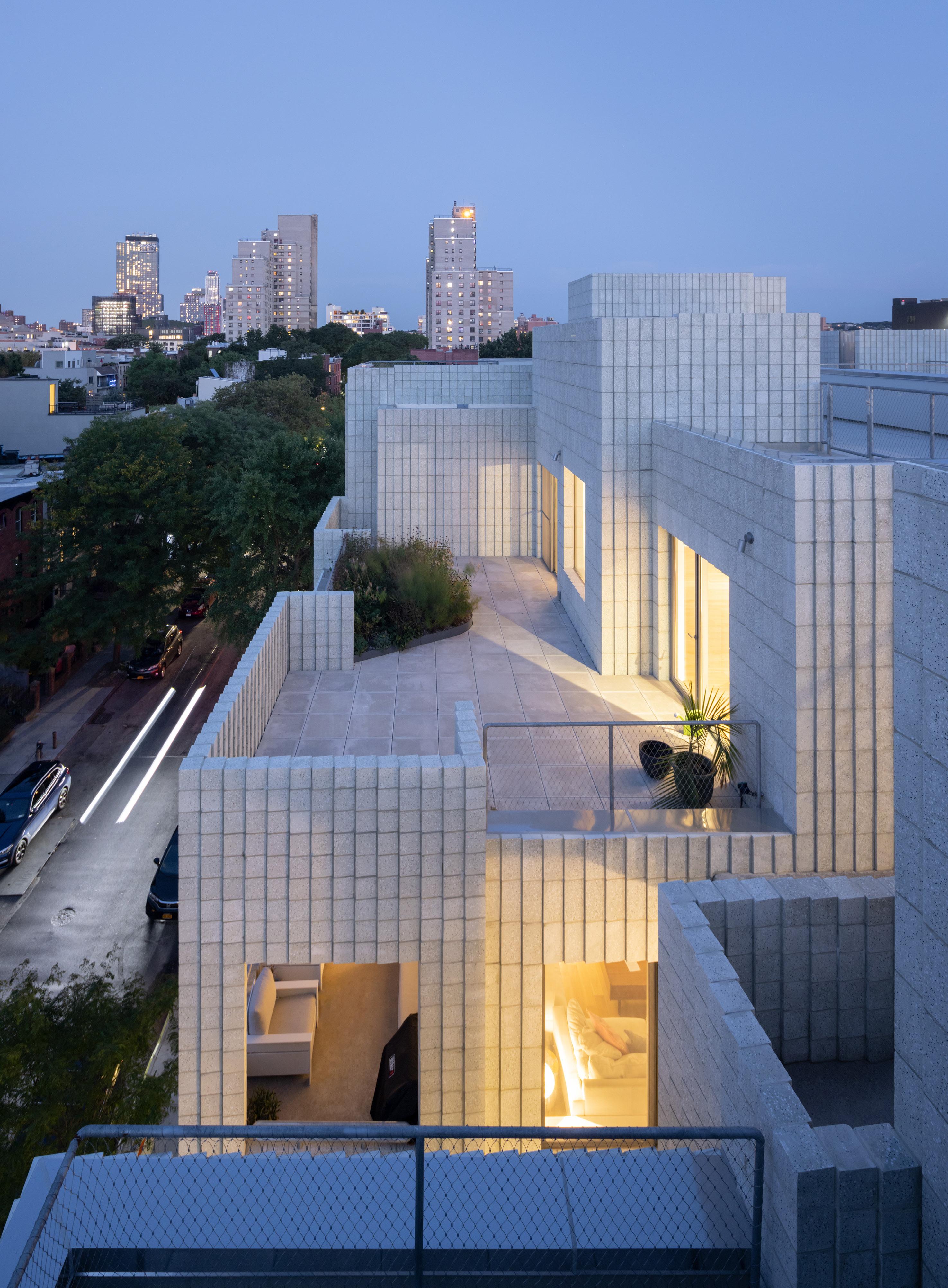
In the midst of the ongoing housing crisis, these case studies and products offer ways to live together, both inside and outside.
The U.S. housing crisis has reached a critical stage, with an estimated national deficit of 3.8 million homes at the end of 2020, according to one report. The shortfall is in large part responsible for a more than 30 percent increase in the cost of buying a home since 2020. The deficit also exacerbates a homelessness crisis, as more than half a million Americans are unhoused, and the number grows every year.
The reasons we’ve gotten here primarily relate to policy, not design. In cities across the country, zoning regulations and restrictive covenants tend to favor single-family homes in residential districts, thus limiting the number of units that can be built in a given area. The most obvious case in point is California, where, according to reporting in The New York Times Los Angeles County reserves 76 percent of its residential area for single-family homes, while the Bay Area allocates 85 percent.
Increasing urban residential density is clearly a necessity, and it must be done without going back to the Dickensian overcrowding of industrial-era cities or a turn to dystopian people-warehousing solutions like the dormitory proposed by Charlie Munger.
In this Focus section on residential construction, we consider three case studies that
work with density at different scales while optimizing interior daylighting and providing outdoor communal spaces that put residents in touch with nature and their neighbors.
XO House in Houston by LOJO explores the courtyard typology to fit a primary residence, a work-from-home space, and an accessory dwelling unit (ADU) on what is nominally a single-family lot (the site originally contained two small bungalows built for the daughters of the farmer who once owned the land). In Brooklyn’s Boerum Hill neighborhood, SO – IL’s 450 Warren pulls apart the typical urban condominium block, creating outdoor circulation that doubles as social space. In doing so, it avoids the use of a double-loaded corridor. And the Keeler Court Apartments in San Diego by BNIM Architects are an affordable-housing project that consists of 2 four-story buildings connected by outdoor bridges on a site that also features a community garden, children’s playground, and BBQ and picnic area.

Each of these case studies offers prompts to policymakers about how they might update their zoning codes to accommodate greater density while providing safe, humane, and attractive housing for more people.


XO House by LOJO is a contemporary take on the Roman domus.
Architect: LOJO
Location: Houston
Structural engineer: Insight Structures
Civil engineer: Karen Rose Engineering
General contractor: Viviano + Viviano
Landscape architect: Falon Land Studio
Landscape installation: Telloc Landscape & Construction
Sliding gate fabricator: Aria Signs & Design
Concrete floors: Dungan Miller Design
In this case, XO doesn’t stand for hugs and kisses. Rather, XO House—which Jason Logan and Matt Johnson of LOJO in Houston designed for Logan, his wife, and his wife’s father, who had dementia—references the house’s two plans: The ground floor is an X, the upstairs an O.
“Matt and I like to work with typologies,” Logan said. “The last house we designed for me and my wife was a dogtrot. Here on this site, the typology we had in mind was the courtyard of the Roman domus, specifically the compluvium.”
Situated on a tight corner lot in a sliver of Houston between the Woodland Heights Historic District and the Near Northside, XO House responds to its context while setting a new precedent. The two-story structure’s corners are carved away at the ground floor, opening space for two carports, a pedestrian entrance to the courtyard secured by a perforated steel gate (the perforations are a gradient of Xs and Os), and a small back patio. The enclosed spaces on the ground level include the in-law apartment (a generous one-bedroom setup), an office with full-height windows overlooking the courtyard, and the entryway to the main living space upstairs.
The main living space features a kitchen, a living/dining room, a primary bedroom with an en suite bathroom, a guest room, a powder room, and a utilities closet, all wrapped around the courtyard and cantilevered over the vacated corners below. The interior is spare, and the materials are kept to a minimum: just drywall, white oak floors, and yards and yards of white oak millwork cabinetry and shelving. To obviate the need for drawer pulls, Logan drew a curving
millwork detail for the opening and closing of the cabinetry. Logan, who professes to not like doors, kept the bedroom and adjoining bathroom almost entirely free of them. Instead, the spaces flow one into another. The exceptions are the utilities closet and powder room, and, more choicely, the guest room, which can be enclosed by a secret door that swings 180 degrees from its concealment in the hallway’s millwork to shut off this space should it be occupied by a visitor.
Throughout the home, windows are carefully placed to frame specific views. By carving away at the volume, the architects opened a corner window in the bedroom, which is on the north of the site, looking south across the side of the house toward downtown. A window on the floor of the living room allows easy views into the courtyard below. A full-height window in the kitchen looks across the gabled rooftops of the neighboring bungalows to the west. Glass walls on the south face are pulled back from the perimeter, shading the glass, opening space for an exterior balcony and freeing the architect from the task of detailing
a window around the cross bracing of the steel cantilever (the structure is a hybrid of steel and wood framing).
Located near White Oak Bayou in the 500year floodplain (though the site did not flood during Hurricane Harvey), XO House takes water seriously. The compluvium of the roof is functional, though rather than directing water into an impluvium it feeds large gutters and downspouts that lead to a 2,500-gallon underground cistern to keep stormwater on-site. The foundation is also raised two feet above grade as an anti-flooding measure. Additional sustainability measures include seven 300foot geothermal wells that offset heating and cooling loads, and the roof has room for a 28-panel solar array that, when set up, could take the house completely off the grid.
Clad in dark gray corrugated metal panels and larch boards that accentuate the project’s carved volumetric qualities, the house is at once assertively modern while not trying to stand out too much in this neighborhood of early 20th-century bungalows. AS
 LEONID FURMANSKY
Facing page: Sited on a corner lot, XO House is a variation on the courtyard house typology and accommodates a main residence, office, and ADU. Clad in dark gray corrugated metal panels and larch boards, its upper story cantilevers over two carports and the main entrance, which opens into the courtyard.

Left, top: The courtyard is the physical and spiritual center of the house, where the ADU, office, and main residence share an outdoor social space.


Left,
The interior is ripe with yard and yards of white oak millwork, here defining the stair to the main residence upstairs.
 bottom:
Above, top: The living/dining area features a glass wall pulled back from the southern elevation to create shade and put the steel structure of the cantilever on display.
Above, bottom: The two floor plans clarify the house's name: downstairs is the X, upstairs the O.
LEONID FURMANSKY
bottom:
Above, top: The living/dining area features a glass wall pulled back from the southern elevation to create shade and put the steel structure of the cantilever on display.
Above, bottom: The two floor plans clarify the house's name: downstairs is the X, upstairs the O.
LEONID FURMANSKY
In the realm of home renovation, hardware is a small but mighty force. With the power to completely transform a space, updating your hardware might be one of the most substantial yet cost-effective changes you can make. To help you do so, the following manufacturers have rolled out a number of new collections that promise to deliver on aesthetics and durability.


 Sophie
Aliece Hollis
Tubular Latch Accurate Lock accuratelockandhardware.com
Cast Buster + Punch busterandpunch.com
Pebble Collection Belwith Keeler belwith-keeler.com
Otto Collection by Float Studio Modern Matter Modern-matter.com
Sophie
Aliece Hollis
Tubular Latch Accurate Lock accuratelockandhardware.com
Cast Buster + Punch busterandpunch.com
Pebble Collection Belwith Keeler belwith-keeler.com
Otto Collection by Float Studio Modern Matter Modern-matter.com
The most durable & feature-rich product in its class

STAINLESS STEEL CONSTRUCTION FIELD ADJUSTABLE HUB ORIENTATION TO PREVENT LEVER TILT
ADJUSTABLE LATCH PROJECTION
REMOVABLE LATCH BOLT TO CONVENIENTLY COMPLEMENT FACEPLATE FINISH


REMOVABLE FACEPLATE ALLOWS FOR FINISH FLEXIBILITY

SO – IL innovates condo living through inventive massing, circulation, and details.
Architect: SO – IL
Location: Brooklyn, New York
Architect of record: Kane AUD
Developer: Tankhouse
Structural engineer: Silman
MEP engineer: ABS Engineering
Facade consultant: Laufs Engineering Design
Lighting designer: Lighting Workshop
It rains inside 450 Warren, a new 18-unit condominium in Brooklyn’s Boerum Hill neighborhood. It snows too, though not much so far this winter.
Judging from appearances, this climatic permissiveness can come as a little surprising. The five-story development, though puny compared with the vertiginous public-housing complex across Bond Street, affects a low-key defensive posture, not unlike the priggish rowhouses lining the rest of Warren Street. SO – IL’s elemental, Minecraft-like massing is accentuated by the uniform surfacing of concrete blocks, gathered into tight vertical bands that are slightly offset and angled from one another. At a compositional level, the cubic cladding is relieved by deadpan punched windows and balconies, and at a microscopic level, the terrazzo-like green flecks mixed into the aggregate work to soften the building’s image.
But step through the entry gate (placed off to the side, on Warren), and the architecture suddenly slackens. What at first seemed a dry polemic about archetypal representations of
mass is a lucid, well-executed proposition for a new kind of urban housing. Three buildings are arranged around an open-air space, with the far ends of the floor plates connected by slinking gangways. Wire-mesh drapery affixed to the sides of these thin concrete footbridges obviates the need for railings even as it hints at a certain danger.
Paradoxically stiff yet blousy, the cable netting modulates the character of the shared court, and thus of the complex as a whole. The effect can be uncanny, particularly on a summer day, when sunlight shimmers across its surface. Slicked with rain, the veil acquires a beguiling sheen. This past holiday season, residents took to pinning festive accoutrements to the mesh, from ghost dolls and spiders for Halloween to Christmas wreaths.
“At first, I worried that people were going to clutter the surface with decorations,” said Sebastian Mendez, with a chuckle. Mendez is an architect and cofounder of Tankhouse, the start-up developer behind the building; he lives on the fourth floor. 450 Warren is the first of four collaborations between Tankhouse and SO – IL to be completed. Conceived as a set, the projects spurn the pro forma thinking that characterizes New York City housing. “Typically, residential developments here will have an efficiency of 80 percent,” Mendez said, referring to building-efficiency ratios that balance leasable or sellable space against the overall floor area.
“In this case, it’s close to 50 percent.”
Stacked courtyards are an anomalous condition in New York. Exceptions can be found in historically wealthy pockets of Manhattan (London Terrace Gardens in Chelsea being the pinnacle of the type) or in the early garden suburbs of Queens, where block-spanning quadrangles were reduced in height and largely denuded of the ornament lavished on their city counterparts. At a little over 50,000 square feet, 450 Warren is an abbreviated take on the idea, even as it throws in a few twists, enough to earn it a win in the Residential—Multi-unit category in AN ’s 2022 Best of Design Awards.
For instance, every apartment faces at least two directions, with front doors positioned around the court. The architects devised foyer-like alcoves—think of mudrooms without doors—where residents shed their sodden shoes and parkas or park their groceries on built-in resin benches as they feel around for house keys. Domestic provisions such as these were possible only because Tankhouse and SO – IL dropped the sunless double-loaded corridor favored by local developers. Instead, they substituted those semi-contiguous walkways, swoopy like a sneaker logo and as suggestively uncomplicated as Matissian découpages. Though exposed to the weather, they are not completely unmediated: The slender slabs are embedded with electrical trace heating to melt snow, and however oblique they may seem, the passages offer the minimum coverage dictated by code.
January/February 2023
“The building inspector told us, ‘I don’t like it, but I have to sign off on it,’” recalled Florian Idenburg, cofounding partner of SO – IL. “That was his attitude toward the whole design.”
The units have all been sold, save for the top-floor penthouses (asking price: $2 million). SO – IL also designed the interiors of the apartments, where custom pink-marble countertops scream “luxury,” while the gallery-quality baseboard reveals merely murmur it. Idenburg called attention to the provision of natural lighting in all the bathrooms, as well as skylights in hallways and bedrooms; on the building’s website, the broker instead chose to foreground the number of closets in each unit, which is prodigious.
True generosity, however, is to be found outside, in the viscerally breezy central court and in the elevated garden facing Bond Street. The latter, larger than the former, is a more conventional quadrangle slotted into the gap between the buildings and a neighbor’s party wall. Compelled by a zoning mandate, the architects constructed a false facade—really, a two-story surface made with chain-link fence— to enclose the space. Eventually, creepers will provide additional privacy for residents from outside eyes, if not from one another. Owners of the two units adjacent to the area show little inclination toward setting up any barriers; indeed, the manner of their decor seems to invite bidirectional glances. At 450 Warren, the theme seems to be receptivity—to precipitation as well as to each other. SM
Fifth-floor plan: The three penthouses sport private terraces. The building's three masses, fully separate on lower floors, are joined on the right (eastern) side to connect a primary bedroom suite to its unit.


Above, top: The angled block cladding creates variable textures and shadows as the light changes throughout the day.

Above, bottom: The cable netting both protects residents and screens off planted zones. Entries to individual units are accompanied with vestibules that sport circular, inset doormats.

Right: The curving walkways, though tight, serve as both circulation and social spaces. Lighting is incorporated into the slabs, as are heating elements to melt the snow.

Facing page: Standing five stories tall, 450 Warren scales between the existing densities of rowhouses and the taller complexes of Gowanus Houses, operated by the New York City Housing Authority.
Second-floor plan: The thinner, more expressive inner circulation threads between the thicker, block-faced walls. The shared elevated garden is at the bottom left.
Ground-floor plan: The street level includes four spaces, presumably for retail, and nine parking spots, in addition to the base of the interior court.


Years of research and innovation have changed the paint and primer game. Going far beyond color, the following products employ cutting-edge technology to ensure that each coat is actively working to protect your home and everyone in it. Disinfecting, cooling, and air purifying are just a few of the many qualities that these paint and primer products will bring to your next job. Sophie

 Aliece Hollis
Copper Force Interior Paint Behr behr.com
KILZ RESTORATION Primer KILZ kilz.com
Cool Surface Technology Floor Paint Glidden glidden.com
Exterior Paint Clare clare.com
Aliece Hollis
Copper Force Interior Paint Behr behr.com
KILZ RESTORATION Primer KILZ kilz.com
Cool Surface Technology Floor Paint Glidden glidden.com
Exterior Paint Clare clare.com
As unpredictable weather grows more and more common, it’s never a bad idea to ensure your home’s envelope is sealed and secure. Whether you’re looking to keep the elements out or maintain the conditions inside, the following sealant, barrier, and insulation products promise top-of-the-line performance to maximize your home’s efficiency and protection.
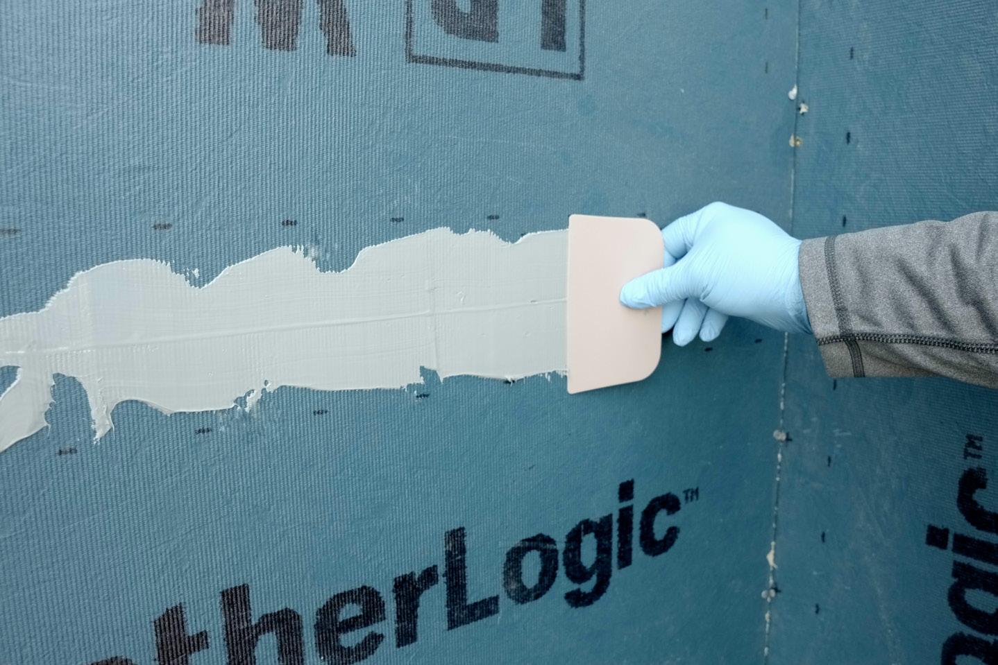


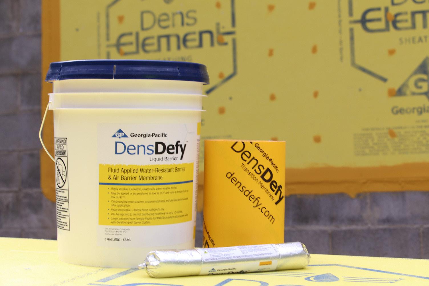 Sophie Aliece
Hollis
DensDefy Liquid Barrier Georgia Pacific gp.com
PINK Next Gen Fiberglas Owens Corning owenscorning.com
Comfortbatt PRO Rockwool rockwool.com
Sophie Aliece
Hollis
DensDefy Liquid Barrier Georgia Pacific gp.com
PINK Next Gen Fiberglas Owens Corning owenscorning.com
Comfortbatt PRO Rockwool rockwool.com
BNIM’s Keeler Court is an affordable-housing complex with an emphasis on outdoor community space.
January/February 2023
Architect: BNIM
Location: San Diego
Owner/partner: Community HousingWorks
Landscape architect: BNIM
Structural engineer: DCI Engineers
Civil engineer: Project Design Consultants
MEP engineer: Fard Engineers
General contractor: Highland Contracting Group
Rents in San Diego County have been among the fastest rising in the country, a condition that only accelerated during the pandemic, with prices rising 15.4 percent from November 2020 to November 2021, outpacing Los Angeles and Orange counties. While the rate of increase showed some signs of slowing during the fourth quarter of 2022, local governments have declared the housing shortage an issue of primary importance, with city- and county-level officials working together to propose potential pathways to construct more housing.
In one initiative, the San Diego Housing Commission provides federal rental housing assistance to 16,000 low-income households per year and has acted as a developer, investor, and lender for an additional 23,000 units of affordable housing. In November 2021, this collaborative work came to include the Keeler Court Apartments. Designed by BNIM and developed by Community HousingWorks, the 76,500-square-foot development spans two buildings and contains 71 units. The mix of studio, one-, two-, and three-bedroom apartments were built to provide housing for San Diegans whose income is between 30 and 60 percent of the area median income, or between $39,050 and $78,060 per year for a family of four. Seven of the units are reserved for formerly unhoused veterans in collaboration with the Department of Veterans Affairs and the Department of Housing and Urban Development.

Located on a formerly undeveloped lot in San Diego’s majority-Hispanic Southcrest
neighborhood, Keeler Court is close to existing grocery stores, an elementary school, the Southcrest Park and Recreation Center, and public transit stops. The buildings’ appearance is lightened by balconies cut into the blocks and finished in yellow, resulting in a ribbon of stucco on the facade. This move is set above a band of bright orange along the ground floor. The stucco is consistent with the surrounding context, but the orange, meant to introduce warmth, adds an accent color to an otherwise muted color palette.
The two 4-story structures are connected by exterior pedestrian bridges, saving interior space for the units while reducing the mass of the two buildings, which are constructed with timber framing over a concrete podium. The scheme incorporates an interior courtyard, which is intended as a space for communal activity within the complex. The project also includes a children’s play area, laundry room, computer room, bicycle storage room, and garden.
In addition to providing communal spaces, the design team at BNIM paid careful attention to the buildings’ long-term impact on residents and the environment. They estimate that 45 percent of the site’s energy will be generated through a combination of photovoltaic panels and a solar hot water system on the rooftops. The buildings’ materials contain no or minimal amounts of volatile organic compounds to improve interior air quality. Roof insulation also lowers energy usage. The exterior passages, operable windows, and ample daylighting give residents the opportunity to feel more connected with nature and their neighbors.

If significant gains in housing construction are needed to ease rising costs across the country, complexes like this offer one way to add capacity in a thoughtful, budget-conscious manner. Chris Walton
 CHIPPER HATTER
COURTESY BNIM
Above, top: The two-building complex splays open from its eponymous cul-de-sac.
Above: Ground-floor parking areas are covered by upper-level floorplates.
Left: Recessed areas, finished in orange and yellow, brighten the stucco facades.
CHIPPER HATTER
CHIPPER HATTER
COURTESY BNIM
Above, top: The two-building complex splays open from its eponymous cul-de-sac.
Above: Ground-floor parking areas are covered by upper-level floorplates.
Left: Recessed areas, finished in orange and yellow, brighten the stucco facades.
Versatility is the name of the game with these new residential lighting solutions. Offering both design flair and flexibility, the following pendants, sconces, and innovative track lighting systems promise to redefine illumination in your next residential project.

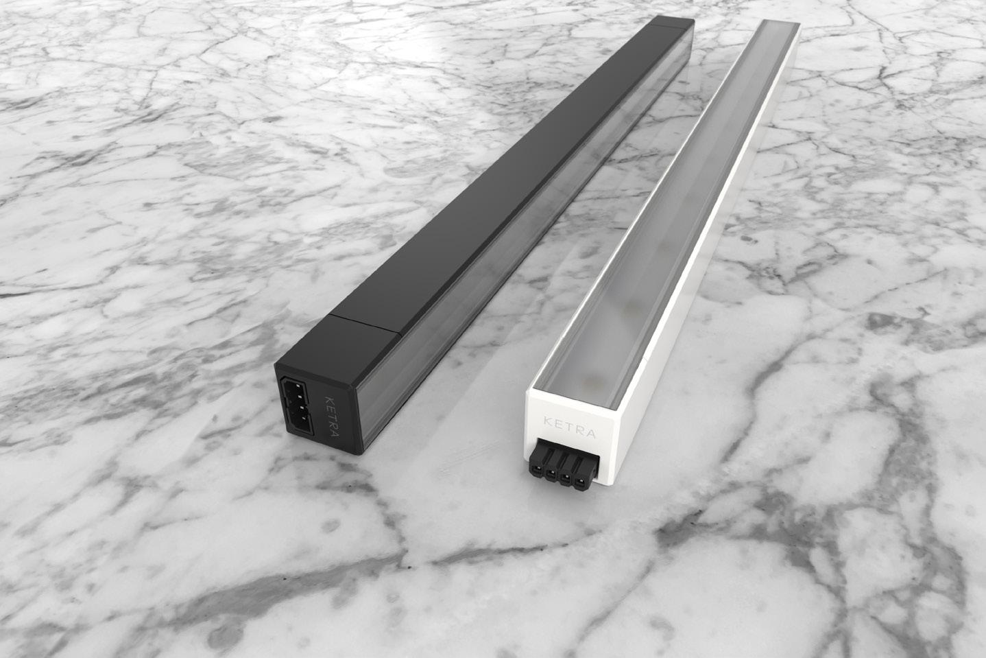
 Sophie
Aliece Hollis
MULTIVERSE System Juniper juniper-design.com
Sophie
Aliece Hollis
MULTIVERSE System Juniper juniper-design.com
Owning and maintaining a home is no small task. Fortunately, constant innovation in the tech space has flooded the market with gadgets and systems that attempt to lighten this load. From smart switches and remotely accessible cameras to intuitive shower controls and appliances, the following IoT products promise to deliver simplicity with tasteful design.


 Sophie Aliece
Hollis
Sophie Aliece
Hollis
Delta Fassade delta.dorken.com
James Hardie jameshardie.com
Kinetica kinetica.com.mx
Omega omega-products.com
Schoeck schoeck.com
Soprema soprema.us
Sto stocorp.com
Tremco tremcosealants.com
Tyvek dupont.com
Hardware
Accurate Lock accuratelockandhardware.com
Assa Abloy assaabloy.com
Belwith Keeler belwith-keeler.com
Buster + Punch busterandpunch.com
Emtek emtek.com
Modern Matter modern-matter.com
Schlage schlage.com
Stanley stanleydoorproducts.com
Von Duprin vonduprin.com
Yale yalehome.com
Kohler kohler.com
Legrand legrand.us
LG lg.com
Lutron lutron.com

Ring ring.com
SimpliSafe simplisafe.com
Lighting
Artemide artemide.com

ELCO elcolighting.com
Estiluz estiluz.com
FLOS usa.flos.com
Foscarini foscarini.com
Juniper juniper-design.com
Ketra ketra.com
Lucifer luciferlighting.com
Pablo Designs pablodesigns.com
RBW rbw.com
Vibia vibia.com
Behr behr.com
Benjamin Moore benjaminmoore.com
Clare clare.com
Glidden glidden.com
KILZ kilz.com
Duravit duravit.us
Hansgrohe hansgrohe-usa.com

Infinity Drain infinitydrain.com
Kohler kohler.com
Watermark watermark-designs.com
Daltile daltile.com
Hanover hanoverpavers.com
La Nova Tile lanovatile.com
Legno Bastone legnobastone.com
Georgia Pacific gp.com
LP Building Solutions lpcorp.com
Owens Corning owenscorning.com
Rockwool rockwool.com
Arcadia arcadiacustom.com
Kawneer kawneer.com
Milgard milgard.com
RAM ramwindows.com
Reynears reynears.com
Western Window Systems westernwindowsystems.com
February 18, 2023 | Palm Springs, California
Keynote Presentation by Thom Mayne, FAIA
Founding Partner of Morphosis


Thom Mayne has been the recipient of 29 Progressive Architecture Awards, over 120 American Institute of Architecture Awards and numerous other design recognitions. Special introduction by presenting sponsor Sunset Magazine


Cooper Hewitt, Smithsonian Design Museum

2 East 91st Street
New York, NY 10128
Open through May 29
Liberty Research Annex at the University of Michigan
305 West Liberty Street Ann Arbor, MI 48103
Open through March 24
The ingenious bar, pie, and pyramid charts—plus line graphs, pictograms, and tables—devised by a young W. E. B. Du Bois and his students at Atlanta University (later Clark University) for the 1900 World’s Fair in Paris are the heart of this show. Over the years, these startling “statistical graphics” have fluctuated in and out of public awareness; Instagram, it seems, has finally ensured them a sort of permanent preserve. The aesthetic dimension of Du Bois’s project can’t be denied, even after discovering they were the result of happenstance. (Those Malevichian reds and
Bauhaus blues and yellows? According to one researcher, they belonged to a standard palette produced by a Philadelphia-based manufacturer; Du Bois had lived in the city before departing for Atlanta.) As indices of Black life in the United States, however, the handmade visualizations carried real sociological weight. Deconstructing Power leverages this tension between representation and data-driven analysis, even as it assembles exemplars of the fin de siècle material culture in which Du Bois’s diagrams fortuitously found themselves. SM

High Museum of Art
1280 Peachtree Street NE Atlanta, GA 30309
Open through March 5
Leah Wulfman, Kevin Daye, and Adam Miller, fellows at the University of Michigan’s Taubman College of Architecture and Urban Planning, dish the dirt on architecture in this polymorphous show. The aim, it seems, involves dragging a profession that insists— not without pathos—on the self-identified “discipline” through the muck of contemporary reality. Its salubrious technocratic fixes are (implicitly) despoiled, its attachments to asymptotically optimized futures (rhetorically) wrecked, its benighted sense of agency (figuratively) pissed on. Wulfman’s installation,
SPUR Urban Center
654 Mission Street San Francisco, CA 94105
Free Dirt , incorporates such dissimilar materials as tree branches, LEDs, video screens, and soil obtained from Craigslist in a simulation of our “unruly, self-fragilizing ecosystem.”

While the occasion for all this sordidness is prosaic—like many schools, Taubman’s faculty and fellows routinely exhibit their work in group settings—it reveals the preoccupations of a younger generation of architectural designers who, uninterested in selling out, prefer to work in the creative margins. What they’re telling those above and below them is this: Train your mind on the gutter. SM
Open through February 28
For all its anxious alienation, the pandemic proved a productive period for some. If Shelter in Place is any indication, Stephen Burks and Malika Leiper, who run the Brooklyn industrial design office Stephen Burks Man Made, made the most of their time in self-isolation. “Our home sort of became a laboratory,” he told an interviewer last year. “We looked for opportunities to create space for one another.” Of the notional but spirited residential furnishings that form the centerpiece of the exhibition, one is for the newest member of the Burks-Leiper household: a flat-screen
TV. Rather than putting up “a big black void” on the wall, the couple ensconced it in a woven shroud. Other pieces—all of them handmade—include a mobile reading nook, a bookshelf made to resemble a giant bust, artful collages, and loungey seating. The staging surveys the last decade of Burks's practice, during which he did stints as a studio instructor at Columbia GSAPP. Shelter in Place is accompanied by a book of the same name, published by Yale University Press, which, among other texts, includes Burks in conversation with the late bell hooks. SM
Curated by Michelle Chang of JaJa Co and Rudabeh Pakravan of Sidell Pakravan, this more conventional group show nonetheless raises timely questions about ADUs, which some proffer as a solution for alleviating the country’s affordable-housing crisis. That vision hasn’t exactly panned out: A 2021 program in Los Angeles, for instance, failed to significantly ease permit retrievals, minimize costs, or open up new revenue streams for architects. Many of the exhibition’s nine ADUs—split between sites in Cambridge, Massachusetts, and nearby Berkeley—are implicitly critical of
such approaches: Less concerned with formal whimsy, they relate architectural investigation to realistic administrative constraints. First Office’s entry seeks rapprochement with builders by embracing mundane but easily doable details; Anderson Anderson Architecture’s is premised on total prefabrication; and NEMESTUDIO’s design doubles as an apologia for land trusts. Should all this sound too boring, find consolation in the cheery, supple curves of Sean Canty’s proposal. From March 30 until April 2 the show will be on view at the Helms Bakery District in Los Angeles. SM


Inscriptions: Architecture Before Speech is a 624-page doorstopper reminiscent of the shelf-busting tomes published in the anni mirabiles of the late 1990s. It is filled with excellent work, much of it exhibited in a show staged at the Harvard Graduate School of Design’s Druker Gallery in 2018, also called Inscriptions. Both efforts attempt to extract a theory of contemporary architecture from a constellation of 112 practices—some young, others more well-known—that fill faculty rosters in architectural schools throughout the world. Many of the designers and practices come from the GSD’s ranks or have studied there. However, Inscriptions does not feel burdened by a sense of disproportionate representation. In looking at the 750 images chosen by K. Michael Hays and Andrew Holder for Inscriptions, what emerges is a snapshot of a moment in contemporary practice invested (as usual) in forms, materials, and tectonics. This is no surprise, of course, and even an architecturally interested reader with no prior knowledge of the book or appetite for its heady arguments will recognize the work by the featured practices. Viewers will likely appreciate seeing these projects in a single bound volume, fully outside the more familiar formats of social media. Gathered together, there is a hint of cohesiveness—a flash of understanding that, yes, these folks are all up to something interesting.

Blink, however, and you may miss the occasional nods to urbanism, landscape, or infrastructure. The same goes for the handful of moments that address current events (primarily in essay contributions by Lucia Allais and Sylvia Lavin). History, or rather its imperfect, formalist eidolon—breathed into life by Rudolf Wittkower and Colin Rowe and kept alive today by Hays—remains at the forefront in Inscriptions. Hays and Holder argue for a persistence of forms (“Originals”) that predate texts and thereby inscribe themselves in architectural culture. Readers may find it strange that a term that refers to the act of writing is used to refer to something that existed before speech. Yet in his introductory “Prelude,” Holder disposes of this conundrum rather quickly. He is clear in his insistence that “Inscription” is not about writing, but about creating a media-friendly array of objects with banal titles like “slack collections,” “scatters,” and “stacks.” “Architects pitch design against—or rather inscribe it onto—the emptiness of what we would call an original […] such that the original persists as a regulating substrate even while it is overwritten by the architectural activity reforming its surface,” Holder continues, in a passage reminiscent of Franz Kafka’s “In the Penal Colony.” In that story, a visitor travels to a prison to get a firsthand glimpse of the “Harrow,” a machine that inscribes and re inscribes a sentence for a crime on a prisoner’s flesh.
I also thought of Fredric Jameson’s 1975 book, The Prison-House of Language. As a reviewer, I feel sheepish about conjuring Jameson, yet his presence lurks within the heady conceptualizing in Inscriptions The Prison-House of Language is especially relevant: In it, Jameson remarked how “philosophic language feels its way gropingly
along the walls of its own conceptual prison, describing it from the inside as though it were only one of the possible worlds of which the others are nonetheless inconceivable.” Something similar is happening in Inscriptions, and it becomes especially evident when noticing the book’s design. In each of the chapters dedicated to an inscription, project images are printed as monochrome plates, a design decision that leaves them bereft of any vitality. (Color arrives on the glossy signatures, reserved for the table of contents and interludes.) Within the pages of Inscriptions, the field of contemporary architecture is flattened, whether due to Studio Lin’s now-familiar brand of monograph normcore, or conformed to Hays and Holder’s curatorial vision pinned to the page.
Reading through Inscriptions is like listening to a piece of ambient music or binge-watching a streaming show. It is like the steady blur of white noise, a kind of background that does not necessarily serve as a setting but is just there. Relentlessly so. And after a while all your eyes may recognize are fields of square black-and-white
images interspersed among lengthy essays typeset in a vertically elongated sans serif typeface that seems to be made to be read quickly from top to bottom in a PDF format on a computer screen. The book captures today’s doomscroll aesthetic.


The debt to semiotic theory is clear enough that the diagram that organizes the book’s content comes from A. J. Greimas’s “semiotic square.” The square bears a passing resemblance to the Klein diagram made famous in Rosalind Krauss’s “Sculpture in the Expanded Field,” and yet it is supposed to operate more like a blank terrain, or even something like the “Approval Matrix” in New York Magazine. It is, in other words, a flat space, an idealized frame for idealized relations. It also puts readers in the unlikely position of having to make sense of the book on their own. It is all well to ask the reader to make conjectures and find patterns. However, when your only guide is a talismanic diagram that itself becomes an empty signifier, things can get a bit taxing. (It evokes Laurie Anderson’s quip from her song “Sharkey’s Night”: “Hey sport. You connect the dots. You pick up the pieces.”)

Or, to use a term from astronomy, it is asterism: finding, in a vast field of objects and stars, connections and patterns that otherwise did not exist.
Throughout Inscriptions, the editors and contributors refer to Hays and Holder’s curatorial vision. What this vision is, however, remains a mystery, as it is alluded to in the most generic terms. “Curation,” Holder declares in the prelude, “is perhaps the ideal test bed for this ambition to align discourse with architecture’s artifacts.” And when it comes to the tricky issue of writing an exhibition catalogue, Holder admits that the book is not so much a tabula rasa as an opportunity to revisit and reimagine the meaning of "inscription” and its relation to architectural culture. And yet the contributing essays seem to operate as if the book were a more traditional exhibition catalogue. Stan Allen, for instance, observes that “Inscriptions maps […] the dilemma of the exhibition curator when practice itself has become a form of curation. For many younger architects, including some represented in this publication, design is reconceived as an operation of selecting, sorting, and editing.” These are largely generic statements about curation, the equivalent of telling readers, “Our curatorial strategy is that we have a curatorial strategy.” And if the intent is to portray design as curation, this too is unfortunate, because it reveals an all-too-overbearing curatorial strategy that focuses on similarity rather than originality.

There is a lot that is good in Inscriptions. The design work is generally excellent, and the reader is rewarded at the end of the book with a portfolio of projects with full descriptions and better images that do more work in describing the book’s ambitions. The essays too are often illuminating: Texts by Antoine Picon, Edward Eigen, Marrikka Trotter, and Lavin set a historiographic armature for Hays and Holder’s disciplinary ambitions. The temptation to mention Lavin’s essay in the same breath as Lucia Allais’s is because both are exceptional works that stand out in their analysis of the history and theory of screen culture in architectural education. Phillip Denny’s study of “the creaturely” is a bit puzzling only because his reliance on literary critic Sianne Ngai’s theory of the aesthetic category of “cute” is rendered into a purely visual category without acknowledging the importance of “larger social arrangements,” in Ngai’s words. The book ends with an intense postlude by K. Michael Hays that reconfigures semiotic theory with the goal of “allowing us to pass from identity politics to a political economy of the Thing” in a “theoretically infinite series of possible encounters.”
Inscription’s contents will no doubt be pored over in studios and seminars in the years to come. But any intellectual gains will be hard-won, as the opacity of the framework threatens to obscure the work of the 112 practices whose images are lodged within.
Theaster Gates | New Museum | Open through February 5

continued from cover Within the New Museum, he transforms loss into an acknowledgment and celebration of Black creative production and centers the construction of Black subjectivity in the often-abject mundanity of everyday life. These are conditions and works usually not considered to be art or architecture in the highfalutin situations of the art world and the academy. In the lexicon of the Black church, the exhibition can be considered more of a “home-going” service for these Young Lords and a celebration of the liberatory power of Black artistic creativity and labor. As video artist Arthur Jafa (whose elegiac poem “Virgil” is included in this exhibition) stated in a 2018 interview in Artnet News, “Black people figured out how to make culture in free-fall.”
Gates transgressively transmutes the conditions of white-(cube)-space galleries and remixes the secular and the sacred. The Black sermonic model of “three points and a poem”—whereby the preacher conducts an exegetical review of a biblical text, makes three progressively intense points or lessons from that text, and then culminates in a poetic celebration—is a useful precedent. Gates uses it as a curatorial structure across the three floors of the exhibition, beginning with the theme of “archives” on the second floor, continuing with “vessels” on the third floor, and concluding with “communion” in the airy atmosphere of the fourth floor.
When Black churches were outlawed in the 1830s following the planning of slave insurrections, Black people went underground to carve out space in what were called “bush arbors” or “bush harbors” (which also denoted a place of security or refuge). These were simple one-room structures that were never considered “architecture” and were often constructed in the forest out of brush or bushes tied together with rope or vines in the form of an arbor. Yet, within these spaces, Negro preachers creatively appropriated biblical stories and the theology of their slave masters to preach liberation. In the 20th century, the role of the Black church as a space of liberation later translated into the liberative promises of social and political justice of the Civil Rights Movement and in particular Black liberation theology, which posits that liberation is the fundamental goal of theology. As defined by James H. Cone, Black theology is one of liberation that springs from an identification with the oppression of Blacks in America and seeks to interpret religious teachings and biblical history in light of this condition while recognizing the relationships between the Black struggle for justice and theological discourse. Cone’s discourse spans from the spatial praxes of Black power, which itself extends from slave insurrectionists worshiping in bush arbors, to the defiant declaration, “I am Black because God is Black!” This epistemology runs counter to that of Euro-American knowledge systems. It is from this background that Gates questions systems of knowledge, epistemologies, and the archive.
Upon arrival on the second floor, the wall immediately becomes a roof with the monumental Roof Strategies for a Museum Corridor (2022), a 50-foot-long expanse of acrylic paint on rubber torch down roofing, canvas, ink, and plastic. This work is echoed
by Seven Songs for Black Chapel #1–7 (2022) on the opposite wall in the main gallery, a series of abstract paintings of industrial, oil-based enamel; rubber torch down; bitumen; wood; and copper commissioned for the 2022 Serpentine Pavilion in London designed by Gates with the support of Adjaye Associates. Sweet Chariot from the series Painting Black with Kettle (2012), a tar kettle gifted to Gates by his father, Theaster Gates Sr., upon his retirement as a roofer in Chicago, is staged in the foreground. The material transformation of tar and rubber torch down in these works destabilizes the histories of European and American modernist abstract painting (like the Russian Suprematist works of Kazimir Malevich and the color field paintings of Mark Rothko) and calls into question their myths, mysteries, and spiritualist overtones. Gates suggests that Black labor and physical embodiment is a different knowledge system for artistic creativity, cultural production, and even spiritual energy. In turn, this suggestion about ways of knowing is answered by various archives in the same room and in the royal red-colored adjacent gallery, including Robert Bird’s archive of 4,500 volumes primarily focusing on Russian literature, film, and modernism; the photographic archives of Ebony and Jet magazines from the Johnson Publishing Company; and A Negro Digest for a Weary Heart (2019), Gates’s work of over 100 bound titles alluding to Black spirituality and the struggle for freedom.
The adjacent gallery also includes an installation of objects and ephemera from collections Gates is preserving, including works made by various Young Lords whose impact is felt in Gates’s practice. These works are presented in hundred-year-old wooden vitrines from the University of Chicago’s Oriental Institute, a research center and museum for the study of ancient civilizations. With this bit of mischief, Gates has substituted his own personal collections for other canons that for centuries
excluded African cultures and Indigenous civilizations. While viewing these vitrines, one hears the voices of Black intellectuals (like bell hooks) that accompany the nearby six-channel video installation Art Histories (2019). The piece mixes hundreds of art history slides from the University of Chicago’s Glass Lantern Slide Collection acquired by Gates with photographs from the Johnson Publishing Company. Gates described the resulting interpretive process as “reading Blackness” into the collection. However, through juxtaposing works by Brancusi, Picasso, Giacometti, and Matisse with images of Black life, fashion, bodies, faces, and objects from Ebony and Jet, Gates in fact exposes the unspoken Blackness in the work of these artists.
A stone jar connects exhibitions between the second and third floors and reveals Gates’s sermonic model. The work was made by David Drake, an enslaved African also known as “Dave the Potter” who worked in Edgefield, South Carolina, a center of stoneware production before the Civil War. It resonates with the nearly 40 reliquary stoneware vessels that occupy the main gallery, a “lower chapel” in which one hears Gates intone, “In the beginning was clay; clay was without form!”—a declaration from A Clay Sermon (2021), a 16-minute film presented in a flanking gallery/side chapel. In the film, Gates uses the Black church vernacular of preaching and hymns to conduct an expository sermon on the significance of clay and its material and spiritual transmutations. For Gates, working with clay is a spiritual process that relates the potter to the hand of God while forming “man” from the clay of the earth. The film also folds in the history of Indigenous clay- and brick-making practices, which were in place before those in Europe. The opposite flanking gallery is a choir room where one hears Billy Sings Amazing Grace (2013), Gates’s film that captures soul singer Billy Forston rehearsing a version of the hymn “Amazing
Grace” alongside the experimental music ensemble The Black Monks, who are Gates’s frequent collaborators. In Forston’s rendition, original lines of the hymn are switched out for secular references to Black life, much like the sonic elisions that occur between Black gospel music and the blues. In the aediculae of the narrow stairway connecting the third and fourth floors, Gates locates the wood-fired brick-and–clay–oxide sculpture Lady on a Senufo Stool (2021) and Black Jesus (n.d.), painted in oil in a vernacular style common to many Black pulpits. In the fourth floor’s “upper chapel,” Gates takes us to church. Here he concludes his transmutation of the white cube and of other art spaces like New York’s Park Avenue Armory, where Gates acquired the 138-year-old wood flooring of the Wade Thompson Drill Hall and used it to produce the Floor Works series exhibited here.
Beginning with Double Door (2022), he assembles geometric forms in Georgia pine that reference religious symbols and Frank Stella’s striped Black Series. In one corner, a wood-framed shed houses St. Laurence Bell (2014–22), which Gates salvaged from the now-demolished St. Laurence Catholic Church on Chicago’s South Side. Once a sanctuary for Polish and Irish immigrants, the church later became meaningful for the neighborhood’s Black and Latinx communities. Bathroom Believer (2018) occupies the opposite corner; the two-piece installation of 25 porcelain floor panels and 17 rows of industrial fluorescent light strips recalls Gates’s mother, who would retreat to a locked bathroom to pray. The piece simultaneously reads like an altar and references the work of Dan Flavin. These corner installations majestically frame the central A Heavenly Chord (2022), which comprises a Hammond B3 organ, an essential instrument in the Black gospel church, and seven Leslie speakers mounted high on the wall. (They reference Seven Songs for Black Chapel #1–7 [2022] in the second-floor gallery.) The scene is not a quiet artifact or a funereal curiosity: It is activated on select Saturday and Sunday afternoons between 1:00 p.m. and 4:00 p.m. during the run of the exhibition. This final gallery contains Gates’s most direct references to architecture and the power of the Black radical tradition to elevate the mundane conditions of the everyday into art and architecture. It concludes Gates’s sermonic model and reveals that this power is not predicated upon European epistemologies, techniques, and histories but rather comes from Black ingenuity, making, and believing. At the press preview, Gates described the fourth floor as “a kind of Doric temple,” an “honorific space where the gods are present.”
Returning to the essay “When the Battle Is Over,” Gates notes in that text that from time to time he and Arthur Jafa get on the phone. Hence, it’s useful to lift Jafa’s May 2020 statement and offer it to anyone who sees Young Lords and Their Traces : I’m not a believer, but “I believe in Black people believing.”
A job posting on Instagram by SO – IL sparked outrage. AN speaks with Florian Idenburg and Jing Liu about how the incident relates to wider structural issues in the profession.
Just before Thanksgiving last year, the Brooklyn, New York–based architecture office SO – IL advertised two jobs—designer (2–5 years) and project architect (5–8 years)—via Instagram. The salary range, required by a recent New York City pay transparency law, was listed as $55,000 to $65,000. The post quickly received unwanted attention for the low pay, and overnight the company took to the comments of a follow-up post to clarify its predicament. For a time, the embarrassment opened a window of exchange; some internet commenters used the space to rail against the often-depressing economic predicaments of architectural designers while others came to the defense of small-firm owners everywhere. The kerfuffle arrived as SO – IL is expanding after leaner years; the pandemic had disrupted work worldwide, and the office, like others, shed staff and, for some employees, reduced salaries and working hours.
In December, changes at SO – IL were implemented: Profit sharing was eliminated for associates but retained for senior associates, and salaries were raised “across the board,” according to Idenburg, a move based on projections for 2023 that was in the works before the “Instagram event.” The incident, in his words, “triggered frank internal conversations about what type of office we want to be, including how much work we allocate towards nonprofits. As we are growing as a firm, we are keen on ensuring we can offer a meaningful place of work where people can commit to living well in the city and working on projects they enjoy.” He continued, “The most productive outcome of the event is a better fundamental understanding throughout the office of how the financials work and how we organize our time.” As of this writing, SO –IL’s website lists salary expectations for two outlined positions: “3-5 years of experience: $75,000 - $80,000” and “5+ years of experience: $80,000 - $85,000.”
In a conversation with AN, Idenburg and cofounding partner Jing Liu discussed the incident and the difficulties of practicing architecture today. An edited version follows.

AN: Tell us about your job post on Instagram.
Florian Idenburg: Our website was down, so we posted about job openings at SO – IL on Instagram. What was poorly clarified in the post was that the position was a certain base salary plus profit sharing. This was available for the senior position, so that amount, around $20,000 or so, would make the compensation on par with the market. The post went wrong because we cannot promise profit sharing in a job listing, so people got upset about a pay rate that wasn’t accurate.
We learned a lot from this post. We hadn’t revisited our salaries recently, which meant that we had lost some potential hires, as New York City is expensive. The whole thing was a wake-up call, so in that sense, this has been a positive thing.
Clearly, the post and its aftermath became a lightning rod for a much larger issue. While we did delete the original post, we didn’t want to pretend as if nothing had happened. In a second post, we tried to share the reality of our numbers and the challenges of running an office in New York in our current moment. We try to do work that’s not about profit. For instance, a social housing project we did in Mexico paid $20,000 in fees. We’re interested in working
with a good cause and not just with the wealthiest clients.
AN: SO – IL (@solidobjectives) made this post and then deleted it. Then it made a second post, which went into the economics of your practice. You later deleted that latter post, which had over 600 comments. It felt like the medium had collapsed and you were having a conversation with your followers. What can you say about that exchange?
FI: I think social media should be social in the sense that you are communicating. It’s not a one-way medium; there’s a reason why comment boxes exist. Some offices primarily post pretty pictures of their work, but we think there is something nice about being able to have these exchanges.
We deleted the original post because it started to live a life of its own with no nuance. The topic is clearly on everyone’s mind, and that evening of exchange was an exciting discussion. But at some point, there were so many threads that they started to repeat. We gave the same answer over and over, like a game of Whac-A-Mole. At some point, we just needed to go to sleep, although we didn’t sleep much that night.
AN: How does this incident fit into the larger trajectory of your practice?
Jing Liu: We started SO – IL in 2008 at a time when many architects lost their jobs, firms folded, and people went into tech or cinema or things like that. We started as immigrants without trust funds, so we had to be frugal. It was clear to us then that the practice of architecture in America is tied to the market. There is almost no room for culture to be preserved in the face of larger macroeconomic forces.
During the pandemic, the company’s revenue went down by 50 percent. There are a lot of things you can shed, but we tried to preserve the office’s knowledge and keep everyone. There were pay cuts, so in our mind profit sharing was something that could help. This should, of course, be on top of a living wage that is negotiated before work starts.
Like other offices, we plot our expenses against our projected revenue, and if that doesn’t happen, then the only thing you can do is to let people go, which is not a good scenario.
We were trying to have a conversation about this on Instagram, which was a foolish way to go about it. We don’t know where we go from here, but we do need to raise our fees. That’s the first thing.
AN: How do you raise your fees? Would it work, or would the move negatively impact the company? How could organizations like AIA better establish these standards?
FI: We work in many different regions in the world. With the strong dollar, the value of overseas contracts—like in the Netherlands—was reduced by 30 percent or so. We were able to negotiate some adjustments in situations like this.
We also tend to lose money with scope creep. We quickly draw a little bit of landscaping on the balcony, and before you know it, we’re also the landscape designer. This is something we have to work on, as we’re a young firm with designers who want
to design everything. So to say “No, you cannot draw a tree here” or “Don’t draw a furniture layout in the apartment” is something to practice. At the start of many projects, people don’t know what will happen, so the architect shouldn’t be the only one with risk during that discovery process.
JL: We know there are certain things we spend time on that will lead to better results, even though the client wouldn’t be able to see that or want to pay for it. There was one thread in the Instagram conversation that talked about the difference between setting the standards and agency in architecture. I thought it was a good point: Where is our agency? In the U.S., many public projects already have fee standards, and there are often fee caps. In many other countries, the standards are very fair, like in Australia or Switzerland. But even with those standards, we know that we go the extra mile in our work—if something budgeted for ten hours takes 15 hours, we know that extra five hours will make a difference. Who pays for that? If it’s the taxpayer, doesn’t the effort stand to make the project better? Maybe it’s easier with private clients who might value quality.
AN: How can you promote better business literacy while advancing a practice’s culture? How can we talk about money more directly?
JL: It’s funny, because we always talk about money in our office. But we’re all in this moment where we don’t know how to talk about money, so maybe that’s why the conversation becomes only about money. We need to balance that topic with other conversations; it’s not about solving one problem and leaving behind all the others.
FI: Because we both teach, we know that in schools most students dedicate their energy toward studio, and there’s still a culture of pulling all-nighters. This semester, I asked everyone to stop designing two weeks before the final deadline to work on time management.
There are two things that I think we need to change in education. One is the studio culture that rushes toward a final presentation with the most awesome things. Making awesome things is important, but time management is also important. What is the essential information that we need now to convey the idea in the best way possible?
The other thing is understanding the costs involved in running an architecture practice. It’s not just a bunch of people and computers. There is an incredible lack of knowledge about things like insurance. Yes, schools have professional practice courses, but they’re often not taken seriously. I hear from our staff that they want to be able to read the contracts and understand what we’re agreeing to.
Another element is that we’re competing on a global market for talent. It’s not just New York. Costs vary. For example, OFFICE KGDVS in Brussels is about the same size as our practice, but the cost of their firm is one third of ours. That’s part of why David Chipperfield has an office in Berlin: London is expensive. Even in the U.S. there are salary disparities between cities.
Again, it’s hard to discuss architectural
fees in the U.S. openly. It’s clearer in Germany, for example, where contracts have layers of scopes, and each type of work comes with a percentage. We should be more precise in coordinating the type of work and the fee. I think the AIA could make strong recommendations about this. The AIA contracts are robust regarding the legal structure, but as agreements relate to money and changes, it’s left to the architect and client to make a deal; there are no real guidelines.
JL: Today, there’s a huge push for unions in architecture. My personal opinion is that I don’t think a union is the right tool. In our office, there isn’t a division between the “capitalists” and the “laborers.” The capital that exists is intellectual capital. Our work is ultimately a collaborative and collective endeavor, and we must solve these issues together.
I do think that our profession should together engage in collective bargaining; maybe the AIA should do more. We need standards about our services. We, as architects who spend five years on a project, shouldn’t be making less money than the real estate brokers who do a few months of emails. That’s ridiculous.
AN: What did you learn at SANAA about creating office culture?
JL: People have this idea that SANAA is a slave den where everyone works long hours and develops unhealthy habits. It was true to some extent when we were there decades ago.
I think what we took from that experience is this incredibly alluring—and necessary, in our mind—collective sense of community. There was that commitment at SANAA that we want to harbor in our office, and that has shaped how we structure it.
From the beginning, we also said we’re not going to do “bread and butter” projects. No matter how hard it is, we don’t want anyone in the office to feel their time is spent supporting someone else. We must be passionate about every project, if it’s making money or not.
AN: What else should we know?
FI: The whole Instagram situation was quite emotional because suddenly we realized the variety of audiences on Instagram. And you don’t just get hearts. We also learned from our daughter that if somebody posts a puke emoji, you have to answer with a “palms up together” emoji. We learned a lot about new ways of communicating. ������